The graphic novel adaptations of the #1 New York Times bestselling Wings of Fire series continue to set the world on fire!
One will have the power of wings of fire . . .
Sunny has always taken the Dragonet Prophecy very seriously. If Pyrrhia’s dragons need her, Clay, Tsunami, Glory, and Starflight to end the war, she’s ready to try. She even has some good ideas how to do it, if anyone would listen to her.
But shattering news from Morrowseer has shaken Sunny’s faith in their destiny. Is it possible for anyone to end this terrible war and choose a new SandWing queen? What if everything they’ve been through was for nothing?
Buried secrets, deadly surprises, and an unexpected side to scavengers are all waiting for her in the shifting sands of the desert, where Sunny must decide once and for all: Is her destiny already written?
Or can five dragonets change their fate and save the world . . . the way they choose?
Okay, I know what you’re thinking. Tui? What kind of name is that? Is it short for something?
Nope. Among the many great things to come out of New Zealand (the Lord of the Rings movies, cats that paint, my mom) is a bird called the tui—not as well known as the kiwi, but a heck of a lot noisier!
I was born July 31 (same birthday as Harry Potter!) in Caracas, Venezuela, and lived in Asuncion, Paraguay; Miami, Florida; and Santo Domingo, Dominican Republic, before moving to New Jersey in high school, where I started doing theatre—mostly backstage work, because (a) it was fun, and (b) you got to hang out in the dark with cute boys. (Er, I mean . . . because it was artistically fulfilling, yes.)
I graduated from Williams College in ’98 and I currently live in Boston with my husband, my perfect new baby, and my adorable yoodle Sunshine (what’s a yoodle? A puppy that’s three-quarters poodle and one-quarter Yorkshire terrier, of course!).
Much to my parents’ relief, I abandoned my theatrical aspirations after college for the far more stable and lucrative career of fiction writing.
My first two official books were beginning readers, part of Grosset & Dunlap’s “First Friends” series for kids learning to read. MEET MO AND ELLA is tough to find now, but FUN WITH MO AND ELLA should still be out there somewhere.
My first novel for teenagers was THIS MUST BE LOVE, which retells Shakespeare’s play A Midsummer Night’s Dream in a modern-day high school, from the POV of the two heroines, Hermia and Helena.
And now I'm writing in a new project called SEEKERS! It's a children's book series that I'm writing with Erin Hunter. Check out my blog to find out more!
*SPOILER TO BOOKS 1 AND 5 WHEN I DONT EVEN KNOW WHY ITS THAT BIG OF A DEAL* VERY exited for this to come out, I cant wait to see SCARLETS SAD MELTED SIDEWALK POPSICLE FACE! But all in all im exited!
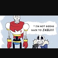
Boo! They made Stonemover so small! When I first heard magic-dragon-turning-to-stone-because-of-overuse-of-powers-&-is-indistinguishable-from-the-mountain-rocks, I was expecting him to kinda be ONE with Jade Mountain. Here? He's just pretty much a Nightwing statue lying down. Eh, still great. The art brings so much of the story to life as usual (nice touch giving the dragonbite viper a literal skull&crossbones marking), although since a lot of the book was about Sunny's internal struggles with her own worth, a lot of thought balloons take up some pages.
The Good: -Sunny is my favorite character in the graphic novels. Her design fits her much better than Joy Ang's cover art. All of the dragonets' designs, but especially Sunny's, are so expressive! This would be my favorite WoF graphic novel if for no reason other than it has beautiful drawings of Sunny on almost every page. -Burn's weirdling tower and were well drawn. The weirdling tower in particular felt much creepier in visual format than in the book. -It's still the same story as book five, and I like book five.
The Bad: -I was a little disappointed by Thorn's design, and a little more disappointed by Qibli's. They're both some of my favorite characters and I was excited to see their designs. They aren't bad, but they're nothing special. -Burn's stronghold was imaginatively drawn, but looked completely implausible. It was made of many intersecting ellipsoids which looked too heavy for their narrow connections to each other. -Some other things I only noticed because it was a graphic novel: How do the Outclaws enforce the whole "you need to pay to get into the Scorpion Den" thing? Can't dragons just fly in? They don't need to use the gate. Would a dragon city even have a gate? And along the same lines of thinking: Why do Sunny and Smolder walk up the weirdling tower? In the original book, I assumed the tower had multiple floors, so you had to use the stairs, but here there's a clear path to fly right up and avoid the hazardous prisoner half way up. -This one is a pet peeve of mine: Mike Holmes completely messes up drawing moons. They're wrong in just about every way I can think of. For starters, in a crescent or gibbous moon, the points should always be opposite each other on a circle. They usually aren't in this book. Also, when the moon isn't full, the "empty" part isn't gone, it's just dark. You shouldn't be able to see stars in the gap! To my great aggravation, Mike Holmes draws them there anyways. And lastly, moons in the same part of the sky should be in a similar phase because they'd be lit the same way by the sun. I think you know whether that rule is broken too. There's artistic license, and then there's just not having a clue how to draw a moon. This might seem like a minor point, but it isn't hard to get right, and the moons are moderately important to the story. Every time I see a botched moon, it's a blow to my suspension of disbelief. How am I supposed to be convinced of the world's plausibility when the moon isn't a crescent, it's a sphere with a bite taken out it?
My only con for this book (that I can think of rn) is based majorly on previous books to set up for this one. The other books were in other dragons’ povs and all made Sunny look like a dunce. This book gave her SO much characterization and competence, that instead of reinforcing the others’ opinion of her being all sweet and ignorant, just made it feel like loose and sloppy writing. It felt like a, “aw man, it’s Sunny’s book now, so it’s time to actually give her personality.”
In this case, Sunny gained personality and Clay lost his. I am TIRED of this mf only thinking about FOOD.
Sunny in the previous four books had little to no worth or input. To put it nicely, she literally had no use until this book. This book itself made me love her, but it’s so sad to see her be so easily tossed aside in the other books.
Lastly, give Deathbringer his own book. Bro deserves it 100%.
This is definitely my favorite out of 1-5 and I love the new characters, even though burn and blister were evil I'm still sad that they died but at least blaze survived! I really hope that Tui T. Sutherland makes more graphic novels for all of the other books, mainly because I like to read the graphic novels before the other books but also because they are awesome!
This entire review has been hidden because of spoilers.
I’d give this a 4.5 rating. Wings of Fire is a series I’ve read since middle school, and I appreciate the continuation of dragon stories out in the world. The graphic novels are a fun, easy way to access the story, and I found myself particularly enjoying this one, because to be honest I’d forgotten how the story ends, and I really liked it! Dragons for the win.
I was really satisfied with the ending of this book, even though the final solution to the war was a little predictable. The characters all made good comebacks and their stories were well rounded to a finish. Still loved the illustrations and as far as I know I think it's a pretty good adaptation of a novel to a graphic novel.
It's been a long time since I read anything Wings Of Fire, but it's so nice to get back to it. Although Sunny was never my favorite character, she's truly the perfect one to round off the first arc of the series. Reading her solo adventure in graphic novel form was great and I'm excited to read Moon Rising next!
My daughter adores these books and I love sharing them with her and seeing into her world. They are fun and have so much to draw from as we discuss bigger issues as she gets older.
in direct contrast to my opinion on the dark secret, i think this one worked extremely well as a graphic novel. i also just really enjoy sunny's pov and how she's the absolute best narrator for the culmination of the prophecy plot and how her personal arc lines up so nicely with those themes and now i want to reread the actual novel bc there's more theme/arc detail there for me to be !!!! about. (the graphic novel read was supposed to stop me from going to reread the whole series but i think it has done the opposite. oh well! stay tuned) (most of my other thoughts while reading were about the book itself rather than the graphic novel adaptation aspect so i shall save them for later)
also the several cinematic panels where we get all 5 dragonets,,, thank u mike holmes u know what the people want
“Wings Of Fire(The Graphic Novel): The Brightest Night” is the best way to end the first part of the Wings Of Fire series. The well-known Tui T. Sutherland, the author, & Mike Holmes, the artist, were a great pair for this book. The main character is Sunny, the Sandwing dragonet in the prophecy. Sunny was always told that she was born to end the war, or at least she & her friends were. The entire Nightwing home has just been destroyed & their queen & Morrowseer as well. But a terrible secret has been revealed. The dragonet prophecy isn’t real. Learning this secret mortifies Sunny. She decides to make her own destiny & find the one thing she has always wanted. To find her parents. Facing the desert, her friends, multiple kidnappings, old enemies, heartbreak, death, scavengers, & the truth, Sunny might be the bravest dragonet of them all. This book is my favorite in the graphic novel series( so far!). This fantasy story left me at the edge of my seat & made me want to read the next book( when it comes out). I would give this book a five out of five stars for creativity, the emotion it made me feel, & the story it told. The theme for this book is that you can form your own destiny & you can always make peace in the worst times. You should read this book if you like dragons, graphic novels, fantasy, & secrets!
The Brightest Night was the perfect conclusion to the first arc of the Wings of Fire series, and seeing it all again in full color only made the end ten times more satisfying. With the introduction of new characters (Qibli!) and the thrilling climax, I almost prefer the graphic novel to the authentic book in this case. The first arc of Wings of Fire was amazing, and I’m thrilled that the graphic novels went exactly the same way. Can’t wait to continue!!
Not sure if a graphic novel fully counts as a book… especially when I read it in 45min but ya, I read this. I’m in a reading slump so I figured this might help Me get out of it… not sure if it worked but whatever
An incredibly satisfying ending to a heartwarming series with wonderful characters and world building. It probably doesn't hurt that it's the first series my oldest became seriously enamored by and seeing him fall in love with books this way has been a whole separate joy in and of itself.
ReedIII Quick Review: ReedIII Quick Review: The story from Wings of Fire #1, #2, #3 & #4 seems to conclude. The WOF world is more complete with this novel building on the past. The final of the 5 dragons of destiny gets her focus with a gratifying ending.