An accessible and inspiring guide full of creative ideas and practical lessons for designing happy, family-friendly spaces. In her first book, interior designer Betsy Wentz shares 13 fabulous family homes. The book is really a practical design guide for anyone who may not want―or simply cannot afford―to hire an interior designer. The story of each home includes color studies, design lessons, and pro tips, plus plenty of practical advice for anyone who might face similar challenges. The featured homes are in the following
Color is important to me: it establishes mood, helps me organize, highlights for focus. [I have an extensive collection of bookmarks, of which a large proportion are paint chips from hardware stores, and picking the particular bookmark for each book reliably sparks joy. I would *love* to own a full set of pantone series] I don't know were I saw this book mentioned, but I knew I wanted to get my eyes on it. And, having lingered over every photo, Betsy Wentz is the designer I would call before any others. The book provides a good range of aspirational dreams along with realistic advice for DIY on any budget. One thing I particularly appreciated was that the Wentz aesthetic didn't overwhelm the personality of the households she was working with. She has preferences and go-to ideas, obviously, because not every single thing can or should be a distinct heavily-invested choice. I have always loved beautiful pictures of beautiful rooms, and mostly not as inspiration. Anyway, highly recommended for the sheer pleasure of looking alone.
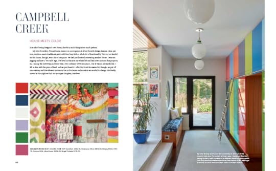
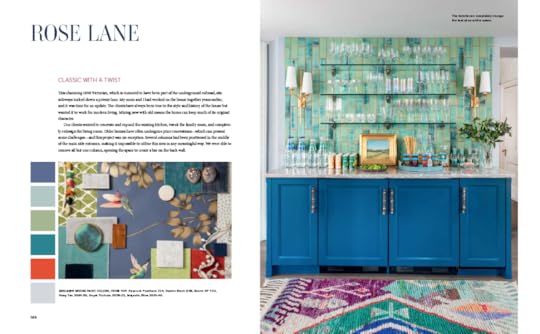
Here's a weird thing though: I don't think the chips for each home are properly identified. Yes, I looked at every single one and read off the brands and color names, and somehow quite a few are misaligned, although probably only within the chapter set. Truly an unfortunate error given the nature of the book. Anyone wishing to use a particular color would be advised to verify they're choosing correctly.
This is indeed a happy little design book, filled with joy-sparking, eye-popping color, both on the walls, and as accents scattered around the rooms. A real treat for anyone who's sick of decorating books and magazines filled with white-on-white everything.
An excellent designer monograph as well as a great exploration of the creative use of color. People who enjoy comfortable, livable upscale design as opposed to luxury design which is meant to impress will like this book.
2.5 stars Sorry, but I expected more color and pattern from a book with this title. I thought that neutrals were used to often to temper the effects of any color or patterns. Left me feeling blah.