Unglückliche Liebende, edle Prinzen, magische Winde, unterirdische Paläste, hohe Burgen und abscheuliche Trolle – Östlich der Sonne und westlich des Mondes ist eine klassische Sammlung skandinavischer Märchen, die seit ihrer Erstveröffentlichung Mitte des 19. Jahrhunderts zahllose Auflagen erlebt hat. Zu den schönsten zählt die Ausgabe von 1914, die der legendäre dänischen Künstler Kay Nielsen (1886–1957) im Stile von Aubrey Beardsley illustrierte, ein rares und von Sammlern begehrtes Meisterwerk der Kinderbuchillustration.
Kay Rasmus Nielsen (March 12, 1886 – June 21, 1957) was a Danish illustrator who was popular in the early 20th century, the "golden age of illustration" which lasted from when Daniel Vierge and other pioneers developed printing technology to the point that drawings and paintings could be reproduced with reasonable facility. He joined the ranks of Arthur Rackham and Edmund Dulac in enjoying the success of the gift books of the early 20th century. Nielsen is also known for his collaborations with Disney for whom he contributed many story sketches and illustrations.
When I first read this fairy tale, in the collection of Norwegian tales collected by Peter Christen Asbjørnsen, I thought it was a charming folktale that was the highlight of an anthology where all tales were so similar to each other they just blended together in my mind, but back then I found it too similar to Apuleius' "Cupid and Psyche" for me to enjoy much.
Besides the Wintery setting, the white bear, the Winds and the trolls, the plot is basically the same as in the Greco-Roman myth found in "The Golden Ass" as to be practically a retelling of it. It really is a Norwegian retelling of Eros & Psyche that they adapted to their culture and environment, but shorter.
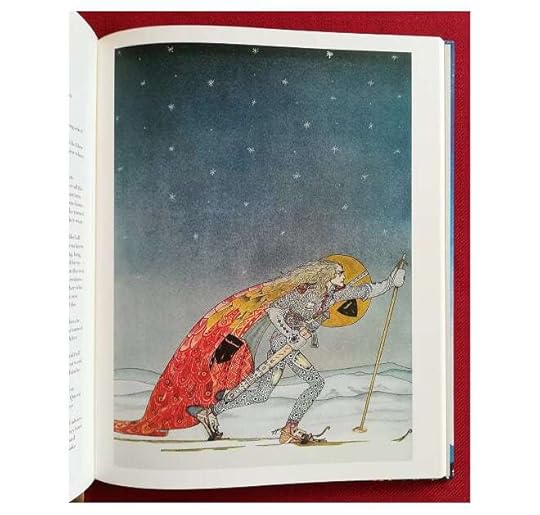
Nowadays, I adore this fairy tale very much, it's my favourite of all the B&B variants, and I like how enterprising the girl is, a bit more than Psyche in the original E&P myth and definitely far more than Beauty in B&B. All three have in common that the girl is the real heroine of the tale, and earns her happy ending because of her courage and her kindness. And, of course, the classic illustrations by Kay Nielsen only make this edition all the better. They're old school, and very few for the tale's length, but they're so pretty! And Nielsen being familiar with the Nordic culture, he gets the looks right, too, he loses to Lynch only because the latter's art is more lush and realistic and not abstract.
This edition is perfect for reading to children as well, as it contains the tale in its entirety and Nielsen's artwork is appropriate for them. 4.5 stars rounded up it is!
Get lost in a world of magic... creepy six-headed trolls, princesses looking for the perfect match, lazy young men coming of age just fine, ice bears and dark long nights filled with cold north wind and snowdrifts. Just what I like to read during the darkest period of the year especially because of the magnificent illustrations. And just take a look at that font... ♡ ▪️ This book is in every detail a perfect and beautiful designed reprint of East of the Sun and West of the Moon (1914), richly illustrated in art nouveau style by Kay Nielsen, and supplemented with a long introduction on his work and background information on the fairy tales origins. Kay Nielsen (Denmark, 1886 - 1957) was a grand illustrator at the beginning of the 20th century, known as the 'golden age of illustration' in Britain.
Truly a gorgeous book. The Kay Nielsen illustrations are like windows onto another world. When I was a youngster devouring books like this, East of the Sun and West of the Moon not only held me entranced with its Nordic fairy-tale sensibility, but also for the pictures, which changed my thinking about what was possible. In a very real way, it was my introduction to fantasy-sci-fi, and Nielsen's art deco inspired drawing has held a special place in my imagination ever since. If you have a young child, or know one, you owe it to that child's imagination to give them this book.
I can't not give this 5 stars, I adore Kay Nielsen's art and style!
I was curious to read the fairy tales too, but I wanted the book for Kay Nielsen's illustrations. They are exquisite, and it was great to see what scenes they were illustrating (I'd already seen a lot of the art before).
The stories themselves were probably 2.5 stars for me. I don't know if they were in an abridged format here, but they seemed far too short and summarised. Perhaps I'm just too used to reading novels. They were also very repetitive. I know that fairy tales have the same formulas, but some of the stories were literally the same just in a different setting, or the character was a boy instead of a girl.
Overall, the stories were meh, but the illustrations were amazing. I'm sure I'll be leafing through the book often.
This is a treasure of a book that anyone with any interest in folktales, fairytales, and general whimsical wonder nerds to own. The illustrations by the great Kay Nielsen are definitely the biggest asset to this magnificent book - you spend more time puzzling out the intricacies of his art than you do actually reading the tales. But oh, what tales! I know little of Norwegian history or culture, but the magic in these stories will resonate with anyone who loves fantasy, whether it be from The Brothers Grimm or Tolkien.
The essays at the start give good background information about how these tales were collected and the industry of illustrated gift books that were popular preWWI. It's super cool to learn about a corner of the industry that I hadn't known before! In addition, learning about the illustrator was pretty neat.
I bought this on a whim when it came into work, since I'm always fascinated by mythology and folklore. I kind of expected the stories to be a bit boring, but I was pleasantly surprised by how much I enjoyed them! I also like avoiding retellings when studying mythology, and try to find the closest to the "original source" (no matter how fluid that source is when it comes to local legends), so I was pleasantly surprised that many of these were the original translations of the original gathered stories.
East of the Sun, West of the Moon - 3 stars
I love the Cupid/Psyche vibes! And I really like the determination of the Lassie. The story itself was odd in how information was revealed - for example, two nights into the stay at the castle, it's mentioned that other people were in the room right next door. I'm curious if that's a weird quirk of this story or a style choice for most of these tales. The pictures are stunning - I love the one with the Lassie in the forest.
The Blue Belt - 3.5 stars
However you think this tale will go, you're wrong. This is insane - why was the beggar woman okay with killing the Lad?? And the Bear plotline?? Did he HAVE to kill the servants?? The giant chicken was just... a thing??
The lions are the MVPs of this tale fr
Prince Lindworm - 4 stars
Also insane, kinda love it though. I love the illustration of the wedding - it's so odd. I'm pretty sure I've heard at least parts of this story before!
The Lassie and her Godmother - 3 stars
This was odd, and the Christain influences even odder. These stories often don't end as they begin - there's no "tying it up" at the end.
The Husband who was to Mind the House - 3.5 stars
Incredible. Don't disrespect women's work.
The Lad who went to the North Wind - 2.5 stars
Me personally, I would have used the stick on the North Wind.
The Three Princesses of Whiteland - 3 stars
I love the water in the woodcut style here.
This reminds me a lot of the first two stories. I'm also so curious about promising the child away, because that didn’t really come up again, except to bring him to Whiteland?
Soria Moria Castle - 3.5 stars
I love the image of Halvor getting his hair combed.
Also is this the first story where a character is named?
Halvor is SO dramatic I love him. It's a story interestingly devoid of moral - his laziness isn't commented on, the princess welcomes him back with open arms, his bravery isn't really a Thing, he just has potions do the heavy lifting.
The Giant who had no Heart in his Body - 4 stars
This has my favorite art so far, including the cover of the book. The stone brothers were cool too!
Also the protagonist is named Boots so that's neat.
I'm surprised that Boots was "allowed" to lie to the giant about sparing his life.
The Princess on the Glass Hill - 3 stars
Another Boots! Is this like the name Jack? He's also the second protagonist who hangs out in the ashes.
This is probably the most repetitive of them so far, but still satisfying.
The Widow's Son - 3.5 stars
Oh this starts out VERY similarly to "The Lassie and her Godmother."
I'm obsessed with how the Lad dresses - I want his pants so badly.
Kind of a wild story honestly. I liked how much autonomy the Princess has, although she probably could be more considerate lol.
The Three Billy Goats Gruff - 3.5 stars
I love goats. Good for these guys.
The Three Princesses in the Blue Mountain - 3.5 stars
This starts with real Ecclesiastes vibes.
I love the snow picture - using the dark color to indicate it is really cool looking.
This also has the "drink the drink that's next to the weapon and you can carry it easily" trope.
Why couldn't he have just shown up at the palace?? This feels very similar to earlier stories, but I do like it!
The Cat on the Dovrefell - 3 stars
Haha.
One's Own Children are Always the Prettiest - 3 stars
Awkward.
The note before this story says it's like Aesop's fables, which I absolutely see.
----
There were a few recurring tropes - children being naughty and looking into rooms they shouldn't, princesses as prizes to be won, boys named Boots and men named Halvor, some sort of strength level-up either through drinking something or bathing in it, etc.
These were much more sprawling and seemingly random than I expect from fairytales - I expected a straightforward moral, like with fables, or even a throughline, like with Disney movies. In these books, though, a beggar woman tries to marry a troll and her son befriends lions then marries the princess of Arabia and disguises himself as a bear. I wonder if, say, The Brother's Grimm have that vibe, or if they're as concise as the oft-repeated versions.
I also thought the note at the end of the Christianization of the land was interesting, especially with how it interacts with more local creatures like trolls.
Overall, I'm very glad to have read this, and feel very satisfied that my impulse purchase was worthwhile.
After putting off reading these for ten years and then receiving this 2018 edition as a gift, I can't NOT give it five stars, if just for the editing alone. These fairy tales are BANANAS—some make absolutely zero sense all the way through only to tie up rationally in the end!—and Kay Nielsen is just the most brazen and beautiful of the Golden Age illustrators, period. Noel Daniel did such a gorgeous job with this edition; from the essays to the grouping of the watercolors to the design. There are also, inexplicably, stickers included. Loved it.
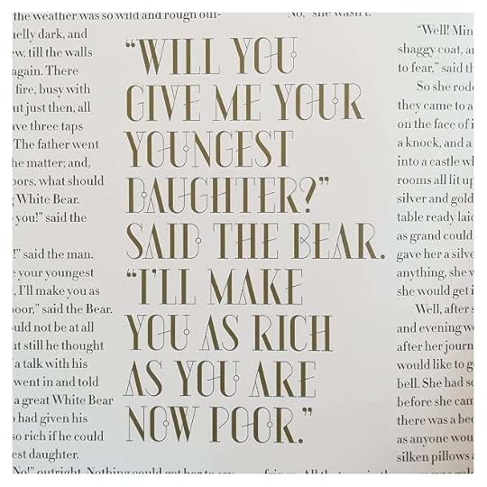
"That was what the big Billy Goat said. He flew at the Troll and poked his eyes out with his horns, and crushed him to bits, body and bones, and tossed him out into the burn."
This small hardcover from Taschen - complete with gorgeous binding, rich and deep colors from the waxy pages, and of course that mesmerizing artwork from Nielsen - is one of my favorite books I own.
Five stars for the illustrations and, like, 1.5 stars for the tales.
I got this as a Christmas gift in 2018--I wanted it because I read an article about how amazing the illustrations are. I unwrapped it Christmas day, looked at the illustrations--which really are amazing--and then set it on a shelf.
A year later, I was like, "Why didn't I read the stories?"
So I read them and they sorta suck.
I read SO MANY FAIRY TALES as a child. I read every single fairy tale the Brothers Grimm collected. I read multiple translations. I read adaptations and expansions of fairy tales. I started rereading them a few years ago, especially looking for tales I might have missed (like these Russian Folk Tales) but the fact is, I've well and truly outgrown them. They're samey and repetitive and often super misogynist. They're not fun to read, and the only reason for me to read them now is to critique them, though at least they provide the basis for books I still love, like Spinning Silver by Naomi Novik.
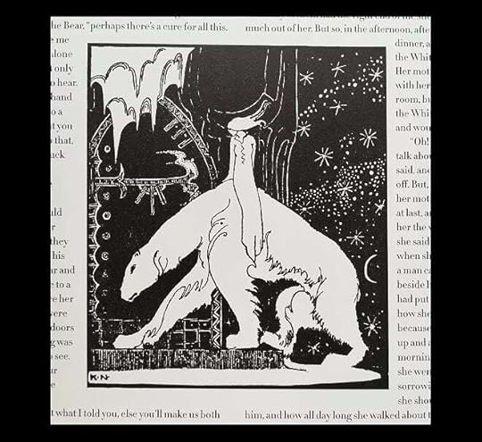
Nielsen's illustrations are a unique Art Nouveau take on Beardsley's tall, curvy figures. Each image is at once reduced to a distinct foreground-background division (the background is often also plain black) and enhanced by a richness of the costumes (a feature Nielsen picked up during his career in theatre).
The tales have a predictably happy ending and mostly follow the predictable pattern of triple actions (wishes, failures, deeds), though occasionally the plot can throw up a somewhat unusual combination of tropes in the middle. After a few pages, one learns that to become strong enough to wield the sword of the troll, the hero must drink from a flask near the sword, or to become healthy again after a beating, the hero must rub himself with an equally handy ointment. But there is a spirit of old to be read between the lines.
Five stars for the illustrations. Much less for the stories. Which gives four—as a book I shall return to for the images.
I rated this book so highly for the beautiful illustrations and I’m not a huge fairy tale person but the preface on how they played a huge role in the Norwegian language was so interesting! The Nordic fairy tales are characterized by literal and figurative ice and this comes through in the illustrations. I am only familiar with the Brothers Grimm tales which aren’t warm and fuzzy but the Nordic stories were so void of the predictable moral teachings that they were hilarious at times. I love how it’s like “yes if you want to marry the princess you must go get flogged by a troll duh”. Similar to other fairy tales there is a lot of bartering of unborn children and of course everything comes in threes!
However, I hate how they have positioned the pictures throughout the story. You have to flip back and forth to see which artwork corresponds to the part in the story that you are reading. It's really annoying. The same happened with the introduction. They really try to drag out the length of the book with the inconvenient positioning of pictures and random large quotes.
The stories themselves are obviously quite outdated — most regard a man who goes through an unconventional ordeal and receives some sort of boon before he eventually gets his reward — the princess.
Other than that, this is a great book, for it contains Kay Nielsen's wonderful artworks.
A beautifully designed book filled with interesting Norwegian fairy tales & gorgeous art by Kay Nielsen, but I found the typeface hard to read.
My favourite tales were Prince Lindworm, The Widow's Son, and The Three Princesses in the Blue Mountain.
(The Blue Belt was such nonsense, though. What a weird story!)
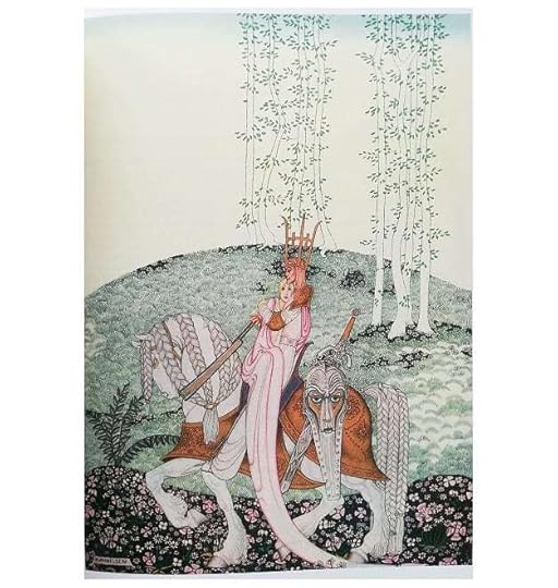
My favourite illustrations were the ones in The Lassie and Her Godmother, The Three Princesses of Whiteland, and the front cover illustration, which is from The Giant who Had No Heart in His Body.
Kai Nielsen is one of my favourite illustrator's of the Golden Era of Illustrations. He could grasp the uncanny and eerie feeling of fairytales just very well and put it on paper in a splendor of lines, colours and composition.
That said, my criticism of this book focuses on the formal one: though it's printed on high quality paper, the awkward and small format and the soft binding of the cover (well, my copy has a weird soft-hard cover) makes it at times difficult to fully appreciate and enjoy the drawings.
It's also an unusual size fir a traditional fairy tale book, which used to be on the larger side in the past.
Nevertheless, reading the introduction, and especially the fairy tales, all of which I know from many versions, was a nice throwback into my past and simpler days.
The tales are great, the illustrations are superb and honestly the smaller misnamed "hardcover" edition is so adorable I couldn't resist and just ordered the Grimm and Andersen books in the same size instead of the actual hardback versions. This edition has thick but flexible paper covers that are incredibly tactile and have no lamination or dust covers and IT IS GORGEOUS!!!!! AND CHEAP!!!!! However this only has 10 tales: East of the sun and west of the moon The blue belt Prince lindworm The lassie an her goodmother The husband who was to mind the house The three princesses of Whiteland The giant who had no heart in his body The widow's son The three Billy goats gruff The three princesses in the blue mountain
The following stories missing: The lad who went to the North wind Sonia moria castle The princess on the glass hill The cat on the dovrefell One's own children are always the prettiest
6 of the black and white illustrations are also missing (including the leafs and birds design used at the end most of the tales in the original) and the end papers are faithful to the originals but the left and right edges are missing but there are many detailed full page views of the illustrations in the book and other works by Kay that all is forgiven.
The book is printed in such a way that no matter how familiar you already are with the illustrations you can still discover new things in them. Oddly despite the fact that the colors in this book are probably closer to the original watercolors they are warmer than any other print and somewhat clash with the cold mood that permeates the idea of the north and the tales, something that the bluish tint of earlier reproductions captured so well.
But the edition is so STUNNING that it's worth considering buying both sizes because it's worth every single penny and moment waiting for it to arrive after placing the order. The smaller flexicover also comes with six stickers.
nielsen is the best and most famous illustrator of east of the sun and west of the moon, incorporating swathes of foggy spaces offset with a pronged northern star, bluish polar bears (much distinguished from dulac’s fluffier variation), and stylistically-willowy maidens. this same style is beautifully applied to the other scandinavian stories in this collection (all from asbjørnsen), initially released in 1914 from english publishers. this latest taschen edition is a redesign of that release in hardcover. loved the editor’s note in the preface about the title story: “its disorienting coordinates reset the compass to a fantastical cosmos”—yes :) my favorite fairytale.
This book is utterly beautiful, and clearly a labour of love. Though it was based on the original printing layout from 1914, it's the little touches added by the editor that really make it something lovely.
The editor has added a nice little biography of the illustrator, Kay Nielsen, whose work is similar in atmosphere to that of Arthur Rackham, as well as some history about the original compilers of the Norwegian folk tales and their journey getting it published in England. It also includes a fairly short but fascinating overview of how the advances in colour printing finally made it possible for work of such detail and colour could be rendered into a printed work. Even at the back, there's a little rundown of how this book came to be, and what was envisioned for its layout. The cover, the endpapers, the high-quality paper and the beautifully printed illustrations all make this a little gem fo those interested in folk or fairy tales. That's even before you get to the tales themselves!
I had heard of one of the tales inside before - The Three Billy Goats Gruff. And it's just as hilarious as I remember. All of the others were a mixture of hilarity and inspiration. According to the editor, the recurring themes of trolls princesses and the fight against good and evil (that is pagan and Christian) were all allegory for the introduction of Christianity into Scandinavia. They're not overbearing themes at all, and the stories are written in that very fanciful, and fairly comeidic tone, that the kinds of tales have. That and entirely matter of fact. A salmon asking for help, and the guy's like, oh sure, I'll help. The princess is like, yeah so the troll has six heads, and the guy's like, oh, meh, I'll deal with that. Drink some mysterious matter from some random horn to gain strength here, use a whistle to call a giant speaking eagle there. All in a day's work. These folk tale folk do not sweat it!
Maybe one day I'll be privy to an original copy of the book this version is based on, but until then, an utterly enjoyable and enchanting addition to my collection and entirely recommended.
Beautiful drawings, quality print. That's it with the good words. This book doesn't know what it wants to be. Is it an art book? Is it a children's fairy tale book? It can't be a children's book since they used old English for the tales. It can't be an art book since quite a few of his works is so small, up in a corner of the page. You see, they had to make space for the endless boring lamenting about what a genius he was. Which took more than a half of the book, mind you! Yes, ok, I agree, but maybe let the work speak for itself? We can't see most of it right now. What it made it so boring was that it was only subjective opinion of the author, not facts. I'm no expert but I don't think this is how texts covering historical events work. Facts, even though boring by nature, are concise. Something sloppy that I noticed - they reused texts throughout the book. You just read something, and there it is again, as a description to an illustration. Just copy-pasted. Why? There are a million other things that could be put there - the size of the illustration, the medium used, the year created, etc. In the tales, the same happens with the quotes - you read something and then, right below it, there it is again. This time with bigger font. Why?! Not to mention sometimes the illustrations are placed in such an order that they spoil the story. Especially if you read their descriptions. The summary of the tales are full of spoilers too! And they're placed just below the title so you didn't even have the chance to start reading. But my biggest problem with this book was the font they chose to use for the body text. This font is for titles, it's not meant for prolonged reading! It made it so hard to read the book, it strains your eyes, I can't believe it passed any editorial checks. If it wasn't for the beautiful illustrations, I'd be giving this away. If you care only about them, you'll be fine.
This gorgeous edition of Norwegian folktales as illustrated by Kay Nielsen might be an absolute shoe in for my top books of the year list. Taschen’s art publications are always of high quality, but they surpassed themselves with this lush reprint. Nielsen’s illustrations are showcased alongside their accompanying stories wonderfully and the introductory essays provide some much appreciated context on the importance of Asbjørnsen and Moe’s work to collect and chronicle the folktales of Norway, so it is easy to see how this book was a smash hit when it was first published and why Taschen chose to reimagine it for the modern market. What I liked most about this book (besides the illustrations and quality of publication, of course) is the fact that the stories are actually readable. Many collections of this sort either cater to a child audience or become too academic in their transcription, in addition to collecting too many stories of the same sort which quickly becomes tedious to read in any attempt to read the collection cover to cover, but each story stands well alone and is easily accessible by readers of any age. My only small complaint is that Taschen chose to have captions for the images taken straight from the text of the stories, which I felt was alternatingly pointless (readers can either easily identify the match between image and text, or the specific image can apply to many parts of the story) and a wasted opportunity to provide more context and commentary extraneous to the text of the stories.
The stories were fun and I appreciate them being unlike tales I've heard before, but they are a little repetitive in themselves (though, maybe that could also be a translation thing or choice to purposefully tell the tales in a similar voice). Things often were done 3 times, a couple stories here and there seemed pretty much the same with a few specific differences, most if not all included there being a royal family and a 'regular' family or person. I kind of have to look back on them in order to differentiate them and keep them from not blurring together or getting things confused/mixed up. The story that stands out to me the MOST and that might be my favorite of the bunch is Prince Lindworm! Other favorites, so-to-speak, would be The Three Princesses of Whiteland, The Widow's Son, and the title story East of the Sun and West of the Moon.
I love how this edition includes a lot of information about Kay Nielsen (the illustrator), publishing and illustrated books during his lifetime and their heyday, and the gathering of these tales. These sections take up about half the physical book and the tales make up the other half. Nielsen's style is really to my taste and the images go so well with the stories! As I'm in my fairytale era I've started other fairytale/folktale collections and I've been a bit disappointed by the artwork because of reading this first and being used to these more elaborate and less specifically-for-a-child kind of drawings. I commend the small details of Nielsen's work and definitely want to get the other books he did illustrations for.
Despite having a Calla edition of this book, when I saw this edition it didn't take me long to give in to temptation. It is a beautiful book, as it promised to be. Nielsen was a fantastic artist; the details and colours within his illustrations are just stunning. That is to take nothing away from the black and white illustrations, these are brilliantly detailed, conveying just as much emotion as the coloured ones. The size of the book is on the larger size. Whilst this would make it difficult to easily transport it, for reading on the go, it means instead that you are encouraged to curl up, rest it in your lap, and be taken away to magical, far away lands. The only downside, and the only way that this edition could have been improved, was the slipcase designed for the book. Rather than being a solid, sturdy way to protect the book, this slipcase is more like thick paper. It feels rather flimsy, just covering the front, back and the tops and bottom; both ends are open, rather than the more solid slipcases. Whilst this is only a minor issue, given that so much attention to detail has been given to the rest of the book, it is surprising that this was overlooked.
Having said all of that, as expected, this is an exquisite edition of classic fairy tales. For anyone who either loves the Golden Age of book illustration, or for those with a passion for fairy tales, this is sure to make a welcome addition to their collection. I will certainly treasure it for a long time to come.
Everything about this collection of classic Norwegian (Norse) folktales is lovingly crafted. Featuring the stunning illustrations of Kay Nielsen (an early Disney illustrator who had already had quite the impact before he joined the Mouse House), you'll gape at the detail in much of the artwork if you're anything like me.
The tales themselves are intriguing, of course, but I almost find the story behind their creation even more fascinating than the tales themselves. The volume opens with a short biography of the two Norwegian folklorists (Asbjornsen and Engebretsen) responsible for chasing the tales all over the wilds of their native Norway. The legwork they apparently put into their quest puts them in a category above even the famous Grimm brothers.
The title story is a variation on the Beauty and the Beast motif, featuring a monstrous polar bear. It is very close to the Cupid and Psyche version of the story that inspired C.S. Lewis's final novel, Till We Have Faces.
My favorite story was probably The Widow's Son. The watercolor of the young man charging into battle is as dramatic as a freeze frame out of a modern Hollywood war epic like Braveheart. Very, very impressive work.
This is a piece of literary history that deserves to be widely read. Appreciate it for the interest of the tales themselves, yes--and perhaps even more for the influence this collection has had on so many writers and artists since.
Sobre el ilustrador: Grata sorpresa aprender sobre el trabajo de Kay Nielsen que fue de los grandes ilustradores de la época dorada, y sobre el proceso editorial que hubo en la época y que atravesado por la guerra el trabajo fue disminuyendo. Amplia invitación a aprender sobre su vida y trabajo.
Sobre los cuentos: No siento que yo tenga mucha experiencia leyendo cuentos salvo las versiones populares de los hermanos Grimm y otros, pero si se siente una diferencia de estos cuentos daneses, como el que el personaje principal sea un joven humilde y que después de cierta hazaña se convierte en rey, creo que eso es algo común también la realeza y también la representación del mal como los Trolls y que los héroes son cristianos. También me quedo pensando en que si hay muchos más cuentos clásicos porque los estudios de películas (Disney) no se basa en esto y no deja de hacer refritos.
Sobre la edición: Me hubiera gustado que fuera un formato más grande para apreciar los detalles de la ilustraciones, en el libro mencionan que pudieron escanear algunas de las obras originales y por eso hay acercamientos a esas ilustraciones, pero no en todas, por ello el tamaño final del libro. Igual mencionan que las ilustraciones en la obra original no estaban acomodadas de acuerdo al orden de la lectura y aquí intentaron que hubiera esa coherencia, pero creo que se pudo haber mejorado el acomodo
Full disclosure: I bought this book for the illustrations. I saw an exhibition of Kay Nielsen’s work in Boston last fall and I fell hopelessly in love with it. My favourite illustrations were the ones he made for this collection of Norse fairytales so when I found out Taschen had published it in this very pretty edition, I bought it. And of course, since I bought the book, I thought to myself, well, I might as well read the stories too!
I was a bit afraid of how tedious I would find them since I haven’t been able to stomach children’s literature for a while now, but some of the stories were quite fun and interesting albeit a bit repetitive (everything comes in threes!). Nielsen’s illustrations certainly help make the reading quite magical and I wish he had had more chances to do animation, I think his style was so suitable for it!