Eula is the only square cat in town—and she doesn’t think there’s anything hip about it. Everything that normal cats do is hard for her: She can’t get her square paw into mouse holes, she can’t wear her favorite circle skirt, and all of her friends are round! Eula is sad until her two best friends show her just how well a square cat can fit into a round world. Debut author/illustrator Elizabeth Schoonmaker applies her dry wit to the topic of fitting in, and the spare text and appealing trim size of Square Cat make it ideal for repeated readings.
Eula is a square cat who wanted to be round so she could play with her friends. Life is just so difficult when you're square (especially when you tip over)! However, with the help of her friends Patsy and Maude she learns that maybe being square isn't so bad after all.
More than just a story about being different, this is also a sweet story of true friendship. Eula is a square cat when everyone around her, including her two friends Patsy and Maude, are round. Eula's self-esteem is low, as she doesn't seem to fit in and can only see the negative aspects of being square. However, her friends show their genuine love for their friend first, by trying to make her feel round, and then by trying to look like her so that she'll fit in, by showing her positive things about being square, and helping her dress attractively. This touching story would make a great readaloud and should generate some discussion if used in a classroom. I've got to add this one to my collection! Highly recommended!
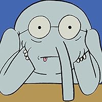
I know I probably write a lot about my cat, but it's hard not to do so. She's small and adorable, and I love her. I'm a cat person, through and through. There just happen to be several new cat books out lately that I've had opportunity to view (Won Ton, Cat Secrets, etc). So when Square Cat, by Elizabeth Schoonmaker, finally crossed my desk, you can only imagine the little thrill of delight that rushed through me. I've been looking forward to this book ever since reading Betsy Bird's Simon and Schuster Spring Preview post last December. Just look at that cover. Look at that darn cat! There's too much cuteness, I can barely stand it.
Square Cat is the story of a cat named Eula (what a great name!), who is square. All of her friends are round (rotund, I would say), and Eula wishes she could be more like them. "Life wasn't easy for a square cat", you see. Among her problems were blending in with city architecture, wearing stripes, and worst of all, tipping over and getting stuck. Eula was so unhappy, she lost her purr. Eula's friends try to make her happy by giving her round things, including rouge circles on her cheeks and doughnuts, but nothing works. And so Patsy and Maud, Eula's friends, decide to don boxes to be square, just like her. Then they show her all the lovely things about being square, including pillbox hats, advertising and square dancing, of course. In the end, all three cats are happy, and Eula has her purr back.
If Eula wasn't so flipping cute, this book might not have worked so well, but Schoonmaker has designed such adorable and memorable characters, not only in Eula, but her friends as well, that it is very easy to go along with the silliness. Some of the humor might fly over children's heads (the big about red shoes making Eula look short goes a bit over my head, to be honest), but they will laugh at Eula tipping over, every time. They will also like the design of Eula's balloon shaped friends, and the boxy disguises they take on to help Eula fit in (one is decorated as a pizza box). Besides the humor, there is a lovely message about being different and the importance of friendship that is there, without being in your face about it.
All these things are lovely, of course, but really...just look at the cover. That cat is too darn cute. How can anyone resist?
I really like the idea of the book- a theme of individuality and accepting your personal differences and learning to love yourself but the way the book came off left me disappointed. First, I don't quite get where the name Eula is coming from (end user license agreement?), especially as the other two cats have mundane names- Patsy and Maude. The best line in the book is certainly the one about mouse holes- "they are impossible for all cats, round or square," although I can't really figure out why "round" is in red text and "square" is in green. The whole text colouring thing doesn't really make sense throughout the book- maybe the book designer was trying to make a boring book more interesting? My biggest concern is with the lack of expression the illustrator achieves on the faces of the cats. Patsy and Maude especially seem to always have the exact same expression and because its shared between two characters they consequentially have no personality. I do like the outside shape of the cats, especially on Eula the square cat, who has been drafted with a straightedge and triangle rather than drawn. this can be seen in the way the corners sometimes over lap and sometimes don't meet. This is technically sloppy drafting, but in a children's book I like allowing some freedom, as the messiness adds whimsy. The watercolor infill is also working for me, as it doesn't quite come up to the line of the outside shape, emphasizing the outside line. On the other hand, the composition is pretty boring- the figure(s) of one to three cats are always plopped in the middle of a white page. I also strongly object to the many symmetrical two page spreads- they're boring and static and don't make sense in a picture book where the reader is moving left to right across the page rather than staring at a single composition. So, over all, the idea is nice, the narrative could be reworked a little to flow better and be alright, and the illustrations should be discarded and done over from scratch.
Square Cat by Elizabeth Schoonmaker - friends not only accept you for who you are but sometimes can make you feel special and accepted. Loved how square cat was upset until friends helped find a solution. Quite special book. Simple yet perfect illustrations as well!
I loved this book! Eula was so darn cute, especially when she tipped over. The book encourages kids to embrace their differences AND to be kind to other people who are different. Eula has some pretty amazing friends in Patsy and Maude. Really, really a nice book.
Eula has a hard time being square, but her round friends Maude and Claude put on boxes to help her feel accepted. In real life, mimicking the disabilities of people doesn't make them feel better, so it's not a solution, even metaphorically, that I want to pass on to kids.
Square cat just wants to be like all his cool round friends. His friends turn out to be very cool, indeed. We all need round friends like Maude and Patsy.
I really enjoyed the message of this book! “Square Cat” tells the story of Eula, a square cat living in a round world. She doesn’t feel like she fits in and longs to be round like her friends Maude and Patsy. With a little help from her friends, Eula learns that being square isn’t so bad after all. I loved that Patsy and Maude ended up putting on boxes to be square just like Eula and show her that being square was awesome. This is a story of friendship and compassion. Eula’s friends show her all the great things about her being square and make her feel comfortable with herself. I think this would be a great book to share with students. I think we have all been able to relate to Eula at some point in life. It’s nice to know that true friends can make us feel special even on our worst days. I could use this book to show that being different is what makes you special. I could also use it to show students what being a true friend and showing compassion is all about.
I love this book! The story follows a cat named Eula, who is a square cat in a world full of round cats. Square Cat reveals the importance of embracing what makes one unique. The story also goes through the journey of friendship; Eula’s friends go out of their way to accept Her and show her all of the wonderful parts of being a square-shaped cat.
Eula is not a fan of Eula. She wants to be more like her friends that are round. Her friends go through great lengths to help Eula feel better about herself. They try to make her "feel" round because she thinks that will make her happier. When that doesn't work, they show her all the great things about being "square".
This is a great book about self-acceptance and friendship. When Eula, a square cat, doesn't fit in, her friends instead of trying to eliminate differences, help her see the beauty in being herself. A great way to learn about shapes, too.
This is another JoJo pick, one I admit I looked askance at when she handed it to me. Have you ever wanted to go back and slap yourself in the face? Because I do for that; this book should be required reading for its message of acceptance and helping others feel good about themselves.
This is a story about a square cat who doesn't fit in in a world of round cats. It's a sweet story of friendship and acceptance. The storyline and book length are ideal for a 2- and 3-year-old crowd, but there are references that that age group wouldn't understand and some references that I even had to explain to my 5-year-old. The simple words do make it appropriate for new readers (probably a level 1 or 2).
Square Cat wants to be like their two friends who are round cats. They try making Square Cat round but that didn't work out and the round cats became square cats. The friends end up helping Square Cat feel comfortable and unique being themselves.
Square Cat wants to be like their two friends who are round cats. They try making Square Cat round but that didn't work out and the round cats became square cats. The friends end up helping Square Cat feel comfortable and unique being themselves.
For young readers who may feel like the "square" cat in the world full of "round" cats (and those of us who grew up thinking we were square pegs in a world of round pegs), this is a delightful story of discovering one's uniqueness and a story of friends accepting one's differences.
Eula the square cat longs to be round just like her friends and laments on all the bad things about being square. Loved the friendship theme and the clear shape lessons. Toddler and up.