Garbage men in the future venture back to an abandoned Earth to try to clean up the toxic waste and damage done by humans ages ago.
One man’s trash is another man's living. Since earth became inhospitable, humanity escaped ages ago to live in a space station floating above the atmosphere. Now Travis and his crew of garbage men are tasked with cleaning up mountains of toxic waste, working for a company called Atomic Bros INC., to create a ‘Clear World’. But when one of Travis’ crew members goes missing near an old nuclear facility Travis' job becomes a bit more complicated.
Well, that was certainly unique. This graphic novel imagines an Earth that has been buried in garbage and can no longer support human life, aside from the space-suited garbage pickers who sort through the refuse. The grungy art style reminded me of 1990s trends in illustration. Some interesting ideas and artwork, but the story was as cluttered and difficult to sort out as the tidal wave of trash.
As some other reviews have said, this isn’t a revolutionary story just kind of a (sadly) realistic look into the future with some gorgeous art.
The world has been destroyed for humanity by oligarchs and politicians who sold out the people for a little more money at every turn. The remaining humans of means live in a space station the workers are kind of like Wall-E, just clearing trash and radiation.
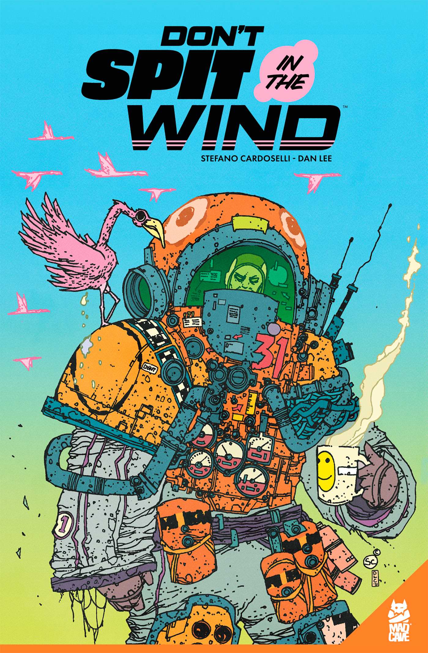
The art is so wonky - it’s really a blast to look at each page, the little details in every drawing BUT it’s not the cleanest, which isn’t a knock, it is less James Stokoe more street art- which is great to look at too!
I received an ARC copy of this GN in exchange for an honest review.
I literally loved the drawing style, the use of colors and in general the visual impact that this GN gave me. The story is very simple but important: a criticism of today's consumer society and the repercussions of the damage we are doing to our planet. In a future where social inequality and the mistakes of the past continue to destroy human society, what chance does our planet have of surviving man?
"Don't Spit in the Wind" starts off with a promising visual style that truly stands out. The drawings are undeniably unique, capturing attention and sparking curiosity. However, as the story progresses, it falls victim to a repetitive pattern that becomes apparent after the second issue. The plot seems to stagnate, leading to predictable and weak conclusions that don't live up to the initial intrigue. While the artwork remains a strong point, the lack of narrative development and recurring weak resolutions hinder the overall experience. Despite its visual appeal, the story's inability to evolve leaves the reader wanting more substance and depth.
My thanks to both NetGalley and the publisher Mad Cave Studios for an advance copy of this graphic novel set in the future on an Earth that is treated like a waste dump, and the horrible day a group of workers are having while just trying to work.
One doesn't see much in the way of happy future stories for Earth anymore. Sure Star Trek seems like fun, but even the modern versions seem to be making the Earth darker and grimmer, and I don't think that can be blamed on CGI. Record heat waves, once in a century storms happening yearly, roads covered in trash and more and more in life becoming disposable. No wonder our science fiction is getting so dark. Even science fiction that deals with humans on other worlds, Earth is always looked at like a cesspool, a dead world, that no one ever wants to see. However dead worlds have trash, and trash is money to someone, so there will always be someone working it, making money, even if it costs their lives. Don't Spit in the Wind Volume is written and illustrated by Stefano Cardoselli with coloring and lettering by Dan Lee, and tells the story of Earth has a planetary garbage dump, the people with dreams of rising up from their work on th planet, and the many enemies that they must face.
The Earth is a trash pile littered with radioactive waste, human waste, filth and animals mutated from the melange of chemicals and more. Most of humanity has migrated to a large space station in orbit over the planet, the station set up so the wealthy have the best food, air, and room, and the poor getting pretty much the dregs. People work the planet hoping to make money so that they can move up in the social strata of the space station. The planet is also home to humans who never left, and are now lead by a strange prophet from the wastes who says a lot of strange things, but wants to bring down the order, and maybe blow up the planet. For a few sanitation workers today is not going to be a good day.
Don't Spit in the Wind is very reminiscent of 1970's and 80's Métal Hurlant stories, in art, story design and pacing. This is a fast story, one that easily could have a been a feature story in the past, a story that takes off quickly and doesn't stop until the last panel. The story moves so fast that a lot of plot is never really explained, very much like a European comic. While the comic might be lacking in plot, the art is really amazing. Bright, brash, bold, colors, odd objects, strange creatures, huge tech armored men, half-armored women fill the panels. Disgusting rich people, huge vehicles and lot of gross images of cupcakes. The color is also a throwback, and fits well with the style, and makes everything really pop. The panels are also just packed with details, i just wish the story was a little clearer.
Recommended for fans of European comics, or for readers who like big artwork. The art does a lot of heavy lifting here, saving what could have been an ok story. I am not sure what they can do for volume 2, but I am very interested in finding out. Especially if the art remains the same.
Thank you to NetGalley and the publishers for an advanced copy in exchange for my honest review!
2.5 Man, this was a huge miss for me. Something about how discordant the plot feels and my distaste for the character design for the only woman in the entire cast made me dislike this entire graphic novel. The world is a mix of Mad Max and WALL-E and is drawn in a style slightly reminiscent of Tank Girl. The art style I personally don't care for as it comes off as a confusing mess in multiple parts. The character designs mostly were alright, but the stark difference between the single female character versus the men irritated me. The rest of the men are in heavy bulky suits, to protect them from the hazardous environment Earth has turned into. Yet, the female character is in a skin-tight catsuit and is built like Nanami from One Piece. She's also a trashman, yet she's got nowhere near the amount of protective gear the rest of the cast has. The plot itself moves way too fast, and it felt like I was watching only the first ten and last ten minutes of episodes of a show. The chapters are all connected, but nothing flows together. It leaves the overall plot feeling jerky. A lot of stuff happens in this volume but nothing is explained. You get bare-bones details about the world, but nothing beyond it. Half of the time I was sat down reading in confusion, because I didn't know what the heck was going on. It's a pity because, on paper, the plot sounds exactly like something I would enjoy, but I did not enjoy this at all.
Ya conocía la obra de Stefano aunque no había leído este cómic todavía, por lo que me alegré enormemente de que Diabolo ediciones fuera a publicarlo en español. Una historia de ciencia ficción, divertida e interesante, pesca al igual que exagerada con todo ese espíritu punk de cómics más antiguos y un enorme grado de rebeldía frente a problemas que sufrimos o podríamos sufrir en breve. Cierto que no destaca por la originalidad pero sabe llevar los clásicos temas de un mundo post apocalíptico con muchísima gracia y una enorme pegada. la gran pega de este cómic es que daba para muchísimo más. La trama va creciendo a cada página al igual que el interés en los sucesos. Al final todo se condensa y es difícil darle una salida satisfactoria porque cada hilo temático es una gran idea que confluye extraordinariamente en el desenlace final. El dibujo es nervioso, de colores otoñales, desproporcionado, exagerado y con sabor a clásico de los noventa. Una expresividad fabulosa en tonos contaminados que se adapta perfectamente al trasfondo. En verdad, un cómic que merece la pena y al que volveré de vez en cuando. Espero que la colaboración entre su artista y Diábolo continúe y así podamos disfrutar de más historias, en especial, las de trasfondo lovecraftiano. Excelente.
Puc entendre les crítiques que li fan al volum referint-se a la trama i als personatges, però no les comparteixo. Per mi, són el menys important. Vaig triar el còmic pel seu impacte visual, per la brutalitat de l'escenari i les situacions que planteja, encara que aquestes no tinguin gaire sentit. Que la part de l'estació Hope és molt minsa i el seu fi massa precipitat? Que el seu personatge no té gaire recorregut? Tant se me'n dona: el paio protagonista està ben fotut des d'un principi, ja ho diu a la primera vinyeta. I què collons, surten monstres a tort i a dret, i fins i tot una divinitat-peix!
El grafisme m'ha flipat i algunes escenes m'han fet xalar de valent. Vaig pagar pel que volia i ho he trobat, en Cardoselli m'ha ben sadollat amb les seves paranoies. Cap obra és rodona —aquesta tampoc ho és—, però no li fa falta. El que importa és el missatge, el fet que estem condemnats, i la trama és un detall ínfim i sense importància quan no hi ha salvació possible.
Imagine the movie “Wall-E” with a darker tone and less robots. This was a weird and bloody comic.
Earth has been destroyed by humans and we have fled to space to live on a hierarchical space station. Unfortunately, the same issues of greed and selfishness follow us into space. Meanwhile on Earth, we follow a clean up crew as they face dangers of both human and creature varieties.
The artwork reflects the grittiness of the story and there are several graphic depictions of death and violence. There is definitely an undertone of political and environmental commentary that you won’t have to look hard for.
(Thanks to the publisher for an ARC of this comic in exchange for my honest review.)
Don’t spit in the wind focuses on a crew of humans who go back to an abandoned Earth to clean up toxic waste. I loved the graphics with this novel, especially the different colours! The “monsters were a lot of fun, and the different units were very unique. I did find this book a bit choppy at times, and wished you got a bit more background for the characters. The humans who escaped Earth are living in a giant space station that continues to highlight human’s power, greed and fight for survival. This book had some interesting turns I wasn’t expecting, overall a good read. I rated this 3 stars. Thank you to NetGalley for this free eARC in exchange for an honest review.
"Don't Spit in the Wind" is a graphic novel with story and art by Stefano Cardoselli with a SF theme.
The Earth is trashed and abandoned. Left behind are garbage collectors like Travis who are tasked with cleaning up the planet that humanity abandoned due to pollution. He and his crew work for a company called Atomic Bros INC. It all seems to be going well until one of the crew goes missing by an old nuclear facility, then things get dangerous.
The story is a bit muddled and confused, but the artwork is pretty great with eye popping color and detail. I just wish the story lived up to the art.
I really wanted to like this one. It has a distinct look and seems like over-the-top fun. But it was just a little half-baked. I finished it an hour ago and I can't tell you any character names or anything that sets this apart from any other future dystopian environmental failure type of story. This one didn't have anything original to contribute the conversation and didn't have compelling characters or a plot. Just a surface-level interesting world, messy storytelling, and art that is cool but a little difficult to follow.
Don’t Spit in the Wind Vol 1 was a dark story about Earth covered in trash and the people working to clean that up. Things go bad really fast when one of them stops responding. This is a darker take on the future of earth and humanity. It did a good job of making me care what happening in a short amount of time and I do definitely want to see where this goes in future volumes.
Note: arc provided by the publisher via netgalley in exchange for honest review
"Don't Spit in the Wind" by Stefano Cardoselli and Dan Lee portrays an apocalyptic and dystopian future in which humanity has escaped to space from the earth it has poisoned and destroyed but it cannot escape from its own destructive behavior. Set primarily on an earth that is no longer hospitable to human life much of this book focuses on a few garbage workers trying to salvage what they can from the trash dump the Earth has become. Meanwhile the space station above, in which all of humanity has relocated, hovers on the brink of revolution and orbital collapse while rapacious elites continue the same consumption that doomed the earth in the first place. This is not a subtle or pleasant look at the future, but sadly it may not be very far off the mark either.
Thanks to NetGalley and the publisher, Mad Cave Studios, for providing me with an eARC in exchange for my honest review.
Come here if you have a taste for graphic novels with nothing to say. The artist wants to do some interesting things with scale, and fails. The creators also like the idea of masking everybody up in similar fashion, so you never really get a grip on who is who – and by the end of this nihilistic trash you know you even then were wasting your time. Overall it's a book you really do not need to hasten to read before the world ends – one and a half stars.
I appreciated the art style but this was a strange read. I suppose it is a meditation on the state of planet earth and man’s less than stellar stewardship of it but presented a bit too hastily. This probably needed to be at least double in length to really get its point across.
It’s giving WALL·E meets Mad Max. Like dark environmental post apocalyptic battle for survival. I enjoyed it it was pretty short and I’d definitely wanna see where the story goes.
Thanks to NetGalley and Mad Cave Studios for and eARC.
I understand the moral behind the story, but I didn't enjoy the story very much.
Set in the future after huamns escaped earth to live in space stations, and earth is completely covered with human trash. teams are send after so many years to clean the earth, but it goes horribly.
Love the artwork and style. The story is very well done and well paced. It isn’t a fun story, but it’s well crafted. , The dystopian future it’s told in is all too real, and it was pretty poetic in the end.
Absolutely no new ideas, but plenty borrowed that have been successful, and still nothing happened in this book. A huge waste of time. The art is a pretty cool 90s punk rock style. Extra star for that.
Absolutely beautiful, the colors and grungy lines created a breathtaking atmosphere. The plot and characters left a lot to be desired, but damn it's pretty.
disjointed and kind of amateurish, some cool images and the bones of a decent enough genre comic in here, but overall the sequential storytelling was pretty weak.
Una historia que ya se ha contado bastante y el dibujo que hace recordar muchisimo (por no decir que es una copia, o un homenaje) a Basura dibujado por Gimenez