Now in full color in a larger size! 40% more content and over 750 images to enhance and better clarify the concepts in this thought-provoking resource for graphic designers, professors, and students.
This very popular design book has been wholly revised and expanded to feature a new dimension of inspiring and counterintuitive ideas to thinking about graphic design relationships.
The second edition includes a new section on web design and new discussions of modularity, framing, motion and time, rules of randomness, and numerous quotes supported by images and biographies. This pioneering work provides designers, art directors, and students—regardless of experience—with a unique approach to successful design.
Veteran designer and educator Alex. W. White has assembled a wealth of information and examples in his exploration of what makes visual design stunning and easy to read. Readers will discover White's four elements of graphic design, including how to: define and reveal dominant images, words, and concepts; use scale, color, and position to guide the viewer through levels of importance; employ white space as a significant component of design and not merely as background; and use display and text type for maximum comprehension and value to the reader. Offering a new way to think about and use the four design elements, this book is certain to inspire better design.
Allworth Press, an imprint of Skyhorse Publishing, publishes a broad range of books on the visual and performing arts, with emphasis on the business of art. Our titles cover subjects such as graphic design, theater, branding, fine art, photography, interior design, writing, acting, film, how to start careers, business and legal forms, business practices, and more. While we don't aspire to publish a New York Times bestseller or a national bestseller, we are deeply committed to quality books that help creative professionals succeed and thrive. We often publish in areas overlooked by other publishers and welcome the author whose expertise can help our audience of readers.
Some good info, but its buried in pages of disorganized filler. Readability is sacrificed for visual flare on each page which makes for a hard read. (Ironically, this is what White instructs designers not to do). He introduces terms without defining them until chapters later. He can't seem to decide whether he is writing a guide for beginners or his grand treatise as a designer with years of experience. Generally his tone is pedagogical and snobby.
As the other reviewer stated, for a book about graphic design, this book has lots of visual clutter. Sidebars, topbars (is that a thing?), and full-page examples distract from the text and obscure the point that the author is trying to make. I could barely follow the text through because my eye didn't know where to go. I'm not a graphic designer, but I felt that the layout could have been a lot better. The text was well-written, though I felt it read more like an academic paper than a textbook, and it was theory-focused with minimal explanation of why the presented examples work or how to create them.
If you are starting a career in graphic design this book can give you a short but effective overview of the basic principles professional designers follow in their work, and the aesthetics behind it.
But if you are simply someone that, for some reason or the other, needs to build some graphical skills, and apply what you learn to some practical work, you are going to find this book just too theoretical.
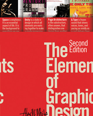
The only part which seemed to me to be a bit more down-to-earth is the last section (the fourth) about type, and even in that case, as in the rest of the book, there are no such things as instructions, practical examples, exercises, hints, tips, tricks or anything that might help a beginner to actually start designing in a less clumsy way. The first three sections, in case you wonder, are about space, unity, and page architecture.
Bottom line: if you are already in some serious way into graphic design, or would like to be, go for this book. If you aren't, what this book will give you is at best a better understanding of other people's work.
I am an Educator and I found this book to be worth the time reading. I would categorize it ad an introductory book on design. Also, it is important to understand that this book is not a typical read and cannot be approached in the same way as other non fiction.
The unique layout was engaging. It gives the reader an experience with the topic. There are many examples throughout that illustrate the authors points, along with various quotes that add emphasis. There is plenty of imagery and even some compare and contrast.
I can see this book being beneficial for anyone spending time creating documents, presentations, or visuals of any kind. If you commit to the read it will help you connect with your audience. Any audience.
I gleaned an incredible amount from this book! If you've read any other reviews on this book they'll tell you that the formatting on this book is ironically clunky. And they're right. But for someone with an interest in graphic design who has no education or work experience this was the perfect starting point! It covers some theory, some history, and gives plenty of examples. White also sprinkles in lots of quotes and visual illustrations to emphasize a point. I'll probably just start reading again from the beginning now that I've finished it.
For a book about graphic design, the interior was a MESS. There was no white space, no breathing room, nothing that wasn't jam-packed with graphics and text. It was overwhelming. I'm much more enjoying Design Elements: a Graphic Style Manual. The layout is clearer, the graphics and illustrations are given more space when paired with descriptive text, and the pace of the information is better.
Good reference to learn the basic principles of design with a lot of examples. This should be a good thing but I have however mixed feelings. The reason is that every page has so many of them that sometimes it was difficult for me to either focus on the main text or on the examples. Plus, some are crammed at the top of the page and sometimes too small.
Concise introductory design tips focused mostly on use of white space and typography.
I'll agree that this has a lot of visual clutter, but I think it was going for a textbooky look—which does tend to run heavy on the visual clutter. There was a bit of a "do as I say, not as I do" aspect to it.
One of the more enjoyable books on graphic design I've come across in recent years. The book covers mainly layouts and the use of space, although there's also a chunky section on typography too. The typography section was a lot weaker than the rest of the content, mainly because it listed a lot of commonsensical stuff (e.g. be careful of hyphens, word spacing shouldn't exceed column spacing, etc), and gave examples that were very subjective in nature and did not clearly illustrate "bad design" (i.e. some of their supposedly "bad" examples I found nothing wrong with).
But the bulk of the book that focused on layouts was good. Both design for print and web are covered. There were many examples, shown side by side, of the exact same content but with different layout or design configurations, so you could see exactly which was best, and why the others weren't as good or effective. It was both interesting and fun to see why certain layouts worked, while others didn't. The explanations given and "rules" to follow to avoid bad design were concise and easy to understand, and most I totally agreed with. A lot of content organisation is steeped in how the brain processes information, and as a designer you want to be able to convey information easily but yet impactfully too. Sometimes the choice of design is very context-dependent, but it is always rooted in what your ultimate goal or purpose is. It was thought-provoking to think about the multitudes of examples the book gave and consider how successful they were in producing the intended result.
The book also gives an overview of how various aspects of design have evolved through the ages, from medieval times to present. This was interesting and educational. What we can do is limited by what we have available, and it was amusing to see how people of the past designed stuff to try to get round certain limitations, or how limitations shaped the way design evolved.
At the back of the book is a checklist which you can use to see if your design is effective (e.g. do all areas of white space look planned and thoughtfully used? are contrasts clear enough to look purposeful? have similar elements been grouped? etc).
Overall this was an enjoyable read. The tips and advice contained within are also largely useful. Might be good to invest in a hard copy version for easy reference. (The e-book version of the book which I read was sadly extremely badly formatted, with images missing/too tiny.)
I have had this book on my shelf for years. With COVID-19 giving me a little more time indoors, I figured it was time to dust it off and gain some design knowledge. I chose to read this book over another book I also had purchased about the same time: The Non-Designer's Design Book
I wish I would have read the other book first! This book is convoluted and hard to understand. The author writes with a "holier than thou" style, in a book that lacks the basic design principles he touts. I hesitate to give it 2 stars, but I did so for the reason that the principles are there. They are just hard to unearth through poorly formatted prose and illustrations. At times, you don't know which illustration goes with which explanation.
I don't know if the author got caught up in being artsy, but it results in a horrible example of design. If you have a TON of time to read, go ahead and read this book. If not, skip it for something that will actually be an example of true design principles.
I learned some valuable tips from this book. The format is weird in the order of information given. Also I think it was more confusing to have the info on the right page and the examples on the left page. Having to look back and forth to figure out which example pertains to the info wasn’t always simple when there are sometimes 10 small examples on one page. Also, there was a lot of information repeated too many times. I understand how white space and letterforms could pertain to multiple design topics but it was too much. Lots of spelling and grammar errors.
Don’t force this terrible book on students with learning disabilities. This book is not educational grade. It is coffee table grade. Keep it on the coffee table and don’t stab people in the eyes with it.
I think I could write a better book. I could use broken and worn out Christmas lights as the photos. Maybe a drawer full of risk pieces and thumbtacks juxtaposed in a quasi interesting way. I hope Mr. White reads this. Clutter does not graphic design make.
Like the Titel indicates, it is a perfect book to get into the elements of graphic design. I recommend reading it if you are completely new to graphic design and want to learn the basics and the fundamental principles. But it is very theoretic.
A must read for design aspirants. It gives overall review and information about the aesthetics and theoretical explanation beyond every design principle. Every aspect of graphical design stripped away from its shroud of misconceptions and ambiguity. A text book for graphic design enthusiasts, if you like to get started, it's the right one. But ironically the graphic design aspects of this book are not too good, hazy arrays of visuals, bad page layouts make us a bit uncomfortable. It would have been better if the author explained how the principles exactly fit into the visuals he depicted. Barring these flaws the book was good.
This entire review has been hidden because of spoilers.
A little too academic to make it really enjoyable but there is a lot of really good information in here. I only wish whoever designed the layout of the book had taken the advice of the book, lots of the graphics were hard to follow and confusing, some were very low resolution as well. Strange for a book on graphic design.
The actual text portion of this book I would give 4 stars, as it is chock-full of useful information and really helps cement basic design principles. However, I'm giving it 3 stars because the structure and design of the content makes gleaning the information at times a challenge.
The content itself is pretty basic graphic design principles, how to think about them, how to use them. Size, color, proportion, white space, grids, typography, etc. While is could have been organized so there was a little less repetition and clarity, most of it was well explained and demonstrated. Much of it was not new to me, but then I have a BFA, worked a good deal in the graphic art side of printmaking, and have spent a good deal of time with typography. I didn't study design, however, and much of this is framed as a teacher might cover it in a class, therefore quite welcome. I'm especially grateful for the checklist of questions to ask about a design, which is extremely helpful for clarifying potential issues in my design work that I'm not always good at identifying or articulating.
The design of the information, though following the kind of order and internal logic described in the text, is often too busy, overloaded with examples and quotes. All quite helpful indeed, but the lack of white space and inclusion of 3-4 threads of information makes everything difficult to parse. You could argue that the author is drawing attention to these elements by using them in a more heightened way, but then that begs the question of whether it really helps the reader to grasp the actual content. I don't really mind design that challenges presumptions of good design and pushes the limits, but within the context of just conveying best use principles, this may not be the best approach.
This is certainly a great-looking book, and I'll be keeping it on my shelf for the general guidelines and checklist, but personally I would prefer something with a more straightforward approach to the content.
This is probably the best book on graphic design I've ever read. Usually, Graphic Designers are fairly incommunicative verbally. They will try to show you; ask you whether you "see" it or "feel" the harmony or balance or whatnot of some design. Of course, I don't see it. If I did, I wouldn't have to ask in the first place. Thankfully, this Alex W. White doesn't do that. His prose is clear about every concept Graphic Designers have ever introduced me to and neglected to explain.
Majority of the book is actually devoted to the idea of Active White Space ... or the unprinted portions of a page that is left intentionally blank. The author believes that while content is important, whitespace is equally important to contribute.
The book mixes the theoretical and the practical. There is the usual precepts to have 50-60 characters in a line. But there are also little gems like, "Total lack of controlled white space produces visual noise."
I also liked, "Sequencing information is among a designer's most essential tasks. Book designers, for example, structure their typography into title, chapter and section headings, subheading, text, and captions. Such typographic structure helps the reader scan for generalities and, at least initially, ignore details until they commit themselves to the text."
The big turn-off for me is that the body text is set in a sans serif font. Why does he do that? I don't know. But it is not important.
read this book!
Understanding the grammar of visual design is almost a second form of literacy in our consumer driven society.
To be honest, I think it's an overrated book which lacks substance and is difficult to read because of the format chosen to display the information. The explanations from the glossary are more useful than the general definitions, examples until that point. I can't recommend this book to someone else.
Besides being a very well-designed book (as one would expect), this is a very practical and down to earth handbook for graphic designers. The emphasis throughout is on the techniques needed to convey a message, as opposed to simply satisfying a designer's desire to be different or to stand out.
This book is obviously useful for aspiring or professional graphic designers, but I think it would be useful as well for anyone putting together a website, writing a brochure, putting out a newsletter, etc.
Okay. Book on graphic design. You expect it to be well-designed.
I'm not sure if this one was or not: maybe that was the purpose. It was incredibly informative (especially on typesetting, for some reason), but the layouts and graphics seemed to break a lot of the rules that he was trying to get across. You'd look at a page and have no idea where to start reading, there were so many text boxes on it. And yet it wasn't hard to read, or boring, or confusing--you just had to dance around a lot.
I liked this book compared to other graphic design books I've read. I believe it gave me a good jumping off point in learning GD fundamentals. The "elements" (space, unity, page architecture, and type) didn't go as deep as I would have liked but alas their only elements. A few exercises, discussions, or even quizzes could have added more insight. I will have to find more material for further learning but at least I have a small base to start from. There are a few bits of information I could use this book as a reference but I feel there must be a more encompassing read out there.
Ich würde dieses Buch allen empfehlen, die ein Grafik Design Studium anstreben oder sich generell für diese Materie interessieren. „The Elements of Graphic Design“ liefert eine gute Grundlage um gutes Design verstehen und nachvollziehen zu können. Es sind genügend visuelle Beispiele für jedes Thema vorhanden. Es deckt wirklich alle wichtigen Elemente des Grafik Designs ab. Fazit: Exzellentes erstes Design Buch für Amateure aber auch eine gutes Nachschlagewerk fürs Regal, sogar, wenn man schon ein alter Hase ist.
Yet another book that I wish my coworkers would read. This is written at just about the perfect level for me, covering a broad amount of content without going too deep. It was a good overview, and definitely showed me that I could stand to learn some more about this topic. (Especially typography, which was quite fascinating. I've read a bit about typography in the past, but this presented the topic in pretty much the exact amount of detail that I wanted.)
I enjoyed the many examples presented here. I found many suggestions and the way they were presented to be disjunct. Possibly this is an attempt to meet the public where attention spans are generally short and fragmented? As film seems to bombard the senses, the reinforcing inserts seemed to impede the flow for my taste.
This is a great book for designers and students to read in order to find out what graphic design is about. Designers and students will benefit from this book, Alex brought up very good example of what space is about and why it is important in graphic design, when applying elements onto layout.
I was going to just write a review of this book when I saw it on my shelf, but an hour later I'm done reading it through again. In a long tradition of books about graphic design being overly stylized and self-indulgent, this is a mediaful fun-fest of knowledge and artsy-fartsy discovery.