
Multi panel cover works for sci fi? > Likes and Comments
date newest »
message 1:
by
B.D.
(last edited Dec 03, 2025 05:58AM)
(new)
Dec 03, 2025 05:56AM
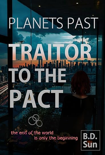
 My cover designer came up with two versions of a cover. One more traditional, and one a multi panel cover. Glad to get the opinion of you guys. Is the first too unconventional for sci fi?
reply
|
flag
 I'd say the second one looks cleaner overall, and I don't think there's anything in the first image that is necessary to grab a potential reader. Personally, I am unsettled by the person staring at me in the corner of the top cover.
A text suggestion would be to differentiate the series title even more. Have it be something like "A Planets Past novel" or "Planets Past: Vol. I" in a smaller font. Even a colon would help reduce confusion as to the title of the volume versus the title of the series.
 I agree that the second cover is much more attractive than the first one.
Aside from Aryan Man's half a face, the title "Traitor to the Pact" is separated "Traitor" and "To the Pact" and doesn't seem to connect at all.
