
 Aaron’s
Comments
(group member since Feb 20, 2013)
Aaron’s
Comments
(group member since Feb 20, 2013)
Aaron’s
comments
from the Goodreads Artists group.
Showing 1-20 of 75
 Well, myself I find it much more inspiring and perhaps consuming to absorb myself in an unexpected project where I don't totally know myself where it's going. With paying jobs, there's a limit on how much miraculous can happen.
Thank you Tamara!We're all familiar with those hermit periods.
Well, myself I find it much more inspiring and perhaps consuming to absorb myself in an unexpected project where I don't totally know myself where it's going. With paying jobs, there's a limit on how much miraculous can happen.
Thank you Tamara!We're all familiar with those hermit periods.
 I'm always jealous of people who can do sculpture. I'd really like to be able to make idols like I see in my head.
I've always wondered about marketing decisions. How do they work, and what are the factors? I read somewhere that marketing teams for publishing companies rarely allow writers much say in the artwork that will emblazon the face of their book, due to the fact that writers are considered ignorant of marketing needs. However there also seem to be exceptions. When does the marketing department yield on this issue, and allow writers to have some say?
I'm always jealous of people who can do sculpture. I'd really like to be able to make idols like I see in my head.
I've always wondered about marketing decisions. How do they work, and what are the factors? I read somewhere that marketing teams for publishing companies rarely allow writers much say in the artwork that will emblazon the face of their book, due to the fact that writers are considered ignorant of marketing needs. However there also seem to be exceptions. When does the marketing department yield on this issue, and allow writers to have some say?I've no idea if it's related, but I'm also curious about how these companies reach a decision about how important it is for the cover art to reflect the story, or not.
Some books like the guardian cycle show images which reflect scenes from the book, down to the last detail, indicating either the author was very hands on, or the artist was a fan of the books. While I'm not a fan of these illustrations per say, I must say I appreciate, no I revere the effort put into them, and the sensitivity the artist displayed.


Other books Like Silverthorn, (shown above in the thread), seem more emblematic. A scene is shown representing the essence of the story presented in an almost allegorical way.

Still others like almost all the books from the Forgotten Realms series's form only the most tenuous connection between the cover art, and the story contained within. I have trouble with artwork where it looks like the heroines have just come from the mall, and had makeovers.


In some cases I would even say that the cover art has been a sort of half baked marketing decision, and the artwork is actually misleading.
Exhibit A:

This cover seems to be depicting an eighties soft core porn star battling a host of demons in the ruins of a Cambodian temple complex. This does not reflect the story at all. In fact the only parallel between the cover art and the story here is that the main character is female, and wields a sword.
Amazing stuff.
Yay!
I'm currently in the process of ordering the series by Fiona Mcintosh, but I'm stuck because the Orbit edition is readily available, but I want the Voyager editions, because the artwork is nicer. Is anyone else as crazy as me, that they're willing to pay more fore cover art?Orbit Edition
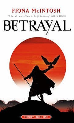
Voyager edition
 It's interesting how what we like about ourselves is not necessarily our most popular quality. The following piece is my favourite drawing out of my own work, but it has not received a single like on Deviant Art.
 One of my friends told me that it's a very dark piece which I couldn't understand because, the painting I did of the witch burning received ten likes. My friend explained that the darkness in the witch burning is symbolic, whereas the darkness in this drawing is visceral and immediate.
This drawing is entitled The Darkmoon Elf Boy.
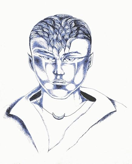
Explanation:
"There is a sort of toxic hostility which some young men exhibit at a certain age.
Here it is personified in the Darkmoon Elf boy who is most powerful, and dangerous in the last part of the waning moon. Most moon elves draw their power from the light of the full moon, but the darkmoon elves take theirs from the shadow of the moon.
The darkmoon elfboy symbolises the part of the subconscious which is hidden, and is driven by an incessant need for recognition, and satiety. At the same time, it is covered by a veil of shame, bringing the intensity of all his desires to a slow boil."
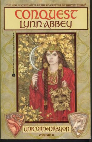

 Me Too! It's a series though. The one on the right is the first. Not sure if that matters. Anyway he's a good writer, and doesn't follow the typical fantasy mold.

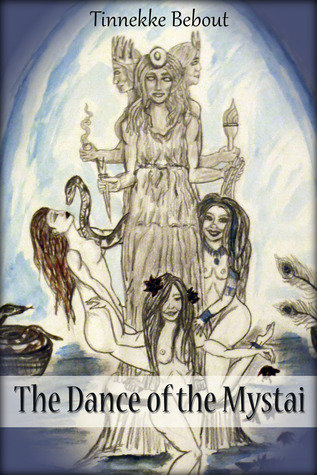
 The Dance of the Mystai
Yes, it's going up. I almost didn't post it after I heard some criticism. It looks more intriguing from a distance to me than close up, but I still like it.
 Oh I almost forgot this grisly but haunting one.
 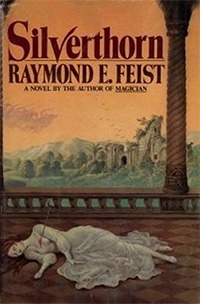 Put your favourite book covers here for the illustrations. I'd recommend using the "Add book/author" and then the "cover" option so everyone can see the cover immediately on this thread, but it's not a hard and fast rule.


By the way, is anyone else vexed by the new trend of putting photographs on the cover of fantasy novels? Are people too lazy to paint nowadays? That said I did include the cover of Witch Child, which I think is a really cool photo.
It's also possible for enthusiasts to post an enlarged version of the cover like so.

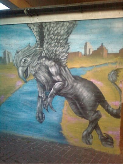
Yes, it's a Gryphon flying over the Thames, nothing to do with the pub above, just some random graffiti but I thought it was cool. Some artists need more recognition.
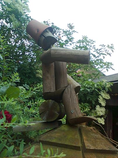
I was trying to find the pub called The Flying Swan mentioned in the Brentford Trilogy, (which became a cylce), but I finally only found this place which is called The Gryphon. It had this lovely wooden man sitting atop a gazebo in the Garden.

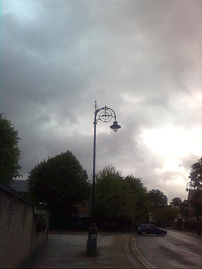
I think to most londoners, this image may look a little dismal, but for a Canadian, it speaks to the enchantment we lack in Canada.
