
Webcomic Wonderland discussion
General Discussions
>
A Page at a Time
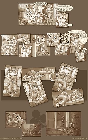
 I've always thought that Tracy Butler was fantastic at drawing expressions, and this page is no exception. Freckles' anxiety and restlessness is clear with few words necessary to explain what's going on. I love the panel layout in that middle part there: it gives that extra feel of tossing and turning. I don't think I ever noticed before the large empty background. I can't decide if I like it or not. On one hand, it allows for very interesting panels layouts, like the one on this page. One the other hand, I feel like the space could be better used or eliminated altogether.
 Mod
Mod
The panel structure in the middle is great, but I wish the beginning and end had used a more traditional layout to make that tossing and turning part feel more unique. Even just eliminating the overlap in the panels outside of that part would have added to it's impact.
It's interesting - when reading the comic the sepia tones didn't really register outside of being appropriate for the feel of the strip and working well. Don't know if it's this particular page or because we're looking at one page in isolation but it feels kind of bland here. Weird.
 Man I can't see these. Now I can never draw again from the envy. The thing I love most about this page is the attention to cloth. Cloth is hard to do! (For me at least.) But it looks so natural here.
 The open spaces are not so obvious when looking at the full page (or so is my impression), so a lot of the issues might be as you say, Mike--an aspect of seeing it in isolation.
The 1st panel on the bottom row perfectly captures that dead-eye stare when you finally give up on trying to sleep.
Mod
It's so incredibly dead-on. I also love the third panel in the middle where you can see the frustration and borderline anger building at not being able to fall asleep.
Katrina wrote: "Cloth is hard to do! (For me at least.) But it looks so natural here."
Totally agree - the texture to things in Lackadaisy (especially clothing) is amazing.
Katrina wrote: "Man I can't see these. Now I can never draw again from the envy. The thing I love most about this page is the attention to cloth. Cloth is hard to do! (For me at least.) But it looks so natural here."I took an art class about a year ago and we spent a class on how to do fabric. It is hard! It's incredible how you can see Freckles' weight pressing into the mattress and pillow.
Another thing that I find remarkable about Lackadaisy is the usage of period and regional slang. There's only a few here("bee in your bonnet" and "landsakes"), but it feels so natural.
Mod
The handling of time period in general in the comic is perfect. Tone and feel of the art, dress and attitude of the characters, etc all seem spot on. And as you said the language is appropriate and natural without standing out or feeling odd even though we don't speak that way.
 Nice use of color. You're not overpowered but there's enough there to know it's a colorful world overpowered by the atmosphere.
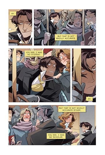
You what I really love about this artist? Noses. Jayd draws beautiful noses. There are five people on this page and they all have unique, interesting, beautiful noses. The blond man has a bulbous nose, the bearded guy has a crooked one, the lady has a cute little button nose. It's wonderful.
Nice use of color. You're not overpowered but there's enough there to know it's a colorful world overpowered by the atmosphere.
You what I really love about this artist? Noses. Jayd draws beautiful noses. There are five people on this page and they all have unique, interesting, beautiful noses. The blond man has a bulbous nose, the bearded guy has a crooked one, the lady has a cute little button nose. It's wonderful.I adore the expressions on the middle two panels. It perfectly encapsulates that horrible feeling of being jostled.
Now, I love Jayd's art. A lot. So, I hardly ever talk or think too much about the writing. I feel kinda bad about it because Sfeer Theory would not be Sfeer Theory without Alex. There aren't a whole lot of words on this page, but I like the feel of them. Very rambling, stream-of-consciousness. It feels like I'm reading Luca's thoughts rather than just words on top of the pictures.
I don't know if I'm reading way too much into this, but I like the color palette of Luca versus the other characters on the page. (spoilers, I guess) (view spoiler)
Mod
This is an interesting page - I remember getting a distinct impression from it when first reading. Mild spoilers: (view spoiler)
Kristen wrote: "You what I really love about this artist? Noses. Jayd draws beautiful noses. There are five people on this page and they all have unique, interesting, beautiful noses. The blond man has a bulbous n..."
Neat observation. It adds a lot of individuality to the characters. I think it got a little away from itself with the guy at the far right of panel 2 (whose nose looks ridiculous to me) but that's a minor point. Great, unique feel to all of the characters here.
Katrina wrote: "Nice use of color. You're not overpowered but there's enough there to know it's a colorful world overpowered by the atmosphere."
I love this about Sfeer Theory in general - the color palette is extremely varied but the hues and tones carefully subdued to establish atmosphere. It's has a great effect overall.
Awww, I like that guy's nose. I think it's cool :)I agree that the subdued color palette really works for Sfeer Theory. It gives the whole comic a lovely atmosphere.
There are some really great facial expressions on this page. They tell a miniature story by themselves. Blondie's really excited about whatever it is he's reading to his friend there and carelessly bumps into Luca. Luca falls, the lady makes sure he's okay and the gentleman chides Blondie for his actions. None of that was told with any words at all. It's quite remarkable.
Mod

What does everyone think?
Mod
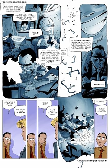
One thing I particularly love about MAoH is the dialog. We get a little peek at it's typical banter and it's driving force (Simon's bluntness) here.
I'm just not sure what to say about this one. Truth is I wasn't overly impressed, but I think that's more a reflection of sitting here with strep throat than the page. ;-P I can say that the facial expressions are pretty good: nice use of eyebrow movement. I also found the dark blue in the third panel distracting from the focus, which is the wee one holding the... I'm not sure what that is... LOL.. I should check out this comic next free day I get!
Mod
The dark blue is totally over the top. Part of the reason I thought this page would be good to discuss is that while I think it works overall as part of the comic (as I rambled about above) I wasn't sure it would hold up well in isolation. I find that kind of disconnect interesting.
The facial expressions are another thing I really like about the comic in general. Very consistent and strong at conveying emotion.
LOL! Another things that doesn't work too well in isolation. :) It's Simon's superhero costume. You totally should if you get a chance - it's a fun read.
Ooh! You know I thought it might be someone's shed skin? Shows that I watch too much Supernatural.I do like the attention to drawn detail in panel 3. I'm too lazy to go through such motions on a good day, but that looks pretty good. You kind of go over the room and then boom, there's this girl holding up someone's shed skin with pride.
Mike wrote: "A simple but effective layout here that puts emphasis on the triple length third panel. The high percentage of white in the other panels also accentuates it. The bright colors strew about in Simo..."I think you are right about the panel layout, though I wouldn't have noticed if you hadn't pointed it out. Personally, I think the use of white is too heavy. Besides the abundance of white in the three smaller panels, there is a lot of white on the right side of the third panel. A few more contrasting colors would have been appreciated. I love Simon's room. It looks like a child's room. It's a mess, there are stickers on his furniture and posters on the walls. He's got a bunch of anime stuff, too, which i find endlessly amusing. I love the color palette for Nilus's outfits as well. It's a recurring palette and it's really beautiful. It makes her look more ethereal.
I love the banter of this comic as well as the facial expressions, but sometimes I feel like they don't come together well. I think it might have something to do with the way the bubbles are laid out. In the first panel, the words are separated into two bubbles, so I'm kind of reading it with a couple of facial expressions in mind. However, since it's a single panel, there can only be one facial expression. I think the first panel would have worked better for me if the words were in a single speech bubble.
Mod
You know, I would totally read a comic about a superhero who has trouble hiding his secret identity because of shed "costumes"/skin lying around.
Yes, my brain goes in very odd directions sometimes...
Kristen wrote: "Personally, I think the use of white is too heavy. Besides the abundance of white in the three smaller panels, there is a lot of white on the right side of the third panel. A few more contrasting colors would have been appreciated. "
Agree, although I'm not sure where contrasting color could go. Simon's costume colors are set and his bedspread matches. A colored towel for Nilus would make that panel clash more and take away from her outfit's subdued contrast with Simon's stark colored room. Color on the door would mean a lot of extra effort keep it consistent in future strips. Maybe if they all had different colored towels (and Nilus' stayed white) or the boys were standing fully against the wall.
Kristen wrote: "I love the banter of this comic as well as the facial expressions, but sometimes I feel like they don't come together well..."
Huh. Nice catch - I kind of felt like something was a little off here and there with the layouts as I read, and it might be the tendency to use double word balloons. It's not a big thing (and I never would have put my finger on it if you hadn't mentioned it) but it does disrupt the feel here and there.
The first panel dialog also could've used an exclamation point. "Oh my God" doesn't work too well for me as a statement.
Mike wrote: "Kristen wrote: "Personally, I think the use of white is too heavy. Besides the abundance of white in the three smaller panels, there is a lot of white on the right side of the third panel. A few more contrasting colors would have been appreciated. "Agree, although I'm not sure where contrasting color could go. Simon's costume colors are set and his bedspread matches. A colored towel for Nilus would make that panel clash more and take away from her outfit's subdued contrast with Simon's stark colored room. Color on the door would mean a lot of extra effort keep it consistent in future strips. Maybe if they all had different colored towels (and Nilus' stayed white) or the boys were standing fully against the wall."
I think if the walls and door frame had been different colors, the contrast would have increased a lot. Like if the door was wood and the walls were green or something. I can kinda see what the artist was going for, though. Everything follows the Everywhere color scheme. It shows how proud Simon is of the Everywhere name.
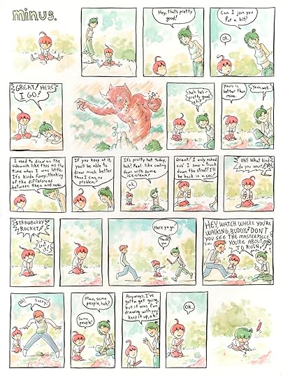
Oops! Looks like I forgot to put up the new page on Wednesday. Sorry!This page is from minus. You can get a closer look at the page here.
 Well when I click the link to get a closer look, up pops a page that has my mind going "Hello, my name is Simon..."
Cute artwork. I like the watercolor feel about it. The colors aren't overused - something I always appreciate - and somehow this person managed to fit a lot of dialogue onto one page. That alone is a glorious feat of glory in my book.
Oops! Linked to the wrong page there! Link is fixed now.
Mod
This is a cute strip, and surprisingly normal one for minus. The uses of her godlike powers are subtle and amusing here (I missed the ice cream she created herself the first time I read it), particularly the hair color change out of admiration at the end.
I do love the color palette of minus: it gives a childlike innocence and wonder to the world. The somewhat blurry backgrounds add to this, too. There are some visual elements here that I'm not fond of. I think the panels are a bit small and seem dominated by the word bubbles. And the characters have side-mouth. I can't stand side-mouth. It's a really lazy way to do expressions.Mike wrote: "This is a cute strip, and surprisingly normal one for minus."
This is pretty normal for minus, huh? It's one of my favorites. I love the interactions between Minus and the older girl. I also love the oddly normal response of copying the older girl from minus. It contrasts to her typical godlike behavior.
Mod
In retrospect side-mouth always kind of bothered me in other comics when I "registered" it, but I didn't notice it consciously or know what it was about such drawings that seemed off until the drawing lessons from Lackadaisy pointed it out.
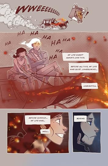
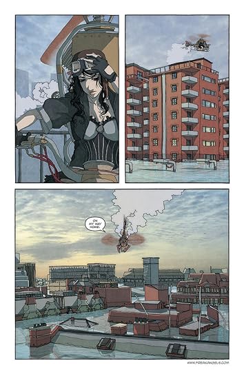 So this is a page from the very first chapter. It's the first time that we get a look at the city and get an idea of what is going on. It manages to be rather melancholy and dramatic at the same time. KK's resigned expression really adds to that feeling.
The line work on this page is very squiggly. You don't really notice it as much on the organic shapes, like people, but it's more obvious on the buildings.
Is the sky a picture or is that painted? I can't tell.
Mod
---
Yeah, it really sets the atmosphere well. It also gives a good look at the style of the strip, which I love. KK's detailed outfit and the copter capture the blend of steampunk and personal style that permeates the strip, and as you mentioned the page as a whole conveys a touch of the effect the current status quo has on everyone.
I only noticed with this page in isolation, but the buildings do look a little weird. It doesn't stand out when reading the comic as a whole though.
No idea. If it's painted it's a phenomenal job.
 Kristen wrote: "New page to critique! This one is from Sfeer Theory! You can get a closer look at the page here.
"
I don't know a darned thing about technique or anything like that, but the page was interesting enough to make me flip to page one and read the whole thing from the beginning. That's gotta be a good thing right? I really enjoyed the small ironies and the body language.
Mod
Definitely. :) Hope you enjoy it!
Yes, anything that can convince you to read it in a single page has to have something going for it! And I wouldn't worry about not knowing anything about techniques or what have you. The critiques aren't just about knowing specifics about art or storytelling. It can be how the page made you feel, as well. You found the page compelling in some way or another, so that's a critique :)
 There's kind of a bleak quality. Also, a sense of isolation with the water surrounding the buildings.It seems like it would be quiet, with just the sound of KK's copter chugging along.
It does look really quiet. That kind of almost eerie silence of the early morning. And it looks like it is early morning, judging by the light quality.
New Page! This one is from Hark! A Vagrant. You can get a closer look at the page here.
There's kind of a bleak quality. Also, a sense of isolation with the water surrounding the buildings.It seems like it would be quiet, with just the sound of KK's copter chugging along.
It does look really quiet. That kind of almost eerie silence of the early morning. And it looks like it is early morning, judging by the light quality.
New Page! This one is from Hark! A Vagrant. You can get a closer look at the page here.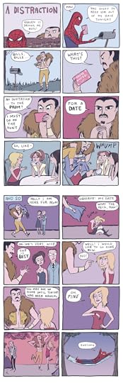
My apologies for the silliness. I thought this was really funny and I thought we could do something a little different than what we've done so far.
Mod
The art is actually really impressive - it's a simplified style (well, outside of Kraven's coat...) but the humor wouldn't work half as well without the great facial expressions and body language. I'm particularly fond of stakler Kraven in the first panel and happy Kraven in the second to last.
I love the expression here as well. It's amazing how expressive her characters are with so few lines used.I like that a lot of the backgrounds are kind of purple. They contrast really nicely to Kraven.
 I love the layout of this page. It's beautiful. It's so loose and flowing, but still has a clear direction. And Smiling Guy. Oh, he's so creepy and I love it. He exaggerates the insanity of the page.
Mod
I love the layout of this page. It's beautiful. It's so loose and flowing, but still has a clear direction. And Smiling Guy. Oh, he's so creepy and I love it. He exaggerates the insanity of the page.
Mod
And it has a flamethrower! Who doesn't love flamethrowers. ;)
Looks like I forgot to post a new page again. Oops! Here's your new page! It's from Paranatural(I swear I'm going to get you guys to read it) and you can get a closer look at the page here.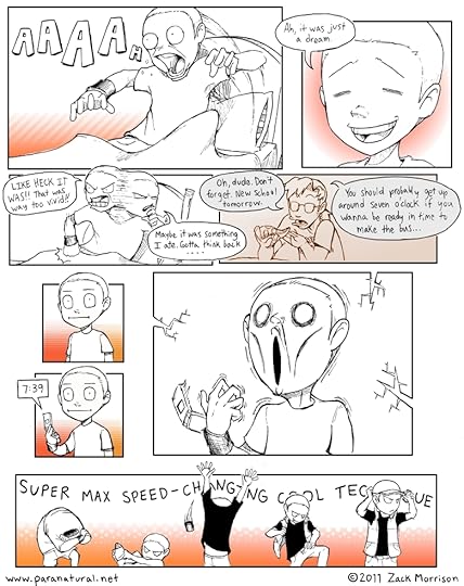 Mod
The facial expressions on this page are fantastic. They are a great mix of Western and Eastern cartooning styles. It's kind of like the eyes use Eastern techniques and the mouths use Western ones. I also love how dynamic the movement is on this page, not just in the last panel, but in the first as well. I think the movement and the expressions perfectly captures that feeling when you realize that you woke up late. What's really strange for me is to see a page of this webcomic that is in black and white. This is a page from pretty early on, so the comic hadn't fully transitioned to color yet. The coloring of the comic is one of it's high points, so it is weird to see a page that looks so bland in comparison.
Mod
Mod
The facial expressions on this page are fantastic. They are a great mix of Western and Eastern cartooning styles. It's kind of like the eyes use Eastern techniques and the mouths use Western ones. I also love how dynamic the movement is on this page, not just in the last panel, but in the first as well. I think the movement and the expressions perfectly captures that feeling when you realize that you woke up late. What's really strange for me is to see a page of this webcomic that is in black and white. This is a page from pretty early on, so the comic hadn't fully transitioned to color yet. The coloring of the comic is one of it's high points, so it is weird to see a page that looks so bland in comparison.
Mod
There's great energy to the page in general.
Kristen wrote: "This is a page from pretty early on, so the comic hadn't fully transitioned to color yet. The coloring of the comic is one of it's high points, so it is weird to see a page that looks so bland in comparison. "
Interesting. The art's pretty strong hear even with limited coloring. Very curious now to see what it becomes.
Kristen wrote: " It's from Paranatural(I swear I'm going to get you guys to read it) and you can get a closer look at the page here."
I keep forgetting about it because it's not on my "to read" shelf. If only someone maintained some sort of list for webcomics without... goodread... pa...
Uhm, I mean I was just waiting for the right time. Yep. Which apparently is very, very soon. ;)
Mod
Wow do I see what you mean about the coloring. It's fantastic. This page is not too far after the one above and seems like a completely different comic / art style just b/c of the coloring.
His dad doesn't really exude authority, does he? Seems like he takes a more relaxed approach to parenting.Yep. That page in particular is very pretty. I considered using it for the Critique a Page, but decided to go with one that had some dialog in it. It's a bit more representative of the comic as a whole. I thought about using the page that directly follows the one I posted, too, just because I thought the joke about his sister's shirt was so funny.
I wanted to point out that I think it's cool that there is still a sense of depth in the page, even with little to no shading used. His use of line and positioning somehow adds dimension.
Mod
That was really funny. And as mean as it was I also loved this exchange at the beginning:
Z: Well I think it's kinda cool. My friends are gonna be jealous 'cause I can get candy and stuff whenever I want to.
M: Ha-ha. That's true Zoey.
M: Oh, wait!
M: WE MOVED! YOU DON'T HAVE ANY FRIENDS!!
I didn't consciously notice until you mentioned it, but very true. And that's really hard to accomplish without any shading.


If there are any webcomic pages you would like to see critiqued, shoot me a message with a link to the specific page(s). Keep in mind that I can't use anything that's NSFW or contains spoilers.