
Clean Romances discussion
General Chat
>
Which Cover is Best?
date newest »
 I like the first one better. The second looks too bitsy, and the couple's heads are cut off.
 Definitely the first as it makes me feel I could be sitting in that chair.
 I also agree with Lynne about the heads being cut off.
 Is it weird that the cut-off was intentional? *hides* Looking at it now I realize I missed the mark on that style! Eek! Thanks for your thoughts, guys! That's 2 for A and 0 for B. :)
 Hm. I prefer the second one. The first one looks dull to me. The second one looks fun and romantic. Sorry :(
Hehe no need to apologize, Emily. :-) That's exactly the kind of thoughts and feedback I'm looking for. Thanks for sharing!
Hm. I prefer the second one. The first one looks dull to me. The second one looks fun and romantic. Sorry :(
Hehe no need to apologize, Emily. :-) That's exactly the kind of thoughts and feedback I'm looking for. Thanks for sharing!A - 2
B - 1
 I like the second one. For some reason, the first one with its empty chair and neglected glasses makes me think it's some kind of suspense. The second lets me know when there's a love story.
 A - 3
A - 3B - 3
Thanks so much for your thoughts everyone! You're really helping me see which one conveys the story more. Since it's a light contemporary romance, I'm leaning toward reworking the latter since the first may confuse some readers expecting another type of read!
 Definitely the first one for my taste! I think many readers don’t like seeing actual faces on a cover—they prefer to imagine what the people look like. I think that’s the reason for the head-cut-off thing (I used back-to for my cover, for the same reason). The second one looks as if it could be in New England—doesn’t read “Rio” to me. Thanks for letting us weigh in!
Thank you for your thoughts, Abigail! That's a good point. I've been seeing a lot of the head cut off which is why I thought I would try it hehe. That's a good point about the picture setting. Hmm I'll have to think more along the Rio beachy type of style or try a back-to myself. :-)
Definitely the first one for my taste! I think many readers don’t like seeing actual faces on a cover—they prefer to imagine what the people look like. I think that’s the reason for the head-cut-off thing (I used back-to for my cover, for the same reason). The second one looks as if it could be in New England—doesn’t read “Rio” to me. Thanks for letting us weigh in!
Thank you for your thoughts, Abigail! That's a good point. I've been seeing a lot of the head cut off which is why I thought I would try it hehe. That's a good point about the picture setting. Hmm I'll have to think more along the Rio beachy type of style or try a back-to myself. :-)
 I agree with a couple of the comments here. I like the first one because the color does pop out at you, it IS more inviting, and it lives up to its title.
 The second cover does look New Englandish, and like Abigail stated, I'm one of those who prefer to imagine what the people look like. (That's why on my covers, you only see their bodies. Readers already have an idea of what their ideal man looks like)
Can't wait to see the finished product:) And all the best with your book:))
 I don't think its too weird that it was intentional. I actual like B better. My friend likes A because of the colors and how calming they are
 To me the first one looks impersonal, empty.
But I too, dislike it when the heads get cut off. Don't mind people on the cover, long as they do resemble the characters.
 I prefer the first cover, the colors draw me in. I like that there is a couple on the second cover, but I don't like that it is so specific. Also, it doesn't remind me of Rio at all. Perhaps having a couple with their backs to the reader sitting in the chairs of the first cover would work and convey that this is a romance. Hope that helps!
Thanks for the well wishes, Groovy! And thanks to Amanda and Gerd for chiming in. And April for your suggestion!
I prefer the first cover, the colors draw me in. I like that there is a couple on the second cover, but I don't like that it is so specific. Also, it doesn't remind me of Rio at all. Perhaps having a couple with their backs to the reader sitting in the chairs of the first cover would work and convey that this is a romance. Hope that helps!
Thanks for the well wishes, Groovy! And thanks to Amanda and Gerd for chiming in. And April for your suggestion!So I decided to go back to scratch to try and get closer to that 'yay' feeling when doing covers because nothing was working. Last night I came up with this one.
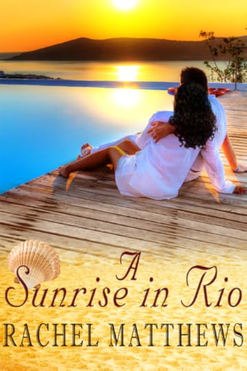
The title gave me the biggest headache cause I couldn't get it looking right with the composition but in the end I'm thinking this is what hits the mark on my 'yay' factor!
Since I made two other covers for the next two planned sequels, this one fits more with that look for the title and byline so I think I'm going to go with this one! Hopefully it combines the strengths and advantages of both cover versions above.
Thanks to everyone in this thread for chiming in with your thoughts and feedback. It helped SO much! :-D
Yeah, I like both of those. Not sure the shell is required, though.
I really like the one with your name in lights (well, OK, drop shadow, but you know what I mean) at the top!
I like this cover the best. I don't think the sea shell is really required either, it looks a little odd to me. I also agree with Abigail with your name in lights.
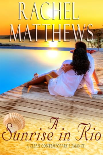
Lol! Thanks guys! Hmm...Here's how sans shell cover looks: Would it be better to have the name like this:
A Sunrise
in Rio
The 'A' looked a little lost by itself. But I do think it looks better without the shell. :-)
 I love the new cover but I would drop the A off the title. Just Sunrise in Rio.
I can't change too much of the title at this time. :-( It's already circulating with readers including some ARCs so I can only do some minor changes. I have a feeling Amazon already wants to drop kick me in the bum for how many updates I've done recently! Lol.
I love the new cover but I would drop the A off the title. Just Sunrise in Rio.
I can't change too much of the title at this time. :-( It's already circulating with readers including some ARCs so I can only do some minor changes. I have a feeling Amazon already wants to drop kick me in the bum for how many updates I've done recently! Lol.Thanks for your suggestions though. :-D
This cover is really good! Congratulations.
I love the new cover so much better, I actually like the people on it; and your name in lights looks so nice. Good job, CaliGirlRae!!!
It looks amazing!! Maybe a way to make the "A' look it belongs more would be to just move the title and "A Clean Contemporary Romance" down one space. If I'm correct in my thinking this way it will all be completely on the sand, just a thought.
Thanks Amanda! Hmm, I think I'm going to try the new suggestions on the paperback version and see how they look! :-)
 I'm coming in late, but I wanted to say that that last cover looks fantastic! I love it!


I'd love to pick the minds of the readers and authors in this group and get your opinons on my clean romance book coming out later this month.
If you were at the bookstore or perusing the Amazon shelves, which one would catch your eye and why?
Cover A
Cover B
This is mainly contemporary romance with like one scene of inspirational. Thanks in advance to whoever responds. This would save me a whole heap of headaches!