
Support for Indie Authors discussion
Archived Workshop No New Posts
>
Cover feedback
date newest »
 It's my ebook cover. What are you trying to view it on?
 You are asking for people to tell you what they think of the cover but you didn't post a picture. It'd help if you would. BUT no link to book please. Just a picture. Thanks
I thought I did post a link. I'm sorry.
You guys will have to excuse me. I am blind and so I thought I posted it but here it is again.
You are asking for people to tell you what they think of the cover but you didn't post a picture. It'd help if you would. BUT no link to book please. Just a picture. Thanks
I thought I did post a link. I'm sorry.
You guys will have to excuse me. I am blind and so I thought I posted it but here it is again.https://www.dropbox.com/s/afmsviyonw1...
(Dimension might be a little off but I hope it's close enough)
Here, I posted it directly in the thread. It will be easier for people to see and comment. :)
 It's definitely easier now it's in the thread.
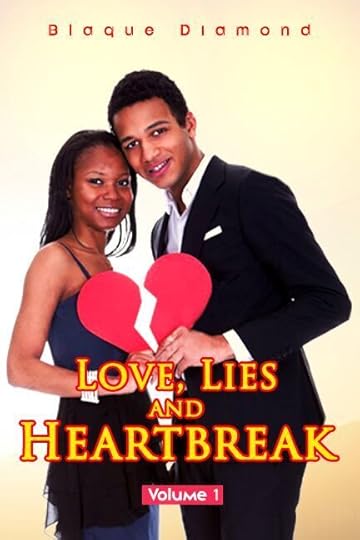
 I think the basic idea is sound. Couple of corrections that I think could help make it look a little more polished:
The title is hard to read with the letters outlined like they are. Maybe try a solid font?
Author name is too small when the cover is viewed as a thumbnail. "Love, lies" might be better a bit larger too.
Same for the volume 1 part. Basically bump all the text up a few point sizes.
Last thing that struck me as off: there's a broken heart, and the title says lies and heartbreak, but the models are smiling. Their happiness seems out of place to me.
Hope that helps!
Blaque wrote: "Thank you G.G. I appreciate the help."Any time!
Also Francis I wanted to mention the models are supposed to look happy because people are supposed to look from the outside in. On the outside they look happy but really they are not.
 I'm with Francis. Red and Yellow are death together in print. Go with Red since your background is in yellow. Also agree with the other comments re: font size.
 The thing that jumped out the most, though, was the white space between the models and the broken part of the heart. It looks like you didn't finish it.
Finally, the color for the volume I isn't anywhere else on the cover. It needs to be changed.
Hope that helps.
 Hi Blaque. I like the top half of the cover and I would agree with the other comments about the lower half. I've given a few suggestions, in case they are helpful.
The author name looks good (I like the typeface), however, I agree with Frances that it could be bigger. You have a decent amount of space available above the models' heads in which to fit the text so I don't think it would throw off the balance of the design to increase the font a little.
The models look good to me. The contradiction between their expressions and your title could be intriguing.
I agree with previous comments about the main title. It doesn't come across with complete clarity in the current red/yellow. A one-colour version may read better.
I would change the typeface for the "Volume 1" subtitle. Too many different typefaces can muddle a design. You have used sans-serif for the author name and serif for the title, so it may make sense to stick with the serif typeface for the subtitle as well?
Overall, I think this works nicely and, with just a few tweaks, I think it could be a strong cover.
Thanks to everyone for their suggestions. I will send the cover back to the artist to see if they will do the changes. I have noted all of your suggestions and I really appreciate your input. It is hard having to rely on someone else to design for me when I can't review the product myself to see if it is something that I would like so I appreciate your comments.

graphic 1Love, Lies and Heartbreak Volume 1 Cover