Support for Indie Authors discussion
Archived Workshop No New Posts
>
Cover changes feedback
date newest »
 newest »
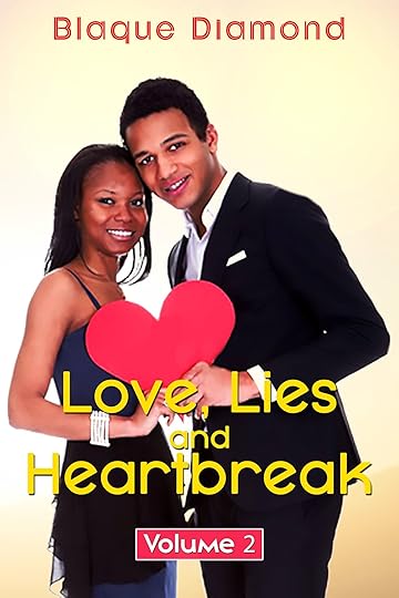
 Hi Blaque - I have (hopefully) dropped a copy of your cover into the thread itself, in case that helps when people come to review the changes.
I think the title is now a lot clearer to read, with just the one colour being used. I'm afraid that I am still not madly keen on the "volume 2" typeface myself, but that is a matter of personal opinion :)
I think the cover design looks clean and the text can be clearly read (which are two of the most important things, in my opinion).


https://www.dropbox.com/s/tcyh1o6scam...
I have to post it as a link to my dropbox account because I don't know how to put it in the thread.