
Book Cover Reviews discussion
Cover Reviews
>
NEANDER 3
date newest »
 Mod
Mod
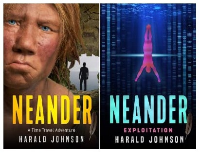
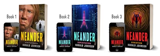
for ref: Books 1 & 2:
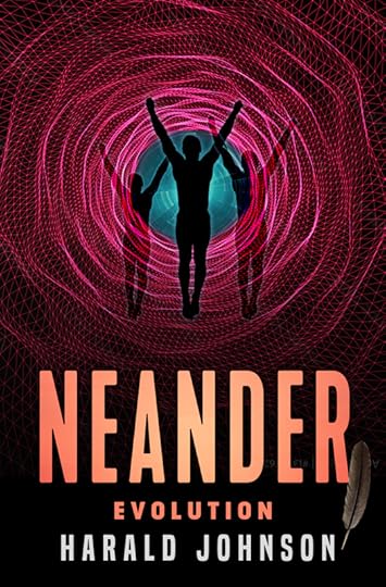
N3 OPTION A:
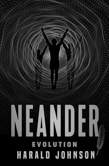
N3 OPTION B:
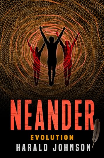
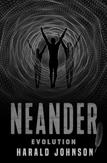
100521: revised a bit more: changed the center area, gave more modeling/color to central figure, and made the main title a stronger red (which I may back off of a bit). Here:
N3 OPTION C:
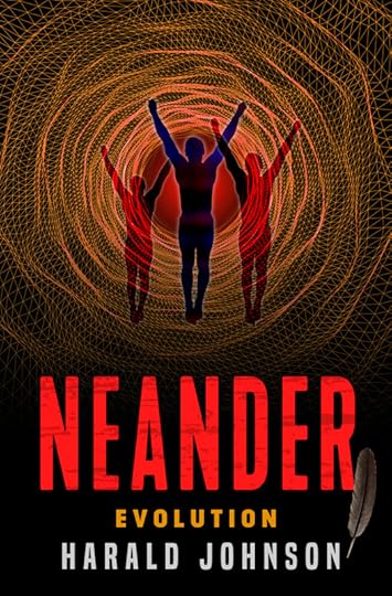
 I think the last one (C) is most interesting. I like the bit of blue -- gives it depth. The other titles are pretty strong, so I don't think you need to dial the color back at all. I do like the graining in the title, too.
Mod
I think the last one (C) is most interesting. I like the bit of blue -- gives it depth. The other titles are pretty strong, so I don't think you need to dial the color back at all. I do like the graining in the title, too.
Mod
Thank you, Gifford! Appreciate the feedback.
 Harald wrote: "Gifford wrote: "I think the last one (C) is most interesting. I like the bit of blue -- gives it depth. The other titles are pretty strong, so I don't think you need to dial the color back at all. ..."
Agree!
Mod
Thanks, Judy!
Mod
 Harald -
This is a great looking series. Each of the covers works really well by itself, but as a set it is clearly linked together—unique, distinct, but through your specific use of typography, unified.
Well done!
Paul
Mod
Thanks, Paul. I feel a little guilty about #3 being a little "lazy," but after beating my head against the wall for a while, I decided it was good enough. And I spent a lot of time on getting just the right Hue of the red title on #3. It's not quite as "poppy" as I would normally like, but I went with it.

The final installment of my Neanderthal time-travel series (trilogy) is at the developmental editor’s. Time to work on the cover of “N3”! Would like your opinions on this option I’m developing (low res). Thanks for inputs!
for reference: Books 1 & 2:
new N3 OPTION A:
N3 PREMISE: With the portal closing, time-traveler Tom Cook confronts enemies in different worlds to save both his family and his adopted band of Neanderthals.
Thoughts? Comments? THANKS!