
Book Cover Reviews discussion
Cover Reviews
>
EL NORTE
date newest »
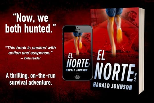
 Hi, Harald,
I love the shading behind the title, and the running boy gives it a real feeling of suspense. The cover is easy to read even in thumbnail; it has great colors & is nicely balanced.
But I'm having trouble making out what the figure on the top left is -- my first glance said boat, but a closer examination shows there's steps (?) Maybe it's the resolution, but I'm just not sure what that is.
 Mod
Mod
Thank you for this feedback, Gifford. And your questioning the top left image is vital for me to hear. I, of course, know exactly what it is, but the fact that you don’t is very important. So I’m going to tell you what it is and would love to hear your reaction to this info. Are you ready? ...
Click this link to see the raw image:
https://haraldjohnson.com/wp-content/...
Yes, a higher-res version of the new cover, which I’ll be getting to soon, MAY show that better, but I’m thinking that I need to find a clearer representation of that element to use in the way I do (at an angle). (NOTE: this element is important in the story) The challenge is: there are only so many versions of that element I can access for use. The other potentials I have are even worse, in my opinion, but I’ll have to look harder. I can post another revised version of the cover, but then you’ll already know what to look for —which is why I just edited this response and hid the element on my website with the link. But I think I’ll try and you just have to erase this conversation from your mind, OK? ;-))
Thanks again for your feedback.
Aha! I think it's the angle of it that got me. I was reading it as horizontal instead of vertical, and the shadows seemed to be more watery than sandy (hence the boat).Taking a file out of my memory banks is tricky, but I'll give it my best shot!
Mod
Working on a revision. Will post soon...
Mod
xxx...
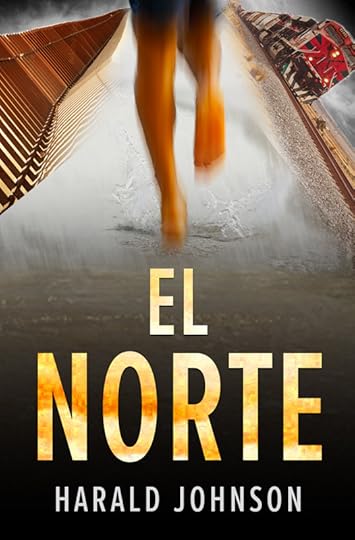
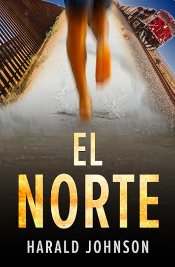
Keeping in mind that the transitions are still rough, does the element at top left look like a border wall?
And in terms of the water, that’s a good catch. The figure is actually running in very shallow water on the beach. Here:
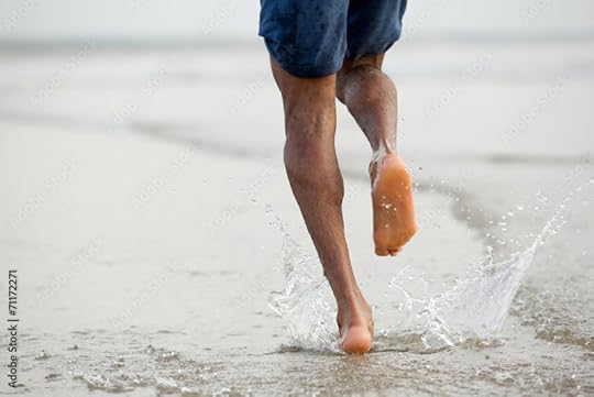
And water is a key element in the story. But so are trains, walls, sand, and dry places. Maybe it makes sense to have him running on a dry/sandy surface and skip the water???
In this new angle, I see the posts of the wall. Well done.One of the reasons I saw "boat" before was the splashes by the figure's feet. As far as sand goes, it can mean both beach & desert. I do like the water, and both the train & the new fence pictures' environs look pretty sere. So my tendency is to stick with the water.
Mod
Thank you for this, Gifford. I just got my dev edit back so need to work on that next, but then I’ll return and finalize this more. I’ll be posting those.
And am open to any other comments from anyone else in the meantime.
 The only thing I think is that if you didn't tell us upfront that it was a suspense-thriller, I would never get that from the cover. Sorry, but I'm just trying to help.
Mod
The only thing I think is that if you didn't tell us upfront that it was a suspense-thriller, I would never get that from the cover. Sorry, but I'm just trying to help.
Mod
You’re right! And I’ve been working on it (when I can). I want it to be a little “harder.” Here’s where I am currently (at right):
https://haraldjohnson.com/wp-content/...
Thoughts?
P.S. SORRY... I couldn't get the in-post version to work and no time to futz with it, so linked to a larger version. Keep in mind that this is still just a low-res rough draft.
Mod
NOTE: to see actual size, go here:
https://haraldjohnson.com/wp-content/...
Hi, Harald,I think the red is a very good choice & I prefer the version on the right. The one on the left is a bit generic to me.
Not only does the title stand out against the red (and the shading there is great), but the splash at the boy's feet is much clearer. And with the straighter angle, I saw right away that it's the border wall.
Mod
P.S. I've also created a map to place after the end of the text. Showing the route my hero takes.
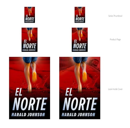
P.P.S. Notice how crummy/chunky the inline versions look here compared to the linked versions?
I love maps! And, yes -- there's definitely a difference with the linked versions. For a site that caters to books & readers, it's hard to understand.
Mod
Once the book is out, I'll post a link for it here. Then you can see the PBK and EBK covers. But you'll have to get a book to see the map ;-)
I like it better now with the red color. I wonder how it would look with the train headlight turned on?
Mod
Interesting question. But I "toned down" both the wall and the train on purpose to not take attention away from the main figure running. Thanks for the thought.
Mod
You can check it out here:
https://www.amazon.com/dp/B0BR6993GY
Thanks for the inputs on the cover. They helped.
-- Harald

PREMISE: An introverted high-school graduate has his world blown apart on a family vacation to Central America and has to find the strength in himself to survive and to get justice for his family.
Whatcha think?