
Fringe Fiction Unlimited discussion
Book Covers That Catch Your Eye
date newest »
 Would anyone read expect me because I was curious? Probably not lol But the cover definitely caught my eye because I think, due to the content, it's the best marketing the author could have done.


Absolutely gorgeous and really showcases the main character well, makes me wonder what he's all about.


I haven't read this one yet, but the cover was the main reason I picked it up. Not exactly pleasant huh lol. It's really not even that well done as some of the text is hard to read, and the cover is mostly text, but something about it was still striking.
 Lily wrote: "Would anyone read expect me because I was curious? Probably not lol But the cover definitely caught my eye because I think, due to the content, it's the best marketing the author could have done.
..."
Actually, it got my attention. :D
Mine would be, say:


 Quentin wrote: "
I haven't read this one yet, but the cover was the main reason I picked it up. Not exactly pleasant huh lol. It's really not even that well d..."
Interesting. It looks underwater. It's a clever use of gradient color in the letters, giving that underseas feel, as if the letters have sunk to the bottom. Unsettling, yet perfect for the content.
Sorry, graphic desingner. I can't help it. Call it a tragic flaw.
 Indie:
 (Sorry, I realize I'm repeating myself since I pointed out this cover on another post. I'll leave it there because I really, really do love it but I'll add two that were not mentioned. (I hope it's ok...)
Trad Pub.

Indie:

 G.G. wrote: "Indie: (Sorry, I realize I'm repeating myself since I pointed out this cover on another post. I'll leave it there because I really, really do love it but I'll ..."
Oooo, love the ZOO cover.
I love that there's so much diversity in all these covers!
@Lily: See, I knew something was cool about that cover, I just didn't know how to express it in artistic terms lol.
Quentin wrote: "@Lily: See, I knew something was cool about that cover, I just didn't know how to express it in artistic terms lol."It could be worse. a roomful of artists lol
 I occasionally see covers that make me groan because I know the artist is well out of my price range for future books.
Covers like
 . By the gun, that is a sexy cover. I still need to read the first book, but man, I'd own that one just for the art.
So many interesting covers. There's hope yet :)
In line with this topic, check out the difference a cover can make. Look at this cover:
. By the gun, that is a sexy cover. I still need to read the first book, but man, I'd own that one just for the art.
So many interesting covers. There's hope yet :)
In line with this topic, check out the difference a cover can make. Look at this cover:
Not that great right? But look at the new cover:

Is that not night and day? What a contrast!
Quentin wrote: "In line with this topic, check out the difference a cover can make. Look at this cover:Not that great right? But look at the new cover:
[bookcover:The Hirelin..."
That's really interesting. They removed the one thing that was most damaging to the cover - the group of people. That one aspect was not eye-catching at all.
The second, while not perfect, is more eye catching than the previous. Simplicity is the key here.
 Mod
Quentin's post reminded me of something as far as "the difference a cover can make".
Mod
Quentin's post reminded me of something as far as "the difference a cover can make".A series of books that had a different cover for every edition. The publisher had said it was because of "expanding their target audience":
http://3.bp.blogspot.com/-KEJKce2H040...
 My buddy Edward M. Erdelac had a similar "cover upgrade" happen with his fourth and final Merkabah Rider book. The first three came out through Damnation Books (boo hiss boo for all the bullshit they pull) and are as follows:


When he decided to self-publish the fourth book, he ended up with this cover:
 which is a helluva lot more interesting and fitting for the series. The rights are currently returning to him (he just got the first book's rights back) over the next few years and then he's going to try and re-release them with the white style covers.
Ugh, Daamnation Books covers. Don't even get me started...
which is a helluva lot more interesting and fitting for the series. The rights are currently returning to him (he just got the first book's rights back) over the next few years and then he's going to try and re-release them with the white style covers.
Ugh, Daamnation Books covers. Don't even get me started...Sorry. I'll shut up.
The funny thing about his first cover is that, for years, even now, I still think the zombie/ghost face on the cover is just smoke. Every damn time. Though I will say, at least the second book's cover has something more relevant to what's IN the book besides the volcanic pistol (which isn't even the right color).But yes, back to pretty covers. I'm reading Starship Blackbeard right now and I love the cover!
 Jacek wrote: "Quentin's post reminded me of something as far as "the difference a cover can make".
A series of books that had a different cover for every edition. The publisher had said it was because of "expan..."
That's pretty cool. It's interesting, too to note the different time eras that these covers were probably designed in. The top row look like 70's 80's covers. The last row looks the most recent. I wonder when the ones that we think are fabulous now will be considered dated and un-tasteful?
Tabitha wrote: "That's pretty cool. It's interesting, too to note the different time eras that these covers were probably designed in. The top row look like 70's 80's covers. The last row looks the most recent."In fact, the time gap there isn't really THAT big. The first edition was published in 2003-2005, the last one... somewhere in 2010s - I guess 2014. But you make a good point. The sense of "attractive" constantly changes and I'm pretty sure in 10 or 20 years most of the covers that catch our eyes today will be considered obsolete.
Good news! Many current book covers are not obsolete and are eye catching to many people as many have already posted, which is what this topic is about :)By means, continue sharing the covers that you presonally find eye catcching.
Jacek wrote: "Tabitha wrote: "That's pretty cool. It's interesting, too to note the different time eras that these covers were probably designed in. The top row look like 70's 80's covers. The last row looks the..."Holy crap! Guess the author was going for a vintage look :)
Ok, Lily, we'll get back on topic now :P
 If you try to have a cover commercially prepared it can be really expensive or you just end up getting a prefab template that looks just the same as 50 other books. Covers ARE important: "You can't judge a book by its cover, but most people do", but there's no reason to break the bank over it or settle for a crappy cover. The cover for my own book The Reflections of Queen Snow White
Only ended costing me about $200 total (Art, design, etc.) and I honestly could have gotten it done even cheaper than that, but I really fell in love with the piece that I ended up using for my cover art. If you are interested in how to find great art cheap, I actually wrote a GR blog post a while back about it here:
https://www.goodreads.com/author_blog...
Cover art is one of those things that can really impact your book sales. Very often it's the only thing that determines whether a casual browser clicks your chapter sample or blurb or if they just keep scrolling down their search results.
David wrote: "If you try to have a cover commercially prepared it can be really expensive or you just end up getting a prefab template that looks just the same as 50 other books. Covers ARE important: "You can't..."David, this topic is about covers that catch your eye. There's anothing topic about why covers are important.
I guess I made the logical leap that cover art is what catches your eye. I probably should have stated that more explicitly. Great cover art is immediately engaging, but an awful lot of prefab stuff I've seen (especially in the romance genre) just makes books blend together.
Seriously, are there more than five romance covers in the whole world?!
David wrote: "I guess I made the logical leap that cover art is what catches your eye. I probably should have stated that more explicitly. Great cover art is immediately engaging, but an awful lot of prefab stuf..."I understand that, but this topic is for actually naming examples of covers that catch your eye.
Well then, another cover that really stood out to me was the original paperback edition of Tad Williams' The Dragonbone Chair

The version pictured here is almost the same, but the cover art on this edition originally was printed on glossy color paper behind the cover. The original cover was forest green with Greek Font letters and had a window-shaped cut out over the boy's face. Among the slew of dozens of typical fantasy covers it really stood out and is probably why I bought it.
I think cut-outs are cool and you don't see them very often anymore.
Cut outs are unusual, this is the first I've seen in a while.
It's probably a cost thing, but they really catch my attention.
 Mod
Mod
I''ll post a few of covers that catch my eye in a few.

This was one of my rare impulse buys based soley on the cover. I didn't even know Wendy Froud did this kind of art. (Wife of Brian Froud who worked on many Henson's productions, Dark Crystal, Labyrinth, etc).
It's a photo book, I know, but I like covers that show me preview of the content, and I feel that way about novels too.
Here's an interesting food for thought.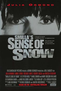
I can't find the copy that I own, but it uses the exact same image as the movie poster above. I bought this book in a used bookstore years ago. I bought it because I recognized and respect the actors. Also, I really like the black and white style, quite representative of the freezing snowy sight of Greenland (where the story is set). I didn't get around to seeing the movie until much later. Smilla's Sense of Snow quickly became one of my fav novels once I read it.
So, the movie poster made me buy the book. Go figure.

Even though I found the novel itself so-so, I still come across it on my bookshelf from time to time, and the cover beckons me in.
Lily wrote: "This was one of my rare impulse buys based soley on the cover. I didn't even know Wendy Froud did this kind of art. (Wife of Brian Froud who worke..."
Ah, the faery art! Takes me back to my twenties.
I bought this one based solely on David Delemare's cover art:
 Tabitha wrote: "I bought this one based solely on David Delemare's cover art: The Art of Faery by David Riche "
How could you not? :D
Mod


I'm not necessarily saying all of these are my favorite/best I've ever seen BUT they're examples of how a self-pub author can put themselves out there in a way that is professional enough that people aren't passing on the cover alone.
Courtney wrote: "Here's a few covers I thought were snazzy (or - if nothing else - perfectly presentable) on the indie side of things:[bookcover:Dollhouse|160..."
Oooo, love the Gravity cover.
This topic is looking amazing. It's practically glowing.
Mod
Courtney wrote: "There is like a whole subculture on GR revolving around "despondent waifs in ballgown" covers"Isn't it beautiful? :)


This book kept popping up on my feed and I couldn't stop staring at the cover art. I scoffed at the premise but still gave the sample a try, not liking it at all. Fast forward a few months, I see the cover again... and I give it another try... and I fell in love with the story. Cover art, man.
Mod


Some others:


 Courtney wrote: "There is like a whole subculture on GR revolving around "despondent waifs in ballgown" covers"
They can be good:

though that one it helps that I liked the book, too.
Though the covers that really get me are Kinuko Craft ones, like

or
 Mary wrote: "Courtney wrote: "There is like a whole subculture on GR revolving around "despondent waifs in ballgown" covers"
They can be good:
though that..."
Wow, and what's amazing is that the two ballgown covers have the same stock photo but were formatted completely different. They both have a unique and eye-catching look.
Mod
Mod

Fringe Fiction Unlimited
Books mentioned in this topic
The Treachery of Beautiful Things (other topics)The Bell at Sealey Head (other topics)
Ombria in Shadow (other topics)
The Treachery of Beautiful Things (other topics)
Skin Medicine (other topics)
More...
Authors mentioned in this topic
Kinuko Y. Craft (other topics)Edward M. Erdelac (other topics)

It should be interesting to see how diverse everyone's tastes are in book covers.
(P.S. The intent is not to tell fellow group members that they have sucky taste in cover art!)
Here's mine: