
Sci-Fi Romance discussion
Talk Genre
>
Cover Art
message 1:
by
new_user
(new)
Aug 08, 2010 01:48PM
 So scifi novels seem to have a similar scheme: spaceship in a field of stars, maybe with a nice planet in the background. Do you guys like this kind of cover? Have you seen any really unique scifi covers that interest you? :)
reply
|
flag
 I always liked the original covers for Gabriel's Ghost and Games of Command. The cover for "In Enemy Hands" isn't bad, either. For me, covers have to have something else going on besides the h/h in a clinch and some stars. That seems to be the trend, which is a shame.
That being said, a cover doesn't decide if I buy the book.
This kind of leads into a question I have: what is everyone's preference: SF with a romance thread, or Romance with a sci-fi theme? I must admit to leaning toward those novels that have a strong sense of worldbuilding along with the romance, though, again, that's not a hard and fast rule for me.
I have to admit, I don't mind the couple in a clinch if it's just a few books, but if it becomes a trend... On the other hand, there are quite a few boring covers, LOL. It's tough. I do like the original Ghost cover too. I would like to say that the cover doesn't influence me at all, but if a really nice cover catches my eye, I'll pick it up and read the blurb, so it definitely does influence me. And when all's done, I'd rather buy something pretty than an eyesore, but if it sounds horrible on the back, I'll just sigh in disappointment and put it back, LOL. It's great to find a book with a fantastic cover to match the fantastic content.
Btw, Jade, you might like to check out this topic. ;)
 Since I buy mostly digital, the covers don't matter that much, but Heather at The Galaxy Express has made me more aware of them. LOL! I like the Gini Koch covers and In Enemy Hands is nice.
 I like my SF with R, but I don't need sex, just a happy ending.
 I admit to buying books now and then purely for the cover art. Been burned with a dull novel that way too. LOL.
A couple in a clinch on a starfield is okay, I guess. But it won't make me buy a book. Sorry. I like covers like Linnea's original print covers, or Catherine Asaro's Radiant Seas. The Touched by an Alien cover is good. So are Tsunami Blue, and Unmasked.
The heaving bosoms covers don't do it for me, normally, though a shirtless man is okay.
I come to SFR from SF so I tend to prefer the more SF novels. I am actively trying to expand into all sorts of SFR though.
LOL. What are heaving bosoms going to do for us anyway? ;)
 I like my SF with a Romance thread, rather than the other way 'round. But as far as covers - oooh, boy. Folks, if any of you recall the awful, cheesy, nasty SF covers of the early 70's, you'll realize how far SF covers have come.
I have the rare privilege of trolling through SF covers when I do the SFR Brigade's Tag Party every week, and by, golly, I get to see lots of 'em. Yes, lots of space backgrounds with smooching couples. Lots of scantily dressed chicks with or without blasters. But there's some very good work out there, as well, original and digital collage work.
Linnea's covers are good ones. Pauline Baird Jones - want to give a shout out for Girl Gone Nova - love that cover. Other good ones that really caught my eye and imagination - Blaze of Glory (Nantus), Nebula's Music (Dionne)
My favorite cover, though, is still probably the one for A Civil Campaign
 Oh, yes, the Tag Party is a great way to see some attractive covers and read intriguing blurbls. I liked Blaze of Glory's very active cover too. The cover designer (Kanaxa) said she enjoyed creating that one because it allowed her to experiment a little.
 I liked the original Gabriel's Ghost and also the original Games of Command covers. Grimspace is also a nice cover. And Hunters from Carina Press.
I'm a bit partial to the stars or a planet being on the covers, myself. I like my SFR to look like SFR. :)
Thank for the shout out on Girl Gone Nova, Sandra! :-) I do think its quite smashing and feel for my poor publisher trying to create a concept for my books. In the bookstore, a cover can prompt me to pick a book up, though sometimes its hard to find one that pops out of the mass on the shelves. I liked those cartoon contemporary romance covers until they took over, but yeah, you can get burned by the book.
My daughter, an editor, went to a workshop on cover art a few years back and they talked about how challenging it is to design cover art that looks great on a print book, but also looks engaging on the internet and as a thumb nail.
And then add in trying to telegraph what the book is about, what genre, without cheesy. Wow. I love some of the new steampunk covers. The Affinity Bridge had an awesome cover and the other steampunk books? Really fun looking. And I feel for my publisher again, because my current project is a mix of steampunk and SFR. I can't even imagine what she can do for that.
 I'm dying to see my cover for Blown Away. I told my publisher what I'd like to see and they were going to try to pull it off.
It should have a Retro kind of look if they do it right.
Waiting for covers drives me crazy.
LOL
its the worst! be sure to post a link when you get it! we'll die to see it with you. lol
Oooh, D.l., feel for you. Waiting on a cover now, too, for the second half of Romenel's story. The artist is wonderful and always sends me mockups beforehand (what do you think of this? Or this? or maybe this?) but I still chew my nails off waiting for the final :D
i suspect we will have some authors with short nails for a while! lol
 I like the new CG anime style like on Eve Kenin's Driven
I also like the "western" space opera feel like this promotional photo from the series Firefly:
 Oh, Sandra, those are some great ones! I like the original BoG with the phoenix on the cover -unless you mean a different title altogether, LOL- and love the Nebula's Music cover. The original cover for A Civil Campaign was so charming! So Cinderella and cheeky the way the heroine's laughing back at the camera! Love it.
Oooh Linnea Sinclair's cover for Rebels and Lovers. Love the glasses on the hero.
Wow, I have never seen glasses on a hero on a cover, LOL!
Oh, Sandra, those are some great ones! I like the original BoG with the phoenix on the cover -unless you mean a different title altogether, LOL- and love the Nebula's Music cover. The original cover for A Civil Campaign was so charming! So Cinderella and cheeky the way the heroine's laughing back at the camera! Love it.
Oooh Linnea Sinclair's cover for Rebels and Lovers. Love the glasses on the hero.
Wow, I have never seen glasses on a hero on a cover, LOL! Mandy, I didn't like the anime-style cover at first, but I've warmed up to it now.
When you think of the cover, think of the 30's and 40's style pin-ups that you'd see painted on a bomber or other military aircraft or vehicle. Not Betty Boop, but more like Betty Page. That's what I asked for and I'll do back-flips if they can deliver.Blown away is a combination of military and sci fi romance/erotic romance. I wanted the cover to be sexy and reflect the sci fi and military elements in it.
I've taken EOD, Explosive Ordnance Disposal into space and onto alien worlds. The book is out in November in print. It's the first of a planned series.
Here are the blurbs:
Detonate
Alice MacKay can't keep up with all the bomb threats in Trios Port. When Boomer, a former Terran Marine with more than a healthy dose of arrogance, strolls into her office for an interview, she can't get rid of him fast enough. But disarming bombs is easier than disarming amorous Marines. When Boomer decides to stick around, MacKay wonders if she's met her match.
Happy Trails
Jenna's been infatuated with Tyson Rivers since she boarded the mining ship, but the scoop's explosive ordnance officer doesn't seem to know she's there. Too shy to introduce herself, she decides to snoop in his personnel file instead. When Tyson catches her digging, he realizes he's not the only one feeling the attraction, but could his tactics to get her alone end with a bigger bang than he expected?
Rebels and Lovers was a great cover, IMHO. Loved the glasses.The bomber art sounds way fun for a cover. I saw a lot of it when I was researching my WWII novel. Fun stuff.
I agree, Pauline, heroes with glasses need love too. ;)
I think sometimes marketing people under estimate us gals and what floats our boats. LOL!
And what's with the headless covers???Come on, show us a face. I love to see faces.
LOL! because we all love headless men. That's like an immutable law of the universe, isn't it? LOL
LOL! They do underestimate us, for sure! I think we see headless covers though because people are always complaining the model's all wrong. LOL.
that's true. of course, if they'd READ the book or even listen to the author, at least they'd get the hair right. (though i was at fault with Girl Gone Nova. Didn't even think about the hair color, just thought, wow, cool. LOL)
LOL. True, true, publishers should probably get at least a little note from the author about the important details. For example, the hero has pink eyes, etc. LOL.
I love the cover on Diana Palmer's Morcai Battalion. I bought it for the cover. I read a historical romance a couple years back where the heroine was a light blonde.Can't remember the title but the cover--I won't forget. It was really a pretty cover, but it was all wrong! The cover had a dark brunette. The story was great, but I couldn't get the dang cover out of my head the entire time I was reading. It really bugged me. It was like the cover didn't belong to the book and that wasn't the heroine. Uber distracting.
I'm impulsive. I'll check out a new author if the cover catches my eye. If the blurb on the back delivers, I'll buy the book. Yeah, shallow, buying a book for the cover, but I know I'm not the only one out there that does.
I think covers are what authors can control the least, but it's also one of the most important things to us and it's a major cause of anxiety for a lot of writers. If it's good--it helps. If it's bad, head-desk. Traumatic Book Cover Disorder. And they wonder why writers can be so nuerotic???
LOL! that is so true! TBCD. Maybe we should start a support group?
LOL. Yeah, it's true, knowing that covers have such an effect on readers, I can see why authors get concerned about their covers, LOL.
I found this amazing video of vintage Scifi book covers. Thought it might be interesting. The music is a bit avant garde but strangely goes well with the cover art. (you can just mute if you want)http://www.goodreads.com/videos/show/...
What a cool collection! So much of the really old covers are pure cheese, but it still makes me nostalgic to see. The screaming blondes. The torpedo bra boobs. The Japanese rubber suit movie monster look to the aliens. So fun.
Wow, look at those covers. Thanks, Mandy. That vid is great. You really see the excitement and new fascination of everything space in those images. Really captures that.
And I forgot to share when I did get the new cover: 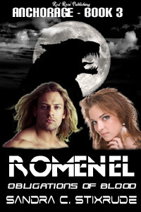
This is the second half of Romenel's story - I love how Missy carried over the fonts from the first cover.
That cover looks fantastic Sandra!
Oooh, what's that in the background? I'm most intrigued, LOL.
Thank you, Mandy! New - I have one word, and hopefully it only intrigues you more: kresnas.
 I'm a sucker for starry scenes and I don't mind spaceships and such. What I don't like are too cartoony covers like the cheap sci-fi paperbacks do. They do nothing for me. I'd have to know the author or already know it's a good book in order to be enticed to buy it.
Sandra wrote: "Thank you, Mandy!
I'm a sucker for starry scenes and I don't mind spaceships and such. What I don't like are too cartoony covers like the cheap sci-fi paperbacks do. They do nothing for me. I'd have to know the author or already know it's a good book in order to be enticed to buy it.
Sandra wrote: "Thank you, Mandy! New - I have one word, and hopefully it only intrigues you more: kresnas."
LOL! I am intrigued. And baffled! LOL. What is a kresna, if I may ask?
Chaeya, do you mean like the SHOMI covers? I didn't like them at first, but I warmed to them eventually.
Chaeya - I do like some of the SHOMI/Manga style covers - but you're right, some of them are poorly drawn and cheap looking.New - nope, nope, that would be telling. You have to read the books. The kresnas don't appear until the second one, but they're the driving force behind books 2 and 3.
No, I don't mind anime covers and some of the SHOMI covers do fit that "ick" category. The covers I mean are usually military sci-fi and the covers usually have the usual spaceship or space guy or girl with a weapon in their hand, explosions in the background, and it's drawn very much like a comic book. I don't want to come across like I dislike all of the covers because some of them are very well done.
*nods* Understood - some covers are just....bad. One of my favorite worst ever SF cover sites:
http://www.goodshowsir.co.uk
(the covers are bad, the commentary is hilarious)
Those are hilarious! Yep, that's what I'm talking about. I have like several books from the 80s with the voluptuous half-dressed Barbarellas.
LOLSo not the thing I should be looking at while I'm waiting for a cover. Those are terrible and the commentary is indeed hilarious.
I despise the headless dudes as though the book is more about the man-titty than the plot I'd spent months perfecting. Now if it was straight erotica, I could see the man titty, but please give the dude a head. If you're not sure what he should look like, ask the author or better yet, read a discription of him from the book.
Seriously, the world building in many sci fi roms is fantastic, so why shouldn't the covers match? Those covers in that site above are older, but I've seen some ugly covers lately, including Susan Grant's Sureblood, that left me scratching my head.
If I didn't know Susan and her work, I might have passed on the book. It doesn't look anything like a sci-fi rom with that Pyscho-style, in the shower, cover
I love my cover for Last Flight of the Ark, with one exception, the hero is too old and he's in a tie and suit jacket that he never wore in the book. Kaleb Titan is in his 40's in the story but the dude on the cover could be 60. LOL It's still a beautiful cover and the three characters on the cover do reflect the menage theme.
D.I. part of the reason why I didn't seek traditional publishing was I wasn't happy that I had no control over the cover. I've had friends whos book sales were hurt because the publisher gave them an awful cover, and this is both NY print and e-book. I admit that I'm a perfectionist and I'm a pain in the butt when it comes to how I want things done so I spared myself the agony.
I hired Melissa Findley to do my cover art for my upcoming nove. I sent her the actual paragraphs describing the characters and sent her pictures I got from iStock and she followed my instructions to the T and I got what I wanted.
I've studied artwork and publicity and there are certain colors and designs which get people's attention. I don't think enough publisher's pay attention to that. When I'm in a bookstore in front of hundreds of books, I don't have time to pick up each and every book and read a blurb. Something has to draw me to pick it up read it. And it also tells me that either the author and the publisher actually care about what they're putting out. And I haven't been disappointed as to the quality of the writing either. Or maybe I've just been lucky.
I don't always buy a book based on suggestions. Most of the time, I like to go in the bookstore and find something, that's fun. However, I have noticed that the more famous the author, the crappier the cover. Just my opinion.
I like your cover and I see what you mean by the guy.
Then they can get everything right. My cover for Slipping the Past is beautiful and perfect for the story. A post apoc romance, the artist incorporated everything I wanted into it. She really listened to what I had to say. I guess drawing a cover is like the lottery. You could win big, but there's no guarantee. On the cover for slipping the past, my heroine is a redhead and blind. She's got her eyes closed on the cover and they used the colors I asked for--also very important to the story. The skyscrapper and details on the cover, hint to events in the past and future. She nailed it.I too am an artist. Many authors, I've discovered, are also artists. So why don't the publishers trust our creative minds? We know our vision better than anyone else. I know that the way the cover is arranged can draw the eye to important details and the flow, the way it's framed, can create a certain mood. Color can be powerful. The first color a person notices when they look at something is red. The use of negative space can also pop an object forward and grab attention. It's so important to grab that attention at a glance. Just like you grab your reader with your first paragraph. Some publishers will allow you to use your own artist or art, some will not. Some give you pages upon pages to complete for your cover art request and others don't even ask. I've had both.
The cover I'm waiting for, was one of those descriptive requests. I was allowed to give a very detailed description of what I want to see. But what I also asked for isn't an easy thing to pull off. It takes a gifted artist and more than photographic skills to make it work. If they do it right, it's going to be awesome. If they don't--I shudder to think. I'll be on that bad cover website. LOL
Let's hope the artist rocks!
I agree, Slipping the Past is a beautiful cover and very unique. Once I get everything settled down, I'd like to read your story. Chaeya
I think publishers do try to release a cover that draws the eye. They want copies sold too and they know the means. That said, it's difficult to create a cover that says "scifi" and "romance," and I think many romance readers still veer away from a scifi cover automatically. I guess the cover has to convey the degree of scifi or romance in your SFR. :)

Sci-Fi Romance
Books mentioned in this topic
The Refugee Ruse (other topics)Lost Valyr (other topics)
Pestilence (other topics)
The Glass Admiral (other topics)
Jabari (other topics)
More...
Authors mentioned in this topic
Shelly Crane (other topics)Shelly Crane (other topics)