
Indie Book Collective discussion
Your Book Cover
 Joanna, I like it. The only thing I'd change would be to make the doll a bit bigger, so you can see her face better. Ebook covers are tricky, because the perspectives change in a thumbnail view. Here's the link to one of my horror ebooks: http://www.amazon.com/13-Horror-Stori...
I tried a completely different style of cover with this horror ebook: http://www.amazon.com/Big-Chills-eboo...
I'd love feedback on these covers. Thanks!
John
Hello John. Thanks for your comments on my cover.
I checked out your 2. I prefer the one for Big Chills, because it is subtle. The other one is almost too gruesome for me. Others are sure to feel differently.
Thanks for joining in.
I checked out your 2. I prefer the one for Big Chills, because it is subtle. The other one is almost too gruesome for me. Others are sure to feel differently.
Thanks for joining in.
Joanna:Thanks very much for the feedback. I sort of agree with you, although Big Chills is not selling as well as 13 Horror Stories. The gruesome cover seems to be working, although I have wondered if the Big Chills cover doesn't work for a horror book. It looks more like a murder mystery cover to me. I'll be interested to see what others say.
13 Horror Stories
 Joanna... The cover isn't making me want to jump up and buy the book. It's not capturing my imagination. A bigger doll with different lighting and no fire, or a grown woman carefully adjusting a collection of dolls might get my attention.
John...
I like the top half of the one with the skulls, but the bottom isn't doing much for me. In the thumbnail size it just looks like a big block of red.
The photo work for the bath tub one looks better, but it's much more a mystery cover than a horror cover.
Here's my own foray into the cover art world:
Sylvianna

I'm in the process of working up a new cover.
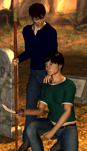
That's the base image. I'm still playing with it, messing with colors, posture, expressions, and lighting.
Excellent light and colour. Shows the reader a lot - something sinister.
 Morning everyone,
Joanna I would make the doll bigger & have less fire 'cos this is where my attention is going at the moment.
Think also about using different font & colour for your title.
John I like the skulls but not too certain about the red colour at the bottom it makes me think that your story is a horror/comedy. I like "Big Chills" leaves a lot to imagination.
Kery I think the new cover for your book is looking much better & modern than the previous one. Makes one wonder.
This is the cover of my upcoming kids book without text of course.
http://www.goodreads.com/book/show/12...
Happy Wen.
Magda
Joanna wrote: "Thanks for your feedback, Keryl.Here is the link to my first novel Vissi d'arte.
Vissi d'arte"
I like the minimalist effect of the cover, but nothing about it says music, passion, or drama.
I'm thinking larger font, in a brighter color would attract the eye more easily.
Magda wrote: "Morning everyone,Joanna I would make the doll bigger & have less fire 'cos this is where my attention is going at the moment.
Think also about using different font & colour for your title.
John ..."
Magda, without seeing how the text is going to be laid out, my biggest concern is the empty spaces.
Right now you've got a large wodge of text in a big empty spot in the design. What will be there when you've got the real cover text?
Otherwise I like the covert art quite a bit. It's cute, fun, and child friendly.
Joanna wrote: "Thanks for your feedback, Keryl.Here is the link to my first novel Vissi d'arte.
Vissi d'arte"
I like the minimalist style of Vissi, but nothing about the cover yells love, music, or passion. If it was clearly the curtains to an opera that might get some of the idea across visually.
Since you've got the space, I'd suggest making the text bigger. The title is legible, but the tag line and author name could be made easier to read in the thumbnail size.
Keryl wrote: "Magda wrote: "Morning everyone,Joanna I would make the doll bigger & have less fire 'cos this is where my attention is going at the moment.
Think also about using different font & colour for your..."
Thanks a lot for having a look. Title will go in the middle. :)
Magda:I like your cover, but there's too much text, and it's too small. In a thumbnail view you can't read it. The artwork is good, however.
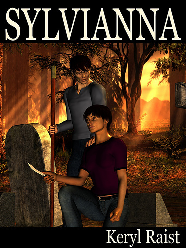
Keryl:
In thumbnail view I can't see the pentagram, or whatever that piece of jewelry is called, in the person's hand. Otherwise, it's great. I would just try to make the jewelry stand out more.
 John wrote: "Magda:
I like your cover, but there's too much text, and it's too small. In a thumbnail view you can't read it. The artwork is good, however.
Keryl:
In thumbnail view I can't see the pentagram,..."
John,
Thanks so much for having a look. This is more of a poster than cover at the moment but illustration will stay. Have to look into being too small.
 Here are my book covers.
 and
and
 .
.Thanks.
Shannon
Shannon:"Beg For Mercy" is good, although I'd like a different font for the title, to make it stand out more. Also, I can't read your name very well. You might want to try a different color, although it's hard because you have it across a white and black background.
"Remember" is terrific. I love closeups like that, and the blood on her lips is a great touch. Very good.
Shannon wrote: "Here are my book covers. and .Thanks.
Shannon"
I like Beg For Mercy, but agree with John on a different font. Something a little more gothic might go better with the plot.
On the larger image, Remember is fine. But as a thumbnail, not only is the title invisible, but to me it looks like the rose is some sort of mutant flower that's caressing her lip with a tendril of some sort. Just putting the title in white would make it stand out enough to see there's one there. If the shadow under her lip was less dark, that might make it stand out further from the rose. Or if the rose wasn't red, it wouldn't blend into the shadow and blood.
Do the image in black and white, leave the rose and the blood red. Make the title bright red or white, and I have a feeling your cover will stand out a whole lot more.
Plus, it'll look a bit more like your other story, giving your brand a connected feel.
Thanks John, for your input. I do agree that my name on the cover (BFM) is totally lost especially in the thumb nail.Thanks for liking the Remember cover.
I absolutely love your cover. It is brillant.
Keryl, I have to agree with your comments too. I struggled with Remember and decided on this one. The book isn't out, so there is still time to make changes. The two stories are totally different. I had an option kind of like what you mentioned, but I wanted to keep the two series separate because they are vastly different.Beg for Mercy is out. I'd already given it to a graphic artist to spruce up, but I'm not sure how many changes I will make. I haven't gotten anything back yet. But I will see.
Your cover had me intrigued. I wanted to know what was up with the necklace. Overall it was good. Congrats!!!
John wrote: "Magda:I like your cover, but there's too much text, and it's too small. In a thumbnail view you can't read it. The artwork is good, however.
Keryl:
In thumbnail view I can't see the pentagram,..."
Thanks for the input John. I've been debating about making the hand/septagram (it's got seven points, not five) bigger.
I'm sorry it's taken me this long to comment, but I just noticed you've got a cover up. I saw Shannon's comment and realized I had missed yours.
So, even though it's red, it obviously didn't catch my eye.
I don't want to be mean, but to me it looks very blah. Even big, it's not catching my attention. Maybe one gift, bigger, or a picture of the doll and the little girl would make more of a splash.
I like the font. I like the color. But it's just not grabbing me and saying: BUY ME!
Keryl wrote: "Joanna wrote: "Thanks for your feedback, Keryl.
Here is the link to my first novel Vissi d'arte.
Vissi d'arte"
I like the minimalist style of Vissi, but nothing about the cover y..."
Many thanks, Keryl. I think you are right. I'm working on a new cover. Similar but with a strong suggestion of music. Thanks!
Here is the link to my first novel Vissi d'arte.
Vissi d'arte"
I like the minimalist style of Vissi, but nothing about the cover y..."
Many thanks, Keryl. I think you are right. I'm working on a new cover. Similar but with a strong suggestion of music. Thanks!
 Here's my book cover for Dreaming Dangerously.
 I have three, and I've been told the cover for the first is boring, but I like it.
This one is the second in the series.

And I put a lot of work into this cover:

I'm doing a book signing for this one in two weeks.
 These are the DIY covers I did for my ebooks. They show up well as thumbnails but I'm not sure they're 'professional' enough.
http://dlmorrese.files.wordpress.com/...
http://dlmorrese.files.wordpress.com/...
http://dlmorrese.files.wordpress.com/...
Here is the cover for the re-release (second edition) of my first novel, a YA Christmas story called Clara Claus. Enjoy!

Kathleen wrote: "Here's my book cover for Dreaming Dangerously."I like the cover, but it doesn't say anything about the book.
For example, is the book a romance? Is the moon or the sea important to the plot? Is it symbolically important to the story?
I might make the title bigger and brighter so they stand out better in the thumbnail, and I might stretch the image a bit so you don't have that black line down the left side, but otherwise is looks fine.
K.C. wrote: "I have three, and I've been told the cover for the first is boring, but I like it.This one is the second in the series.
[bookcover:Werewolves Rule|124060..."
The first one needs work. Your main image is out of focus. The gems and hilt look like they were added with photoshop, and not in a good way. The background is in better focus than the main image, and that's not a good thing.
The title looks good.
The second one look fine, if generic.
Since they're part of the same series, I'd try to tie them together in some way. Maybe use the same white bar for the title, and the same font with both books.
Crushed looks better than both of the other two. I'd believe that was a professional cover.
D.L. wrote: "These are the DIY covers I did for my ebooks. They show up well as thumbnails but I'm not sure they're 'professional' enough.http://dlmorrese.files.wordpress.com/...
ht..."
They don't scream professional to me, but they aren't bad, either. What sorts of books are these? Is a pop art/comic style appropriate?
I get a sort of 50's style ironic Andy Wharhol vibe from those images.
Alexandra wrote: "Here is the cover for the re-release (second edition) of my first novel, a YA Christmas story called Clara Claus. Enjoy!"I'd make the title bigger. Right now it gets sort of swallowed up by the thing behind it.
Otherwise, looks fine.
Kathleen wrote: "Here's my book cover for Dreaming Dangerously.
"
Kathleen,
I love your cover, but I love moons, water and blue. To me it suggests peace and beauty, but with the title, it shows there are undercurrents. I like your pitch too.
Joanna
"Kathleen,
I love your cover, but I love moons, water and blue. To me it suggests peace and beauty, but with the title, it shows there are undercurrents. I like your pitch too.
Joanna
Here is the cover for my novel, Eumeralla.

 Would love to hear what others think of my debut novel's cover:
Please be sure to click through to see the larger version, as the Goodreads thumbnail compression sucks. There are better smaller versions at the various etailers.
Okay, here's the mock up of the 'new' cover. Thumbnail:
Bigger:
Comments especially on the value of this versus the cover with the necklace are very welcome. I do have a version of the necklace cover where the septagram is larger.
Joanna wrote: "Here is the cover for my novel, Eumeralla."At a glance the cover doesn't say family epic to me. But, given that, I'm not coming up with anything that would say, Family Saga.
I do like the font/text. The title is clear even in the tiny version, and that's important.
Todd wrote: "Would love to hear what others think of my debut novel's cover:Please be sure to click through to see the larger version, as the Goodreads thumbnail compression ..."
I think you've got a winner!
Keryl wrote: "Kathleen wrote: "Here's my book cover for Dreaming Dangerously."I like the cover, but it doesn't say anything about the book.
For example, is the book a..."
Thanks for the advice, but on the book itself it actually looks really good. However in the poster I made, the title is way too dark, so I am going to lighten it up. Also, the blurb on the back tells what the book is about.
Joanna wrote: "Keryl wrote: "Joanna wrote: "Thanks for your feedback, Keryl.Here is the link to my first novel Vissi d'arte.
Vissi d'arte"
I like the minimalist style of Vissi, but nothing abo..."
I have to say I liked that cover.Very mysterious too me.
Todd wrote: "Would love to hear what others think of my debut novel's cover:Please be sure to click through to see the larger version, as the Goodreads thumbnail compression ..."
Todd quite interesting,scary. However I would think about having your name in red just like the title & probably have a different shade of grey dividing the water & island.
 Hi all - great book covers! As we all know, the cover could really make or break the book. Just remember to keep it simple. Check out mine for Water.
[image error]
I have a good post about book covers on my blog:
Twain Wannabe
Terra Harmony
Keyrl writes: I think you've got a winner!Thanks for the feedback, Keryl.
Magda writes: Todd quite interesting,scary. However I would think about having your name in red just like the title & probably have a different shade of grey dividing the water & island.
Thanks for the feedback, Magda. The ebook version has my name in red. The paperback version is the one shown. You can see the red text version here.
Terra wrote: "Hi all - great book covers! As we all know, the cover could really make or break the book. Just remember to keep it simple. Check out mine for Water.
I am actually not sure how..."
Terra, It looks mystical. An interesting cover.
I am actually not sure how..."
Terra, It looks mystical. An interesting cover.
Todd wrote: "Keyrl writes: I think you've got a winner!Thanks for the feedback, Keryl.
Magda writes: Todd quite interesting,scary. However I would think about having your name in red just like the title & pr..."
In my opinion looks better it;s screaming look at ma look at me !!!!
Terra wrote: "Hi all - great book covers! As we all know, the cover could really make or break the book. Just remember to keep it simple. Check out mine for Water. I am actually not sure how..."
Water is excellent! Great cover. This one actually does make me want to know more about the book.
Todd wrote: "Would love to hear what others think of my debut novel's cover:Hi Todd - I like the cover, very creepy. Can I make a suggestion on your book blurb, though? I would start it out with the line "There is a place on earth where unrestrained evil flourishes." It is a very catchy line.
Also, can I ask what html code you used to insert the link to your book's page when you click on the image? I can't figure it out! Thanks!
Terra Harmony
 Hi Terra :) - click on the add book/author and then choose the cover option. I hope that's what you're looking for? The (some html is ok) offers more HTML code you can use.
 Here's my latest: Shangri-La Trailer Park... It will be released on Halloween!
 Todd wrote: "Hi Terra :) - click on the add book/author and then choose the cover option. I hope that's what you're looking for? The (some html is ok) offers more HTML code you can use."
That easy? Yep - it was! Thanks!
Keryl wrote: "D.L. wrote: "These are the DIY covers I did for my ebooks. They show up well as thumbnails but I'm not sure they're 'professional' enough.http://dlmorrese.files.wordpress.com/......"
Thanks for checking them out, Keryl. They are humorous science fiction parodies of fantasy epics for adults and young adults. (A bit Douglas Adams, A bit Terry Pratchett, A bit Eoin Colfer...) I used Pratchett's latest covers as inspiration. What I thought was important for ebooks was vivid colors, simple design, and large font.


You can see larger versions of them here:
http://dlmorrese.wordpress.com/novels/
Keryl wrote: "Joanna wrote: "Here is the cover for my novel, Eumeralla.
"
At a glance the cover doesn't say family epic to me. But, given that, I'm no..."
Thanks, Keryl.
"At a glance the cover doesn't say family epic to me. But, given that, I'm no..."
Thanks, Keryl.
Keryl wrote: "Joanna... The cover isn't making me want to jump up and buy the book. It's not capturing my imagination. A bigger doll with different lighting and no fire, or a grown woman carefully adjusting a..."
The lighting is beautiful. Very eye catching.
The lighting is beautiful. Very eye catching.

Indie Book Collective
Books mentioned in this topic
Sylvianna (other topics)Quest (other topics)
Quest (other topics)
From Love and Pain (other topics)
The Wood & Copper Inn and other Short Stories of the Supernatural (other topics)
More...
Authors mentioned in this topic
Keryl Raist (other topics)Keryl Raist (other topics)
Terri D. (other topics)
Terri D. (other topics)
Terra Harmony (other topics)
More...

Authors, post a link to your books and let your fellow writers tell you what they think.
Here is the link to my crime novel.
http://www.amazon.co.uk/The-Doll-Coll...