
Fantasy Book Club discussion
Archived threads
>
Book covers
 I like Patricia McKillip's book covers. The artist Kinuko Y. Craft usually does them, and the artwork is stunning.
 Poll question...
how often do you let the cover art sway your desire to read a book, thus perpetuating the "judging a book by its cover" addage??
I have to admit I am swayed by the cover art. I don't care for cheesy fantasy art, so sometimes won't buy a book becasue of it.
 I try not to be swayed by cover art, I'd have missed some fine reads in my time were I to let that happen. There are times, however the cover over powers my desire to read a book, but not often. I really love the covers of O.R. Melling's Chronicle of Faery series.
The Hunter's Moon

The Summer King
They are silvery and just look like they came from a faery library!
 I have a hobby of making mosaic tile out of stained glass, and recently made a piece for my place based on the mist and cover art of Brandon Sanderson's Mistborn. It turned out really well! I love being nerdy!
Would be great to see you post a photo of the mosaic you made :)
Oh, I am easily swayed by the cover! sigh! Even the title of a book affects me lots. If IMO the book has a bad title I may take forever to read it even if its a good book.
 I am guilty of judging books by their cover.
I prefer the "less is more" styles of book cover art in general... I would rather be enticed to reading a book by a hint of what's to come, rather than feeling that the entire story is on the cover.
Plus, I just like simple art, whether it's on a book or on a wall.
Laurel, that sounds beautiful! I'm about halfway through Mistborn now. And I'm totally loving it!
Rachel, you'll need to join our discussion of Mistborn next month! A few of us are reading it right now in preparation.
 Let me see if I can do this right.
The Thread That Binds the Bones

A Warrior Made (my own idea, too!)

The Diva's Fool
I'll have to go through my collection to find more.
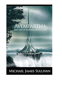
 I don't really let cover art influence my choices but one thing I HATE is when they put the main character on the cover - after all part of reading is "conjuring" your own idea of what people look like. My husband so far has been successful in getting his publisher to "not" put on people - he is trying for an all "exterior" set with each book in a different "color" scheme based on the season. For instance CC is fall and Avempartha is Spring. An odd coincidence is that CC was released in Fall and Avempartha is going to be released in Spring - kind of neat.
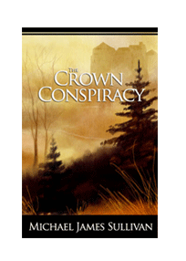
 I would not have picked up Brent Weeks' Night Angel series if not for the cover art of the first novel
[image error]
The Way of Shadows.
Robin, both of those covers are EXACTLY the type that would make me gravitate towards the book. Simple, elegant and beautiful, with an air of mystery that just begs me to open it to see what its about.
I would not have picked up Brent Weeks' Night Angel series if not for the cover art of the first novel
[image error]
The Way of Shadows.
Robin, both of those covers are EXACTLY the type that would make me gravitate towards the book. Simple, elegant and beautiful, with an air of mystery that just begs me to open it to see what its about. I have to say I prefer the "Avempartha" cover, but I'm just partial to shades of blues & grays more than yellows & oranges.
 Robin wrote: "I don't really let cover art influence my choices but one thing I HATE is when they put the main character on the cover - after all part of reading is "conjuring" your own idea of what people look ..."
I totally agree. When browsing through the bookstore, I tend to avoid books that have pictures of people on the covers because I have a tendency to suspect they'll be cheesy. (Yes, I know it's stupid, but one must have some way to filter what's out there.) I do make exceptions to the people on the cover rule if it's very artistic. I love the covers of Charles de Lint's books. They are amazing.
I hate the cover of my first novel, which features the three main characters, not as I'd imagined them (not that I had a specific image of any of them), in a situation that has no place in the story, doing nothing. Very Static. The sover to my second novel is much better, based on my ideas and properly done.
Becky wrote: "Robin, both of those covers are EXACTLY the type that would make me gravitate towards the book. Simple, elegant and beautiful, with an air of mystery that just begs me to open it to see what its ab..."Thanks Becky - My husband is the artist for both of them. When the publisher sent a sketch by their preferred artist for the first book he quickly did a watercolor of what he was thinking of - and the publisher ended up going with it. I too like Avempartha better - but probably because I know more about the book - that tower is featured prominently in book 2.
-- Wife of GR Author Michael J. Sullivan | The Crown Conspiracy | Avempartha
His first career (before he quit to write full time) was in art - in fact when he was in college he wanted to be a book cover designer ;-)Most of his career was in advertising doing graphic design for companies anything from ads, to brochures and websites. It was fun for him to dig into his past and try his hand at them again.
Viktoria wrote: "I would not have picked up Brent Weeks' Night Angel series if not for the cover art of the first novel [bc:The Way of Shadows|3227063|The Way of Shadows (Night Angel, Book 1)|Brent Weeks|http://ec..."I must say that while I generally don't like people on covers this is one that has certainly caught my eye several times and the person is "shadowed enough" to work for me.
Robin wrote: "Viktoria wrote: "I would not have picked up Brent Weeks' Night Angel series if not for the cover art of the first novel [bc:The Way of Shadows|3227063|The Way of Shadows (Night Angel, Book 1)|Bren..."Another thing that helps me with the people on covers is that despite what they may have painted or drawn, it has little to no effect on what my mind sees. I don't picture Rand from WoT anything like what I have seen on covers or even on Jordan's website. I see that he looks different but I don't care. It's MY story once it enters my brain. I see it the way I see it and it's just that simple. *shrug*
 I just "browsed" tis post really quickly - I do like the Brent Week's cover and I thought Griffen's Daughter was nice. I'm really not impressed with the first Wheel of time Cover.
 I've always the preferred the way the covers look for UK books than U.S. Why U.S. covers can't be as good as that? I'll never know.
"how often do you let the cover art sway your desire to read a book, thus perpetuating the "judging a book by its cover" addage??"
This can happen quite often for me actually if it's a book I've never heard of. Then more often than not, I'll pick the one with the more enticing cover. Otherwise if I knew the book got great reviews/a lot of recommendations, then of course I'm not going to care what the cover looks like.
For me .... not very much - unless the cover is REALLY ugly in which case it does make me pass
 I feel that there are too many books in the world as is. In addition, at school, I was one of the only ones who devoured books so I had to find them myself; covers were the only thing that helped narrow my initial search. Even now I still have so few books on my reading list, and no one to suggest new ones, *sigh* old habits die hard I guess.
Although, if someone recommends a book with a horrid cover, I'll still read it.
I always wondered why they change the cover for the different country releases. Is it because they feel certain covers appeal more to different nationalites, or is it to do with the permission of the illustrator.
JJ wrote: "I always wondered why they change the cover for the different country releases. Is it because they feel certain covers appeal more to different nationalites, or is it to do with the permission of t..."I think it's because different countries have different publishers. A book published by Gollancz in the UK might be published by Del Rey in the US. I'm pretty sure that a US publishing house will use an American artist and a publishing house out of the UK will use a British one. That's just a guess. It might also be because the publisher owns the rights to the cover art.
 I don't choose a book because it has beautiful cover but I can appreciate an attractive cover. I'll choose a book for content and a nice cover is a bonus.
Going to a shelf in a bookstore or the library, browsing with no specific book in mind, a nice cover will get me to pick it up and read the back cover or inside sleeve. Nice covers get me to notice the book.
Same here. If the cover or title don't get my attention, I need someone to tell me about it, otherwise there are just too many books.
I am often influenced by the cover of a book. For example I saw the cover of Deborah Chester's The Queen's Gambit, but I did not like the cover of the book that introduces this world "The Sword". However, I wanted to read the books in order, so I bought "The Sword" just to get to "The Queen's Gambit". Also I prefered the second edition cover of The Mistborn: The Final Empire by Brandon Sanderson and kicked myself for not waiting for that one.
Finally, the first rendition of The Game of Thrones with a picture of a character on horseback is better than the subsequent edition. It influenced my buying of the book. I know I should not judge a book by its cover, but what can I tell you? The visual super hero comic book reader in me rules!
Finally, the first rendition of The Game of Thrones with a picture of a character on horseback is better than the subsequent edition. It influenced my buying of the book. I know I should not judge a book by its cover, but what can I tell you? The visual super hero comic book reader in me rules!
I don't agree. I think readers, especially younger readers would want to get a visual of the main character(s). Doesn't that help them to identify with the character, like a visual queue? With my book,I wanted a picture of the main characters on the cover.
I always "invent" my own picture of the people in the book - so I prefer not to see "someone else's" Intepretation on the cover.
 I will say that I love to look at fantasy art covers (as much as I love looking at death metal cd covers - seriously!). As a kid, this was how I got into the genre. I really do try and not let the cover sway me (I wasn't fond of Tad Williams's The Dragonbone Chair cover but I adore the book), because like everyone I might miss out on a good book. But I did pick up Kushiel's dart because of the cover & loved it fine! I will add that I love to look at covers drawn by Lois Royo. What artists do you all like? And should this be another thread?
 My favorite fantasy artist is Ciruelo Cabral. He was the first one I contacted when my publisher asked me to pick an artist for the cover of my first book Griffin's Daughter but he had a 2-year backlog of work. We eventually went with Matt Hughes.
 I love a great fantasy art cover, and a good one will make me pick up a book, but the cover art doesn't influence me to buy a book, no matter how stunning. I enjoy the art for it's own sake, and if I could afford it, I'd buy more original fantasy artwork for my tiny collection.
These days, I choose almost all of my reading material based on recommendations by other people, or because I like a particular author. The cover art is not a factor.
Leslie wrote: "My favorite fantasy artist is Ciruelo Cabral. He was the first one I contacted when my publisher asked me to pick an artist for the cover of my first book [b:Griffin's Daughter|1362888|Griffin's D..."He's my favorite fantasy artist too. I like to buy his dragon calendar every year. I also love Michael Whelan's art. :)
Does anyone remember Brian Froud? I used to love his artwork.
Robin, I have to agree with you. I prefer not having anyone else's interpretation of a character on the cover. I like to create my own image of them in my mind. (This is also why I never see a movie before reading the book, if I can help it.)I suppose some people like to have a idea of what the character is supposed to look like, but in my opinion, it's the author's job to imagine their characters, not the cover artist.
The only exception I make to the "person on the cover" rule is with historical fiction and classics. I don't seem to mind those so much, because their cover art is normally a well-known work of art that is "borrowed" for the book cover, rather than specifically created for the book - or at least it seems that way to me.
Robin, I certainly remember Brian Froud. He did those wonderful books on fairies back in the 80's.
 Ciruelo Cabral is my favorite artist as well! I asked the publisher if we could use him for the cover and they said yes. Check out the covers on my website. Neither were originals for me, but they work perfect for my Iron Dragon Series.
www.paulgenesse.com
Best wishes,
Paul Genesse
Author of The Dragon Hunters
Book Two of the Iron Dragon Series
May 2009
Paul, those are great! How awesome that you were able to get your favorite artist's work for your books!
Manal wrote: "I will say that I love to look at fantasy art covers (as much as I love looking at death metal cd covers - seriously!). As a kid, this was how I got into the genre. I really do try and not let the ..."Luis Royo is my favourite fantasy artist. I have several posters of his artwork. I have 4 of his books. Royo makes me happy *contented sigh*
 I can't recall the cover art influencing my decision to buy or not by a book. Even in a bookstore where the artwork is the first "preview" of the book, I still pick up the book and read the back. Now, that doesn't mean I don't like/appreciate the artwork, because I do, it's just not as important as whether what I read "hooks" me. Of course, nowadays, most of my book shopping is done online or on my kindle, which really reduces the impact of the artwork even more.
 JJ wrote: "I always wondered why they change the cover for the different country releases. Is it because they feel certain covers appeal more to different nationalites, or is it to do with the permission of t..."
I can answer this, actually, because I've worked as a freelance cover illustrator both for NY publishers, and for HarperCollins in Britain.
It has little to do with nationality, but more the way the publishers in their respective countries perceive the best way to reach their home markets. For a time, US books leaned toward depictions of the characters, with a figure or a portrait shown within a scene. The British trend preferred a wide open landscape approach. When I inquired why, one British editor explained that fantasy readers in her country responded best to the uncrowded, mystical feel of an otherworldly place that would lure them in.
In some cases, this split trend is still evident, though more recently, fantasy novels are moving toward a more graphic approach. Some publishers tried this to capture a wider audience, moving away from the pulp like trend that broadcasts the look of genre fantasy. Some did it as a shortcut to save money as budgets were slashed, and slashed again, since text design with a simple icon can be done by an in-house designer, very quickly, with photoshop. Other publishers moved this way to bring a more mature look to certain titles, since general prejudice sometimes throws out the knee jerk label that fantasy is only for children or teens.
I have been called upon to paint covers in all three styles, and have enjoyed the merits of each for different reasons.
 Yes, thanks for that very informative explanation, Janny. I've always wondered myself. I think one of the criticisms of the cover of the first edition of my own novel Griffin's Daughter is that it does give the erroneous impression, at least for some folks, that it is a YA title, and therefore adults who are not into YA titles shied away from it. The cover of the second edition is vastly different; it is a photo of a medieval tower in very dark tones. It is much more mysterious and mystical.
 I still love the first cover, though. I even purchased the original painting from the artist.
Jim wrote: "That was interesting. Thanks, Janny."You're very welcome, Jim. If you or anyone has other questions, fire away, if my direct experience is of any interest, I don't mind sharing.
Leslie wrote: "Yes, thanks for that very informative explanation, Janny. I've always wondered myself. I think one of the criticisms of the cover of the first edition of my own novel [b:Griffin's Daughter|1362888|..."Leslie, there can be nothing more maddening than getting a cover that doesn't capture the correct angle to bring in the right readership - which leaves a lot of responsibility in the hands of the selection process, that picks the artist, and then, in the hands of the artist, personally. At one time, things were more free - the artist would be assigned a book, read it, and produce their own ideas based on the book, on the assumption that the artist chosen suited the written work in question. Now, it is far more in the hands of marketers, and the artist is quite likely to be told exactly what image to paint.
There can be no better compliment to the cover artist than having the author purchase the work. Brava to you, and to the artist, for creating an image that does justice to the originality of your novel.
 I'm new to Goodreads and to this Group. Liked this thread and although it may be moot, I figured I'd weigh-in.
Cover art: Love it. But it never leads me to buying a book. Cover art has dissuaded me from buying some though - particularly the cheesy fantasy art that one sometimes sees.
That being said, seeing that I simply adore books in and of themselves, it does seem to make some books in my library more cherished. Sometimes I'll even be upset when I see one of my favorite books with 'more appealing' cover work in an edition that I don't own.
Character names - that's yet another way that I decide whether or not I'll buy a book (particularly for fantasy/sci-fi/detective novels). "Lance Steel" type names, makes me drop the book right then and there! But that's another thread.....

Fantasy Book Club
Books mentioned in this topic
The Purple Emperor (other topics)Faerie Wars (other topics)
The Purple Emperor (other topics)
Faerie Wars (other topics)
Ruler of the Realm (other topics)
More...
Authors mentioned in this topic
Herbie Brennan (other topics)Joseph Delaney (other topics)
Michael J. Sullivan (other topics)
O.R. Melling (other topics)
but sadly in Australia books 10 and 11 only had the plain cover of a serpent biting its tail for some reason, which ruined my series collection. I suppose royalities are paid for sales also to the artist of the book cover so having have a plain cover avoids that, which shows lack of consideration to readers i think.
At least Griffin's Daughter
has great watercolour artwork on the cover. I suspect Leslie choose that herself and her publishers agreed. At least self publishing also guaranteeds your chosen cover work is on your book covers so was pleased to see coverwork such as the cover below on the book shelves.
Pathway of the Gods
Whats your favorite book cover for a fantasy novel ?