George J. Mount's Blog
November 29, 2025
How to deliver live online Excel training for large audiences
Running live online Excel training for a big group — and I mean big (50, 75, 100+ people per instructor) — is a completely different beast from a normal-sized workshop. All the things that make small-room training fun and spontaneous? Most of that goes out the window the second the attendee count spikes.
But large-audience Excel training still works. It can be high-impact, follow-along, and genuinely transformative… if you design for scale instead of fighting against it.
What follows are the principles I’ve learned from dozens of these sessions, refined by trial, error, and “OMG why is the chat exploding” moments.
Avoid surprises like your session depends on it (because it does)The bigger the group, the more your session needs to run like a YouTube video with chapter timestamps. People want to know exactly what’s happening, when it’s happening, and how long it’ll take. If even three people get confused about what file they should have open or whether they’re supposed to be watching or doing… that confusion spreads fast.
So you tell them:
What we’re doing right nowWhat we’re doing nextWhat file we’re usingWhen the exercise starts and endsAnd you repeat it. Multiple times. Out loud and in the chat.
This sounds excessive, but big groups hate ambiguity. If timing or instructions feel fuzzy, the session derails instantly.
Bonus trick: deputize your audience. Let them repost links, remind others where files are, and echo instructions. People like having a little ownership, and it keeps the chat manageable.
Make logistics painfully clear (and keep them visible)Large-group online Excel training collapses when logistics are vague. You have to be explicit about:
Where the downloads areWhere the recording will beWhether you’re using Windows-only featuresWhat version of Excel is requiredHow to check if Power Query or Python in Excel is availableThis isn’t condescending. It’s protecting your session. And people genuinely appreciate clarity.
Also: don’t wait for the Q&A. Bring logistics up early and throughout. The more visible and repetitive they are, the fewer derailments you’ll hit.
Participation still matters, but you have to adjust for scaleWhen 80 people show up to a session, the vibe changes. Even typing in the chat becomes intimidating for a lot of learners. That doesn’t mean you abandon interactivity, but you pick your battles.
What works well in large rooms:
Anonymous polls (perfect for formula questions or quick comprehension checks)Lightweight chat prompts (“Type Ready,” “Type SUM if you’ve used it,” etc.)Short, predictable exercises with a visible timerWhat does not work:
Breakout rooms (people freeze or disappear)Calling on individuals20-minute group activitiesAny “surprise” assignmentBig rooms thrive on predictability, not pressure.
Let people follow along, but give them guardrailsFollowing along is the gold standard for Excel learning. But troubleshooting 50+ individual machines virtually is impossible. So you design your follow-along time with safety nets:
Provide a clean starter fileProvide a solution fileGive written steps of every demoShare your speaker/instructor notesThis isn’t giving away “secret sauce.” It’s how you help a large group become self-sufficient. If someone gets stuck, they check the solution and jump back in. Zero shame. No holding up the session.
Encourage hands-on work, but make it easy for people to recover if something glitches or they miss a step.
Keep exercises short, simple, and clearly timedFive to ten minutes. That’s really the sweet spot. Keep the exercises simple: just a few steps, a small dataset, ideally all on one sheet so nobody’s hunting around or zooming in and out trying to find things.
Throw a timer on the screen. It calms people down. When they know exactly how long they have and what the goal is, they stay focused instead of spiraling. Again, they want to know what’s happening at any moment.
Also make it crystal clear that it’s totally fine to peek at the solution file whenever they need to. You do not want someone silently struggling and then dragging the next 20 minutes off course because they got stuck on Step 2.
Reduce technical risk before it tanks your sessionWay too many huge Excel trainings that fall apart because:
Someone has the wrong Excel versionExcel for Mac works differentlyPower Query isn’t enabledTheir display zoom is at 125%They’re trying to join from a ChromebookWith a large group, you cannot stop for every edge case. It’s just not possible.
So you:
Send requirements earlyProvide sample/test files ahead of timeGive a simple preflight checklistAccept that some people will still miss it (and that’s okay)And then you keep moving. You simply don’t have the time or bandwidth to confirm that every single person requested the right access or is joining from the machine they’re supposed to be on.
A few Excel-specific tricks that make big sessions smootherThese little choices go a long way when you’ve got 100 people watching your screen:
Use Zoom to Selection oftenBump your demo font size to 16–20 ptsFreeze panes early and oftenOnce you’ve used a formula, prompt, or keyboard shortcut, add it straight to the chat for learners to copyUse named ranges when referencing far-off cellsKeep datasets small enough for older machines and online screensharesUse FORMULATEXT() and Ctrl + ~ to show formulas used on screenThese things sound small, but they dramatically reduce confusion.
Large-group Excel training really can workIf your goal is to give people reps, build confidence, and get them genuinely better at Excel, large-audience online training absolutely works. You just have to design it like the medium it is, not the small-group classroom you might wish it were.
Be clear. Be structured. Be predictable. Let people follow along, but give them safety nets. And don’t be afraid to open up your materials: the more self-sufficient the audience, the better the experience for everyone.
Large-audience Excel training checklistUse this as a prep guide for your next session, or hand it to your team.
Large Audience Online Excel Training ChecklistDownloadIf you’re planning Excel training for a large group…This is literally what I help teams design and deliver. If you want to talk curriculum, logistics, or how to keep a big room engaged, book a free discovery call:
When you make things clear, predictable, and easy to follow, large groups don’t just “get through” Excel training; they thrive in it. That’s what I want to help you accomplish.
The post How to deliver live online Excel training for large audiences first appeared on Stringfest Analytics.


November 24, 2025
How to understand prompt patterns for Copilot in Excel
If you’ve used Copilot in Excel and noticed that some prompts work beautifully while others miss the point, the difference usually comes down to how you ask. Copilot responds to structure, not magic phrases, and that’s where prompt patterns come in.
Prompt patterns are simple ways of framing your request so Copilot has the right context and direction. Sometimes you want a quick no-context answer, sometimes you show an example, sometimes you build the request step by step, and sometimes you tell Copilot what not to do. Each pattern nudges Copilot in a different way, and knowing when to use which one gives you much cleaner, more predictable results.
In this post we’ll walk through six essential patterns, from zero-shot to one-shot, chaining, refinement, and even negative prompting, and why they matter for Excel users.
If you want to follow along, download the fictitious equities dataset below and open Copilot in Excel:
Download the exercise file hereZero-shot prompting
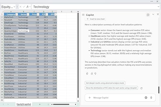
Let’s start with the simplest pattern: zero-shot prompting. This is where you ask Copilot a direct question with little to no setup, almost like you’re talking to a human analyst who already knows your data. It’s fast, it’s lightweight, and it’s great when you just need a first draft or a quick read on a pattern. The downside is that Copilot doesn’t have much to anchor on, so the output can drift, stay generic, or miss the nuance you actually care about.
For example, you might try something like: “Using the EquitySnapshot 3table, give me a brief sector-level valuation overview focusing on differences in P/E and EPS. Keep it to one short paragraph.”
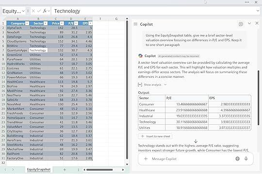
Copilot will give you something serviceable, but it probably won’t be tailored to your model, your definitions, or the exact story you’re trying to tell. Zero-shot is useful for breaking the ice with your data. Just don’t expect precision.
One-shot promptingOne-shot prompting gives Copilot a little more direction by offering a single example of the tone or structure you want. You’re basically saying, “Talk like this.” It’s a simple way to nudge Copilot toward a certain voice without overexplaining or writing out a full template. You still won’t get perfect control over depth or structure, but the output usually feels closer to what you had in mind than a pure zero-shot prompt.
For instance, you might say: “Here’s the style I want: ‘Technology names saw higher multiples supported by strong earnings trends.’ Using the EquitySnapshot table, write a similar short summary of how valuations vary across the major sectors.”
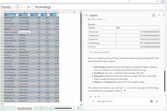
That one example tells Copilot the tone, rhythm, and level of detail you’re aiming for. It won’t lock things down completely, but it does give you a clearer, more consistent starting point.
Multi-shot promptingMultishot prompting builds on the same idea as one-shot, but with more examples to anchor Copilot’s style, tone, and structure. By giving it two or more samples, you’re tightening the guardrails and showing exactly how you want the summary to read. It takes a little more setup, but the payoff is more consistency. Copilot has a clearer blueprint to follow, and you get output that feels closer to your own writing.
For example:
“Example A: ‘Healthcare displayed resilient earnings with mid-range valuations.’
Example B: ‘Consumer names clustered at the lower end of the valuation range.’
Using the EquitySnapshot table, write a sector-level valuation summary in a similar voice.”
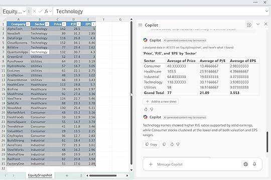
With multiple samples, Copilot can triangulate the tone and pacing you’re after instead of guessing. You give it the vibe and the structure, and it fills in the analysis.
Reasoning promptsReasoning prompts ask Copilot to walk through its thinking before it gives you the final answer. Instead of jumping straight to a summary, you tell it to spell out how it’s comparing values, what it’s filtering on, or how it’s ranking things. This is especially useful when you care about accuracy and transparency, or when you want to cut down on hallucinations and vague “handwavey” summaries. The tradeoff is that responses tend to be longer and more detailed, so you may need to skim.
For example: “Using the EquitySnapshot table, walk through how you compare sectors based on P/E and EPS before giving the final summary. Then give me a clean, 3-bullet takeaway.”
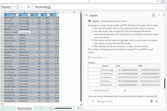
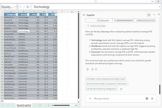
Here you’re telling Copilot: first, show your work; second, compress it into something tight and useful. That makes it easier to trust the output and reuse the logic later.
Chained promptsChained prompts break a task into a sequence of small, deliberate steps. Instead of asking Copilot for one big deliverable, you guide it through the process: explore the data, choose an angle, then produce the final output. This works really well for complex analysis where you want control at each stage and don’t want Copilot to jump straight to a conclusion you didn’t ask for. It takes a little more time, but the end result is usually cleaner and more aligned with your intent.
For example, you might start with: “Scan the EquitySnapshot table and identify standout valuation patterns.”
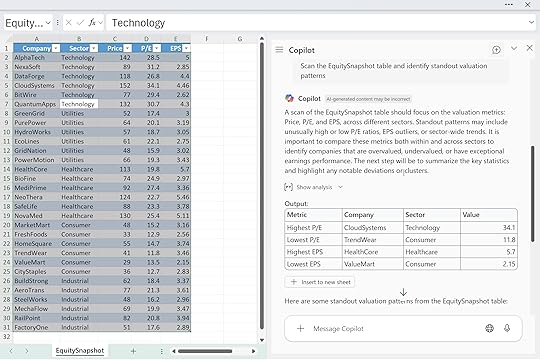
Then follow with: “Now suggest 2–3 angles to highlight.”
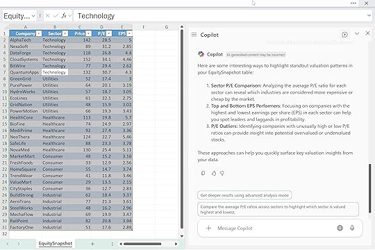
And finish with: “Now write the summary as three crisp bullets.”
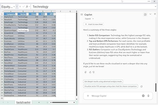
By chaining your prompts, you’re basically project-managing Copilot. Each step narrows the direction until the final answer is exactly what you want.
Negative promptingNegative prompting is all about setting boundaries. Instead of just telling Copilot what you do want, you also spell out what you don’t want in the answer. This is useful when you need the output to stay descriptive, neutral, or compliant, especially in finance or regulated environments. Copilot tends to drift into advice, predictions, or extra color unless you tell it not to, so negative prompting reins that in.
For example: “Summarize sector-level valuation patterns in the EquitySnapshot table, but keep it strictly descriptive and avoid recommendations or forward-looking statements.”
By defining the “no-go zones,” you help Copilot stay focused on the facts in front of it. It’s a simple pattern, but it makes a big difference when precision and tone really matter.
ConclusionThese patterns aren’t some official taxonomy or set of rigid “prompting laws.” They’re just things you start to notice once you’ve used Copilot enough times to see how it behaves. You’re like won’t sit at your desk with Copilot and think, “Let me craft a multishot prompt today.” You’ll just reach for whatever gets the job done, the same way you do algebra or arithmetic without saying the names of the rules out loud.
Most real prompts end up being blends anyway. Maybe you start zero-shot, then follow up with a chained step, then tack on a quick “don’t give me recommendations” at the end. That’s normal. The point is to build a feel for how Copilot responds to structure, examples, boundaries, and sequencing. Once you get that intuition, prompting stops feeling like “prompt engineering” and more like just…using the tool.
To wrap things up, here’s a quick at-a-glance table summarizing the strengths, drawbacks, and best uses for each pattern:
PatternWhat It IsBest ForWatch OutsZero-shotAsk with no setupQuick drafts, rough pattern-spottingGeneric output, weak accuracyOne-shotGive one exampleSetting tone or voiceStill loose on structureMultishotTwo+ examplesConsistent style and framingMore setup timeReasoning“Show your steps” firstAccuracy, transparency, trustLong/wordy responsesChainedStep-by-step sequenceComplex analysis, tight controlMore back-and-forthNegativeTell Copilot what not to doCompliance, neutrality, descriptive summariesNeeds clear boundariesUse this as a reference, but don’t get hung up on labels. Copilot works best when you treat prompting like any other Excel skill: something that gets smoother the more you practice, test, and tweak.
The post How to understand prompt patterns for Copilot in Excel first appeared on Stringfest Analytics.
November 23, 2025
Copilot in Excel: How to understand Think Deeper with Python
Exploratory data analysis often feels like wide-open territory. There’s no single formula or button that tells you the “right” way to cut through your data. And when Python enters the picture, the intimidation factor often goes up… now you’re thinking about code, errors, and environments before you even start analyzing anything.
If that feels familiar, the Think Deeper mode in Copilot for Excel is a great middle ground. It sits on top of Python in Excel, but you don’t have to write or tweak code yourself. Instead, it uses a reasoning-focused LLM to build a structured plan, generate the Python steps, and walk you through deeper insights with more context.
What makes this different from a quick Copilot answer is its reasoning model. Think Deeper breaks your question into steps, chooses appropriate techniques, tests options, and explains why it’s taking a particular approach. It behaves more like an analyst thinking through a problem than a tool spitting out a single-shot response.
For this example we’ll use the well-known vehicle mileage dataset. Say you’re an insurance data analyst studying how vehicle characteristics like weight, cylinders, and horsepower relate to fuel efficiency as a proxy for driving patterns and risk. The dataset gives you a clean historical baseline for building and validating models that predict claim likelihood for older vehicles.
Think Deeper is a great place to start because it walks through the relationships for you, tests different angles, and explains why certain features matter. You get a structured reasoning path instead of a quick one-off answer, which is exactly what you want when you’re scoping a risk model from scratch.
To follow along, download the exercise file below:
Download the exercise file here
If you’ve used Advanced Analysis with Python before, this workflow will feel pretty familiar. (If not, check out my earlier post for a quick primer.)
How to get started with Advanced Analysis with Python for Copilot in Excel
You’ll still want to save your raw data as a table, make sure the workbook is in OneDrive, launch Copilot, and say the magic words: “Analyze this data with Python.” The only real difference is what you do next: instead of the default option, you’ll click the second button to run the analysis with Think Deeper.
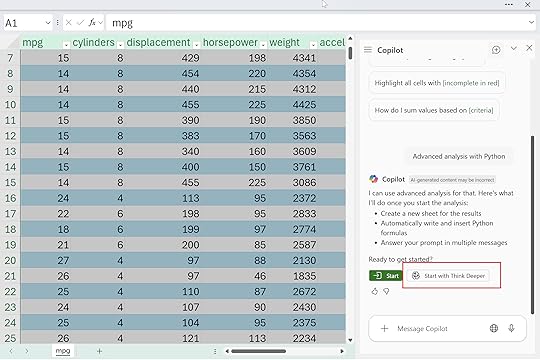
Mine says, “With Think Deeper, I take longer to respond with more in-depth answers for complex tasks.” You’ll also see a basic analysis plan appear in the side panel, and then Copilot starts generating and running the code. It can take a little while, and there’s a lot happening under the hood, so don’t get overwhelmed by the code flying by.
The nice part is you can use Copilot itself to review, understand, and even troubleshoot the analysis it just created.
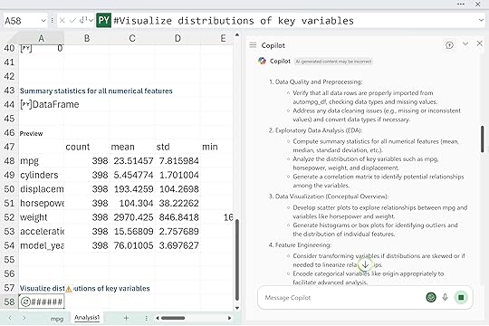
Eventually, Think Deeper will push all the way into predictive analytics, which might be farther than you planned to go with simple EDA. Results will vary from run to run, of course, but the overall structure is consistent. You can even run it a couple of times on copies of the same data to see different angles and deepen your understanding of the dataset.
Think Deeper can be a really helpful middle step between “I don’t want to code” and “I want deeper analysis than a quick summary.” It’s great when you need structure, when your data has multiple angles worth exploring, or when you want to see how a reasoning model approaches the problem before you commit to your own Python or Excel work.
But it’s not always the right choice. Think Deeper takes longer to run, it generates a lot of code, and it can easily wander deeper into predictive analytics than you planned. If you already know exactly what question you want answered, or you just need a quick chart or summary, the standard Advanced Analysis workflow is faster, simpler, and a lot less overwhelming.
Here’s a quick side-by-side comparison you can skim before choosing which mode to use:
FeatureAdvanced Analysis (Standard)Think DeeperSpeedFasterSlower (multi-step reasoning)DepthDirect answersStructured plans, explanations, alternativesOutputA single chart, summary, or insightFull analysis plan + Python code + narrativeReasoningMinimalHigh — breaks the problem into stepsBest forClear, focused questionsOpen-ended exploration and EDACoding involvementPython behind the scenes, minimal exposureHeavy Python generation (you don’t write it, but you’ll see it)Learning valueGood for dipping your toes into PythonGreat for understanding how an analysis comes togetherPredictive analyticsOnly when promptedOften included automaticallyRisk of overwhelmLowMedium — longer runs and more outputIdeal userSomeone with a precise question and limited timeSomeone exploring a dataset or scoping a modelBoth tools are useful. They’re just useful in different moments. And you can always query, question, or refine anything Think Deeper generates. Copilot can even help you understand, troubleshoot, or simplify its own work, which is honestly one of the best parts of using it.
The post Copilot in Excel: How to understand Think Deeper with Python first appeared on Stringfest Analytics.
November 20, 2025
How to get AI-ready even if you don’t have paid Copilot
People ask me all the time what to do if they don’t have paid Copilot or Power Automate or any of the other “new wave” Microsoft tools. Usually it comes from two groups: analysts who genuinely want to learn this stuff, and managers who are getting asked about it and don’t want to make a blind commitment.
The funny thing is: not having Copilot isn’t really the barrier people think it is. Most teams have bigger, older problems that no AI tool is going to magically solve. And honestly, getting those things sorted out now will make life a lot easier once you do turn these tools on.
Start by improving the data you already haveAs an Excel trainer and MVP, I see the same patterns across scores of organizations: the data people rely on every day is held together by luck and muscle memory. Columns shift around, naming is all over the place, refreshes break, and everyone has a slightly different version of the same file.
People want Copilot to fix that. It won’t. It can’t. But you can fix quite a bit of these broken workflows right now, no Copilot required:
Turn your ranges into proper Excel Tables.Move the weekly cleanup steps into Power Query.Stop hard-coding your data sources (pasting CSVs on top of last week’s data, pointing to someone’s Downloads folder, etc.).Keep your raw data intact instead of overwriting it every cycle.If the data comes from an external system, pull it the same way every time. Don’t manually export one week and copy/paste the next.These small, boring steps are what make a dataset reliable enough for anything downstream: formulas, PivotTables, automation, or Copilot.
If you need a place to start with this, begin with my book Modern Data Analytics in Excel:
It walks through everything from tables to Power Query to building data models the right way. Once the foundations are in place, the rest of the “AI stuff” starts behaving a lot more predictably.
And even before Copilot arrives, remember that if you’re on Microsoft 365, you already have the Analyze Data button in Excel. It’s free, built-in, and a great way to practice asking AI questions about your dataset, without exposing anything sensitive to an external model:
While you’re waiting, build the skills Copilot works best alongside
Additionally, if you have access to Python in Excel, this is a great time to start getting comfortable with it. I don’t mean jumping into machine learning or trying to become a data scientist overnight. I just mean learning the basics: generating clean sample data, reshaping messy tables, doing simple transformations, or sanity-checking calculations.
You don’t need Copilot for any of that. And once Copilot is turned on, having even a tiny amount of Python literacy goes a long way. You understand more of what it’s suggesting. You can verify its logic. You can use Python for the heavy lifting and Copilot for the explanation layer. The two complement each other really well.
And there’s a larger reason Python matters so much here: Python in large part is the language of modern AI. Almost every major AI model you’ve heard of was trained with Python. The entire machine learning ecosystem—TensorFlow, PyTorch, scikit-learn—lives in Python. Copilot’s Advanced Analysis feature uses Python behind the scenes:
How to get started with Advanced Analysis with Python for Copilot in Excel
That means when Copilot generates Python for you, you’re speaking the same language the model understands natively. A little Python knowledge lets you sanity-check the code, extend it, and know when something looks off. It’s one of the highest-ROI skills you can build while waiting for Copilot to arrive.
The same goes for Office Scripts and Power Automate if your organization already has them. I’m not suggesting you run out and try to replace Copilot with these tools (you won’t, because again, it’s not meant to replace them). But knowing the basics now means you’ll eventually have a much cleaner handoff between what you do manually, what Copilot helps you with, and what you automate later. Even something as simple as learning how to record an Office Script and look under the hood will make Copilot’s script-generation features feel far less mysterious when they land.
I explain this a lot in my courses: Copilot isn’t a standalone solution. It’s part of a larger ecosystem. A little familiarity with Python, Power Query, and Office Scripts makes your prompts clearer and your results better.
And a quick note on using free AI tools responsibly
If you’re leaning on the free versions of Copilot or ChatGPT while you wait for the paid version at work, If you’re leaning on the free versions of Copilot or ChatGPT while you wait for the paid version at work, that’s completely fine and not a bad idea. But a quick reminder I tell all my corporate clients: don’t paste anything sensitive into them.
Keep it to synthetic data, scrubbed examples, structure and logic, formulas, and generic versions of your workflow. Save the real business data for the paid, enterprise-secured tools when they arrive.
ConclusionUltimately, getting “AI-ready” takes far more than purchasing a Copilot license. It requires getting your data into shape, building a few adjacent skills, and creating an environment where Copilot can actually help you once it arrives. Most of the heavy lifting happens long before the AI shows up. Teams that take the time to clean up their inputs now are the ones that see the fastest payoff later.
If you want help getting your team ready for all of this—data foundations, Python, Copilot, Power Query, Office Scripts, or anything in between—I teach this every week for organizations of all sizes. Reach out if you want to talk through what a practical, non-disruptive path to AI-powered Excel looks like for your team:
The post How to get AI-ready even if you don’t have paid Copilot first appeared on Stringfest Analytics.
November 19, 2025
Python in Excel: How to do logistic regression with Copilot
For years, running a logistic regression in Excel meant relying on add-ins like XLMiner or the Analysis Toolpak. They worked in a basic sense, but they were rigid and opaque, and they didn’t give analysts what they really needed: a clear, interpretable model that supports real decision making.
Python in Excel and Copilot’s Advanced Analysis mode change that entirely. Instead of struggling with the tool, we can focus on the actual analytical work. We can explore patterns, test ideas, understand why outcomes occur, and build models that are transparent and easy to explain.
To see this in action, we are using a simple but realistic dataset from a social network advertising scenario. Each row represents a user who was shown an ad, along with information such as gender, age, and estimated salary, and a binary indicator showing whether they purchased the product. The structure makes it ideal for a first logistic regression example.
You can download the exercise file below to follow along in Excel, run the model with Python, and explore the results with Copilot.
Download the exercise file here
If you haven’t set up a dataset to use with Advanced Analysis in Copilot yet, this post will walk you through exactly how to get started:
How to get started with Advanced Analysis with Python for Copilot in Excel
Before we start prompting, it helps to get clear on what logistic regression actually does. Logistic regression predicts the probability of a binary outcome. These are situations with two possible results such as yes or no, purchased or not purchased, or clicked or not clicked. Linear regression estimates continuous values like income or price, while logistic regression tells you how likely an event is to occur.
In this dataset, each row represents a user who saw a social network ad. We know basic attributes like age, gender, and estimated salary, along with a simple outcome that indicates whether they purchased the advertised product. Logistic regression helps us understand how those characteristics influence the chance that someone converts. Instead of guessing that, for example, higher income users might be more willing to buy, the model quantifies how much each factor matters.
Exploring the data for logistic regressionFirst things first: your data needs attention before modeling. Logistic regression comes with certain assumptions about the data, and it’s crucial to meet them for meaningful results. Let’s prompt Copilot to guide us through the necessary preprocessing steps:
“Check the dataset for missing values, outliers, and imbalanced target classes. Recommend data preprocessing steps needed before running logistic regression.”
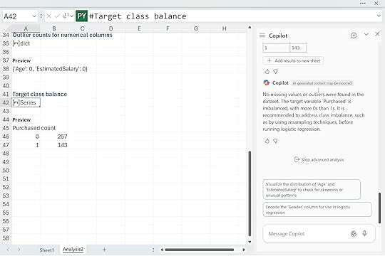
Copilot reported no missing values and no outliers, but it did flag a class imbalance in the Purchased column. We have 257 zeros and 143 ones. This is a mild imbalance, not a crisis. Logistic regression can handle a split like this, so you can continue without immediately fixing anything. The imbalance only affects how the model treats its default prediction and how you interpret accuracy, false positives, and false negatives.
If you want to experiment with balancing the classes, Copilot can walk you through it with a simple prompt like “Use Python in Excel to apply oversampling or undersampling to the Purchased column and explain the tradeoffs.” It keeps the focus on understanding the workflow rather than jumping into advanced techniques.
Next, I asked Copilot to take a look at the numeric features more closely. Distributions matter in logistic regression because extreme skew or scale differences can quietly pull the model off course. So I prompted it with:
“Show the distribution of numeric features and recommend any transformations that would help logistic regression perform better.“
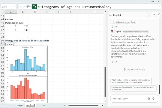
Copilot returned histograms for Age and EstimatedSalary. Age looks fairly even across the range, but EstimatedSalary tilts to the right with a long tail. Copilot suggested scaling both features and possibly applying a log transform to EstimatedSalary if that skew becomes an issue. This is a helpful reminder that logistic regression works best when numeric predictors are on comparable scales and do not contain large distortions. By checking these distributions early, you avoid surprises later when interpreting coefficients or diagnosing model performance.
Building the logistic regressionWith the distributions checked, we have a few mild issues to be aware of, but nothing that stops us from moving forward. Age looks fine, EstimatedSalary is a bit skewed, and the class balance leans toward zeros, but none of these are severe enough to pause the workflow. This is exactly the kind of dataset where you can keep going and let the model show you whether any of these concerns actually matter.
Rather than hand-picking variables or writing your own encoding steps, it is easier to let Copilot build the first version of the model. I asked it to fit a baseline logistic regression and walk through which predictors matter:
“Fit a logistic regression model predicting customer purchase using the other available features. Explain the importance of each predictorc and identify which predictors are statistically significant.”
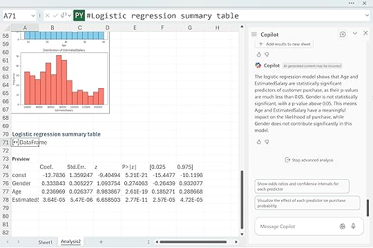
Copilot returned a clean summary table showing the coefficients, standard errors, z-scores, p-values, and confidence intervals. From this first pass, Age and EstimatedSalary clearly stand out with very small p-values, which means they contribute meaningfully to the likelihood of purchase in this dataset. Gender, on the other hand, has a much higher p-value and does not appear to be statistically significant. That is perfectly normal. Baseline models like this often reveal which features actually matter and which ones quietly fall away once the math weighs them properly.
Diagnosing and interpreting model performanceOnce the model is built, the next step is to understand how well it actually performs. Copilot can take care of the heavy lifting, so I asked it to explain the results in plain language:
“Visualize the confusion matrix for this logistic regression model and explain, in plain language, what each metric (accuracy, precision, recall, F1, false positives, false negatives) reveals about the model’s predictive strength and weaknesses.”
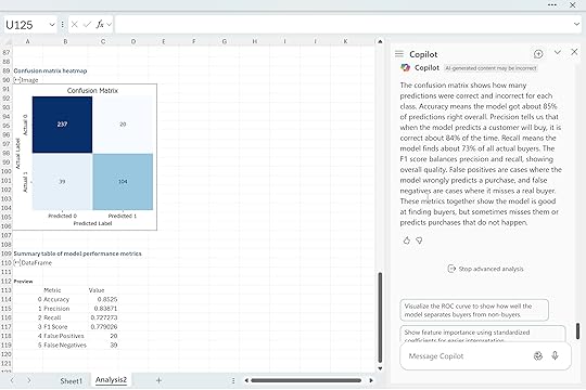
Copilot returned a confusion matrix along with a clear explanation of each metric. This model gets about eighty five percent of predictions right, which tells us it is generally reliable for this dataset. Precision shows that when the model predicts a buyer, it is correct most of the time. Recall shows how many actual buyers the model manages to catch.
The F1 score summarizes both perspectives and gives a sense of overall balance. The false positives and false negatives are especially useful because they show exactly how the model is getting things wrong. In this case the model tends to miss some actual buyers, and it occasionally predicts purchases that never happen, but overall the pattern is solid for a simple first pass.
This is the point in the workflow where you start making decisions about whether the model is good enough or whether you need to refine it further with scaling, transformations, threshold adjustments, or feature engineering.
Checking the model’s assumptionsUp to this point, we have focused on the data itself. At the beginning of this walkthrough, we checked for missing values, outliers, skewed predictors, and class imbalance. Those steps help us understand the raw material before building anything. Now that we have a fitted model, the focus shifts. We are no longer asking “Is the data clean enough to start modeling?”
We are now asking a different question: “Does the model we built actually satisfy the assumptions that logistic regression relies on?” To dig into this, I asked Copilot to evaluate the assumptions directly:
“Explain the assumptions underlying logistic regression. Check these assumptions using our dataset and discuss any potential issues identified.”
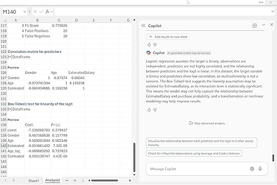
Copilot checked the correlation matrix, confirmed that multicollinearity was not a problem, and then ran the Box-Tidwell test to assess the linearity of each predictor with the logit. This is an important distinction from earlier. Before, we looked at histograms simply to understand the shape of the variables. Here, the test is far more targeted. It examines whether the relationship between each predictor and the log odds of purchase behaves in the way logistic regression expects.
In this case, the linearity assumption appears to be violated for EstimatedSalary. The interaction term is statistically significant, which suggests the logit may curve rather than follow a straight pattern. That does not break the model, but it does tell us that the EstimatedSalary relationship might not be fully captured without a transformation or a nonlinear term. Age, on the other hand, looks fine, and the lack of strong correlations means multicollinearity is not a concern.
These checks help us understand not just what the model predicts, but how trustworthy those predictions are. From here, we can decide whether to refine the model, transform variables, or move on to interpreting and communicating the results
Business interpretation and applicationAt this stage, we have explored the data, fit the model, checked performance, and verified the key assumptions. The final step is the one that actually matters to stakeholders. A model is only useful if someone can act on it. Copilot helps bridge that gap by turning statistical output into business guidance. I asked it to interpret the model in practical terms:
“Provide a clear, actionable interpretation of the most influential features from the logistic regression. Explain what these results mean for business decisions related to customer retention and marketing strategy.”
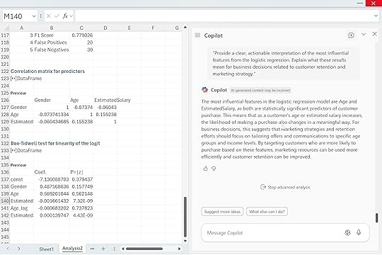
Copilot highlighted Age and EstimatedSalary as the two most influential predictors. Both are statistically significant, which means they have a dependable relationship with purchase likelihood. As either variable increases, the probability of purchase shifts in a meaningful way. For a business audience, this translates into simple guidance. Customer behavior varies across age ranges and income levels, so marketing efforts are more effective when they are tailored to those segments. High-income customers may respond differently to promotions than lower-income customers, and certain age groups may be more receptive to specific products or messaging.
By identifying which groups are more likely to convert, a company can allocate its marketing budget more efficiently and strengthen retention among high-value customers. This is where logistic regression becomes more than a math exercise. It becomes a decision tool. And with Copilot handling the technical translation, analysts can focus on crafting recommendations that are actually useful to the business.
Model refinement and improvementOnce you have a basic interpretation of the model, the natural next question is whether it can be improved. Copilot can help you explore those possibilities just as easily as it handled the diagnostics and interpretation. I asked it:
“Suggest ways to improve model performance further. Should we add interaction terms, polynomial features, or apply feature selection techniques? Guide me through these options.”
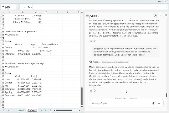
Copilot suggested several paths forward. Interaction terms like Age × EstimatedSalary can capture effects that a simple additive model might miss. Polynomial features can help address the nonlinear behavior we saw with EstimatedSalary in the Box Tidwell test. Feature selection methods can refine the model by focusing on the strongest predictors while reducing noise. These are the kinds of steps analysts consider once the baseline model is understood and the assumptions have been checked. None of them guarantee better performance, but they offer structured ways to experiment and push the model further.
ConclusionLogistic regression becomes much more approachable when Python and Copilot are available directly inside Excel. You can explore patterns, check assumptions, and interpret results without switching tools or fighting with add-ins. Copilot handles the mechanics and keeps the explanations clear, so you can focus on what the model is actually telling you.
At the same time, this workflow shows that even a clean dataset has limits. Logistic regression depends on certain assumptions, and real data does not always line up perfectly. EstimatedSalary’s nonlinear behavior is a good example. The model still works, but it hints at opportunities to improve things through transformations, interactions, or more flexible approaches. Copilot helps you explore those options, but your judgment guides the final call.
The big takeaway is that building and understanding models in Excel is no longer a chore. With Python and Copilot, you can create an interpretable model, evaluate it, and translate the results into real business insight. From here, you can refine the model, test new features, try different thresholds, or compare logistic regression with tree-based methods. Whatever direction you take, this workflow gives you a solid foundation to keep going.
The post Python in Excel: How to do logistic regression with Copilot first appeared on Stringfest Analytics.
November 12, 2025
Python in Excel: How to build optimization models with Copilot
Excel users typically turn to Solver for optimization, but let’s face it—Solver isn’t exactly user-friendly, with its confusing menus, tricky constraints, and cryptic error messages. Luckily, there’s another option: Python in Excel’s Advanced Analysis.
But here’s the catch: Advanced Analysis expects neatly structured datasets with clear rows and columns. Optimization problems, however, usually involve exploring relationships between variables, calculations, and constraints, making them quite different from typical data analysis tasks.
That means we’ll need a creative workaround, but it’s also a great chance to rethink optimization and discover what’s possible with Excel and Python together. Ready? Open a blank workbook and type “Advanced Analysis with Python” into Copilot to launch Advanced Analysis and get started.
Example 1: Product optimizationProduct optimization is a classic analytics problem, and Python in Excel gives us a surprisingly clean way to model it without Solver. In this example we’re working with a simple two-product scenario. I frame it almost like a word problem: lay out the parameters, constraints, and objective in plain language, then hand the entire setup to Copilot.
Copilot interprets the problem and returns the optimal solution:
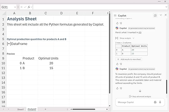
The entire optimization model is translated into and then executed in Python. It’s helpful to look at the code Copilot generates behind the scenes:
If you know Python, you’ll notice it uses plain lists, tuples, and NumPy arrays rather than DataFrames, even though Python in Excel normally wraps most inputs and outputs as DataFrames. That difference introduces a little friction when you’re doing optimization inside Excel. You’ll may notice in the following examples that important final values like total profit or total cost don’t always appear in the results, because they don’t fit cleanly into the output DataFrame Copilot creates. When that happens, you may need to ask Copilot for those numbers directly or print them from the code yourself.
Still, the workflow is straightforward: describe the optimization problem clearly, pass it to Copilot, and let Python build and solve the model directly inside Excel.
Three-product optimization with added constraintsHere’s a slightly more realistic scenario. Instead of choosing between two products, we now have three: A, B, and C. Each one has different profit margins and different demands on labor and material, and now we add real-world constraints like minimum production and maximum capacity. Again, I describe the entire optimization problem in plain language, just as you’d see it in a textbook or case study, and hand that straight to Copilot.
Copilot interprets the structure, builds a Python optimization model underneath, and returns the production plan.
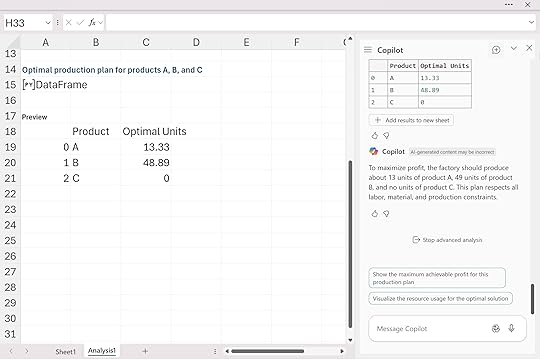
Python decides that the best mix is roughly 13 units of A, 49 units of B, and zero units of C. That result fully respects the labor and material limits, meets the minimum production requirement for A, and stays under the cap for C.
As with the previous example, you don’t automatically see the total profit or resource utilization in the output table. Those values exist in the Python environment (or could be easily produced), but they’re not displayed unless you explicitly ask for them.
Minimizing shipping costs across locationsThis last example shifts from production planning to a classic transportation problem. We have two warehouses and three retail stores, each with its own shipping cost, capacity, and demand. Again, I describe the entire problem as a word-problem: the costs, the capacities, the store requirements, and the objective of minimizing total shipping cost.
Copilot takes that plain-language description, builds the underlying optimization model in Python, and returns the shipment plan.
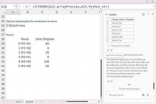
Warehouse 1 fully supplies Store 1 and part of Store 3, while Warehouse 2 picks up the remaining demand for Stores 2 and 3. Some routes end up with zero shipments because the optimizer naturally avoids expensive or unnecessary paths. And just like before, the output appears as a small DataFrame because that’s the default format for Python in Excel. If you want additional information like the total minimized cost you’d need to ask Copilot for it or extract it directly from the Python code.
Want to check your results against mine? Download the solution workbook below:
Download the solution workbook here
In summary, while Excel users traditionally turn to Solver for optimization, Python in Excel’s Advanced Analysis offers an attractive alternative. This approach simplifies model building by allowing users to frame optimization scenarios clearly in everyday language, bypassing Solver’s often complex interface. Leveraging Python’s powerful analytical capabilities directly within Excel makes this method intuitive and accessible.
However, it’s important to recognize some limitations. The optimization packages available within Python in Excel—primarily SciPy, NumPy, and pandas—can effectively handle many scenarios similar to Solver’s linear and nonlinear optimization tasks. Yet, advanced capabilities such as integer programming (available via Solver’s GRG or Evolutionary engines) or convex optimization tasks typically handled by specialized libraries like PuLP or CVXOPT aren’t supported within the current Python environment in Excel.
Additionally, users may encounter issues where essential outputs, like total profits or minimized costs, aren’t immediately visible and require manual extraction from the Python environment or additional prompts to Copilot.
By clearly defining optimization problems in plain language and using Python libraries available in Excel, you can streamline complex modeling tasks and gain practical insights without leaving the familiar Excel interface.
The post Python in Excel: How to build optimization models with Copilot first appeared on Stringfest Analytics.
Python in Excel: How to conduct linear regression with Copilot
Data and tech trends come and go, but linear regression has remained one of the most reliable tools in a data analyst’s toolbox. It helps you identify relationships, test hypotheses, and make predictions with a clear view of how different factors influence outcomes. Whether you’re working in finance, marketing, manufacturing, or real estate, few methods match linear regression for both clarity and ease of use.
For all the benefits, however, Excel’s built-in regression tools were never very user friendly. You had to load the Analysis ToolPak (if you could find it) step through a dated wizard, and then make sense of an output sheet that offered little guidance. Changing your model or presenting the results to others was awkward.
With Copilot, things are much smoother. You can build more advanced models with Python in Excel, understand how they work, and interpret the results directly within your workbook. It’s easier to see what your data is telling you and focus on meaningful conclusions rather than the mechanics.
We’ll explore this using a fuel economy dataset. Download the exercise file below to follow along.
Download the exercise file here
If you haven’t used the Advanced Analysis with Python feature yet, take a look at this post:
How to get started with Advanced Analysis with Python for Copilot in Excel
To get started, we’ll run a very simple linear regression: just one dependent and one independent variable. It’s a good habit to make the scope of your model explicit, even when you’re testing something small. In this case, it makes sense to treat mpg as the variable we’re trying to explain and weight as the factor we think influences it.
Here’s the Copilot prompt I used:
“Run a linear regression in Python where mpg is the dependent variable and weight is the independent variable. Include a summary of the results.”
Copilot automatically fitted the model using the dataset and produced the following regression summary:
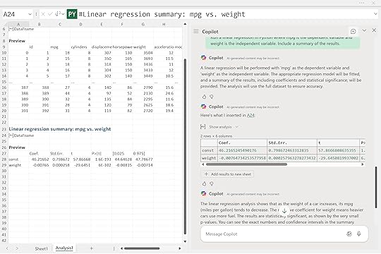
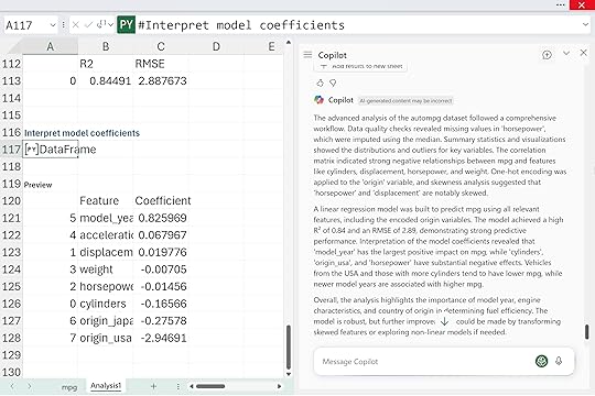
The interpretation is straightforward: as a car’s weight increases, its fuel efficiency tends to decline. The negative coefficient for weight means heavier vehicles use more fuel. The very small p-value confirms the relationship is statistically significant.
This is the classic starting point for regression analysis: one variable at a time, clear direction, and easily interpretable results. From here, we can begin layering in more predictors to see how horsepower, displacement, or cylinder count refine the story.
Adding more predictors and checking model diagnosticsNow that we’ve built our first model, it’s natural to wonder what other factors might influence fuel economy. Weight appears significant, but horsepower and acceleration could also play a part.
As we start refining our models, we need a way to tell if each new version is actually improving. Two standard metrics help with this: R-squared, which shows how much of the variation in mpg is explained by the predictors, and RMSE, which measures the average prediction error in miles per gallon.
Here’s the Copilot prompt:
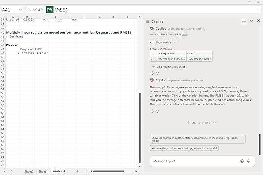
The R-squared value of about 0.71 means roughly 71 percent of the variation in fuel efficiency is explained by these three variables. The RMSE of 4.22 means the model’s predictions are off by about four miles per gallon on average. It’s a noticeable improvement over our single-variable model and a good sign that we’re moving in the right direction.
Visualizing predicted versus actual valuesOnce you’ve built a model and reviewed the metrics, it’s important to see how well the predictions line up with reality. A quick visual check often reveals patterns or problems that numbers alone can miss.
“Plot the predicted vs actual mpg values from the model to check how well the regression fits. Include a line showing perfect predictions for reference.”
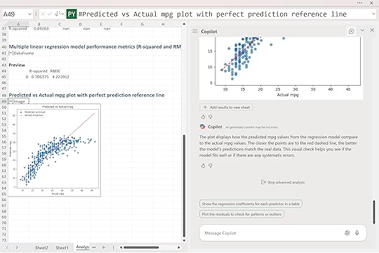
Copilot produced a scatter plot comparing the model’s predicted mpg values with the actual ones. Each point represents a car in the dataset. The red dashed line shows what perfect predictions would look like, where predicted and actual values are exactly equal.
This visualization gives a quick gut check on model performance. The tighter the points hug that line, the stronger the predictive power. And while the model isn’t perfect, it’s doing a solid job of explaining how weight, horsepower, and acceleration interact to influence fuel efficiency.
Interpreting model coefficientsYou might be wondering how each variable contributes. That’s where interpretation comes in, and Copilot can help you reason through it, not just calculate.
Here’s the prompt:
“Interpret the coefficients of the model using statsmodels. Which features have the biggest impact on mpg and in what direction? Explain in plain language.”
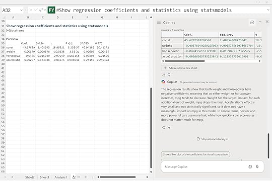
Copilot returned a summary showing that both weight and horsepower have negative coefficients. This means that as either of these increases, fuel efficiency tends to decrease. Weight has the strongest influence. Each additional unit of weight leads to the largest drop in miles per gallon. Horsepower also lowers mpg, though not quite as sharply.
Acceleration, on the other hand, shows a very small and statistically insignificant coefficient, suggesting it doesn’t meaningfully affect fuel economy in this dataset. In other words, how quickly a car accelerates doesn’t matter much for mpg once weight and horsepower are already accounted for.
Together, these results tell a clear story: heavier and more powerful cars use more fuel, while quick acceleration on its own doesn’t add much explanatory value.
Checking model assumptionsOnce you’ve built and interpreted your model, it’s a good idea to run a few quick diagnostics to make sure the basic assumptions of linear regression hold. One of the most important checks is to look at the residuals, or the differences between the predicted and actual values.
Here’s the Copilot prompt:
“Plot the residuals of the model. Are they randomly distributed? Is there evidence of non-linearity or heteroskedasticity?“
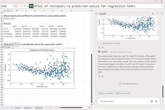
Copilot produced a residuals vs. predicted values plot. Ideally, the points should be scattered randomly around the zero line. That pattern suggests the model is capturing the data well and that errors are evenly spread across all prediction levels.
In this case, the residuals look mostly random, but there’s a slight funnel shape as mpg increases. That widening spread hints that the model may fit smaller cars a bit more consistently than larger ones, a mild sign of heteroskedasticity. It’s not severe, but it’s worth noting.
Residual plots are one of several ways to check whether your model is behaving properly. You can also look at whether the relationships between predictors and mpg appear roughly linear, whether residuals seem normally distributed, or whether there’s evidence that one error predicts the next. These checks help confirm that the model’s estimates are trustworthy.
Copilot can guide you through these steps, not just by generating plots or statistics, but by explaining what they mean and why they matter. In that sense, it acts less like a calculator and more like a coach, helping you understand the reasoning behind good modeling practice.
Making predictionsFinally, let’s put the model to work in a real-world example. In business settings, the real value of regression often isn’t just understanding relationships. It’s using those relationships to make predictions. Decision-makers care less about the exact slope of a line and more about what it means for future outcomes: how a change in product weight, horsepower, or price might affect performance or profit. A well-built model lets you turn analysis into foresight.
Here’s the Copilot prompt:
“Given a car with 3000 lbs weight, 130 horsepower, and 15 seconds of acceleration, use the regression model to predict mpg.“
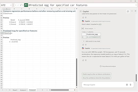
Copilot returned a predicted fuel efficiency of about 21.6 miles per gallon.
That means for a car with those specifications, the model expects it to travel roughly 21 and a half miles on a gallon of fuel. This is where regression analysis becomes more than just theory. You can use it to estimate outcomes for new observations, guide design tradeoffs, or compare how different features affect performance.
ConclusionIinear regression remains one of the most practical and interpretable tools in data analysis, and Copilot makes it easier than ever to use inside Excel. Even a simple model can uncover useful insights when built thoughtfully and checked carefully. Metrics like R-squared and RMSE help quantify performance, but visuals and diagnostics often reveal the places where your model fits well and where it struggles.
And in the business world, the real power of regression lies in prediction. The ability to estimate how changes in one factor might influence another turns analysis into something decision-ready.
That said, linear regression isn’t magic. It assumes straight-line relationships and evenly distributed errors, which don’t always hold up with messy real-world data. Outliers, overlapping variables, or curved relationships can throw things off, and that’s where judgment comes in. Copilot can automate the steps, but it still takes a human eye to decide what makes sense.
From here, you might explore adding interaction terms, adjusting variables to handle nonlinearity, or comparing results to more flexible models like decision trees or random forests. You could even use Copilot to test cross-validation or experiment with feature selection to see how stable your model really is.
The post Python in Excel: How to conduct linear regression with Copilot first appeared on Stringfest Analytics.
November 11, 2025
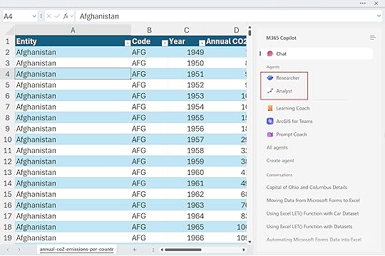
How to use Researcher and Analyst agents in Copilot for Excel
Copilot in Excel started as your built-in AI assistant, something you could chat with right inside your workbook. You could ask natural language questions like “summarize sales by region” or “find trends in this data,” and Copilot would instantly generate the right formulas, charts, or summaries to help you explore your data.
Now we’re entering what Microsoft calls the agentic era, a new stage where AI doesn’t just assist you but begins to take action. Inside Excel, this means you can call on specialized agents, pre-built and task-focused versions of Copilot that can reason about your data, gather context, and act on your behalf.
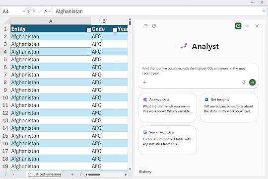
To see what this looks like in practice, we’ll use a dataset on global CO₂ emissions. Within Excel, two pre-built agents available for Microsoft 365, Researcher and Analyst, offer different perspectives on this data. The Researcher agent helps you understand context and background, while the Analyst agent focuses on computation and insights.
Together they show how Copilot is evolving from a simple assistant into a true reasoning partner for your data. Let’s see it in action. Download the exercise file below and follow along.
Download the exercise file here
To find these agents in Excel, open the Copilot button and select Copilot Chat. Then, toggle the navigation pane in the upper-left corner of the window. You’ll see a list of agents, some preloaded by Microsoft, others that you can sync or even create yourself. You’ll also notice that Copilot Chat is listed among them. The implication here is that Copilot is just one of many agents you can work with.
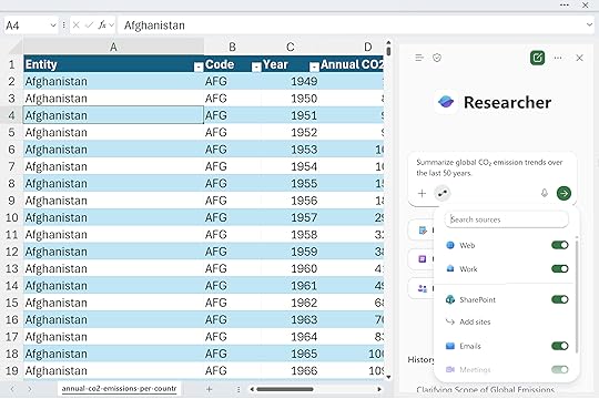
 Researcher Agent: context and framing
Unlike the traditional Copilot in Excel experience you might be used to, Researcher doesn’t interact directly with your workbook data. Instead, it draws on trusted sources and knowledge models to help you shape and frame your analysis.
You might start by asking Researcher:
“Summarize global CO₂ emission trends over the last 50 years.”
You can even choose what kinds of sources Researcher can draw from to provide context, whether that’s information from the web, internal company data, specific SharePoint sites or more.
After a few moments, Researcher produces a neatly formatted, report-style summary that brings together all the information sources it can access… including, yes, the data in your workbook.
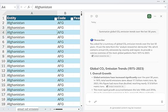
So even though it doesn’t interact directly with your data in the same way Copilot does, it can still read it to inform its analysis. And because our data was stored in a properly structured Excel table with clear column headers, Copilot could understand it much more easily and generate cleaner, more relevant results.
Let’s look at one more example. The goal here again is to think broadly about how you’re approaching your research. Consider what kinds of context you might want to include, what questions are worth exploring, and what insights you might want to explain or connect back to the data itself.
“Explain how CO₂ emissions relate to GDP and industrialization.”
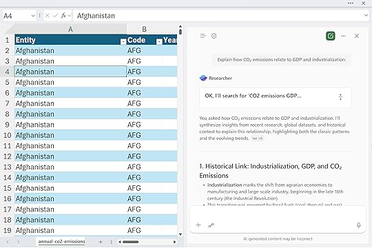
In other words, think about the bigger story of how you came across this data, why it matters, and what perspective you’re trying to uncover through your analysis. Rather than performing calculations, you’re using Researcher to think through the problem, define your approach, and clarify what matters.
In short, the researcher helps you focus on the “why” behind your work, giving you the background and conceptual grounding to make your data exploration meaningful. What makes this an agent is that it operates with a defined purpose and set of capabilities. It doesn’t just respond to a single question and stop there. It reasons across multiple sources, builds structured outputs like reports or summaries, and adapts its behavior based on your prompts and settings.
Analyst Agent: Data-driven executionOnce you’ve set the direction, the next step is analysis. The Analyst agent operates differently from Researcher because it works directly with your Excel data. You can also upload additional datasets if you want to expand its scope. This is where the idea of an agent really starts to come to life. Analyst can plan, reason, and carry out a sequence of steps to accomplish a defined goal.
You might ask Analyst to do things like:
“Find the top five countries with the highest CO₂ emissions in the most recent year.”
Notice that Analyst doesn’t search the web or pull in outside information. Its focus is entirely on the data at hand, making it ideal for in-depth, workbook-level analysis. In many ways, it operates like the Advanced Analysis feature of Copilot, where you can ask to perform more complex or custom computations.
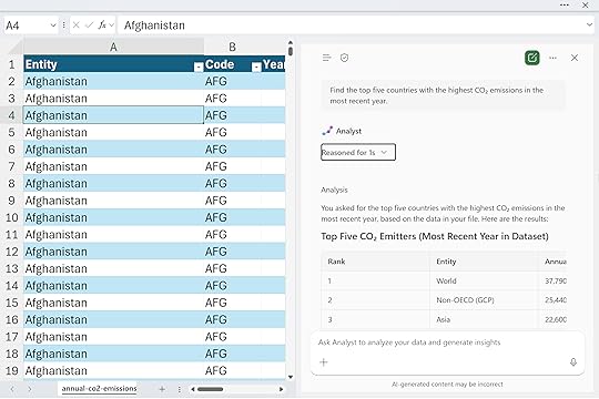
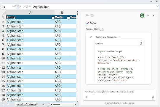
If you open the dropdown menu while it’s running, you’ll see exactly what’s happening behind the scenes: much like Advanced Analysis, Python code is being generated and executed to carry out the analysis. This gives you transparency into how the results are produced and lets you learn from or even customize the underlying logic if you want to refine your approach further.
Please note that there’s a lot happening behind the scenes here: reasoning loops, code checks, and data validations running in sequence. It may take a little time to process, so be patient while the agent works through each step to deliver accurate and reliable results.
Next, I’ll ask for a data visualization:
“Create a chart showing total CO₂ emissions over time for the top three countries.”
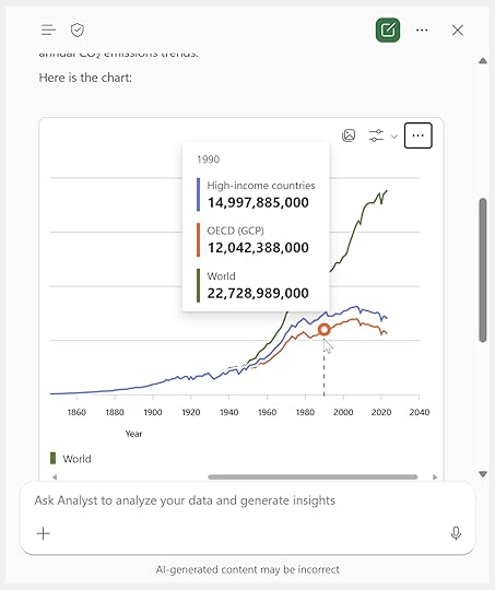
Not only do I get a clean, well-formatted chart in return, but it even includes interactive tooltips. This visualization is created using a Python library called Plotly, which unfortunately isn’t yet supported natively in Python in Excel.
However, the underlying code is fully visible, so you can copy it, save the image, or adapt it as needed. With a bit of help from Copilot, it wouldn’t take much to refactor this Plotly chart into a native Python in Excel visualization.
What makes Analyst an agent is that it doesn’t just execute a single command or calculation. It operates with intent and autonomy toward a defined analytical goal. It plans a sequence of reasoning steps, checks its own work, and adapts as it goes, much like a skilled analyst would. Rather than returning one-off results, it manages a full analytical workflow: identifying the right computations, generating Python code, validating outcomes, and presenting insights in clear, visual form.
ConclusionResearcher gives you context. Analyst gives you execution. Together, they show how Copilot in Excel is moving from a simple helper to an intelligent partner that can reason, plan, and act. This builds on the basic Copilot experience. Where Copilot Chat handled single questions or formulas, agents like Researcher and Analyst can connect steps, hold context, and adapt to your goals.
Tools like Copilot Studio and Power Automate will only extend this further, letting you design full workflows that link multiple agents and data sources. Together, they form a growing Excel AI stack built for reasoning, automation, and insight:
Thanks for exploring this with me. I hope it helps you see how these new agentic tools can take your Excel work to the next level and inspire new ways to analyze, automate, and create with your data.
The post How to use Researcher and Analyst agents in Copilot for Excel first appeared on Stringfest Analytics.
November 5, 2025
How to understand Microsoft Fabric as an Excel user
As Microsoft’s data ecosystem continues to evolve, Excel users are hearing more about Fabric, Power BI, and Dataverse. Many are wondering how all these elements fit together. Excel has long been a cornerstone of data analysis and reporting, but as organizations move toward cloud-first, AI-driven architectures, understanding this broader ecosystem is essential.
This post explains how Fabric, Power BI, and Dataverse relate to one another, what roles they play in Microsoft’s data architecture and why this matters for Excel users.
Fabric, OneLake and Microsoft’s data architectureMicrosoft Fabric is a unified data platform that brings together storage, analytics, governance, and AI under one umbrella. You can think of it as the foundation upon which modern Microsoft data tools are built.
At its core lies OneLake, a single, organization-wide data lake that serves as the “OneDrive for data.” It’s designed to eliminate data silos and ensure that every analytics tool, from Excel to Power BI to SQL, works with the same, trusted datasets.
Fabric unifies capabilities from technologies like Azure Data Factory, Synapse, and Power BI into one environment. For Excel users, this means that the workbooks you create, the data models you connect to, and the reports you share can all be part of a broader, governed ecosystem rather than isolated files. In other words, you can spend less time managing copies of data and more time analyzing it.
Power BI as a layer of FabricPower BI is no longer just a visualization tool. It’s an essential part of Fabric. The relationship between Power BI and Fabric is best described as semantic + platform:
Fabric provides the infrastructure: storage (OneLake), compute, and governance.Power BI provides the semantic model: how data is organized, related, and presented.In practice, Power BI runs on Fabric. When you create a Power BI dataset, it’s stored in OneLake. When you build a report, it can connect to the same Fabric-based data model that other tools (including Excel) use.
ExampleA sales team might store raw transaction data in Fabric’s OneLake. Power BI builds a semantic model on top of that data, defining measures such as revenue, profit margin, and year-over-year growth. Excel users can then connect directly to that semantic model, creating PivotTables or custom reports without duplicating data or logic.
For Excel users, this means instead of relying on manually updated spreadsheets or one-off exports, you can work directly with governed, version-controlled data that’s consistent across the organization.
Dataverse and the Power Platform: The operational counterpartIf Fabric is the analytical backbone, Dataverse is the operational brain of the Power Platform.
Microsoft Dataverse stores structured, relational business data used by Power Apps, Power Automate, Power Pages, and Copilot Studio. Unlike Fabric, which is optimized for analytics and large-scale storage, Dataverse is optimized for transactional operations and business workflows.
While Fabric and Dataverse serve different purposes, Microsoft is steadily connecting them. For example, Dataverse data can be shared into Fabric via OneLake shortcuts, making it available for deeper analysis in Power BI or Excel.
ExampleA company’s HR team might use a Power App built on Dataverse to track employee training. That same data can be shared to Fabric, where analysts use Excel or Power BI to measure completion rates, visualize trends, and correlate training with performance metrics.
For Excel users, this means that the data you analyze is directly tied to the systems running the business. No more CSV exports or outdated files. Your reports can be live reflections of real operational data.
How Excel fits into this landscapeExcel sits comfortably across both worlds:
Excel can connect to Fabric datasets or Power BI semantic models for governed reporting. Excel can update or reference Dataverse data through Power Automate or the Dataverse connector. Tools like Power Query, Python, and Copilot in Excel can leverage both Fabric and Power Platform data sources to summarize, generate, or explain insights, all within the familiar Excel interface.Example:An analyst could open Excel, connect to a Fabric dataset of company financials, and use Copilot to summarize quarterly trends and identify outliers. Behind the scenes, that analysis might draw on data stored in OneLake, modeled in Power BI, and enriched through a Power Automate flow from Dataverse.
Comparing the core componentsTo put all of this into perspective, it helps to compare the key layers of the Microsoft data ecosystem and how Excel interacts with each. Understanding these roles clarifies where Excel fits and why it matters.
PlatformPrimary FunctionOptimized ForExcel’s RoleFabricUnified analytics platform (OneLake storage)Analytical workloads, AI, reportingConnect to shared datasets and create governed reportsPower BIVisualization and semantic modeling layerBusiness intelligence and dashboardsAnalyze and visualize data models from FabricDataverseOperational data platformApps, workflows, and transactional dataServe as source/target for automated workflowsPower PlatformIntegration and automation layerConnecting systems and dataTrigger or respond to actions using Excel dataWhen you understand this stack, you can start building workflows that make Excel a strategic player in your data operations rather than just a spreadsheet tool.
Common workflows for Excel usersUnderstanding these systems conceptually is one thing, seeing them in action is another. The following examples show how Excel can act as a bridge between Fabric, Power BI, and Dataverse in real business workflows.
ScenarioWhat’s HappeningTools InvolvedBuilding a shared datasetData loaded to Fabric and modeled in Power BI; Excel connects directly for analysisFabric, Power BI, ExcelAutomating data refreshPower Automate flow triggers Fabric dataset refresh when Excel data updatesPower Automate, Fabric, ExcelIntegrating operational dataDataverse stores CRM records that sync into Fabric for analysisDataverse, Fabric, Power BICreating an AI-assisted reportExcel Copilot analyzes a Fabric dataset and generates narrative insightsFabric, Copilot for ExcelThese use cases show how Excel users can extend their reach into automation, AI, and advanced analytics, without leaving Excel itself.
Why this mattersMany Copilot and AI-driven capabilities across Fabric the Power Platform rely on access to data in Fabric or Dataverse. Understanding how these systems interact allows Excel users to:
Communicate effectively with IT and data teams about data sources and permissions.Design smarter workflows that avoid redundant data silos.Unlock Copilot capabilities that depend on connected, governed data.By understanding how data moves through Fabric and the Power Platform, you’ll be well positioned to future-proof your Excel skills and boost your value as an analyst. Even if you don’t yet have the licenses or IT permissions to use every new workflow these tools enable, you’ll still stay aligned with modern trends in data architecture and AI-driven analytics.
ConclusionExcel remains a critical front door to Microsoft’s data strategy. Its role is evolving from a standalone spreadsheet tool to a gateway into a connected data ecosystem powered by Fabric, Power BI, and Dataverse.
By understanding these relationships, Excel users can modernize their analysis, automate their reporting, and collaborate with IT and data teams on equal footing. In short: you don’t need to stop being an Excel expert. You just need to expand your world.
For more details, explore Microsoft’s documentation for Fabric, Power BI, and Power Platform.
If you’d like some help thinking through how all these pieces fit together and how to future-proof your data strategy, workflows, and talent you can book a free discovery call below:
The post How to understand Microsoft Fabric as an Excel user first appeared on Stringfest Analytics.
November 3, 2025
How to use Copilot in Excel for insurance claims data
A lot of people are excited about Copilot, but they don’t just want to see it summarize the same old generic, synthetic datasets again. They want to see what it can actually do for them.
If you work in insurance, this one’s for you. We’ll walk through how to use Copilot in Excel to extract key details from claims, automate text reviews, and uncover insights that would have taken hours to find manually. From formatting and calculated columns to advanced analysis with Python, here’s how to turn your everyday insurance data into clear, actionable intelligence, all without ever leaving Excel.
To follow along, download the exercise file below:
Download the exercise file here
This dataset contains real-world insurance claims, and we’ll perform a practical, hands-on analysis using that data.
Formatting and calculated columnsThe easiest way to get started with Copilot in Excel is often to work with your columns, especially if your data is in a table format (and it should be). Copilot understands structure, so the more organized your data is, the better it performs. A great starting point is reformatting your columns or creating calculated ones. Here are some example prompts.
Notice how I’m being very specific with the column names and phrasing things like a programmer would. That precision helps Copilot understand exactly what you want it to do.
“Convert the ‘policy_bind_date’ and ‘incident_date’ columns into standardized date formats.”
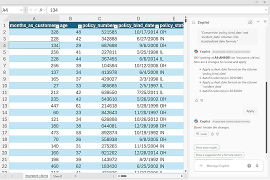
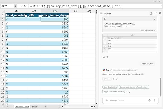
Create a new calculated column ‘policy_tenure_days’ showing the number of days between ‘policy_bind_date’ and ‘incident_date’ to measure how long customers held their policy before filing a claim.
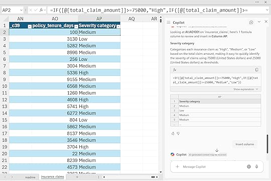
“Categorize claims into ‘High’, ‘Medium’, or ‘Low’ severity based on ‘total_claim_amount’.”
For more help working with formulas and functions, check out my LinkedIn Learning course.
Excel Copilot: Working with Formulas and Functionshttps://t.co/z1FdE9zKsz
— George Mount (@gjmount) November 3, 2025
What we did not really cover here is using Copilot for one-off formulas and functions like you might in a financial model. To be fair, this is one area where Copilot struggles a bit. It works best when your data model is structured and clear, not when it has to scan a large, loosely connected workbook.
Financial models often rely on ad hoc formulas and cross-sheet links that only make sense in context, which makes them tricky for Copilot to interpret. In those cases, you might actually find it easier to use Agent Mode to build an updated workbook instead of trying to repair the existing one. Starting fresh gives the AI a cleaner structure to follow and often leads to faster, more reliable results.
Copilot can even help with conditional formatting. This is one of those places where the more specific you are, the more controlled and meaningful the output will be. In the examples below, I’m telling Copilot exactly which colors to use and what thresholds they map to.
“Apply conditional formatting to the ‘total_claim_amount’ column, highlighting amounts above $10,000 in red, amounts between $5,000 and $10,000 in yellow, and amounts below $5,000 in green.”
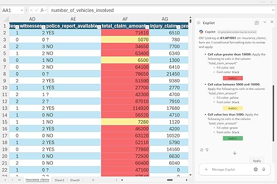
You could just ask Copilot to “add conditional formatting” to a column and let it take its best guess, but the result might not mean much. Sometimes that’s fine if you’re just brainstorming ideas or exploring trends. Just make sure you can always explain your reasoning and turn those visuals into something useful, not just sugar for your stakeholders.
Summary PivotTables and PivotChartsNow we can actually get into analyzing the data. I find that PivotTables and charts are usually the best tools to use with Copilot for this stage. It is often a good idea to specifically ask for these artifacts in your prompt. Otherwise, Copilot might generate a random Python code block instead, which probably is not what you wanted (we’ll look at using Python in a more controlled manner later in this post).
If you are looking to explore or summarize a dataset, start by asking Copilot to create PivotTables and PivotCharts. Once they are built, Copilot can help make small adjustments to them, though it may not handle every detail. For more complex refinements, you can ask Copilot more generally for high-level guidance.
If you would like more structured help with PivotTables and Copilot, check out my LinkedIn Learning course on the topic:
Excel Copilot: Working with PivotTableshttps://t.co/NmopWSycZC
— George Mount (@gjmount) November 3, 2025
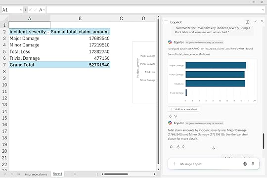
“Summarize the total claims by ‘incident_severity’ using a PivotTable and visualize with a bar chart.”
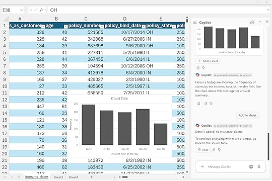
“Visualize claims frequency by the hour of the day using a histogram.”
These summaries go far beyond simple reports. They help you see which claim types drive the most losses, when incidents occur most frequently, and where underwriting or claims operations could focus next. For leaders, that means faster reviews and more consistent insight across teams.
Advanced Analysis with PythonAnd now we get to my favorite part of Copilot in Excel, the advanced analysis mode.
Maybe you have been a little underwhelmed so far with what Copilot can do. If you are an experienced Excel power user, you can already handle formulas, charts, and PivotTables in your sleep. Fair enough. But once you add Python to the mix, the possibilities expand fast.
Advanced analysis with Python lets you do things that would otherwise be very difficult or impossible to achieve with standard Excel tools. You can run correlations, model claim probabilities, and visualize risk distributions, all with plain-language prompts. You don’t need to be a Python or statistics expert, just analytical enough to know whether the results make sense.
To get started, use the phrase “Advanced analysis with Python” in Copilot. This opens a new message asking if you want to continue in that mode.
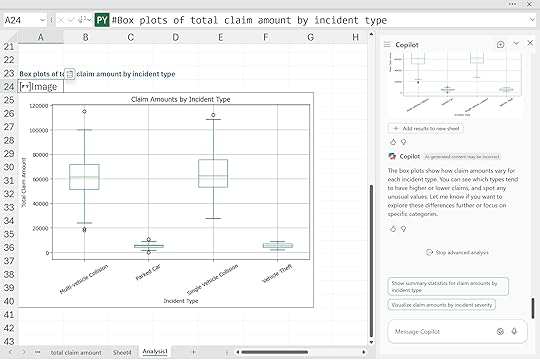
“Create box plots comparing claim amounts across different ‘incident_type’ categories.“
“Run a basic correlation analysis between ‘insured_age’ and ‘total_claim_amount’ to understand potential relationships, and visualize with a scatter plot.”
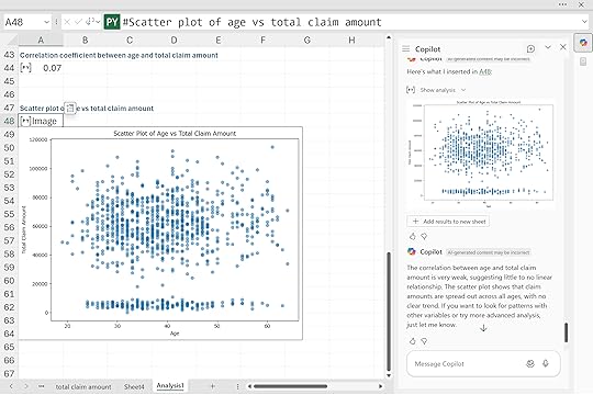
From there, we can ask Python to handle everything from visualizations to exploratory data analysis to full-on predictive modeling. It really is a powerhouse tool, and the best part is that we are doing all of this just through our prompts.
“Perform a logistic regression analysis predicting the likelihood of insurance claim fraud based on policy characteristics and incident details. Generate a ROC curve and confusion matrix to evaluate model performance.”
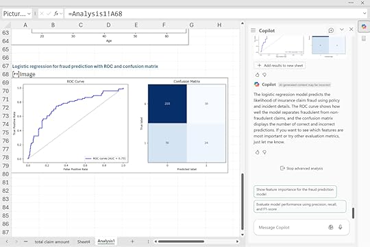
For insurers, this capability means identifying outliers faster, testing hypotheses on the fly, and validating models directly in Excel. It transforms spreadsheets from static reports into dynamic analytical workbenches.
ConclusionGenerative AI is changing how insurers use Excel. With Copilot, analysts can automate claim reviews, speed up audits, and uncover insights that support underwriting and risk management. It makes data analysis faster, clearer, and more accessible to teams who already know Excel well.
Copilot still depends on clean, well-structured data and human judgment. It can handle formulas, formatting, and even predictive modeling, but it needs clear direction and critical thinking to ensure accurate results. The best outcomes come when analysts combine their business knowledge with Copilot’s automation and analysis features.
As a next step, insurance teams should start by testing Copilot on a few key workflows such as claim reviews or loss ratio reports, learning where it saves the most time and produces the clearest insights. From there, the benefits can scale across departments.
If you want to make this technology work for your insurance company, book a free discovery call:
The post How to use Copilot in Excel for insurance claims data first appeared on Stringfest Analytics.