Tim Erickson's Blog
July 7, 2022
Time series without time on an axis
Long ago I promised a post (to come quickly; apparently I lied) about this topic.
If we have time-series data, we typically put time on the horizontal axis. But that’s not the only way to represent something that changes in time. There is an alternative that’s closely related to parametric equations and graphs.
Consider this typical physics-class situation: you have a weight on a spring moving up and down. You can plot its position as a function of time. For regular old Hooke-ian springs where  , that will be a sinusoid.
Now plot the velocity as a function of time. That will also be a sinusoid, but shifted by  , like this:
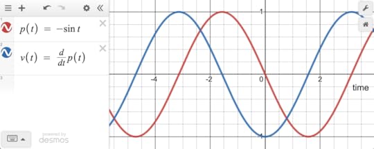 Position (red) and velocity (blue) for a weight on a spring. Or the bob of a pendulum. Or any number of things.
 These are normal time-series functions, drawn with time on the horizontal axis. But as you may remember, you can instead plot them with the position on the  axis and velocity on the
  , making a new point for every value of
  :
:
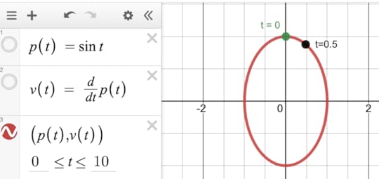 Velocity (y) against position (x). Two points are labeled with time, showing that in this diagram, as time passes, the point moves in a clockwise direction.
 There are many cool things about this, like what happens when the frequency of  is different from
  , or when the delay is not 90°, and you get a wide variety of Lissajous figures. Or when you plot the velocity of a chaotic system against position…but that would be more of a digression than we want here.
Can we ever see this in real-world data, like, not from our imagination of a physics lab activity? Sure!
Here is one of my favorites, drawn from the “Blodgett” dataset available at codap.xyz. There we have air temperature in the Blodgett forest over the course of a year. We also have soil temperature. Here is one day of both plotted as traditional time series:
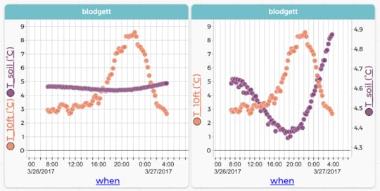 Air (orange) and soil (purple) temperatures for one day in March 2017. The left-hand graph uses the same scale for both.
 Now here is the same data plotted with soil temperature on the vertical axis and air on the horizontal. In this plot, time is going counterclockwise:
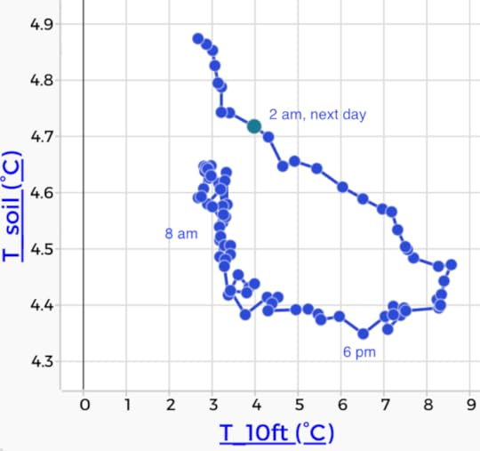 Soil versus air temperature. Time increases as you travel counterclockwise around the loop.
 If you’re like me, that graph does not immediately shout what’s going on. But with some practice, we realize that the shape of the loop tells us about the delay between the air temperature and the soil temperature.
The point being, there are more ways in heaven and earth [Horatio] to display time series. Usually, of course, stick time on the horizontal. But be open to intriguing alternatives.
May 18, 2022
Letter Frequencies (and more) in Wordle
Let’s assume you already know about Wordle. As you may know, Wordle uses a curated list of five-letter words. For example, it doesn’t include plurals of four-letter nouns (no BOOKS) or past tenses ending in ED (no TIMED). The list is easily discoverable online, at least I discovered one and maybe it’s the one used in the puzzle. You can see it in this CODAP document.
But this blog is about data, so that’s where we’re going. You know from growing up with (or learning) English that E is the most common letter. You might even remember a mnemonic such is ETAOIN SHRDLU that’s supposed to represent the top dozen letters by frequency. I once learned ETAONRISH for the same purpose. These listings are not the same! How could that be?
Of course, it’s because they must have been compiled from different sources of text. Consider: suppose Blanziflor uses the words in a dictionary, while Helena uses the text of today’s New York Times. Helena might have more T, H, and E than Blanziflor simply because THE appears many times in her text but only once in Blanziflor’s.
So it might be interesting to look at letter frequencies in the “Wordle corpus,” if only to get an idea of which letters to try to fit into your next guess.
So, for your exploration and enjoyment, here is a CODAP document (same link as above) with “my” Wordle list, broken down into individual letters using the “texty” plugin.
I get EAROT LISNC UY for the top twelve. See the graph at the top of this post.
To make that graph in CODAP, I grouped the data by letter, then made a new attribute to count() the number of appearances of each letter. That’s kind of an “intermediate” CODAP task with very little explanation; see if you can figure out how to do it.
The analysis also includes digraphs, that is, all the two-letter sequences, with the underscore “_” standing in for a space. So in the table below you see r_ (case 6) containing the last letter in CIGAR and _r (case 7) with the first letter in REBUT.
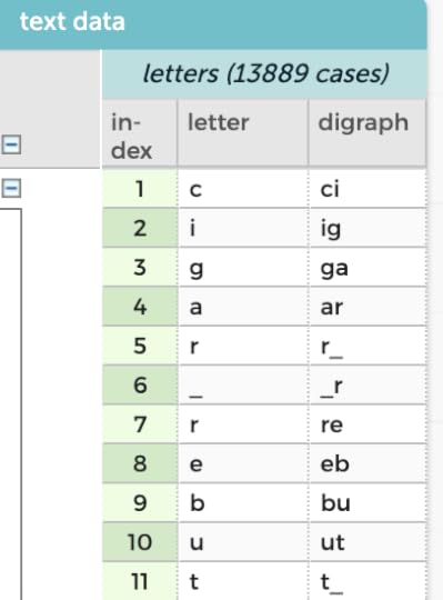
An interesting question here might be something like, “J is the least common letter. How many times does it appear? Is it always the first letter of the word?”
One more thing: is this cheating? Reasonable people can disagree; here’s how I draw that line: writing a version of WordleBot for personal use is an interesting programming challenge, but would be cheating for actually doing Wordle. Searching the word list using regular expressions is a no-no for sure. I think that looking at the word list while doing Wordle is still cheating, at least a little. But having looked at the word list is OK. Likewise, learning the frequencies of letters, I think, is OK: it’s enhanced common sense. It does not use the power of computing to be systematic and exhaustive.
December 30, 2021
Time Series! Smoothing and COVID (and folding, too)
Welcome to the third in a soon-to-end series in which I figure out what I think about time series data, and how it is different from the data we usually encounter in school assignments. We’re exploring what tools and techniques we might use with time series that we don’t traditionally cover in stats or science, and wondering whether maybe we should. For me and my CODAP buddies, it also raises the question of whether a tool like CODAP should have more built-in support for time series.
SmoothingOne of these tools is smoothing. There is smoothing (for example Loess smoothing) for other, non-function-y data, but smoothing is easier to understand with time series (or any other data that’s fundamentally a function; the previous post in this series explains this obsession with functions).
Since it’s December 2021, let’s stick with COVID and look at the number of new cases in the US by day (CODAP file here):
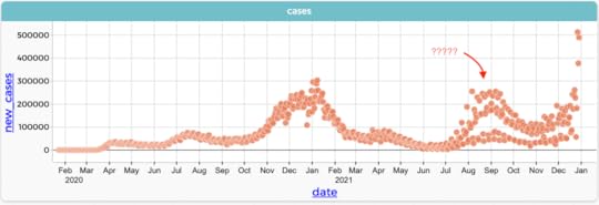 Daily newly reported COVID cases in the US. Data from https://ourworldindata.org/.
 Graph in CODAP
What a funny-looking graph! The question marks point to a region in about September 2021 where there seem to be several strands of case numbers. What’s going on? Have we put five different countries in here together by mistake?
No. Let’s zoom in and connect the dots:
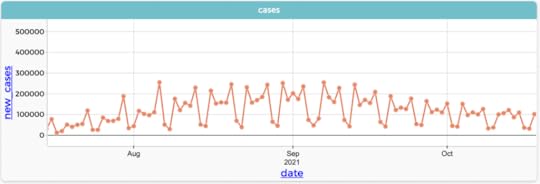 Same data, connected and zoomed in to August and September 2021
Looks kinda periodic, right? With a period of…seven. (The phenomenon of seeing the data as separate sequences is called aliasing.)
Oh! It’s weeks. And if you dig deeper, you see that the two “low” days in each period are Saturday and Sunday—except for that first weekend in September, which seems to have three days….ohhhh! Labor Day. Looking at the details highlights the human nature of data. The numbers are reported cases, and some people go home over the weekend and file a pack of new reports on Monday.
But we’re interested in the bigger picture, the overall pattern of COVID cases over the course of months rather than the details within an individual week. Students can come up with ideas about how to display that, and might come up with two strategies, two different data moves:
Do everything by the week instead of by the day. If you want the average daily total (instead of weekly totals), just add up all seven numbers from a week and divide by seven. This will produce one data value per week.Do everything by day, but for each day, average that day plus the six that follow it. This produces one value per day. This is more sophisticated, though not necessarily any better.For a small dataset, students can do these by hand and get a feel for how the smoothing works. But how to do it in technology requires thinking about the tools.
Weekly AveragesIn CODAP, for the weekly averages, they might create a new attribute for week_number (perhaps using floor(caseIndex/7)). Then group by that attribute (dragging it to the left) and create a new weekly average for each group. If you plot that against date, you get seven identical values per week. If you connect the dots and make them small, you see only the lines. Some options:
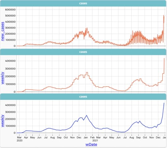 Same daily COVID case data. Top: the original data, just showing the lines. Middle: showing the weekly averages every day. Bottom: showing weekly averages once a week.
 This is not as easy as I made it sound. At the end of 2021, CODAP’s powerful grouping capabilities (see Awash in Data for many more details) can handle this, but not (ha ha) smoothly. It’s designed for other situations, not for this kind of work with time series data. (If you try it, and I hope you do, you’ll need to eliminate formulas while keeping values in a number of steps. Here is a link to a CODAP file with the original data.)
Smoothing: the rolling meanIf you want the sophisticated “rolling mean” solution in CODAP, you’re in luck! There’s a function called rollingMean:
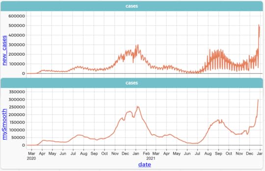 As above, but this time, Bottom shows the daily, smoothed values. The CODAP formula is rollingMean(new_cases, 7)
The difference between CODAP’s rolling mean and what we described before is that it takes the current value and instead of adding the next six (and dividing by seven), it adds the previous three and the following three.
Reflecting on the two methodsI think the first is conceptually easier for kids to grok than the second: just plot it by week.
The curse of the second, rolling-mean strategy is that you get this nice smooth result using one relatively-obscure function whether you understand the function or not. But if students can handle it, the second has some interesting properties, and is “open at the top”: it leads elsewhere. In particular, I think understanding it expands your understanding of the mean.
Here’s what I mean by that: Suppose you wanted to explain what was going on. You might use a metaphor like this:
Imagine a line of people, all equally spaced. You want to weigh them and plot the weight against where they are in the line. One way is, you put a scale on a little cart and run it along the line of people. When the cart gets to a person, they step on, and the weight gets recorded. Now imagine that everybody is close to the same weight, except for one really heavy person called Blanziflor. When you get to Blanziflor, you’ll see a spike in the graph.
Now imagine a bigger cart, one that’s as wide as seven people, and the scale will weigh them all together. As the cart rolls along, when one person gets on the front, another steps off the back. So the total weight gets greater by the weight of the person getting on, and less by the weight of the one leaving.
Now when you get to Blanziflor, the total goes up by a lot—the same amount as before—and stays high for as long as Blanziflor is on the scale: seven spots. But the scale records the total weight of seven people, so when you record the average weight, you have to divide the total by 7. That is, the rise of the average when Blanziflor is on the scale is only 1/7 of what it was when we weighed people one at a time. However, that rise goes on for seven times as long. It all balances out.
The result is that fluctuations in the values we get for the average—the rolling mean—are smaller than if we just plotted each data point. Even so, the values still take all the underlying data into account.
(Picture the animation that shows this. I don’t have time to make it right now, but imagination is powerful!)
Stats teachers will also recognize a connection to sample size and sampling distributions: the spread of the “sample mean” decreases as N increases, even though these are far from being random, independent samples.
To go further, notice that our cart, our moving window on the data, is rectangular: you’re either in the interval or you’re not, and everybody in the interval counts the same. It doesn’t have to be that way. You could count people near the edges less than the ones in the middle, doing a weighted average of their values. Then when Blanziflor stepped on, it wouldn’t be such a big jump—it would ramp up more gradually, and then gradually fall off. This leads to the idea of convolution, especially when you make this weighting function continuous, and instead of thinking carefully about how much to add and what to divide by, you just wheel out the big guns and integrate that sucker.
FoldingWith periodic data, folding or wave slicing is a powerful technique for understanding that periodicity, for example, by figuring out the period. It turns out I’ve already posted about this technique here, and developed that into a paper you can read.
The basic idea is to chop up the data into chunks one period long and superimpose them. The trick is that this “period” might be wrong, so you put it on a slider and adjust it dynamically. When things line up, you have it right!
A cool part of the underlying math is that you do the slicing using the modulo function, which hardly ever appears in math class, but shows up in CS all the time. Here is a salient illustration from the article…
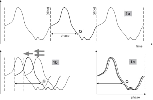 1a shows the data with the slices, one period apart.
 Also, notice point Q’s “phase,” which is how far it lies within its cycle.
1b shows the same data in the process of being superimposed
1c shows the completed superposition. It’s not exact because it’s data.
Notice that 1a‘s horizontal axis is time, but 1c‘s horizontal axis is phase.
Relevant CODAP formula for phase: time % period, where period is a slider.
I won’t spend more time on that here, except to say that this is another example of something that is not in introductory data analysis but that is useful when you analyze (periodic-ish) time series.
Next time: looking at time series when time is not on the horizontal axis. We’ll use phase-space diagrams to explore the effects of delay.
December 29, 2021
Time Series and Modeling
The second in a sequence of posts about time series. Here is the first one.
Students in traditional stats, as well as in science and math classes, learn linear modeling in the sense of finding a straight line that fits some data. Suitable data are often (but not always) time series: some phenomenon is increasing or decreasing regularly with time; you take repeated measurements; you plot the values against time; et voilà! A linear relationship.
Here is a data set I’ve used before. I put a pot of water on the stove, stuck a thermometer in the water, and turned on the flame. I recorded the time whenever the temperature passed another five degrees Celsius.
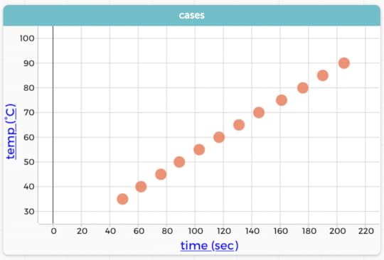 The author heated water on a stove. Graph in CODAP. We could clearly connect these dots with lines, and it would make sense.
A linear model looks appropriate here. In CODAP, we can add a movable line (or a least-squares line, but the “eyeball” values from a movable line are good enough) and get a slope and intercept.
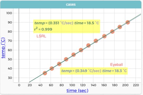 Same data, two models in CODAP: a least-squares line (LSRL) and an “eyeball” fit using a movable line.
One key thing for students to understand is the meaning of the slope and its units: about 0.35 degrees per second. By including the units, we give students a leg up in understanding what that slope means: every second, the temperature goes up by 0.35 degrees; it takes about three seconds to go up one degree. Furthermore, the slope is (well, looks) constant: that rate is the same early in the process and later, when the water is hot.
In this case, the intercept (18-ish degrees) is also meaningful: it was the temperature of the tap water. This only works because I started timing when I turned the flame on, so that time = 0.0 is the actual start of heating.
Anyway, all this is modeling pedagogy 101. Without going into all the details, four comments:
You can use the linear model to predict, but you have to be careful: if you go outside the range of the data, the model might not work. This is part of the point of using heating-water data: if we kept going, the temperature would stall at about 100 °C when it boils and the physics of the situation changes. The linear model looks good, but is it the best? It’s useful to make a residual plot, and if you do, you’ll see a pattern in the residuals that suggests that the slope is decreasing as the temperature increases. This is a higher-order effect consistent with Newton’s Law of Cooling. Learning to make and interpret residual plots is a whole ‘nother topic. There is nothing special about nonlinear models in time series. Use the same strategies you would use in other contexts. We might think of a time series of growth as being a great setting for an exponential model. Ha! It’s amazingly hard to find suitable, clearly-exponential data in the wild.Time Series, Functions, and RatesWhat’s special about time series when you do modeling?
A time series dataset is a function: there is only one value at every time. In contrast, consider the a linear-modeling task where you measure the weights of different volumes of sand. You would make a linear model, and make predictions and all that, but because it is possible to have two measurements with the same amount of sand, the data won’t pass the vertical-line test. It’s inappropriate in a graph to connect those dots with lines, whereas it is in the heating-water situation.
Because it is a function, you can always put a time series in order, and then you can compute the slope between adjacent points. This slope, as we discussed above, always has a clear meaning: it’s the (time) rate of change of the quantity, averaged over that interval. The next graph shows such a rate.
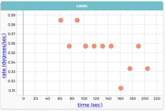 Plotting rate (the difference quotient) as a function of time. That is, the rate is generally going down because it takes more time to go up 5°.
 NB: The chunkiness comes from the fact that the times are to the nearest second; each lower rate is one more second between readings. Because the jagged pattern comes from the resolution of the data, I did not connect these points with lines!
NB2: the CODAP formula for rate is (temp-prev(temp))/(time-prev(time))
Notice that the linear model suggested that the slope is 0.35 °/sec, while the graph of these individual rates—though chunky—suggests that it’s decreasing from maybe 0.38 to 0.32 over the course of a couple of minutes. This is a different way of showing that a straight line may not be the best model, an interesting alternative to making a residual plot.
This slope-as-rate idea works in the non-function contexts, where, for example, the slope of the sand line might be in units of grams per cc, which has a clear meaning. (Isn’t it cool that density is a rate?) But a time series is a little different in the sense that if you do that slope calculation for adjacent points, you’re looking only at the data; there is no model distinct from the data itself: no least-squares line, just the line segments connecting the dots.
That is not to say that the model is useless, far from it. But we often compute these more instantaneous rates, e.g., the rise or fall of the number of COVID cases each day, and these are always possible to compute in time series data.
A gotcha for students: students will sometimes get complacent and think of the rate as the difference between adjacent points. That’s why it’s great to make sure they have to cope with datasets where the points are not equally spaced (as the heating water data are not equally spaced). That is, to get a rate and not just the difference, you have to divide by the difference in times. Slope, after all, is rise over run, not just rise. Notice how this leads directly to the definition of the derivative; wouldn’t it be great if every calculus student understood this before they took that course!
Next time: folding and smoothing and all that.
Another Aside about Traditional StatsLast time, I claimed that regular stats doesn’t go deeply into time series because (among other things) it’s not very inferential. That’s not completely fair for at least two reasons that relate to today’s topic:
As suggested above, regular intro stats does do least-squares linear models, sometimes even including transforming nonlinear data to make it linear. You might judge whether something is increasing by doing inference on the slope of a graph. That is, you might ask, is the slope of this graph greater than zero? This is true whether it’s a time series or not. Also, you can use randomization techniques (e.g., scrambling) for this task.December 28, 2021
Thinking about Teaching and Time Series
Time series data shows the same phenomenon taken at different times. It’s possible, therefore, to plot the data—traditionally with time on the horizontal axis—and see how the data values change with time. As in the “banner” graph above.
The graph tells a story; and we read it chronologically from left to right. As experienced graph-readers, we see the surges and dips in COVID cases, as well as the vertical omicron rise (and as of this writing we have no idea what will happen!).
We see graphs like this all the time in the news; right now, of course COVID is a topic of interest, but you’ll see time series about topics from temperature to stock prices to TV viewership.
The question for us teachers up to high school is, what do students need to know about time series? More pointedly for today, what can we think about as we plan lessons? My first take on this includes:
Basics: how do you read or make a time series graph? How do you know whether it should be treated as time series?Time series and modeling: linear models, rates, nonlinear patterns, and the road to calculus.Special tools that work with time series such as smoothing and folding.The idea of adjusting, as in “adjusting for inflation” or “seasonally adjusted.”Other sneaky and cool representations such as phase-space diagrams.Teaching Time Series BasicsI don’t have a lot to say here, except to imagine that this (a) is not hard, it’s just that students have never seen it before and (b) we can teach these basics embedded in other lessons, more as a just-in-time pedagogy thing than as a whole unit introducing the Principles of Time Series (heaven help us). I think that most of this could happen at middle school, but it’s not unreasonable to reinforce (or introduce) these skills at the high-school level.
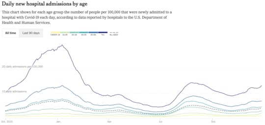 Also from the New York Times, 28 December 2021.
For example: imagine a lesson where you’re teaching about COVID and you look at a lot of published graphs of how things are changing. Ask students to identify which quantities are on which axis. Write these up on the board. Then, hey, everybody, what do you notice about what goes on which axis? Yeah, interesting: time seems to go on the horizontal axis in all these graphs. How does that connect with anything else you know about what goes on an axis?
You might also display a graph that’s not a time series and ask groups to describe what’s different about this graph compared to the time series. What is the graph maker trying to get across? Looking back at the time series, what story does that tell?
 (Not a time series! Still tells a story, but not in time.)
You can also ask questions that explicitly get at the time/rate/story aspects of a graph, like, “What was happening to the number of admissions in January 2021? How can you tell?” Or “When was the number of new admissions at a maximum? Why would we care?”
Finally, a small note: we expend some effort getting students making graphs by hand to stop connecting all the dots. But time series graphs are often an exception: because each data point connects to a previous point and to a successor, lines connecting the dots often make conceptual and numerical sense. In the example COVID case graph, it’s gone so far that they plot only the lines and leave the dots out!
(In CODAP, use the “ruler” palette in the graph to show connecting lines.)
That’s enough for today. More to come on other time-series topics…
…except for a longer aside…
Kvetch Corner: Stats courses and time seriesI’ll make a claim right away: in a class labeled statistics (like AP stats), the traditional curriculum doesn’t do much with time series at all. This is understandable because the topics and techniques are not about time series but rather are aiming towards inference questions (What is the confidence interval for this proportion? Did the treatment show a significant improvement?). I think it’s worth noticing, though, that time series are everywhere in our students’ lives, and that, with more data available, more technology to display it, and an increased presence of data science, our students might need (yea, deserve) to be exposed to time series more deliberately.
A hardened stats teacher might rightly say that a time series graph like the one above is really descriptive statistics, suitable only for the first few weeks of a serious course of study. I agree that it’s descriptive as opposed to inferential, but would say that today’s tools let us do more with descriptive stats (as in, much of data science) so we ought to look.
Why doesn’t traditional stats treat time series? One reason might be is that a lot of (beginning) statistical tools assume that data values are independent. But the whole point of time series is that we’re looking at a sequence that’s probably causally connected: the temperature today is related to the temperature yesterday. Looking at this another way, consider a dataset of daily COVID cases over a month. We can easily imagine asking students to calculate the standard deviation of the number of cases. This task is a bad idea, because the spread that you get doesn’t reflect natural variability in the data, but rather, at least partly (and often mostly) the change in that case rate over the course of the month.
October 1, 2021
How can you be awash in data? Let me count the ways.
Three.
I oversimplify, of course, but this is what I’m thinking about; and this came as a result of attending an advisory meeting about a cool project called Data Clubs. And as usual for this blog, we are using CODAP.
Elsewhere (especially in Awash in Data) I have talked about being awash because there are so many cases. When there are a lot of rows in the table, when you make a graph, there may be so many dots that you can’t see the pattern. One remedy to try is to use data moves such as filtering or grouping-and-summarizing (making aggregates), both of which reduce how many dots appear in your plots.
Another kind of awash happens when you have a lot of attributes. You have trouble figuring out what you even want to plot because there are so many choices. Sometimes you want to essentially filter columns in the table, or, alternatively, find a way to combine multiple columns into one. We developed a remedy for the former in work on the Writing Data Stories project in the form of a CODAP plug-in called Choosy that lets you hide columns easily. For the latter, write a formula to combine many columns into one—and then use Choosy to hide the many. (I call this a calculation data move, mutate for those of you in the tidyverse.)
But today, I saw something I had seen before, but never in quite this way—a third way of being awash.
We were looking at this dataset from the National Health Interview Survey. It’s about injuries sustained at leisure or during sports. And here is a typical kind of CODAP graph some students might make:
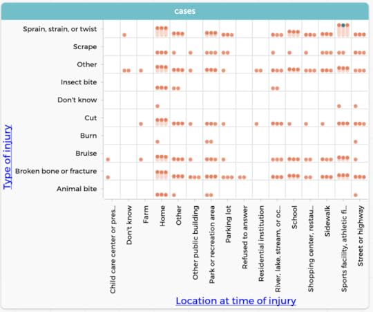 Type of injury (10 categories) by Location at time of injury (16 categories). Sheesh.
I kind of hate this kind of graph. It’s really hard to see anything in it, and it’s hard to use it to help make an argument. There are just too many cells and too many labels to read. Why? Because it’s two categoricals, and each one has a bunch of categories. What’s worse, some novice students seem to like these graphs a lot, maybe because they look very official and complicated. Michelle set me straight about part of this, though: although making sense of the numbers of dots in the cells is a fool’s errand, it’s interesting to see patterns in which cells have anything and which have nothing. So I don’t hate them anymore. They’re not useless.
Still, looking at it, I’m certainly awash, but in this new way: not from too many cases (rows) or attributes (columns), but from too many categories.
We don’t have great tools for this. One possibility is to do a (different) calculation data move, recoding the data into fewer categories (here is an example from Awash, so I guess I have thought about this, just not this way). But recoding is not always a good idea, and it may be a bridge too far for the middle-school students who are the target population for the Data Clubs project.
So I write this to remind me about this insight, and maybe inspire someone to figure out other ways to cope with a surfeit of categories.
March 12, 2020
Flowers! Phi! Codap!
Okay, something very short, with thanks to Avery Pickford: How do sunflowers organize their seeds? Why is phi the most irrational number? How are these two questions connected, and how can we model that in CODAP?
Here is the YouTube video from Numberphile that inspired it. Worth a watch.
And here is a CODAP document:
https://codap.concord.org/releases/latest/static/dg/en/cert/index.html#shared=149141
[image error]
November 6, 2019
Weather Models Reflection
Last time I described an idea about how to use matrices to study simple weather models. Really simple weather models; in fact, the model we used was a two-state Markov system. And like all good simple models, it was interesting enough and at the same time inaccurate enough to give us some meat to chew on.
I used it as one session in a teacher institute I just helped present (October 2019), where “matrices” was the topic we were given for the five-day, 40-contact-hour event. Neither my (excellent!) co-presenter Paola Castillo nor I would normally have subjected teachers to that amount of time, and we would never have spent that much time on that topic. But we were at the mercy of people at a higher pay grade, and the teachers, whom we adore, were great and gamely stuck with us.
One purpose I had in doing this session was to show a cool use for matrices that had nothing to do with solving systems of linear equations (which is the main use they have in their textbook).
Some takeaways:
Just running the model and recording data was fun and very important. Teachers were unfamiliar with the underlying idea, and although a few immediately “got it,” others needed time just to experience it.Making the connection between the randomness in the Markov model and thinking about natural frequencies did not appear to cause any problem. I suspect that this was not an indication of understanding, but rather a symptom of their not having had enough time with it to realize that they had a right to be confused. The diagram of the model was confusing.
Let’s take the last bullet first. The model looked like this:
[image error]Our two-state Markov weather model. Use one die to update today’s weather to tomorrow’s.
Of course I also explained it in words: “We will all start on a sunny day. To find the next day’s weather, roll one die; if you get a 1–5, tomorrow will be sunny. If you get a 6, it will rain. If it’s raining, you look over here to find the next day’s weather. Notice how it’s different…” and so forth.
But the numbers on the arrows flummoxed some teachers. One improvement might be to put the numbers closer to the circles that represent the states, like this:
[image error]
Another idea we came up with was to make spinners, one for each state:
[image error]Imagine these are spinners!
Spin “today’s weather” to find tomorrow’s.
This looks almost horoscopical

October 12, 2019
Weather Models and Matrices
Ack! I don’t have time to do justice to this right now, but any readers need to know if you don’t already that the geniuses at Desmos seem to be making a matrix calculator: https://www.desmos.com/matrix.
Having read that, you might rightly say, I can’t get to everything in my curriculum as it is, why are you bringing up matrices? (You might also say, Tim, I thought you were a data guy, what does this have to do with data?)
Let me address that first question (and forget the second): I’m about to go do a week of inservice in a district that, for reasons known only to them, have put matrices in their learning goals for high-school math. Their goal seems to be to learn procedures for using matrices to solve systems of linear equations.
I look at that and think, surely there are more interesting things to do with matrices. And there are!
One is to use matrices as transformation operators, like doing reflections and rotations using 2×2 matrices in the plane. Just using 0 and ±1, you can do a lot of great stuff. You can even introduce symmetry groups. But not in this post.
Because you can also use them to model the weather, and that’s what we’ll do, using the Desmos tool to help with calculation.
A very simple model
Suppose we say, this is California, mostly it doesn’t rain. So we’ll make a model of the weather that goes like this: every (simulated) day, you roll a die. If you roll 6, it rains. Otherwise it’s sunny.
This will have some long-term behavior that kinda-sorts resembles real weather but also really doesn’t. We can ask, what aspects of the simulated weather this algorithm generates are realistic, and what are not?
For one thing, 1/6 is probably not the fraction of days with precipitation. (If you want to find out the real proportion, you could play with my recent portal to weather data. See? I am a data guy!) We could adjust the model so the probability was right. We won’t do that, though, because I want to stick with dice.
We could point out that “sunny or rainy” is too coarse. We might want temperature, wind, amount of precipitation. Agreed. But that’s not where I’m going either.
Instead, we might note that the weather tends to be streaky. That’s another way of saying that the weather one day is not independent of the weather on another day: if it’s sunny today, there is a big chance that it will be sunny tomorrow—bigger than if it’s raining today.
So we will make a model that takes today’s weather into account when predicting tomorrow’s weather.
A Markov model
Here’s the model we will study:
If today is sunny, roll a die: if it’s a 6, tomorrow will be rainy, otherwise it’s still sunny.
If today is rainy, roll a die: if it’s a 5 or 6, tomorrow will be rainy again, otherwise, it will be sunny.
[image error]Diagram for our Markov model for the weather
We can now give the class a task: everybody model a month. We can ask all sorts of what-do-you-notice questions. We can assess the streakiness of sunny or rainy days, and so forth. We can muse about how to change the model to make it more like Seattle, or whether we should have different models in different seasons, or what our model should really depend on.
But let’s focus on this question: in this model, on average, what fraction of the days are rainy?
It should be clear that it ought to be more than 1/6, because of the rule for rainy days.
Do the data bear this out? Sure: especially when we have a class where everybody has done 30 days. We aggregate the data and see (for a fictitious class of 20, 600 days run in CODAP) that we have 479 sunny days and 121 rainy days, for a ratio of almost exactly 4:1, or 20% rainy days. About one-fifth. Which is more than one-sixth, as expected.
You might already be objecting: “but you have to start with either rain or sun—that will bias your results.” Not as much as you might think! More on this later.
How could we figure this out theoretically?
There is an amazingly elegant way that I will let you figure out. My theory about this is that we will usually approach problems first in an inefficient way, and only later will we see the cool, elegant solution—often inspired by the result we get inelegantly.
One such inelegant way is to start making a tree diagram. I will spare you this. Instead, I’ll modify that tree diagram and follow Gerd Gigerenzer and his colleagues in using natural frequencies.
Imagine that we have six situations (six, because dice), each starting with a sunny day. Of those six, on average, five will be sunny the next day and one will be rainy. That is, the six equally-likely outcomes—assuming we start sunny—are SS, SS, SS, SS, SS, and SR.
To do the next level, we have to start with 36 sunny days and let them progress; we get six each of our results from the previous paragraph. That’s 30 SS and 6 SR.
Of the 30 days that began SS, 5/6 (or 25) will still be sunny: SSS
The other 5 will be SSR
Of the six that began SR, four will be sunny: SRS
And the other two are still rainy: SRR.
If we look just at the most recent day, the sun:rain ratio is 29:7, or just under 1/5.
Finally, using matrices
At this point, we could move on to the next level, the third new day, perhaps starting with 216 days; or we could do this again starting with a rainy day, or we could count up all the days instead of just the last—but I want to get to the matrices while I have the time.
We can use matrices to do the calculation. Suppose we represent the initial sunny state with a vector like this:
[image error]
That one in the top is for sunny and the zero is for rainy.
I can make a matrix that evolves that state to the next day. I think figuring out that matrix would be a great challenge for students, but I haven’t done that part with actual students yet, so I will just write it here as a matrix A:
[image error]
Think deeply about why this is the matrix that represents the model

July 11, 2019
Sometimes, articles get done
Back in 2017, I gave a talk in which I spoke of “data moves.” These are things we do to data in order to analyze data. They’re all pretty obvious, though some are more cognitively demanding than others. They range from things like filtering (i.e., looking at a subset of the data) to joining (making a relationship between two datasets). The bee in my bonnet was that it seemed to me that in many cases, instructors might think that these should not be taught because they are not part of the curriculum—either because they are too simple and obvious or too complex and beyond-the-scope. I claimed (and still claim) that they’re important and that we should pay attention to them, acknowledge them when they come up, and occasionally even name them to students and reflect explicitly on how useful they are.
Of course there’s a great deal more to say. And because of that I wrote, with my co-PI’s, an actual, academic, peer-reviewed article—a “position paper”; this is not research—describing data moves. Any of you familiar with the vagaries of academic publishing know what a winding road that can be. But at last, here it is:
Erickson, T., Wilkerson, M., Finzer, W., & Reichsman, F. (2019). Data Moves. Technology Innovations in Statistics Education, 12(1). Retrieved from https://escholarship.org/uc/item/0mg8m7g6.
Then, in the same week, a guest blog post by Bill Finzer and me got published. Or dropped, or whatever. It’s about using CODAP to introduce some data science concepts. It even includes figures that are dynamic and interactive. Check out the post, but stay for the whole blog, it’s pretty interesting:
https://teachdatascience.com/codap/
Whew.


