Sherry Chiger's Blog
July 2, 2016
Looking for Me?
Surprise: I no longer maintain this blog. My portfolio site is sherry-chiger.squarespace.com. You can also find me at your-commerce.com. See you there!


April 3, 2015
Subject Lines: The Haiku of Marketing?
The rule of thumb with email subject lines is that the first 35 or so characters are the most critical (and alas, each space between words counts as a character). On mobile devices, that’s very roughly It’s tough to craft a catchy subject line that will stand out from the madding crowd—let alone one that will do so within the first 35 characters. I know this firsthand, as my day job requires me to write at least a dozen subject lines a day. Sometimes it’s tough not to resort to a brutally direct “Buy these items; I have a kid to feed” (37 characters, for what it’s worth).
Some brands turn to symbols or dingbats to tersely grab attention. On March 31 I received two emails with symbols in the subject lines.

Maybe it’s just me, but the apostrophe after the heart symbol throws me off; every single time I read this as “Spa Week’s Connecticut.” And I never did open the email.
I did open the email with the subject line below:

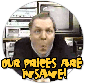
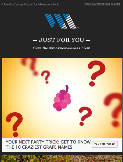
Not because I was interested in InSaNe grape names, but because I was curious as to whether the email itself was as cheesy as the subject line. It was not:

There seems to be a major discrepancy in tone and voice between the tacky subject line and the elegant, gently witty email. The sender, Wine Awesomeness, sells curated collections of wine, so the email itself feels brand appropriate. The subject line, on the other hand, would have been perfect for the late, little-lamented Crazy Eddie electronics chain.
 The ’70s were a magical time, kids.
Temple & Webster, an Australian home decor etailer, eschewed symbols for something a bit sneakier: a “Fwd:”

There’s something dishonest, to my mind, about pretending that the email was forwarded by someone I trust more than Temple & Webster, which with its faux “Fwd” hasn’t shown itself all that trustworthy. It reminds me of the trend a few years ago of sending out false “Oops, we goofed” emails: Apparently emails with apologetic subject lines had higher open rates, which led slews of brands to email apologies for ecommerce misdeeds such as slow site-load times and typos. Had all those goofs been genuine, it would have suggested that the average marketing pro had an IQ and work ethic similar to Homer Simpson’s.
Enough negativity. Here are two recent subject lines that I loved:
“Check out #4” from shopping app Keep, a scant 12 characters long. Who could resist the suggestion that an entire list of goodies were tucked within the email, and that #4 was especially fabulous? Not me; I opened the email.
“We Got Big Bags and We Cannot Lie” (33 characters in all), from Timbuk2, a marketer of (surprise!) bags and other accessories. It’s a bit cheeky, which is perfectly in keeping with the brand, but at the same time utterly straightforward.
Email subject lines are like haiku poetry. Too often, the focus on character count/syllable count results in uninspired doggerel. True masters, though, can produce art.
And yes, I just called email subject lines an art form. Hey, I’ve got to justify the hours I spend writing them somehow...
Some brands turn to symbols or dingbats to tersely grab attention. On March 31 I received two emails with symbols in the subject lines.

Maybe it’s just me, but the apostrophe after the heart symbol throws me off; every single time I read this as “Spa Week’s Connecticut.” And I never did open the email.
I did open the email with the subject line below:

Not because I was interested in InSaNe grape names, but because I was curious as to whether the email itself was as cheesy as the subject line. It was not:
There seems to be a major discrepancy in tone and voice between the tacky subject line and the elegant, gently witty email. The sender, Wine Awesomeness, sells curated collections of wine, so the email itself feels brand appropriate. The subject line, on the other hand, would have been perfect for the late, little-lamented Crazy Eddie electronics chain.
 The ’70s were a magical time, kids.
 Temple & Webster, an Australian home decor etailer, eschewed symbols for something a bit sneakier: a “Fwd:”

There’s something dishonest, to my mind, about pretending that the email was forwarded by someone I trust more than Temple & Webster, which with its faux “Fwd” hasn’t shown itself all that trustworthy. It reminds me of the trend a few years ago of sending out false “Oops, we goofed” emails: Apparently emails with apologetic subject lines had higher open rates, which led slews of brands to email apologies for ecommerce misdeeds such as slow site-load times and typos. Had all those goofs been genuine, it would have suggested that the average marketing pro had an IQ and work ethic similar to Homer Simpson’s.
Enough negativity. Here are two recent subject lines that I loved:
“Check out #4” from shopping app Keep, a scant 12 characters long. Who could resist the suggestion that an entire list of goodies were tucked within the email, and that #4 was especially fabulous? Not me; I opened the email.
“We Got Big Bags and We Cannot Lie” (33 characters in all), from Timbuk2, a marketer of (surprise!) bags and other accessories. It’s a bit cheeky, which is perfectly in keeping with the brand, but at the same time utterly straightforward.
Email subject lines are like haiku poetry. Too often, the focus on character count/syllable count results in uninspired doggerel. True masters, though, can produce art.
And yes, I just called email subject lines an art form. Hey, I’ve got to justify the hours I spend writing them somehow...
March 25, 2015
What’s in a Quotation Mark?
Preserve describes itself as offering “the finest artisan-made products and handiwork from our talented group of artisans and craftspeople.” (Gee, the “artisan-made” products were made by “artisans”—who’d have thunk it?)
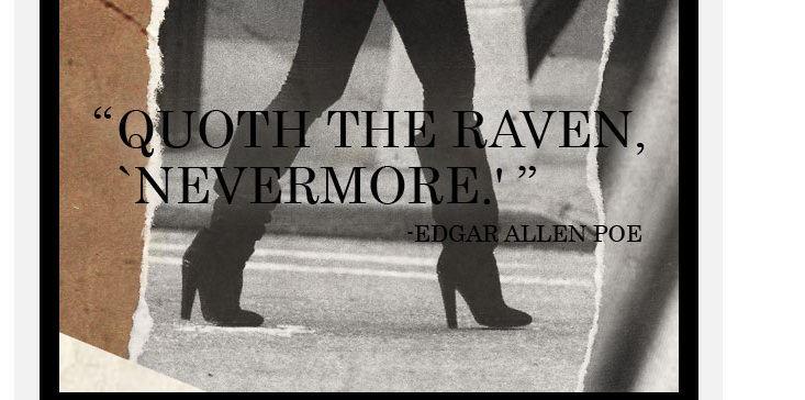
The finest doesn’t come cheap. We’re talking $140 bras, $97 yoga mats, $56 flashlights. At those price points, you expect the products to be made with a persnickety attention to detail. You also expect the persnicketiness to apply to the copy and art from the brand itself. You do not expect—or at least I didn’t—to find the main graphic of a Preserve email to include a sloppy, inconsistent type treatment:
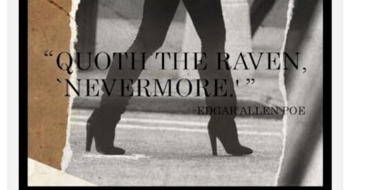
Never mind (for now, anyway) that some of the black text is nearly impossible to read against the darker parts of the photo. Instead look at those quote marks.
The double quotes are so-called curly quotes—true quotation marks. But the single quote marks around “Nevermore” are straight quote marks; the second is technically a foot mark, and I don’t know the true name of the first mark.
The two styles of quotation marks clash, rendering the entire copy block ugly. Even more disturbing, the inconsistency speaks of a lack of attention to detail. Apparently nobody noticed the difference—or worse, someone did and didn’t think it worth fixing. And that’s not a mindset I want from a purveyor of pricy luxury goods. If Preserve is lax about the typography in its emails, which are its primary marketing tool, how can I trust that its standards regarding its merchandise, delivery, and payment security are any better?
Retail is detail, as the saying goes. Which means you really do have to sweat the small stuff. In practical terms, that means having a fresh eye, be it a copyeditor/proofreader or someone from a department other than art/creative, read over everything before it’s released into the wild.
And while I have Preserve in my sights, why doesn’t the website let me click directly onto a product page? The category pages (“Ladies,” “Gents,” “Home”) present a grid of product images. Hover over an image, and the product name and price appear. Click the image, and a pop-up presents you with several more images, as well as an “add to cart” button and a link to “see more details.”
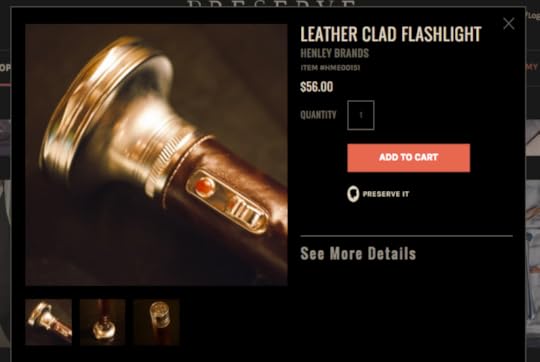
At this point, there’s not one word of copy telling us what the product is made of, how large it is, its features or benefits. All we know about the $56 flashlight, for instance, is that it’s “leather clad.” (And because the phrase comes before a noun, “leather-clad” should have been hyphenated in the product name, but I know a losing battle when I’m fighting one.) Apparently I’m not Preserve’s target audience, because I would never hit “add to cart” without knowing how large the flashlight is and what batteries it requires—facts I don’t consider “details” so much as information vital to my purchasing decision.
So what’s the point of making me click through once more before providing me with that info? Perhaps when it comes to online shopping, as in almost everything else, the rich are different from you and me.
I doubt they’re that different, though…
The finest doesn’t come cheap. We’re talking $140 bras, $97 yoga mats, $56 flashlights. At those price points, you expect the products to be made with a persnickety attention to detail. You also expect the persnicketiness to apply to the copy and art from the brand itself. You do not expect—or at least I didn’t—to find the main graphic of a Preserve email to include a sloppy, inconsistent type treatment:
Never mind (for now, anyway) that some of the black text is nearly impossible to read against the darker parts of the photo. Instead look at those quote marks.
The double quotes are so-called curly quotes—true quotation marks. But the single quote marks around “Nevermore” are straight quote marks; the second is technically a foot mark, and I don’t know the true name of the first mark.
The two styles of quotation marks clash, rendering the entire copy block ugly. Even more disturbing, the inconsistency speaks of a lack of attention to detail. Apparently nobody noticed the difference—or worse, someone did and didn’t think it worth fixing. And that’s not a mindset I want from a purveyor of pricy luxury goods. If Preserve is lax about the typography in its emails, which are its primary marketing tool, how can I trust that its standards regarding its merchandise, delivery, and payment security are any better?
Retail is detail, as the saying goes. Which means you really do have to sweat the small stuff. In practical terms, that means having a fresh eye, be it a copyeditor/proofreader or someone from a department other than art/creative, read over everything before it’s released into the wild.
And while I have Preserve in my sights, why doesn’t the website let me click directly onto a product page? The category pages (“Ladies,” “Gents,” “Home”) present a grid of product images. Hover over an image, and the product name and price appear. Click the image, and a pop-up presents you with several more images, as well as an “add to cart” button and a link to “see more details.”

At this point, there’s not one word of copy telling us what the product is made of, how large it is, its features or benefits. All we know about the $56 flashlight, for instance, is that it’s “leather clad.” (And because the phrase comes before a noun, “leather-clad” should have been hyphenated in the product name, but I know a losing battle when I’m fighting one.) Apparently I’m not Preserve’s target audience, because I would never hit “add to cart” without knowing how large the flashlight is and what batteries it requires—facts I don’t consider “details” so much as information vital to my purchasing decision.
So what’s the point of making me click through once more before providing me with that info? Perhaps when it comes to online shopping, as in almost everything else, the rich are different from you and me.
I doubt they’re that different, though…
December 29, 2014
If You Don’t Read This Blog Post, We’ll Kill This Dog
Not really, but we'd still like you to read this post.
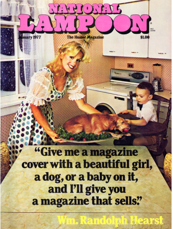
William Randolph Hearst allegedly said, “Give me a magazine cover with a beautiful girl, a dog, or a baby on it, and I'll give you a magazine that sells.” I say “allegedly” because I came across this quote only once, on a cover of the late, lamented National Lampoon.
Dog: It’s the new white meat?
Several marketers seem to have adopted that axiom for email subject lines this holiday season, referring to dogs even though their products had nothing to do with canines.
Take this November 6 email from apparel retailer Club Monaco. The subject line: “The best gifts + the cutest puppy.” Opening the email did indeed reveal a gif of a damn cute puppy snuggling in a soft blanket.

Awwww!
Sadly, once I clicked through to the website, no other puppies were immediately apparent. If only Club Monaco had carried the theme through—why not show puppies alongside the models flaunting the clothes? Though to be fair, the company’s Christmas Day email did feature the pup again, along with a sibling:

Double awww!
Timbuk2, which sells bags and travel accessories, followed suit with its December 18 email. You have to admire the blatant cheekiness with which it didn’t even pretend that dogs had anything to do with its marketing message; the subject line read “Puppies! Up to 50% Off Tech Tested [sic] Favorites.” The email itself continued the tenuous theme:
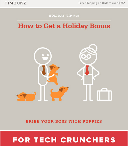
Again, though, no puppies showed their adorable floppy ears or cute yearning eyes anywhere on the Timbuk2 website—except on the product page for the Muttmover Backpack, a backpack designed to carry, well, you can figure it out. This sort of irreverence seemed to work well for Timbuk2, however; after all, this is a website with a tab titled “Super Exciting Fine Print.”
The canine reference was relevant to womenswear brand MM.LaFleur’s November 28 promotion. “Treat yourself. Save a puppy” implored the subject line. The email itself explain why, “instead of slashing prices for Black Friday,” the company would donate 10% of each sale that day to the animal shelter from which it had adopted “the fluffiest and most beloved member of the MM team.”
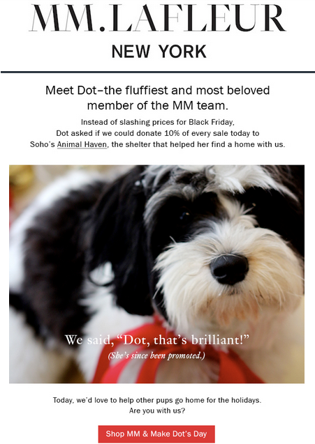
Apparently Dot, the fluffy staffer, even got a promotion out of the deal.
If I’d been in the market for MM.LaFleur’s tailored apparel, I would have made a purchase from the company on the basis of its email. I wonder if the promotion did indeed goose sales. Although Black Friday has evolved (devolved?) to focus on sales and bargains, the holiday season is also the time to appeal to people’s better, more charitable selves.
Both as a canine-lover and as someone whose day job requires her to write 12 subject lines a week, I appreciate how these seemingly irrelevant emails break the monotony of the usual “here’s what we’ve got; please open and click through.” I imagine that, used sparingly, such tactics provide a lift in response. The trick is to make sure that recipients aren’t disappointed when they do click through... and of course, to come up with other concepts for the occasional disruptor message.

Also to avoid comparisons with another classic National Lampoon cover.
December 21, 2014
“Two Excited Men Trudged Up”
Most “prizes” for bad writing, such as the Bad Sex in Fiction Award and the Bulwer-Lytton Fiction Contest, “reward” labyrinthine, clause- and adjective-festered prose. I propose that we come up with an award for worst simple sentence. After all, anyone can write poorly by heaping modifiers atop modifiers. But just as it’s generally tougher to write short than to write long, conjuring up in a handful of words a sentence that makes the reader lift his head up from a book and moan “What the …?” requires a special talent.
(Yes, I’m aware that with this post I’m leaving myself wide open to Muphry’s Law. Go on, buy a copy of my book Beyond Billicombe and have at me. )
One of my nominees for what I'm calling the WTF Awards cropped up in a book I read in April, yet I still remember the sentence eight months later. The protagonist is running from a murderous psycho (of course) in some sort of underground tunnel lined with stone busts and other sculptures: “The next instant, the great stone head plopped down on Lucas with a sickening crunch.”
Would a heavy stone sculpture, one weighty enough to make a “sickening crunch” upon landing, “plop”? A pebble might plop into a pond; I definitely plop onto a chair at the end of a crazed workday. I don’t think that, say, the head of Michelangelo’s David would plop onto a passing Florentine were an earthquake to strike the city.
My other nominee is even shorter: “Two excited men trudged up.” Remove “excited” from that sentence. You’re picturing two tired, maybe dusty, probably stoop-shouldered men, silent save for their heavy panting, barely making their way up. Now focus on just the first three words of the sentence, “Two excited men.” These men are chattering or yelling, their words tumbling one atop the other; gesturing; hopping from one foot to the next. If you’re excited, you aren’t trudging. If you’re trudging, you aren’t excited.
How does this happen? In the first instance, the author might have been trying her darnedest to avoid a pedestrian verb such as fell. In the second, um, maybe the author doesn’t know the meaning of trudge?
Regardless, those ill-chosen words yank the reader from the scene and shatter the illusion that the fictional world is a real one. They also make me doubt that the authors themselves fully imagined the scenes they were describing.
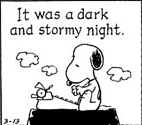
For all the grief that Edward Bulwer-Lytton gets, it was clear that he saw and heard the scenes he described. Take the much-maligned opening of his novel Paul Clifford, the first phrase of which has been immortalized by Snoopy: “It was a dark and stormy night; the rain fell in torrents—except at occasional intervals, when it was checked by a violent gust of wind which swept up the streets (for it is in London that our scene lies), rattling along the housetops, and fiercely agitating the scanty flame of the lamps that struggled against the darkness.”

I’ll take that over excited trudging any day.
Do you have any sentences you’d like to nominate for the WTF Awards? If so, post them in the comments section below. (Hopefully I’m not responsible for any of them…)
(Yes, I’m aware that with this post I’m leaving myself wide open to Muphry’s Law. Go on, buy a copy of my book Beyond Billicombe and have at me. )
One of my nominees for what I'm calling the WTF Awards cropped up in a book I read in April, yet I still remember the sentence eight months later. The protagonist is running from a murderous psycho (of course) in some sort of underground tunnel lined with stone busts and other sculptures: “The next instant, the great stone head plopped down on Lucas with a sickening crunch.”
Would a heavy stone sculpture, one weighty enough to make a “sickening crunch” upon landing, “plop”? A pebble might plop into a pond; I definitely plop onto a chair at the end of a crazed workday. I don’t think that, say, the head of Michelangelo’s David would plop onto a passing Florentine were an earthquake to strike the city.
My other nominee is even shorter: “Two excited men trudged up.” Remove “excited” from that sentence. You’re picturing two tired, maybe dusty, probably stoop-shouldered men, silent save for their heavy panting, barely making their way up. Now focus on just the first three words of the sentence, “Two excited men.” These men are chattering or yelling, their words tumbling one atop the other; gesturing; hopping from one foot to the next. If you’re excited, you aren’t trudging. If you’re trudging, you aren’t excited.
How does this happen? In the first instance, the author might have been trying her darnedest to avoid a pedestrian verb such as fell. In the second, um, maybe the author doesn’t know the meaning of trudge?
Regardless, those ill-chosen words yank the reader from the scene and shatter the illusion that the fictional world is a real one. They also make me doubt that the authors themselves fully imagined the scenes they were describing.
For all the grief that Edward Bulwer-Lytton gets, it was clear that he saw and heard the scenes he described. Take the much-maligned opening of his novel Paul Clifford, the first phrase of which has been immortalized by Snoopy: “It was a dark and stormy night; the rain fell in torrents—except at occasional intervals, when it was checked by a violent gust of wind which swept up the streets (for it is in London that our scene lies), rattling along the housetops, and fiercely agitating the scanty flame of the lamps that struggled against the darkness.”
I’ll take that over excited trudging any day.
Do you have any sentences you’d like to nominate for the WTF Awards? If so, post them in the comments section below. (Hopefully I’m not responsible for any of them…)
September 26, 2014
The (Marketing) Week That Was
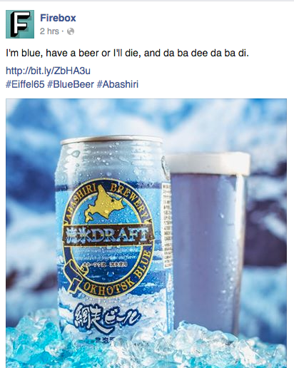
If The Voice were a contest for copywriters instead of singers, the team at Firebox would win hands down. Firebox is the sort of etailer that sells heated narwhal slippers alongside toothbrush sanitizers designed to look like ninjas alongside single-serving French presses alongside Abashiri Blue Beer.
The blue beer caught my eye in my Facebook feed the other morning. Not merely because it’s, well, beer that’s a startling blue hue. But because of the brief blurb with which Firebox accompanied the photo: “I’m blue, have a beer or I’ll die, and da ba dee da ba di.”

If you’re lucky, you’re unaware of the frighteningly catchy but utterly inane song titled “Blue (Da Ba Dee)” that Firebox was referencing. I’m not one of the lucky, however, so though the tune immediately lodged itself in my brain, I nonetheless clicked the link to the product.
The copy on the Abashiri product page was just as clever as the Facebook’s blurb, but informative too: “…This striking beer achieves its unique aquamarine hue by using a blend of blue seaweed and locally grown flowers, it even contains water from melted icebergs. To sip this beautiful blue brew is to immerse yourself in the wild and colourful flavours of the frozen Abashiri coastline. Seriously, you're basically drinking the island, soon there'll be nothing left….”
Firebox’s copy voice is consistently cheeky yet fact-based. While the writers clearly aim to entertain, they never forget that job one is to provide shoppers with enough product information to close the sale.
The consistency in terms of voice extends to its Twitter feed too. After reading about the blue beer, I tweeted, “@firebox may have the best copywriters ever.” Within minutes Firebox responded, “We’re also well known for our questionable music tastes, Sherry.” I can’t think of how the brand could have improved upon its reply.
For those reasons, Firebox is our winner of the week. (Cue the kazoos.)
To continue with our Voice metaphor for a moment, two other brands would definitely have been worthy challengers to Firebox. One is the publishing house Penguin. Its newsletters never fail to delight, whether it’s the cute illos of penguins and puffins or the dry humor of its copy, as in this invite to join its reader panel: “Guess what? You love books! You probably knew that already, but thanks to some analytical wizardry and other computerised shenanigans we’ve deduced that you’re one of our most dedicated Penguin Books newsletter openers. Don’t tell the other subscribers but that makes you our favourite...”
Voice is, in fact, what distinguishes Heat from Britain’s myriad other weekly gossip rags. The magazine is snarky, but deep down you know it doesn’t really want to hurt the objects of its ribbing—well, at least not most of them. It’s just a laugh and a lark, and too bad if they can’t take a joke.
Here’s a taste of Heat’s voice, from this week’s email announcing its website redesign: “After a hundred thousand meetings, a million billion printed out redesigns, and an infinite number of articles transferred from the old website to the new one... heatworld.com has a brand new look! And seriously, look at it: so shiny! So colourful! So many celebrity stories to marvel at!” Us magazine (in the States) or Now (one of Heat’s UK rivals) wouldn’t use phrases such as “million billion” and “so shiny!”—either on its pages or in its emails. Heat shows that in a commoditized market (and yes, celebrity gossip has become commoditized), a startlingly different voice is a worthy USP.
[An aside: When I lived in Devon, my Tuesday morning ritual included stopping at Tesco to buy the new Heat (and a chicken-and-bacon sandwich—oh, and some strawberry laces: breakfast of champions and that). Shortly after I returned to the States, the newsstands in Grand Central Station stopped carrying Heat, and I don’t know where I can buy it here in Manhattan. If you can hook me up, please do!]
If there are winners, there have to be losers too. Voice isn’t what let down this web advert from department store Macy’s; simple lack of brain cells did:
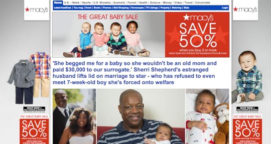
“The Great Baby Sale”? With the headline above a photo of a racially diverse selection of four babies, as if to show the variety of colorways you can choose from? And “Save 50% when you buy 2 or more”? Yeah, beneath that it says “select styles from Carter’s, First Impressions, blah blah blah,” but still…
Making matters worse for Macy’s is that it had paid to run on the Daily Mail’ s website just below the newspaper’s nav bars and above the headline of its lead story—which happened to be “ ‘She begged me for a baby so she wouldn’t be an old mom and paid $30,000 to our surrogate’…” She probably could have saved a bundle by skipping the surrogate and shopping at Macy’s instead.
Yes, it’s been a while since I’ve blogged here, but I’m going to try to get back into the groove. If you have anything cool or heinous you’d like to share, feel free to send it along!
The blue beer caught my eye in my Facebook feed the other morning. Not merely because it’s, well, beer that’s a startling blue hue. But because of the brief blurb with which Firebox accompanied the photo: “I’m blue, have a beer or I’ll die, and da ba dee da ba di.”
If you’re lucky, you’re unaware of the frighteningly catchy but utterly inane song titled “Blue (Da Ba Dee)” that Firebox was referencing. I’m not one of the lucky, however, so though the tune immediately lodged itself in my brain, I nonetheless clicked the link to the product.
The copy on the Abashiri product page was just as clever as the Facebook’s blurb, but informative too: “…This striking beer achieves its unique aquamarine hue by using a blend of blue seaweed and locally grown flowers, it even contains water from melted icebergs. To sip this beautiful blue brew is to immerse yourself in the wild and colourful flavours of the frozen Abashiri coastline. Seriously, you're basically drinking the island, soon there'll be nothing left….”
Firebox’s copy voice is consistently cheeky yet fact-based. While the writers clearly aim to entertain, they never forget that job one is to provide shoppers with enough product information to close the sale.
The consistency in terms of voice extends to its Twitter feed too. After reading about the blue beer, I tweeted, “@firebox may have the best copywriters ever.” Within minutes Firebox responded, “We’re also well known for our questionable music tastes, Sherry.” I can’t think of how the brand could have improved upon its reply.
For those reasons, Firebox is our winner of the week. (Cue the kazoos.)
To continue with our Voice metaphor for a moment, two other brands would definitely have been worthy challengers to Firebox. One is the publishing house Penguin. Its newsletters never fail to delight, whether it’s the cute illos of penguins and puffins or the dry humor of its copy, as in this invite to join its reader panel: “Guess what? You love books! You probably knew that already, but thanks to some analytical wizardry and other computerised shenanigans we’ve deduced that you’re one of our most dedicated Penguin Books newsletter openers. Don’t tell the other subscribers but that makes you our favourite...”
Voice is, in fact, what distinguishes Heat from Britain’s myriad other weekly gossip rags. The magazine is snarky, but deep down you know it doesn’t really want to hurt the objects of its ribbing—well, at least not most of them. It’s just a laugh and a lark, and too bad if they can’t take a joke.
Here’s a taste of Heat’s voice, from this week’s email announcing its website redesign: “After a hundred thousand meetings, a million billion printed out redesigns, and an infinite number of articles transferred from the old website to the new one... heatworld.com has a brand new look! And seriously, look at it: so shiny! So colourful! So many celebrity stories to marvel at!” Us magazine (in the States) or Now (one of Heat’s UK rivals) wouldn’t use phrases such as “million billion” and “so shiny!”—either on its pages or in its emails. Heat shows that in a commoditized market (and yes, celebrity gossip has become commoditized), a startlingly different voice is a worthy USP.
[An aside: When I lived in Devon, my Tuesday morning ritual included stopping at Tesco to buy the new Heat (and a chicken-and-bacon sandwich—oh, and some strawberry laces: breakfast of champions and that). Shortly after I returned to the States, the newsstands in Grand Central Station stopped carrying Heat, and I don’t know where I can buy it here in Manhattan. If you can hook me up, please do!]
If there are winners, there have to be losers too. Voice isn’t what let down this web advert from department store Macy’s; simple lack of brain cells did:
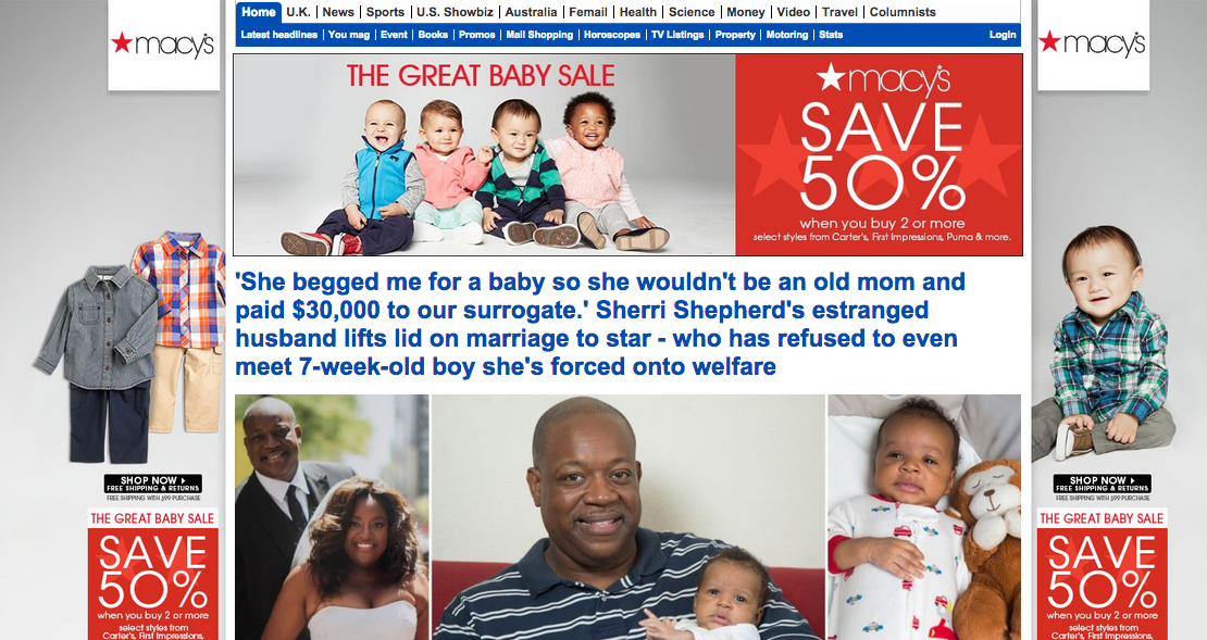
“The Great Baby Sale”? With the headline above a photo of a racially diverse selection of four babies, as if to show the variety of colorways you can choose from? And “Save 50% when you buy 2 or more”? Yeah, beneath that it says “select styles from Carter’s, First Impressions, blah blah blah,” but still…
Making matters worse for Macy’s is that it had paid to run on the Daily Mail’ s website just below the newspaper’s nav bars and above the headline of its lead story—which happened to be “ ‘She begged me for a baby so she wouldn’t be an old mom and paid $30,000 to our surrogate’…” She probably could have saved a bundle by skipping the surrogate and shopping at Macy’s instead.
Yes, it’s been a while since I’ve blogged here, but I’m going to try to get back into the groove. If you have anything cool or heinous you’d like to share, feel free to send it along!
March 31, 2013
Dreams of Ronnie Lane
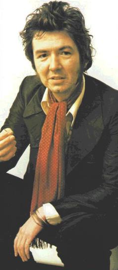
I see your wheels are rusting in the backyardI know that we’re not going anywhereWe used to roam so freely,It’s been so long.I take my dreams to bed now,Where they belong.—Ronnie Lane, “April Fool”
Although “April Fool” is a song of middle-age resignation, Ronnie Lane was only 31 years old when he recorded it. Then again, he was already past the midpoint of his life when it appeared on Rough Mix, the album he recorded with Pete Townsend, which was released in 1977. Born on 1 April 1946, he died on 4 June 1997, just 51 years old, from complications due to multiple sclerosis.
By the time Plonk recorded “April Fool,” he’d already been diagnosed with MS. He'd also already toured the world as a member of two seminal bands: the Small Faces and the Faces. And he’d already burned through considerable cash he’d earned from those bands, in large part by touring the UK with the Passing Show, in which his solo band, Slim Chance, was supported by a costly and impractical carnival. The tour was a dream of his, a response to the years of impersonal stadium concerts, but from a pragmatic, pounds-and-pence point of view, it was one that definitely belonged in the realm of bedtimes and lullabies.
I first heard of Lane thanks to the ARMS benefit concerts of 1983. A gaggle of his better-known colleagues—Eric Clapton, Jeff Beck, and Jimmy Page among them—banded together, literally, to perform a few shows to raise money for MS research and treatment. I traveled from Philly to New York to see one of the concerts at Madison Square Garden. And even all the way from my seat one row shy of the ozone layer, I felt the camaraderie, the warmth, the love, and the magnetism that radiated from the stage, like the waves of heat that shimmer from the pavement on the hottest days of the year, when Ronnie was helped to a mike by two towering, burly men so that he could lead the ensemble in “Good-Night, Irene.”
That night my obsession with Ronnie Lane began. Thanks to my then-husband, who worked in radio and was a rock-music maven, I came into possession of one of Lane’s few solo albums. On a trip to Montreal we met a record-store owner who made me tapes of his other solo albums. When several years later I had surgery to remove a spinal tumor, surgery that I was told could leave me paralyzed, I listened to those albums almost continuously during my recovery. I titled my third novel One for the Road after Lane’s album and song of the same name.
In 1989 or 1990, Lane played a gig at New York’s Lone Star Café. It was a tiny venue, and maybe a dozen of us were in the audience. Before showtime, Lane’s wife wheeled him into the back of the club—he was in a wheelchair by then—and left him alone for a few minutes. After another attendee made his way to the back to have Lane sign an album, I summoned up the nerve to pay court as well.
He was a scrawny figure, almost dwarfed by the square metal frame of the wheelchair. When I stammered my thanks for all the pleasure and inspiration his music gave me, he said, “Why, thank you, darlin’.” His voice was as cracked and creviced as an old asphalt driveway after an especially harsh winter, but his nearly black eyes twinkled, and his entire face beamed. It was almost as if my remarks meant as much to him as his music had meant to me.
Ten years after he died, I moved from the States to England, a move I’d dreamed of since I was 10 years old. When I wrote my final editor’s letter for the magazine I edited at the time, I quoted a song Lane had written while still with the Faces: “Can you show me a dream, can you show me one that’s better than mine?” Three years later, when I had to return to the States, I played “April Fool” over and over again.
I’m now just about the age Ronnie Lane was when he died. Often I wonder whether I should be taking my dreams—of living once again in England, of having my novels published—to bed as well.
But then I think of Ronnie Lane at the ARMS concert, singing with all the gusto and heart he could, surrounded by his friends. I think of how he continued to write and perform, to carry on with his mates, even while weakened and withered from the MS, and of what other music he might have produced, what moments of happiness he might have brought to his family and friends, if he hadn’t been cut down so young. Because all it takes, sometimes, is one or two moments of pure joy to make everything else worthwhile.
And then I remember a few such moments of pure joy from an early 1970s performance of his Faces song “Richmond” on Top of the Pops.
Happy birthday, Ronnie Lane, and thank you.
March 3, 2013
Love My Dog, Love My Protagonist
My daughter had just turned eight when we moved to England several years ago, and while she made a few good friends right away, she had difficulty penetrating the cliques that are a part of grade school. When I heard that she was spending lunchtimes not in the schoolyard playing with her classmates but inside with one of the teachers, I was indignant, probably more so than she. How could the other girls and boys not want to play with her? How could they not appreciate how fun she is, how funny, how athletic, how smart?
I wasn’t filled with the anger that accompanied the one time she was taunted (a boy called her pancake face, which is apparently a disparaging term for an Asian; my daughter was the only non-Indian Asian—not to mention the only American and the only Jew—in the entire school; she and the boy eventually became, if not friends, friendly). Instead I ached with a quiet mournfulness.
Now that I’m submitting my latest manuscript to agents, I ache in the same way for my character Steve.
Steve is one of the two narrators of 100 Days, the novel I’m shopping around. He is also one of the two narrators of the novel I wrote before Beyond Billicombe (which, by the way, is available as a paperback and a Kindle ebook). That I wrote a second novel about Steve without managing to get representation for the first one shows how much I love the character. (Or it shows how absolutely pig-headed and impractical I am—your call.)
Steve is a young man from Devon who suffers from undifferentiated schizophrenia. The first book tells of his budding friendship with a visiting writer and his move to London. 100 Days picks up five years later, as he is hospitalized for a suicide attempt and a psychotic break following his first romantic relationship.
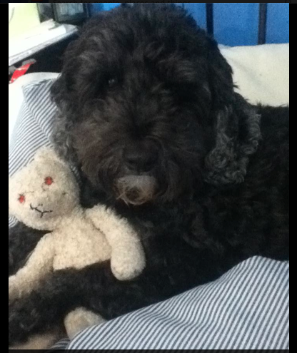
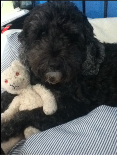
Of course, I don’t love Steve as fiercely as I do my daughter. But I think it’s fair to say that I adore him as much as I do my dog, a statement that may sound odd to those who don’t have a pet but one that surely makes sense to those who do. Just as I want everyone who meets my dog (that's him in the photo above) to acknowledge how cute, how sweet, how irresistible he is, I want everyone who reads about Steve to admire his self-deprecating wit, his gutsiness, his determination.
So it hurts me when agents read the first few pages of 100 Days and reply along the lines of, It’s well written, but it’s not for us; I just don’t love it enough to represent it.
How can you not love Steve?
So in keeping with the fiction writer’s mantra of “show, don’t tell,” I’m including the first chapter of 100 Days below. Would anyone like to read more?
Chapter 1Steve
This time I’m going to do it right. No half-arsed slicing and dicing with a butter knife in a public toilet. No overdose of pills that makes you wish you were dead without actually doing the trick. No noose around a clothes rack that’s too rickety to support the weight and comes crashing down before you even have the chance to kick the chair away. First, I lock the bedroom door. Next, barricade it with my nightstand. Then the pills, every one of them I have, except the ones for my high blood pressure and that. They wouldn’t be much good, would they? I wash them down, two and four at a time, with straight vodka. Like I said, I’m not taking any chances this time. It feels good to focus. To have something to focus on. For the past few weeks, since getting out of hospital, or even since landing back in hospital before then, everything’s been blurred. Like those paintings that look like a landscape when you’re standing a meter away but when you get up close are nothing but dots. Sometimes I can barely make out where I am, what’s surrounding me. What all the colors are supposed to be. What all the shadows are from. But now everything is clearer than it’s ever been. The lettering on some of my pills. The grain of the wood on the floor planks, each lazy curve. Each tiny point of the knife along its edge, winking at me. A friendly wink. By the fifth or seventh mouthful, I’m having a tough time forcing the pills down, even with the vodka easing the way. Last time I didn't take the pills in one fell swoop. Just shoveled down a few here and there when I remembered. Though last time I don’t think I was trying to kill myself. I didn’t have my shit together enough to have a goal, really, other than to shut up the mumbles and stop thinking. About Diandra, and everything else. Harder and harder to swallow. Even though after all these years I’m a dab hand at pill-taking. Just about the only skill I have, isn’t it? Though as Cat would say, that and fifty cents will get you a cup of coffee—not even, she adds whenever she uses that expression. Woozy. Filmy. Hope to hell I don’t sick the pills up. Grit your teeth, hiss the mumbles. Swallow, you arsewipe, swallow. For fuck’s sake, surely you can do this right. I thought I’d drowned the mumbles once and for all back in December, during the bender that landed me in hospital and now here. But they’re back. Or maybe it’s their ghosts. Now, the steak knife. I swiped it from the kitchen. The knives are supposed to be in one of the locked drawers, so only the staff can get to them. But you know what care staff are like. You can’t blame them for getting sloppy. They’re paid, what, eight quid an hour? Besides, it’s been so quiet here in the house, at least in the weeks since I arrived. No real fights. Most everyone agreeing to take their meds when they’re supposed to, coming to group more or less on time, all but one or two showering regularly. Julia’s the most troublesome of us, and she’s half-catatonic five days out of seven, so the main issue with her is getting her to actually eat and to use the toilet instead of pissing and shitting herself. So I’ve got the steak knife, and I’m tying around my arm a scrap of an old T-shirt I’d ripped up last night. Tying it above the elbow. Like they do before taking blood, so that the veins on the inside of my left arm pop right up to the surface. Nurses have a hard time taking blood from me, seeing as I’ve got so much scarring on my wrists and arms. I don’t want to have a hard time cutting myself open. Especially not the way my fingers are growing thicker and harder to manipulate. That’s a good word, manipulate. Cat buys me these word-a-day calendars every year, which is where I picked up that one. Fuck Cat, snarl the mumbles. The mumbles, so the doctors say, aren’t coming from anywhere but instead my head. Most times I agree with them, the doctors, I mean. But when the mumbles start chanting Fuck Cat, fuck the bitch, I have to doubt what the doctors say. Because while I may have a lot of crazy thoughts, I’d never think something like Fuck Cat. She’s pretty much all I’ve got. Though I don’t really even have her. I press the serrated edge of the knife against my wrist. I can’t feel it. Can’t even feel the knife in the grip of my hands, my fingers curled around its handle. Not until I’ve been watching a gorgeous pure red, gleaming rivulet of blood trickle down my arm, in no hurry as it glides toward my elbow, do I realize I’ve actually cut through. It’s so wet, the blood, so bright. So clean. The way it pulses so slowly, it really is the most beautiful thing I’ve ever seen. And right now it’s pretty much all I can see. Everything around it has constricted. I’m not even sure if I’m still slicing away. I finally know what it’s like to be completely happy. No worries, nothing to fear. My eyelids close, but I can still see the blood. Nothing but blood. Not even my arm anymore. I’m floating on the blood, and it’s floating me away.
February 18, 2013
Features and Benefits, Telling and Showing
It’s not often that catalog copy blows me away—and let’s face it, it’s not supposed to. It’s supposed to persuade you to pull out your credit card and make a purchase. But the copy for the latest Lands’ End catalog impressed me by exemplifying how effectively and easily copy can balance features and benefits.

Most catalog and online copy seems to emphasize product features: The dress has an empire waist; the table is made of kiln-dried wood; the drill has 195 inch-pounds of torque. That’s certainly important information. And if the consumer is somewhat knowledgeable about the product category, that along with the imagery may be enough info to close the sale.
But let’s say the consumer doesn't know whether an empire waistline best suits her figure, or that kiln-dried wood is less likely to warp and shrink than other wood, or just how much torque she needs for the projects she has in mind (clearly I have no idea about how much torque is the right amount of torque, which is why I’m being so vague here).
This is where the copy needs to focus on the benefits. Instead of simply stating “This dress has an empire waist,” you could show the benefit of said feature by writing something like “The flattering empire waist helps elongate the figure.” Ah,says the 5'2" shopper to herself, that dress will make me look taller and thinner—I’m sold.
Just as important, the 5'11" shopper says to herself, That schmatte will make me look like a beanpole; now I know to avoid empire waists altogether. Thank you, Ms. Copywriter. Why is preventing this sale just as important as closing the previous sale? Because it saves your company from having to accept a return for a product the shopper ordered and hated or, worse, losing that customer altogether because of her disappointment with the product.
(And yes, I’m aware no one in the history of humanity has ever thought or uttered the phrase “Thank you, Ms. Copywriter,” but a copywriter can dream, can’t she?)
Here are a few examples of how Lands’ End explains benefits in the context of features to drive a sale:
Princess seams sweep from the bodice into diagonal welt pockets that add a slimming element to the skirt. And the ponté fabric is structured yet soft. So it even smooths lumps and bumps. (Not that you have any.) I couldn’t tell you what a princess seam is, but who cares: It'll help me look slimmer, which is what I really need to know.
[The tee-shirts’] all-cotton knit fabric has ultra-fine ribs. Barely visible to the naked eye, those ribs give these tees exactly the right amount of body and shape. So they’re never clingy, never sheer, never skimpy. So a ribbed shirt will hold its shape and won't cling to my bra straps or nipples? Well, that’s definitely worth shelling out a few bucks more for.
And that’s just the sku/product copy. The Lands’ End catalog also judiciously uses callouts that even more explicitly connect the feature to the benefit. For instance: What makes piqué cool? The fabric has thousands of tiny vents. Which makes our Piqué Polo sort of like wearable air conditioning. As someone who breaks into a sweat as soon as the temps climb into the 60s (sadly, I’m not exaggerating), I’m dog-earring every page of the catalog with items made of piqué.
Granted, with products that are nonessential or purely decorative, it can be tougher to isolate the benefits. But every product has ’em.
Take a 12" blue glass vase. Because it’s glass, it would make a great weapon for clobbering a burglar should your life come to resemble a Chuck Jones cartoon. But most retailers, alas, would shy away from that sort of benefit. So for this sort of product I might write that it will add color and height to a tablescape, for instance, or will brighten a room even when flowers are in short supply.
Okay, it’s not brilliant. But it’s better than one of my pet peeves, which I come across all the time: the loading up of adjectives in lieu of substance. Don’t tell me that the vase is “striking, eye-catching, and lovely”—there’s a photo, and I’ll be the judge of whether the vase in it is indeed any or all of those things.
Novice fiction writers are constantly admonished to “show, not tell.” You could say that emphasizing features is telling, while explaining benefits is showing. Contrary to what those writing teachers say, you can’t avoid telling altogether in a work of fiction; sometimes you have to move things along with a simple "For two months the fugitives remained absent" (Wuthering Heights) or "she said." But you do often need to show as a way to get the reader/consumer to buy what you’re telling and selling, whether it’s the prowess of a protagonist or the suitability of a vase.
January 1, 2013
A New Post from the CEO
Wow, the CEO of Aéropostale emailed little ol’ me a New Year’s message! And so did the president/CEO of Yankee Candle! Gosh, they really care about me! I’ll never shop from another teen apparel merchant or scented-candle purveyor again!
I assume that’s the response these companies were going for when they planned these particular email campaigns. They must have figured mentioning the CEO in the subject line (Aéropostale: “Happy New Year from Tom Johnson, CEO”; Yankee Candle: “A heartfelt ‘Thanks’ from our CEO”—and no, I don’t know why “Thanks” is in quotation marks) would encourage opens and instill warm-and-fuzzies in recipients.
But these messages instilled only cynicism in my suspicious, cold little soul. I did like that the message from Aéropostale’s Tom (I figure we’re on a first-name basis now) included his email address: “…if you ever have a question or suggestion, I hope you don’t hesitate to share it with me…” The letter also emphasized the company’s commitment to quality and community in a straightforward manner.

The Yankee Candle message was, like most of its fragrances, too cloying for my tastes: “Home is where our most cherished memories are made. Where the stories of our lives are fashioned and held close. As a reflection of our dreams and aspirations, home is the most personal of places. So I feel very privileged, as we approach a new year, that you have invited us into yours…”

Of course, if Harlan M. Kent, Yankee Candle president and CEO, felt so privileged, he could have at least included an email address so that I could touch base with him, the way I can with my new buddy Aéropostale Tom.
These messages come across as hokey (at least to me) because they’re so out of character for these companies. I’ve never received anything but the usual promotional email messages from them before.
Conversely, I received several emails from Karmaloopfounder and CEO Greg Silkoe during the holidays. Granted, most were part of a reactivation campaign. But it’s not unheard of for Greg (who included not only his email address in several of the messages but his mobile number too) to communicate via email to customers throughout the year. What’s more, Greg’s emails, in keeping with the hip, fun, trendy Karmaloop brand, are disarmingly informal: “It's me, your fearless CEO and Sushi Chef Greg Selkoe @Selkoe. I want to tell you about a bunch of exciting things coming up in the loop they call Karma over the next few weeks! “But first... since we love you so damn much: “30% OFF & FREE SHIPPING NEXT 24 HOURS!! It's this simple Buy Any NEW or REGULAR PRODUCT (excluding sale stuff). SHOP NOW!“What? wait... did I just read this correctly? How do you guys work the magic you do? Nobody knows, roll with it!”
The emails from Karmaloop Greg come across as part and parcel of the Karmaloop brand. The lone emails from Aéropostale Tom and Harlan M. Kent seemed like patches sewn onto the fabric of their brands at the last minute.
At least the Aéropostale email provided recipients with an outlet for feedback (Tom’s email address). Assuming Tom or one of his minions actually responds in a timely, personal manner to any messages sent to that address, Aéropostale’s New Year message could be seen as an effective means of establishing a genuine relationship of sorts with subscribers.
As for the Yankee Candle email… well, maybe the Real Housewives of South Boston would have appreciated the message.
(Yes, this is my first email-related post for quite some time. Most of my 2012 posts were related to writing, editing, and marketing my novel Beyond Billicombe, which was published in September. Beyond Billicombe has nothing to do with email marketing, but I think you might like it anyway; you can check it out here.)