
Rachel Andrew's Blog
January 30, 2022
2021 in review
I didn’t write a year in review in 2020, deciding that it would have been too full of pandemic and fury. That was probably a good decision, and the fact that this post will have to touch on things that happened in 2020 only reflects the strangeness of time right now.
At the beginning of 2021, three things happened:
My divorce finalized.We sold Perch CMS.I passed my MA in International Journalism, with Distinction.I probably can’t or shouldn’t say too much about the first two, but doing a post-graduate degree in one year, during a pandemic, while working more than full-time hours, and while getting divorced, is about as Rachel as it gets. I don’t recommend it, though I enjoyed doing it immensely, and I guess it kept my mind off everything else.
SpeakingI used to start these round-ups with the distances I had traveled and the places I had been. It’s been over 18 months since I stepped onto an aircraft of any type, and I’ve been on precisely two trains-to London and back to speak at the one in-person conference that managed to happen.
However, I have spoken at a bunch of online events and run a few workshops. You can find all of those on my Notist profile.
Work and a big changeThe majority of 2021 was, spent working on contracts with both Mozilla (working on MDN) and Google (working partly on MDN documenting Web APIs, and partly on web.dev as an editor.)
In October, I ended my 20-year run as a self-employed person by taking a full-time role at Google as a staff technical writer. My responsibilities are as the content lead for the web.dev and developer.chrome.com sites, working as part of Chrome DevRel. As I write this post, I’m almost four months into the role and very happy with the decision to make the jump. There’s a lot to learn as I figure out how to operate within a giant company.
People keep asking why I made this decision. I was a successful business owner, freelance writer, and contractor. I didn’t need to move to full-time. There had been opportunities put to me in the past that I had sidestepped. Ultimately it was the right time and the right role. For the first time since my early 20s, I was making a decision just for me. My daughter is grown-up and running her own successful freelance business. Post-divorce, and with the sale of Perch, I am no longer required to run a business due to it being our sole family income. I was contracting for and working with the people who would be my team and enjoyed working with them. And, as someone who is primarily a writer, there is a limit to what you can achieve alone. I love to dig into technology and then pass on what I’ve learned to other people, and I’m reasonably good at this. However, the only way I can scale that is as part of a team. Earlier in the year, I read Sarah Drasner’s post about career laddering, and her example career ladders for people who write documentation. This underlined a growing feeling that I was stuck, that I’d pretty much done what I could do alone. When the possibility of becoming a full-time employee came up, it was a pretty easy decision to go for it, despite knowing it would involve my first interviews in over 20 years!
Sport and fitnessDespite the pandemic canceling everything and making the gym and pool seem terrifying, I’ve kept up my training. My little box-room home gym now includes an extensive set of Les Mills Body Pump weights, a Watt Bike Atom, a rowing machine, and the only TV in the house. Strava tells me I logged 400 hours of training in 2021 and swam, biked, and ran a total of 3447 miles. I also started open water swimming at Vobster Quay. I am not brave enough to be jumping in a lake in the middle of winter like some, so once it warms up again, I’ll be heading back there.
I’ve done a couple of races, but deferred others due to a run of injuries. I’m starting 2022 in a good place injury-wise, and I’m working with my coach and physio to keep it that way, hoping to do another 113 (half-ironman distance) triathlon this summer.
The year of DIYIn my 2019 review, I mentioned that we (my now ex-husband and myself) had managed to buy a house. Three months later, my marriage ended, and I was left wishing I’d bought a home in a better location for me, especially given the pandemic was going to trap me in it! The house also needed a lot doing to it, and so, once I’d got the legal stuff sorted at the beginning of 2021, I embarked on a year of house projects. I’ve been able to get people who know what they are doing to do the major things by learning to do a lot of smaller stuff myself. This has included laying floors in three rooms upstairs, so I now know how to lay LVT flooring and fit skirting boards. I also own a power mitre saw, and a shop vac.
In the process of laying floors and doing other jobs, I’ve relearned how to use all my power tools left-handed. For those who don’t know, I completely shattered my right elbow in 2013, and I’ve had a lot of surgery to try to put it back together. I have significantly reduced range of motion but more problematically nerve-related problems with my right hand. It basically can’t be trusted. I drop things without realizing it, I burn and cut my fingers because I can’t feel them, and the vibration from power tools makes it all a whole lot worse. I’m pretty good left-handed after all this time, but I wasn’t sure I’d be able to learn to use a jigsaw, for example. It turned out that flooring was a good practice project, the fiddly bits aren’t that fiddly, and if you mess up, you chop the end off that board and try again. After doing three rooms, I’m perfectly competent and looking forward to tackling other things.
This house isn’t the forever home, but it’s going to be home for a while, and all the things I’ve learned will be helpful if I manage to buy the Victorian home that I would love to own one day.
Onwards!I’m heading into 2022 a happier person than I’ve been in years. I’m working with people I like, who are brilliant at what they do, and I’m learning so many new things. Life is quiet, calm, and ordered, and it’s good. I miss travel, and I can’t wait to meet up with my friends around the world. I miss the conversations with people after a conference, and finding a place with great coffee (or whiskey) in a city where none of us live. I’ll value those moments so much more when that becomes possible again.


March 11, 2021
Good news about display: contents and Chrome
Using display: contents should allow us to use semantic elements to ensure that our content is understandable by accessibility technology, while also not displaying boxes for those elements. It is especially useful when using grid layout and flexbox, as only direct children become grid or flex items. Essentially it allows us to promote grandchildren up to the level of direct children.
However, just as we were getting excited about the possibilities, people began to note that the value also removed the element from the accessibility tree in all browsers. This meant that you may as well have marked up your list items with divs, for all the meaning you were left with.
Just as I was preparing my talk for axe-con, I saw the bug I was tracking in Chrome become marked as fixed. On testing, I can see that a ul removed from the visual display using display: contents is still a list when inspecting it. This is really great news, as now both Firefox and Chrome have fixed the problem. You can try this out using this demo.
Keep testingDo make sure you are still testing when using display: contents that your intent regarding semantics isn’t being damaged. There will still be some time before all Chromium browsers update, and the problem still exists in Safari. So, we’re not out of the display: contents woods yet, but it feels like a good step forward. I know from talking to engineers that this was not an easy fix at all, and I’m really happy to see that it has been prioritised and fixed in these browsers.
For more information on display: contents and this issue:
More accessible markup with display: contentsDigging into display: box generationMarch 10, 2021
Talk for axe-con: Grid, content re-ordering, and accessibility
It will soon be two years since I wrote about the issues around CSS Grid and content re-ordering on this site. We aren’t any further forward with a solution to that problem. With new ways to jumble up your layout such as Grid Layout Masonry, plus new tools which allow the visual generation of layout, I have real concerns about an increasing number of sites launching with a very poor experience for anyone who relies on the source and visual order being consistent.
I was asked to talk at axe-con, and so have chosen to again highlight this problem. My talk includes things for web developers to bear in mind, but also asks people to get involved in the discussions about how to provide a better solution than don’t do it. There is an issue raised regarding the potential impact of masonry here.
Slides and resources on Noti.st. I believe the video will be released in due course and I’ll add it to the Notist page once it is.
May 14, 2020
Writing technical articles: Defining your ideal reader
I edit a lot of technical articles over at Smashing Magazine, and write a good few myself. Over the years I’ve absorbed a lot of information in terms of what works when writing tutorial content, and one thing I keep coming back to is that you need to know who the ideal reader of your piece is.
Technical articles can’t all start from explaining to the reader how to create an HTML page, therefore they all bring with them some assumed knowledge. The level of assumed knowledge might be basic HTML, or for an advanced piece might involve a whole compendium of languages and tools. There is always something you expect your reader to know. Define that for yourself before you start.
What languages does the reader need to know, and to what level?
What tools, frameworks or libraries should they be familiar with?
Once you have that list, you can refer back to it as you write the article. You may even be able to think of someone you know who is that ideal reader. As you come to explain something, which refers to one of the things you expect the reader to know, you don’t need to over explain. If the thing you need to refer to isn’t in that list, then give a more complete explanation, perhaps linking to another article for more detail. Your list helps you to explain the things that need explaining, and avoid filling the article with things your reader should already know.
Your list should also be part of your introduction to the article, explain to the reader that to follow along they need to already know certain things. You could always offer a link to an introduction to those subjects. If the article is for real beginners, then be clear about that too, it’s helpful to know right away that something has been written for a person like you.
Writing for the experienced
When writing for experienced practitioners, you need to write something that offers value over that person just looking at the documentation. Your list of assumptions, and imagining your ideal reader can help here. An experienced person is likely to be able to get to “Hello, world” from the product docs. Therefore an article for that person needs to share more than an introduction. Good things to include are tips and tricks gained from your own practical use, the sort of thing you don’t get from the docs but from actually using the tool within the constraints of a real project. The docs often don’t go into how the tool can be combined with other tools or techniques, how it can fit into an existing workflow, or how you can transition from an older way of doing things to this new fancy way. All of these are good topics for the more experienced reader.
Writing for the beginner
When writing for beginners to a technology, be especially careful with your assumptions when considering your ideal reader. It’s incredibly offputting if you think something is for beginners and then realise you need to understand an entire toolchain just to get started. Avoid using words like “just” and “simply”, include good resources for getting started with any prerequisites.
However remember that many readers will be beginners to this technology but not beginner developers. A great example is when writing about the modern JavaScript ecosystem. A reader might be a perfectly competent JavaScript developer, but they have never used a framework like React. They don’t want to read something that speaks to them as if they have never written JavaScript before, but they will need a lot of background information about how the ecosystem now works to be able to start to work with React. As a writer, it is a useful practice to keep a list of really great introductory articles to various subjects. You can then use those as links to help people with the things you don’t have time to cover in your piece.
So, next time you start writing, or creating a presentation, or tutorial video, first consider the question who is this for? Answering that will make all the difference.
May 5, 2020
Does masonry belong in the CSS Grid specification?
When I first began to demo CSS Grid to people, in particular the dense packing mode, at a first glance it looked a bit like the layout achieved by - most notably - the Masonry JavaScript plugin. Sometimes also described as a Pinterest Layout, after the application which is best known for using this kind of layout.
Grid isn’t Masonry, because it’s a grid with strict rows and columns. If you take another look at the layout created by Masonry, we don’t have strict rows and columns. Typically we have defined rows, but the columns act more like a flex layout, or Multicol. The key difference between the layout you get with Multicol and a Masonry layout, is that in Multicol the items are displayed by column. Typically in a Masonry layout you want them displayed row-wise.
I raised an issue in January 2017 due to the number of people who had requested a Masonry-like layout. It seemed to come up in every talk and workshop I did, as it was a very popular layout at one point. At that point I noted it seemed more flex, than grid-like.
Requests for Masonry do seem to have died down somewhat, although that may well be because people have realised grid is not Masonry so have stopped thinking it would solve that problem and therefore don’t comment on it. However Firefox have implemented an experimental way to do this, which is currently using the grid spec. The CSS Working Group would love for you to have a look at it.
To do so, you need to have Firefox Nightly, and to enable the flag layout.css.grid-template-masonry-value.enabled by going to about:config in the Firefox Nightly URL bar.
I’ve built a simple demo which you can see below, plus a second one as an experiment to see what happens if you have an item placed on the grid.
See the Pen
Proposed Masonry by rachelandrew (@rachelandrew)
on CodePen.
Speaking personally, I am not a huge fan of this being part of the Grid specification. It is certainly compelling at first glance, however I feel that this is a relatively specialist layout mode and actually isn’t a grid at all. It is more akin to flex layout than grid layout.
By placing this layout method into the Grid spec I worry that we then tie ourselves to needing to support the Masonry functionality with any other additions to Grid. Or, essentially saying that you can’t do a certain thing when in Masonry mode. Whereas Flexbox is a simpler spec, and one that is less likely to have new functionality loaded into it. I’m keen that we get the layout method, less so of where Mozilla are proposing it sits. I can imagine this being a future weight that has to accompany all additions to Grid, that we’ll forever more be asking the question, “but how does this work with Masonry?” So I would weigh the convenience of it seeming to fit quite nicely into Grid today, with whether that convenience today will become a burden in the future.
Anyway, the CSSWG would love your feedback. Jen Simmons has also built some demos - here and here. In particular it would be very useful to see if it would work in situation where you have already used Masonry, or would have liked to but didn’t because of the performance issues of that type of layout.
April 23, 2020
Running Online Workshops - The Smashing Podcast
At SmashingConf we normally run online workships alongside our conferences, with the San Francisco and Austin conferences postponed we decided to take the workshops online.
We’ve so far run two workshops, and a third sell out workshop with Brad Frost is ongoing. We’ve got a great lineup of upcoming workshops with many of your SmashingConf favourite speakers.
I talked about that decision to take the workshops online, and how the first two workshops were received on the Smashing Podcast. As I mention in the episode, I was really surprised how connected the experience felt, I felt that I was there with the attendees, not just preaching CSS Layout at my screen! The Q&A section at the end of each session was really busy too, I easily filled the time available with all the questions. I’m looking forward to running my next one in June.
You can listen here, subscribe in your podcatcher of choice, or visit Smashing Magazine for a full transcript.
April 17, 2020
Let's Learn CSS Grid!
Learn With Jason is a live show, streamed on Twitch, where Jason Lengstorf pair programs with other developers and designers, and in 90 minutes creates something new. I’ve never done a show like this before and it was far more fun than I had imagined.
April 7, 2020
Making Things Better
In 2019 I presented a talk at An Event Apart about my ideas about and fears for the web platform. This post is a written version of that talk.
You can see the video of the talk on the An Event Apart website, and also find the slides and resources online at Notist.
Redefining the technical possibilities of CSS
I have been fortunate enough to be invited to stand on the An Event Apart stage and talk about CSS for over three years now. Over that time our understanding of and abilities with CSS Layout has been totally rewritten. The An Event Apart attendees have witnessed that change, been part of the excitement.
We had been using floats as our primary layout method for over 15 years. That usage is now being resigned to history.
The happenings of the last few years being no less dramatic of the move away from tables for layout to CSS.
“Tableless web design”
If we think about tables to CSS for a moment though. That move was difficult because we asked people to limit their designs in many ways. If we look at the table layouts of early websites, some of these were incredibly complex. They were designed in graphics design applications, sliced up into pieces and reassembled in complex table structures.
A move to CSS meant a simplification, as those complex designs were not possible to create using CSS alone, we just didn’t have the tools.
A lot of the web for over a decade drew inspiration from designs such as Doug Bowman’s Minima theme for Blogger.

And this was no bad thing, I think that the move from table based designs to CSS heralded the start of us thinking about the web as it’s own medium, something which progressed with the idea of Responsive Web Design. Yes, we simplified, but we did so in order to enable great experiences for everyone.
However we downplayed the problems. Us CSS advocates, those of us involved with the Web Standards Project. We weren’t looking to see how we could improve the platform and invent new CSS to solve problems, we were campaigning for browsers and web developers alike to comply with the standards that existed, to build accessible and cross platform websites, and to be happy with our lot.
I keep coming back to this idea that what we see as good web design is rooted in the technical limitations of CSS2.
[I] accepted that CSS is just hacks over top of a document model that was never designed to be used like it is today.
—
Bailey Ling
I believe that the way many people see the web is still hobbled by the attitudes and limitations of those early days.
Sometimes, an audience member or a reader will object to something I demonstrate. They tell me that, “the web is not print” deeming the technique to be too close to print design. Or, I will hear the idea that CSS is something of a failed medium, without any of the things we really need, and we have to just hack at it to get what we want.
Yet times have changed.
In this article I want to show you the problems we have solved, the problems we are solving, and also point at the problems we haven’t yet solved. Because I not only want you to understand new CSS, use it, create beautiful things, and practical things, solve the problems of your site visitors in ever more elegant ways.
I also want you to be empowered to contribute to solving the new problems that we hit. I want you to know that is possible, and to walk with me to remove even more of the technical limitations of CSS.
You never know how tall anything is on the web
“We can’t control the height of things”, I would explain to the designers I was working with who would produce a design which relied on the height of things being known.
A design as simple as this one. Three boxes, different amounts of content, but we want the bottoms of those boxes to line up. Not so many years ago this was impossible, because a floated layout had no way to line up the bottom of the boxes.
So we would fix the height, based on an assumed amount of content. And, when too much content was added, and poked out the bottom of the box we would look to our CMS, see if there was a way to prevent too much content getting in.
I have a CMS product. I still get people asking how to do this for this very reason.
We hacked around the problem
Designs were created that hid the issue, a gradient that faded away and hid the fact that the boxes were uneven heights, avoiding background colors altogether, the faux columns technique of the past. A technical limitation influencing design, and even sometimes our content.
Enter flexbox and then Grid and the fact that align-items has an initial value of stretch and the problem not only disappeared, but the default behaviour of these layout methods was the thing we struggled with for so long.
See the Pen
An Event Apart: Equal Height Boxes (Solved by Flexbox) by rachelandrew (@rachelandrew)
on CodePen.
How big is that box?
But it isn’t just about how tall the thing is, but in general how big it is. We’ve gained new abilities to size things based on how big they are. My talk in 2018 at An Event Apart is online as a video, and in that talk I unpacked some of the complexity of sizing in new layout.

And we think we know a lot about sizing because to make those floated layouts work we have to give everything a width, and make sure that the total width across the container – including margins used for gutters - doesn’t add up to more than 100%
This means that to make a responsive design, we end up using a lot of media queries to change the size at various breakpoints. For when the box gets too small for the contents suboptimal things occur, we get the CSS is Awesome problem, or the floated layout starts to fall apart.
This obsession with setting the width of things resulted in everyone believing that Flexbox should behave in the same way as floats. We find Flexbox grid systems which set the width of things exactly as we did for float-based systems. And, the fact that flex items sometimes seem to end up an unusual size is quoted in various articles as being a failure on the part of flexbox, it behaves weirdly, it isn’t intuitive.
No, it just isn’t the layout method you think it is.
If you think flexbox is for lining things up with other things then yes, it seems weird and badly behaved. Once you realise it is for taking a bunch of oddly sized things and returning the most reasonable layout for those things it makes sense.
It does this by looking at the things and seeing how big they are then assigning space to give the best sort of layout for those items, rather than squashing a big thing into a tiny column and leaving loads of spare space around a tiny thing. In doing so, it solves the problem of needing to give everything a width and then change that width when the viewport changes because it works that out for you.
It just blew my mind that someone thought the default behavior should be to just have the text honk right out of the box, instead of just making the box bigger.
—
Steven Frank
Staying with sizing, and the problem highlighted by the CSS is Awesome meme. What we really have here is an issue of overflow. You have made a fixed width container and are trying to put content into that container which is too big, what do you want CSS to do here?
CSS by default will do what you see in the meme because to do anything else would cause data loss, which is CSS terms means that some of your content vanishes.
We try and avoid data loss because if something on your page vanishes at certain screen sizes – because of overlap, or it going off the side of the screen, you may be unaware of it. A quick eyeballing of the page may not cause something missing to jump out at you. You will tend to spot the messy overflow though.
A good example of this design pattern can be seen in the Box Alignment specification, with the safe and unsafe alignment keywords. Safe alignment, means that your chosen alignment method won’t be used if it causes data loss, unsafe means that data loss may happen.
In certain situations, your choice of alignment method could cause overflow that results in data loss, for example by pushing an item off the side of the viewport. If you use the keyword safe you are telling the browser that you would prefer a different alignment over data loss. The keyword unsafe declares that you want your chosen alignment even if it causes data loss. You can see these keywords in action in a supporting browser in the CodePen below.
See the Pen
An Event Apart: safe and unsafe alignment by rachelandrew (@rachelandrew)
on CodePen.
Overflow happens, if you fix the size of things. By default CSS tries not to cause some of your information to vanish. If you want something else to happen then you need to declare that. And you have an increasing number of options.
Better ways to stop content just “honking out of the box”
The author of the meme wondered why the box didn’t grow to fit the content. However if you give something a fixed size in CSS, it will respect that size. What the author really wanted was to make the box min-content sized. With a box that has a width of min-content the box will grow as big as it needs to be to contain the content, with all soft-wrapping opportunities taken, but no bigger.
If instead, you want to make the box not wrap at all, then give it a width of max-content. The text will then display all as one line and take no soft-wrapping opportunities.
Perhaps you need to have the box that fixed width, but don’t mind if it grows taller. In that case use overflow-wrap: break-word.
Take a look at the next CodePen for all your awesome possibilities.
See the Pen
An Event Apart: Awesome by rachelandrew (@rachelandrew)
on CodePen.
Being awesome vertically
A problem which perhaps many of us English speakers haven’t run into, is the fact that CSS had for any years a baked in assumption that we were all using a left to right top to bottom language. Essentially that we were all English speakers.
However CSS has also updated to match the reality that worldwide many languages are not horizontal, and running left to right, but perhaps are horizontal and running right to left, or written vertically, or maybe even a mixture of the two. The Writing Modes specification details the different writing modes and allows us to switch between them, we can do so for creative reasons or, because we are typesetting a language which uses those writing modes.
Flexbox and CSS Grid brought with them an agnostic approach to the writing mode of the document
For the first time we had to think about start and end, rather then left and right, top and bottom. This agnostic approach is apparent in alignment, and also in line-based and auto placement in grid. In fact, in my early Grid talk, which you would have seen if you came to An Event Apart sometime in late 2015 or 2016, I mentioned that if you set all four lines using the grid-area property the order of the lines wasn’t the familiar top right bottom left of setting a margin shorthand, but instead - when in a horizontal writing - mode top left bottom right. The reverse of that order.
What that shorthand is doing is setting the block and inline start then the block and inline end, for as soon as your grid is not in horizontal-tb thinking about top, right, bottom, and left doesn’t make a lot of sense.
Logical Properties and Values
The problem then is that we have a situation where our main layout methods talk about start and end and inline and block, and everything else in CSS - floats, positioning, margins, padding and borders, all describe themselves in terms of physical dimensions.
All this specification contains is a set of mappings, and additional shorthands that give us a way of defining things in a flow relative, logical way as opposed to the physical way we are used to. If I have a grid layout with a width but then use Writing Modes to switch to a vertical writing mode, the grid layout will all work in that writing mode. However the width remains tied to the horizontal measure, meaning that the shape of the grid changes.
Instead of width I could use the new mapped property inline-size, representing the size in the inline direction. Which for a vertical writing mode is vertical not horizontal. This would mean that once in a vertical writing mode, the inline-size would control the height of the component and the entire grid would retain its dimensions.
Therefore if we give our awesome meme an inline-size of min-content, when we are being awesome horizontally, the inline-size runs horizontally. To be awesome vertically the inline-size runs vertically.
There are mapping like these for pretty much all properties in CSS, and some values too. I’ve recently documented these over at MDN, MDN also has lots of live examples so you can play around with the different properties.
Browser support is improving with the mapped properties, and I mention this here, partly because I think ultimately these logical, flow relative properties will become our defaults but also in the context of problem solving. In creating CSS.
An additional complexity for anything that we create in CSS is it needs to consider these writing modes. We’re not in the business of creating a better web just for horizontal language users. In fact, as I’ve looked into vertical writing more as a spec editor, I’ve realised what a wealth of interesting patterns emerge from people who use the written word in a different way to me.

There is no fold
Clients ask us to have things above the fold, and we roll our eyes as we explain for the millionth time that there is no fold on the web, that people do know how to scroll. Once responsive design became a thing, this request seemed all the more frustrating. Which fold were they talking about? The one on a watch, a phone, or a giant desktop screen?
The thing is, today we know exactly where the fold is. We can even engineer our designs to reflect on the size of the screen the user has.
Viewport units
Viewport units represent a portion of the height or width of the viewport. 100vw = 100% of the viewport width, so 1vw is 1% of the viewport width. 100vh is 100% of the viewport height. We can’t use percent, because that already means something in pretty much every part of CSS.
Given that we know the size of the viewport, we can create designs which make use of the viewport. The bit that the user sees. Treating that space almost as if it were a page.
My layout here is using CSS Grid Layout, and viewport units for track sizing. This means that I can size a screenful of images exactly to fit the desktop. I essentially have three pages of content, arranged using siz rows. The sizing of the rows and gap has been implemented using the vh unit, so that I end up with 100vh. I then get a nice paged effect as I move through my gallery. If you play with the demo you will also see I’m using the CSS Scroll Snap specification to snap from screen to screen of images. In a layout like this we see the lines between the continuous media of the web and the paged media of print converging in some ways. I’ll come back that point later.
See the Pen
An Event Apart: Gallery with Viewport Units and Scroll Snapping by rachelandrew (@rachelandrew)
on CodePen.
Grid and Subgrid
Before thinking more about paged media, I wanted to think a little bit about a problem that is currently being solved. I think most people would agree that CSS Grid Layout has been the biggest problem solver of the last few years, giving us a real layout system for the web for the first time. Moving us away from hacking around floated layouts to build grid-based designs.
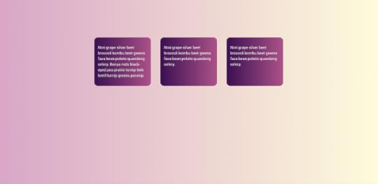
A new problem appears however when we begin to really work with grid, we discover that one grid is not enough. I’ve got a different presentation of my gallery here, which uses grid layout and I have this time added some captions to the images. The overall layout here is a fairly straightforward grid, each individual image and caption is also a grid, by making the grid item a grid container and defining two row tracks. This enables me to stretch the image over two tracks, and place the caption in the second track.
The problem we have however is if we add additional text to the caption. It becomes taller than the other items and the effect of nice lined up boxes is diminished. We can’t line the captions up because those nested grids don’t know about each other and how big each caption is. Sound familiar?
That’s right. We never know how tall anything is on the web.
What we need is a way to ask the nested grid to use tracks defined on the parent. That way the captions could be in the same row. A change to the size of one caption would then change the height of the entire row, taking the other captions with it. This is exactly what the subgrid value of grid-template-columns and grid-template-rows gives us. You can see this is action in the CodePen below, as long as you use Firefox. Firefox is currently the only browser to support subgrid. If you would like to see it in Chrome, it wouldn’t hurt to go star this bug to show your support.
See the Pen
An Event Apart: More subgrid by rachelandrew (@rachelandrew)
on CodePen.
The point it, that as you start to design with and for these new layout methods you will hit other problems. And do you know, that’s a good thing.
Don’t fall into the trap, of becoming excited about all the new things, and when someone points out something you can’t do, perhaps scoffing, oh you think grid is so great but look, it can’t do this, feeling you need to defend it, perhaps explaining that this isn’t a limitation, the web doesn’t work like this, the web is not print, or perhaps the web is not native, or whatever ….
We just can’t do that yet
We get to do it, by finding the use cases, explaining them, writing them up. Pointing to other media and asking whether we can do that thing on the web in an elegant and performant manner. We get this stuff because we create this stuff.
Not just me, or the CSS Working Group, or the browsers, or the folk from print user agents or EPUB. All of us.
So here are my edges, the things I want to be able to do. Things I think we’re sort of close to, and where more use cases and more thinking might just help to push them over the line.
If we can back to my example of three pages of gallery images. What would happen if I wanted to put text into one of those boxes? It’s a grid layout, so the area can accept text rather than an image. However, if we end up with more content than the fixed size row will accept we get overflow. The only way to fix that is to make my track expand to auto size, and I then lose my nice paged effect because I can’t be sure that my rows will add up to 100vh. We are right back to our same problem, we don’t know how tall things are on the web. It’s like groundhog day here.
Overflow and Multicol
How might we solve this problem? We can start by taking a look at overflow in multicol. CSS Columns behave differently in a few ways depending on whether we are in Paged Media, such as a book or a printed webpage, or in Continuous Media which is what we are on the web. These things really refer to what happens with overflowing content. When you end up with more content than will fit on a page in Paged Media, a new page is created. When you end up with more content than will fit on a screen in Continuous Media you get a scrollbar and can scroll down to view more content.
In multicol on the web, if you have more content than fits on the screen the columns just get longer and longer. Eventually you have to scroll up and down to read the content, which is a terrible reading experience, and the reason people tend not to use multicol on the web.
If you fix the height of the container, to prevent the up and down scrolling thing, the overflow columns are created in the inline direction. You will end up with a horizontal scrollbar. Again, there might be some use cases for this but I don’t want to do a horizontal scrolling thing very often.
See the Pen
multicol overflow by rachelandrew (@rachelandrew)
on CodePen.
So let’s assume I’m not a maverick and want to stick with scrolling in the block dimension. What if you could say I want my multicol container to be so high - perhaps 100 viewport height high AND if there is more columns, create another 100 vh box in the block dimension and fill it with columns. Keep on doing that until you run out of columns.

How useful would that make multicol? I think that would be excellent, and this idea of overflow in the block dimension is something we are considering for a Level Two of the multicol specification.
Multicol doesn’t quite solve my problem, as even with block dimension overflow I would need space for those columns to go.
What I really want here is to be able to have some marked up content, and instead of having to work out how much can go in each box, and break it up into sections somehow, and stick some in each container, I want to let the browser deal with it.
Hey browser, this content can go into any of these boxes. Fill them up!
Paged Media
We already have places where CSS has come close to this idea. If we start with Paged Media. It often comes as a surprise to people how much usage there is of CSS for print and other paged media such as EPUB, when we talk about paged media we are talking about any of these things. There are user agents which turn HTML and CSS into a print ready PDF.
You need to use a specific user agent for print when you work with paged media, browsers support a very small subset of the tools that you get with a user agent such as Prince.
When creating a PDF either to use as a PDF or for print, you have the concept of a page box, which defines a physical page with a size. You can add things into the header and footer area of each page box, target left and right pages individually. You can insert content - using Generated Content - into the margin boxes of the page. Then, when you add your content, enough pages will be created to hold the content. If you add more text, increase the text size in your stylesheet, or decide to change the size of the page to make it smaller. More pages will be created – each the same.
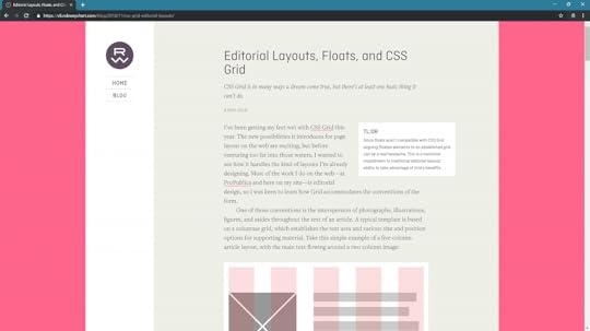
In a paged context you can take content and flow it through as many pages as are needed to contain it. But if you think about creating web site or application with defined screens, how different is that to paged media? Perhaps not very.
Is it wrong to think of web content as a set of defined pages rather than a continuous scroll? I don’t think so, but at the moment you will fight quite a battle to make it work well. However, we have had attempts in CSS to develop a spec which would behave in the way I explained, allow the creation of sets of boxes that content could flow through. That attempt was CSS Regions.
CSS Regions
I’m using Regions here as a demo because it helps me describe something that we can’t otherwise come close to in browsers today, and not because I expect it to end up in our browsers any time soon. As the screenshot below demonstrates, that seems unlikely. Regions was actually implemented and then removed from browsers.
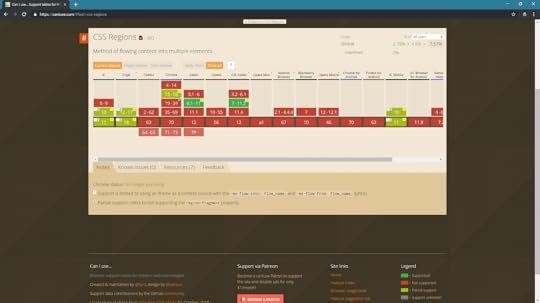
The image on Can I Use above was taken before Edge moved to Chromium. Edge had an implementation of Regions and so I was able to record the following video, demonstrating how Regions worked with my grid layout.
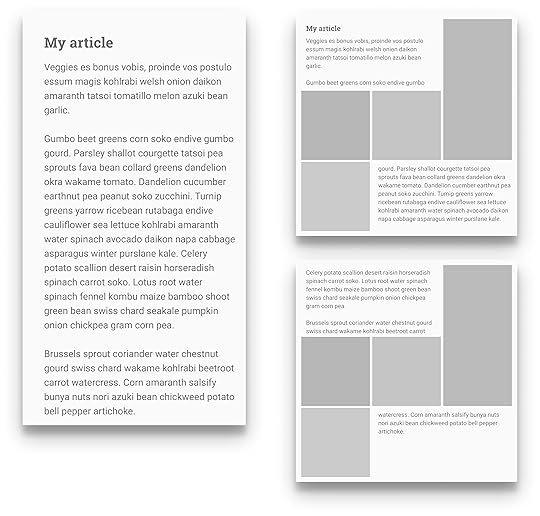
The text is one continuous thread. It fills the boxes in turn. First filling box 1, then box 2 and moving onto fill box 3.
.embed-container { position: relative; padding-bottom: 56.25%; height: 0; overflow: hidden; max-width: 100%; } .embed-container iframe, .embed-container object, .embed-container embed { position: absolute; top: 0; left: 0; width: 100%; height: 100%; }
The problem with Regions can be understood via this example. The content flows nicely between the boxes. I get a multicol like effect between the first two boxes. The remaining content then flows into the third box.
But what happens if there is more content then these three boxes can hold, or the user has increased their font size? That’s right – we get overflow because you never know how big things are on the web. Regions needs somewhere for the content to go. You have to create a stack of redundant elements to hold content which may or may not be forthcoming, second guessing the content to have enough layout and not too much. In all likelihood using JavaScript to work that out and create enough elements.
There was no ability to do anything like the things we can do in Paged Media, no way to declare that my pages or components look like this, please create as many as you need and put the content into these boxes.
It has been suggested to me that the spec is fine because you can dump everything leftover into a final div for sad content without a home. I don’t think that is a solution anyone really wants. That’s a hack, a workaround, it feels like something not fully thought through.
Regions faltered. The code was removed from Blink. Whenever it comes up people get very tetchy. However this all really predated grid layout.
I think that now, in a world where we have Grid and where Regions makes a lot of sense, we can circle back and look at something which is like Regions again.
As with block dimension overflow for multicol, I think this is also all about overflow. Web design has always been a battle against overflow, against the fact that we never now how tall (or how big in the block dimension) anything is on the web.
The minute we decide that we have a finite page, we aren’t just scrolling forever, we have decided how big this is in the block dimension, we risk overflow and we have given ourselves the job of managing it.
Web design is mostly a batle against overflow.
Did Regions pave the way for something better?
What if, as with multicol overflow, we can say - this is my container - it’s 100vh. It looks like this, at this breakpoint, it looks like this at another breakpoint. Here is my content, I want it to flow through these boxes. If I fill all the boxes, create me another box with the same layout and continue to add content.
As with the original regions idea my content thread is a semantically marked up thing, it makes sense outside of that layout. We gain that separation of structured content and the layout. I think it would be incredibly exciting and useful. There are however things that need to be put into place before anything Regions-like can happen. CSS Regions, like multicol relies on Fragmentation, and fragmentation is not in great shape across browsers right now. And, while it is annoying enough to end up with a heading at the bottom of one column with the content in the next. It would be a dealbreaker to have the heading in a box completely disconnected from the rest of the content.
Making things better
Whether you like the idea of Regions or not, I talk about these things because this is how we get new things. This is how we solve problems.How we figure out the next big layout challenge and start to fix it. Here is another example.
At An Event Apart I ended up chatting to Rob about a problem he had with Grid. He wanted to be able to float items but still have them use the grid layout.
Because a floated item, when it becomes a grid item, loses the float behaviour he couldn’t do that. So had come up with a hacky solution to the problem and he wrote it up.
Now Rob saw this as a grid problem. He wrote it up as a grid problem.
However when I looked at it, because I’ve been digging around these specs for years, I recognised that we already had something in CSS that could solve this. The Exclusions spec – also only useable in Edge right now – solves this problem perfectly.
I was able to write up the solution with some demos.
More importantly it gave me a great use case to take back to the CSS Working group, to show them of a real-world problem that Exclusions solved, to see if we could start talking about it and solving the problems in that spec so more browsers might implement it.
This is the sort of thing that anyone can do. Write up the things you can’t do – even guess at a solution – don’t worry if it isn’t the best solution. Figuring that out takes more than one mind most of the time – that’s why we have the CSS Working Group. But do show us. Don’t assume that because CSS doesn’t work like that now it can never work like that.
We have come so far in the last few years. The last thing I want, is for it to stop now.
Perhaps these first few years of grid, when we look back will look very grid like, as we all got excited about being able to neatly line up our boxes. That’s great, lining up boxes is a useful thing to be able to do, but let’s not allow that to define our new technical limitations, and instead keep poking at the edges and asking what next, why can’t I do that? And we’ll keep pushing at the edges, and continue to break out of the technical limitations, making things better, faster, or yes just less weird.
And this was very nearly the end of this talk. But, when I was about to present this in San Francisco for the first time something happened that I think backs up the importance I place on more people having input into the web platform.
I woke up, to the rumors that were later confirmed that Microsoft were dropping their rendering engine EdgeHTML in favour of using Chromium. And I feared that we were heading right back to the days where one browser had over 95% market share. Where one browser could quite literally dictate the direction of the web.
Many of the things I have talked about, Exclusions and Regions for example, were implemented by the Microsoft team. No, not in a perfect finished way, but enough for us to be able to experiment. Enough for us to try them out. Grid Layout was first implemented by the Microsoft Team in IE10. No, it wasnt perfect, essentially a prototype for what was to come, but it enabled people to experiment. I probably wouldn’t be known as the CSS Grid person if it hadn’t been for that implementation allowing me to start to work with the spec.
Fewer browsers mean fewer experiments. Mean fewer places where things can start to evolve. When I first gave this talk, I said I was absolutely sure that the excellent people on the Microsoft browser team, people who I would call my friends, good people, good engineers, true standards advocates would do great work on Chromium. That has already played out to be true. But ultimately, it’s a single rendering engine and is driven by the needs of Google.
And, if we are not to have diversity in rendering engines then we need to double down on making sure that there is diversity of thought involved in the standards process.
At a W3C meeting or standards discussion, the room should not be 60–70% Googlers.
—
Ferdy Christant
As Ferdy Christant points out, there are other players who can be involved in standards discussions, not just the people behind rendering engines. CSS Shapes, Exclusions and Regions came out of work done by Adobe.
Many of the people on the CSS Working Group represent the world of publishing. We need to make sure that those non-browser companies are given weight and impact.
We need to encourage independent voices into the process. We need to make sure that it is as easy as possible for web designers and developers to join the discussion, and encourage those who show real talent for standards work.
Then we need to make sure that every time someone comes along who is good at this, who can impact the process, who can be a different voice or represent different people, that they are supported to do so and are not just immediately hired by Google as the only route to do web platform work. A shoutout in that regard to Fronteers and their great experiment in funding me as an official representative of web developers.
And I am not having a dig at Google here, again, there are some great people doing great things there, and the company is being a company doing what companies do - growing, succeeding. This isn’t a fight between good and evil. It’s a fight against a monoculture turning the web platform into the product of a single company. Whoever that company might be this time.
So please. Participate, share your ideas, help us solve problems. And let’s work together for the future of the open web platform.
January 7, 2020
The CSS Layout Masterclass
I���ve got an all-new workshop for 2020, and so far I have bookings for SmashingConf in San Francisco, Austin, and New York. I���d love to see you there.
I would also love to book some workshops in the UK and Europe. So, if you would like me to run a workshop at your conference, or visit your company to train people in-house - please get in touch.
Workshop details
We���ve been learning CSS and CSS for Layout in the same way since we broke free of table-based layouts in 2001, however CSS has grown-up and over the last few years a proper and consistent system for layout has emerged.
We can understand CSS layout as a system, and rather than poke around using trial and error to do layout, learn the rules that control this system saving a lot of time and enabling more elegant and performant layouts.
In this all-new workshop I will take you through this new system for layout, giving you the ability to properly understand and use CSS Layout with real understanding of why things behave as they do.
This understanding will make choices such as ���should I use grid or flexbox��� or, ���what do I do about old browsers��� much easier, in fact sometimes the answer will be so obvious, you���ll not need to ask those questions!
Who is this for?
This workshop is for front-end and full stack developers. If you love CSS already, you will enjoy gaining a deeper understanding of the language. If writing CSS is not your favourite thing, then you���ll come away with a better understanding of how things work, and the ability to treat CSS in the same way you treat other languages. Even if you don���t leave loving CSS, you will leave being able to do the parts of your job that involve CSS in a faster and better way.
This workshop is also structured to make it as easy as possible for you to share what you have learned with your team. If part of your job is to help other team members with their CSS, you���ll find you have better ways to explain things to them.
The basic design principals behind CSS
What is the display property really, and how has it changed?
Formatting contexts
Multi-column Layout
Fragmentation
Grid Layout - including subgrid
Flexbox
Sizing, alignment and writing modes
Developing robust fallbacks for browsers without support
Feature Queries
Media Queries - including the new features in Media Queries level 4 such as pointer detection, and prefers color scheme
The contain property - using CSS to improve performance
Using DevTools to understand and debug layouts
I will also be happy to answer specific questions you might have along the way, and for in-house workshops I can always tailor the material to make sure it reflects your needs in the company.
December 31, 2019
2019
I���ve run the gamut, A to Z. Three cheers and dammit, C���est la vie. I got through all of last year, and I���m here. ��� ���I���m Still Here���, Follies, Sondheim.
Twenty years ago I saw in the Millennium, at home recovering from flu. My daughter was a toddler, I had no money, and was just beginning my career in web design. I had no idea what building websites would lead to, or what the web would look like 20 years on.
Given my status as an early bird, I���m fairly unlikely to still be awake at midnight in the UK to see in 2020. In fact I���ll probably be having my breakfast as the East Coast of the USA are celebrating, before heading out to do two New Year���s Day parkruns. So here is my 2019 roundup.
2019 by the numbers
Tripit tells me I have traveled 202,092 km to 53 cities in 13 countries. I was on the road for 171 days in total. I���ve traveled fewer miles though been away from home longer than last year as I���ve been trying to combine trips where possible, rather than fly back and forth. None of this was vacation, but conference and W3C related travel.
Strava has logged 818 miles run, 1501 cycled, and 36 hours of swimming.
Notist reminds me I spoke or gave a workshop 30 times.
Speaking
My Notist Profile lists all of my past and upcoming speaking engagements, other than in-house workshops or talks. Many of these pages linked below contain video, resources, and links to the hundreds of code examples I create to go along with my talks and workshops.
Building a CSS Layout: Livestream, Smashing TV December 2019
Now You See It. Understanding Display, An Event Apart SF December 2019
Does it work? Using the new CSS Layout, East Bay WordPress December 2019
Does it work? Using the new CSS Layout, Web Clerks November 2019
Does it work? Using the new CSS Layout, Refresh Conf November 2019
Making Things Better: Redefining the Technical Possibilities of CSS, An Event Apart Denver October 2019
Grids All The Way Down, Codemotion October 2019
Next Steps With CSS Layout Workshop, Smashing Conf New York October 2019
Refactoring (the way we talk about) CSS, Nordic.js October 2019
Next Steps With CSS Layout Workshop, Fronteers October 2019
Who Designed This? Where Web Platform features come from, and how to get involved, Fronteers October 2019
Does it work? Using the new CSS Layout, Finch Front-end September 2019
Making Things Better: Redefining the Technical Possibilities of CSS, An Event Apart Chicago August 2019
Making Things Better: Redefining the Technical Possibilities of CSS, An Event Apart Washington DC July 2019
Next Steps With CSS Layout Workshop, Smashing Conference June 2019
Hello subgrid!, Fronteers Meetup June 2019
Refactoring (the way we talk about) CSS, CSS Day June 2019
Grids All The Way Down, Pixel Pioneers June 2019
Hello subgrid!, CSSConf EU May 2019
Grids All The Way Down, Umbraco Codegarden May 2019
Next Steps With CSS Layout Workshop, Frontend United May 2019
Grids All The Way Down, Frontend United May 2019
Grids All The Way Down, Colchester Digital Conference May 2019
Making Things Better: Redefining the Technical Possibilities of CSS, An Event Apart Boston May 2019
Next Steps With CSS Layout Workshop, Smashing Conference April 2019
What���s New In CSS?, W3C AC Meeting April 2019
Grids All The Way Down, Frontend NE April 2019
Next Steps With CSS Layout Workshop, Rustbelt Refresh March 2019
Making Things Better: Redefining the Technical Possibilities of CSS, An Event Apart Seattle March 2019
What���s New In CSS?, Fronteers W3C Meet-up February 2019
Writing
I���m incapable of having a thought without turning it into a 2,000 word essay, I���m happy with the collection of words I���ve created in the past year. Some of them seem to have been useful to other people. I try and keep the work page on this site relatively up to date with things I have published. Here are some of them:
Helping Browsers Optimize With The CSS contain Property
A History of CSS Through Fifteen Years of 24 ways
Web Design and Development Advent Round-up 2019
Black Friday 2019: Support Indie Makers
Teaching CSS
Things We Can���t (Yet) Do In CSS
The W3C At Twenty-Five
Editorial Design Patterns With CSS Grid and Named Columns
Smashing Magazine is Thirteen
Overflow and Data Loss in CSS
Pitching Your Writing To Publications
Writing Modes And CSS Layout
Everything You Need To Know About CSS Margins
CSS Lists, Markers, And Counters
How To Create A PDF From Your Web Application
Digging Into The Display Property: Grids All The Way Down
Digging Into The Display Property: Box Generation
Looking Back At SmashingConf San Francisco 2019
Digging Into The Display Property: The Two Values Of Display
-How To Align Things In CSS
Designing An Aspect Ratio Unit For CSS
Breaking Boxes With CSS Fragmentation
A Guide To CSS Support In Browsers
When And How To Use CSS Multi-Column Layout
How To Learn CSS
MDN
I have been writing for MDN throughout the year, documenting CSS Layout, updating the Learn CSS section of the site, and trying to keep the Browser Compat Data for CSS up to date. MDN is such an important resource for the web community, it has been a privilege to be able to direct so many of my words there.
Get Ready For CSS Grid Layout, 2nd edition
Also this year I updated my little guide to grid layout - Get Ready For CSS Grid Layout. The first edition was published long before grid shipped in browsers, so it seemed fitting that this update was published just as subgrid was becoming a possibility.
CSS and the W3C
I have just come to the end of my first full year as the representative for Fronteers at the W3C. This has meant attending Advisory Committee meetings in addition to the CSS Working Group. I���m not a fan of meetings in general, however I have enjoyed discovering more about how the W3C works, and I will be continuing as the representative for Fronteers in 2020.
You can find out a little bit about that work in the video of my talk at Fronteers Conference this year.
One of the ways I���ve been involving Fronteers members in the work of the CSS WG has been in running spec reading workshops. A group of us get together and read through a spec. In addition to helping attendees understand how to read a spec, these workshops have led to actual changes in the specifications. Having new eyes on a spec can really help to clarify it, and to identify places where new diagrams or information would be useful.
Multicol
I am co-editor of the Multiple-column Layout spec, and we read through the Editor���s Draft in the first workshop I ran for Fronteers. This resulted in a number of edits, which are now part of the Working Draft I published on the 15th October. my next move is to return to working on the test suite, as I would love to get multicol back to CR status soon.
Smashing Magazine
I published a review of 2019 from a Smashing perspective over at Smashing Magazine today. It���s been a good year. We have published an article almost every working day, the conference team have brought four wonderful conferences to life, and we���ve published two books and a print magazine. I���m looking forward to seeing some of the plans we have been making come to life in 2020.
CSS Layout News
I have continued to post CSS Layout News each week throughout 2019. There are almost 11,000 subscribers and I have a whole year of sponsorship slots to fill if you would like to help pay for the ever-increasing costs of sending the thing!
Notist
Our application for public speakers continues to grow steadily. A lot of people seem to really like it, some have even paid for pro accounts. The topics page is always interesting to me, as there are huge collections of materials on many different topics, with more video than I ever imagined being included - here is design for example.
Running and Triathlon
I���ve had a really good year for sport in 2019. I started working with a new coach in the middle of the year. I���m highly motivated and also used to correcting myself due to my background as a dancer, I also travel far too much to have regular in-person appointments with a coach, so I opted for remote coaching. I found Laura Henry and Team MPI via the Women in Triathlon Facebook Group, and she has managed my hectic schedule and the challenges I face due to my mangled arm amazingly well.
I don���t need encouraging to work out, what I needed was someone to help me work smarter, to make progress despite traveling so much, and to stop running myself into the ground and bouncing from injury to injury. That is what Laura has given me, and I���m heading into 2020 with fewer niggles, less stress over what I should be doing, and some nice successes to build on.
In 2020 I tackled a 70.3 (half-ironman distance) triathlon for the first time. I made two attempts at the course, the first I had to DNF half way through the bike leg when my entire right arm locked up into my shoulder leaving me without safe control of my bike. I have significantly reduced range of movement and nerve damage in my right arm due to an accident in 2013; the cold swim (with less than perfect technique) was ultimately what took me out of the race. I worked on my swim, and the other parts of the race, and in August managed to complete the same course. It wasn���t fast or pretty - but for someone who has learned to cycle and swim as an adult, and with a disability which causes problems in both of those disciplines, it was a huge achievement. I can���t wait to do it again in 2020, and rather than just get round, have the confidence to race it and improve my time.
I also traveled with my bike to Chicago, when there for An Event Apart, and did the Chicago Triathlon. It ended up being a duathlon as the lake wasn���t safe to swim in. However the biggest challenge of that trip was putting my bike back together in the hotel room!
In September I did the Berlin Marathon, which I had to defer in 2018 due to a flu virus. It was dreadful weather and I���d not done as many long runs as I would have liked due to IT Band niggles and being in the middle of fairly intense travel, but I had great fun. I did encounter the worst portaloo I have ever seen however, while waiting at the start. Drew and I both have places for Berlin next year, in addition to Manchester Marathon in the spring. I���m hoping to be able to improve my times in 2020.
I���ve also had fun doing local races and parkruns while traveling, along with encouraging conference runners out at all of the Smashing Conferences.
Flying
I���ve not got much further with my PPL. The weather in Bristol, and the lack of aircraft availability at my flying school worked to make it almost impossible to fly when I was home. I���ve decided to go finish my license abroad - probably in Florida. Due to the next item in this round-up I put that idea on hold until 2020, but I am really looking forward to re-starting my training.
I bought a house
While writing out my goals for 2019 I wrote in my planner buy a house. We���ve never owned a house. I was young and worked in theatre when my daughter was born, by the time I was earning enough money to make buying even possible, I was funding her dance school and college. That���s not a decision I regret - training and education are far more valuable than material things - however having to ask permission to hang a picture in my rented house was getting a bit tiresome. I am also aware aged 44, that having the security of property is probably a good thing.
I wrote buy a house in my planner, and a detailed set of steps that would get us there, and we just celebrated Christmas in our new home. Rather boringly, the way I got us here was by the somewhat pass�� method of working very hard and very long hours. I wish I had some magic beans that achieved these things with a 40 hour workweek, but it���s never worked out that way for me! I know that when I want something, it���s probably going to involve my nose meeting the grindstone - whether that���s work, sport, study or anything else. I feel I���m fortunate to be in a position to do work that is interesting to me, and that I am in good health and able to do it.
The Rachel of the year 2000 had very few opportunities as a young mum, with a theatre background and no education. The fact that working hard at this web thing has enabled me to put my daughter through school, and finally get us onto the housing ladder is amazing. Even more so is the fact that the things I have worked on have been useful to the people who come to tell me about how my books, articles or talks have helped them get started with this web thing.
On to 2020. Happy New year!
Rachel Andrew's Blog

- Rachel Andrew's profile
- 13 followers

