David Petersen's Blog
April 28, 2026
Mouse Guard Coloring Book
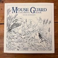 I have released a new Mouse Guard coloring book! It is a 10" x 10" 96 page coloring book! This item is available EXCLUSIVELY through my online store and at conventions I attend:
http://mouseguard.bigcartel.com/product/mouse-guard-coloring-book
"Experience David Petersen's beloved comic series Mouse Guard with this lush coloring book. Featuring over 90 black and white illustrations showcasing the intricate detail of the environments, cities, and characters from across the Mouse Territories, readers of Mouse Guard and colorists alike can bring this world to life with th vivid colors of their imaginations."
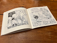 Years ago the first coloring book we did with Archaia went out of print, and fans and the coloring book community have been asking all that time if or when we'd ever reprint or put out a new edition. Julia and I opted to do a new version with all new art not included in the original.
 We also went with a lay-flat binding option so that you can open the book to any page and have the book stay open without having to fight the page next to you closing or break the spine to stop it.
April 21, 2026
Usagi Yojimbo Kaito 84' Cover
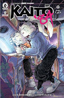 I've been fortunate enough to get to do several Usagi covers for Stan Sakai's beloved series (see past covers/pinups), so when I was asked to do a cover for the new Usagi series written by Zack Rosenberg and painted by Jared Cullum that is set in 1984, I was thrilled. Not just because I'm a fan of Usagi, but it's interesting to be part of this historic project where Stan Sakai is not at the helm. This could worry some fans, but anyone who know's Jared's work and Zack's enthusiasm and their combined dedication to this book, it's source material, and the outside influences it's tapping into will be picking this book up with every new issue.
To the side you can see my finished cover, and in this post I'll talk about the process of creating it.
 It started with a conversation with Jared & Zack at SDCC last year where they asked if I'd do a cover. We talked about the story and influences of 80's anime they were inspired by for this 'modern' take on Usagi––and Zack mentioned I could do something that wasn't even story specific and just gave off a 1980's vibe. I mentioned Usagi at an arcade where all the cabinets had art on the sides that were not our real world games but nods to Usagi comics––and with that agreed upon I started compiling photos I could find of early 80's arcades.
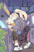 Using that reference to draw a tight series of cabinets (tighter than I wanted, but it was hard to get enough of the machines in that they could be seen in the tall formatting of a cover. I penciled Usagi and Yukichi using the costume reference Jared shared with me each separately and had to move and reposition bits (Usagi's head tilt and his hand) until I had a composition where they were interacting with the arcade cabinet.
 I over-did the color blocking, but this was partly to assure, Stan, Zack, Jared and their editor I knew where I was going with this––but it was also to show myself that I knew where I was going. I still left the cabinet decoration loose until I knew they were all on board.
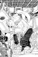 Luckily I was approved to move forward and while I was able to play with motifs and design bits for the other cabinets, I decided to pay homage to The Dragon Bellow Conspiracy on the machine Usagi's using (which I inked as a negative based on one of Stan's drawings).
The inks were done by printing out the layout and taping it to the back of a sheet of Strathmore bristol. On my Huion lightpad I was able to ink while using the printout as a guide instead of traditional pencils.
Most of the tricky parts on this cover were the density of lines on the cabinets while trying to still keep spaces open for color to do a lot of the heavy lifting when it came to the lighting.
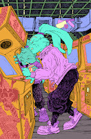 The inks were then scanned and I started the coloring process. This first step is called flatting, where it's more of a professional coloring-in-the-lines assignment so long as each color area (Usagi's fur, Usagi's coat, Yukichi's fur, coat, each cabinet, the floor, etc) are all different flat colors. As you see here, the colors don't even need to be final choices, they can be anything as long as they are different from one another.
At this stage I also established color holds, areas where I want the lineart to be a color other than black, on all the graphics of the cabinets, Usagi's scar, and the screens.
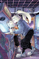 Once I got the base colors closer to my layout piece, the final rendering was done using dodge and burn tools in Photoshop to add light and shadow. This cover also relies on a lot of lighting effect layers to add those screen glows and the bounced color lighting. It was fun to re-imagine my experiences in retro arcades Tilt, Alladin's Castle, and Pinball Pete's and try to make it work for a Usagi comic.
 USAGI YOJIMBO: KAITO '84 #3
Publication date: May 20, 2026UPC: 76156801508900331
April 14, 2026
Kestrel Archer
 As I work toward a new sketchbook this year, I'll be doing a series of posts about Mouse Guard illustrations I've done that will be included in that new release: 'Past Whereabouts' that will debut at Emerald City Comic Con and be available in my online store soon afterwards.
Sketchbook illustrations are often a chance to explore corners of Mouse Guard that I haven't gotten to yet. Whether it's certain locations, characters, or just ideas or thematic tones. For this illustration it's a Kestrel archer with a mouse helper. In this post I'll break down the steps to creating the illustration
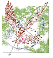
Leaning into the era of Mouse Guard before the Guard...when mice were in the employ of other beasts (see Jeremy Bastian's Legends of the Guard Vol 1) I wanted to show a bird using a weapon of its own as a mouse helper rode with it keeping arrows stocked.
I drew the kestrel based on photo reference (though I made anatomical adjustments to get the legs in the right position to draw back the bowstring) and then on another sheet of copy paper overlayed on the first drawing, I drew the mouse & bow. These were assembled in Photoshop where I dropped in some vector silhouettes of pine trees as background.
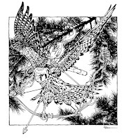 The digitally assembled pencil layout was printed out and taped to the back of a sheet of Strathmore Bristol and placed on a light pad. With the light shining up, I was able to see through the bristol surface to the printout to use as a guide as I ink the artwork. I used Copic Multiliner SP pens to do the inking (the 0.7 nib mostly)
The inking focus was on the kestrel's feather pattern and on all those pine needle clusters. Originally my plan was to use the bird & mouse as a tee shirt design and to drop the pine branches away for the shirt, but ink them in so the original art looked more finished. I opted to not use this as a shirt (mouse was too small).
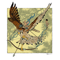
With the inks scanned, the color flatting (painting areas of flat color to establish all the color areas) started. The kestrel colors were referenced from the photo, but I certainly made hue, value, and saturation decisions with the base colors. The mouse colors were to echo the orange and grey-blue of the kestrel's head.
It's also at this stage that I established color holds (areas where I wanted the lineart to be a color other than black) for the feather patterns, bow string, and the pine branches.
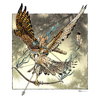
The last step was to render the colors with dodge and burn tools and a stock textured brush. Dodge and Burn are tools based on photography terms (and from when Photoshop was a photo retouching program) having to do with purposely over or under exposing areas––or in other words darkening or lightening them.
I use these tools to create shadows and highlights to my base colors while giving a bit of a pebbly texture with that stock brush. I also shifted colors a bit here or there either with a soft paintbrush or a feathered lasso and the color balance tool.

This illustration, along with many more, is in the sketchbook 'Past Whereabouts'
which is available in my online store: https://mouseguard.bigcartel.com/
April 7, 2026
Grain Cart Model Video
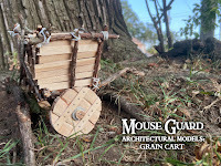 The model of the grain merchant's cart, made of oak twigs, scrap wood, popsicle sticks, and twine.
 In the video below, I show and talk about every step in making it 20 years after I drew the scene in the first issue of Mouse Guard to mark it's anniversary with a print in 2025 as well as wandering the woods with it taking photos at tree bases until the right reference photo leaps out as the one to use.
Direct YouTube Link:https://youtu.be/JsX337hPtRI
March 31, 2026
Barkstone Approach
 With the new sketchbook now available, I'm continuing a series of posts about Mouse Guard illustrations I've done that are included in that new release: 'Past Whereabouts' available in my online store: https://mouseguard.bigcartel.com/
Sketchbook illustrations are often a chance to explore corners of Mouse Guard that I haven't gotten to yet. Whether it's certain locations, characters, or just ideas or thematic tones. For this illustration it's Saxon, Kenzie and Lieam approaching Barkstone. In this post I'll break down the steps to creating the illustration
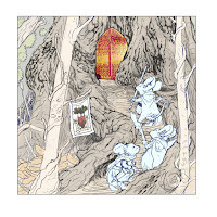
One of the 'Past Whereabouts' I wanted to journey back to was that walkway up to the gates of Barkstone from Fall 1152. The location was based on a real tree behind the antique store I worked for when I started Mouse Guard. I still had reference photos to look at as I drew the tree and rotted root walkway. On another sheet of copy paper I drew the characters, and then in Photoshop assembled them all with some light color blocking while adding in a photo of the door reference from Fall as well as a stained glass window with references to 'strength' and 'home' I felt was appropriate for thiscity on the western edge of the mouse territories.
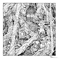
The digitally assembled layout was printed out and taped to the back of a sheet of Strathmore Bristol and placed on a light pad. With the light shining up, I was able to see through the bristol surface to the printout to use as a guide as I ink the artwork. I used Copic Multiliner SP pens to do the inking (the 0.7 nib mostly)
The inking focus was on all that texture of the tree bark and fallen ground cover and debris. I tried to keep some of the tree bits open as well as to not flood the characters with too much line density so the eye has somewhere to rest.
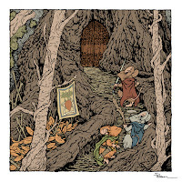 With the inks scanned, the color flatting (painting areas of flat color to establish all the color areas) started. The colors were based on the colors from Fall, but darkened and muted down a bit. The door is much more red than it was in the Fall book––I wanted it to have a bit more identity and not just blend in as another shade of brown.
 At this stage I also established color holds (areas where I wanted the lineart to be a color other than black) flag/banner design.
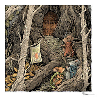 The last step was to render the colors with dodge and burn tools and a stock textured brush. Dodge and Burn are tools based on photography terms (and from when Photoshop was a photo retouching program) having to do with purposely over or under exposing areas––or in other words darkening or lightening them.
I use these tools to create shadows and highlights to my base colors while giving a bit of a pebbly texture with that stock brush.
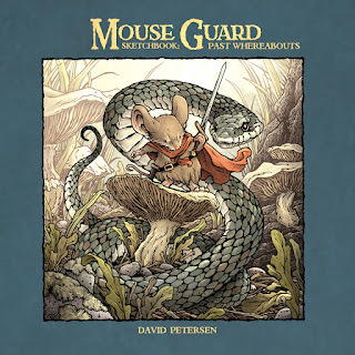
This illustration, along with many more, is in my NEW sketchbook 'Past Whereabouts' available in my online store: https://mouseguard.bigcartel.com/
March 24, 2026
Darkheather Weasel & Bat
 With the new sketchbook now available, I'm continuing a series of posts about Mouse Guard illustrations I've done that are included in that new release: 'Past Whereabouts' available in my online store: https://mouseguard.bigcartel.com/
Sketchbook illustrations are often a chance to explore corners of Mouse Guard that I haven't gotten to yet. Whether it's certain locations, characters, or just ideas or thematic tones. For this illustration it's A weasel in Darkheather with a bat companion. In this post I'll break down the steps to creating the illustration
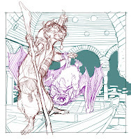
In the epilogue for Winter 1152, I included a few panels showing a weasel in a boat in the distance with a candle on their head and a bat hanging from their arm like an upside-down falcon on a falconer's arm. I think I had a clever idea of what that was going to be some day for a future story––but for the life of me I can't remember what it was. No worries, I can still go back to it whenever I have a clever idea of how to tie it in.
The weasel, bat, and room were all drawn separately on sheets of copy paper and then digitally assembled. I was looking at reference for the bat, and certainly am referencing a photo of a Moorish tunnel room for the location (though I flooded it and added a boat)
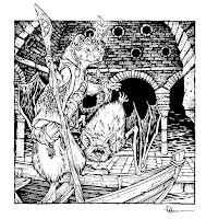
The digitally assembled layout was printed out and taped to the back of a sheet of Strathmore Bristol and placed on a light pad. With the light shining up, I was able to see through the bristol surface to the printout to use as a guide as I ink the artwork. I used Copic Multiliner SP pens to do the inking (the 0.7 nib mostly)
The inking focus was on the stippling of the stone bricks so the candle offered a bit of halo glow, but also so the tone of the background pushed the more open figures forward.
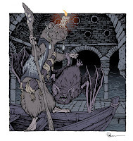 With the inks scanned, the color flatting (painting areas of flat color to establish all the color areas) started. I went with a very purple base (much like the Darkheather pages in Winter 1152) and shifted base colors of the weasel and bat in that direction too.
 It's also at this stage that I established color holds (areas where I wanted the lineart to be a color other than black) for the cobweb shawl, candle glow, tile symbols on the staff, and the water ripples.
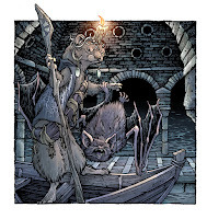 The last step was to render the colors with dodge and burn tools and a stock textured brush. Dodge and Burn are tools based on photography terms (and from when Photoshop was a photo retouching program) having to do with purposely over or under exposing areas––or in other words darkening or lightening them.
I use these tools to create shadows and highlights to my base colors while giving a bit of a pebbly texture with that stock brush. There was a lot of adjustment to color balance wherever the candle light would hit that had to be selected using a lasso tool with a soft feather.

This illustration, along with many more, is in my NEW sketchbook 'Past Whereabouts' available in my online store: https://mouseguard.bigcartel.com/
March 17, 2026
2026 Bookplate
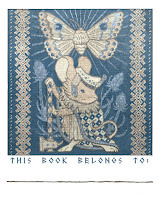 Every year since 2012 I do a new Mouse Guard bookplate I make available at conventions and in my online store. The idea is that this mini-print can be pasted/taped into your book(s), you can write your name in to identify it as yours to borrowers, and since the bookplates are signed, it means you now have a signed book. I try and make each year's bookplate art some medium the mice would/could use. I've done stained glass, relief printing, stone & wood carving, mosaic, etc in past years––this year I was inspired to revisit embroidery.The bookplate debut at Emerald City Comic Con and is in my online store now. Below is the process for making the art for the bookplate.
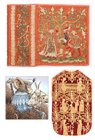 Back in 2014 I'd done an embroidered bookplate––well, I emulated the look of embroidery I should say. And It was one of the artistically crafted mediums I thought I could go back to and do a better job with this time.
I hoarded image examples of medieval embroidery and tapestry before beginning, and narrowed it down to these two as my main inspirations. I liked the dark background with light/metallic figures (Opus Anglicanum) like the Chasuble in the lower right, but I also really likes seeing the individual stitches and that border pattern on the German embroideries with Allegorical Scenes on the top. It reminded me of a Norwegian snow motif I used on the 2019 Teasel print.
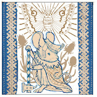 I penciled a simplified pencil drawn version of the mouse from the Teasel print, and a moth (based on an owl moth photo I referenced) scanned them into Photoshop and composed an image using the border pattern of the German embroidery I mentioned earlier. Instead of a dark red velvet, I thought it would be nice to do a muted royal blue (which would echo back to the Teasel palette)
 To fill the space I digitally drew in some teasel silhouettes and blocked in color ideas going more for a cream colored embroidery thread rather than the metallic silver I'd originally assumed I'd use. I have to say that at this point, I still wasn't sure HOW I wanted to execute this––pencil rendering, ink, digital painting, traditional paining?...
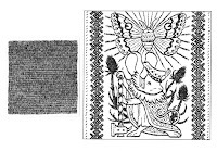 Go with what you know, I guess, right? I inked the main image still considering doing some kind of pencil rendering for the cloth texture spaces. The digital composite layout was printed out and taped to the back of a sheet of Strathmore 300 series bristol and on a lightpad I inked the main stitching with a Copic Multiliner SP pen (the 0.7 nib). Then, I used a smaller scrap of bristol to ink a 'stitch texture pattern' I could use digitally to mimic the effect of the final piece being embroidery while also still being my own lineart instead of photo-texture.
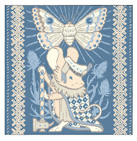 Scanning in the inks I was still unsure about this method for emulating embroidery and nearly gave up to restart after I blocked in the color.
 This first step of coloring is called 'fatting' because it's just about dropping in flat color with no shading or texture just to establish the color choices and placement. I also added color holds (areas where I wanted the inklines to be a color other than black) to everything except the outer boarder.
The worry with at this stage was how to get the embroidered look correctly without it looking like a bad trick or painstaikingly digitally painting over this with individual stitch/weave texture.
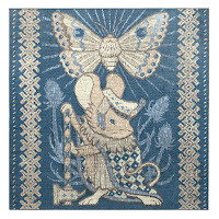
That's when the hand inked stitch texture pattern came in handy. I lightened it a great deal and set it to layer mode 'multiply' to get it over everything (I had to tile it several times over since I made it small to save on it's tedious creation). That also made a great guide for me to go in and shade individual areas between the texture lines to highlight as stitches standing proud or with a slightly lighter thread. In the end I also added some subtle gradients to the top and bottom to shade and highlight it to look more like a photograph of a real object instead of a drawing of one.
The bookplate will be available at all my convention appearances this year and also in my online store
--ALSO--Here are all the past years Bookplates––many of which are available in my online store as a bundle (http://mouseguard.bigcartel.com/product/set-of-mouse-guard-bookplates). Below are the blogposts about the process of making each:
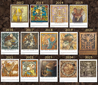
Blogposts:
2012 – Lino Print
2013 – Stained Glass
2014 – Embroidery
2015 – Mosaic
2016 – Pencil Rendering
2017 – Engraving
2018 – Wood Painting
2019 – Gouache Painting
2020 – Wood Carving
2021 – Lino Registration Print
2022 –– Stained Glass
2023 –– Gouache Painting on Canvas
2024 –– Encaustic Tile2025 –– Stone Relief
March 10, 2026
Marigold Print
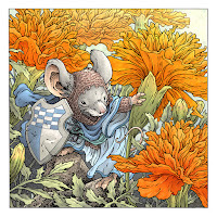 Each Year I create a new limited edition signed and numbered 11" x 11" print. The tradition started many years ago when Julia urged me to create a new print for a convention or event that was 'just pretty'. She thought that we had plenty of images of mice wielding swords and threatening snakes and owls––that the audience, especially women, appreciated when I just drew tender moments, or nature, or flowers. I followed her advice, and for years now fans have proven her right by anticipating and purchasing the new square print I offer annually.
This year the piece is titled 'Marigold'. Below I'll show the step-by-step of creating the art.
 The last few years of botanicals have mostly been in the pinky-purple color range and my first inclination was to do a flower with some yellow or orange warmth, some sunshine for all of us mice. Then picked a Matriarch whose robes/cloak was in the blue range (contrasting color to orange) and saw Laria from the stained glass portraits from the Matriarch chamber in Black Axe as a perfect addition. I drew her on one sheet of copy paper, the marigolds (looking at reference) on another (with the shield), and then the leaves on yet a third.
These were assembled in Photoshop and I did a fast color blocking to help me visualize the final as well as see the different shapes clearer in the next step.
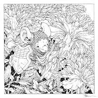 I printed the digitally assembled layout/pencils and taped them to the back of a sheet of Strathmore 300 series bristol. On my Huion lightpad I was able to see through the surface of the bristol to the printout to use as a guide while I inked with a Copic Multiliner SP 0.7 nib pen.
 Line weight in the marigold petals and her robes plated a big part in making the inks work and offsetting the areas where I did more fill-in or texture like on her hood, sleeves, cloak, and the rocks. I'd originally envisioned her hood being ringmail, but then decided to ink it more like it's a coarse knit or crochet texture. But in the end, I think it's still ambiguous.
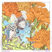
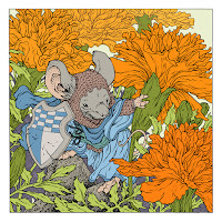 The inks were scanned and using the layout color blocking to pick from, I layed in flat colors. This first step of coloring is called 'flatting' for that reason, it's simply about establishing color areas with flat (not shaded, not textured) base colors.
 There were still several tweaks I needed to make to all these base colors in terms of hue, value, and saturation before I got to the flat version you see here. At this stage I also establish color holds (areas where I want the inks to be a color other than black) on her knit/mail, the shield design, the darker areas behind her, and the marigolds going off into the distance.
 The last step was to render the colors. I used the dodge and burn tools in Photoshop with a stock textured brush to get all the lights and shadows. In a few placed I painted with the paintbrush tool (something I rarely use) to blend in the marigold buds that have not opened yet to have yellow tops.
The Marigold signed and numbered print debut at ECCC and is now available in my online store.
As this is the 15th year I've been doing these, here are the past year's 11x11 limited prints (many of which are available in a bundle in my online store) and links to blogposts for these pieces below
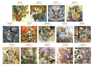
2012 Peacock2013 Raspberry2014 Moonflower2015 Lavender2016 Juniper2017 Rose2018 Elderberry2019 Teasel2020 Sharon2021 Yarrow2022 Pinecone2023 Clematis
2024 Foxglove2025 Belladonna
March 3, 2026
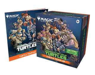
Magic the Gathering: Teenage Mutant Ninja Turtles
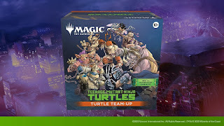 Magic the Gathering is releasing a Teenage Mutant Ninja Turtles set this weekend!https://magic.wizards.com/en/products/teenage-mutant-ninja-turtles
And I was hired to do the artwork for the packaging on the TURTLE TEAM UP:
Magic players of all skill levels team up with the TMNT to fight bad guys in this exciting new co-operative strategy format for up to four players! Equip awesome ninja gear, play with your favorite of the four pre-built 60-card hero decks, then crack open the four included Play Boosters for even more ways to get the drop on the pre-built enemies deck featuring Shredder and his cronies!
For the artwork I was asked to include all four turtles as well as Shredder, Rocksteady, Bebop, Baxter, Splinter and Krang all in Dimension X by the Technodrome. Each character was on a separate layer so that depending on packaging variations they could remove certain characters or background elements to suit their needs (seen in two variations below)
But I was able to get permission from Wizards of the Coast to share the full approved art I sent them with all the characters and background:
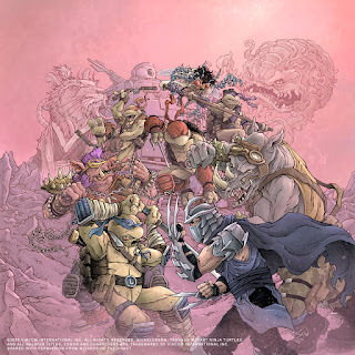
Magic the Gathering: Teenage Mutant Ninja Turtles is already in pre-release and comes out officially March 6th!
February 24, 2026
FACTS print
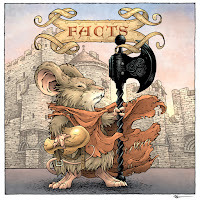 In April I'll be a guest at the FACTS comic convention in Ghent, Belgium (https://www.facts.be/en/). This was an event I'd hoped to attend back in 2020, but the pandemic put that all on hold and we are glad to be able to finally attend this year.
The organizers asked me to do a piece of artwork for the convention that could be used as VIP badge art, a print, and perhaps as part of a banner behind my signing table.
Here you can see the final image, and in this post I'll go through the steps to create it.
 FACTS asked specifically for Bardrick from Dawn of the Black Axe (the latest hardcover available now!) and wondered if I could add something in with the word FACTS––they suggested a book with that on the spine. I decided to regionalize it even more by making the backdrop The Gravensteen a medieval castle in the city of Ghent and to make the FACTS text more heraldic.
 I drew Bardrick on copy paper and used reference to draw the castle and ribbon banner...these were all scanned into Photoshop and assembled into this layout. Each drawing was tinted a bit differently to help me see the lines and then I blocked in some color on Bardrick to also help me see his overall form.
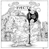 The layout was printed out at about 12" x 12" and taped to the back of a sheet of Strathmore bristol. On my Huion lightpad I was able to see through the surface of the bristol down to the printout to use as a guide as I inked.
 The inking was all done with a Copic Multiliner SP 0.7 nib pen. While inking Bardrick was fairly straight forward, I did have to think about the density of texture and detail on the castle so it didn't become too busy and overbearing. I also looked back at how Gabriel Rodriguez drew the axe itself in Dawn of the Black Axe so I could emulate his inkwork on the weapon for some continuity.
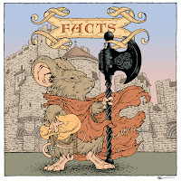 The inks were then scanned and I started the coloring process. This first step in coloring is called 'flatting' because it's only about blocking in all the color areas with flat color––no shading, no texture. Think of it as a professional version of coloring-inside-the-lines. Now I did add a gradient to the sky because I needed to adjust my castle colors to work with the pink to blue transition.
It is also at this step where I establish color holds (areas where I want the lineart to be a color other than black) and I did that for the castle, the banner's details, and the text.
 The last step was to render the color adding light, shadow, and texture. I do this mostly using the dodge (lighten) and burn (darken) tools in Photoshop with a stock textured brush––though I did some painting with a brush to get the sky transition more natural.
The final image was sent off to FACTS where it will become a VIP badge and print. Id you will be attending FACTS in Ghent Belgium April 11-12, I look forward to seeing you there!
https://www.facts.be/en/
Also of note––if you are attending FACTS, I have a commission pre-orders open in my online store: https://mouseguard.bigcartel.com/product/facts-brush-pen-commission
David Petersen's Blog
- David Petersen's profile
- 343 followers


