
Bill Thomson's Blog
March 22, 2020
CHALK Your Walk!
A video of my wife and I decorating our driveway on "Chalk Your Walk" day!
 https://youtu.be/fWOGLxiS2yg
 https://youtu.be/fWOGLxiS2yg

September 9, 2019
NEW WEBSITE!
I am thrilled to announce the launch of my new website, www.billthomson.com! In addition to a completely new and much more beautiful look, the new site includes a lot of new content and features. The site is divided into two main categories, “Children’s Book” and “Illustration” with 42 illustration examples in each, almost doubling the previous number of pieces shown. Being more children’s book focused and interactive, the site also includes two new sections, “School Visits” and “Games & Guides”. The School Visit section provides information about my author visits as well as 12 photos of past visits. The “Games & Guides” section features downloadable content for children and teachers including 5 activities and 3 curriculum Guides. The site was designed by my wonderful wife, Diann, and created by web developer, Myles Angell- I am very appreciative to both of them for all of their wonderful work! I also appreciate the support of the Hartford Art School and HAS Inc. Please check it out and let me know what you think!

July 1, 2019
Comic Books and Me
When I was a boy, I loved comic books. Comics were one of the major reasons that I pursued art as my career. My interest in comics began when I was seven years old and was directly connected to my first love- the Chicago Bears!
At that time, my family lived in the Chicago suburb of Addison, Illinois. The Chicago Bears weren't very good in those days, but they did have the best player in the National Football League... the legendary linebacker, Dick Butkus! My brother and I had Dick Butkus football cards, jerseys, and a huge Dick Butkus poster adorning a wall of our bedroom. However, despite living near Chicago, we had never been to an actual Chicago Bears game and had only seen Butkus on T.V. That changed when we visited my uncle in Atlanta, Georgia in November of 1970. The Bears were playing the Atlanta Falcons during our visit and our uncle got us tickets for the game- we would get to see Dick Butkus play in real life!
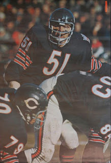
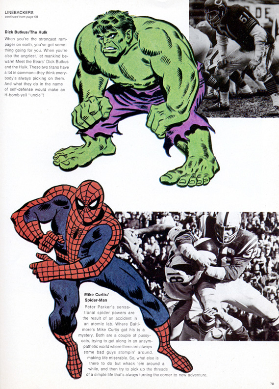
When we went to the game, the cover of the program featured a group of superheroes and the headline, "Beware the Linebacker".
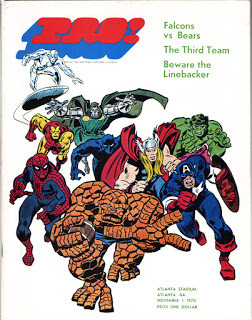
In a feature inside, the program compared Marvel superheroes to NFL linebackers of that time. Since Dick Butkus was the greatest linebacker ever, I wondered who he would be compared to. As I found the page where Butkus was featured, I saw a drawing of a big, green monster mirroring the pose of a photo of Butkus. I instantly became captivated by the depiction of this green behemoth, The Incredible Hulk!

My beloved Bears won the game (a rare win in those days), and I got an added bonus- my introduction to the Marvel universe. When I got home from the game, I repeatedly tried to copy the Hulk drawing, failing miserably at every attempt. The Hulk illustration was done by an artist named John Buscema and his incredible skill was way beyond my 7 year old capabilities. My mother, who is very talented, tried her hand at copying the drawing and did what I thought was an amazing job. Incidentally, John Buscema and his brother Sal were two of Marvel Comics' most talented artists and helped create the marvel universe... both would have a major impact on me for many years to come as the two most influential artists of my childhood.
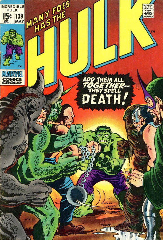
A few months later (in February of 1971), I was home sick from school with a cold. My mother went out to get me some medicine, and remembering the Hulk drawing, she also picked up a copy of the Incredible HULK #139... my first comic book! That comic made me feel much better than the medicine ever did and began my childhood obsession with comic books and drawing.

I just loved the Hulk and his adventures. I also discovered a new artist, Herb Trimpe (the artist that drew Hulk comic books), and I marveled at his powerful perspectives and visual storytelling. I tried to copy his drawings, but similar to my earlier attempt at copying John Buscema's Hulk, I failed miserably. However, this time I didn't get frustrated. Instead, I kept trying. And trying. And trying. Each month I bought a new Hulk comic book, and each month the cycle continued. I would try to copy the drawings contained within those magical newsprint pages and I would always fail. However, my skills slowly developed with the constant practice, and fewer drawings wound up in my garbage can. I eventually even created my own superheroes and told their stories through my art. Comics taught me about drawing, anatomy, perspective, composition and telling a story with pictures. But most importantly, those experiences fostered my love of art and shaped the future direction of my life. My work still reflects the things that comics taught me all those years ago.
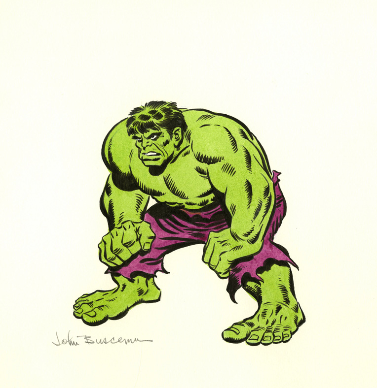
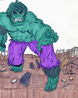 My copied drawing of the Hulk at 10 years old.
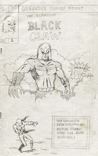 The Black Claw, a comic I created at 12 years old.
Epilogue: Since comics were at the very roots of my artistic career, I wanted the walls of my studio to reflect their importance to me . I have been lucky to find some of the actual vintage original art that inspired me throughout my childhood including the drawing that began my journey. Here are a couple of vintage original drawings that surround me while I work:
 Original painting from Bears vs. Falcons program, John Buscema (Nov. '70)
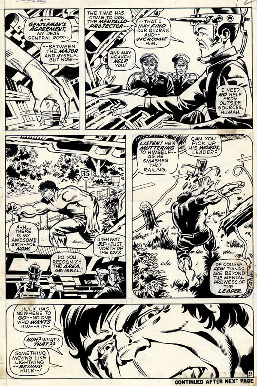
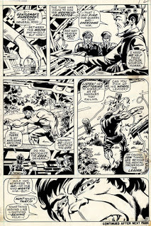 Original art Hulk #139, page 9, Herb Trimpe (Feb. '71 issue)
At that time, my family lived in the Chicago suburb of Addison, Illinois. The Chicago Bears weren't very good in those days, but they did have the best player in the National Football League... the legendary linebacker, Dick Butkus! My brother and I had Dick Butkus football cards, jerseys, and a huge Dick Butkus poster adorning a wall of our bedroom. However, despite living near Chicago, we had never been to an actual Chicago Bears game and had only seen Butkus on T.V. That changed when we visited my uncle in Atlanta, Georgia in November of 1970. The Bears were playing the Atlanta Falcons during our visit and our uncle got us tickets for the game- we would get to see Dick Butkus play in real life!

When we went to the game, the cover of the program featured a group of superheroes and the headline, "Beware the Linebacker".

In a feature inside, the program compared Marvel superheroes to NFL linebackers of that time. Since Dick Butkus was the greatest linebacker ever, I wondered who he would be compared to. As I found the page where Butkus was featured, I saw a drawing of a big, green monster mirroring the pose of a photo of Butkus. I instantly became captivated by the depiction of this green behemoth, The Incredible Hulk!
My beloved Bears won the game (a rare win in those days), and I got an added bonus- my introduction to the Marvel universe. When I got home from the game, I repeatedly tried to copy the Hulk drawing, failing miserably at every attempt. The Hulk illustration was done by an artist named John Buscema and his incredible skill was way beyond my 7 year old capabilities. My mother, who is very talented, tried her hand at copying the drawing and did what I thought was an amazing job. Incidentally, John Buscema and his brother Sal were two of Marvel Comics' most talented artists and helped create the marvel universe... both would have a major impact on me for many years to come as the two most influential artists of my childhood.
A few months later (in February of 1971), I was home sick from school with a cold. My mother went out to get me some medicine, and remembering the Hulk drawing, she also picked up a copy of the Incredible HULK #139... my first comic book! That comic made me feel much better than the medicine ever did and began my childhood obsession with comic books and drawing.
I just loved the Hulk and his adventures. I also discovered a new artist, Herb Trimpe (the artist that drew Hulk comic books), and I marveled at his powerful perspectives and visual storytelling. I tried to copy his drawings, but similar to my earlier attempt at copying John Buscema's Hulk, I failed miserably. However, this time I didn't get frustrated. Instead, I kept trying. And trying. And trying. Each month I bought a new Hulk comic book, and each month the cycle continued. I would try to copy the drawings contained within those magical newsprint pages and I would always fail. However, my skills slowly developed with the constant practice, and fewer drawings wound up in my garbage can. I eventually even created my own superheroes and told their stories through my art. Comics taught me about drawing, anatomy, perspective, composition and telling a story with pictures. But most importantly, those experiences fostered my love of art and shaped the future direction of my life. My work still reflects the things that comics taught me all those years ago.
 My copied drawing of the Hulk at 10 years old.
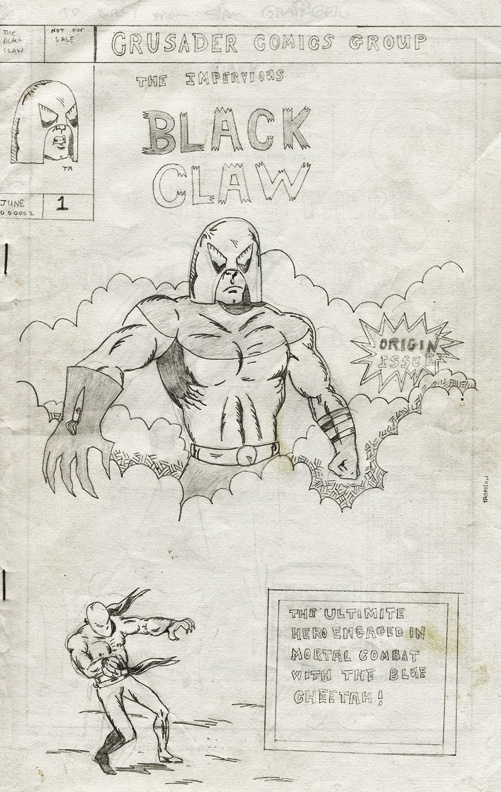 The Black Claw, a comic I created at 12 years old.
Epilogue: Since comics were at the very roots of my artistic career, I wanted the walls of my studio to reflect their importance to me . I have been lucky to find some of the actual vintage original art that inspired me throughout my childhood including the drawing that began my journey. Here are a couple of vintage original drawings that surround me while I work:
 Original painting from Bears vs. Falcons program, John Buscema (Nov. '70)
 Original art Hulk #139, page 9, Herb Trimpe (Feb. '71 issue)
November 28, 2016
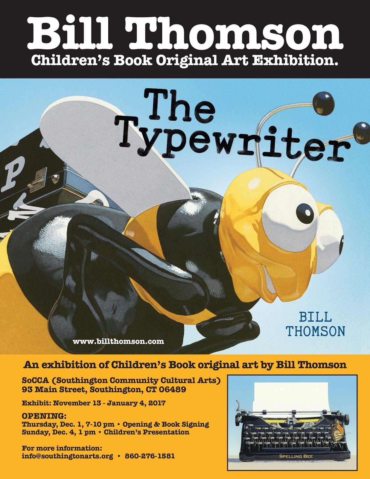
THE TYPEWRITER Original Art Exhibition at the Southington Community Cultural Arts Building Through December 31
I am very excited to have an exhibition of the original art for my book, THE TYPEWRITER, along with other assorted work at the Southington Community Cultural Arts Center at 93 North Main Street in Southington, Ct. The exhibition runs through December 31 with an opening on Thursday, December 1 (7-10 pm) and a special children's presentation on Sunday, December 4 (1:00 pm). Please see the link below for details.
http://www.southingtonarts.org
http://www.southingtonarts.org/bill-thomson

http://www.southingtonarts.org
http://www.southingtonarts.org/bill-thomson
October 28, 2016
ARTS CENTER EAST CHILDREN'S BOOK EXHIBITION
If you are near Vernon, Connecticut on Saturday, October 29, please come and see a nice children's book exhibition including my original artwork at Arts Center East 709 Hartford Turnpike Vernon, CT 06066. I will be making a presentation about my work, participating in a panel discussion and signing books tomorrow at 2pm)!
http://artscentereast.org/event/creating-childrens-picture-book-presentation-2/
October 8, 2016
WARWICK CHILDREN'S BOOK FESTIVAL
If you are near Warwick, NY on October 8, you can vista me at the Warwick Children's Book Festival from 11am-4pm, a WONDERFUL event sponsored by the Warwick Public Library celebrating children's literature!
http://www.warwickchildrensbookfestival.org
http://www.warwickchildrensbookfestival.org
March 11, 2016
THE TYPEWRITER: An Evolving Creative Process
My latest book, The Typewriter, celebrates the power of words and fuses imagination with writing in a dramatic visual adventure. The Typewriter follows CHALK and FOSSIL as the final chapter in my trilogy of wordless books. Each of these books explores a different elementary school subject through the lens of a child’s imagination. The Typewriter intends to foster creativity and encourages young readers to view writing as a fun and powerful tool.
The Typewriter, CHALK and FOSSILwere not only created to entertain young readers, but I hope they will serve as educational tools as well. Wordless stories require the participation of young readers and offer the opportunity to create unique narratives by interpreting what is seen in the illustrations. This allows readers to develop an understanding of story structure, establish characters and settings, and hone prediction, sequence and inference skills. Wordless books can function as a visual prompt to build confidence for beginning or reluctant readers, as a "story starter" for older children, and as a possible launching point for creative activities or discussion. Creative educators across the country have utilized my books in wonderful ways with their students, and I hope The Typewriter will be put to similar good use.
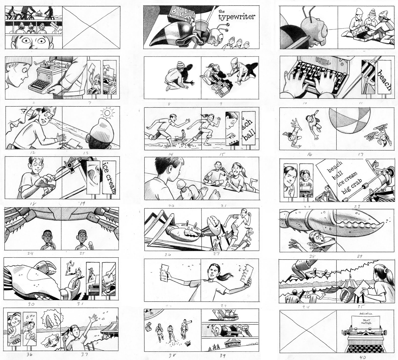
For me, creating a book is an evolving process. The Typewriter began as a written synopsis that was very different than the book I ultimately created. After refining my initial story idea, I drew small thumbnail sketches to clarify the story and work out the vantage point of each illustration. As a comparison of my first thumbnail sketches with the finished book would demonstrate, the ending of the book completely changed from what I originally drew. But this isn't unusual- I constantly try to improve upon my initial idea and make many changes throughout the entire creative process.
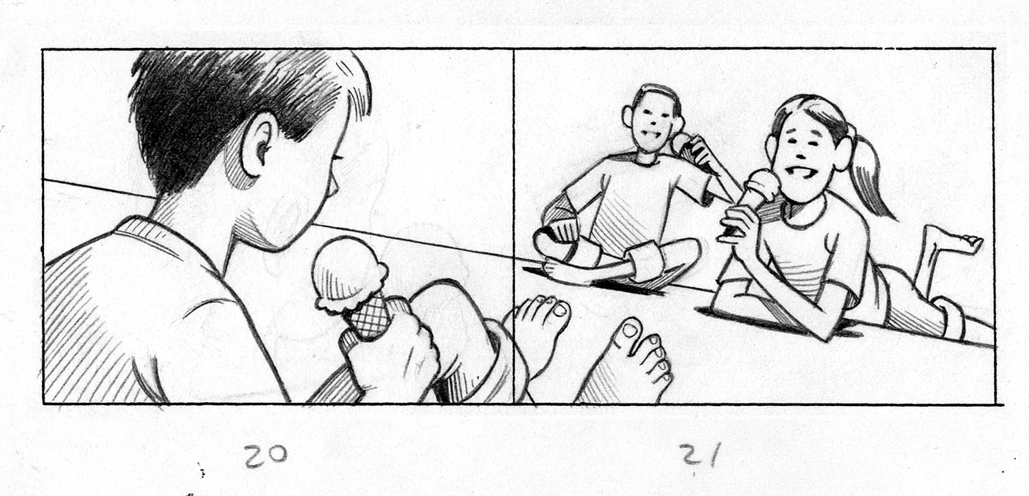
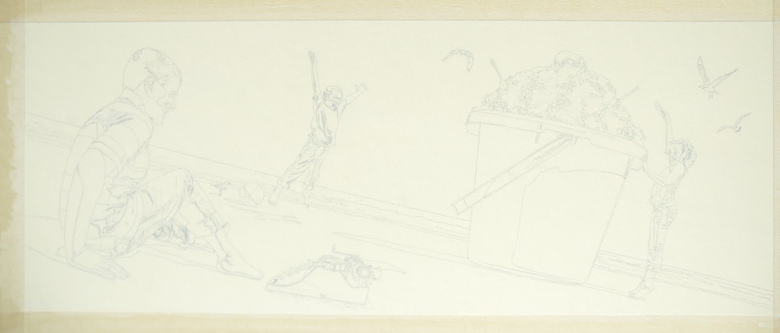
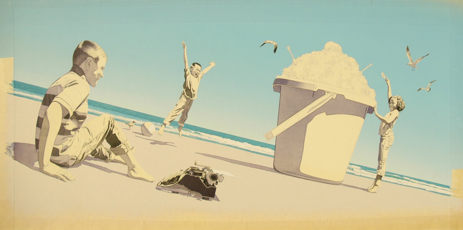
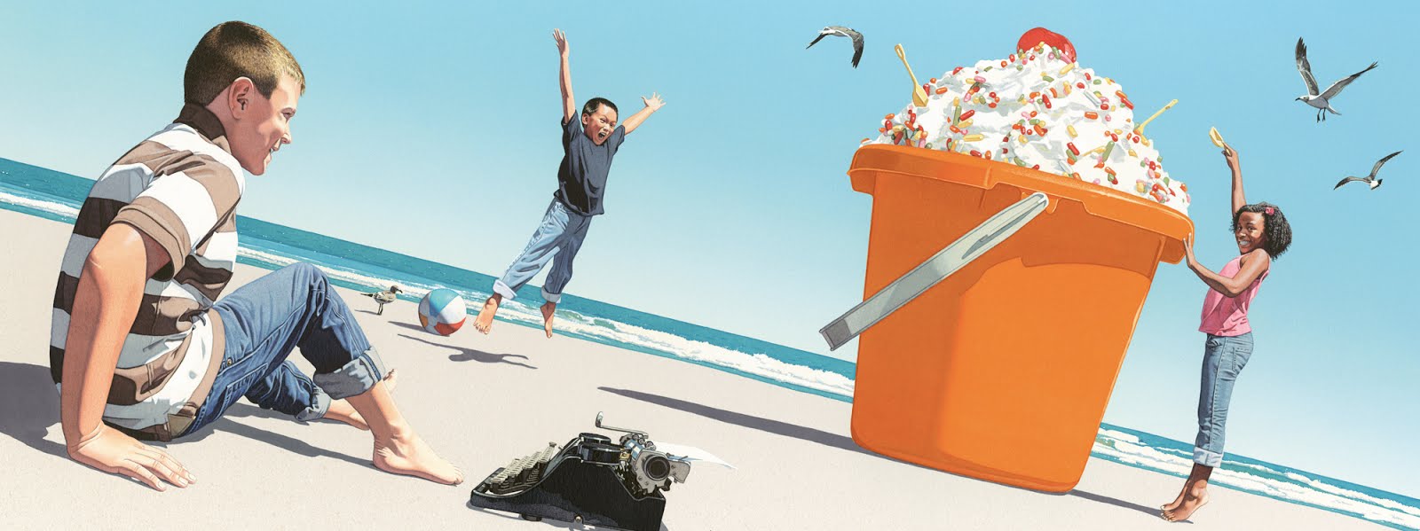
Here is my thumbnail sketch for an illustration depicting what happened after the children typed the word, "ice cream." This illustration underwent went more changes than any illustration in the entire book (and maybe any book I have illustrated).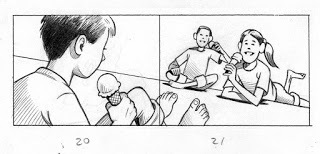
After settling on my idea, I always shoot reference photographs to provide visual information to draw and paint from. This helps me make every element of my painting look equally convincing and believable. My youngest son, Ethan, was the model for this illustration, and you can see him holding an ice cream cone similar to my sketch.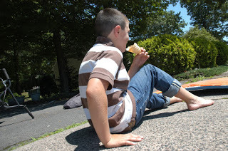
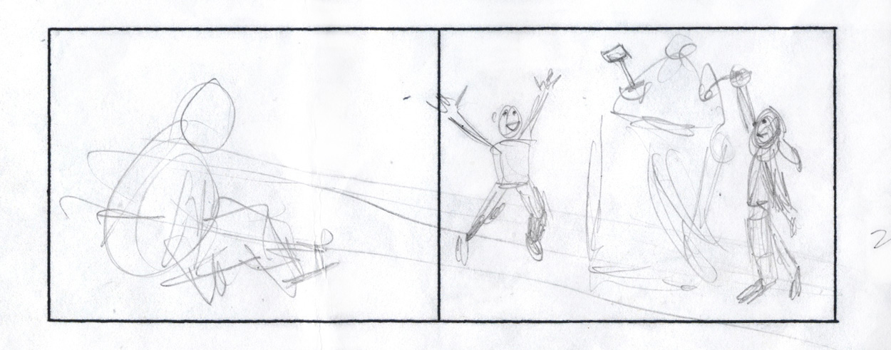
While photographing my other models, I realized eating small ice cream cones wasn't a very dramatic or grand visual. While I wanted to show ice cream as something kids could relate to, I thought a large bucket of ice cream would be much more spectacular and fit better with the beach. I quickly doodled an alternate sketch idea with the ice cream being in a giant beach bucket and shot additional photographs to go along with that idea. I liked it much better and moved the illustration in that direction.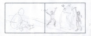
Here are the photographs that I took for the various other elements of the illustration. Photographs provide visual reference that help me make the lighting and form consistent and believable. But as you can see, I alternated things significantly (especially their heads and faces). These two models, Mikayla and Hilton, were students I met while visiting an elementary school- they were WONDERFUL! I also took photos of Sunset Beach, North Carolina, our favorite family vacation spot. I use the best information from many photos as the starting point for my drawing, and then change freely to create the best and most convincing painting I can.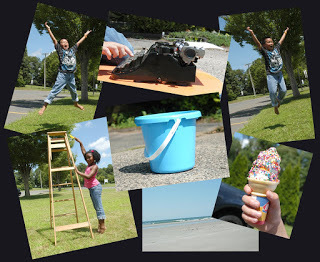
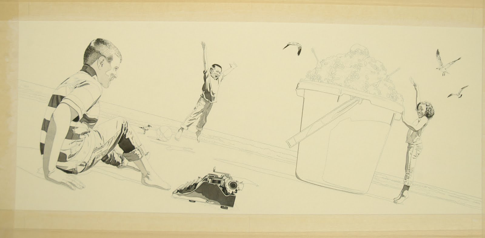
I draw the illustration in graphite on a piece of Crescent #115 Watercolor board.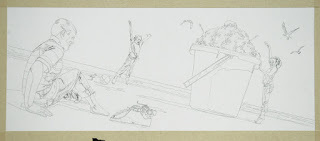
Then I paint over the entire drawing with a thin coat of Gesso and Yellow Ochre Acrylic paint. This gives the entire image a warm "sunshine" base color.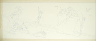
The black areas are painted next to establish the darkest darks.

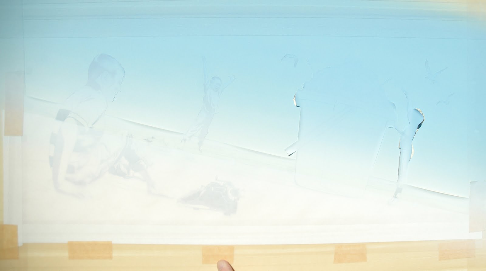
After that, I mask off everything except the sky. To make the sky completely smooth, I use an airbrush.
I really don't like using airbrushes because I have to cover my entire studio with plastic. Airbrushes throw a mist of paint in the air and everything in my studio usually gets covered with light dusting of color. My studio is messy enough without the addition of colored airbrush dust.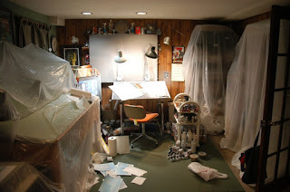
Then I use the airbrush to apply the sky color.
After the mask is removed, the blue sky is complete while everything else remained its original warm base color.
But despite my best efforts, a light blue dusting still found its way all over my studio.
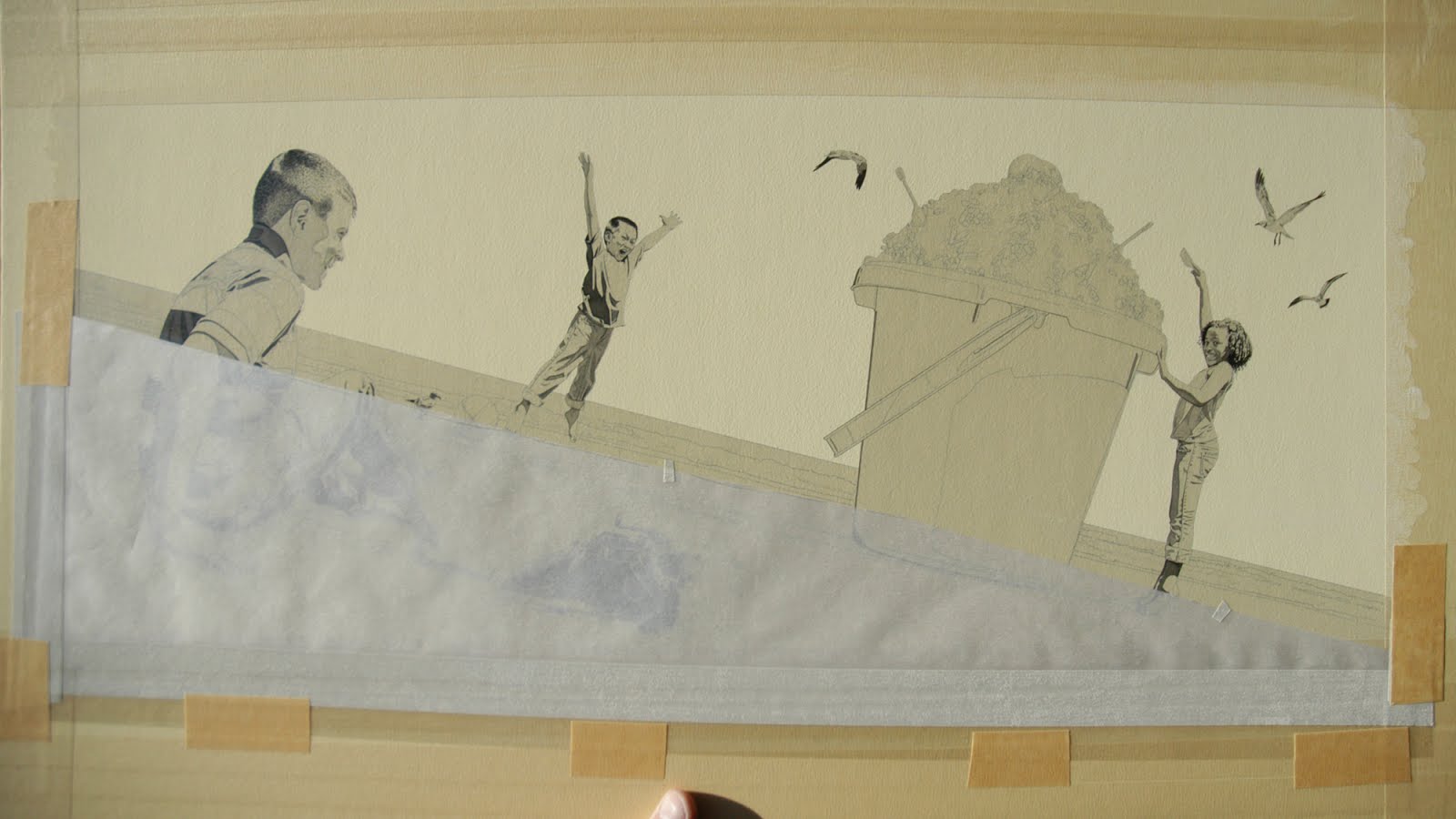
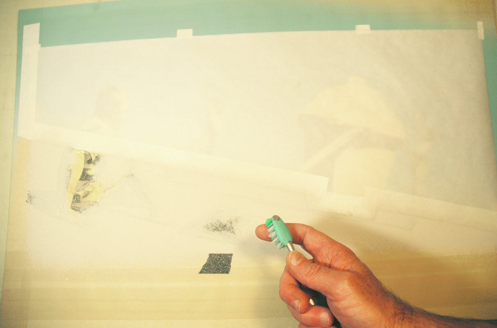
Next, I mask off the sky and figures, leaving only the sand areas exposed. I apply various values of light tan sand colors with toothbrush to create a fine speckled texture.
After the mask is removed, the sky and sand are complete and I paint the water with F.W. Acrylic Inks. I like to work from back to front, so I always paint the background elements of my illustration first. I really like the contrast in texture between the smooth airbrushed sky and speckled sand- it is beginning to feel like the beach! I also add some light blue/violet acrylic washes to give all of the shadow areas a cool tone.
Next I paint the bucket, ice cream, and birds...
… and then the skin tones, beach ball, and typewriter...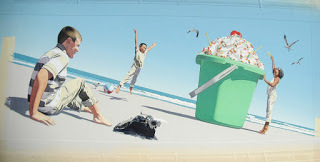
…and the kid's clothing.

And finally, I go over everything one last time with very sharp Prismacolor colored pencils.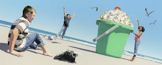
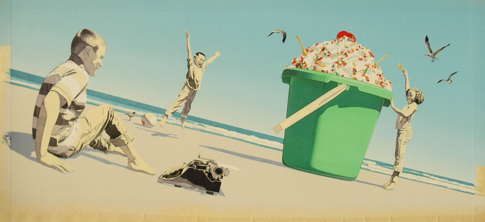
After the illustration was complete and delivered, my editor and art director had some concerns about the green bucket and asked if I would consider changing the color digitally. Creating a book is a collaboration between a publisher and author/illustrator, and I am always happy to explore other possibilities if it will improve the book. As a side note- I hadn't realized it at the time, but every bucket I have ever painted was green. It was time to venture out of my comfort zone (ha, ha).
I explored several different color variations with Photoshop to show possible alternatives. Because the bucket appeared in three illustrations, the color had to work equally well on multiple illustrations.
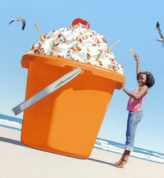
After trying a variety of color options, we settled on the orange bucket. I like it much, MUCH better because it relates to the Monarch butterfly that connects the three books in my wordless trilogy. As complimentary colors, the orange also really pops against the blue sky.
The designer made the final color adjustment in production and this is what the final illustration looks like in the book.
Creating a children's book is a long journey and there are often many changes and adjustments along the way. My constant goal is to produce the very best book that I possibly can for young readers to enjoy. The story is MOST important, so I never allow myself to get too attached to any one particular aspect if I can possibly make it better. In the case of this illustration, I believe that flexibility resulted in a much better illustration and improved the story overall. I think the ice cream bucket was a MAJOR improvement, and I also like the bucket's color change much better as well. I might not always be smart enough to get it right the first time, but by continually striving to improve and being open to change, I try to get there in the end.
As the concluding chapter in my wordless trilogy, I really wanted The Typewriter to be special. I spent more time on this book than anything I have ever done. From drawing reflections on each of the typewriter's forty-six keys to carefully painting the letters adorning its reflective case to demonstrating the function of this beautiful vintage writing machine- creating every meticulous detail of this book was a true labor of love. I hope you enjoy reading The Typewriter as much as I enjoyed creating it, and that it brings the power of words to life for young readers everywhere!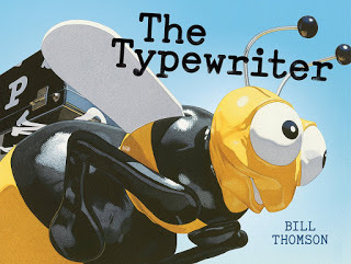
The Typewriter, CHALK and FOSSILwere not only created to entertain young readers, but I hope they will serve as educational tools as well. Wordless stories require the participation of young readers and offer the opportunity to create unique narratives by interpreting what is seen in the illustrations. This allows readers to develop an understanding of story structure, establish characters and settings, and hone prediction, sequence and inference skills. Wordless books can function as a visual prompt to build confidence for beginning or reluctant readers, as a "story starter" for older children, and as a possible launching point for creative activities or discussion. Creative educators across the country have utilized my books in wonderful ways with their students, and I hope The Typewriter will be put to similar good use.
For me, creating a book is an evolving process. The Typewriter began as a written synopsis that was very different than the book I ultimately created. After refining my initial story idea, I drew small thumbnail sketches to clarify the story and work out the vantage point of each illustration. As a comparison of my first thumbnail sketches with the finished book would demonstrate, the ending of the book completely changed from what I originally drew. But this isn't unusual- I constantly try to improve upon my initial idea and make many changes throughout the entire creative process.
Here is my thumbnail sketch for an illustration depicting what happened after the children typed the word, "ice cream." This illustration underwent went more changes than any illustration in the entire book (and maybe any book I have illustrated).
After settling on my idea, I always shoot reference photographs to provide visual information to draw and paint from. This helps me make every element of my painting look equally convincing and believable. My youngest son, Ethan, was the model for this illustration, and you can see him holding an ice cream cone similar to my sketch.

While photographing my other models, I realized eating small ice cream cones wasn't a very dramatic or grand visual. While I wanted to show ice cream as something kids could relate to, I thought a large bucket of ice cream would be much more spectacular and fit better with the beach. I quickly doodled an alternate sketch idea with the ice cream being in a giant beach bucket and shot additional photographs to go along with that idea. I liked it much better and moved the illustration in that direction.
Here are the photographs that I took for the various other elements of the illustration. Photographs provide visual reference that help me make the lighting and form consistent and believable. But as you can see, I alternated things significantly (especially their heads and faces). These two models, Mikayla and Hilton, were students I met while visiting an elementary school- they were WONDERFUL! I also took photos of Sunset Beach, North Carolina, our favorite family vacation spot. I use the best information from many photos as the starting point for my drawing, and then change freely to create the best and most convincing painting I can.

I draw the illustration in graphite on a piece of Crescent #115 Watercolor board.

Then I paint over the entire drawing with a thin coat of Gesso and Yellow Ochre Acrylic paint. This gives the entire image a warm "sunshine" base color.
The black areas are painted next to establish the darkest darks.
After that, I mask off everything except the sky. To make the sky completely smooth, I use an airbrush.
I really don't like using airbrushes because I have to cover my entire studio with plastic. Airbrushes throw a mist of paint in the air and everything in my studio usually gets covered with light dusting of color. My studio is messy enough without the addition of colored airbrush dust.

Then I use the airbrush to apply the sky color.
After the mask is removed, the blue sky is complete while everything else remained its original warm base color.

But despite my best efforts, a light blue dusting still found its way all over my studio.

Next, I mask off the sky and figures, leaving only the sand areas exposed. I apply various values of light tan sand colors with toothbrush to create a fine speckled texture.
After the mask is removed, the sky and sand are complete and I paint the water with F.W. Acrylic Inks. I like to work from back to front, so I always paint the background elements of my illustration first. I really like the contrast in texture between the smooth airbrushed sky and speckled sand- it is beginning to feel like the beach! I also add some light blue/violet acrylic washes to give all of the shadow areas a cool tone.
Next I paint the bucket, ice cream, and birds...
… and then the skin tones, beach ball, and typewriter...

…and the kid's clothing.

And finally, I go over everything one last time with very sharp Prismacolor colored pencils.

After the illustration was complete and delivered, my editor and art director had some concerns about the green bucket and asked if I would consider changing the color digitally. Creating a book is a collaboration between a publisher and author/illustrator, and I am always happy to explore other possibilities if it will improve the book. As a side note- I hadn't realized it at the time, but every bucket I have ever painted was green. It was time to venture out of my comfort zone (ha, ha).

I explored several different color variations with Photoshop to show possible alternatives. Because the bucket appeared in three illustrations, the color had to work equally well on multiple illustrations.

After trying a variety of color options, we settled on the orange bucket. I like it much, MUCH better because it relates to the Monarch butterfly that connects the three books in my wordless trilogy. As complimentary colors, the orange also really pops against the blue sky.
The designer made the final color adjustment in production and this is what the final illustration looks like in the book.
Creating a children's book is a long journey and there are often many changes and adjustments along the way. My constant goal is to produce the very best book that I possibly can for young readers to enjoy. The story is MOST important, so I never allow myself to get too attached to any one particular aspect if I can possibly make it better. In the case of this illustration, I believe that flexibility resulted in a much better illustration and improved the story overall. I think the ice cream bucket was a MAJOR improvement, and I also like the bucket's color change much better as well. I might not always be smart enough to get it right the first time, but by continually striving to improve and being open to change, I try to get there in the end.
As the concluding chapter in my wordless trilogy, I really wanted The Typewriter to be special. I spent more time on this book than anything I have ever done. From drawing reflections on each of the typewriter's forty-six keys to carefully painting the letters adorning its reflective case to demonstrating the function of this beautiful vintage writing machine- creating every meticulous detail of this book was a true labor of love. I hope you enjoy reading The Typewriter as much as I enjoyed creating it, and that it brings the power of words to life for young readers everywhere!

August 2, 2015
BUILDING PROPS
Long before I ever start drawing and painting a finished illustration, I gather reference materials. This visual information serves as a guide and helps me to make my paintings more realistic and believable. The reference stage is usually the most time consuming (and often stressful) aspect of my work process. This involves selecting and coaching models, finding locations, searching for props... and when not available, creating my own.
My upcoming children's book, The Typewriter, is the third and final installment of my wordless trilogy that applies imagination to different elementary school subjects. Where CHALK and FOSSIL explored art and science, The Typewriter blends imagination with writing. In addition to providing entertainment for young readers, my hope is that creative teachers will use these books as a tool to educate and inspire their students.
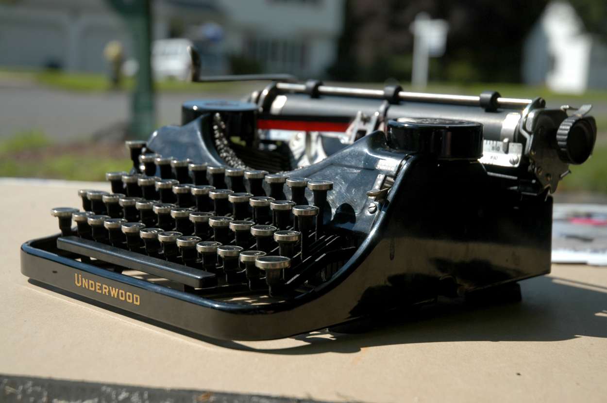
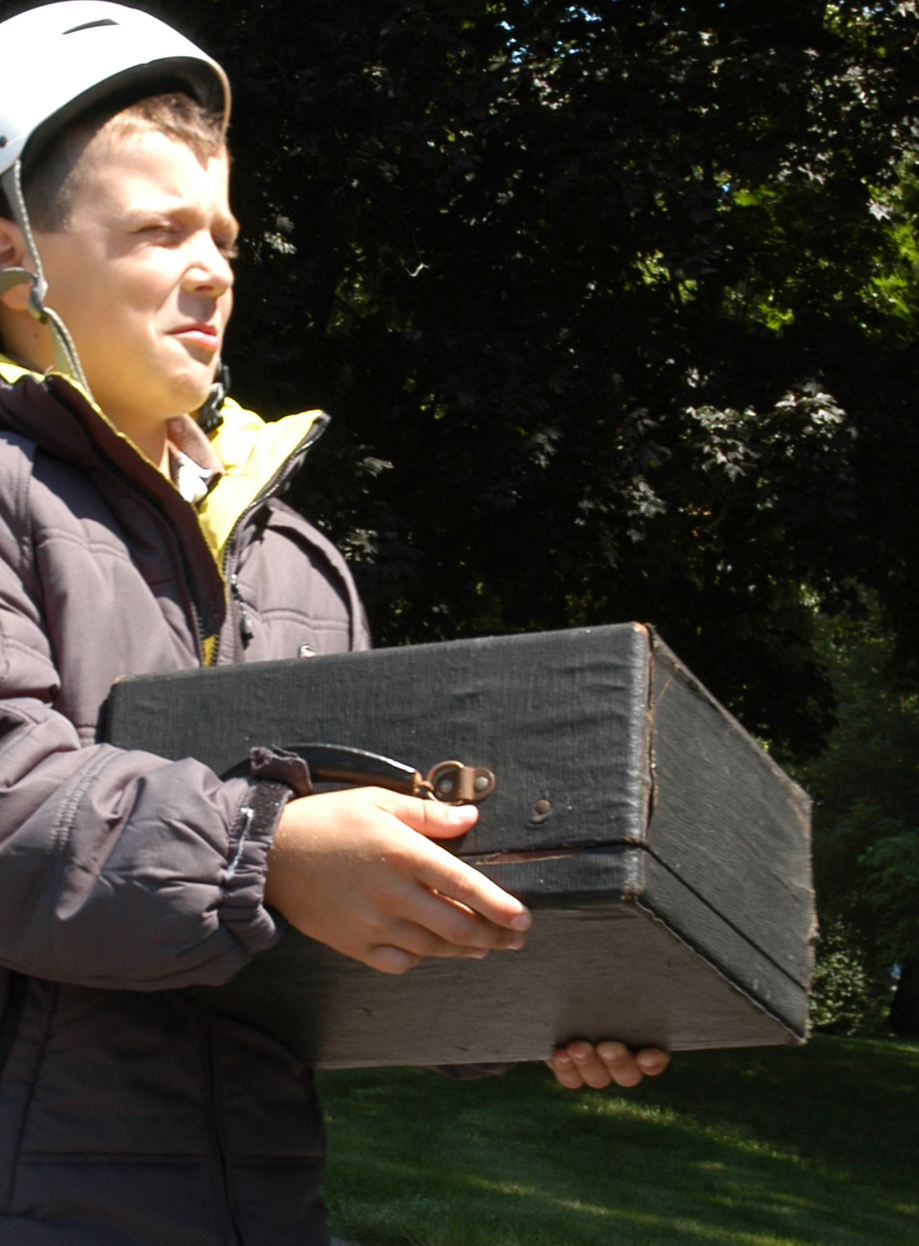
The star of The Typewriter is a beautiful 1936 Underwood portable typewriter that I purchased on Ebay. Originally, I was going to use a Royal typewriter that I already owned, but it was too large and cumbersome to be believably handled by children. In addition to demonstrating the power of words, I hope this interesting artifact will generate discussions about keyboards and other historic tools used for writing.

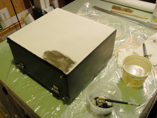
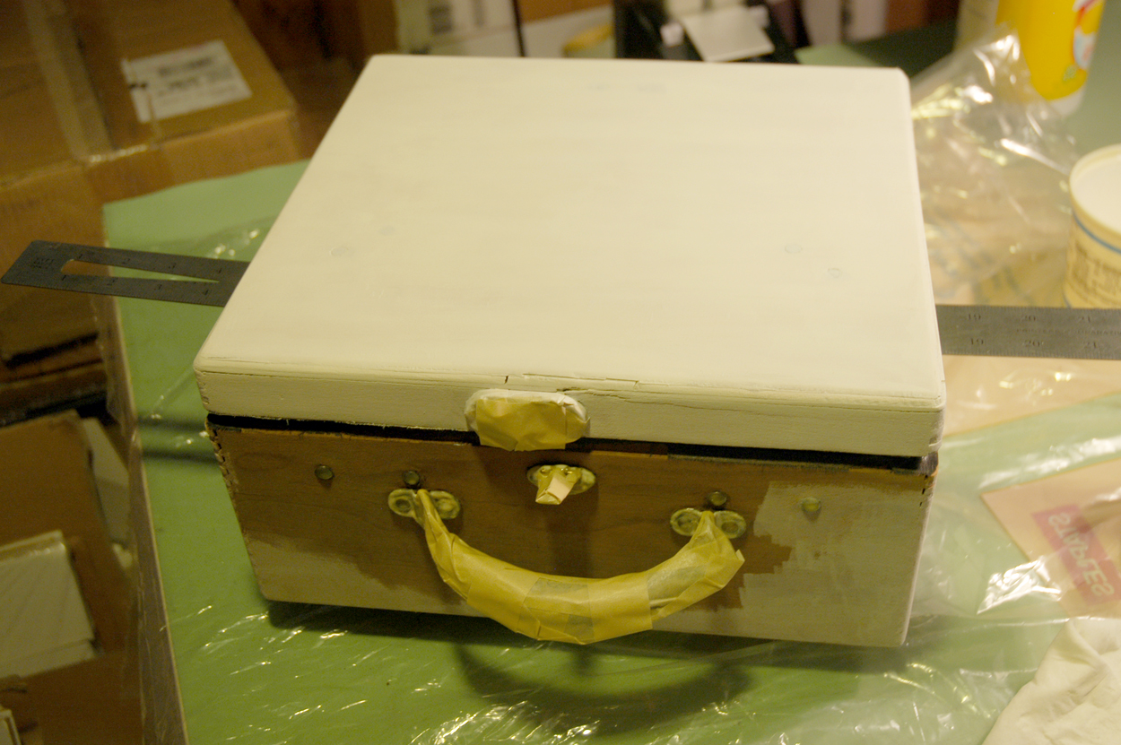
While the typewriter was in beautiful working condition, it's case was smelly and falling apart. This photo shows my son's reaction to its musty odor. I wanted a much more enchanting container to house my creator of dreams.

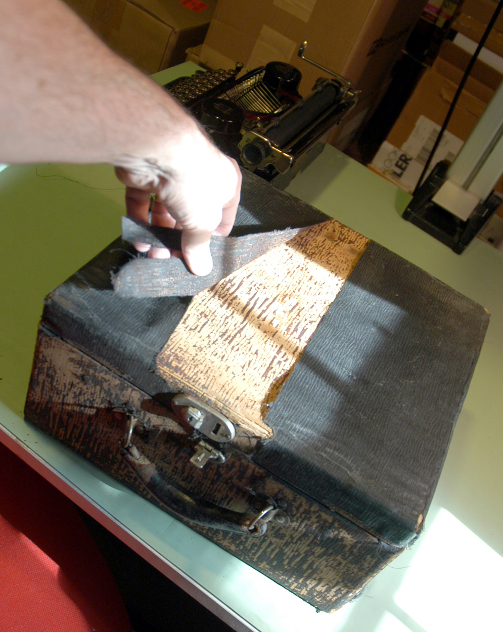
As a result, I decided to transform the case into something more intriguing for a child. First, I peeled off the outer covering that was already torn and detached in many areas.


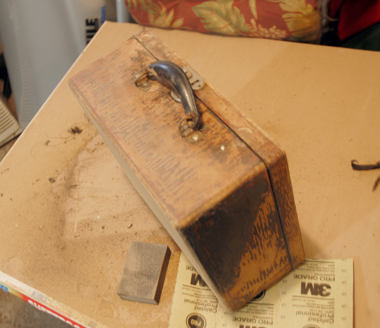
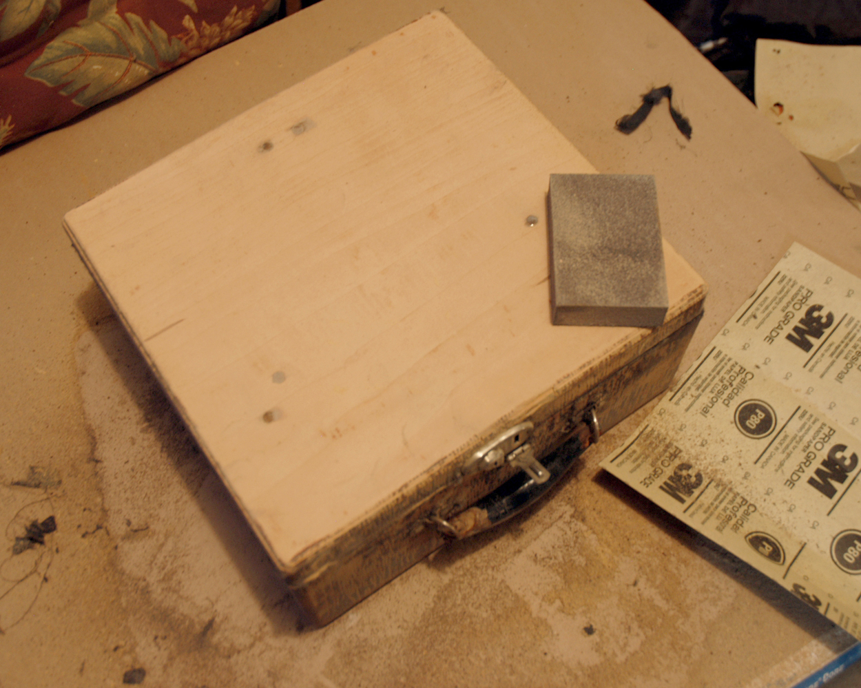
Next, I sanded down the wood to remove the glue stains and provide a smooth surface.

Then I masked off the hardware with tape and liquid frisket and painted the entire case with several coats of gesso. I kept a ruler under the lid so the cover wouldn't stick. The gesso filled in most of the cracks and holes. I sanded it again after it dried thoroughly.


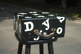
Next, I painted the entire case with several coats of black acrylic paint. When that dried, I painted it again with a coat of polyurethane so the surface would have a reflective finish.
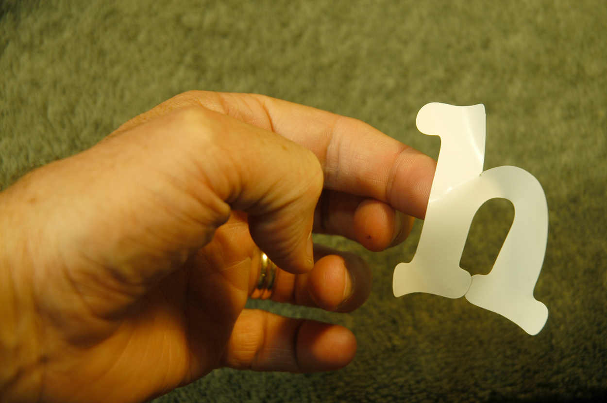
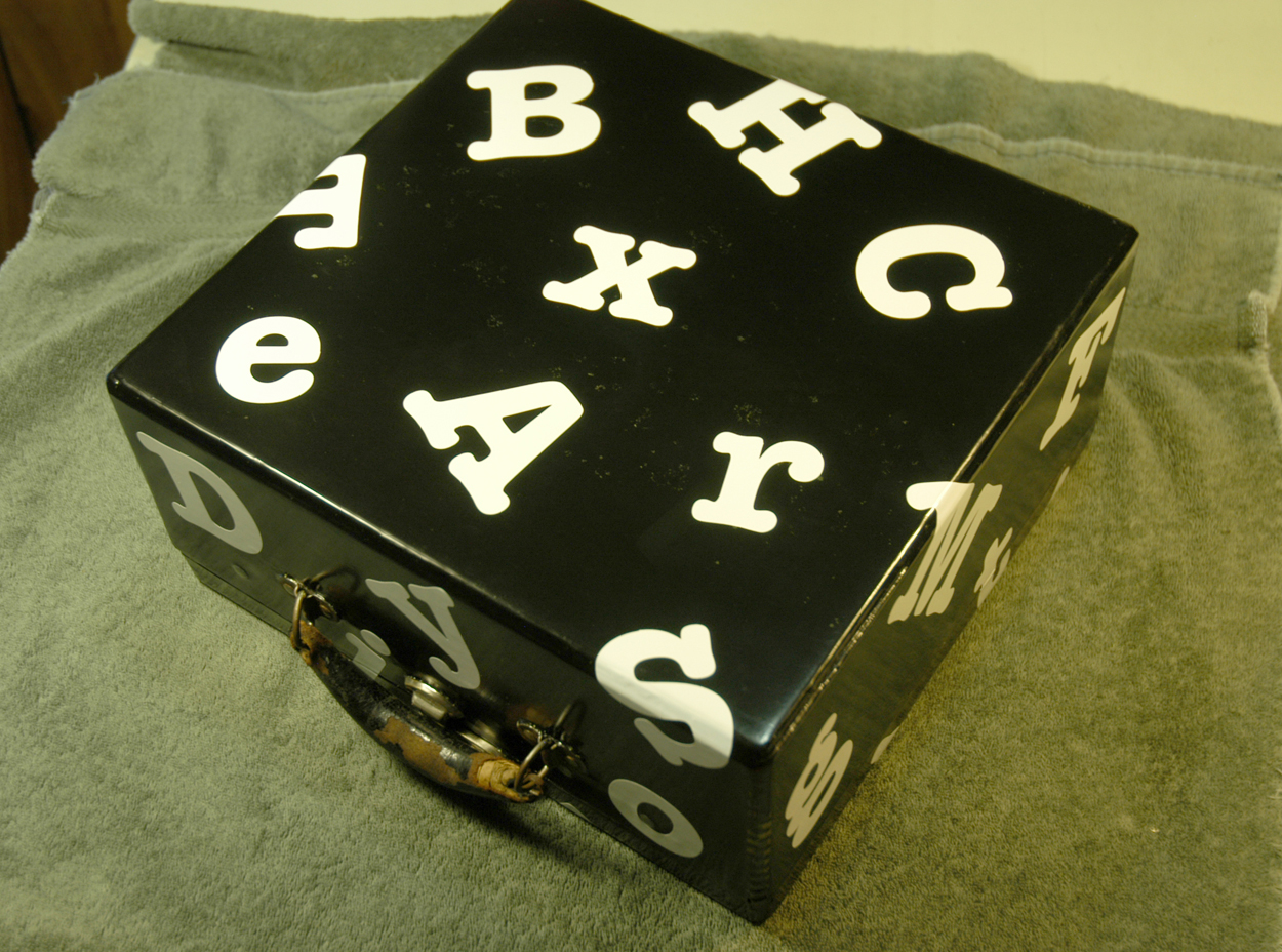
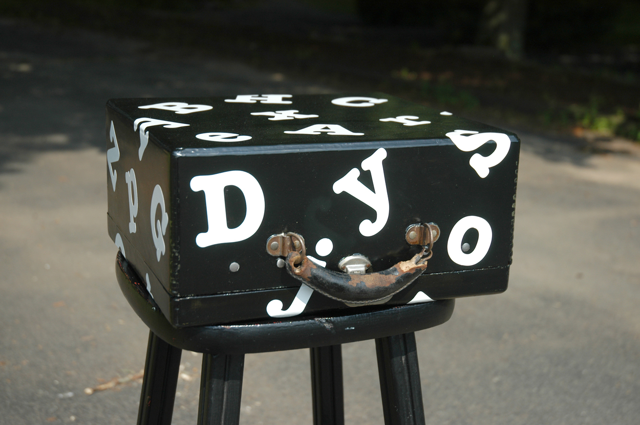
When everything was dry, I added large Gerber letters over the entire surface of the case (using the font, American Typewriter). I didn't bother to repair the handle because I could paint that to look new.

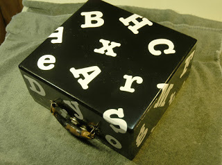
Now my magical typewriter had a case worthy of its power and hopefully will command children's interest!

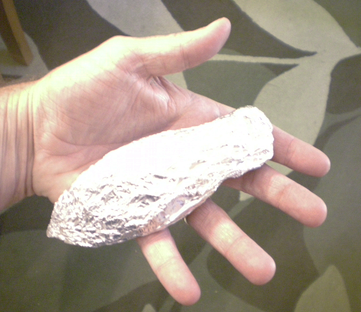
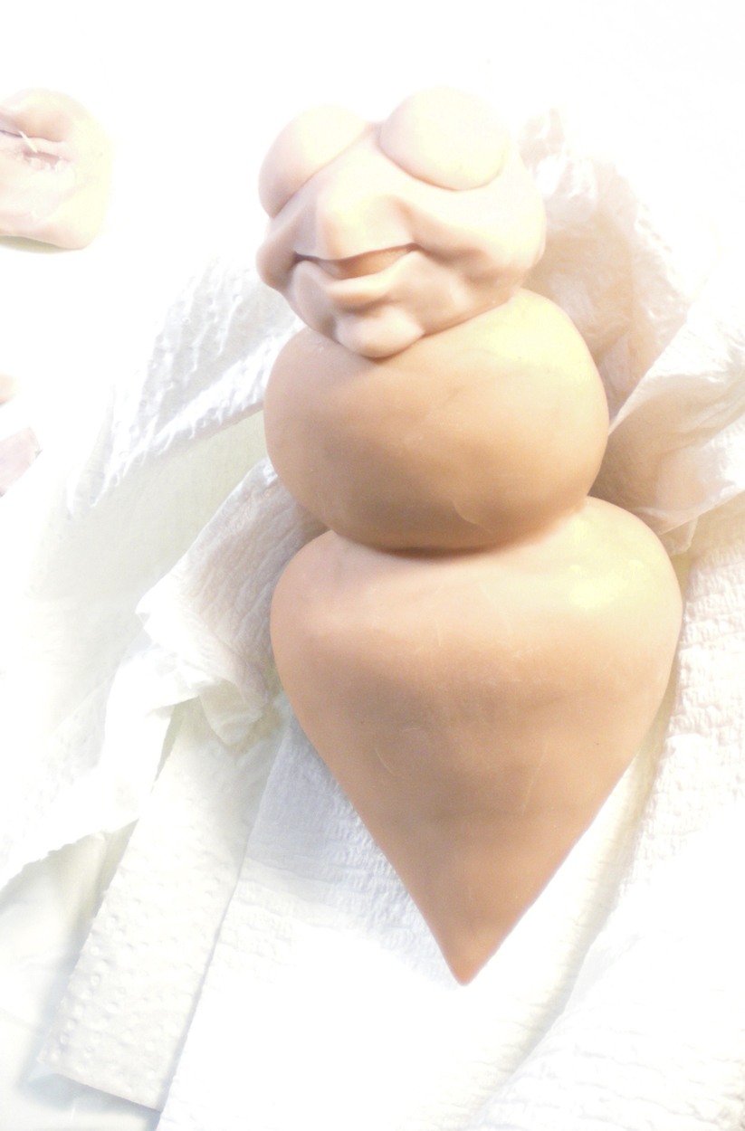
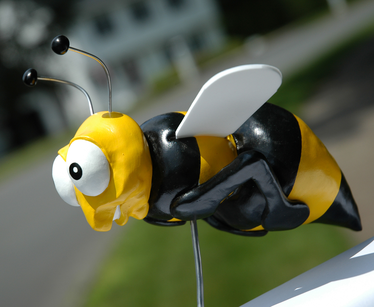
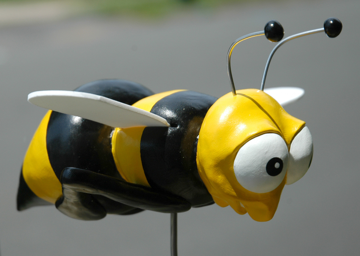
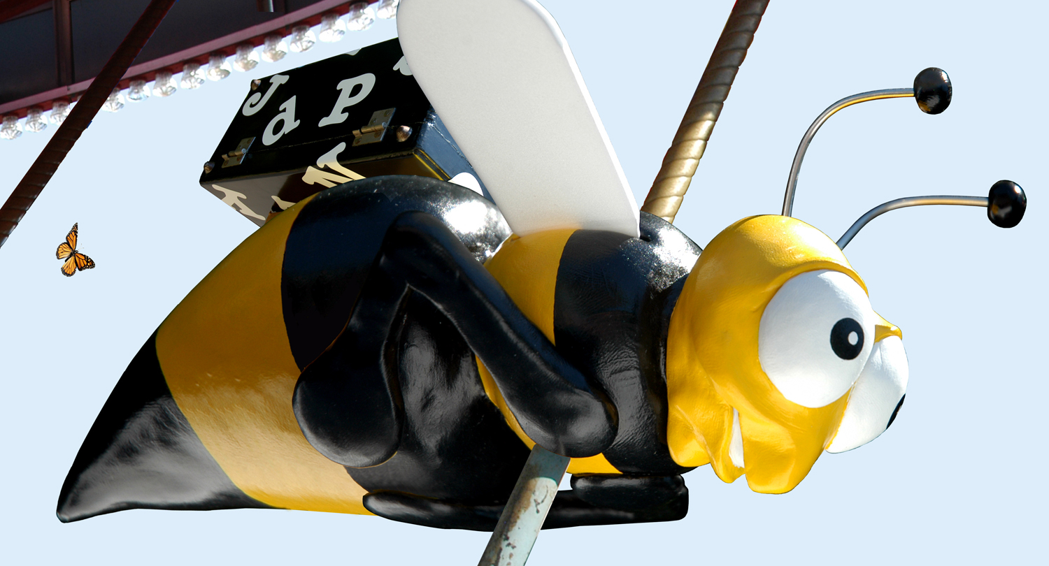
In my story, a group of children stumble upon a closed carousel and see the case sitting on the back of a bumble bee ride. Rather than trying to find a carousel bee (if one even exists), I decided to make my own. I began by making a rough shape of the bee's body out tinfoil.
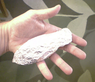
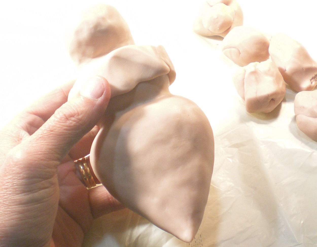
Next, I surrounded the tinfoil with Sculpty clay and formed a basic body shape that could later be hardened by heating it in an oven. I also made slots on its back that I would later put wings in.

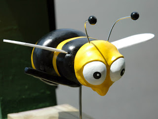
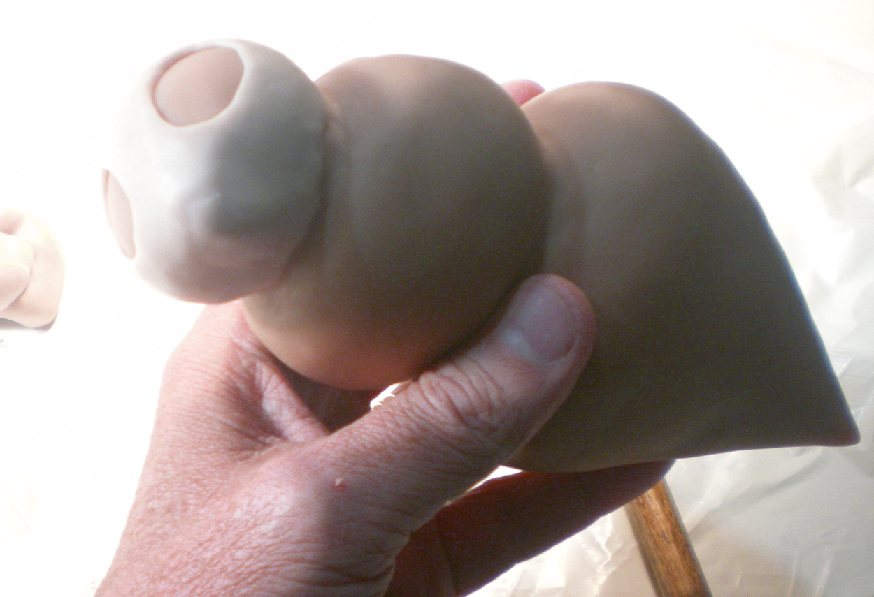
I "cooked" the body shape so it would provide a solid hard base to work over. Then I added a second layer of Sculpty and began to form a head and other details.


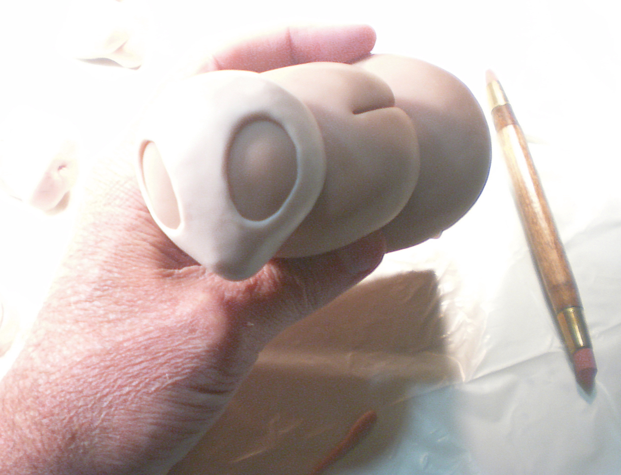
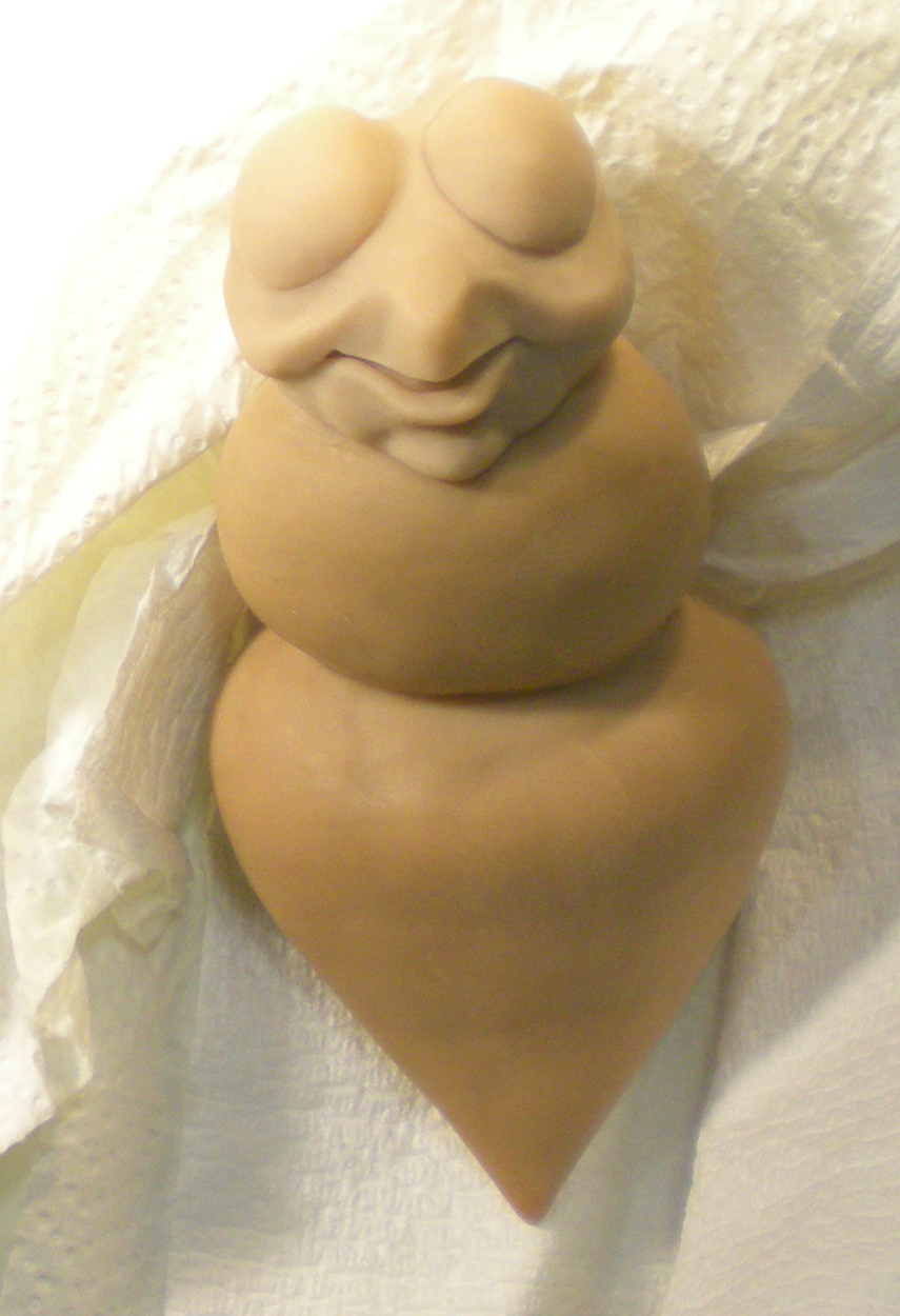
I continued forming the head until it was a happy bee...
and then I cooked him too.

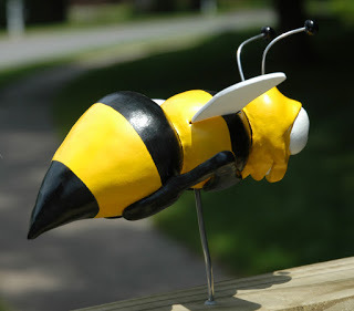
I later added his arms than would also function as foot rests on my bee ride design. And finally, I painted him with acrylic paint. I also cut wings out of foam and created antennae out of wire.


My bee ride was nearly complete. Using Photoshop as the last step in my reference development, I integrated photos of my bee and case with photos of an actual carousel. Now all my reference was complete and I was finally ready to start drawing and painting!

My upcoming children's book, The Typewriter, is the third and final installment of my wordless trilogy that applies imagination to different elementary school subjects. Where CHALK and FOSSIL explored art and science, The Typewriter blends imagination with writing. In addition to providing entertainment for young readers, my hope is that creative teachers will use these books as a tool to educate and inspire their students.
The star of The Typewriter is a beautiful 1936 Underwood portable typewriter that I purchased on Ebay. Originally, I was going to use a Royal typewriter that I already owned, but it was too large and cumbersome to be believably handled by children. In addition to demonstrating the power of words, I hope this interesting artifact will generate discussions about keyboards and other historic tools used for writing.
While the typewriter was in beautiful working condition, it's case was smelly and falling apart. This photo shows my son's reaction to its musty odor. I wanted a much more enchanting container to house my creator of dreams.
As a result, I decided to transform the case into something more intriguing for a child. First, I peeled off the outer covering that was already torn and detached in many areas.
Next, I sanded down the wood to remove the glue stains and provide a smooth surface.
Then I masked off the hardware with tape and liquid frisket and painted the entire case with several coats of gesso. I kept a ruler under the lid so the cover wouldn't stick. The gesso filled in most of the cracks and holes. I sanded it again after it dried thoroughly.

Next, I painted the entire case with several coats of black acrylic paint. When that dried, I painted it again with a coat of polyurethane so the surface would have a reflective finish.

When everything was dry, I added large Gerber letters over the entire surface of the case (using the font, American Typewriter). I didn't bother to repair the handle because I could paint that to look new.
Now my magical typewriter had a case worthy of its power and hopefully will command children's interest!

In my story, a group of children stumble upon a closed carousel and see the case sitting on the back of a bumble bee ride. Rather than trying to find a carousel bee (if one even exists), I decided to make my own. I began by making a rough shape of the bee's body out tinfoil.
Next, I surrounded the tinfoil with Sculpty clay and formed a basic body shape that could later be hardened by heating it in an oven. I also made slots on its back that I would later put wings in.
I "cooked" the body shape so it would provide a solid hard base to work over. Then I added a second layer of Sculpty and began to form a head and other details.
I continued forming the head until it was a happy bee...
and then I cooked him too.
I later added his arms than would also function as foot rests on my bee ride design. And finally, I painted him with acrylic paint. I also cut wings out of foam and created antennae out of wire.


My bee ride was nearly complete. Using Photoshop as the last step in my reference development, I integrated photos of my bee and case with photos of an actual carousel. Now all my reference was complete and I was finally ready to start drawing and painting!
July 26, 2014
MURRAY TINKELMAN: The Greatest Ever
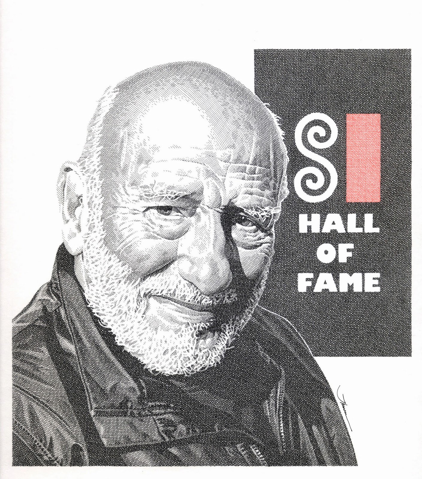
When Murray Tinkelman was inducted into the Society of Illustrators Hall Of Fame, his presenter, Anelle Miller, invited all of his former students in the audience to join him on the stage. Nearly half of the event’s attendees rose and filled the platform. I was honored to have been part of that privileged group. Murray has had a remarkable impact on the field of illustration as both an artist and educator, and I feel extremely blessed to have been mentored by such an extraordinary artist and person.
When I packed up my bags and moved to Syracuse University in the fall of 1981, I wasn’t sure which artistic discipline I would pursue. I was just a kid that loved to draw and hoped to develop the talent God gave me. Since no one in my family had ever pursued a career in art, my only certainty was that I wanted to avoid becoming a member of the dreaded “starving artist” community.
The direction of my life was forever altered when I took my first illustration class with Murray Tinkelman. Simply put, Murray is like a force of nature. His unbridled enthusiasm and passion for illustration is both inspiring and infectious. Blending his vast knowledge and entertaining wit, Murray is a mesmerizing communicator and brilliant teacher. Murray opened my eyes to a whole new world, and I immediately became captivated by the subject that it had been my good fortune to stumble into.
Murray’s teaching is much like his art. At the core of his artwork is the simplest of artistic marks- - a straight line. But it is how Murray utilizes a common pen stroke that results in something quite remarkable. With meticulous care and consistency, he weaves an exquisitely crafted tapestry of lines, intersecting at diverse angles, to create astonishing and memorable images.
Similarly, Murray’s teaching relies on another simple and equally consistent premise-- love. Like the lines of his artwork, his genuine love for his students and illustration are ingrained in every aspect of his teaching. Murray takes great care to develop each student as a unique individual artist and equip him or her with the diverse skill sets needed to be successful. Murray’s uncompromising standards raise student self-expectations and provide motivation to achieve more than they ever thought possible. His absolute faith in his students fosters their self-confidence and inspires their growth. Murray also possesses an encyclopedic knowledge of all aspects of illustration and transfers his wisdom and passion of the discipline to his students. His students learn how to “squint” and how to effectively visually communicate their ideas, and if they do it well, they might even make Murray’s “belly button smile”.
As a student and throughout my illustration career, Murray has been one of the most influential people in my life. The foundation of my professional career was built in his classroom three decades ago and those artistic lessons continue to be vital to me today. Equally important, Murray also taught me a great deal about myself and helped to shape the person I have become. He is much more than a teacher to me. I consider Murray to be the father of my professional career and I love him like the dear friend he is.
When I began teaching illustration at the Hartford Art School fourteen years ago, I was initially frustrated. I wanted to provide my students with the very best possible educational experience, but comparing my teaching to Murray’s, I felt inferior in every respect. I came to realize that I was being unfair to myself. Having had the wondrous good fortune of being taught by the greatest living educator and ambassador of illustration, anyone would fall short in such a comparison. While I can never replicate the nuances that make Murray’s teaching so uniquely effective, I can follow his example. By caring for each of my students and being totally committed to their development, I honor Murray and the profession he taught me to love. Any student of the great Murray Tinkelman can do no less.
(An essay originally written for The Art of Murray Tinkelman, Baseball, Rodeos & Automobiles exhibition catalog for the Norman Rockwell Museum)
December 8, 2013
FOSSIL: The Creative Process Revealed
FOSSIL was inspired by the fond childhood memory of discovering fossils with my brothers in our backyard creek in Roanoke, Virginia in 1970. I wanted to replicate the thrill of our fossil discoveries for young readers and use it as the catalyst for a visual adventure. Most of my books begin this way- - thinking of an interesting subject and then using it as a topic for a story.
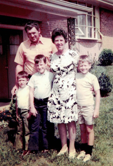 My father, grandmother, and the fossil hunters in Virginia.
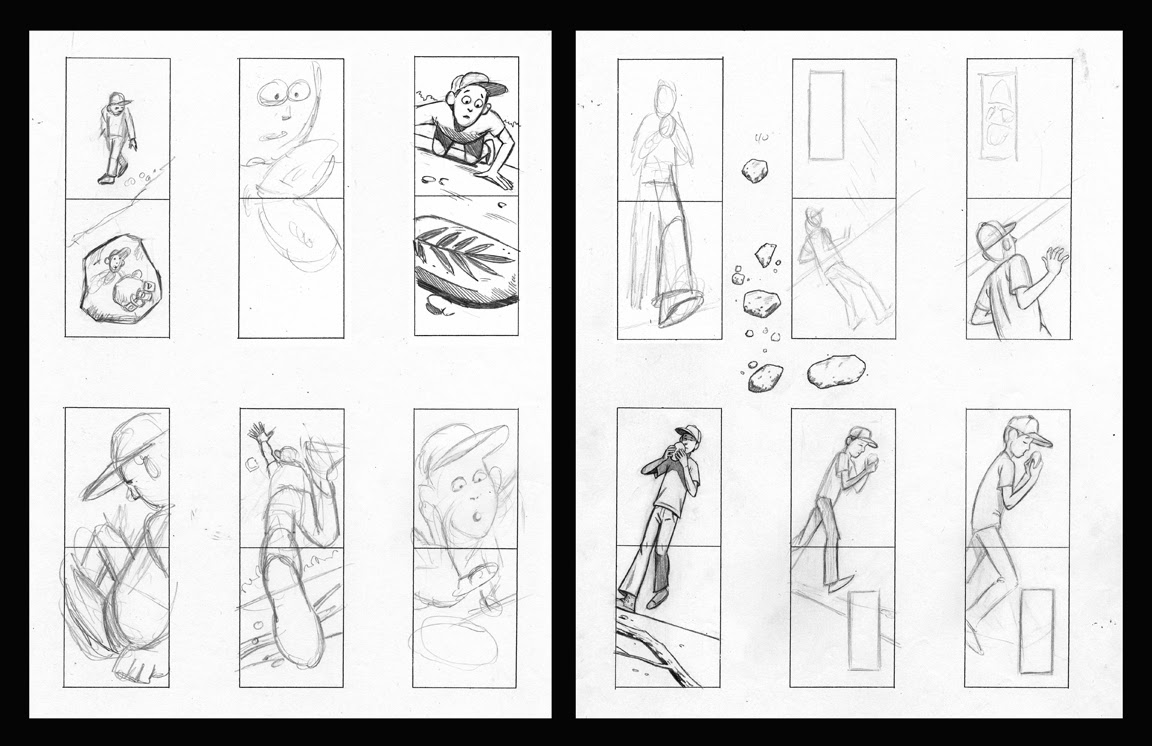
 After I settle on a story idea, I draw rough doodles (about two and a half inches in length) of random scenes from the story. Drawing the entire story in sequence can be monotonous, so I prefer to begin by freely experimenting with different key scenes. This keeps my focus on designing interesting images that will serve as the cornerstones of my story.
I do these sketches extremely fast and cartoony, essentially just playing and having fun. By keeping them quick, the ideas and possibilities flow and aren't constricted by editing ideas or rendering details. I am primarily concerned with the vantage point and how I might use the space. I draw a stack of rough possibilities and then clean up the ones I like best. Some of my initial sketches for FOSSIL are shown below.
I originally experimented with having this book oriented vertically as I did in another book, Building With Dad, but my editor, Margery Cuyler, suggested keeping the format horizontal. This would make it more consistent with CHALK, the first book in the wordless trilogy of imagination-based adventures. Margery always makes great points and is a wonderful resource throughout my creative process.
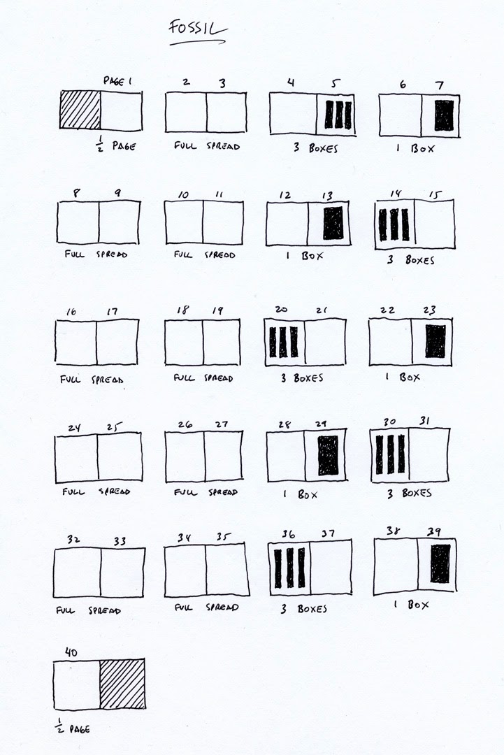
When designing the story, I try to create a pattern of page layouts so the story flows evenly. I love the visual impact of large spread illustrations, but I also use spreads with inset boxes as a tool to provide more information and adjust the pace of the story. The placement of the boxes throughout the story establishes the pattern. The trickiest part of the book’s design is creating a pattern that corresponds to the pace and action of the story.
In FOSSIL, the pattern consisted of 2 full spreads followed by 2 spreads with inset boxes. I alternated a spread with three additional small boxes and a spread with one additional large box, reversing the order each time. Because pages 4-5 begin the story and establish the setting, I placed the three inset boxes on the right side instead of the left (a subtle but necessary shift in the pattern). It took several days to figure out a pattern that would work best. This pattern allows the key moments to be emphasized with the largest spreads and the inset boxes serve to advance the story and provide clarity.
Then I cut out my sketches and arrange them in sequence following the pattern. At this editing stage, I function like a movie director, visually telling the story in the most clear and interesting way possible. I constantly refine, freely adding and subtracting sketches to make the story more cohesive. I try to vary the size, scale and vantage points so that every page is completely different while clearly advancing the story.
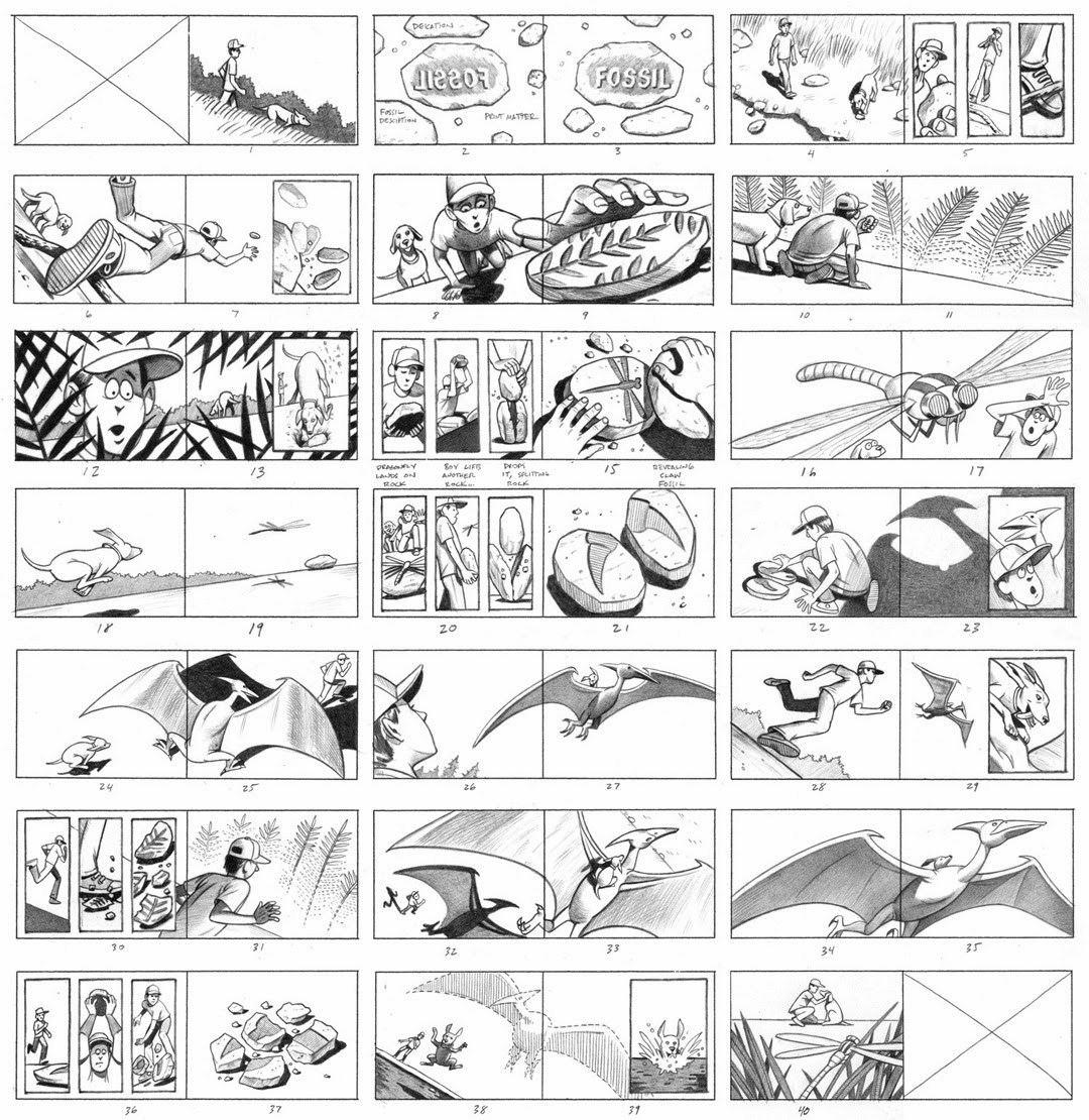
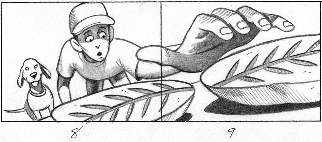
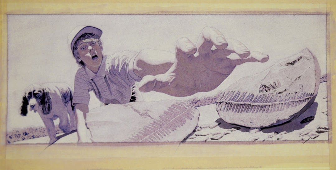
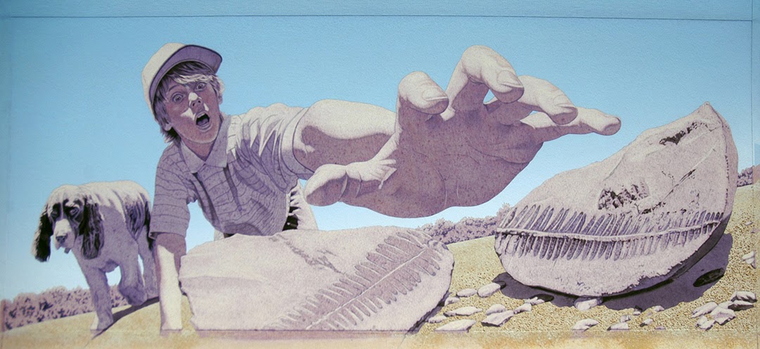
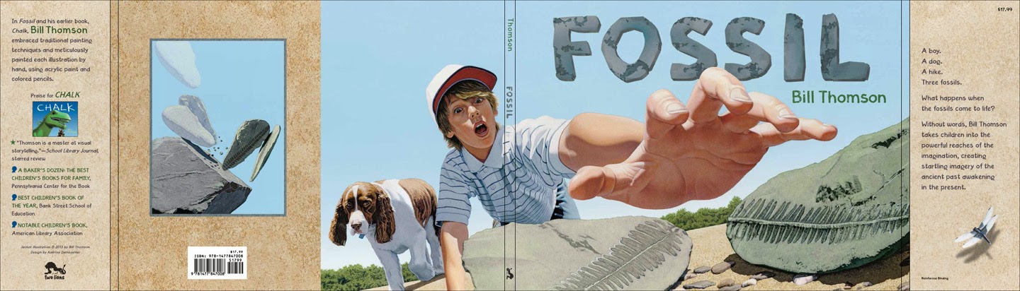
Now I'll focus on the creative process showing the development of one of the illustrations from FOSSIL. The thumbnail above was for pages 8 and 9 and was also selected as the cover. This scene utilizes an extremely low vantage point to prominently show the fossil. Even more importantly, it emphasizes the shocked expression of the boy and his dog upon making their discovery.
After deciding on the content of my illustration, the next step is to bring my idea to life. Because I work realistically, I use photographs as visual reference for my paintings. This requires carefully selecting models, finding locations, and building props. For FOSSIL, I shot over ten thousand reference photographs. The central characters in FOSSIL are a boy and his dog, and I wanted them visually connected by their long hair. The boy I selected played football with my youngest son- his nickname was “Hollywood” because of his flowing locks. I spotted the English springer spaniel while taking a walk with my wife, and instantly fell in love with her long curls. For the characters to appear natural, it is very important to coach my models in their facial expressions and body language. Getting the dog to do what I wanted was more difficult. However, after I discovered her love for Dunkin’ Donut Munchkins, some well-placed donuts coaxed her into the positions I needed. I always have a good light source on my subjects to define their form and texture.

Looking at the best parts of several reference photos and freely making adjustments and additions, I draw out the illustration. I tried to make the dog look apprehensive, a warning of things to come. I use graphite for most of the drawing, but used colored pencils on the skin tone shadows to keep the color rich. After the drawing is complete, I spray it with fixative so the graphite doesn’t smudge.

Using very small paintbrushes, I establish the black areas with acrylic paint.
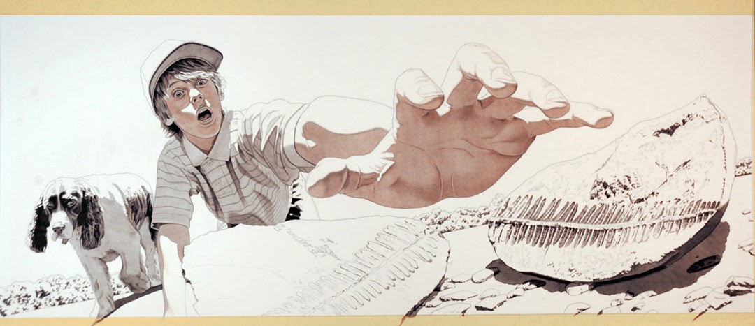
Then I paint over the entire surface with a light coat of gesso mixed with Yellow Ochre paint. Next, I paint over the entire surface again with a light mixture of purple oil paint and mineral spirits. Using a kneaded eraser, I erase the purple to expose the areas of sunlight.

This leaves an under painting of yellow and purple that establishes the areas of light and shadow.
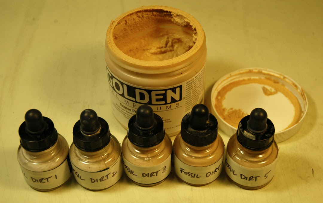
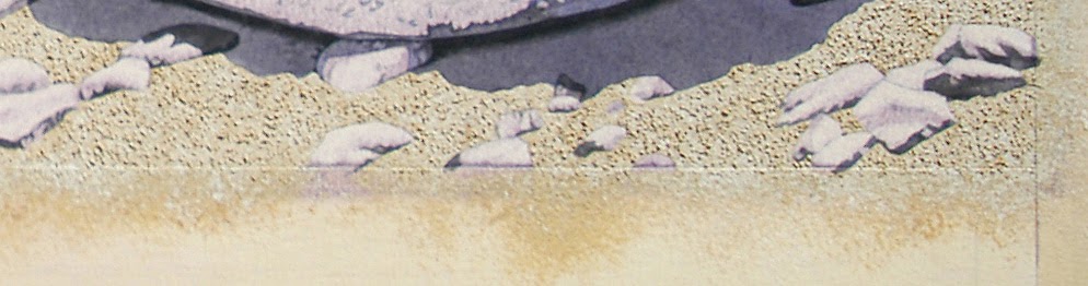
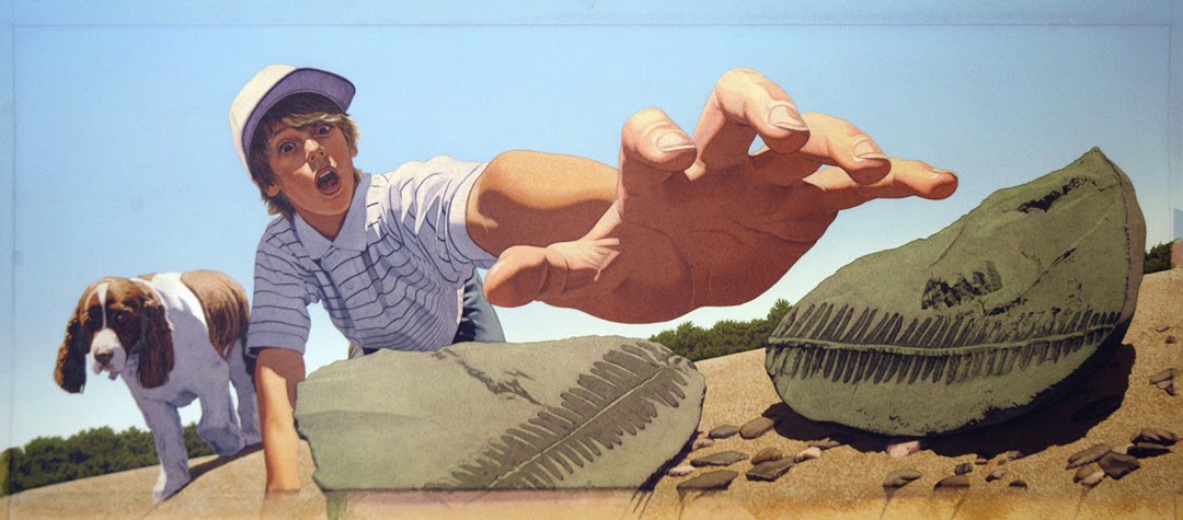
I always paint the background elements first, so I mix 5 different shades of brown that will be the ground color. I also mix the middle value into pumice gel medium that contains small pieces of real volcanic rock.
Next, I mask off everything except the ground using liquid frisket. Then I apply the medium and gesso, so the foreground has actual rocks mixed in with the texture. Using a sea sponge, I create a ground texture on top by overlapping the various values of brown.
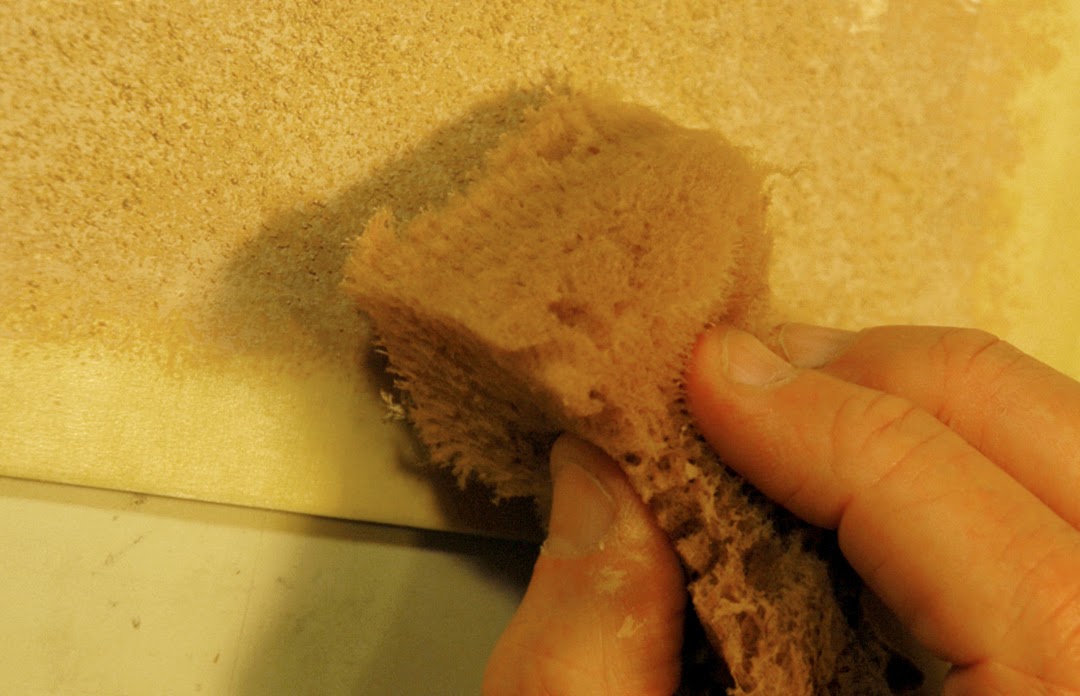
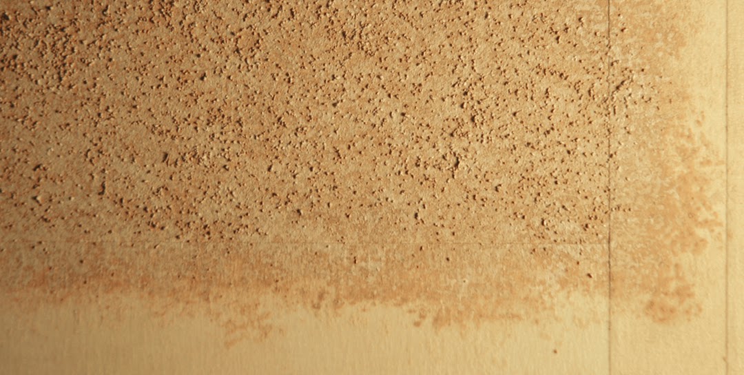
When I peel off the frisket, only the unprotected areas will have the rock texture. While this three dimensional aspect of my painting can't be reproduced in the printing process, the way paint reacts to the texture does, making the ground feel bumpier and more realistic.
Continuing to develop the background of the painting first, I mask off everything except the sky using adhesive frisket. Then I paint the sky using an airbrush. While I don’t like airbrushes, I sometimes use them to apply large flat areas of color. However, everything in my studio also gets a light blue coating of dust that takes me weeks to clean up. Since I'd rather be painting than cleaning, I keep airbrushing to a minimum. When I peel off the frisket, the sky and ground are complete.
Then I paint in all the foreground areas using acrylic paint. This is the most painstaking part of the process, but the color begins to breathe life into the painting.
And finally, I render everything again with colored pencils, bringing out all the details, highlights, and textures. The entire process for this illustration took over 125 hours.
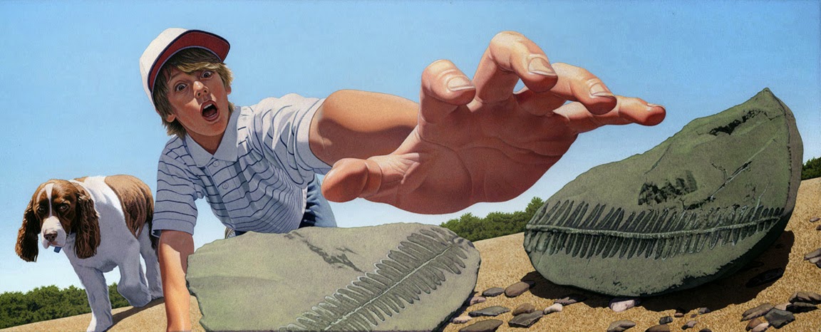
After my artwork is completed, Two Lions Art Director, Katrina Damkoehler, made digital scans of all the paintings to use on her cover design. I love how she incorporated elements from numerous illustrations to create a representative book jacket. Katrina also created a beautifully textured FOSSIL logo that would serve as the centerpiece of the cover.
If you enjoyed seeing this sequence, the creative process for another FOSSIL illustration can be seen on Alyson Beecher's Kit Lit Frenzy blog.


