Nicholas P. Desbarats's Blog
October 17, 2025
The problem with "% above/below target" indicators on dashboards (and what I use instead)
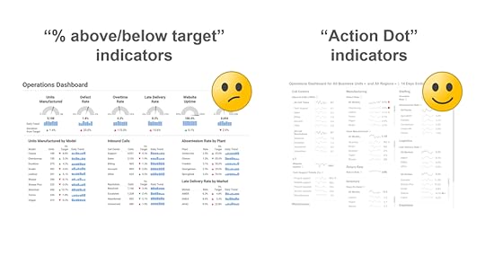
You've undoubtedly seen dashboards with "% above/below target" numbers beside metrics that indicate, for example, that a metric's current value is 4% below target, 5% above target, etc.
The theory is that metrics with larger "% above/below target" indicators require more attention, but is that actually the case? In my latest video (below), I show why metrics with small "% above/below target" indicators can actually require urgent attention, and metrics with large "% above/below target" indicators can actually require no attention at all.
At the end of the video, I show how "Action Dots" draw attention to metrics that genuinely require it much more reliably. Don't believe me? Watch the video and fight me in the comments!
BTW, there are still a few spots left in my in-person Practical Charts and Practical Dashboards workshops at the beautiful offices of Hike One in Amsterdam, which kick off on Oct. 27th! Workshop info/registration: https://fienta.com/nick-desbarats-amsterdam-2025


September 23, 2025
When creating charts, arrogance is the enemy

tl;dr: A recent exchange that I had on LinkedIn underscored a humbling but crucial truth: the same chart design that seems clear and obvious to some can be genuinely confusing to others, even among smart, well-intentioned people.
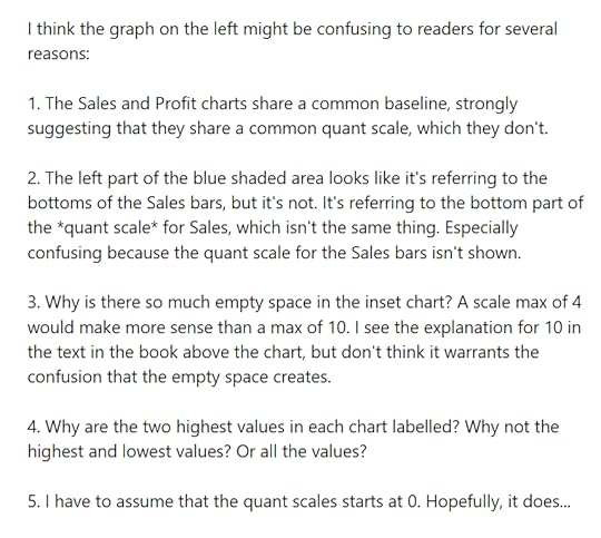
A few weeks ago, I was having a debate with roberto mensa on LinkedIn about which of two visual designs of inset charts readers would find to be most intuitive:
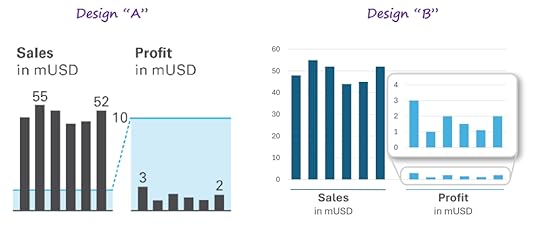
As a (totally unscientific) experiment, I posted both designs in a LinkedIn poll and asked people to vote for the one that they found to the most obvious and easiest to grasp.
I’ll be honest: I assumed that virtually no one would prefer the design that Roberto preferred (Design “A” above). In our LinkedIn discussion, I even provided reasons why I didn’t think anyone would choose that design:
I was wrong.
While more people preferred Design “B,” a full 26% of the 77 respondents preferred Design “A,” including gurus like Amanda Makulec and Evelina Parrou. More than a quarter preferred the design that I thought no one would prefer. I was, to be honest, astonished.
But I shouldn't have been.
This poll was a visceral reminder of a basic truth that I’m consciously aware of but that I unconsciously forget all the time: Even when everyone involved is being perfectly reasonable, acting in good faith, and of similar intelligence (however you want to define that term), what makes “perfect sense” or is “plainly obvious” can vary to an incredible degree from one person to the next.
What someone perceives as “clear” or “obvious” in charts undoubtedly arises from a slew of factors including what they learned in school, which industry they work in, what kind of content they consume, and possibly even genetics. Obviously, these factors vary widely from one individual to the next, so it makes sense that what seems obvious to one person might seem confusing to another.
The comments below the post are truly eye-opening and I'd urge you to scan through them, if you have a moment. You’ll see two groups of reasonable, dataviz-savvy people marveling at how the other group could possibly prefer a design that they found to be “confusing” or “unobvious.”
What this doesn’t meanWhat I’m saying here probably has a high risk of being misinterpreted, so I want to be clear about what I’m not saying:
I’m not saying that it’s impossible to say that one chart design is “better” than another:
If the intuitiveness of a chart depends on who’s reading it, does that mean that we can never say that one chart design is “better” than another? No, I don’t think we need to go that far. In theory, any set of competing chart designs could be tested with a statistically meaningful, representative sample of the chart’s target audience, and whichever design works best for the most test subjects can be said to be “better” than the other designs.
It’s just important to be aware that, even if a given chart design works best for, say, 75% of a test audience, that means some other chart design would have worked better for 25% of that audience.
I’m not saying that every chart design choice will work best for some readers:
There are plenty of chart design choices that I don’t think work well for any reader, e.g., using a sequential color palette to represent non-sequential categories, or truncating the scale of a bar chart.
I should be better at keeping in mind that reasonable, intelligent people can see the same thing fundamentally differently because that’s the central idea of one of my favorite books: “The Righteous Mind,” by social psychologist Jonathan Haidt. As Haidt puts it, “intuitions come first, strategic reasoning second.” We tend to form opinions unconsciously and immediately (and those opinions often differ among individuals), and then our brains go into “lawyer mode” to invent logical-sounding arguments to support those opinions. The catch is that we’re not aware of the unconscious part, so we tend to believe that our opinions are the final result of carefully considered, logical arguments when, in reality, it's the other way around.
This lesson is also well-understood by experienced product designers, who know that the target market for any product will be heterogeneous. Even the best-designed product will be perceived as obviously useful by some customers and completely useless by others.
OK, but what does this all mean when it comes to designing charts?Many times, I’ve seen chart creators design what they considered to be a clear, effective chart, but which is then misinterpreted or disliked by the audience. When this happens, chart creators sometimes blame the audience, believing them to be closed-minded, or just dumb.
While it’s possible that the problem is with the audience, it’s more likely is that the chart creator happens to be in a minority when it comes to how people perceive the design choices in that particular chart, and the audience is in the majority. In those cases, the chart designer might need to make design changes that seem less intuitive to them personally, but that they’ve discovered are more intuitive to their target audience.
As experienced product designers know, it’s a bad idea to design products for themselves (a common product design trap). It's a better idea to design products for their target audience, even if they themselves would never buy that product. I think the same goes for charts.
Now, it’s also possible that the reason why an audience doesn’t respond well to a chart is that it was just fundamentally poorly designed, i.e., that no one would find that chart design to be clear or obvious. Happily, however, it’s possible to learn how to avoid creating charts like that by, oh, I don’t know, taking my Practical Charts course 😉, speaking of which, I have a bunch of...
Upcoming webinars & workshopsIn-person workshops in Amsterdam: I’ll be delivering my Practical Charts and Practical Dashboards courses live and in-person in Amsterdam at the end of October! If this is of interest, use the discount code LI-235-15 on the workshop registration page to get 23.5% off until Sept. 29 and 15% off thereafter.
In-person workshop in NYC: I’ll be delivering an abridged, one-day version of my Practical Dashboards course on Oct. 6th as part of SmashingConf New York 2025. Use this link to get 20% off conference and workshop tickets.
Free webinar: On Wednesday (Sept. 24th) at noon UK time, I’ll be delivering a free webinar in partnership with Rupe Ltd, entitled “How to rescue your failing dashboard.” Pre-register to attend here.
August 26, 2025
Why I avoid using radar/spiderweb graphs (and what I use instead)
tl;dr: I don't use radar graphs because more informative and familiar chart types such as heatmaps and overlapping cycles charts can always communicate the same insights. Also, I'll be delivering a live, in-person workshop in Amsterdam in October, and will provide the registration link at the end of the article.
In my Practical Charts course, there are about a dozen chart types that I recommend avoiding in “everyday” business reports and presentations, including box plots, bullet graphs, connected scatter plots and, yes, radar graphs. These are also known as “spiderweb graphs” and a few other names, but I’m going to call them “radar graphs” in this article.
If you’re not sure what a radar graph is or how to read one, great! Stop reading now. 😂
If, for some reason, you want to invest your time into learning how to read a chart type that I don’t think you should ever use, this is the best explanatory video I could find.
Now, to be clear, I don’t think radar graphs are “bad” or “useless.” You can get useful insights from radar graphs. What I am suggesting is that any insight that can be spotted in a radar graph is at least as clear in more informative and familiar chart types, so there are no situations in which radar graphs are the best choice. Jump in in the comments to prove me wrong, though. 😁
Before looking at some examples, I need to point out that there are two common—but very different—ways in which I see radar graphs being used in the wild:
Comparing several items (e.g., cars models) based on several attributes (e.g., price, fuel economy, safety ratings, etc.), which is the most common use of radar graphs.
Showing cyclical time series data, that is, data with repeating weekly/monthly/yearly/etc. cycles (e.g., hourly electricity consumption, monthly suntan lotion sales).
I need to mention this because the alternative chart types that I use instead of radar graphs are different for each of these two situations.
Let’s start with…
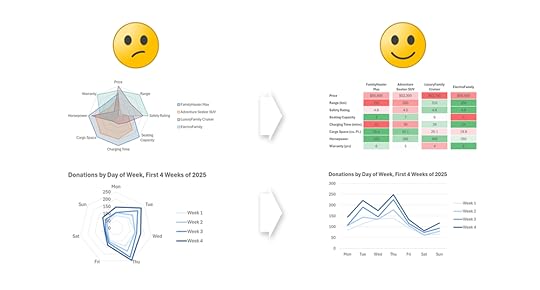
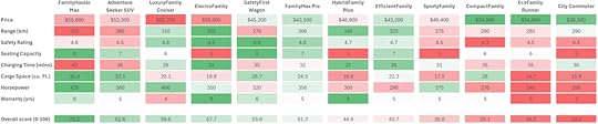
Radar graphs for comparing several items based on several attributes…like this one, which is designed to compare four car models based on eight attributes:
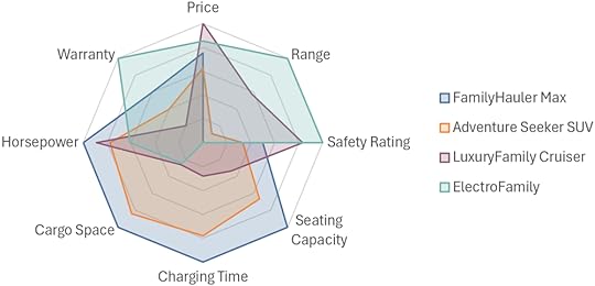
If you know how to read a radar graph and stare at this one long enough, you might notice insights such as:
The ElectroFamily model scores better than the others for Warranty, Range, and Safety Rating, but poorly on other attributes.
The FamilyHauler Max has many desirable attributes, including Horsepower, Cargo Space and Charging Time.
The Adventure Seeker has generally lower scores that the other models.
For giggles, let’s look at the same data as a…
Heatmap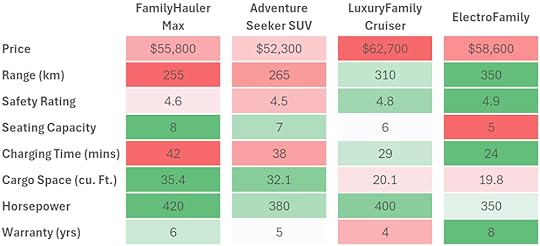
To my eye, anyway, all the insights that I identified in the radar graph aren't merely as clear in the heatmap, they’re considerably clearer. As a bonus, there's a much greater chance that the audience already knows how to read a heatmap like this than a radar graph.
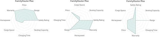
Another concern with radar graphs is that they become essentially unintelligible when comparing more than four or five items:
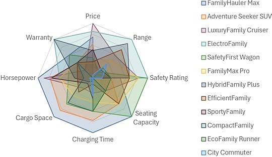
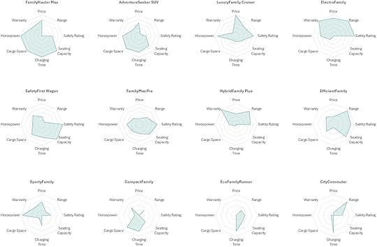
A messy radar graph like this can be split into a "small multiples" arrangement, but now comparing items with one another is considerably more difficult because the items are no longer overlapping:
A heatmap with many items is visually busy, but at least it's still intelligible, and comparing items (i.e., scanning across rows, in the example below) is considerably easier:
I've heard radar graph aficionados say that a unique feature of radar graphs is that readers can spot items with similar "multivariate profiles," but I'd argue that that's at least as easy to do in a heatmap. For example, in the heatmap above, I can easily see that the three rightmost car models all have a similar multivariate profile (i.e., mostly undesirable attributes, but desirable prices).
There are other issues with radar graphs, such as the fact that just changing the order of the categories (i.e., the “spokes” in the radar graph) can make the same item with the same attributes look completely different. The three radar graphs below, for example, all show the exact same car with the exact same attributes, just listed in a different order:
...but I'll leave it at that for now so that we can move on to the second common use of radar graphs, which are…
Radar graphs for showing cyclical time series data… like this:
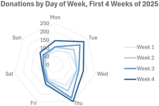
If you know how to read radar graphs and stare at this one long enough, you might notice the following insights:
The four weeks shown generally follow a similar pattern (peaked on Thursday, bottomed out on Saturday, etc.)
Each week was generally higher than the last.
The values for Fridays and Saturdays were similar for all weeks.
Now let’s look at the same data as an…
“Overlapping cycles” chart…like this:
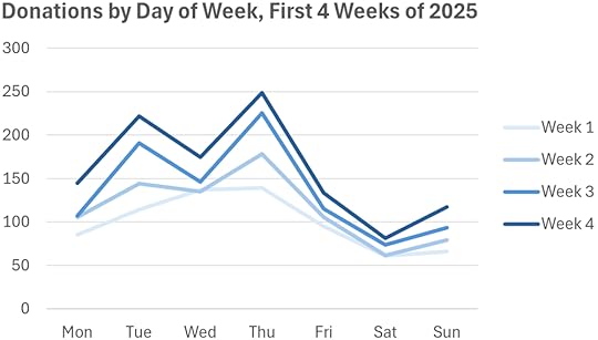
Again, to my eye, all the insights that I spotted in the radar graph are at least as clear in this (considerably more familiar) line chart. This chart actually seems more informative than the radar graph because I noticed a few things that weren’t as obvious in the radar graph, like the fact that Week 1 didn't have "Wednesday dip" like the other weeks.
Does this mean that you should never use radar graphs? No, there’s one (rare) situation in which I think a radar graph can be the best choice, which is…
When the values are associated with points on a circleWhile quite rare in practice, there are situations in which the values are associated with points on a circle, for example, the directions from which wind can come:
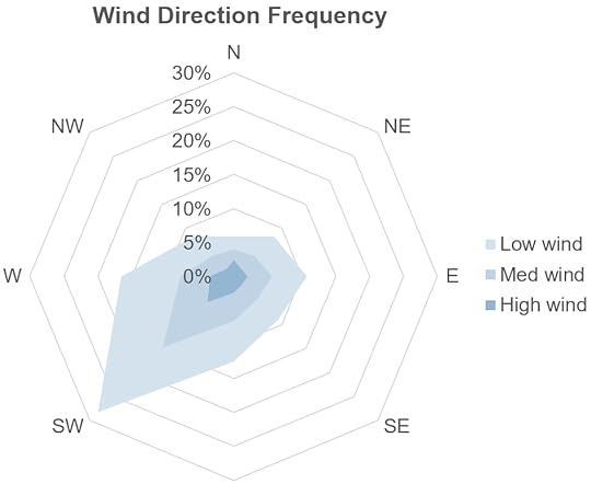
Using a radar graph makes sense in this situation because the values in the chart are associated with the points on a circle (or, rather, an octagon in this case). Indeed, this type of "prevailing wind direction" chart is so widely used in maritime navigation and aviation that it has a name: a wind rose. Values like car features, the days of the week, etc., aren't associated with points on a circle, however, so showing them arranged in a circle is a perceptually dicey proposition, IMHO.
What now?I should clarify that I’m not saying that radar graphs should be avoided solely because they're unfamiliar to many audiences (although that is the case), or that we should avoid asking audiences to learn to read new chart types. I recommend plenty of other chart types that many audiences aren’t familiar with, such as scatter plots, histograms, and step charts, but I recommend those chart types because there are situations in which more familiar chart types can’t communicate the same insights.
I avoid radar graphs because more informative and familiar chart types like heatmaps and overlapping cycle charts can always communicate the same insights as a radar graph, AFAIK. I have yet to come across a single insight that was clearer in a radar graph than it was in a simpler, more familiar chart type, so I'm not aware of any situations in which they’re the best choice (apart from the special "values are associated with points on a circle" case).
I know some people balk at the suggestion that any chart type should be avoided altogether, and insist that every chart type has situations in which it’s the best choice. I’m not sure why that would be true, however, for reasons that I discussed in this article.
Finally, there’s another reason why I avoid radar graphs that I haven’t mentioned yet, which is that I’ve seen a lot of people feel stupid because they struggled to read them or failed to grasp them entirely. Possibly the best reason to avoid radar graphs (or any needlessly complicated chart type), then, is to avoid making people feel dumb for no reason.
BTW, 🇳🇱 Netherlands friends 🇳🇱 ! I'll be delivering a live, in-person workshop in Amsterdam on Oct. 27-28 (Practical Charts) and Nov. 13-14 (Practical Dashboards). Info/registration page: https://fienta.com/nick-desbarats-amsterdam-2025 . 30% of the seats are already gone and the early-bird discount ends Sep. 29, so don't wait! Hope to see you there.
July 23, 2025
My crazy crusade against single-number KPI targets
tl;dr: Almost all organizations set single-number targets for their KPIs (e.g., a sales target of $5M for next quarter), however, this approach causes some surprisingly serious problems, all of which are solved by using four numbers to communicate expectations regarding a KPI’s performance, rather than just one.
When I teach my Practical Dashboards course, I recommend against setting single-number targets for KPIs.
I know.
WTF.
Almost every organization does this, and they’ve probably been doing it since the dawn of the Industrial Revolution.
I get it, but setting single-number KPI targets causes some surprisingly serious problems that, I think, are obvious when they’re pointed out, and I think a better approach exists.
What, exactly, is wrong with single-number KPI targets?
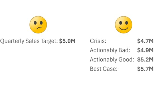
Scenario time…At the beginning of this quarter, our company’s CEO set a sales target of $5M for the quarter, but we ended up just missing it and we only hit $4.96M. So, how should we feel about $4.96M? It seems kind of silly to feel that we “failed” when, from the company’s perspective, $4.96M is virtually the same as $5M.
We could instead just say that, for all intents and purposes, we hit the target, but what if we’d hit $4.9M instead of $4.96M? Should we still consider that we “hit the target, for all intents and purposes” at that point? What about $4.8M? $4.5M?
Basically, at what point do we start to consider sales to be a problem that we need to take action on? With a single-value target like $5M, this is left up to the reader to decide, and they may or (much more often) may not have enough background knowledge to determine that.
Worse yet, different readers will have different takes. Some will say that $4.8M is still fine, whereas others will say that $4.8M would be a huge problem that needs to be solved.
And what if we exceeded the target and hit $5.2M? Would that still be "fine," or would it be absolutely amazing? Hmmm…
What's going on?I think the underlying issue here is that the CEO expressed her expectations of what sales revenue should be as a single number (i.e., $5M), but that’s not how she—or anyone else—actually thinks about sales.
To find out how the CEO actually thinks about sales, we could show her a series of theoretical sales values to react to such as, say, $4.5M, $4.6M, $4.7M […] $5.4M, $5.5M, and ask her what she’d think if sales were at each of those levels. If we ran this exercise, she might tell us something like this:
If sales were below $4.7M, that would be a disaster. We’d have to lay people off.
If sales were at or above $4.9M, that would be fine.
If sales were above $5.2M, that would be more than just fine. We’d probably hire a few more employees at that point.
If sales were above $5.7M, that would be amazing. I doubt we’d ever hit that but, if we did, I’d adjust my expectations upward for future quarters.
Expressing the sales target as a single number like “$5M” doesn’t capture any of this crucial information.
“But,” I hear you collectively say, “we could report the percentage that we’re above or below each KPI’s target instead, and define, say, 5% below target as a problem, and 10% below target as a major problem.”
Sounds good in theory; doesn’t work so great in practice. Why not? The gotcha with this approach is that the same thresholds (e.g., “5% below target is a problem and 10% below target is a major problem”) can’t be applied across all KPIs because being, say, 5% below target would be a catastrophe for some metrics (e.g., “Website Uptime”) and a total nothing burger for others (e.g., “Cash On Hand”).
Therefore, reporting that a given metric is "x% below target" doesn’t actually tell the audience much. Depending on the metric, that could be fine, or it could be a disaster, and it’s entirely up to the audience to figure that out.
Is there another way to set targets that doesn’t have all these downsides? I’m glad I assumed that you asked…
Set four numbers for each KPIIn my Practical Dashboards course, I recommend expressing expectations for the performance of a KPI as four numbers, rather than just one. Each of these four numbers has a very specific definition:
Crisis: The level at which we’d pretty much drop everything until this KPI improved.
Actionably bad: The level at which we wouldn’t just be concerned, we’d be so concerned that we’d do something (e.g., cancel bonuses, launch an investigation, etc.)
Actionably good: The level at which we wouldn’t just be pleased, we’d be so pleased that we’d do something (increase bonuses, make new investments, etc.)
Best case: The best we’d realistically be able to achieve for this KPI. We’d probably never hit this number but, if we ever did, that would be extraordinary.
Using these four numbers, we could represent the CEO’s thoughts about sales revenue accurately, like this:
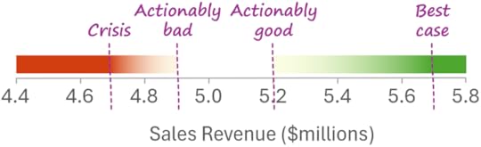
This tells everyone exactly what any given sales number would mean to the CEO and, more importantly, what to do (or not do) in response to that number. For example, everyone can see that, if sales are between $4.9M and $5.2M, that would be fine and we wouldn’t need to take any action.
If we only had a single-number target like $5M, however, what would sales of $4.95M mean? Should we panic? Or do nothing? What about $4.8M? Everyone's guessing at that point.
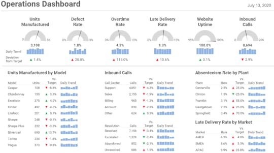
If this four-number approach is used to color-code what I call “action dots” on a dashboard, we end up with something that’s far more useful since the reality is that most metrics fall in the "no action required" range (between Actionably Bad and Actionably Good) most of the time, so only metrics that actually require us to do something get flagged:
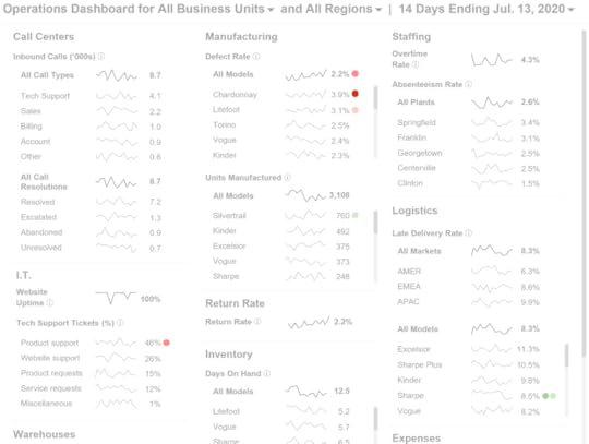
As opposed to a dashboard that shows "% deviation from target," which flags all metrics all the time, regardless of if they actually require action or not:
 What now?
 Do I expect everyone to ditch single-number targets and start setting four-number ones after reading this post? Probably not. Inertia is a powerful thing…
Many of my clients have started doing it, however, and are reaping the benefits. So, if you find that the four-number approach has merit, it might be worth trying to move this particular mountain in your organization…
BTW, I cover this and many other topics in my Practical Dashboards course, which I'll be delivering in two in-person workshops in Europe this fall!
I'll be delivering an "abridged," one-day version of Practical Dashboards as part of SmashingConf in Freiburg, Germany on Sept. 8, 2025. Here's the workshop info/registration page.
I'll be delivering Practical Charts and the full two-day Practical Dashboards course in November 2025 in London, U.K. in partnership with Rupe Ltd. Register your interest by completing this short form before July 31st to get 20% off the registration fee and be notified when tickets go on sale.
Hope to see you at either event (or maybe both if you're a super-keener 😂).
May 26, 2025
How to show OUTLIERS in charts (and how not to)
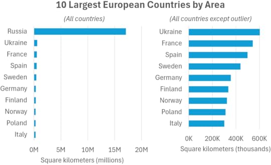
Have you ever tried to visualize a set of values only to find that an outlier in the data (i.e., a value that's much larger than the other values) was messing up the chart by making the other values too small to see clearly?
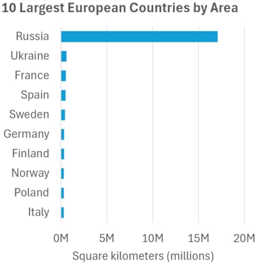
Now, it's important to note that this chart may or may not be problematic. For example, if the "job" of this chart is to show that Russia is much larger than other European countries, this chart does that job perfectly and doesn't need to be "fixed." If, however, the job of this chart is to say something about how the smaller values compare with one another, then, obviously, this chart wouldn't cut it.
Chart creators typically use one of four methods to deal with outliers, one of which I think is the most effective by far.
BTW, if you want a lot (like, a lot a lot) more tips like these, I'll be delivering my Practical Charts course live online, beginning on June 2nd, 2025! Info/registration: https://www.practicalreporting.com/june-2025-online-workshop Hope to see you (online) there!
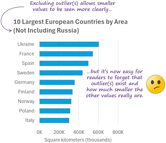
The first method is to simply exclude the outlier(s) from the chart, but this isn't ideal:
The second method is to "break" the quantitative scale, but this isn't a great solution either:
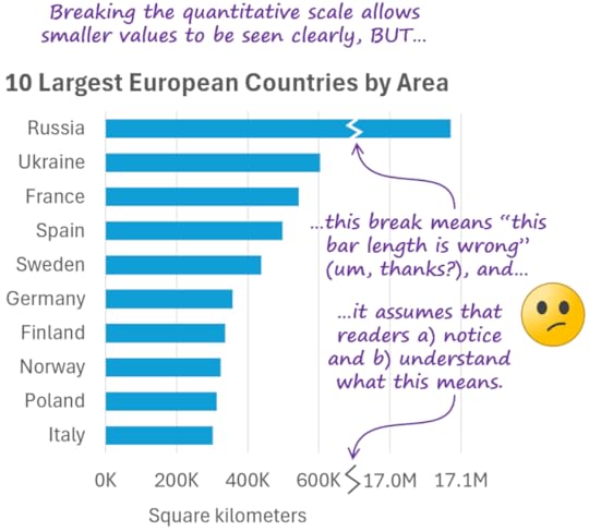
The third method is to switch to a logarithmic quantitative scale but, again, this isn't ideal:
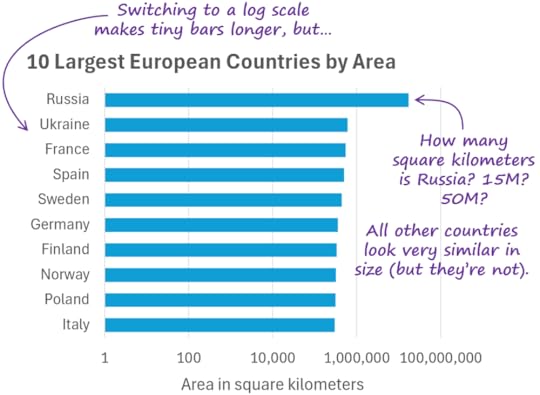
Most audiences struggle to read values on logarithmic scales accurately (assuming they know how to read them at all). Logarithmic scales can be useful for certain types of analysis, but generally not for “everyday” charts.
The fourth method, and the one I use myself in virtually all situations, is to use an inset chart:
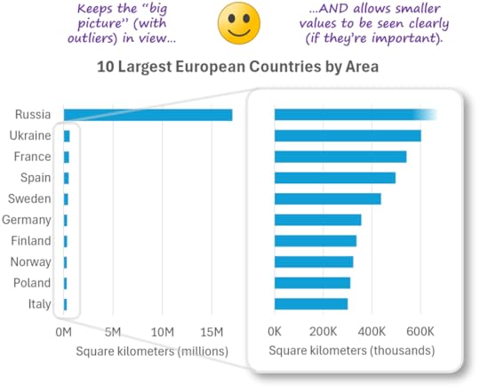
When designing inset charts, subtle design details help readers understand how the “zoomed-in” chart relates to “big-picture” chart:
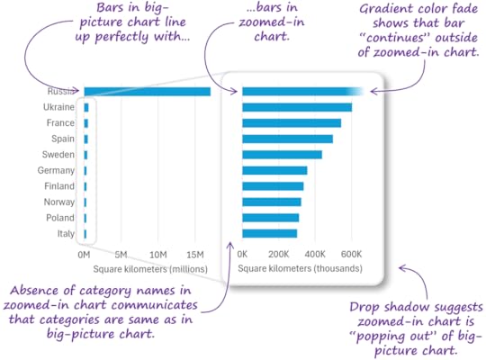
Note that inset charts aren't limited to bar charts, and can be used to handle outliers in almost any chart type:
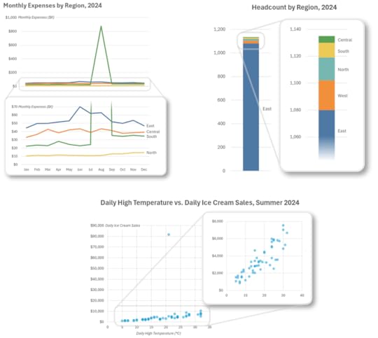
If you're designing charts that will be dynamically generated in a live dashboard/reporting application (Power BI, Tableau, etc.), unfortunately, these applications generally don’t support subtle design details like those shown above. Inset charts can still be used, but the relationship between the two charts will be less visually obvious without the boxes, drop shadows, etc.:
As I mentioned earlier, if you want more tips like these and to become a true dataviz pro, I'll be delivering my Practical Charts course live online, beginning on June 2nd! Info/registration: https://www.practicalreporting.com/june-2025-online-workshop Hope to see you (online) there!
May 12, 2025
"Economic Chaos" Sale! 25% off courses and books until May 20th!

I get it. With the unpredictability that's been injected into the global economy, many of us are hesitant to make any kind of new investments, including new upskilling investments.
That's why I've decided to make it easier to take my courses and get my books by discounting prices by 25% for seven days, from now until May 20th:
Live online Practical Charts and Practical Dashboards workshop (kicks off June 2): Click the big "Register" button on the workshop info/registration page and enter the promo code CHAOS-01 at the top of the ticket selection popup.
Practical Charts On Demand (6.5 hrs of video in 45 lessons): Click the big "Take Practical Charts On Demand Now" button on the course information page, then enter the coupon code chaos-01 on the checkout page (look for the "Have a coupon?" link).
Practical Charts + More Practical Charts PDF + eBook bundle: Go to the "Practical Charts + More Practical Charts (PDF + eBook bundle)" page on our online store, add one (or more) copies to the cart, then check out and enter the discount code CHAOS-01 on the checkout page.
My courses and books don't go on sale often, so take advantage of it!

May 6, 2025
Should you put key insights in chart titles, or in annotations? (4-min video)
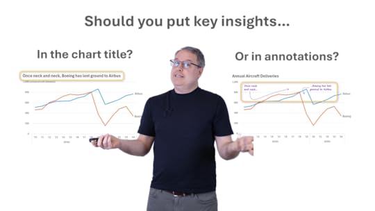
For many years, I've tended to put key insights of my charts directly in the chart title, to tell readers immediately why I thought they needed to see that data:
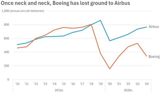
More recently, however, I've been experimenting with putting key insights in annotations directly within the chart itself, and reverting back to "generic" chart titles that simply say what kind of data is in the chart:
I think this insights-in-annotations approach might have some advantages in terms of "cognitive fluency", which I describe in the short (4 mins) video linked below, but I'd love to know your thoughts in the comments below.
BTW, if topics like this are of interest to you (Nerd! Like me 😂), I cover this and many other topics in my Practical Charts course, which I'll be delivering live online on June 2! Early bird prices end May 9 and spots are limited, so register soon: https://www.practicalreporting.com/june-2025-online-workshop
Watch the "insights in chart title vs annotations" video on...
May 1, 2025
New video! Why I don't color category labels in charts
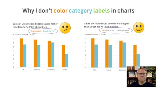
You've probably seen charts where the colors in the chart are identified by coloring category name labels instead using more "traditional" color swatches. I personally don't use this technique in my charts, though. Why not? Find out in my latest video (4 mins); see links below.
Want to learn more skills like these? I'll be teaching my Practical Charts course live online on June 2! Early bird prices end May 9. Info/registration:https://www.practicalreporting.com/june-2025-online-workshop
Watch the "colored text" video (4 mins) on...
April 30, 2025
New video! Should you be using AI to create charts instead of Excel/Tableau/etc.?

Generative AIs like ChatGPT, Claude, and Gemini have been steadily improving their chart-making abilities during the past year or so and now claim to be top-notch chart creation tools. Is this just AI hype, or is it time to switch from Excel/Tableau/etc.?
❓ Is it faster and/or easier to create charts in AI?
❓ Can AI handle the kinds of charts that you need to create? How good are the results?
❓ How much human help does AI need? Can it produce well-designed charts without human intervention?
❓ Are AI-generated charts reliable and accurate?
Having recently put various AIs through their chart-making paces, I can say that the answer to all of these questions is a resounding “it depends.” Sometimes it makes sense to use AI (although there are important caveats to be aware of). Sometimes, however, a tool like Excel or Tableau will be the better choice. When should you use which tool? What are the caveats around using AI? Find out in my latest video (see links below).
One thing that became clear in my testing was that, if you want top-notch charts, you still need top-notch dataviz skillz—even if you're using AI. How can you acquire those skills quickly? Well one pretty good way would be to take my Practical Charts course, which I’ll be delivering in a live online public workshop in June! Info/registration: https://www.practicalreporting.com/june-2025-online-workshop
Watch the "Should you use AI to create charts?" video on...
March 20, 2025
Why it wouldn’t make sense to adapt Practical Charts to Power BI’s limited visuals

My Practical Charts course is tool agnostic, that is, it doesn’t assume that any particular dataviz software product (Excel, Tableau, Google Sheets, etc.) is being used. There are three reasons for this:
The guidelines for making design choices like choosing a chart type or choosing a color palette are the same, regardless of which dataviz software product is being used.
All the chart types and techniques in Practical Charts are pretty standard and can be implemented in just about any modern dataviz software product.
If a workshop participant is unsure of how to create anything that I show in the course, high-quality tutorials for just about every major dataviz software product are just a Google search or AI prompt away.
You might have noticed that, in those last two reasons, I referred to just about any major data visualization software product. The “just about” qualifier is there because of one unfortunate exception:
Power BI.
Power BI can, of course, handle basic bar charts, line charts, pie charts and the like, but, for anything that’s even slightly more “advanced,” or to make even small chart formatting adjustments, there’s a risk that it will be surprisingly complicated—or, in some cases, impossible—to do.
I didn’t realize how limited Power BI’s visualization features were until I watched these fantastic YouTube videos from Power BI guru Greg Deckler, in which he tries to recreate some of the more “advanced” charts from Practical Charts in Power BI. Even though many people wouldn’t consider these chart types and techniques to be particularly “advanced” and they’re easy to create in other major dataviz software products, Greg (who’s literally written books on Power BI) often has to resort to heroic amounts of hacking and custom coding to pull them off, or in some cases, make not-insignificant compromises in the final chart design.
I have no particular beef with Microsoft, and I know a number of people who work there, all of whom are lovely. For whatever reason, though, they made some truly baffling choices when they designed the native visuals for Power BI back in the day, and many of those baffling choices and feature omissions are still in the product. Yes, custom visuals can be used to overcome these limitations, but many of my clients are hesitant to go that route because of legitimate concerns around complexity and maintainability.
Participants in my workshops who are familiar with Power BI sometimes spot these limitations during or after the workshop, and a few have asked me if I’d be open to creating a “Power BI version” of Practical Charts that shows how to create the best charts that can be created within Power BI’s limitations.
I don’t think that this would be helpful, though—even for Power BI users—for a few reasons:
When I designed the Practical Charts course, I cut every single chart type and technique that wasn’t absolutely necessary for creating “everyday” charts. Cutting any more (for example, cutting whatever can’t be implemented easily in Power BI’s native visuals), would leave “gaps” in the course, i.e., common situations and challenges for which the course would offer no guidance.
I’d be forced to recommend chart types and techniques that would not be good choices in certain situations simply because the good choices in those situations aren’t easily doable in Power BI. Basically, workshop participants would learn how to create charts that are needlessly hard to read, unobvious, or potentially misleading.
Even if a particular chart type or technique can’t be implemented easily in Power BI’s native visuals, it’s still important for chart creators to know that that chart type or technique exists. Why? Because, if Power BI prevents a dashboard designer from using the best chart type or technique in a particular situation, the designer will understand why their users don’t respond well to their dashboard, i.e., that the problem is with the tool, not with their design choices.
Most Power BI users also use other tools with more capable visualization features, such as Excel or Tableau, to create charts for presentation slides, written reports, etc. In those situations, they need to be aware of all essential chart types and techniques—not just those that happen to be easily done in Power BI—in order to create effective charts.
Having said all this, I don’t want to make Power BI sound worse than it is. Millions of dashboards have been built on it and those dashboards are getting used (well, some fraction of them, anyway), so it can’t be that bad. Like I said, it handles basic chart types and techniques just fine; it’s just that when it comes to fine-tuning charts with small (but impactful) adjustments, it can get needlessly complicated or impossible to make those adjustments. Power BI also seems to be excellent when it comes to back-end data processing; it’s just the front-end visuals that seem to be lacking.
So, what should you do if you’re a Power BI user? Still take Practical Charts, obviously 😊. I don’t think it makes sense to not want to learn about essential chart types and techniques simply because a Power BI product manager didn’t think to support them back in the day. That would be like learning to write using only certain letters of the alphabet because some of the keys on your keyboard happen to be broken.
What should you do if you need to use a chart type or technique that you saw in Practical Charts but that you can’t pull off fully (or at all) in Power BI? Based on what you learn in the course, you’ll be well-positioned to choose the “least bad” alternative that can be created in Power BI and, if that alternative doesn’t go over well with users, at least you’ll understand why and you’ll know what a better alternative would have been.
BTW, if anyone on the Power BI team happens to read this and wants to know what I consider to be the most basic missing features in the product’s visuals, I’m happy to chat.
BTBTW, I recently updated the Practical Charts “course preview” video! Thinking of taking Practical Charts on demand, live online, or in-person at your location? Check out the course preview video on YouTube (13 mins) for a detailed overview what you’ll learn and what you’ll be able to do after the course!