
Jonas Eriksson's Blog: Jonaswrites.com - official site of author and writer Jonas Eriksson
April 12, 2019
Funny and relevant communication by Revolut


May 10, 2017
What is Amazon Echo Show?
April 11, 2017
Funniest man alive – Louis C.K has a new special
November 14, 2016
The World Chess Championship – Carlsen vs Karjakin
When I was eight years old my father taught me how to play chess. It was one of those moments that could have defined a lifetime and in a way did. I was enchanted by the game’s complexity, started playing almost every day and joined a club. It didn’t take long before I beat my father, then a mid-level club player. I started entering national tournaments for my age and managed to win my first Swedish chess championship for my age when I was ten years old.
Chess is a fascinating game and it swept me away for many years of my childhood. First I travelled the country and then a large part of Europe taking part in international tournaments. At 19 I won the Swedish junior championships and a little later I became a FIDE master. In 2003 I played an international tournament in Stockholm where a certain youngster named Magnus Carlsen took part. He was an international master then, closing in on the grand master title. I played the white pieces but had to fight for six hours before I managed to get a draw. A few years after that I moved to Malta to start a new career and era in my life. For some reason I exchanged chess for my other favourite childhood sport – tennis – and I lost touch with the game I loved as a kid. It’s how life goes sometimes.
Magnus Carlsen on the other hand, he beat all the tough expectations placed on him so early on in his life and became World Chess Champion ten years later (2013). Now he’s defending his title in New York against Sergey Karjakin from Russia and chess is in the main news again.
A world championship match in chess is a special event. It’s a true test for both players, both mentally and physically. Playing 12 (or in the past up to 24!) games against the same player (with the whole world watching) for the title of the world’s best chess player can play havoc on your nerves. It truly can be a spectacle to watch even if you don’t have a strong understanding of chess. Sometimes you can almost taste the tension in the air.
To understand the preparation and importance of a world championship match, just read this article about Carlsen’s worry about Russian hackers getting access to his preparatory work ahead of the match.

This championship match between Carlsen and Karjakin is not even half as political as the famous cold war style Fischer vs Spassky duel in 1972, but both players have early made it clear about their political differences (unintentionally perhaps) with Carlsen mentioning that he doesn’t like Donald Trump and Karjakin earlier being open with his support for Vladimir Putin.
In my mind, chess is more sport than politics and I think the two are best apart, but sometimes it does make for an increase in drama. But that this chess world championship draws interest without political hot air is evident by some of the celebrities frequenting the event in New York: Woody Harrelson, Adrian Grenier, Ken Rogoff and miscellaneous high-flyers in business and politics.
The first two games in the match has turned into quite predictable draws. The third game starts tonight at 20:00 CET. I will for sure keep my eyes on it and hope for some fireworks.
Kudos to the organizers for giving the spectators a great chance to follow the match online through live streaming and commentary. The official website is not half-bad either.
My prediction in this match? Well, I might be a bit biased but I think Carlsen will prevail by two games.
November 9, 2016
Trump wins and contextual advertising
The population of the United States of America shocked us all today when they voted reality star and business mogul Donald Trump to be the next president. It was joke in “The Simpsons” 16 years ago, but today a guy that has been making fun of women, Mexicans, gays and people with mental disabilities, is now trying to make America great again. If that is without all those people, remains to be seen.
Although his winning speech was quite composed and toned down, it will be interesting to see if all the various threats Trumps has talked about, like tossing away trade agreements, incarcerating Hillary Clinton, stopping Muslims for entering the country and building a wall to Mexico, was all talk on the campaign trail.
When I logged into New York Times today, I found piece of contextual advertising that I’m not sure was intentional or not, but still put a wry smile on my face. Above the headline “Trump triumphs” was a banner for a game called World of Warships.
I sure hope that this was just a weird coincidence and that these two messages won’t go together in the future. The only thing we can know for now is that we’re entering a uncertain times.
But no matter what, stay positive, be good, believe in good people and remember that the world is what we make of it.
November 8, 2016
Ryan Air Puns the Election
This is a nice example of using big time news stories in your marketing from Ryan Air. I really like the subject line: “Even Hillary wouldn’t delete this e-mail…” and how it’s followed up by flight prices that nobody can “Trump”. The copywriter must have had some fun working on this campaign.
Daring to be different can sometimes do the trick and since Ryan Air isn’t seen as the most reputable or serious brand, they can easily be more playful in their communication. Let’s see if they will try this kind of communication more often from now. I think it would suit them.

October 28, 2016
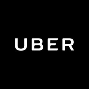
The Internet hates the new Uber logo
Launching a new take on your brand is always difficult. People have gotten used to your design and they probably hardly think about it unless they work in marketing. But you want to change your business, take it to a new level and hence you, or some mighty guy in your management team, wants to change the logo.
So you often end up hiring an expensive agency to rebrand. You might think a rebranding process is a small thing, but for large, established companies it is definitely a huge deal. Â And when you spend a million on your new logo it wouldn’t hurt if it was revealed to an appreciating audience, right?
 And when you spend a million on your new logo it wouldn’t hurt if it was revealed to an appreciating audience, right?
I’m sure that’s what Uber wanted and hoped for, but instead the Internet frowned (just google “new Uber logo” and you’ll see) when the revolutionary (big word, but let’s use it) transportation company launched what looks like a…a…a…
I have no idea what it looks like to be honest and neither did most people. Uber claimed on their new website that it was “inspired by the âbitâ and the âatom,â both building blocks of technology and the world.”
Having worked as a creative for a large part of my life it does sound like the usual agency bullshit to me (the masters of bs award goes to the Arnell Group for their infamous documentation on their Pepsi logo redesign), but it’s often too easy to write these things off without knowing what went on behind the scenes. So I did some research.
The thing that is different with the Uber rebranding is that it was done in-house and actually deeply involved founder Travis Kalanick, who is not a designer. However, he saw it as a personal rebranding (âthereâs an evolution here, for the founder as well as for the company,â he said, âbecause really, theyâre very connected.â) and decided to read up on kerning and color palettes to be able to contribute to the process in a good way.
Together with design director Shalin Amin they sat down to tackle all Uber’s branding problems which according to Shalin were:
The company had two logos. U inside a box on Android and U and no box on Apple.
The letters in the UBER wordmark were too widely spaced.
The upper-case U looked weird beside the wordmark, almost like it extended the word to Uuber.
Like pretty much all design processes, the rebranding of the Uber logo became a lengthy one. But the wordmark part of the Uber logo project went relatively smooth and ended up like this:
But next to this new logo that they all liked – their other brand assets looked dated. And so the process grew and became an entire rebrand with icons, fonts, website look and feel. The design team started working on the story behind it. Thanks to the above mentioned blog post about bits and atoms Kalanick had written, the team had a concept to work with and through multiple jam sessions (sounds better than brainstorming), a communications designer named Catherine Ray came up with grid-like themes inspired by her bathroom tiles. Together they would then choose the pattern that would represent the Uber brand based on the five pillars of Uber: grounded, populist, inspiring, highly evolved, and elevated.
When it came to colors, things got more complicated. They realized they couldn’t be basing the entire design of a worldwide brand (400 cities in 65 countries) around the ideas of a “white guy in California”, even if he was the CEO. So they set up a few design principles and started to work on an international palette based on colors, imagery and popular symbols in the respective markets. This ended up becoming 65 country-specific color-and pattern-palettes and five global ones. Talk about ambition!
The next stage was designing the icon, which wasn’t a straightforward process either. Like with many creative processes today, you high-five after reaching consensus on something you like, only to realize someone else already had this idea before. And if you’re going live in as many countries as Uber, you need make sure you do your research.
The Uber design crew needed to frequently go back and forth to their so called “war room” for brainstorming exercises before they agreed on the geometric shape concept, created by designer Bryan Jow. The idea of the concept was that it, through different interpretations, could work for all Uber apps. Â Kalanick was satisfied and the decision was made. As an example, below are the patterns and icons for the rider icon (left) and the partner icon (right) – the two key planets in the Uber universe.

This is how Uber described it in their press release:
âUber no longer moves just people; weâre now moving food, goods, and soon maybe much more. With the potential for many apps with many app icons, we needed one approach that connected them all. So we came back to our story of bits and atoms. Youâll see that both rider and driver icons have the bit at the center, and then the local colors and patterns in the background. This is a framework that will also make it easy to develop different icons for new products over time.â
It makes sense in a way, but when you’re building or refurbishing a brand you will also need to be more basic in your thinking and consider the daily customer. Will they recognize it? Will they connect with the story and the vision of the brand? If Uber wanted more products and apps one way could have been to create multiple brands and kept the Uber brand as it was.
Alexander Chernev from Kellogg School of Management argued in his excellent Fortune article that “The story of bits and atoms is just too abstract for customers, who know Uber for its primary function: efficient and reliable transportation. The concept of âbits and atomsâ can describe a wide range of companies, including Intel, Amazon, and Google; it does not uniquely identify Uber.”
I cannot agree more. What brands strive for is to be remembered and to own a color, a symbol, a word, something in people’s minds. And Uber had done a good job in owning a whole letter in the alphabet due to its successful delivery of a unique (at the time) and excellent service. The risk of going as abstract as they have, is that they lose the distinction in their brand, which might not hurt them on a short time-frame, but might turn out to be a mistake in the long-run.
What easily happens when a company decides to create or redesign a brand internally is that they see things too much from the inside-out. Their perception of who they are is not necessarily what their customers think they are. It’s like it is with most consulting services companies use, whether it’s creative or legal or financial: sometimes you need someone from the outside to tell it like it is.
However, there are many good things about the Uber process:
Creating a logo in-house enforces it and makes it easier to organisation to buy into and believe in.
Having your CEO be so actively involved communicates to the organisation that this is important.
Letting a process take time is important as you’ll usually live with your decision for a longer time.
Opening up the process to get inspiration from a broader team is a good idea.
But if you summarize the downsides in the way Uber designed their logo
Getting an outside perspective of you who are and should be can be quite healthy. Otherwise it is easy to get stuck with ideas that stick with you, but not your customers.
Maybe they didn’t take a customer first viewpoint on their app-icon. For you to be able to find it on your phone among that clutter of symbols, it needs to be distinct. Their new app icon is, in my humble personal opinion, not.
Sometimes a design process can take long. Very long. And the amount of hours that Uber used on their new app logo could surely have been used effectively on other things if they’d let an external agency take the lead on it.
What do you think about the new Uber logo and app icons? Don’t hesitate to leave a comment.
October 19, 2016


February 5, 2016
Louis CK’s newsletters

If you like comedian Louis CK you really should subscribe to his newsletters. They’re not only funny to read, but they actually have some great learnings for marketeers.
Be personal.
Let your personality shine through.
Transparency is your best friend.
Humor can make the hardest sales pitch soft.
Just read his second newsletter around his new series “Horace and Pete“.
Hello friend guy lady or other,
Some of you are aware that, last Saturday, I launched a new series on my site louisck.netcalled âHorace and Peteâ. Iâm writing now to tell you some stuff about itâ¦.
Horace and Pete is a new show that I am producing, directing, writing, distributing and financing on my own. Â I have an amazing cast: Steve Buscemi, Edie Falco, Alan Alda, Jessica Lange, Aidy Bryant, Steven Wright, Kurt Metzger and other guest stars. Â Also Paul Simon wrote and performed the theme song which is beautiful.
The response to episode one has been great so far and there are more coming. Â We are making them now and having a lot of fun doing it.
Part of the idea behind launching it on the site was to create a show in a new way and to provide it to you directly and immediately, without the usual promotion, banner ads, billboards and clips that tell you what the show feels and looks like before you get to see it for yourself. Â As a writer, thereâs always a weird feeing that as you unfold the story and reveal the characters and the tone, you always know that the audience will never get the benefit of seeing it the way you wrote it because they always know so much before they watch it. Â And as a TV watcher Iâm always delighted when I can see a thing without knowing anything about it because of the promotion. So making this show and just posting it out of the blue gave me the rare opportunity to give you that experience of discovery.
Also because we are shooting this show in a multi-camera format with an emphasis on a live feeling, we are able to post it very soon after each episode is shot. Â So Iâm making this show as youâre watching it. Â
Okay so letâs talk for a minute about the five dollars of it all. Â If youâre on this email list then youâre probably aware that I always make an effort to make the work I do on my own as cheap as possible and as painless as possible to get. Â Thatâs why my specials are five dollars and thatâs why I sold tickets to my last big tour here on the site, with our own ticketing service at a flat price with no ticket charges and we have worked hard to keep my tickets out of the hands of scalpers. Â
So why the dirty fuckballs did I charge you five dollars for Horace and Pete, where most TV shows you buy online are 3 dollars or less? Â Well, the dirty unmovable fact is that this show is fucking expensive.Â
The standup specials are much more containable. Â Itâs one guy on a stage in a theater and in most cases, the cost of the tickets that the live audience paid, was enough to finance the filming. Â
But Horace and Pete is a full on TV production with four broadcast cameras, two beautiful sets and a state of the art control room and a very talented and skilled crew and a hall-of-fame cast. Â Every second the cameras are rolling, money is shooting out of my asshole like your motherâs worst diarrhea. Â (Yes there are less upsetting metaphors I could be using but I just think that one is the sharpest and most concise). Â Basically this is a hand-made, one guy paid for it version of a thing that is usually made by a giant corporation.
Now, Iâm not complaining about this at all. Â Iâm just telling you the facts. Â I charged five dollars because I need to recoup some of the cost in order for us to stay in production. Â
Also, itâs interesting. Â The value of any set amount of money is mercurial (Iâm showing off because i just learned that word. Â It means it changes and shifts a lot). Â Some people say âFive dollars is a cup of coffeeâ. Â Some people say âHey! Five dollars?? Â What the fuck!â Some people say âWhat are you guys talking about?â Â Some people say âNothing. donât enter a conversation in the middleâ.
Anyway, Iâm leaving the first episode at 5 dollars. Â I’m lowering the next episode to 2 dollars and the rest will be 3 dollars after that. Â I hope you feel thatâs fair. Â If you donât, please tell everyone in the world. Â
Meanwhile, weâre going to keep making Horace and Pete. Â Weâre going to keep telling you the story. Â
I sincerely hope that you enjoy it. Â Iâll write you again later and tell you more about it. Â Itâs fun to talk about. Â But for now I want to shut up and not ruin the experience of you just watching the show.Â
Hereâs the link for the website. Â Enjoy episode 2 of Horace and Pete. Â Weâre shooting it now. Â Youâll get it on Saturday morning.Â
This person,Â
Louis C.K.
January 20, 2016
Coca Cola wants you to “taste the feeling”

Coca Cola has changed their concept from “Open happiness” to “Taste the feeling” and today I was met by above ad on the biggest news site in Sweden. So what”s different you might ask? Well, this article from Adweek goes into detail but in general Coke wants to put more the focus on the product but still keep the strong emotional appeal that was started with Open Happiness. Personally, I think they do a really good job with it, but Adam Padilla from Brandfire says it best:
“Open Happiness” was successful in making consumers “feel something,” Padilla said. “But it got away from the actual product in the can, in the bottle. When you start to float too far away from your product offering, it gets too philosophical. … ‘Open Happiness’ could be said about a lot of things, when you open anything. But when you talk about ‘Taste the Feeling,’ you have very strong connectivity with a feeling with Coke, and you also have the literal aspect of tasting itâthe taste of happiness.”
There is one more interesting point to be made though in a time where organic, juicing, health and exercise is all the rage. Geoff Cook from Base Design points it out:
“Coca-Cola is in one of the more unique positions that I’ve ever seen: The brand is revered, and the product is increasingly reviled,” said Cook. “Brand strategies or tactics can deflect from larger issues, but fundamentally, … there’s been a shift toward more healthful living. And until they actively change the product [to be healthier] and change the public’s perception of the product, the new branding initiatives will ring hollow.”
What do you think about Coca Cola’s new concept? And do you think it makes a difference in Coca Cola’s brand position and ultimately, sales?
Here you have 25 nicely done Coca Cola ads
Jonaswrites.com - official site of author and writer Jonas Eriksson

- Jonas Eriksson's profile
- 22 followers

