
Thomas Resing's Blog: Tom Resing's Collaboration Blog
September 11, 2026
Tests for AI-like text
At Microsoft, I spent a lot of the last few years thinking about AI-generated content. I designed internal and external tools using large language models and other machine learning systems. I designed user experiences, focusing on the words people read in apps for features that use AI. And, I spent a lot of time evaluating the output of AI-systems.
After leaving Microsoft, I’ve caught up a bit with some of the work going on outside of Microsoft and recently contributed to a tool by an AI researcher I follow, Simon Willison. Simon once published at least one new post every day for an entire calendar year which is an accomplishment I really admire. At my blogging prime, my goal was to publish 2 posts a month, which I was almost able to do with 200 posts in 10 years. I’ve been thinking about picking up the pace again now that I’ve left Microsoft, but haven’t set any particular goal yet.
One of Simon’s recent short posts on Bluesky caught my eye. He mentioned a tool that highlights AI-cliches. Considering my deep interest in language, software tools, and AI, the tool spoke to me. Lately, when I’ve been reading things people share, I’ve been honestly kind of frustrated when I could tell the content was AI-generated. I like to think of writing as a way of sharing what’s in my head, and reading AI-generated content doesn’t really connect with me with another person the same way that content that’s genuinely authored by a real person does.
I tried out Simon’s highlighting tool, took a look at the source of the cliches, a page on Wikipedia, and tested it out on something I was reading that smelled like AI. While the tool highlighted a part of the text as an AI cliche, it wasn’t the part of the text that stood out to me. I found that Simon’s tool was missing a rule that would highlight that part, so I did what any reasonable professional writer with a degree in computer science would do, I submitted a pull request!
The following is the test configuration for the new rule now caught by Simon’s AI cliche highlighter.
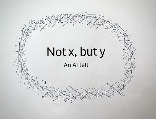
“This is not a tool, but a philosophy,” with a value of 1, triggers the not-but rule. “He did not buy it,” with a value of 0, shouldn’t.
['not-but', 'This is not a tool, but a philosophy.', 1], ['not-but', 'The empty state isn’t filler. It’s orientation.', 1], ['not-but', 'It is not merely useful, but essential.', 0], ['not-but', 'He did not buy it.', 0], ['not-but', 'She was not sure about the plan.', 0],The post Tests for AI-like text appeared first on Tom Resing's Blog.


September 2, 2026
Reflecting on 10 years at Microsoft
As I write this on my last day at Microsoft, almost ten and a half years after I started here in April 2016, it’s kind of hard to wrap my brain around all that I’ve seen and done, all the people I’ve met and worked with, and all that I’ve learned in this time. Microsoft provides an exceptional opportunity for employees to learn and grow and make, sell, and service great apps together. I’m sure as I think more about it over the days and months to come, I’ll have more to share.
Today, however, I’m mostly just thankful. Thankful for the people I’ve worked with and the times we’ve shared together. Some I knew before joining and many I’ll see again, though less often. However, the time we spent together on the huge Microsoft campus in Redmond, or in the virtual HQ of Microsoft Teams will always be a part of my memory.
When I came to Microsoft, I thought of myself as an engineer. Because I was an engineer who wrote, Microsoft hired me as a writer. So now I’ve been a professional engineer for 20 years and a writer for 10. What will the next 10 years bring? I’m not sure. However, I suspect I’ll be writing more of my own thoughts in my own places while continuing to find ways to help others through engineering, as well.
The post Reflecting on 10 years at Microsoft appeared first on Tom Resing's Blog.
June 4, 2026
Focus on people first: two days at CascadiaJS 2026
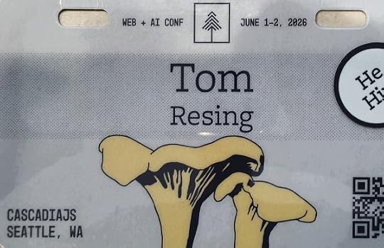 Conference badgeDesign for people
For the first time in maybe a decade, I attended a local, in-person, community-organized conference where I wasn’t a speaker. I had a front-row seat at Town Hall Seattle for CascadiaJS 2026, and the change of pace was exactly what I needed — no slides to rehearse, just two days to listen, ask questions, and meet people.
CascadiaJS has a reputation as the warm, slightly silly, deeply human corner of the JavaScript world, and it lived up to it. The illustrations alone tell you something about the vibe — Brittany Ellich’s stick-figure drawings, the mushroom and flower art on stage, and Luis Montes opening a talk on AI and karaoke with “Mary Had a Little Lamb” and a story about his DJ bike.
But underneath the fun, there was one clear theme: everyone is designing for AI agents now — and the people doing it best are still designing for people.
Agent Experience arrivesNetlify’s CEO, Matt Biilmann, opened the conference by arguing that every product now has an Agent Experience (AX), not just a Developer Experience (DX) — even if you never designed one. His own example: Netlify’s CLI has great DX but poor AX. They’ve started serving clean Markdown to agents that ask for it, exposing their API as tools, and scoring the result with evals.
Then Darius Cepulis gave me my favorite line of the conference. After two days of AX talk, he flipped the framing back toward humans: “Good DX is good AX. Focus on people first.” That stuck with me. The whole event lived in the tension between building for agents and remembering the humans those agents serve — and the talks I liked most landed on the human side.
The hallway track is the real conferenceThe talks were great, but the conversations between them were better.
I chatted with William from Expo during a break about helping mobile developers ship updates without going through the App Store. I caught Jonathan Keslin from Atlassian to ask whether a design system really needs a documentation MCP — his answer was that it keeps agents from reverse-engineering your components and reinventing the wheel, by serving clean per-component Markdown and first-class search instead of letting agents scrape your HTML. Over lunch, I traded notes about ATProto and a new Portland meetup. And after the conference, I followed up with Alex Hinson on LinkedIn to clarify what “fine-tuning” meant in his on-device music demo — it’s a genuinely trained model built with Hugging Face’s Transformers library, not clever prompting, and it’s now on my list to explore.
A few moments I want to rememberRaising my hand when Theo asked who built apps before AWS existed — and realizing I’ve only ever shipped production code that doesn’t run on AWS.Submitting a pull request to fix a broken link on the conference website, because of course you do at a developer conference.James Steinbach wearing red Chuck Taylors to match his talk on CSS colors. I played basketball in black Chucks as a kid; I respect the commitment.Nyah Macklin’s line on context graphs: text similarity finds documents with similar meaning, while structural similarity finds entities with similar connections — and almost no one is building the second.Filip Sodić’s framing that “engineering is compression to types”: design the types well, and the implementation becomes straightforward.I didn’t catch everything — I ducked out early on Day 1 for a Python class, and skipped the closing-night karaoke for a Microsoft intramural basketball game. (Some traditions I’ll have to join next year.)
I came home with a notebook full of ideas and a reminder I didn’t expect from a conference about AI: the best technology still starts with people. Focus on people first.
My handwritten notes from this conference were faint pencil on lined paper — and, it turned out, scanned upside-down and mirrored. I used GitHub Copilot CLI to enhance the scans, cross-check every speaker name and talk title against the official schedule, and compile my notes, posts, and hallway conversations into one record. Then I edited the result. Fittingly on-theme for a conference about working alongside agents.
The post Focus on people first: two days at CascadiaJS 2026 appeared first on Tom Resing's Blog.
March 2, 2026
25 years of developing and designing for SharePoint
Today, March 2nd, we’re celebrating 25 years of Microsoft’s set of software and services branded as SharePoint and the community that’s formed around SharePoint.
The first installMy own personal journey with SharePoint started when I was a manager of software development at a startup in Evanston, Illinois. Our team developed the web-based delivery platform for our company’s main product: data about print ads, mainly in newspapers. My manager, the director of IT, and my former roommate in college, suggested I check out this new software from Microsoft that he’d heard about. I installed it on a test server, poked around with it, and told him I wasn’t sure it was ready yet. We were nimble and built on Microsoft’s web server and database stack. However, we both had experience with Microsoft’s early versions of new products in the past. They often delivered less than they promised in version 1.0.
Customizing SharePointAfter my first install, I continued developing web apps and eventually moved to consulting. I first encountered Microsoft Content Management Server while consulting for a company recently acquired, at the time, by AT&T. I wrote a component that dynamically generated the sitemap for their public website. Based on that work, I later wrote a web part for Dell’s intranet that dynamically generated a list of all the events across internal human resources sites. It was interesting work, but despite the encouragement and training by coworkers like Matthew McDermot and Richard Calderon, I wasn’t sold on SharePoint until the Microsoft Office Developers’ Conference in Redmond in 2006.
Microsoft Office SharePoint Server 2007: MOSSAt the conference, Bill Gates announced that Microsoft Content Management Server would be discontinued and SharePoint would replace it as Microsoft’s web publishing platform. The new product with expanded web publishing would be known at Microsoft Office SharePoint Server 2007, too long to say often, so it was affectionately known as MOSS. After reading the 50-page overview documentation and the 50 pages of installation documents, I practiced installing and setting it up a few times before going onsite at San Antonio’s largest employer, a large financial services company that prefers not to be named. There, probably to Jeff Deverter’s dismay, I was representing Microsoft Consulting Services under a sub-contract as Microsoft’s on-site “SharePoint expert.” Together we explored with our friend Kent Kingery who we’d both later reconnect with at Rackspace’s SharePoint 911 consulting service. Over the next 6 months, I setup most every capability possible in that lab. We proved what MOSS could do for the large financial services company.
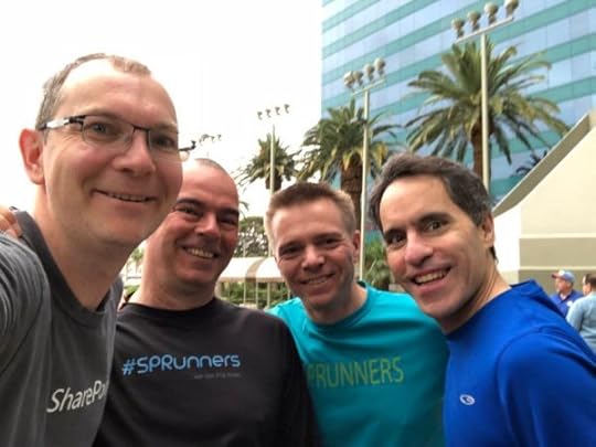
Microsoft Certified Master in SharePoint 2007I submitted the architecture of a SharePoint 2003 to 2007 migration with my application for the highly competitive Microsoft Certified Master program. Vesa Juvonen and company grilled me on the details of my work and rejected my application for the very first cohort of students. When I arrived in Redmond for 3 weeks of training after being accepted to the second round, I found myself in rare company. Out of the 30 or so students, I might have been the only one who didn’t work for Microsoft. I definitely was the only one bold enough to show an iPhone to get a picture with Spencer Harbar after his presentation to the class. Eventually, I passed the tests and joined a small group of experts recognized by Microsoft for large enterprises to rely on for help install, configuring, and customizing SharePoint.
Microsoft Most Valued Professional (MVP)Meanwhile, in parallel, that first pairing with Jeff Deverter had led me into the SharePoint community. With Jeff, I started attending and eventually leading the San Antonio SharePoint User Group. Also, I started writing about SharePoint on my own personal blog. Eventually, I wrote 200 articles, mostly about SharePoint. With that portfolio, Microsoft Press asked me to co-author two books on SharePoint. The writing, combined with my work organizing events like SharePoint Saturday San Antonio and presenting at dozens of events across the US, led to my first MVP award in 2013 and another in 2014.
Content design for OneDrive and SharePointThe most amazing result of those first 10 years of SharePoint led me to Redmond full-time for these last 10 years. I’d learned Redmond was a great destination during the many trips for conferences, MCM training, and MVP Summits (the annual gather of MVP award winners). In Redmond, my content design began while preparing for the release of the SharePoint mobile apps for iOS and Android devices. I’m proud of the many ways I’ve helped improve the user experience of SharePoint as a content designer. And for the last year, I’ve led content design for AI features and the Photos experience in OneDrive. OneDrive’s close relationship with SharePoint is another story.
SharePoint at 25I once read that if SharePoint were a standalone software company it would be one of the top 10 software companies in the world. Almost every large company in the world depends on SharePoint to deliver intranets and file sharing. Because SharePoint is a platform unlike most apps, the role of the software confused many people. A smaller group of people embrace the unique opportunity SharePoint provides to bring content to coworkers. We call that group of people the SharePoint community. And today, the community celebrates our shared past with SharePoint.
The post 25 years of developing and designing for SharePoint appeared first on Tom Resing's Blog.
April 14, 2024
Looking Back: A Lesson from Content Design in 2016
My journey to content design began with technology consulting. In 2008, as a technology consultant, I started writing about SharePoint. By the time I joined Microsoft as a content developer in 2016, I’d written 200 blog posts and co-authored two books on SharePoint. As a new Microsoft employee, I wrote the first articles about the new SharePoint apps. Eventually, I took responsibility for writing the words in the app, as well.
SharePoint’s a critical, but often hidden part of Microsoft’s cloud productivity suite. SharePoint’s where the files are. People add more than 2 billion files to Microsoft 365 every day and SharePoint’s the service storing the files. I know people depend on SharePoint. I was happy to work in content design for the brand-new apps for iPhone and Android.
On the SharePoint mobile app team, I collaborated with a few product managers, a few designers, and many software engineers. And those were just the people dedicated to making these new apps. The larger SharePoint engineering team involved thousands of people. As I learned to be a productive designer on the largest engineering team I’d ever joined, I also learned content design lessons that still help me and the teams I work with today. One of the most important early lessons I learned is to partner with others when writing.
 The SharePoint app store listing on iPhoneCreate space for contribution
Many of my peers at Microsoft have been focused on content design longer than I have. They’ve taught me many tips and tricks starting with one critical tool – the text review notebook, a safe space for anyone to contribute ideas about content in the app and store decisions.
The simplest version of the notebook looks something like the following. First, a visual of the starting draft of the design and then a table for working together on the strings. We used Microsoft OneNote to share the table because it was easy for more than one person to make updates to the table at the same time, encouraging collaboration.
 The sign in form, 2016ID Starting text Brainstorm Comments Approved text 1 Sign in * Login
* Get started [PM] I see Login other places
[Tom] Sign in is the Microsoft Writing Style Sign in 2 Email * Username
* User name
* User name or email[PM] Sometimes the username isn’t an email address
[Tom] The definition for username in the American Heritage Dictionary matches this useUsername
In the fictional example above, the product manager (PM) has added options for strings based on their understanding of the user needs. The comments column captures the PM’s reasoning and the content design response. This simple tool, a table that can be edited easily by anyone on the team, provides both a way to easily allow input from team members and capture decisions made.
Writers at Microsoft have learned that product managers are important stakeholders in content design. A critical part of the PM role at Microsoft is understanding who the product is for and what the users need and writing about it in the product’s specifications. Involving any important stakeholders early in a project provides additional perspective. In PMs designers have a partner who writes about user needs. That’s invaluable! Also, by including the PM in the process, they become advocates for the decisions made along the way.
ConclusionSome things have changed in the 8 years since I started on the design team for the SharePoint mobile apps. For example, OneNote’s been mostly replaced by Figma for collaboration on designs. Also, the most involved contributors in my daily content design work are other designers (including other content designers) and user researchers. PMs, engineers, and customer success specialists are key contributors at milestones.
Yes. I’m an expert on content design. However, I’m not the only one on the team who writes. To deliver the best user experience, I rely on a diverse set of partners in writing. I make room for contributions from partners in whatever ways I can.
The post Looking Back: A Lesson from Content Design in 2016 appeared first on Tom Resing's Blog.
A Lesson from My 1st Content Design Project
My journey to content design began with technology consulting. In 2008, as a technology consultant, I started writing about SharePoint. By the time I joined Microsoft as a content developer in 2016, I’d written 200 blog posts and co-authored two books on SharePoint. As a new Microsoft employee, I wrote the first articles about the new SharePoint apps. Eventually, I took responsibility for writing the words in the app, as well.
SharePoint’s a critical, but often hidden part of Microsoft’s cloud productivity suite. SharePoint’s where the files are. People add more than 2 billion files to Microsoft 365 every day and SharePoint’s the service storing the files. I know people depend on SharePoint. I was happy to work in content design for the brand-new apps for iPhone and Android.
On the SharePoint mobile app team, I collaborated with a few product managers, a few designers, and many software engineers. And those were just the people dedicated to making these new apps. The larger SharePoint engineering team involved thousands of people. As I learned to be a productive designer on the largest engineering team I’d ever joined, I also learned content design lessons that still help me and the teams I work with today. One of the most important early lessons I learned is to partner with others when writing.
The SharePoint app store listing on iPhoneCreate space for contributionMany of my peers at Microsoft have been focused on content design longer than I have. They’ve taught me many tips and tricks starting with one critical tool – the text review notebook, a safe space for anyone to contribute ideas about content in the app and store decisions.
The simplest version of the notebook looks something like the following. First, a visual of the starting draft of the design and then a table for working together on the strings. We used Microsoft OneNote to share the table because it was easy for more than one person to make updates to the table at the same time, encouraging collaboration.
The sign in form, 2016ID Starting text Brainstorm Comments Approved text 1 Sign in * Login* Get started [PM] I see Login other places
[Tom] Sign in is the Microsoft Writing Style Sign in 2 Email * Username
* User name
* User name or email[PM] Sometimes the username isn’t an email address
[Tom] The definition for username in the American Heritage Dictionary matches this useUsername
In the fictional example above, the product manager (PM) has added options for strings based on their understanding of the user needs. The comments column captures the PM’s reasoning and the content design response. This simple tool, a table that can be edited easily by anyone on the team, provides both a way to easily allow input from team members and capture decisions made.
Writers at Microsoft have learned that product managers are important stakeholders in content design. A critical part of the PM role at Microsoft is understanding who the product is for and what the users need and writing about it in the product’s specifications. Involving any important stakeholders early in a project provides additional perspective. In PMs designers have a partner who writes about user needs. That’s invaluable! Also, by including the PM in the process, they become advocates for the decisions made along the way.
ConclusionSome things have changed in the 8 years since I started on the design team for the SharePoint mobile apps. For example, OneNote’s been mostly replaced by Figma for collaboration on designs. Also, the most involved contributors in my daily content design work are other designers (including other content designers) and user researchers. PMs, engineers, and customer success specialists are key contributors at milestones.
Yes. I’m an expert on content design. However, I’m not the only one on the team who writes. To deliver the best user experience, I rely on a diverse set of partners in writing. I make room for contributions from partners in whatever ways I can.
The post A Lesson from My 1st Content Design Project appeared first on Tom Resing's Collaboration Blog.
June 30, 2023
Fluent design system development for designers
Understand Microsoft’s Fluent design system better with hands-on experience with the developer components of the system. If you’re like most designers I work with, you’re familiar with the Figma components of the design systems your product teams use. Another step you can take to learn about the design system is to work with the developer components, too. When you stretch your skills into this new space, you’ll understand the capabilities of the system better. The next time a developer tells you they ran into an issue implementing your design, you might be able to test out the limits of the system yourself!
 Fluent 2 and Fluent UI React v9
Microsoft released the most recent version of Fluent, Fluent 2, in May 2023. Along with the Figma toolkit, updated versions of the Fluent UI code libraries were released. For web development, we use Fluent UI React v9 which in turn relies on the React library and some other tools like Node.js and yarn. While it’s not critical to learn much about each piece, you’ll want to download and install them to explore the Fluent developer components.
Launch a popover from a buttonI recently went through all the steps to get a working example of a button launching a popover. Starting from the beginning, you should be able to repeat my steps in about 20 minutes.
 Set up the tool
To get started with Fluent dev components, the first step is downloading and installing a couple tools.
Grab the right version of VSCode for your device and install itGet and install node.jsNext, make a place to put your work. I normally create a folder like “scratch” or “examples” when I’m getting started and I store the folders for my project there.
Launch a new terminal window (on Windows I use the “Run as administrator” option)Enter the following command in the terminal window “cd \”Then “mkdir scratch”Then “cd scratch”Next, set up and use the yarn tool required by Fluent.
Enter the following command in the terminal window “corepack enable”Then “Set-ExecutionPolicy RemoteSigned”Then “yarn add @fluentui/react-components”After the third step above with yarn, you’ve got the Fluent dev components installed on your machine and you’re ready to use them. Next, you can create your first React project and add Fluent components to it for a hi-fidelity prototype.
Create a React project and open it in VSCodeWith React and yarn installed, I use yarn’s project creation to start my projects.
Enter the following command in the terminal window “yarn create react-app my-app –template typescript”Open VSCodeOpen the folder scratch\my-app in VSCodeNow you’ve got a React project set up for Fluent open in a code editor!
Next, copy and paste my example code to get you started with your popover and button components.
After you save the changes to the index.tsx file, you’ve got the Fluent theming engine running with the theme named “webLightTheme” set for your project. Next, you’ll repeat the steps of opening the other code file and replacing it’s contents so you have a button and a popover.
Select “app.tsx”Replace the contents of app.tsx with the following lines after the app.tsx titleApp.tsximport { makeStyles, Button, Popover, PopoverSurface, PopoverTrigger, PositioningProps, Title1, shorthands } from '@fluentui/react-components';const useStyles = makeStyles({ root: { ...shorthands.gap("16px"), display: "flex", flexDirection: "column", alignItems: "baseline", justifyContent: 'center', },});function App(props: PositioningProps) { const classes = useStyles(); return ( Fluent v9 Popover from a Button Click me Container );}export default App;Run your Fluent codeNow that you’ve completed the installation and setup, created a new project, and added Fluent themes and components you’re ready to see the prototype work live in your browser.
Enter the following in your terminal window “yarn start”You should see something like the screenshot at the beginning of this post.
Congratulations!You’ve created your first Fluent 2 app and you’re ready to change it and add other components.
Next stepsFind the words “Click me” in the code editor and change them to “Learn Fluent”Find the word “Container” and change it to “I made a Fluent app in 20 minutes. So can you!”The post Fluent design system development for designers appeared first on Tom Resing's Collaboration Blog.
November 7, 2022
An open source UX writing example from Mastodon
 An elephant and a typing prompt on a 4 color banner
Unlike Twitter, Mastodon developers use an open-source model. Open-source means, if you take the effort to, you can see the source of the messages you see on screen.
Because Mastodon is an open-source app developed on GitHub, you can create an issue when you see something wrong.
Start by learning how the app works.Then identify an issue that needs to be fixed.Finally, submit a fix to the issue!The following screenshot highlights some text I see on my Mastodon home page, “Pinned post”, followed by a screenshot of the same string, in code.
 Screenshot of my timeline
The next screenshot shows the same message “Pinned post”, in the file defaultMessages.json, in the Mastodon open-source project on GitHub.
 Screenshot of the code
If I wanted to, I could edit defaultMessages.json. Editing is safe because GitHub creates a working version of the code for me, called a fork.
Editing 101After I edit the text in the file, I can submit it to the Mastodon maintainers for their consideration. On GitHub, we call this type of change request a pull request. I’m making a request from the maintainers. I want someone in that group to “pull” my change into the current version of the code. We call this “committing” the change, or a “commit” to the project.
If you feel intimidated by the language, take a breath. You can take your time digesting this new world of open-source – it’s worth understanding. Open-source software puts the power in your hands. And that power requires responsibility. It won’t happen overnight. However, if you try to understand the language of open-source and experiment with creating forks and submitting pull requests, you can gain the power to improve the experience in applications that millions of people use every day.
The post An open source UX writing example from Mastodon appeared first on Tom Resing's Collaboration Blog.
October 16, 2020
King County, Washington – Make an informed vote
Today, October 16th, 2020, nearly 1.4 million registered voters in King County, Washington should have their ballots and voting guides from the state and county.
The amount of information can be overwhelming. If you’re like me, you have 39 different items to vote on. Take some time to read the words on the printed pages you’ve received. Voting is one of the top ways to make your voice heard in the United States. We’re so luck to live in cities like Seattle, Kirkland, and Bellevue that push for voter rights and transparency. Please, use the help that’s being offered.
The Ballot
The official ballots were mailed out October 14, so many have arrived already. Open it up and read the instructions. Take a look at the candidates and measures on your personalized ballot. This will help you limit the other information that will be helpful. The candidates and measures you see are different than what others see in other locations. You don’t need or get to vote on candidates who represent other areas and measures that are for other cities and other counties. For example, there’s a Seattle measure I can’t vote for and a Kirkland proposition people outside Kirkland don’t see on their ballot. I vote for or against my US representative for Congress Susan DelBene. People in Bellevue don’t see her on their ballot.
The Washington State Voters’ Pamphlet
You might have received your state voters’ pamphlet weeks ago. I did. If you didn’t hold on to it, go to sos.wa.gov to see the online version.
Every federal candidate, like the President of the US, statewide candidate and statewide measure has a page or more of information in this small book. Look at the instructions in the front, then browse through for the candidates and measures you see listed on your ballot. You won’t see King County or city measures or local judges. Those are in the next piece.
Everything or person you can vote for or against has some information in the guide.
For example, find Referendum Measure No. 90 under State Measures, on pages 8-12, in the King county north and eastside version of the PDF download. You’ll see an explanation, the projected financial impact, and statements from the community for and against this measure. The community can provide statements for and against every measure on the ballot. Sometimes you’ll only see a statement for or against. That’s a pretty good sign this measure has wide support one way or the other. I normally skim those, just to see if anything sticks out I wouldn’t agree with. Generally, I go with the unopposed recommendations.
Local Voters’ Pamphlet
Registered voters in King County also receive a local voters’ pamphlet. Not all counties in Washington have these, as far as I know. However, King County, with the large amount of voters from the Seattle area, feels like it’s worthwhile to print these to help inform us as voters.
Again, take a look at your ballot to see what part of this voting information is important for you to look at. On my ballot, I have some items from the county and one from my city and a few local judges with information in the guide. Most of the King County measures are responses to racial bias in policing. For example, , is one of two charter amendments on the King County ballots which have community statements both for and against them.
Newspaper endorsementsFor most things on the ballot, I feel I have enough information in the pamphlets to make my decision. For the candidates, I already did a lot of research in the primaries and don’t have to do much more now. However, there are some items on my ballot where the information in the pamphlet isn’t enough for me to make a decision. That’s the case for Amendment No. 5.
Newspaper endorsements are a really good source of information when the voting guides from the state and county aren’t enough. Major local newspapers like The Seattle Times have long established journalistic integrity. Without high reporting standards, papers can’t keep readers. And in times like this, I’m really glad we still have local papers. Without them, there’s just so many voices, from so many sources on the internet, it’s really hard to figure out if all of them have any standards or integrity.
On Amendment No. 5, there’s competing endorsements printed, so read them closely. To me, this is the one item on my ballot I need to do the most research on. It might be the same for you.
The Times recommends voting against the amendment.The Stranger recommends voting for the amendment.The Times also printed a community statement for the amendment.Keep in mind that, while well researched and following journalistic standards, the newspaper endorsements are all printed in the opinion sections of the papers. The three articles I link to should be looked at as opinions you can take or leave. However, they do provide good perspectives on the issues.
Websites and misinformationFinally, if you do need more information beyond newspapers, I suggest you use a tool like NewsGuard to help identify the quality of information from a website. NewsGuard is supported as part of Microsoft’s campaign against misinformation and is a free extension for my browser of choice, Microsoft Edge.
Vote an informed vote this election and every election in the future. It’s your right, a great privilege, and I see it as a duty to support democracy.
The post King County, Washington – Make an informed vote appeared first on Tom Resing's Collaboration Blog.


June 29, 2020
Words can save lives

Disputes delayed early reporting
On January 27th, 2020, Dr. Camilla Rothe discovered Germany’s first case of the new coronavirus. The case involved one person at risk for the virus. According to the New York Times, the visitor from China had “no coughing or sneezing, no signs of fatigue or fever.” Coronaviruses were only known to be contagious from people showing symptoms. Confusion over the words used to describe this case caused delays. Thousands of people who caught the virus from people without symptoms died before the confusion was resolved. Words can save lives.
How do words save lives? The first disagreement was about the words “any symptoms” and the “full onset of symptoms”. Dr. Roche used the first term in her report. A team in Berlin described it the second way in their report. Medical researchers also argued over the words asymptomatic, presymptomatic and oligo-symptomatic. Because of the disagreements, important medical journals didn’t publish either report in January. Instead, news about the dispute of the first report got published.
To you or me, the difference may not matter so much. What we needed to know was that people don’t have to show symptoms to spread the disease. When we know that, we can take steps to prevent the spread. For example, everyone should cover their face, even healthy people.
Finally, reports did save lives
In March, studies from Hong Kong and Britain showed significant transmission of the disease by people without symptoms. People without symptoms spread the disease 50% of the time. In May, a journal published the report from the Berlin team. How many lives would have been saved if doctors in Munich and Berlin hadn’t disagreed about “any symptoms” versus “full onset of symptoms”? Some people knew in January that people without symptoms spread the disease. Because of disagreement and confusion around language, it wasn’t reported in a journal until March. 10’s of thousands of people died who got the virus from someone without symptoms in between.
More posts about words
Do you like posts about writing? I’ve published two others, so far, More on UI Text Design and The Power of 9 Characters.
The post Words can save lives appeared first on Tom Resing's Collaboration Blog.


Tom Resing's Collaboration Blog

- Thomas Resing's profile
- 19 followers
