
Allen B. Downey's Blog: Probably Overthinking It
November 4, 2025
Think DSP second edition
I have started work on a second edition of Think DSP! You can see the current draft here.
I started this project in part because of this announcement:
Once in a while, a few of the Scicloj friends will meet to learn about signal processing, following the Think DSP book by Allen B. Downey, and implementing things in Clojure. Our notes will be published at Clojure Civitas.
If you know some Clojure and you want to learn DSP, click here to learn more.
The other reason I started the project is that Cursor (the AI-assisted IDE) helped get me unstuck. Here’s the problem: Think DSP was the last book I wrote in LaTeX before I switched to Jupyter notebooks. So I had code in Python modules and the text in LaTeX.
At some point I put the code in notebooks, with exercises and solutions in other notebooks. Some time later I converted the LaTeX to notebooks — but those notebooks only had code snippets, not the complete working code. And they were full of leftover LaTeX bits, like references to the figures, which were in all the wrong places.
Merging the text, code, and exercises into a single notebook was too daunting, so the book was idle for a while. And that’s where Cursor came in.
I drafted a plan to convert the notebooks to Markdown (using Jupytext) and then use AI tools to merge them. After I merged the first chapter, I checked it for issues and revised the prompt. After a few iterations, I had a plan document and a prompt document that worked pretty well. Cursor took a few minutes to merge the notebooks for each chapter, but the results were good.
I made a second pass to make the structure of the notebooks consistent. For example, each notebook starts with five or six cells that import libraries, download files, etc. It’s helpful if these cells are the same, and with the same tags, in every notebook. Revising the Markdown version of the notebooks and then converting to ipynb worked well.
The whole process took about 1.5 work days — and there are probably still some issues I’ll have to fix by hand — but it is nice to get the project unstuck!
The post Think DSP second edition appeared first on Probably Overthinking It.


November 3, 2025
It’s Levels
A recent Reddit post asks “Amateur athletes of Reddit: what’s your ‘There’s levels to this shit’ experience from your sport?” Responses included:
We have some good runners who can win local races … And then you realise that if you put them in a 5000m race with Olympic-level athletes they’d get lapped at least 3 time and possibly 4 times.
Former NHL player putting in 10% effort was a harder, faster shot than mid-high tier beer league at 110%. The average adult player’s ceiling is buried somewhere deep under the worst NHL player’s basement floor.
And the thread includes more than one reference to Brian Scalabrine, who played in the NBA but was not a star. After he retired, he participated in a “Scallenge” where he played one-on-one against talented amateur players — and beat them by a combined score of 44-6. Explaining the gap in ability between the best amateurs and the worse professionals, he said “I’m way closer to LeBron James than you are to me.”
Brian Scalabrine is probably right, because professionals in many areas — not just athletics — really are on another level. And then there’s another level above that, and a level above that, too.
This phenomenon is surprising because it violates our intuition for the distribution of ability. We expect something like a bell curve — the Gaussian distribution — and what we get is a lognormal distribution with a tail that extends much, much farther.
This is the topic of Chapter 4 of Probably Overthinking It, where I show some examples and propose two explanations. To celebrate the imminent release of the paperback edition, here’s an excerpt (or, if you prefer video, I gave a talk based on this chapter).
Running SpeedsIf you are a fan of the Atlanta Braves, a Major League Baseball team, or if you watch enough videos on the internet, you have probably seen one of the most popular forms of between-inning entertainment: a foot race between one of the fans and a spandex-suit-wearing mascot called the Freeze.
The route of the race is the dirt track that runs across the outfield, a distance of about 160 meters, which the Freeze runs in less than 20 seconds. To keep things interesting, the fan gets a head start of about 5 seconds. That might not seem like a lot, but if you watch one of these races, this lead seems insurmountable. However, when the Freeze starts running, you immediately see the difference between a pretty good runner and a very good runner. With few exceptions, the Freeze runs down the fan, overtakes them, and coasts to the finish line with seconds to spare.
But as fast as he is, the Freeze is not even a professional runner; he is a member of the Braves’ ground crew named Nigel Talton. In college, he ran 200 meters in 21.66 seconds, which is very good. But the 200 meter collegiate record is 20.1 seconds, set by Wallace Spearmon in 2005, and the current world record is 19.19 seconds, set by Usain Bolt in 2009.
To put all that in perspective, let’s start with me. For a middle-aged man, I am a decent runner. When I was 42 years old, I ran my best-ever 10 kilometer race in 42:44, which was faster than 94% of the other runners who showed up for a local 10K. Around that time, I could run 200 meters in about 30 seconds (with wind assistance).
But a good high school runner is faster than me. At a recent meet, the fastest girl at a nearby high school ran 200 meters in about 27 seconds, and the fastest boy ran under 24 seconds.
So, in terms of speed, a fast high school girl is 11% faster than me, a fast high school boy is 12% faster than her; Nigel Talton, in his prime, was 11% faster than him, Wallace Spearmon was about 8% faster than Talton, and Usain Bolt is about 5% faster than Spearmon.
Unless you are Usain Bolt, there is always someone faster than you, and not just a little bit faster; they are much faster. The reason, as you might suspect by now, is that the distribution of running speed is not Gaussian. It is more like lognormal.
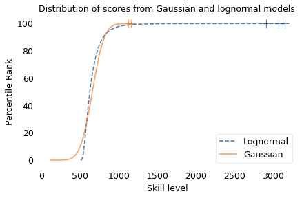
To demonstrate, I’ll use data from the James Joyce Ramble, which is the 10 kilometer race where I ran my previously-mentioned personal record time. I downloaded the times for the 1,592 finishers and converted them to speeds in kilometers per hour. The following figure shows the distribution of these speeds on a logarithmic scale, along with a Gaussian model I fit to the data.
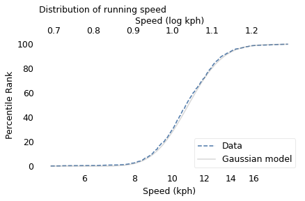
The logarithms follow a Gaussian distribution, which means the speeds themselves are lognormal. You might wonder why. Well, I have a theory, based on the following assumptions:
First, everyone has a maximum speed they are capable of running, assuming that they train effectively.Second, these speed limits can depend on many factors, including height and weight, fast- and slow-twitch muscle mass, cardiovascular conditioning, flexibility and elasticity, and probably more.Finally, the way these factors interact tends to be multiplicative; that is, each person’s speed limit depends on the product of multiple factors.Here’s why I think speed depends on a product rather than a sum of factors. If all of your factors are good, you are fast; if any of them are bad, you are slow. Mathematically, the operation that has this property is multiplication.
For example, suppose there are only two factors, measured on a scale from 0 to 1, and each person’s speed limit is determined by their product. Let’s consider three hypothetical people:
The first person scores high on both factors, let’s say 0.9. The product of these factors is 0.81, so they would be fast.The second person scores relatively low on both factors, let’s say 0.3. The product is 0.09, so they would be quite slow.So far, this is not surprising: if you are good in every way, you are fast; if you are bad in every way, you are slow. But what if you are good in some ways and bad in others?
The third person scores 0.9 on one factor and 0.3 on the other. The product is 0.27, so they are a little bit faster than someone who scores low on both factors, but much slower than someone who scores high on both.That’s a property of multiplication: the product depends most strongly on the smallest factor. And as the number of factors increases, the effect becomes more dramatic.
To simulate this mechanism, I generated five random factors from a Gaussian distribution and multiplied them together. I adjusted the mean and standard deviation of the Gaussians so that the resulting distribution fit the data; the following figure shows the results.
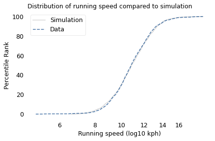
The simulation results fit the data well. So this example demonstrates a second mechanism that can produce lognormal distributions: the limiting power of the weakest link. If there are at least five factors that affect running speed, and each person’s limit depends on their worst factor, that would explain why the distribution of running speed is lognormal.
I suspect that distributions of many other skills are also lognormal, for similar reasons. Unfortunately, most abilities are not as easy to measure as running speed, but some are. For example, chess-playing skill can be quantified using the Elo rating system, which we’ll explore in the next section.
Chess RankingsIn the Elo chess rating system, every player is assigned a score that reflects their ability. These scores are updated after every game. If you win, your score goes up; if you lose, it goes down. The size of the increase or decrease depends on your opponent’s score. If you beat a player with a higher score, your score might go up a lot; if you beat a player with a lower score, it might barely change. Most scores are in the range from 100 to about 3000, although in theory there is no lower or upper bound.
By themselves, the scores don’t mean very much; what matters is the difference in scores between two players, which can be used to compute the probability that one beats the other. For example, if the difference in scores is 400, we expect the higher-rated player to win about 90% of the time.
If the distribution of chess skill is lognormal, and if Elo scores quantify this skill, we expect the distribution of Elo scores to be lognormal. To find out, I collected data from Chess.com, which is a popular internet chess server that hosts individual games and tournaments for players from all over the world. Their leader board shows the distribution of Elo ratings for almost six million players who have used their service. The following figure shows the distribution of these scores on a log scale, along with a lognormal model.
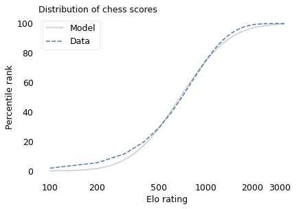
The lognormal model does not fit the data particularly well. But that might be misleading, because unlike running speeds, Elo scores have no natural zero point. The conventional zero point was chosen arbitrarily, which means we can shift it up or down without changing what the scores mean relative to each other.
With that in mind, suppose we shift the entire scale so that the lowest point is 550 rather than 100. The following figure shows the distribution of these shifted scores on a log scale, along with a lognormal model.
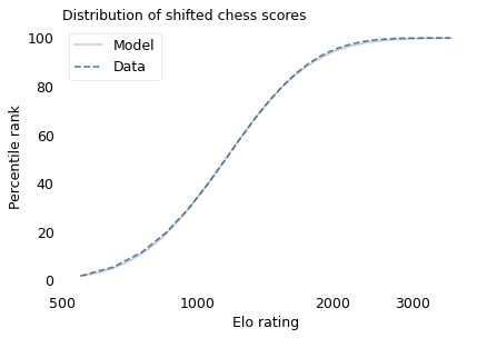
With this adjustment, the lognormal model fits the data well.
Now, we’ve seen two explanations for lognormal distributions: proportional growth and weakest links. Which one determines the distribution of abilities like chess? I think both mechanisms are plausible.
As you get better at chess, you have opportunities to play against better opponents and learn from the experience. You also gain the ability to learn from others; books and articles that are inscrutable to beginners become invaluable to experts. As you understand more, you are able to learn faster, so the growth rate of your skill might be proportional to your current level.
At the same time, lifetime achievement in chess can be limited by many factors. Success requires some combination of natural abilities, opportunity, passion, and discipline. If you are good at all of them, you might become a world-class player. If you lack any of them, you will not. The way these factors interact is like multiplication, where the outcome is most strongly affected by the weakest link.
These mechanisms shape the distribution of ability in other fields, even the ones that are harder to measure, like musical ability. As you gain musical experience, you play with better musicians and work with better teachers. As in chess, you can benefit from more advanced resources. And, as in almost any endeavor, you learn how to learn.
At the same time, there are many factors that can limit musical achievement. One person might have a bad ear or poor dexterity. Another might find that they don’t love music enough, or they love something else more. One might not have the resources and opportunity to pursue music; another might lack the discipline and tenacity to stick with it. If you have the necessary aptitude, opportunity, and personal attributes, you could be a world-class musician; if you lack any of them, you probably can’t.
OutliersIf you have read Malcolm Gladwell’s book, Outliers, this conclusion might be disappointing. Based on examples and research on expert performance, Gladwell suggests that it takes 10,000 hours of effective practice to achieve world-class mastery in almost any field.
Referring to a study of violinists led by the psychologist K. Anders Ericsson, Gladwell writes:
The striking thing […] is that he and his colleagues couldn’t find any ‘naturals,’ musicians who floated effortlessly to the top while practicing a fraction of the time their peers did. Nor could they find any ‘grinds,’ people who worked harder than everyone else, yet just didn’t have what it takes to break the top ranks.”
The key to success, Gladwell concludes, is many hours of practice. The source of the number 10,000 seems to be neurologist Daniel Levitin, quoted by Gladwell:
“In study after study, of composers, basketball players, fiction writers, ice skaters, concert pianists, chess players, master criminals, and what have you, this number comes up again and again. […] No one has yet found a case in which true world-class expertise was accomplished in less time.”
The core claim of the rule is that 10,000 hours of practice is necessary to achieve expertise. Of course, as Ericsson wrote in a commentary, “There is nothing magical about exactly 10,000 hours”. But it is probably true that no world-class musician has practiced substantially less.
However, some people have taken the rule to mean that 10,000 hours is sufficient to achieve expertise. In this interpretation, anyone can master any field; all they have to do is practice! Well, in running and many other athletic areas, that is obviously not true. And I doubt it is true in chess, music, or many other fields.
Natural talent is not enough to achieve world-level performance without practice, but that doesn’t mean it is irrelevant. For most people in most fields, natural attributes and circumstances impose an upper limit on performance.
In his commentary, Ericsson summarizes research showing the importance of “motivation and the original enjoyment of the activities in the domain and, even more important, […] inevitable differences in the capacity to engage in hard work (deliberate practice).” In other words, the thing that distinguishes a world-class violinist from everyone else is not 10,000 hours of practice, but the passion, opportunity, and discipline it takes to spend 10,000 hours doing anything.
The Greatest of All TimeLognormal distributions of ability might explain an otherwise surprising phenomenon: in many fields of endeavor, there is one person widely regarded as the Greatest of All Time or the G.O.A.T.
For example, in hockey, Wayne Gretzky is the G.O.A.T. and it would be hard to find someone who knows hockey and disagrees. In basketball, it’s Michael Jordan; in women’s tennis, Serena Williams, and so on for most sports. Some cases are more controversial than others, but even when there are a few contenders for the title, there are only a few.
And more often than not, these top performers are not just a little better than the rest, they are a lot better. For example, in his career in the National Hockey League, Wayne Gretzky scored 2,857 points (the total of goals and assists). The player in second place scored 1,921. The magnitude of this difference is surprising, in part, because it is not what we would get from a Gaussian distribution.
To demonstrate this point, I generated a random sample of 100,000 people from a lognormal distribution loosely based on chess ratings. Then I generated a sample from a Gaussian distribution with the same mean and variance. The following figure shows the results.
The mean and variance of these distributions is about the same, but the shapes are different: the Gaussian distribution extends a little farther to the left, and the lognormal distribution extends much farther to the right.
The crosses indicate the top three scorers in each sample. In the Gaussian distribution, the top three scores are 1123, 1146, and 1161. They are barely distinguishable in the figure, and and if we think of them as Elo scores, there is not much difference between them. According to the Elo formula, we expect the top player to beat the #3 player about 55% of the time.
In the lognormal distribution, the top three scores are 2913, 3066, and 3155. They are clearly distinct in the figure and substantially different in practice. In this example, we expect the top player to beat #3 about 80% of the time.
In reality, the top-rated chess players in the world are more tightly clustered than my simulated players, so this example is not entirely realistic. Even so, Garry Kasparov is widely considered to be the greatest chess player of all time. The current world champion, Magnus Carlsen, might overtake him in another decade, but even he acknowledges that he is not there yet.
Less well known, but more dominant, is Marion Tinsley, who was the checkers (aka draughts) world champion from 1955 to 1958, withdrew from competition for almost 20 years – partly for lack of competition – and then reigned uninterrupted from 1975 to 1991. Between 1950 and his death in 1995, he lost only seven games, two of them to a computer. The man who programmed the computer thought Tinsley was “an aberration of nature”.
Marion Tinsley might have been the greatest G.O.A.T. of all time, but I’m not sure that makes him an aberration. Rather, he is an example of the natural behavior of lognormal distributions:
In a lognormal distribution, the outliers are farther from average than in a Gaussian distribution, which is why ordinary runners can’t beat the Freeze, even with a head start.And the margin between the top performer and the runner-up is wider than it would be in a Gaussian distribution, which is why the greatest of all time is, in many fields, an outlier among outliers.The post It’s Levels appeared first on Probably Overthinking It.
October 27, 2025
Cancer Survival Rates Are Misleading
Five-year survival might be the most misleading statistic in medicine. For example, suppose 5-year survival for a hypothetical cancer is
91% among patients diagnosed early, while the tumor is localized at the primary site,74% among patients diagnosed later, when the tumor has spread regionally to nearby lymph nodes or adjacent organs, and16% among patients diagnosed late, when the tumor has spread to distant organs or lymph nodes.What can we infer from these statistics?
If a patient is diagnosed early, it is tempting to think the probability is 91% that they will survive five years after diagnosis.Looking at the difference in survival between early and late detection, it is tempting to conclude that more screening would save lives.In a case where a patient is diagnosed late and dies of cancer, it is tempting to say that they would have survived if their cancer had been caught early.And if 5-year survival increases over time, it is tempting to conclude that treatment has improved.In fact, none of these inferences are correct.
Let’s take them one at a time.
ParticularizationHere’s the first incorrect inference:
If a patient is diagnosed early, and 5-year survival is 91%, it is tempting to think the probability is 91% that they will survive five years after diagnosis.
This is almost correct in the sense that it applies to the past cases that were used to estimate the survival rate – of all patients in the dataset who were diagnosed early, 91% of them survived at least five years.
But it is misleading for two reasons:
Because it is based on past cases, it doesn’t apply to present cases if (1) the effectiveness of treatment has changed or – often more importantly – (2) diagnostic practices have changed.Also, before interpreting a probability like this, which applies in general, it is important to particularize it for a specific case.Factors that should be taken into account include the general health of the patient, their age, and the mode of detection. Some factors are causal – for example, general health directly improves the chance of survival. Other factors are less obvious because they are informational – for example, the mode of detection can make a big difference:
If a tumor is discovered because it is causing symptoms, it is more likely to be larger, more aggressive, and relatively late for a given stage – and all of those implications decrease the chance of survival.If a tumor is not symptomatic, but discovered during a physical exam, it is probably larger, later, and more likely to cause mortality, compared to one discovered by high resolution imaging or a sensitive chemical test.Conversely, tumors detected by screening are more likely to be slow-growing because of length-biased sampling – the probability of detection depends on the time between when a tumor is detectable and when it causes symptoms.Taking age into account is complicated because it might be both causal and informational, with opposite implications. A young patient might be more robust and able to tolerate treatment, but a tumor detectable in a younger person is likely to have progressed more quickly than one that could only be discovered after more years of life. So the implication of age might be negative among the youngest and oldest patients, and positive in the middle-aged.
For some cancers, the magnitude of these implications is large, so the probability of 5-year survival for a particular patient might be higher than 91% or much lower.
Is More Screening Better?Now let’s consider the second incorrect inference.
If 5-year survival is high when a cancer is detected early and much lower when it is detected late, it is tempting to conclude that more screening would save lives.
For example, in a recent video, Nassim Taleb and Emi Gal discuss the pros and cons of cancer screening, especially full-body MRIs for people who have no symptoms. At one point they consider this table of survival rates based on stage at diagnosis:
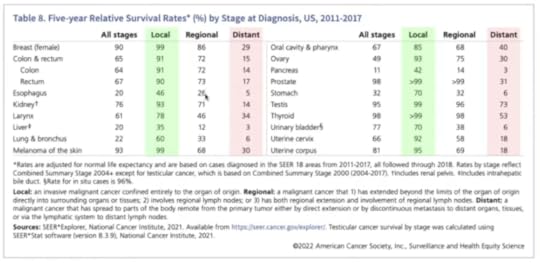
They note that survival is highest if a tumor is detected while localized at the primary site, lower if it has spread regionally, and often much lower if it has spread distantly.
They take this as evidence that screening for these cancers is beneficial. For example, at one point Taleb says, “Look at the payoff for pancreatic cancer – 10 times the survival rate.”
And Gal adds, “Colon cancer, it’s like seven times… The overarching insight is that you want to find cancer early… This table makes the case for the importance of finding cancer early.”
Taleb agrees, but this inference is incorrect: This table does not make the case that it is better to catch cancer early.
Catching cancer early is beneficial only if (1) the cancers we catch would otherwise cause disease and death, and (2) we have treatments that prevent those outcomes, and (3) these benefits outweigh the costs of additional screening. This table does not show that any of those things is true.
In fact, it is possible for a cancer to reproduce any row in this table, even if we have no treatment and detection has no effect on outcomes. To demonstrate, I’ll use a model of tumor progression to show that a hypothetical cancer could have the same survival rates as colon cancer – even if there is no effective treatment at all.
To be clear, I’m not saying that cancer treatment is not effective – in many cases we know that it is. I’m saying that we can’t tell, just looking at a survival rates, whether early detection has any benefit at all.
Markov ModelThe details of the model are here and you can click here to run my analysis in a Jupyter notebook on Colab.
We’ll model tumor progression using a Markov chain with these states:
U1, U2, and U3 represent tumors that are undetected at each stage: local, regional, and distant.D1, D2, D3 represent tumors that were detected/diagnosed at each stage.And M represents mortality.The following figure shows the states and transition rates of the model.

The transition probabilities are:
lams, two values that represent transition rates between stages,kappas, three values that represent detection rates at each state,mu the mortality rate from D3,gamma the effectiveness of treatment.If gamma > 0, the treatment is effective by decreasing the probability of progression to the next stage. In the models we’ll run for this example, gamma=0, which means that detection has no effect on progression.
Overall, these values are within the range we observe in real cancers.
The transition rates are close to 1/6, which means the average time at each stage is 6 simulated years.The detection rate is low at the first stage, higher at the second, and much higher at the third.The mortality rate is close to 1/3, so the average survival after diagnosis at the third stage is about 3 years.In this model, death occurs only after a cancer has progressed to the third stage and been detected. That’s not realistic – in reality deaths can occur at any stage, due to cancer or other causes.
But adding more transitions would not make make the model better. The purpose of the model is to show that we can reproduce the survival rates we see in reality, even if there are no effective treatments. Making the model more realistic would increase the number of parameters, which would make it easier to reproduce the data, but that would not make the conclusion stronger. More realistic models are not necessarily better.
ResultsWe can simulate this model to compute survival rates and the distribution of stage at diagnosis
In the model, survival rates are 95% if localized, 72% if spread regionally, and 17% if spread distantly. For colon cancer, the rates from the SEER data are are 91%, 74%, and 16%. So the simulation results are not exactly the same, but they are close.In the model, 38% of tumors are localized when diagnosed, 33% have spread regionally, and 29% have spread distantly. The actual distribution for colon cancer is 38%, 38%, and 24%. Again, the simulation results are not exactly the same, but close.With more trial and error, I could probably find parameters that reproduce the results exactly. That would not be surprising, because even though the model is meant to be parsimonious, it has seven parameters and we are matching observations with only five degrees of freedom.
That might seem unfair, but it makes the point that there is not enough information in the survival table – even if we also consider the distribution of stages – to estimate the parameters of the model precisely. The data don’t exclude the possibility that treatment is ineffective, so they don’t prove that early detection is beneficial.
Again, it might be better to find cancer early, if the benefit of treatment outweighs the costs of false discovery and overdiagnosis – but that’s a different analysis, and 5-year survival rates aren’t part of it.
That’s why this editorial concludes, “Only reduced mortality rates can prove that screening saves lives… journal editors should no longer allow misleading statistics such as five year survival to be reported as evidence for screening.”
CounterfactualsNow let’s consider the third incorrect inference.
In a case where a patient is diagnosed late and dies of cancer, it is tempting to say that they would have survived if their cancer had been caught early.
For example, later in the previous video, Taleb says, “Your mother, had she had a colonoscopy, she would be alive today… she’s no longer with us because it was detected when it was stage IV, right?” And Gal agrees.
That might be true, if treatment would have prevented the cancer from progressing. But this conclusion is not supported by the data in the survival table.
If someone is diagnosed late and dies, it is tempting to look at the survival table and think there’s a 91% chance they would have survived if they had been diagnosed earlier. But that’s not accurate – and it might not even be close.
First, remember what 91% survival means: among people diagnosed early, 91% survived five years after diagnosis. But among those survivors, an unknown proportion had tumors that would not have been fatal, even without treatment. Some might be non-progressive, or progress so slowly that they never cause disease or death. But in a case where the patient dies of cancer, we know their tumor was not one of those.
As a simplified example, suppose that of all tumors that are caught early, 50% would cause death within five years, if untreated, and 50% would not. Now imagine 100 people, all detected early and all treated: 50 would survive with or without treatment; out of the other 50, 41 survive with treatment – so overall survival is 91%. But if we know someone is in the second group, their chance of survival is 41/50, which is 82%.
And if the percentage of non-progressive cancers is higher than 50%, the survival rate for progressive cancers is even lower, holding overall survival constant. So that’s one reason the inference is incorrect.
To see the other reason, let’s be precise about the counterfactual scenario. Suppose someone was diagnosed in 2020 with a tumor that had spread distantly, and they died in 2022. Would they be alive in 2025 if they had been diagnosed earlier?
That depends on when the hypothetical diagnosis happens – if we imagine they were diagnosed in 2020, five year survival might apply (except for the previous point). But if it had spread distantly in 2020, we have to go farther back in time to catch it early. For example, if it took 10 years to progress, catching it early means catching it in 2010. In that case, being “alive today” would depend on 15-year survival, not 5-year.
It’s a Different QuestionThe five-year survival rate answers the question, “Of all people diagnosed early, how many survive five years?” That is a straightforward statistic to compute.
But the hypothetical asks a different question: “Of all people who died [during a particular interval] after being diagnosed late, how many would be alive [at some later point] if the tumor had been detected early?” That is a much harder question to answer – and five-year survival provides little or no help.
In general, we don’t know the probability that someone would be alive today, if they had been diagnosed earlier. Among other things, it depends on progression rates with and without treatment.
If many of the tumors caught early would not have progressed or caused death, even without treatment, the counterfactual probability would be low.In any case, if treatment is ineffective, as in the hypothetical cancer we simulated, the counterfactual probability is zero.At the other extreme, if treatment is perfectly effective, the probability is 100%.It might be frustrating that we can’t be more specific about the probability of the counterfactual, but if someone you know was diagnosed late and died, and it bothers you to think they would have lived if they had been diagnosed earlier, it might be some comfort to realize that we don’t know that – and it could be unlikely.
Comparing Survival RatesNow let’s consider the last incorrect inference.
If 5-year survival increases over time, it is tempting to conclude that treatment has improved.
This conclusion is appealing because if cancer treatment improves, survival rates improve, other things being equal. But if we do more screening and catch more cancers early, survival rates improve even if treatment is no more effective. And if screening becomes more sensitive, and detects smaller tumors, survival rates also improve.
For many cancers, all three factors have changed over time: improved treatment, more screening, and more sensitive screening. Looking only at survival rates, we can’t tell how much change in survival we should attribute to each.
And the answer is different for different sites. For example, this paper concludes:
In some cases, increased survival was accompanied by decreased burden of disease, reflecting true progress. For example, from 1975 to 2010, five-year survival for colon cancer patients improved … while cancer burden fell: Fewer cases … and fewer deaths …, a pattern explained by both increased early detection (with removal of cancer precursors) and more effective treatment. In other cases, however, increased survival did not reflect true progress. In melanoma, kidney, and thyroid cancer, five-year survival increased but incidence increased with no change in mortality. This pattern suggests overdiagnosis from increased early detection, an increase in cancer burden.
And this paper explains:
Screening detects abnormalities that meet the pathological definition of cancer but that will never progress to cause symptoms or death (non-progressive or slow growing cancers). The higher the number of overdiagnosed patients, the higher the survival rate.
It concludes that “Although 5-year survival is a valid measure for comparing cancer therapies in a randomized trial, our analysis shows that changes in 5-year survival over time bear little relationship to changes in cancer mortality. Instead, they appear primarily related to changing patterns of diagnosis.”
That conclusion might be stated too strongly. This response paper concludes “While the change in the 5-year survival rate is not a perfect measure of progress against cancer […] it does contain useful information; its critics may have been unduly harsh. Part of the long-run increase in 5-year cancer survival rates is due to improved […] therapy.”
But they acknowledge that with survival rates alone, we can’t say what part – and in some cases we have evidence that it is small.
SummarySurvival statistics are misleading because they suggest inferences they do not actually support.
Survival rates from the past might not apply to the present, and for a particular patient, the probability of survival depends on (1) causal factors like general health, and (2) informational factors like the mode of discovery (screening vs symptomatic presentation).If survival rates are higher when tumors are discovered early, that doesn’t mean that more screening would be better.And if a cancer is diagnosed late, and the patient dies, that doesn’t mean that if it had been diagnosed early, they would have lived.Finally, if survival rates improve over time (or they are different in different places) that doesn’t mean treatment is more effective.To be clear, all of these conclusions can be true, and in some cases we know they are true, at least in part. For some cancers, treatments have improved, and for some, additional screening would save lives. But to support these conclusions, we need other methods and metrics – notably randomized controlled trials that compare mortality. Survival rates alone provide little or no information, and they are more likely to mislead than inform.
The post Cancer Survival Rates Are Misleading appeared first on Probably Overthinking It.
October 22, 2025
The Foundation Fallacy
At Olin College recently, I met with a group from the Kyiv School of Economics who are creating a new engineering program. I am very impressed with the work they are doing, and their persistence despite everything happening in Ukraine.
As preparation for their curriculum design process, they interviewed engineers and engineering students, and they identified two recurring themes: passion and disappointment — that is, passion for engineering and disappointment with the education they got.
One of the professors, reflecting on her work experience, said she thought her education had given her a good theoretical foundation, but when she went to work, she found that it did not apply — she felt like she was starting from scratch.
I suggested that if a “good theoretical foundation” is not actually good preparation for engineering work, maybe it’s not actually a foundation — maybe it’s just a hoop for the ones who can jump through it, and a barrier for the ones who can’t.
The engineering curriculum is based on the assumption that math (especially calculus) and science (especially physics) are (1) the foundations of engineering, and therefore (2) the prerequisites of engineering education. Together, these assumptions are what I call the Foundation Fallacy.
To explain what I mean, I’ll use an example that is not exactly engineering, but it demonstrates the fallacy and some of the rhetoric that sometimes obscures it.
A recent post on LinkedIn includes this image:
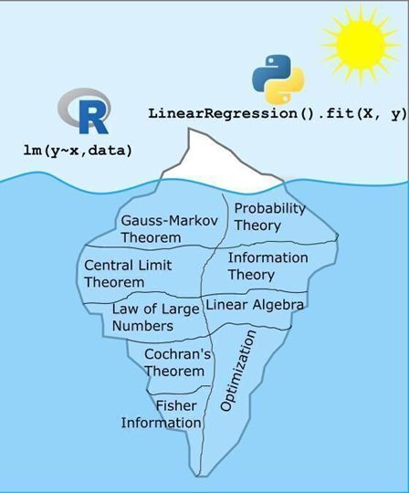
And this text:
What makes a data scientist a data scientist? Is it their ability to use R or Python to solve data problems? Partially. But just like any tool, I’d rather those making decisions with data truly understand the tools they’re using so that when something breaks, they can diagnose it.
As the image shows, running a linear regression in R or Python is just the tip of the iceberg. What lies beneath, including the theory, assumptions, and reasoning that make those models work, is far more substantial and complex.
ChatGPT can write the code. But it’s the data scientist who decides whether that model is appropriate, interprets the results, and translates them into sound decisions. That’s why I don’t just hand my students an R function and tell them to use it. We dig into why it works, not just that it works. The questions and groans I get along the way are all part of the process, because this deeper understanding is what truly sets a data scientist apart.
Most of the replies to this post, coming from people who jumped through the hoops, agree. The ones who hit a barrier, and the ones groaning in statistics classes, might have a different opinion.
I completely agree that choosing models, interpreting results, and making sound decisions are as important as programming skills. But I’m not sure the things in that iceberg actually develop those skills — in fact, I am confident they don’t.
And maybe for someone who knows these topics, “when something breaks, they can diagnose it.” But I’m not sure about that either — and I am quite sure it’s not necessary. You can understand multiple collinearity without a semester of linear algebra. And you can get what you need to know about AIC without a semester of information theory.
For someone building a regression model, a high-level understanding of causal inference is a lot more useful than the Gauss-Markov theorem. Also more useful: domain knowledge, understanding the context, and communicating the results. Maybe math and science classes could teach these topics, but the ones in this universe really, really don’t.
Everything I just said about linear regression also applies to engineering. Good engineers understand context, not just technology; they understand the people who will interact with, and be affected by, the things they build; and they can communicate effectively with non-engineers.
In their work lives, engineers hardly ever use calculus — more often they use computational tools based on numerical methods. If they know calculus, does that knowledge help them use the tools more effectively, or diagnose problems? Maybe, but I really doubt it.
My reply to the iceberg analogy is the car analogy: you can drive a car without knowing how the engine works. And knowing how the engine works does not make you a better driver. If someone is passionate about driving, the worst thing we can do is make them study thermodynamics. The best thing we can do is let them drive.
The post The Foundation Fallacy appeared first on Probably Overthinking It.
October 16, 2025
Simpson’s What?
I like Simpson’s paradox so much I wrote three chapters about it in Probably Overthinking It. In fact, I like it so much I have a Google alert that notifies me when someone publishes a new example (or when the horse named Simpson’s Paradox wins a race).
So I was initially excited about this paper that appeared recently in Nature: “The geographic association of multiple sclerosis and amyotrophic lateral sclerosis”. But sadly, I’m pretty sure it’s bogus.
The paper compares death rates due to multiple sclerosis (MS) and amyotrophic lateral sclerosis (ALS) across 50 states and the District of Columbia, and reports a strong correlation.
This result is contrary to all previous work on these diseases – which might be a warning sign. But the author explains that this correlation has not been detected in previous work because it is masked when the analysis combines male and female death rates.
This could make sense, because death rates due to MS are higher for women, and death rates due to ALS are higher for men. So if we compare different groups with different proportions of males and females, it’s possible we could see something like Simpson’s paradox.
But as far as I know, the proportions of men and women are the same in all 50 states, plus the District Columbia – or maybe a little higher in Alaska. So an essential element of Simpson’s paradox – different composition of the subgroups – is missing.
Annoyingly, the “Data Availability” section of the paper only identifies the public sources of the data – it does not provide the processed data. But we can use synthesized data to figure out what’s going on.
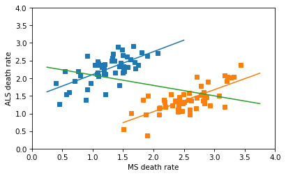
Specifically, let’s try to replicate this key figure from the paper:
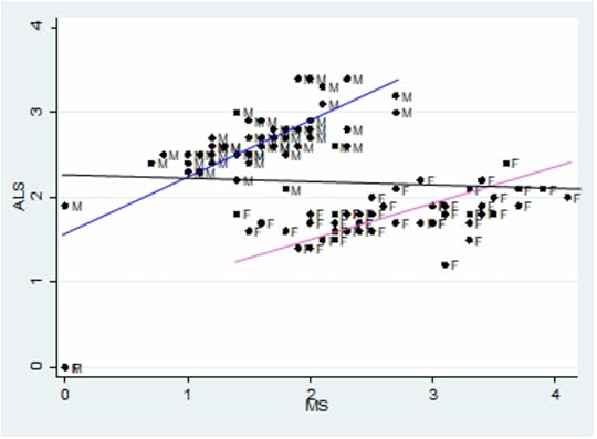
The x-axis is age adjusted death rates from MS; the y-axis is age-adjusted death rates from ALS. Each dot corresponds to one gender group in one state. The blue line fits the male data, with correlation 0.7. The pink line fits the female data, with correlation 0.75.
The black line is supposed to be a fit to all the data, showing the non-correlation we supposedly get if we combine the two groups. But I’m pretty sure that line is a mistake.
Click here to read this article with the Python code, or if you want to replicate my analysis, you can click here to run the notebook on Colab.
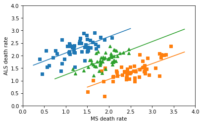
Synthetic DataI used a random number generator to synthesize correlated data with the approximate distribution of the date in the figure. The following figure shows a linear regression for the male and female data separately, and a third line that is my attempt to replicate the black line in the original figure.
I thought the author might have combined the dots from the male and female groups into a collection of 102 points, and fit a line to that. That is a nonsensical thing to do, but it does yield a Simpson-like reversal in the slope of the line — and the sign of the correlation.
The line for the combined data has a non-negligible negative slope, and the correlation is about -0.4 – so this is not the line that appears in the original figure, which has a very small correlation. So, I don’t know where that line came from.
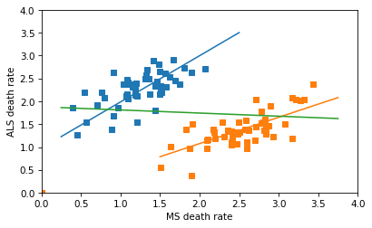
In any case, the correct way to combine the data is not to plot a line through 102 points in the scatter plot, but to fit a line to the combined death rates in the 51 states. Assuming that the gender ratios in the states are close to 50/50, the combined rates are just the means of the male and female rates. The following figure shows what we get if we combine the rates correctly.
So there’s no Simpson’s paradox here – there’s a positive correlation among the subgroups, and there’s a positive correlation when we combine them. I love a good Simpson’s paradox, but this isn’t one of them.
On a quick skim, I think the rest of the paper is also likely to be nonsensical, but I’ll leave that for other people to debunk. Also, peer review is dead.
It gets worseUPDATE: After I published the first draft of this article, I noticed that there are an unknown number of data points at (0, 0) in the original figure. They are probably states with missing data, but if they were included in the analysis as zeros — which they absolutely should not be — that would explain the flat line.
If we assume there are two states with missing data, that strengthens the effect in the subgroups, and weakens the effect in the combined groups. The result is a line with a small negative slope, as in the original paper.
The post Simpson’s What? appeared first on Probably Overthinking It.
September 25, 2025
The Poincaré Problem
Selection bias is the hardest problem in statistics because it’s almost unavoidable in practice, and once the data have been collected, it’s usually not possible to quantify the effect of selection or recover an unbiased estimate of what you are trying to measure.
And because the effect is systematic, not random, it doesn’t help to collect more data. In fact, larger sample sizes make the problem worse, because they give the false impression of precision.
But sometimes, if we are willing to make assumptions about the data generating process, we can use Bayesian methods to infer the effect of selection bias and produce an unbiased estimate.
Click here to run this notebook on Colab.
Poincaré and the BakerAs an example, let’s solve an exercise from Chapter 7 of Think Bayes. It’s based on a fictional anecdote about the mathematician Henri Poincaré:
How Many Loaves?
Supposedly Poincaré suspected that his local bakery was selling loaves of bread that were lighter than the advertised weight of 1 kg, so every day for a year he bought a loaf of bread, brought it home and weighed it. At the end of the year, he plotted the distribution of his measurements and showed that it fit a normal distribution with mean 950 g and standard deviation 50 g. He brought this evidence to the bread police, who gave the baker a warning.
For the next year, Poincaré continued to weigh his bread every day. At the end of the year, he found that the average weight was 1000 g, just as it should be, but again he complained to the bread police, and this time they fined the baker.
Why? Because the shape of the new distribution was asymmetric. Unlike the normal distribution, it was skewed to the right, which is consistent with the hypothesis that the baker was still making 950 g loaves, but deliberately giving Poincaré the heavier ones.
To see whether this anecdote is plausible, let’s suppose that when the baker sees Poincaré coming, he hefts k loaves of bread and gives Poincaré the heaviest one. How many loaves would the baker have to heft to make the average of the maximum 1000 g?
Here are distributions with the same underlying normal distribution and different values of k.
mu_true, sigma_true = 950, 50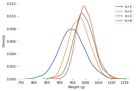
As k increases, the mean increases and the standard deviation decreases.
When k=4, the mean is close to 1000. So let’s assume the baker hefted four loaves and gave the heaviest to Poincaré.
At the end of one year, can we tell the difference between the following possibilities?
Innocent: The baker actually increased the mean to 1000, and k=1.Shenanigans: The mean was still 950, but the baker selected with k=4.Here’s a sample under the k=4 scenario, compared to 10 samples with the same mean and standard deviation, and k=1.
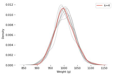
The k=4 distribution falls mostly within the range of variation we’d expect from the k=1 distribution (with the same mean and standard deviation). If you were on the jury and saw this evidence, would you convict the baker?
Ask a BayesianAs a Bayesian approach to this problem, let’s see if we can use this data to estimate k and the parameters of the underlying distribution. Here’s a PyMC model that
Defines prior distributions for mu, sigma, and k, andUses a custom distribution that computes the likelihood of the data for a hypothetical set of parameters (see the notebook for details).def make_model(sample): with pm.Model() as model: mu = pm.Normal("mu", mu=950, sigma=30) sigma = pm.HalfNormal("sigma", sigma=30) k = pm.Uniform("k", lower=0.5, upper=15) obs = pm.CustomDist( "obs", mu, sigma, k, logp=max_normal_logp, observed=sample, ) return modelNotice that we treat k as continuous. That’s because continuous parameters are much easier to sample (and the log PDF function allows non-integer values of k). But it also make sense in the context of the problem – for example, if the baker sometimes hefts three loaves and sometimes four, we can approximate the distribution of the maximum with k=3.5.
The model runs quickly and the diagnostics look good. Here are the posterior distributions of the parameters compared to their known values.
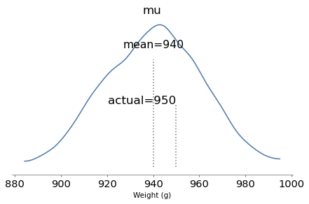
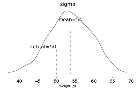
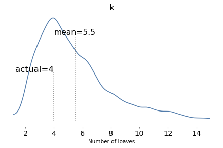
With one year of data, we can recover the parameters pretty well. The true values fall comfortably inside the posterior distributions, and the posterior mode of k is close to the true value, 4.
But the posterior distributions are still quite wide. There is even some possibility that the baker is innocent, although it is small.
ConclusionThis example shows that we can use the shape of an observed distribution to estimate the effect of selection bias and recover the unbiased latent distribution. But we might need a lot of data, and the inference depends on strong assumptions about the data generating process.
Credits: I don’t remember where I got this example from (maybe here?), but it appears in Leonard Mlodinov, The Drunkard’s Walk (2008). Mlodinov credits Bart Holland, What Are the Chances? (2002). The ultimate source seems to be George Gamow and Marvin Stern, Puzzle Math (1958) – but their version is about a German professor, not Poincaré.
You can order print and ebook versions of Think Bayes 2e from Bookshop.org and Amazon.
The post The Poincaré Problem appeared first on Probably Overthinking It.
September 22, 2025
Think Linear Algebra
I have published the first five chapters of Think Linear Algebra! You can read them here or follow these links to run the notebooks on Colab. Here are the chapters I have so far:
Chapter 1: The Power of Linear Algebra
Introduces matrix multiplication and eigenvectors through a network-based model of museum traffic, and implements the PageRank algorithm for quantifying the quality of web pages.
Chapter 5: To Boldly Go
Uses matrices scale, rotate, shear, and translate vectors. Applies these methods to 2D compute graphics, including a reimplementation of the classic video game Asteroids.
Chapter 7: Systems of Equations
Applies LU decomposition and matrix equations to analyze electrical circuits. Shows how linear algebra solves real engineering problems.
Chapter 8: Null Space
Investigates chemical stoichiometry as a system with multiple valid solutions. Introduces concepts of rank and nullspace to describe the solution space.
Chapter 9: Truss the System
Models structural systems where the unknowns are vector forces. Uses block matrices and rank analysis to compute internal stresses in trusses.
As you can tell by the chapter numbers, there is more to come — although the sequence of topics might change.
If you are curious about this project, here’s more about why I’m writing this book.
Math is not realIn this previous article, I wrote about “math supremacy”, which is the idea that math notation is the real thing, and everything else — including and especially code — is an inferior imitation.
I am confronted with math supremacy more often than most people, because I write books that use code to present ideas that are usually expressed in math notation. I think code can be simpler and clearer, but not everyone agrees, and some of them disagree loudly.
With Think Linear Algebra, I am taking my “code first” approach deep into the domain of math supremacy. Today I was using block matrices to analyze a truss, an example I remember seeing in my college linear algebra class. I remember that I did not find the example particularly compelling, because after setting up the problem — and it takes a lot of setting up — we never really finished it. That is, we talked about how to analyze a truss, hypothetically, but we never actually did it.
This is a fundamental problem with the way math is taught in engineering and the sciences. We send students off to the math department to take calculus and linear algebra, we hope they will be able to apply it to classes in their major, and we are disappointed — and endlessly surprised — when they can’t.
Part of the problem is that transfer of learning is much harder than many people realize, and does not happen automatically, as many teachers expect.
Another part of the problem is what I wrote about in Modeling and Simulation in Python: a complete modeling process involves abstraction, analysis, and validation. In most classes we only teach analysis, neglecting the other steps, and in some math classes we don’t even do that — we set up the tools to do analysis and never actually do it.

This is the power of the computational approach — we can demonstrate all of the steps, and actually solve the problem. So I find it ironic when people dismiss computation and ask for the “math behind it”, as if theory is reality and reality is a pale imitation. Math is a powerful tool for analysis, but to solve real problems, it is not the only tool we need. And it is not, contrary to Plato, more real than reality.
The post Think Linear Algebra appeared first on Probably Overthinking It.
May 28, 2025
Announcing Think Linear Algebra
I’ve been thinking about Think Linear Algebra for more than a decade, and recently I started working on it in earnest. If you want to get a sense of it, I’ve posted a draft chapter as a Jupyter notebook.
In one way, I am glad I waited — I think it will be better, faster [to write], and stronger [?] because of AI tools. To be clear, I am writing this book, not AI. But I’m finding ChatGPT helpful for brainstorming and Copilot and Cursor helpful for generating and testing code.
If you are curious, here’s my discussion with ChatGPT about that sample chapter. Before you read it, I want to say in my defense that I often ask questions where I think I know the answer, as a way of checking my understanding without leading too strongly. That way I avoid one of the more painful anti-patterns of working with AI tools, the spiral of confusion the can happen if you start from an incorrect premise.
My next step is to write a proposal, and I will probably use AI tools for that, too. Here’s a first draft that outlines the features I have in mind:
1. Case-Based, Code-FirstEach chapter is built around a case study—drawn from engineering, physics, signal processing, or beyond—that demonstrates the power of linear algebra methods. These examples unfold in Jupyter notebooks that combine explanation, Python code, visualizations, and exercises, all in one place.
2. Multiple Computational PerspectivesThe book uses a variety of tools—NumPy for efficient arrays, SciPy for numerical methods, SymPy for symbolic manipulation, and even NetworkX for graph-based systems. Readers see how different libraries offer different lenses on the same mathematical ideas—and how choosing the right one can make thinking and doing more effective.
3. Top-Down LearningRather than starting from scratch with low-level implementations, we use robust, well-tested libraries from day one. That way, readers can solve real problems immediately, and explore how the algorithms work only when it’s useful to do so. This approach makes linear algebra more motivating, more intuitive—and more fun.
4. Linear Algebra as a Language for ThoughtVectors and matrices are more than data structures—they’re conceptual tools. By expressing problems in linear algebra terms, readers learn to think in higher-level chunks and unlock general-purpose solutions. Instead of custom code for each new problem, they learn to use elegant, efficient abstractions. As I wrote in Programming as a Way of Thinking, modern programming lets us collapse the gap between expressing, exploring, and executing ideas.
Finally, here’s what ChatGPT thinks the cover should look like:

The post Announcing Think Linear Algebra appeared first on Probably Overthinking It.
May 22, 2025
My very busy week
I’m not sure who scheduled ODSC and PyConUS during the same week, but I am unhappy with their decisions. Last Tuesday I presented a talk and co-presented a workshop at ODSC, and on Thursday I presented a tutorial at PyCon.
If you would like to follow along with my very busy week, here are the resources:
Practical Bayesian Modeling with PyMCCo-presented with Alex Fengler for ODSC East 2025
In this tutorial, we explore Bayesian regression using PyMC – the primary library for Bayesian sampling in Python – focusing on survey data and other datasets with categorical outcomes. Starting with logistic regression, we’ll build up to categorical and ordered logistic regression, showcasing how Bayesian approaches provide versatile tools for developing and evaluating complex models. Participants will leave with practical skills for implementing Bayesian regression models in PyMC, along with a deeper appreciation for the power of Bayesian inference in real-world data analysis. Participants should be familiar with Python, the SciPy ecosystem, and basic statistics, but no experience with Bayesian methods is required.
The repository for this tutorial is here; it includes notebooks where you can run the examples, and there’s a link to the slides.
And then later that day I presented…
Mastering Time Series Analysis with StatsModels: From Decomposition to ARIMATime series analysis provides essential tools for modeling and predicting time-dependent data, especially data exhibiting seasonal patterns or serial correlation. This tutorial covers tools in the StatsModels library including seasonal decomposition and ARIMA. As examples, we’ll look at weather data and electricity generation from renewable sources in the United States since 2004 — but the methods we’ll cover apply to many kinds of real-world time series data. Outline Introduction to time series Overview of the data Seasonal decomposition, additive model Seasonal decomposition, multiplicative model Serial correlation and autoregression ARIMA Seasonal ARIMA
This talk is based on Chapter 12 of the new edition of Think Stats. Here are the slides.
Unfortunately there’s no video from the talk, but I presented related material in this workshop for PyData Global 2024:
After the talk, Seamus McGovern presented me with an award for being, apparently, the most frequent ODSC speaker!

On Wednesday I flew to Pittsburgh, and on Thursday I presented…
Analyzing Survey Data with Pandas and StatsModelsPyConUS 2025 tutorial
Whether you are working with customer data or tracking election polls, Pandas and StatsModels provide powerful tools for getting insights from survey data. In this tutorial, we’ll start with the basics and work up to age-period-cohort analysis and logistic regression. As examples, we’ll use data from the General Social Survey to see how political beliefs have changed over the last 50 years in the United States. We’ll follow the essential steps of a data science project, from loading and validating data, exploring and visualizing, modeling and predicting, and communicating results.
Here’s the repository with the notebooks and a link to the slides.
Sadly, the tutorial was not recorded.
Now that I have a moment of calm, I’m getting back to Think Linear Algebra. More about that soon!
The post My very busy week appeared first on Probably Overthinking It.
April 6, 2025
Announcing Think Stats 3e
The third edition of Think Stats is on its way to the printer! You can preorder now from Bookshop.org and Amazon (those are affiliate links), or if you can’t wait to get a paper copy, you can read the free, online version here.
Here’s the new cover, still featuring a suspicious-looking archerfish.

If you are not familiar with the previous editions, Think Stats is an introduction to practical methods for exploring and visualizing data, discovering relationships and trends, and communicating results.
The organization of the book follows the process I use when I start working with a dataset:
For the third edition, I started by moving the book into Jupyter notebooks. This change has one immediate benefit — you can read the text, run the code, and work on the exercises all in one place. And the notebooks are designed to work on Google Colab, so you can get started without installing anything.
The move to notebooks has another benefit — the code is more visible. In the first two editions, some of the code was in the book and some was in supporting files available online. In retrospect, it’s clear that splitting the material in this way was not ideal, and it made the code more complicated than it needed to be. In the third edition, I was able to simplify the code and make it more readable.
Since the last edition was published, I’ve developed a library called empiricaldist that provides objects that represent statistical distributions. This library is more mature now, so the updated code makes better use of it.
When I started this project, NumPy and SciPy were not as widely used, and Pandas even less, so the original code used Python data structures like lists and dictionaries. This edition uses arrays and Pandas structures extensively, and makes more use of functions these libraries provide.
The third edition covers the same topics as the original, in almost the same order, but the text is substantially revised. Some of the examples are new; others are updated with new data. I’ve developed new exercises, revised some of the old ones, and removed a few. I think the updated exercises are better connected to the examples, and more interesting.
Since the first edition, this book has been based on the thesis that many ideas that are hard to explain with math are easier to explain with code. In this edition, I have doubled down on this idea, to the point where there is almost no mathematical notation left.
New Data, New ExamplesIn the previous edition, I was not happy with the chapter on time-series analysis, so I almost entirely replaced it, using as an example data on renewable electricity generation from U.S. Energy Information Administration. This dataset is more interesting than the one it replaced, and it works better with time-series methods, including seasonal decomposition and ARIMA.

Example from Chapter 12, showing electricity production from solar power in the US.
And for the chapters on regression (simple and multiple) I couldn’t resist using the now-famous Palmer penguin dataset.

Example from Chapter 10, showing a scatter plot of penguin measurements.
Other examples use some of the same datasets from the previous edition, including the National Survey of Family Growth (NSFG) and Behavioral Risk Factor Surveillance System (BRFSS).
Overall, I’m very happy with the results. I hope you like it!
The post Announcing Think Stats 3e appeared first on Probably Overthinking It.
Probably Overthinking It

- Allen B. Downey's profile
- 236 followers

