
A.J. Cosmo's Blog
June 16, 2014
I've moved!
Hey everyone. Thank you for visiting my blog. Unfortunately I've moved to a dedicated blog on my own server. Check it out here: ajcosmo.com/blog
See you there!
See you there!


March 13, 2014
Increasing Your Productivity Through Checklists
I admit it, I’m as lazy as a cat on a hot summer’s day. So how exactly could a person that takes two naps a day write, illustrate, and code over thirty children’s books in two years?
We all want to get more work done. We all have major goals in mind and visions of success in the future, so what’s the secret to getting things accomplished? What amazing, groundbreaking thing, could the people at the top use to get and stay ahead?
Checklists.
There, done, that was an awesome blogpost.
Seriously though, I don’t know if it’s a result of being raised on video games, but something about checking off a task gives me a sense of accomplishment and a drive to do more. Some days I simply cannot stop until I’ve checked off everything on a list. Call it a compulsion.
So here’s what one of my typical day lists looks like:

Yep, I put everything on there. If you look closely at the top you can even see a little time for God is penciled in. I find it helpful to put tasks on your list that you actually want to do. That South Park check is a reminder to have a little leisure time later on and play the video game that just came out (that’s right, South Park and God in the same list!)
Most of the other entries are things that I need to get done, want to get done, or really don’t want to do. See the checklist has this innate power to get you to do things that you despise simply by forcing you to come to grips with them. Those unchecked tasks taunt you until you are ready to strangle them and, when you finally slay them with a mighty dash, you feel victory over yourself.
Any uncompleted tasks from the previous day get moved to the next day (to taunt you some more.) Mornings are usually spent filling in the checklist with tasks that need done. I also have it nearby at all times so that I can add something at a moments notice.
Abstract tasks such as “brush your teeth” are trivial and will only make you feel accomplished when you actually did little. Vague tasks such as “write a novel” will have the opposite effect and will demotivate you since you cannot possibly check it off. Instead, take your overall goals and break them down into little bits. For instance, when I’m writing a new book, the list will go something like this:
1. Come up with a new idea.2. Outline the idea.3. Write the first draft of the idea.4. Rewrite5. Send to editor.7. Do the concept art.8. Sketch the layouts.9. Fight with the editor (or just implement their changes.)10. Create the final illustrations (can be broken down even further.)11. Layout the book.12. Code the book.13. Publish the book. (including all the little tasks like making a blurb and keywords, etc.)
Phew, that’s a lot of work! However, if you break them down and only give yourself one of those tasks per day you have something manageable. Also note that at thirteen tasks, give or take, you have about two weeks worth of work. You even have a day off in there!
So there you have it. If you break down your writing projects into simple checklists you can get more done. Simple, no?
Now if you’ll excuse me, I have something to check off.
We all want to get more work done. We all have major goals in mind and visions of success in the future, so what’s the secret to getting things accomplished? What amazing, groundbreaking thing, could the people at the top use to get and stay ahead?
Checklists.
There, done, that was an awesome blogpost.
Seriously though, I don’t know if it’s a result of being raised on video games, but something about checking off a task gives me a sense of accomplishment and a drive to do more. Some days I simply cannot stop until I’ve checked off everything on a list. Call it a compulsion.
So here’s what one of my typical day lists looks like:
.JPG)
Yep, I put everything on there. If you look closely at the top you can even see a little time for God is penciled in. I find it helpful to put tasks on your list that you actually want to do. That South Park check is a reminder to have a little leisure time later on and play the video game that just came out (that’s right, South Park and God in the same list!)
Most of the other entries are things that I need to get done, want to get done, or really don’t want to do. See the checklist has this innate power to get you to do things that you despise simply by forcing you to come to grips with them. Those unchecked tasks taunt you until you are ready to strangle them and, when you finally slay them with a mighty dash, you feel victory over yourself.
Any uncompleted tasks from the previous day get moved to the next day (to taunt you some more.) Mornings are usually spent filling in the checklist with tasks that need done. I also have it nearby at all times so that I can add something at a moments notice.
Abstract tasks such as “brush your teeth” are trivial and will only make you feel accomplished when you actually did little. Vague tasks such as “write a novel” will have the opposite effect and will demotivate you since you cannot possibly check it off. Instead, take your overall goals and break them down into little bits. For instance, when I’m writing a new book, the list will go something like this:
1. Come up with a new idea.2. Outline the idea.3. Write the first draft of the idea.4. Rewrite5. Send to editor.7. Do the concept art.8. Sketch the layouts.9. Fight with the editor (or just implement their changes.)10. Create the final illustrations (can be broken down even further.)11. Layout the book.12. Code the book.13. Publish the book. (including all the little tasks like making a blurb and keywords, etc.)
Phew, that’s a lot of work! However, if you break them down and only give yourself one of those tasks per day you have something manageable. Also note that at thirteen tasks, give or take, you have about two weeks worth of work. You even have a day off in there!
So there you have it. If you break down your writing projects into simple checklists you can get more done. Simple, no?
Now if you’ll excuse me, I have something to check off.
March 10, 2014
Remastered Titles
This past week I went through some of my classic books and reformatted them to take advantage of the color Kindles. These titles now have crisp, high resolution, images that fill up the page and text that you can interact with just like any other eBook. I'm hoping that with this new tool I can offer you more compelling and engaging content. So let's look at the titles that have changed.
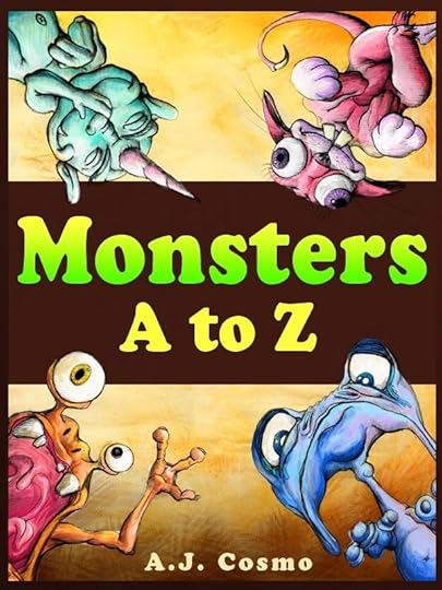
Monsters A to Z got a facelift and a full-screen treatment. This new version is how I originally envisioned the book before we had the ability to create such things. I added the crushed paper texture to the background and floated an old typewriter text above it. It looks close to a field manual and makes it a suitable precursor to Monster Manuel's Field Guide.
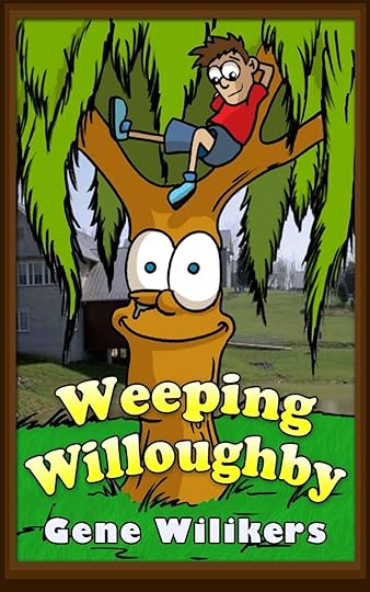
Next up is Weeping Willoughby, a title that came out last November and desperately needed reformatting. Of all the pieces, this one has improved the most. When I originally created it I was struggling with the formatting. I ended up making some of the headings big and others small. It didn't work and, as one reviewer noted, it turned into a mess. This one is worth a look if you haven't seen it.
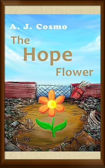
And last but not least I “remastered” The Hope Flower. I had lost the original source files for the project, so I had to recreate and resize the images by stripping them out of one of my old collection books. This meant the resolution was less than optimal, so I had to flex photoshop to resample the images. It also meant that I couldn't update it from the old Kindle size to the new screen size without some padding on the sides. The solution was to create the picture frame that you see below.
This title is one of two controversial books that I have written (the other being Billy the Coral Snake) and as such has a lower rating than most. People either love it or hate it and which side of the fence you land on depends on your approval of the word “stupid.” That’s right, stupid, the other four letter word. I had no idea the word would be so controversial. In hindsight I should have known better, but I stand by everything I create, and leave it up to the parents to decide what their children should and shouldn’t read.
The Hope Flower is free this week from March 10th through the 15th. Give it a download and tell me what you think by leaving a review.
PS- Look for more blog posts going in depth about the update process!
Monsters A to Z got a facelift and a full-screen treatment. This new version is how I originally envisioned the book before we had the ability to create such things. I added the crushed paper texture to the background and floated an old typewriter text above it. It looks close to a field manual and makes it a suitable precursor to Monster Manuel's Field Guide.
Next up is Weeping Willoughby, a title that came out last November and desperately needed reformatting. Of all the pieces, this one has improved the most. When I originally created it I was struggling with the formatting. I ended up making some of the headings big and others small. It didn't work and, as one reviewer noted, it turned into a mess. This one is worth a look if you haven't seen it.
And last but not least I “remastered” The Hope Flower. I had lost the original source files for the project, so I had to recreate and resize the images by stripping them out of one of my old collection books. This meant the resolution was less than optimal, so I had to flex photoshop to resample the images. It also meant that I couldn't update it from the old Kindle size to the new screen size without some padding on the sides. The solution was to create the picture frame that you see below.
This title is one of two controversial books that I have written (the other being Billy the Coral Snake) and as such has a lower rating than most. People either love it or hate it and which side of the fence you land on depends on your approval of the word “stupid.” That’s right, stupid, the other four letter word. I had no idea the word would be so controversial. In hindsight I should have known better, but I stand by everything I create, and leave it up to the parents to decide what their children should and shouldn’t read.
The Hope Flower is free this week from March 10th through the 15th. Give it a download and tell me what you think by leaving a review.
PS- Look for more blog posts going in depth about the update process!
July 12, 2013
Are Pen Names Dishonest?
After much debate I have decided to create a new pen name. Allow me to introduce Gene Wilikers:
You see I had a problem: my work was too diverse. People would contact me and say that they liked the monster stories, but didn't get the stuff with pandas while other people liked the goofy bat and thought the monster stuff was too scary.
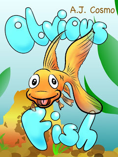
Since the beginning, my work has been along two separate lines. There are the cartoony picture books like "Obvious Fish" which contain limited text and full page pictures.
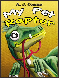
And then there are the more realistically drawn books with more mature subject matter and lots of text like "My Pet Raptor."
I don't think one is better than the other but I can understand why people would get confused if they purchase a picture book and end up getting 3,500 words. I want people to know what they are getting when they pick up one of my books.
So from now on Gene Wilikers will be credited as the author for all of my primary school content. A. J. will still be the illustrator for all of my work and I'll still keep track of them both pen names on this website.
I hope this isn't too bizarre or commercial and I invite anyone reading this to please comment here or on my facebook page about the pen name and what you think. Is it too much? Too business like? Is it unnecessary I'd love to hear from you!
PS- Dirty Dishes will be out Saturday, July 13th!
You see I had a problem: my work was too diverse. People would contact me and say that they liked the monster stories, but didn't get the stuff with pandas while other people liked the goofy bat and thought the monster stuff was too scary.
Since the beginning, my work has been along two separate lines. There are the cartoony picture books like "Obvious Fish" which contain limited text and full page pictures.

And then there are the more realistically drawn books with more mature subject matter and lots of text like "My Pet Raptor."

I don't think one is better than the other but I can understand why people would get confused if they purchase a picture book and end up getting 3,500 words. I want people to know what they are getting when they pick up one of my books.
So from now on Gene Wilikers will be credited as the author for all of my primary school content. A. J. will still be the illustrator for all of my work and I'll still keep track of them both pen names on this website.
I hope this isn't too bizarre or commercial and I invite anyone reading this to please comment here or on my facebook page about the pen name and what you think. Is it too much? Too business like? Is it unnecessary I'd love to hear from you!
PS- Dirty Dishes will be out Saturday, July 13th!
July 8, 2013
When Can You Call a Piece a Failure?
Lately I've been going through my collection and examining each book on an individual basis. It's been a little over a year since I first started and I have a huge library of more than thirty titles under my belt. They range from odd stories about a fish to a book on common household monsters. Some of the books have done remarkably well while others have fallen to the wayside. So here's the question: when should you call a piece a failure?

About three weeks ago I pulled "The Schmoopie" from the Kindle store shelves. It felt horrible. The story was about a sad little animal that different kids try to cheer up. They of course couldn't cheer it up and so get frustrated and throw the creature out. Then one day a pair of sad children find the Schmoopie and take it home. They spend the night complaining to each other about how horrible life is and suddenly the Schmoopie doesn't feel so bad anymore. It leaves happy and goes on its merry way.
I really like this story. It's one of those lessons where you can get it without being able to articulate the meaning. I think kids pick up on these sort of lessons way better than adults. I like the lesson too. I think more people should listen to each other, really listen I mean not just wait for the chance to speak. Yet, it doesn't matter how much I like a piece. In the end I don't matter. Sure my tastes and way of being in the world define my work, but if a painting hangs in an empty museum, why display it?
That's not to say that creating unsuccessful work doesn't have any meaning, you can extract more from your failures than you can your successes, but you have to analyze the works themselves. Which brings me to this piece:
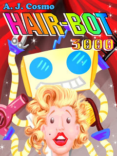
Good gosh that hair is awesome! I loved doing this book. The art style was cartooney but without the black outline, a callback to Disney's Snow White and The Seven Dwarves. I also liked the story about a man challenged by progress to defend his work. It was a metaphor for what we're all going through right now where our jobs and our lives are constantly encroached and changed by new technology.
Unfortunately, I had also accidentally written a children's version of the story "Needful Things" by Stephen King. If you're unfamiliar with that one, it's about the devil coming to s small town and opening up shop with challenges to the village residents. Ok, maybe I didn't go that far, but there are illustrations of scissors flying above a little girl's head. The book had some terrifying imagery. It also had a meaning that was completely irrelevant to most children, since technology creep is mostly experienced by adults. Oh and very few children are in to hair cutting, in fact most of the younger ones are scared of it.
People hate this book. The reviews have been terrible, worse than "The Schmoopie", and the sales have reflected this. The audience has spoken and this piece needs to go back and keep "The Black Cauldron" company. It sucks, it really does, but I do believe that having failures will enable me to make better content for my audience and thus have a better venue for communication. No, I don't believe in "selling out" or only making what you think will appeal to people, that's the surest path to failure, but the more effectively you can appeal to your audience the more effective your communication will be, And that's what this is really all about: communication.
So when can you call a piece a failure? When it doesn't communicate.
If you're interested in "Hair-Bot 3,000" you can pick it up for free this week (July 8th-12th) before I pull it. Then it will only be available in the The A. J. Cosmo Collection #6
June 18, 2013
On Writer's Block
What's more cliche' than a writer writing about writer's block?
I'll just say this up front: I don't believe in writer's block. At least not in the way that most people describe it. I'd rather call it apprehension or better yet writer's doubt.
When an artist first starts out creating things they have a simple goal in mind: they want to express something intangible. They have a need to see an idea in their head materialized in reality. This need is often driven by feelings that the artist has about their view of the world. Something that seems off to them, something that needs to be said, something that people aren't paying attention to. Any of those inclinations can plant a seed of a project and, once those seeds are planted, only time and energy are required to bring them to fruition.
Those types of projects are usually the best.
Unfortunately, to live as an artist, you have to consistently produce new work. (The great censorship of capitalism is that we must sell what we create.) However, once you have tapped out the initial expressive ideas you are left with an empty well of interesting concepts and novel ideas. There is nothing demanding your attention, at least if you had sufficiently expressed your distress in the first place.
So you languish.
Nothing seems right. Nothing has the same flavor as what you made before and you search for ways to reinvigorate your work. You question what it was that made your work popular in the first place. You wonder if what you created was a fluke. You wonder if you are actually contributing anything to the world at all, and when that happens you lose the drive to finish what you were working on. You have created your writers block because you have robbed yourself of the very reasons you created your art in the first place.
By forcing expression we are in fact gagging our voice.
So what do you do? Well, for starters, you re-explore the ideas and feelings that led you to create in the first place. No amount of art in the world can sufficiently answer the issues of society, so there's a good chance that the issues you have with it are still out there. And if, by chance of societal evolution, those problems have gone away, then there are certainly new issues to arouse your creativity. Art doesn't answer societies ills, not in the same way that government and religion can, but it does serve to illuminate and illustrate the realities of our existence while providing a beautiful emotional ideal for us to weigh ourselves against. Once you have re-connected with those observations that planted the seeds in the first place, you will find your resources rejuvenated.
You cannot allow doubt to get in the way of what you create. You may make something awful, you may make something wonderful, but by simply creating you are contributing to a vast and evolving puzzle of creation that contributes to the human experience. To art, the value of a blockbuster and that of a single seller are the same: something has been shared, something has been exchanged, and something has been expressed.
Do not worry how the world will receive your work, the remarkable thing is that you gave it in the first place.
June 13, 2013
Painting the Invisible
My previous article focused on the idea that accurate lighting entices viewers into pieces of art, but how do you paint light when your subject only exists in the imagination?
Here's that cover again:

Poor Slips has really been under the microscope lately, hasn't he? Anywho, I wanted to revise this cover and add a better sense of lighting and depth to the piece. Anytime you feel stuck or in need of improvement you should seek out the advice of the old masters. So who better than Caravaggio to teach us a bit about light?
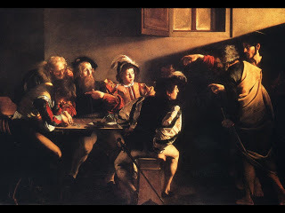
The Calling of Saint Matthew, 1600 A.D.
Notice the intense single light source coming from the right hand side? That was the style of the day. Painting at the time favored a single light source because the light in the painting was a symbol for God and there could only be one god. Caravaggio also knew that a single light source lends a sense of drama to the piece as well as a clear way to move the viewers eye's through the work. It also firmly plants the painting in reality.
So how do we apply this to a giant imaginary chameleon? Well, we start by deciding where the light source should come from.
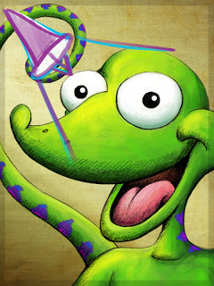
That little purple thing is supposed to represent a spotlight. In reality it would be a little bit off of the surface of the canvas to the upper left of the picture, but I put it there for the purpose of illustrating the point. The shape of the cone indicates the spread of the light while the arrow indicates the direction. Everything outside of those two extended cone lines will fall in shadow while things closer to the center line arrow will show the brightest highlights.
Light is a funny thing. We tend to think of highlights as bright and vibrant but the closer to "bright" a color becomes the more it loses its saturation. Conversely, the more shadowed a color, the more it tends to saturate. Shadows tend to be "cool" colors, they have more blue in them. While mid-tones and highlights are "warm" tending to have more red or yellow in them. The combination of all of these different values is what creates depth in an illustration and gives it a sense of realism.
Once you have decided on your lighting, molding the form of something that doesn't exist comes from your knowledge of painting things that do exist. I know that Slips' eyes are big and round, so shading them like you would shade an orange works. His nose is bulbous and his cheeks rise up over his mouth, so those points get highlights. Notice how deep this image is compared to the earlier version. I'm a little sad to lose some of the bright bubbliness of the first image, but I think that the movement drama, and clarity that the new version has outweighs that loss.
Art is never finished and an artist is never done learning. Thank you for joining me along the way!
Here's that cover again:
Poor Slips has really been under the microscope lately, hasn't he? Anywho, I wanted to revise this cover and add a better sense of lighting and depth to the piece. Anytime you feel stuck or in need of improvement you should seek out the advice of the old masters. So who better than Caravaggio to teach us a bit about light?

The Calling of Saint Matthew, 1600 A.D.
Notice the intense single light source coming from the right hand side? That was the style of the day. Painting at the time favored a single light source because the light in the painting was a symbol for God and there could only be one god. Caravaggio also knew that a single light source lends a sense of drama to the piece as well as a clear way to move the viewers eye's through the work. It also firmly plants the painting in reality.
So how do we apply this to a giant imaginary chameleon? Well, we start by deciding where the light source should come from.

That little purple thing is supposed to represent a spotlight. In reality it would be a little bit off of the surface of the canvas to the upper left of the picture, but I put it there for the purpose of illustrating the point. The shape of the cone indicates the spread of the light while the arrow indicates the direction. Everything outside of those two extended cone lines will fall in shadow while things closer to the center line arrow will show the brightest highlights.
Light is a funny thing. We tend to think of highlights as bright and vibrant but the closer to "bright" a color becomes the more it loses its saturation. Conversely, the more shadowed a color, the more it tends to saturate. Shadows tend to be "cool" colors, they have more blue in them. While mid-tones and highlights are "warm" tending to have more red or yellow in them. The combination of all of these different values is what creates depth in an illustration and gives it a sense of realism.
Once you have decided on your lighting, molding the form of something that doesn't exist comes from your knowledge of painting things that do exist. I know that Slips' eyes are big and round, so shading them like you would shade an orange works. His nose is bulbous and his cheeks rise up over his mouth, so those points get highlights. Notice how deep this image is compared to the earlier version. I'm a little sad to lose some of the bright bubbliness of the first image, but I think that the movement drama, and clarity that the new version has outweighs that loss.
Art is never finished and an artist is never done learning. Thank you for joining me along the way!
June 12, 2013
People Are Like Moths
How important is light to painting?
Yesterday I had dinner with a friend of mine from college whom I hadn't seen in nine years. We used to talk a lot about painting, going so far as to geek out about how warm cerulean blue is and why it makes your skin itch when you use it (tiny crystals get under your skin, seriously.) I showed him my body of work and suddenly found myself in the middle of an art critique.
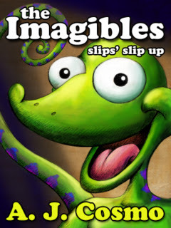
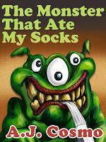
He commented that "The Monster That Ate My Socks" had better lighting, color, composition, movement, and rendering than "The Imagibles: Slips' Slip Up" did. Interestingly these two titles are separated by about a year of work and around fifteen books. That's something like a hundred and fifty illustrations between the two pieces. I was baffled. "Am I actually getting WORSE at art?"
"People are like moths, they're drawn to light."
The major differences between these two pieces are the application of lighting. The sock monster has a high level of lush light and shadow and a background that provides nice contrast to the form. This gives the piece depth, even when it's a tiny thumbnail on your kindle. The Imagibles, by contrast, has the flatness of a playing card and doesn't feel "alive" in the same sense. The color is also flat. There are no cold values weighted against the hot values so the eye isn't as enticed to explore the image. Pretty heavy stuff for a book cover, no?
What's interesting is that as we looked at my body of work, the titles that had this luscious sense of lighting were invariably more popular than the covers that did not. It didn't matter what the illustrations on the inside of the book looked like either, it was the cover, and only the cover, that communicated the quality of the work inside.
My friend quoted his favorite teacher who said that "people are like moths, they're attracted to light." I have to agree. Good art has a sense of light built into it and I think that this is one of the phenomenons you can point to when people say things such as "I don't know why I like it, I just do." Everyone intrinsically has a sense for good art regardless of their training or ability to illustrate because our sense of art comes from observing the world around us. We are conditioned by living life to know instinctually when something seems out of place and thus we are naturally attracted to those images and forms that fit more closely into what we expect out of the world.
I would also take the quote one step deeper. People are not only literally drawn to light but also figuratively. The stories, places, and personalities that put out a "luminous" quality also attract the most attention.
What exactly is luminosity? I'll leave that up to you to decide.
Yesterday I had dinner with a friend of mine from college whom I hadn't seen in nine years. We used to talk a lot about painting, going so far as to geek out about how warm cerulean blue is and why it makes your skin itch when you use it (tiny crystals get under your skin, seriously.) I showed him my body of work and suddenly found myself in the middle of an art critique.
He commented that "The Monster That Ate My Socks" had better lighting, color, composition, movement, and rendering than "The Imagibles: Slips' Slip Up" did. Interestingly these two titles are separated by about a year of work and around fifteen books. That's something like a hundred and fifty illustrations between the two pieces. I was baffled. "Am I actually getting WORSE at art?"
"People are like moths, they're drawn to light."
The major differences between these two pieces are the application of lighting. The sock monster has a high level of lush light and shadow and a background that provides nice contrast to the form. This gives the piece depth, even when it's a tiny thumbnail on your kindle. The Imagibles, by contrast, has the flatness of a playing card and doesn't feel "alive" in the same sense. The color is also flat. There are no cold values weighted against the hot values so the eye isn't as enticed to explore the image. Pretty heavy stuff for a book cover, no?
What's interesting is that as we looked at my body of work, the titles that had this luscious sense of lighting were invariably more popular than the covers that did not. It didn't matter what the illustrations on the inside of the book looked like either, it was the cover, and only the cover, that communicated the quality of the work inside.
My friend quoted his favorite teacher who said that "people are like moths, they're attracted to light." I have to agree. Good art has a sense of light built into it and I think that this is one of the phenomenons you can point to when people say things such as "I don't know why I like it, I just do." Everyone intrinsically has a sense for good art regardless of their training or ability to illustrate because our sense of art comes from observing the world around us. We are conditioned by living life to know instinctually when something seems out of place and thus we are naturally attracted to those images and forms that fit more closely into what we expect out of the world.
I would also take the quote one step deeper. People are not only literally drawn to light but also figuratively. The stories, places, and personalities that put out a "luminous" quality also attract the most attention.
What exactly is luminosity? I'll leave that up to you to decide.
May 29, 2013
Pulling Narrative Thread
How can you take a small idea and turn it into an entire story?
When I was in college, I had a writing instructor that said "you can write anything if you know how to pull the proper thread." It took me years of writing bad stories to understand what she meant.
We are constantly inundated with narrative in our culture, actually every culture, and because of that most of us have access to an intuitive sense of story. For example, if I tell you that I'm working on a love story about a man and a woman who reunite after five years you will immediately assume that in the end of the story those two will wind up together. Did you also assume that they would be separated at some point in the story? What about difficulties between them, do you think they had them or did they get along splendid from the get go?
These assumptions are the "thread" that you as a writer can pull to reveal more about your story and how it wants to be constructed. Yes, stories have a life of their own and I am a believer that the concept behind the story has a way that it naturally wants to be expressed. (Michelangelo talked of how he never actually sculpted anything, he simply revealed the sculpture that was within the stone to begin with.)
By pulling threads, or rather asking questions about your concept, you can quickly and easily work through the entire structure of the piece. Questions lead to other questions and eventually you will have followed enough thread to find the entire yarn (hyuck hyuck hyuck.)
Going back to the example of the love story, lets ask ourselves why the couple was separated in the first place. Remember that there's no wrong answers, only decisions that feel more right than others. Lets say it was because of a sailing accident and the woman thought that her love had been lost at sea. Ok, kind of cheesy, but lets run with it. If a sailing accident happened, then we know that the man sails. Does the woman also sail? Yes. Okay! Is that how they met? Yes! Okay, then we know that we can have a scene early in the story where the two love birds meet over sailing. Perhaps the man teaches the woman how to sail. She was a sheltered upper class woman after all and he was a ruffian from the docks.
See where I'm going? I'm having too much fun so let's take this all the way. If he taught her how to sail then that becomes her "superpower." Most protagonists have something about them that makes them special so that they can overcome their challenges. Luke had his light-saber while captain Kirk had his infallible gambling skill/decision making. So this woman learned how to sail. Her friends and family all told her that her love had died at sea. The coast guard had given up the search. No one thought that he had survived. No one, except our heroine. Her connection to this man told her that he was still alive. So she uses the skills that he taught her to sail out to sea and find her lost love. And, after years of searching, the man never giving up hope, who is it that sails to his rescue? The love of his life of course!
And save, print, submit. All we need is a title . . . How about Love Tide . . . Maybe we'll save title creation for another post . . .
What kind of stories can you come up with?What kind of stories will you create?How about asking your children for ideas? They tend to find the best threads . . .
All my love,A. J. Cosmo
May 21, 2013
Duckfish Cork Floaters (Craft Project)
With summer here, I got to thinking about water and that reminded me of one of my favorite childhood crafts: cork floaters!
Materials you will need:
a large cork topper (ask your parents)safety scissors (parents)a thumbtack (maybe you should do this with your parents)crayonscardboardHave a parent or a guardian cut the cork topper in half (you could make two separate floaters out of one cork.)
Place the cork half flat on a surface and use your scissors to carve out a slot on the top of the cork. (You can also have an adult carve out the slot by using a knife.) The slot should be thin enough to hold paper snug.

Take your cardboard and draw the outline of the creature that you want to create. Here I made my good friend Duckfish. Make sure that at the bottom of the creature you create a bit that sticks out.
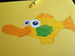
Use the crayons to color the entire surface. Make sure to be thorough, the wax in the crayons will waterproof your creature!
Insert that bit of cardboard into the slit you cut in the cork.
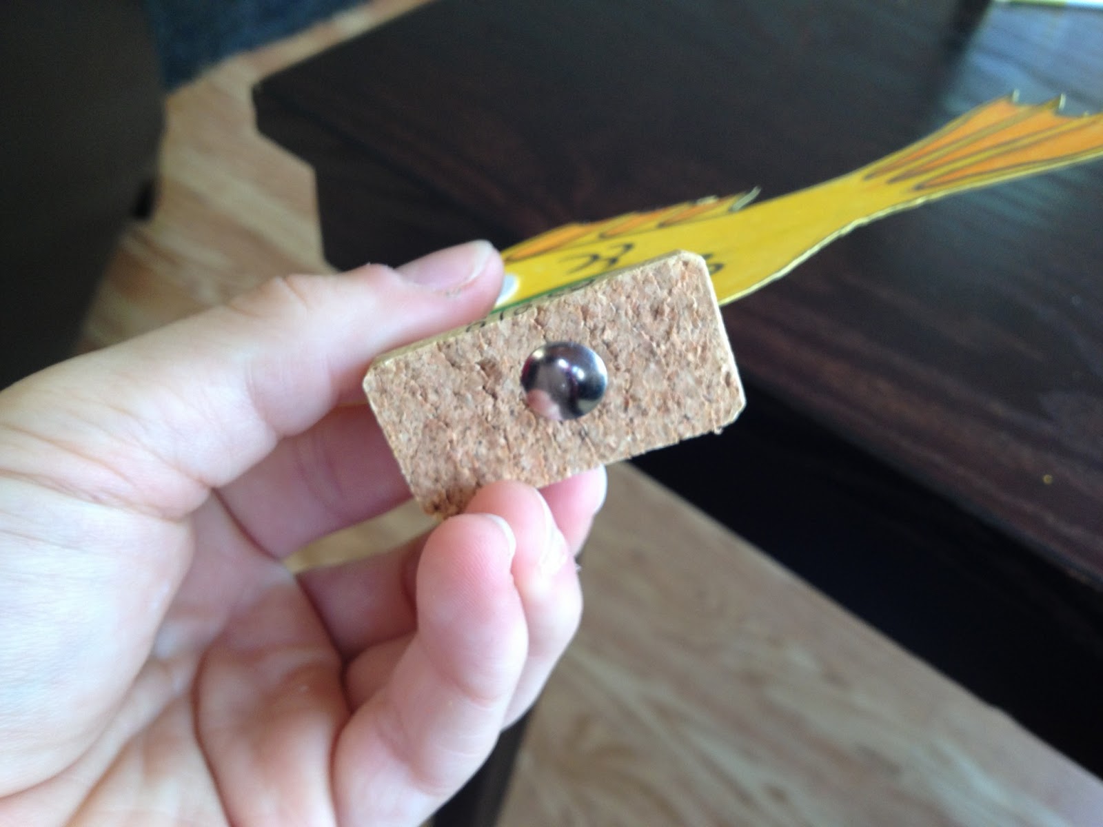
Take your thumbtack and attach it to the underside of the cork. This will weigh the floater down in the water so that it doesn't roll.

Wait . . . something is wrong . . .
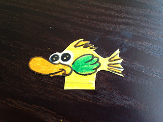
Sometimes whenever you try something new it doesn't work out the way that you planned. That's ok! We learn from our mistakes and try again until we figure it out. In this case, the duckfish was too large for what the cork could support. So I made another, smaller, Duckfish.
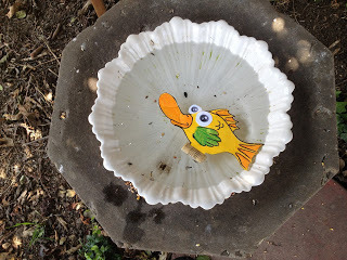
Aww, he's still cute! Time to go for a swim little guy . . .
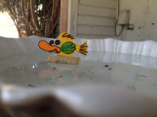
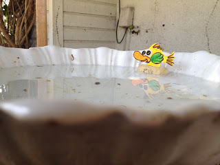
Awesome! Here he is enjoying my bird bath. And then getting blown into the corner by the wind . . .
What is a Duckfish anyway? Who cares!
What kind of things will you create with your children? Share them @ajcosmokids!
Materials you will need:
a large cork topper (ask your parents)safety scissors (parents)a thumbtack (maybe you should do this with your parents)crayonscardboardHave a parent or a guardian cut the cork topper in half (you could make two separate floaters out of one cork.)
Place the cork half flat on a surface and use your scissors to carve out a slot on the top of the cork. (You can also have an adult carve out the slot by using a knife.) The slot should be thin enough to hold paper snug.

Take your cardboard and draw the outline of the creature that you want to create. Here I made my good friend Duckfish. Make sure that at the bottom of the creature you create a bit that sticks out.

Use the crayons to color the entire surface. Make sure to be thorough, the wax in the crayons will waterproof your creature!
Insert that bit of cardboard into the slit you cut in the cork.
Take your thumbtack and attach it to the underside of the cork. This will weigh the floater down in the water so that it doesn't roll.
Wait . . . something is wrong . . .

Sometimes whenever you try something new it doesn't work out the way that you planned. That's ok! We learn from our mistakes and try again until we figure it out. In this case, the duckfish was too large for what the cork could support. So I made another, smaller, Duckfish.

Aww, he's still cute! Time to go for a swim little guy . . .

Awesome! Here he is enjoying my bird bath. And then getting blown into the corner by the wind . . .

What is a Duckfish anyway? Who cares!
What kind of things will you create with your children? Share them @ajcosmokids!


