Drewscape's Blog
April 26, 2026
Why even consider simulating real paints digitally?


Which was done with real paint and which was drawn digitally? That's a question I often quized my daughter when she was growing up. We'd be looking for picturebooks in the library and I always favoured picturebooks drawn with real paint. Asking myself why, I'd explain it this way:
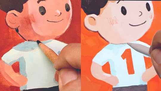
Real paints feel more warm and organic. Like a real person really got their hands into it.With real paints I feel that the painter took more thought and skill to craft it a certain way. As in, it took more effort to fix a mistake or just go with the mistakes and made it work.With digital, it's easy to undo and hide mistakes as if they never happened. The lines textures feel more natural and rich. Digital paint and textures can also feel rich especially when scanned from real paint, but I find they often lack spontaneity, too orderly, too controlled. (Btw, the top picture is with real paints)When drawing comics with a half-natural-line-and-half-digital-colouring approach (which I often do), I think it looks OK because comics are read quickly and, as I reader, I just want to know what happens and get a sense of the feeling from the art. But for picturebooks, the pictures are bigger and I want to slow down and take it all in. I want to savour the art. I want to feel the lines and paint and textures. I want to live in the page for awhile. And with digital, it feels like it is a artificially constructed space and not real. While with real paint, it feels like a space the story teller really lived and worked in. It "feels more real" as many people put it. So if I'm illustrating a picturebook, My first choice would be to do it with real paints. I have tried many ways to get away with it over the years (when I was less confidence with natural media). I've also done 1 or 2 picture books entirely simulating paints digitally. They look alright on their own but compared to my other work with real paints, real paints still win. Real paints was often messier and I had to do it at my desk instead of my sofa, but I did find it more fun and enjoyable, like I was playing rather than working.
So why did I do a Youtube video about simulating natural media digitally? I note that some of you were asking "Why even consider it?"
Imagine you are a student at an art school, and your parents only provided you with an iPad or laptop. You have a budget of $5 for lunch every day. You don't own a scanner, or a printer. It costs money to go to a shop to scan stuff. OK, you do have a smart phone camera with camscanner app. But that's not great for scanning paintings. You might have some basic paints and brushes from a painting class in the past. You are rusty. You do have more experience drawing your favourite manga and anime characters on Procreate or ClipStudio. Now you are given a picturebook assignment due in a few weeks. It is your first time putting a story and layout together. You are struggling with it and doing tweaks suggested by the teacher. You might have 2 weeks left to paint the pages because you procrastinated. How would you choose to render the pages- with real paints or your iPad?
I find that most students would choose digital paints over real paints even though (I feel) the results won't be as amazing as real paints.
But the next problem is that even when drawn and painted digitally, the art might look like a poor simulation of real paint. It's not convincing at all. And it might be that many young ones today have very limited or zero experience with real paint. So when they try to simulate real paint digitally the process is all wrong! They might find a brush that says acrylic and apply it like watercolour and think that is how acrylic should look. Or they will use too many layers and it doesn't allow the paint to mix.
So that's why the video below. I realise that if anyone were to try make their digital paintings look like real paints, it's best to know the process required of that paint medium. And it will get it looking closer to the real thing. And then I hope they'd brush up their skills with the real thing, in time! Yes it will be messier, it will take more work, but it will be worth it.
Some tips: Gouache is different from acrylic. Acrylic would need an underpainting and the layers above while gouache is applied thick without underpainting. At least, that's what I've learned using real paints
And here is another quick and rough run-though video I made for my students covering a few different media.


April 12, 2026
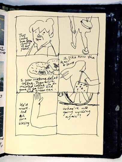
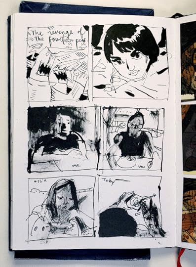
Comic diary on 9 Apr 2026

Drawn with a Uni Pin pigment brush pen. This new small brush pen has waterproof ink and it feels good when I draw with it. I decided I had to draw out another comic diary coz I've been so stressed deciding on all the materials for the upcoming comics class (A physical class in Singapore). I think I'm about settled it but there are so many decisions. Perhaps I should have kept it simpler!
I feel that doing a comic diary is never wasted. Some history is preserved.
My phenakistoscope
 Life for me keeps changing. At one time, when I was single and working at an ad agency, it seemed like things would stay the same all the time, day after day. I was so bored and I wished for change. After getting married, having kids to care for, taking on teaching and learning new things like youtube and photography, I wish things would slow down once in awhile so I can catch my breath. I must say, there is rarely a dull moment these days. Recently I learned to do a phenakistoscope - an invention from the 1800s. The above represents my mind or how I see myself, learning and changing all the time. This was drawn in Photoshop and made into a gif also in Photoshop. I still find it hard to pronounce "phenakistoscope"!
April 8, 2026
I'm teaching a Sequential Art course end of April
 If you want to learn how to draw comics I'm going to be teaching a 6-week course on that at Brahm Centre starting 28th April. It will focus on learning how to use multiple pictures (instead of one) to tell clear narratives. We will be learning the princples involved in this format and also exploring different ways to use sequential art. We will keep it meaningful by using it to record stories from our lives. If this interests you, sign up today using this SIGN-UP LINK on eventbrite. Seniors above a certain age get a subsidized rate. All materials are provided. This course is held in Singapore, so only if you are based here. Seats are limited.
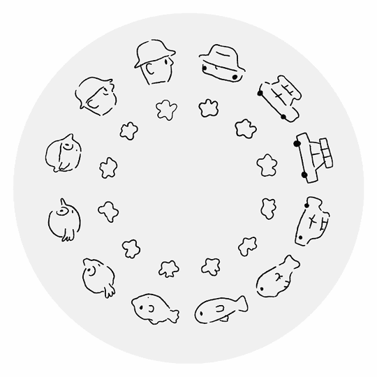
Here are some samples of what we will be learning to do:


April 7, 2026
Being an amateur
I'm not sure where I heard or read it, but it's about when we get to a certain level of expertise, we tend to stick to what we are good at. And we might be afraid to try new things because we don't want to look like an amateur again. Perhaps we want to maintain that expert image.
After years sketching small and drawing in a certain way, I feel like I have little problem making things look good in that small comics-like format. I'm pretty confident in that area. But like I've been saying on this blog, sketching big is something I've not done very often and it's an area I feel I've still got room to improve in. With so much more room to fill, I've to remember to compose it like I compose a smaller drawing. There is more space to fill in the details but I've to remember to simplify or I will get lost in the small details and forget about defining those bigger shapes that hold everything together. It's easy to get lost in small details when drawing bigger.
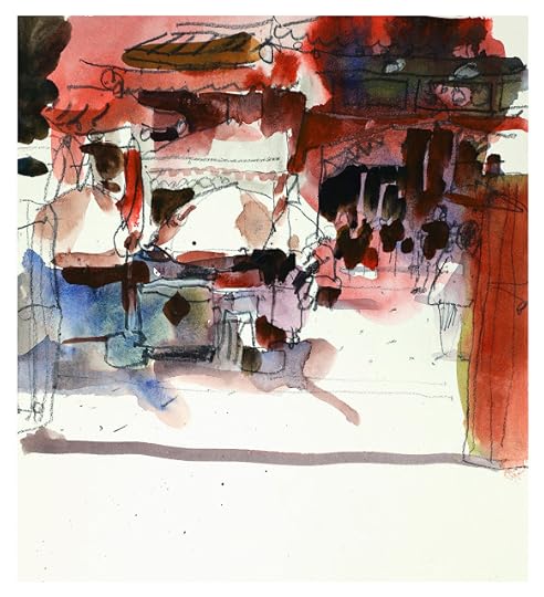
 Gouache and colour pencils. Was rather unsure of the process to nail this image.
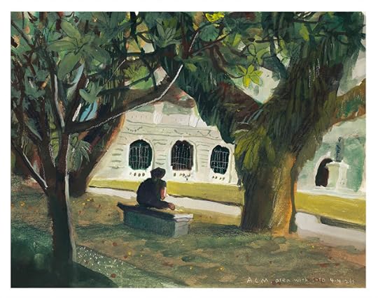
 Watercolours and colour pencils. At a food centre. A little muddy.
 Watercolours and colour pencils. Outside a Temple. I could have shown a clearer subject in this picture.Anyways, the above are some bigger sketches (a little bigger than A4) I've been doing on location. I didn't do thumbnails for these. (I was skipping that though it does help). There are things I like about them. But they aren't great. I could point out things that can work better. I was fumbling around while working on these. But I'm putting aside my wanting people to see me as "a great artist" and just be a amateur and keep learning. I think that's a great place to be.
I think I picked thoughts like that from this book I borrowed from my wife. I don't read many of these books. But I liked this one. Here is two of the quotes:
“Perhaps we'll never know how far the path can go, how much a human being can truly achieve, until we realize that the ultimate reward is not a gold medal but the path itself.”
“To be a learner, you've got to be willing to be a fool.”
― George Leonard, Mastery: The Keys to Success and Long-Term Fulfillment
After years sketching small and drawing in a certain way, I feel like I have little problem making things look good in that small comics-like format. I'm pretty confident in that area. But like I've been saying on this blog, sketching big is something I've not done very often and it's an area I feel I've still got room to improve in. With so much more room to fill, I've to remember to compose it like I compose a smaller drawing. There is more space to fill in the details but I've to remember to simplify or I will get lost in the small details and forget about defining those bigger shapes that hold everything together. It's easy to get lost in small details when drawing bigger.
 Gouache and colour pencils. Was rather unsure of the process to nail this image.
 Watercolours and colour pencils. At a food centre. A little muddy.
 Watercolours and colour pencils. Outside a Temple. I could have shown a clearer subject in this picture.Anyways, the above are some bigger sketches (a little bigger than A4) I've been doing on location. I didn't do thumbnails for these. (I was skipping that though it does help). There are things I like about them. But they aren't great. I could point out things that can work better. I was fumbling around while working on these. But I'm putting aside my wanting people to see me as "a great artist" and just be a amateur and keep learning. I think that's a great place to be.
I think I picked thoughts like that from this book I borrowed from my wife. I don't read many of these books. But I liked this one. Here is two of the quotes:
“Perhaps we'll never know how far the path can go, how much a human being can truly achieve, until we realize that the ultimate reward is not a gold medal but the path itself.”
“To be a learner, you've got to be willing to be a fool.”
― George Leonard, Mastery: The Keys to Success and Long-Term Fulfillment
March 8, 2026
How I used a thumbnail to do a bigger sketch

Yep, I'm super late in posting again. I'm still juggling between doing so many things (parenting, being an adjunct lecturer, personal artwork, creating classes I want to create on Skillshare, showing something valuable on Youtube and Patreon). It's quite a lot. I've a feeling I'm doing too much. I'm still deciding where I should be placing most of my time and why. I still enjoy posting in this blog and just showing what I've been up to.
I've been teaching Urban Sketching with the gang again at a university. Although I teach, I also get to sit in on the other lecturer's lessons. Jeffrey was teaching the students to do thumbnails before doing a bigger A4 drawing, something I hardly ever to. I like going ahead and "attacking" a scene head on. And that's perhaps why I do a lot of cropped scenes and I seldom attempt larger, wider scenes.
I noticed that, among the students, the concept of thumbnails is something not so easy to grasp. I still see many students draw very detailed sketches that can be considered small finished illustrations. And they can often take up to 1.5hrs to do a thumbnail! Something is off about that.
So this is what I understand a thumbnail to be:
It is small. It is drawn very quickly. I usually take about 5 minutes to draw it. Maybe less. I simplify and capture the scene in blocks of shapes. So I outline these shapes and place them in a pleasing order. What makes it pleasing is often the rule-of-thirds and having something in the foreground, mid-ground and background, which creates depth. Then I quickly shade in 3-4 values- highlight (white), light midtone, dark midtone, and dark. I make sure the highest contrast is where I want the focus to be.
Then I start drawing my scene loosely based on my thumbail. I drew the lines lightly with a light orangey colour pencil first. The thumbnail helped me know how the scene should be cropped and how I should colour it based on the tonal value information in it. Then I added the paints and lastly the lines.
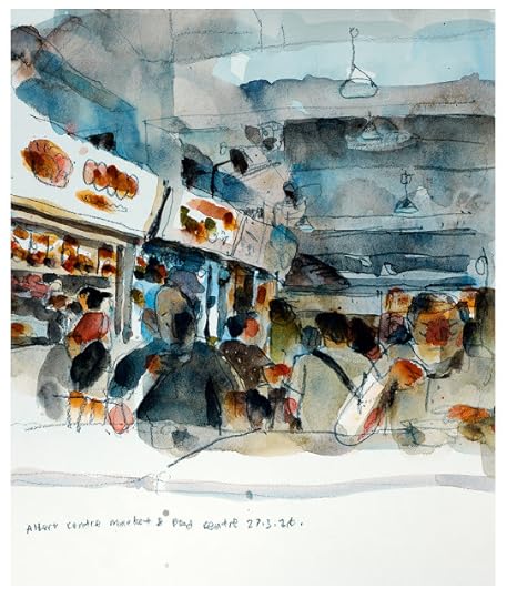
I've been liking gouache again. I bought this deep palette from ArtFriend in Singapore for about only $4. It has a rubber cover that keeps everything moist even after a week. If I leave the paint too long, it does grow mold in Singapore. So I have to be a little careful about it. I like gouache because the colours are bright and I can cover over things, even white over a dark colour.
To keep things portable, I used it with a waterbrush. For the lines I used a Derwent Lightfast Midnight Black colour pencil. The above scene is Tekka Food Centre in Singapore. It is soon going to be Hari Raya and the place is decorated.

The above sketch took me about 2 hours to complete. I was drawing with the students and also guiding students in between. That's longer than I would normally spend on an urban sketch. I usually take 10-20mins because I often draw small. But doing the thumbnail first and then using it to achieve a bigger complex drawing was rather satisfying. So I'm starting to see why some urban sketchers like this slower approach to sketching!
February 2, 2026
Analog urban sketching with a touch of digital coloring

Here are some urban sketches (from direct observation) done during art school class time. We went to the Singapore Botanic Gardens to sketch recently. Since the brief to the class was to draw in the A4 size, I'd to lead by example and not draw in my usual small comic panel size.
I used a charcoal pencil on Fabriano Schizzi 90gsm A4 paper. Charcoal gave me a pleasantly broad line and that helped me cover more ground quicker and it also forced me to simplify. Loved how I was able to create quick mid-tone areas just by rubbing the charcoal. I also loved the messy dirty textures charcoal makes on paper. Each picture took about 10-20 mins. And I mainly focused on combining shapes, and observing the light and dark values.

How did I add in the color in? That's using photoshop. I didn't want to display these as just pure charcoal on paper sketches. I'm not an analog purist neither do I like to do everything digitally. As an illustrator, I want to be open to many ways to create images. I find that combining both analog and digital does open more possibilities on what looks I can achieve. But it does takes restraint not to overdo the digital part. Perhaps it's about using digital tools in such a way that the results still looks like it could have been done entirely with analog tools and mediums. I like this look as using a touch of digital tools gives it some element of surprise.

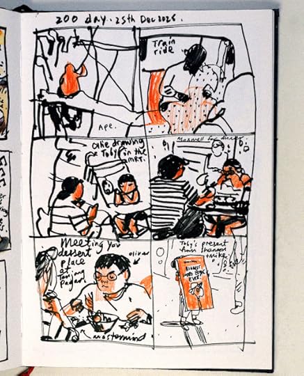
Below was a sketch doing urban sketching with my daughter Ollie.

And this was at the dentist clinic waiting for Ollie while she got her teeth cleaned.

February 1, 2026
Just needs some good meaning

This was simple but I liked it because I collaborated with my 3 yr old son, Toby. I drew a shape on the ipad and he continued with another shape, and so on, back and forth. Animating it produced this. This was some simple and quick to do but I like it because it has meaning to me. This tells me that, perhaps, things don't need to be complicated for it to be enjoyable. It just needs some good meaning? Just pondering here:)
January 19, 2026
Taking time to feel lost and just experiment
2026 arrived and I didn't quite feel ready for it. End of 2025, there was the family vacation trip to japan, two people I knew passed away which made me sad, I'd just done another year of Youtube videos and wasn't sure what else I want to show (or why), I've been playing around with a camera and learning to take pictures. I was just trying not to solve things for awhile. Turn the switch off. Take a break. Then 2026 appeared and I don't quite feel ready to turn everything on yet. So these are my sketches in my sketchbook these past few weeks. They are a little skittish as I was just dabbling and trying things here and there, not very sure where I want to head toward yet.
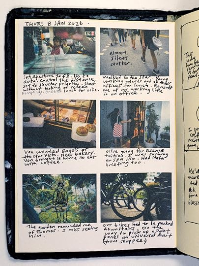
I was rather pleased with this page above. I've been liking taking photos with the Lumix S5ii for the past half year, but there is a problem I'm still trying to solve. What do I do with all the photos?! How do I present them to others? And for what reason? How do I create more meaning or add more story to them (like I can do with comics)? So I printed out six of my photos into a sheet of paper and then pasted it into my sketch book, and I wrote and drew over it with a pen. Yes, it's like a comic page, isn't it? I liked how it allowed me to have more connection with the pictures. I especially liked the parts where the handwriting went over into the pictures. I also like how imperfect the photos became when printed on textured paper. On the next page (below), I drew from each of the photos, elaborating more on some of the details I was interested in.
Random sketches, combining different drawing tools. Sometimes, I'd draw from imagination and other times, from direct observation or from a photo I'd shot.
So these are mostly relaxed random experiments, feeling a little lost on where to go next. The year is getting started (well, almost a month in now). But I think it's fine to take time and allow myself to feel lost and just experiment for awhile.

I was rather pleased with this page above. I've been liking taking photos with the Lumix S5ii for the past half year, but there is a problem I'm still trying to solve. What do I do with all the photos?! How do I present them to others? And for what reason? How do I create more meaning or add more story to them (like I can do with comics)? So I printed out six of my photos into a sheet of paper and then pasted it into my sketch book, and I wrote and drew over it with a pen. Yes, it's like a comic page, isn't it? I liked how it allowed me to have more connection with the pictures. I especially liked the parts where the handwriting went over into the pictures. I also like how imperfect the photos became when printed on textured paper. On the next page (below), I drew from each of the photos, elaborating more on some of the details I was interested in.

Random sketches, combining different drawing tools. Sometimes, I'd draw from imagination and other times, from direct observation or from a photo I'd shot.


So these are mostly relaxed random experiments, feeling a little lost on where to go next. The year is getting started (well, almost a month in now). But I think it's fine to take time and allow myself to feel lost and just experiment for awhile.
Adding darks with reckless abandonment
I've been intrigued with tonal values for some time now. Before understanding the light and dark contrasts in a drawing, my drawings tended to look rather flat and I couldn't tell what was wrong with them. Later, I found that adding mid-tones and darks in the right places, an image stands out more clearly. Note that although I did take art elective classes, I didn't major in art. And I learned a lot from books and trial and error.
When I came across comic books by artists such as Mike Mignola and Sean Phillips, I bought and studied them. Their shadows were more intense and black. That was fresh to me. I liked how their use of darks made their images more contrasty or crisp (and simplier?). The blacks would sometimes bleed into each other and also form shapes, obscuring details but somehow made the images even more appealing. And that also gave a clearer sense of where the light was coming from and where the shadows were. Overall, I thought that looked very stylish. Yes, it's a stylistic choice that often works for darker story themes, and not all stories. For example, it's great for crime and monster stories.


 Hellboy: Conqueror Worm, Mike Mignola
 Incognito, Ed brukaker and Sean Phillips
Trying it for myself I found that, often, I had to make the decision of a mid-tone would be interpreted as black or mid-tone or white. It's almost a game. I don't use in all my drawings. Only when I think it is appropriate. I often find that students starting out in drawing often don't put enough of the darks into their drawings. I do find that it takes some reckless abandonment! Here are some drawings where I intensified the darks and I liked the feel of it.


One way I practice it is to draw from observation and only capture the darks with a brush. I filmed one of my practices here. It is rather long and I probably should have shortened the video. Feel free to speed it up (a lot) if you think it's too long. Or perhaps you'd like to follow and practice along with me, which is what I originally intended, and you can hear me rambling along as I draw haha. Here is the VIDEO. Quicker version HERE.