Jason Fabok's Blog
May 13, 2017
Batman 21 and 22
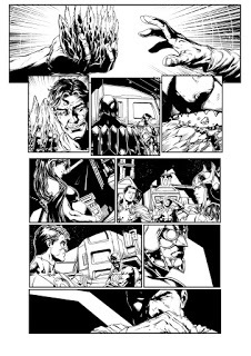
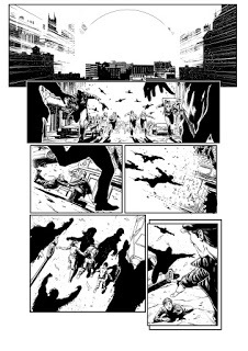
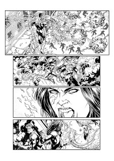
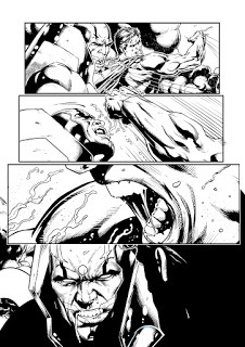
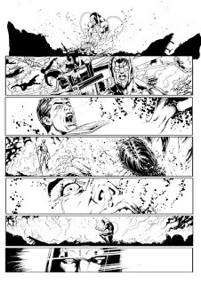
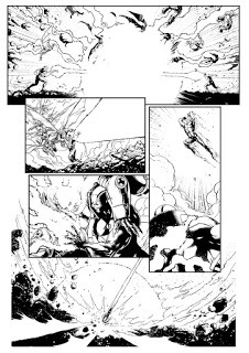
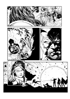
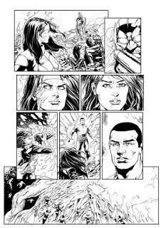
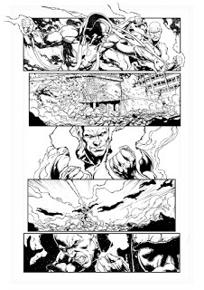
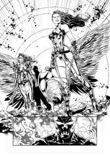
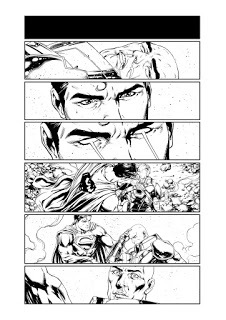
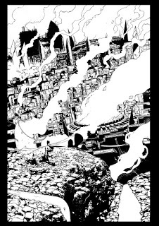
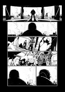
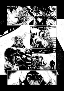
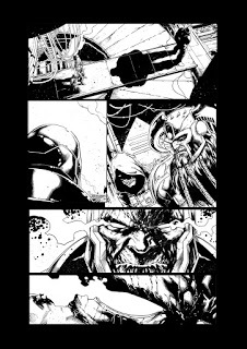
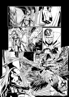
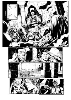
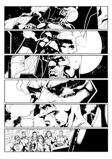
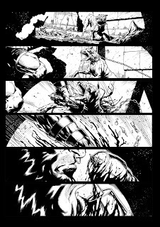
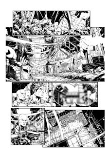
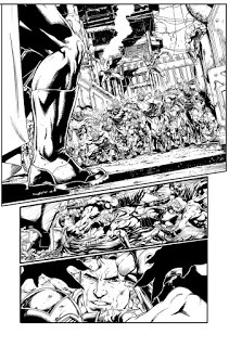
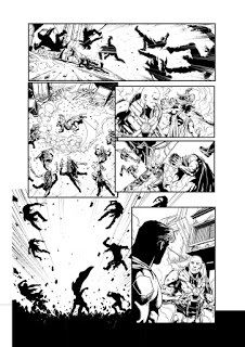
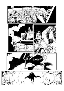
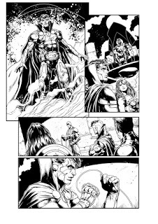
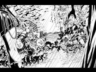
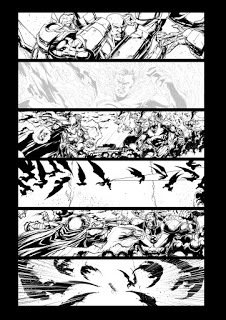
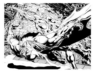
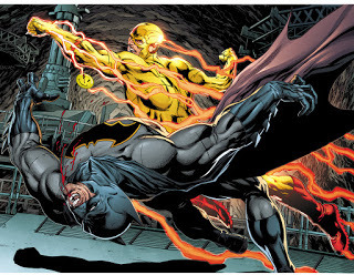
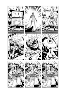
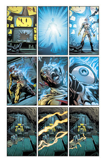
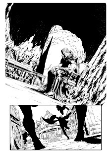
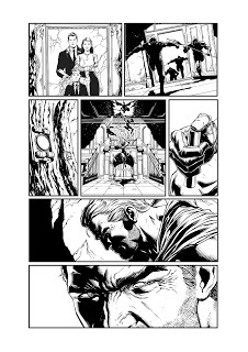
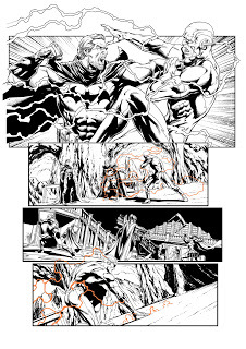
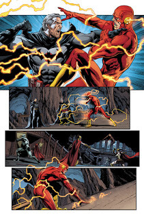
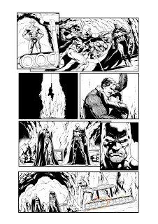
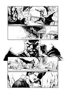
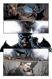
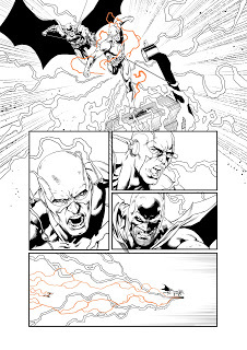
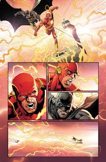
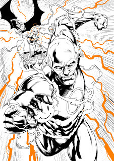
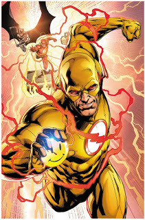
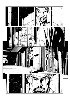
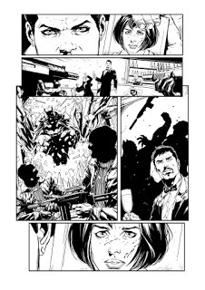
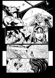
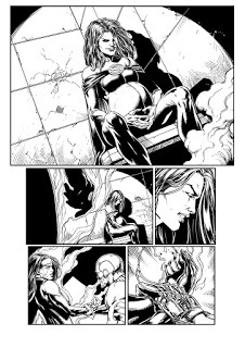
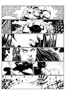
BATMAN 21Inked line work for Batman 21. Colors by the amazing Brad Anderson
When I first read the script for this issue and saw all of the 9 panel grids, I was a bit scared. I like the 9 panel grid here and there, but wasn't sure I was the right fit to draw something like that for an entire issue. I normally like big, open, 4 panel page layouts where I can draw stuff big and bold. But by the end, I was so in love with the way the book was being told that I begged for more! I hope to do more one day and learned a lot while drawing this book.

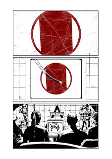
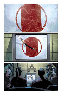
The opening 2 pages were originally different. I had drawn up 2 really interesting pages that tied right in with the original Watchmen story, but it as changed at the last minute and I had to redraw pages 1 and 2. These first two pages were also 9 panel grid pages. I don't know if I'll ever be able to share the original 2 pages. Maybe one day.

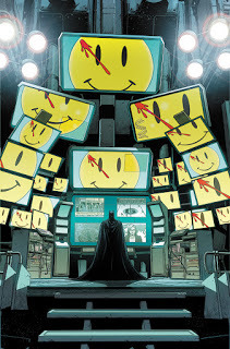
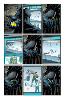
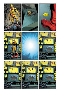
I wanted to have a consistent visual of the watchmen button looming over Batman for the entire issue. So I decided to make the bat computer extra big, with many more screens than necessary, and have the button image on the screens every time you see it.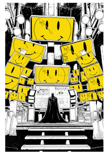
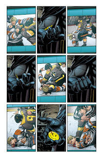
The Hockey sequence allowed me to draw a hockey game, which was really cool. I wanted to portray the game on the TV that Batman is watching to be 100% accurate to an actual hockey broadcast. I also got to use me jersey designs for the Gotham Blades and Metropolis Mammoths that I had done a few months before. So now they are cannon!

One of my pet peeves in comics and movies is when someone's watching sports on TV and the camera is on the field, where it wouldn't be and getting all these action packed shots. That's not how sports are broadcast. Instead we see the action moving across the ice, and when the fight starts, it zooms in, just like it does in a real hockey broadcast. A reviewer knocked me for this sequence, calling the scene boring. I guess he's never watched a real hockey broadcast.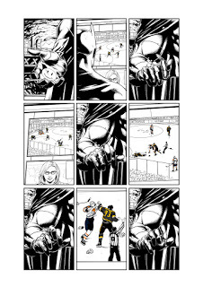
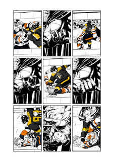
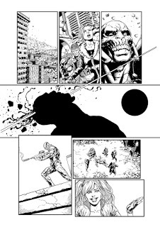
I like how the lightning arcs over the panel borders creating a 3d effect.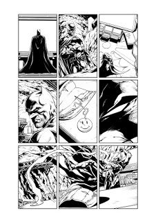
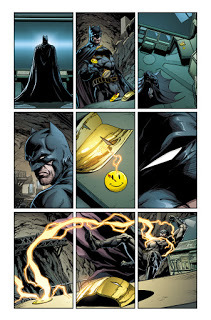
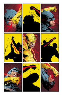
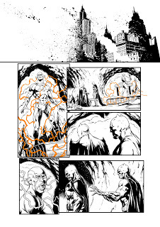
 At this point, we have the Reverse Flash appear...if you notice, the camera line from this point on reverses as well. Its also normal to have the action running left to right. But for the sucker punch...its reversed...
Many people commented on how cool this page turned out. I like it as well. Honestly, I did the silhouettes to pump out this page as fast as I possibly could. This book was a rush, and I had to cut corners anyway that I could. In the end, it created a really memorable sequence. I added the yellow to give it that Watchmen look, riffing off of the classic cover.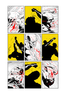
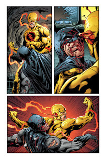
Notice how the blood Batman spits on Reverse Flash's face...is the reverse of the blood on the Watchmen button.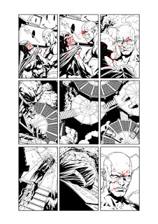
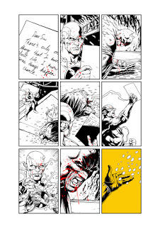
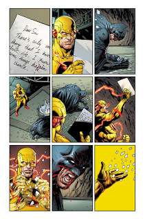
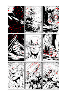
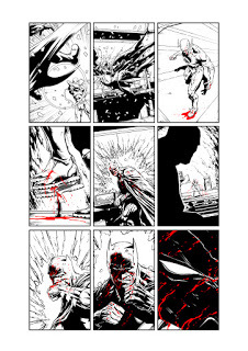
Here, I used the yellow again, but this time we see full detail.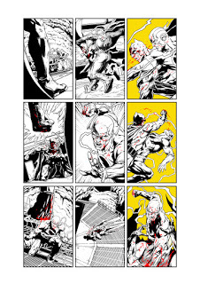
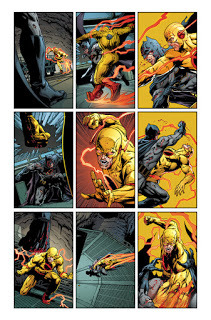
All of the blood was drawn on a different layer so Brad could easily color it.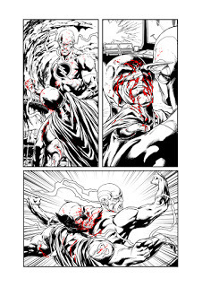
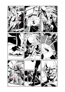
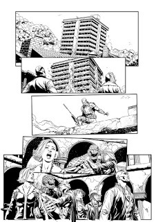
This sequence was fun to do, especially with how we were playing with time in the issue. The shot stays the same for 9 panels, and gives you that quiet sense that something is going to happen. Then BOOM, reverse flash appears and is half burned alive.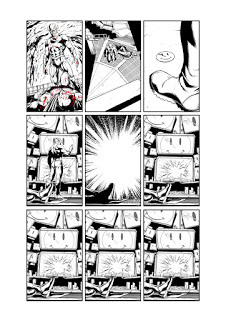
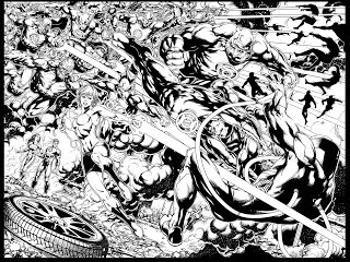
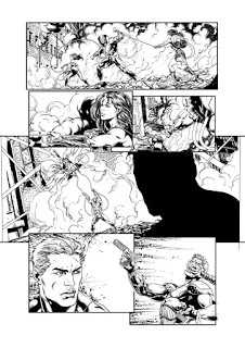
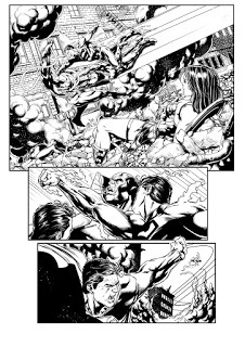
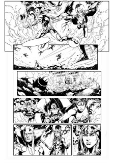
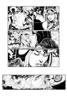
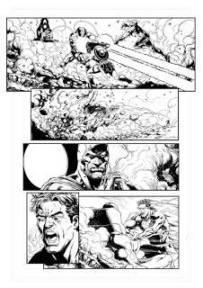
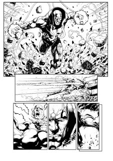
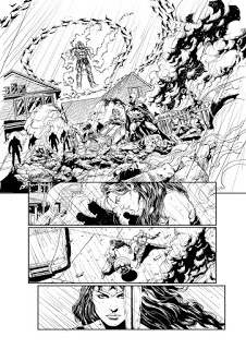
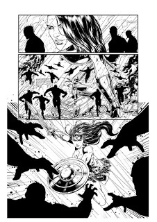
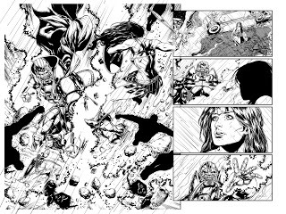
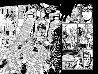
BATMAN 22
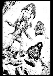
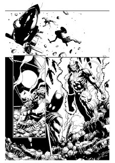
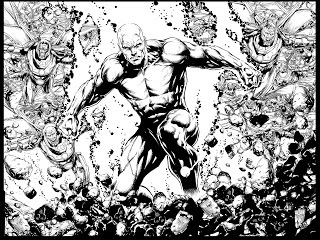
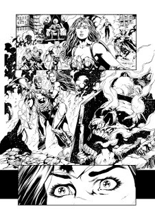
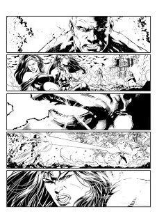
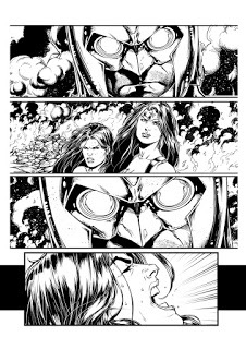
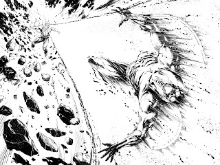
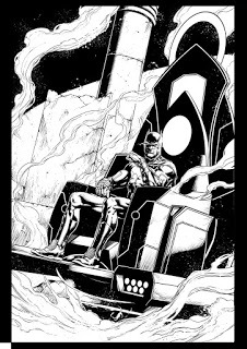
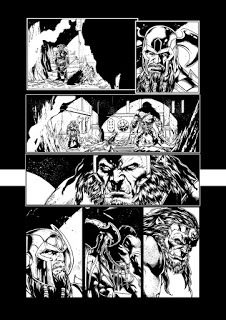
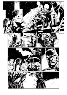
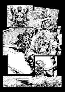
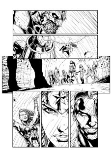
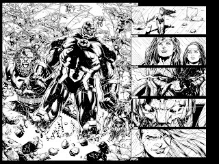
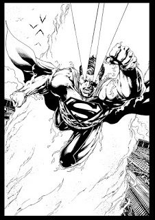
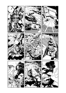
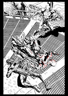
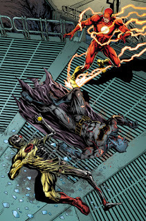
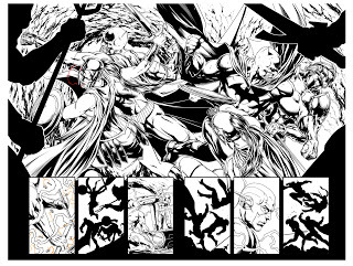
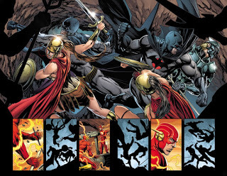
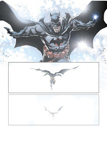
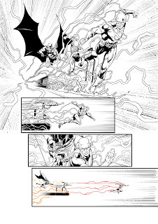
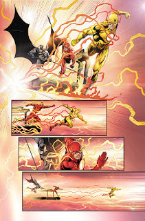
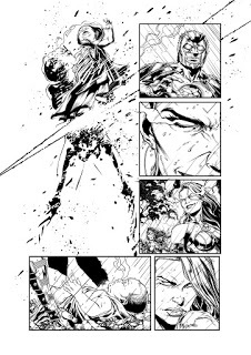
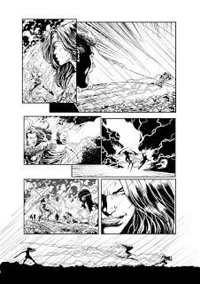
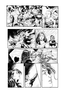
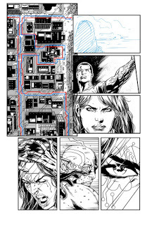
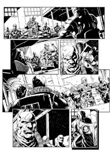
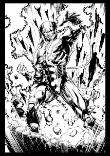
Lineart for Batman 22. Colors by Brad Anderson
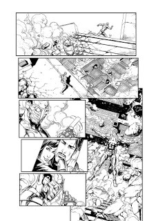
This book was also drawn very very quick. I believe I did 9 pages in one week to finish this book. Luckily Joshua Williamson had pity on me and gave me a few pages of white and no backgrounds to help me hit deadline!While issue 21 was drawn to pay homage to Watchmen with the 9 panel grids, Issue 22 was drawn more like an issue of Flashpoint.
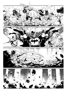
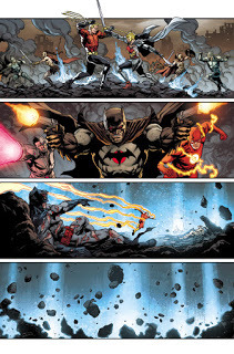

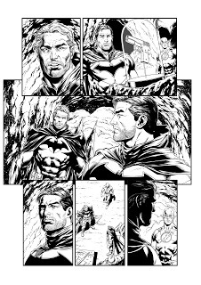
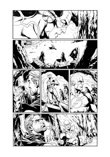
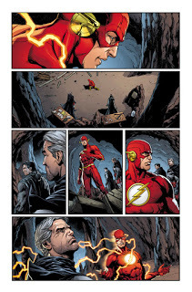
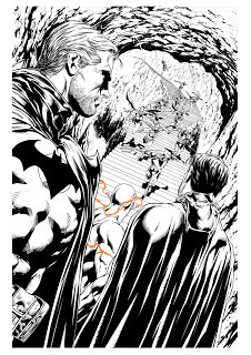
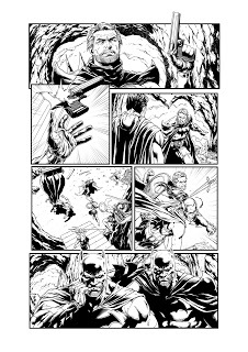
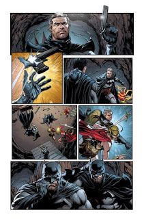
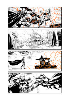
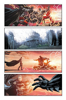
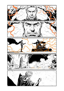
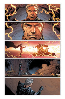
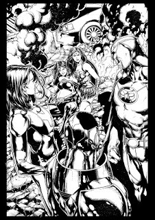
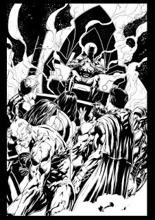
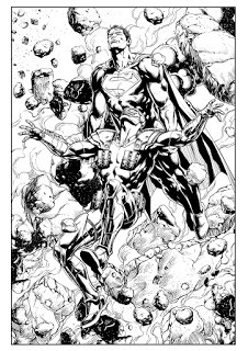
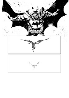 My fav shot of the book is this one of Batman charging into the light! "WE RISE"
Thanks for checking out my process!
When I first read the script for this issue and saw all of the 9 panel grids, I was a bit scared. I like the 9 panel grid here and there, but wasn't sure I was the right fit to draw something like that for an entire issue. I normally like big, open, 4 panel page layouts where I can draw stuff big and bold. But by the end, I was so in love with the way the book was being told that I begged for more! I hope to do more one day and learned a lot while drawing this book.


The opening 2 pages were originally different. I had drawn up 2 really interesting pages that tied right in with the original Watchmen story, but it as changed at the last minute and I had to redraw pages 1 and 2. These first two pages were also 9 panel grid pages. I don't know if I'll ever be able to share the original 2 pages. Maybe one day.


I wanted to have a consistent visual of the watchmen button looming over Batman for the entire issue. So I decided to make the bat computer extra big, with many more screens than necessary, and have the button image on the screens every time you see it.


The Hockey sequence allowed me to draw a hockey game, which was really cool. I wanted to portray the game on the TV that Batman is watching to be 100% accurate to an actual hockey broadcast. I also got to use me jersey designs for the Gotham Blades and Metropolis Mammoths that I had done a few months before. So now they are cannon!


One of my pet peeves in comics and movies is when someone's watching sports on TV and the camera is on the field, where it wouldn't be and getting all these action packed shots. That's not how sports are broadcast. Instead we see the action moving across the ice, and when the fight starts, it zooms in, just like it does in a real hockey broadcast. A reviewer knocked me for this sequence, calling the scene boring. I guess he's never watched a real hockey broadcast.


I like how the lightning arcs over the panel borders creating a 3d effect.


 At this point, we have the Reverse Flash appear...if you notice, the camera line from this point on reverses as well. Its also normal to have the action running left to right. But for the sucker punch...its reversed...


Many people commented on how cool this page turned out. I like it as well. Honestly, I did the silhouettes to pump out this page as fast as I possibly could. This book was a rush, and I had to cut corners anyway that I could. In the end, it created a really memorable sequence. I added the yellow to give it that Watchmen look, riffing off of the classic cover.


Notice how the blood Batman spits on Reverse Flash's face...is the reverse of the blood on the Watchmen button.


Here, I used the yellow again, but this time we see full detail.


All of the blood was drawn on a different layer so Brad could easily color it.


This sequence was fun to do, especially with how we were playing with time in the issue. The shot stays the same for 9 panels, and gives you that quiet sense that something is going to happen. Then BOOM, reverse flash appears and is half burned alive.


BATMAN 22
Lineart for Batman 22. Colors by Brad Anderson
This book was also drawn very very quick. I believe I did 9 pages in one week to finish this book. Luckily Joshua Williamson had pity on me and gave me a few pages of white and no backgrounds to help me hit deadline!While issue 21 was drawn to pay homage to Watchmen with the 9 panel grids, Issue 22 was drawn more like an issue of Flashpoint.


 My fav shot of the book is this one of Batman charging into the light! "WE RISE"


Thanks for checking out my process!
Published on May 13, 2017 11:20
January 16, 2017
Batman and the Flash: 'The Button' crossover event!
My next project has been announced. Its a mini project as I will be joining writer Tom King on Batman for two issues! Here is the press release from Newsarama:
Almost one year after surprising the comic book world by hinting at the merging of the DC Universe with Alan Moore and Dave Gibbons’s Watchmen world in Geoff Johns’ DC Universe: Rebirth #1, DC is getting ready to start offering details into the mysterious connection for the first time.Publishing in April as a four-part crossover between Batman and The Flashongoing series (#’s 21 & 22 of each), The Button will be written by Batmanscribe Tom King and penciled by Jason Fabok, along with The Flash writer Joshua Williamson and artist Howard Porter, respectively.“The two greatest detectives in the DC Universe unite to unravel the mystery behind a certain blood stained smiley face button stuck in the Batcave wall,” reads DC’s official description. “However, what begins as a simple investigation soon turns deadly when the secrets of the button prove irresistible to an unwelcome third party – and it’s not who anyone suspects! This is a mystery woven throughout time, and the countdown starts here!”DC also reports that each issue of The Button will feature a standard cover for the $2.99 edition, along with a $3.99 edition featuring a lenticular cover, all drawn by Fabok.
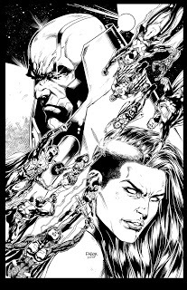
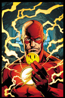
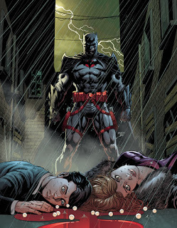
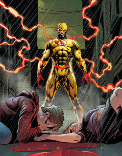
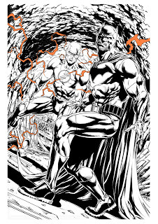
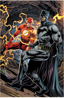
So here is the cover I came up with, which will be a 3d lenticular cover that changes between Batman and the Flash. Below is my process of creating the image.
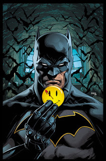

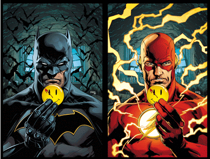
Colors by Brad Anderson and a final animated preview of how the cover's lenticular effect will work.
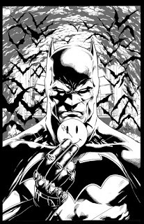
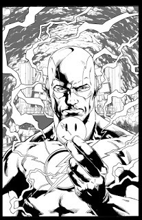
Traditionally inked linework.
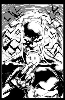
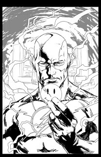
My rough digital pencils that I print up and lightbox inked on a new page.
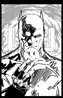
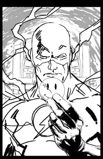
Layout #2
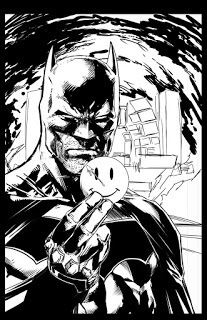
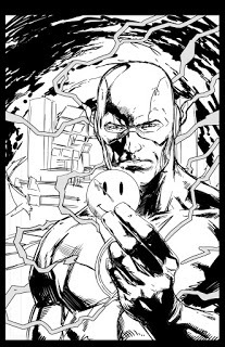
This was layout #1 but it was decided that the two characters should be dead center. The original layout was given to me by Jim Lee.
Published on January 16, 2017 12:21
DC Comics NHL City Teams
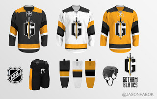
I thought it would be fun to design some fictional NHL jersey's based on the teams in the DC Universe. The two major teams are the Gotham Blades and the Metropolis Mammoths. Here is my take.
Gotham Blades
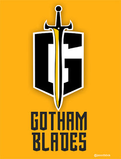


The Gotham Blades would probably have the same color scheme as the other Gotham teams which is Black and yellow. But to make it a bit different, I went with a slate grey for the main color on the home jersey which is unique to the NHL. No team wears grey for their main color.The logo was something I thought up one night. Naming any team "the Blades" leaves you with very little logo design ideas. Usually teams called the Blades have a hockey skate for a logo. But I thought a sword would be cool. Something simple. The "G" behind the logo (for Gotham) is in the shape of a shield. So you have a sword and shield for the crest. Im not a logo designer, and Im sure someone could make this basic concept a lot cooler.
Metropolis Mammoths


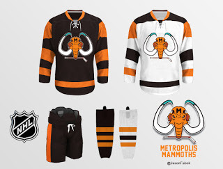
For the Metropolis Mammoths, I went with the first idea that came to my mind, a simple mammoth head holding a hockey stick. There are other sports teams with similar logo's so its nothing to unique but it would work.
As for the color scheme, I have two. One is brown and orange with teal and the other is blue and orange with teal. The brown and orange color scheme would be something very unique to the NHL. This team would probably be very old and maybe they kept their original color scheme for a long time. The blue and orange isnt unique, as the Oilers and Islanders have a blue and orange theme. But the teal would add a little bit of a unique look. Orange is my favorite color so I like both. I'm not sure which one to go with.
Gotham Blades


The Gotham Blades would probably have the same color scheme as the other Gotham teams which is Black and yellow. But to make it a bit different, I went with a slate grey for the main color on the home jersey which is unique to the NHL. No team wears grey for their main color.The logo was something I thought up one night. Naming any team "the Blades" leaves you with very little logo design ideas. Usually teams called the Blades have a hockey skate for a logo. But I thought a sword would be cool. Something simple. The "G" behind the logo (for Gotham) is in the shape of a shield. So you have a sword and shield for the crest. Im not a logo designer, and Im sure someone could make this basic concept a lot cooler.
Metropolis Mammoths


For the Metropolis Mammoths, I went with the first idea that came to my mind, a simple mammoth head holding a hockey stick. There are other sports teams with similar logo's so its nothing to unique but it would work.
As for the color scheme, I have two. One is brown and orange with teal and the other is blue and orange with teal. The brown and orange color scheme would be something very unique to the NHL. This team would probably be very old and maybe they kept their original color scheme for a long time. The blue and orange isnt unique, as the Oilers and Islanders have a blue and orange theme. But the teal would add a little bit of a unique look. Orange is my favorite color so I like both. I'm not sure which one to go with.
Published on January 16, 2017 12:08
January 9, 2017
Hockey Jersey Design Fun
Windsor Spitfires
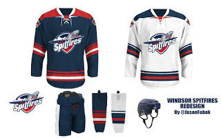
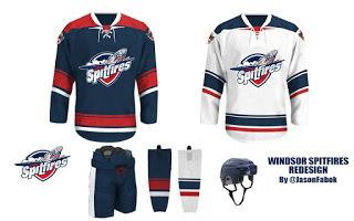
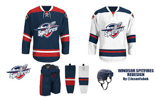
I was looking at the current Windsor Spitfires Uniforms (OHL Junior "A" hockey team where I live) and realized how much I disliked their current look, design and feel. (though I like the modern logo)
I'm a sucker for old school, simplistic hockey sweater design, so I worked up a few uniforms that I think would make a very timeless, classy feel for team and give them an identity that would last for years.
I love the idea of a shoulder yoke to hearken back to the 70-90's look without making the jersey look to clunky. It would be square at the end to give a more tough, militaristic look (the spitfire was a military fighter after all).
The striping is classic and horizontal, and I used some different patterns with varying widths. In the end I like what I came up with. I think it looks modern and yet captures a timeless, classic, retro feel.
#1 is my favorite.
as you move down, the design simplifies itself. I like all three. (these are the kind of things I think of when I'm not working)
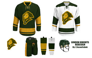
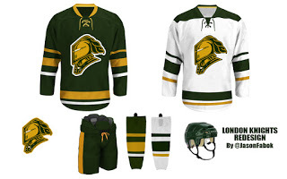
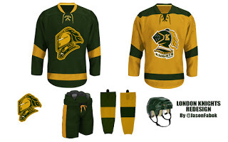
London Knights
I decided to do a London Knights jersey design as well. The logo they use is perfect so I just played with the piping on the sweater to make it look a little more old school. I also dropped the Black from their palette.


Published on January 09, 2017 13:54
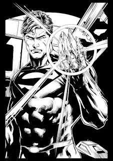
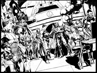
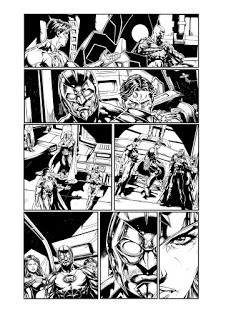
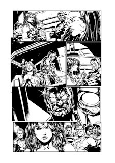
Justice League 50, Justice League vs Suicide Squad and Beyond!
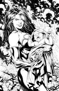
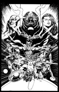
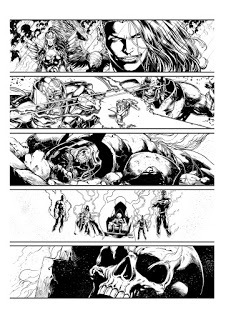
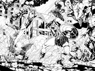
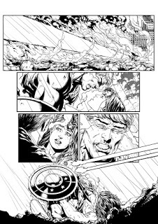
Massive art update! Here we go!
JUSTICE LEAGUE 50:
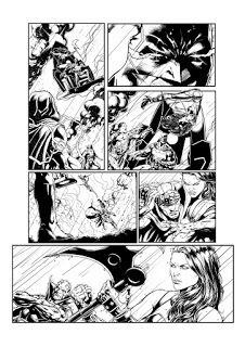
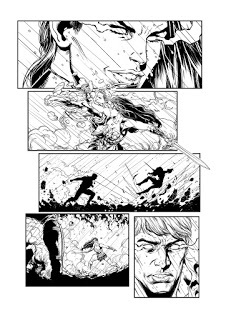
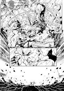
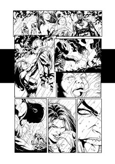
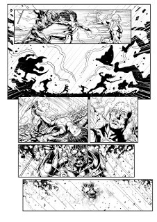
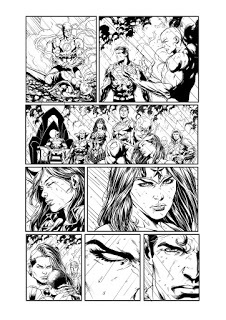
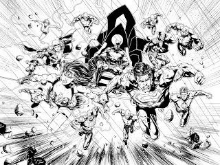
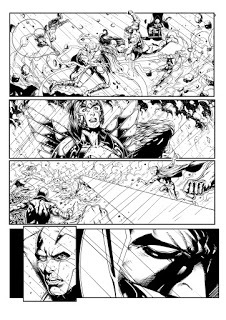
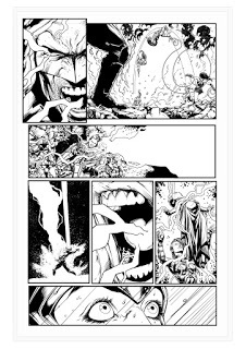
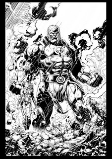
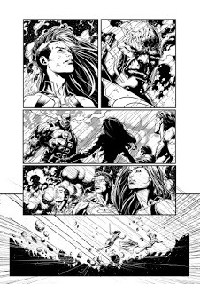
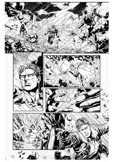
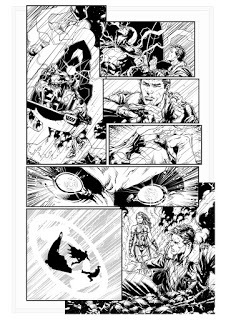
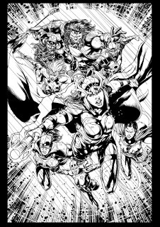
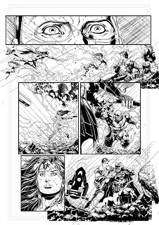
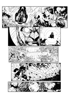
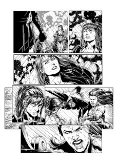
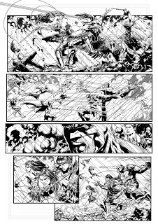
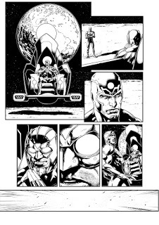
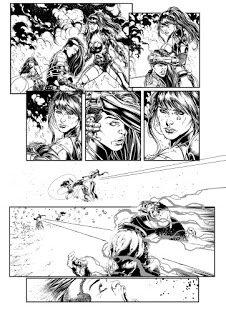
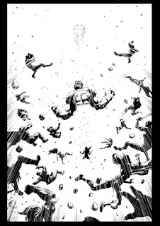
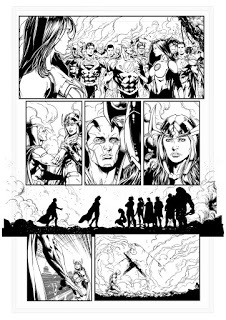
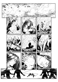
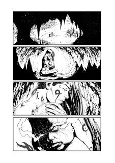
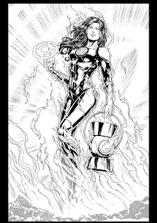
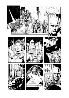
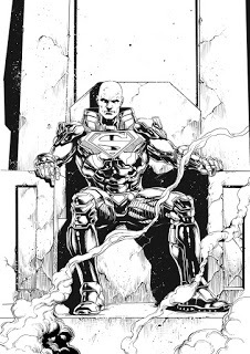
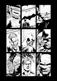
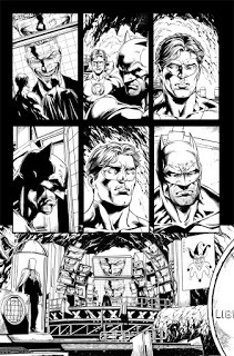
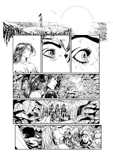
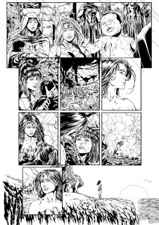
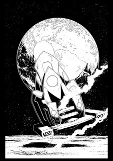
Justice League vs Suicide Squad #1
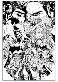
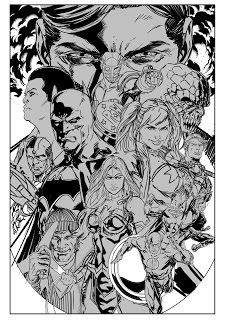
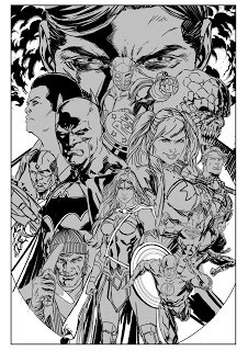
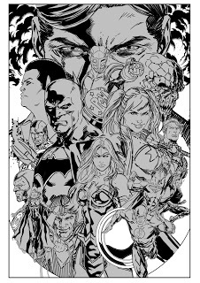
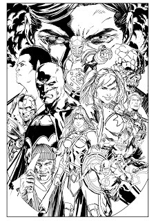 JL v SS#1 Cover layouts.
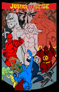
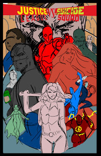
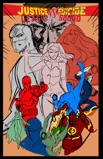
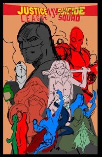 More Cover Layouts
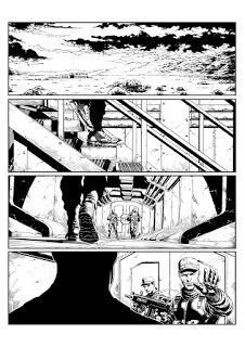
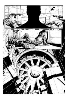
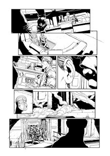
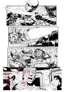
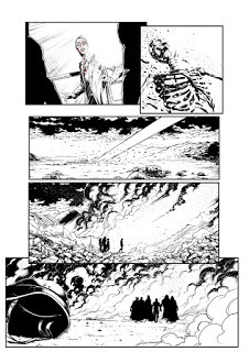
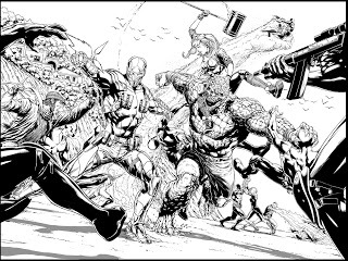
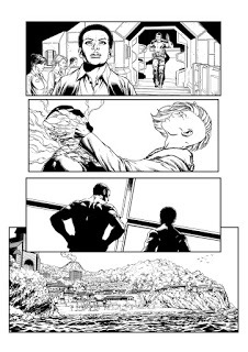
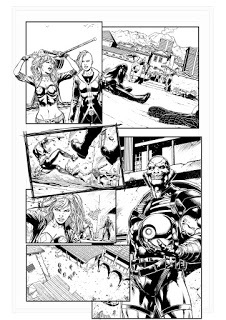
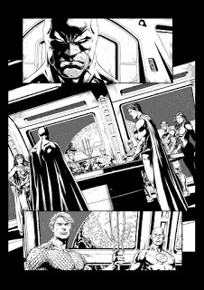
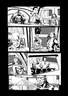
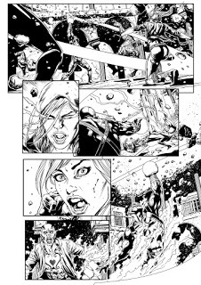
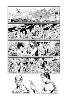
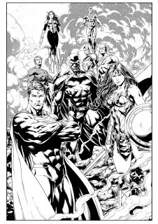
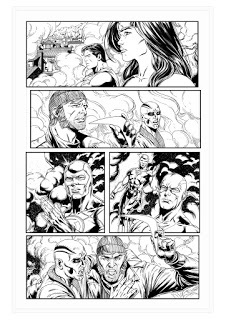
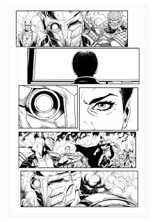
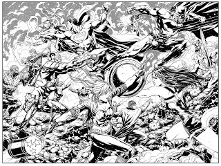
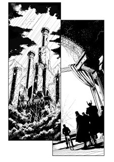
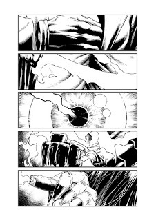
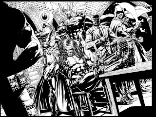
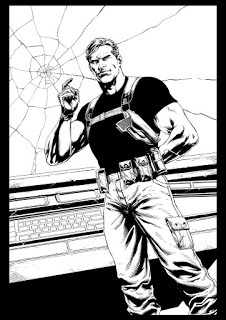
Covers and Other Stuff
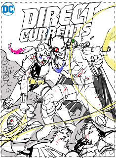 Layout by Jim Lee
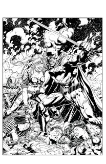
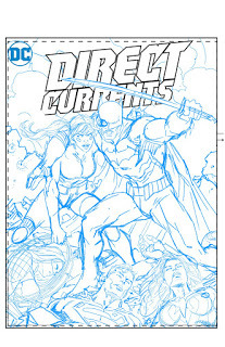
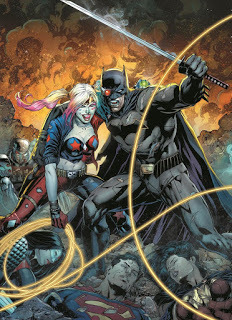
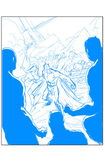
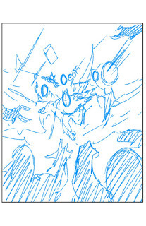
JL v SS Promo used on Previews Magazine. Colors by Peter Steigerwald
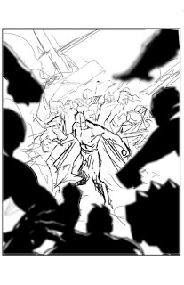
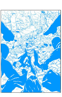
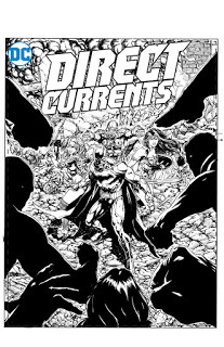
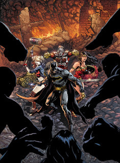
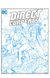
Justice League v Suicide Squad Direct Currents cover...which was never used... Colors by Brad Anderson
Deadshot backup story in Suicide Squad #1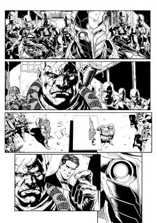
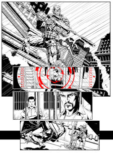
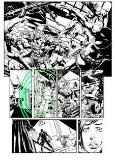
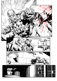
Suicide Squad #1 Cover
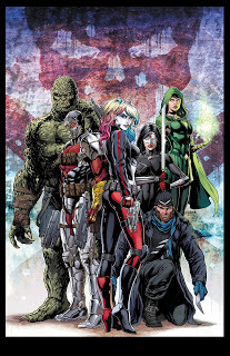
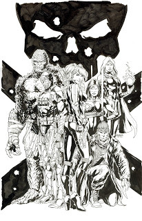
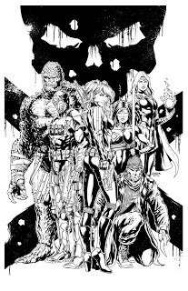
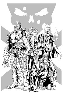
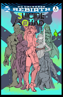
Colors by Peter Steigerwald
Harley Quinn #1 Cover
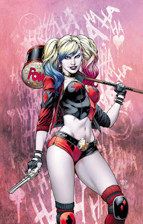
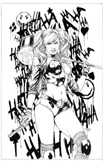
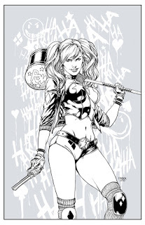
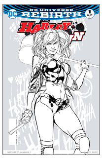
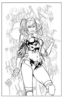 Colors by Peter Steigerwald
Detective Comics 943 Cover
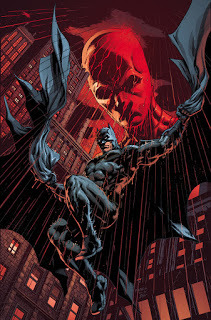 Colors by Brad Anderson
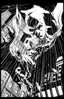
Detective Comics 947 Cover
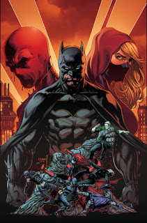
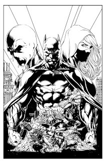
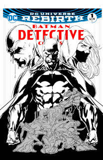
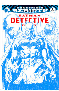
Wonder Woman Pieces for Fun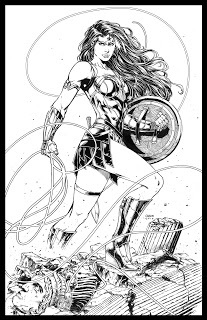
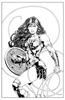
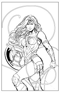
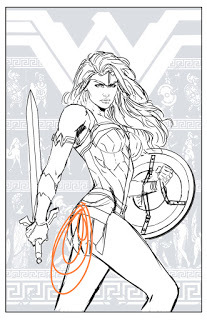 Print Layout that I never finished
Trinity #1 Cover
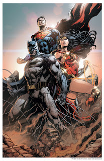 Colors by Brad Anderson
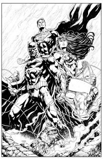
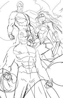
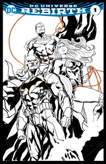
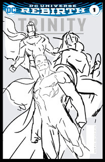
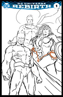
Batman Drawings
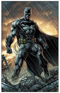
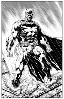
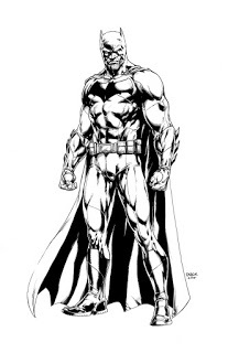
JUSTICE LEAGUE 50:


Justice League vs Suicide Squad #1


 JL v SS#1 Cover layouts.


 More Cover Layouts


Covers and Other Stuff
 Layout by Jim Lee


JL v SS Promo used on Previews Magazine. Colors by Peter Steigerwald


Justice League v Suicide Squad Direct Currents cover...which was never used... Colors by Brad Anderson
Deadshot backup story in Suicide Squad #1


Suicide Squad #1 Cover


Colors by Peter Steigerwald
Harley Quinn #1 Cover


 Colors by Peter Steigerwald
Detective Comics 943 Cover
 Colors by Brad Anderson
Detective Comics 947 Cover


Wonder Woman Pieces for Fun


 Print Layout that I never finished
Trinity #1 Cover
 Colors by Brad Anderson


Batman Drawings


Published on January 09, 2017 13:02
June 30, 2016
Justice League 48, 49 inks
Published on June 30, 2016 05:57
January 9, 2016
Justice League 47 and Interview with Bruce Collins
I recently was a guest on the Bruce Collins Show talking Comics, Career and my Christian Faith. I had a blast and the interview turned out well. Here is the link to the showhttp://fringeradionetwork.com/the-bruce-collins-show-1816-guest-jason-fabok/
Also, here are some inks for issue 47 that came out a few weeks ago. Enjoy!
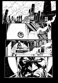
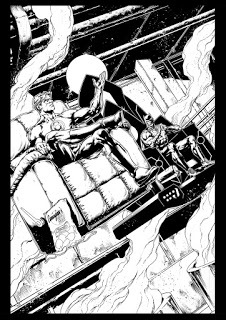
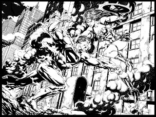
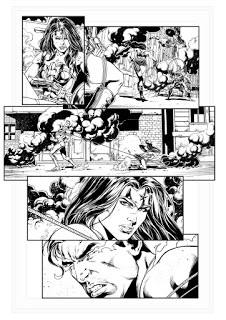
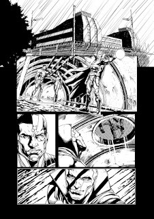
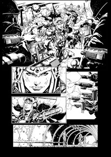
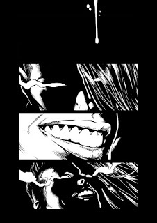
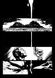
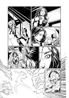
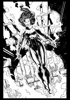
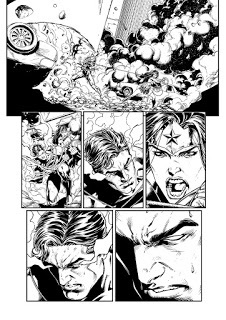
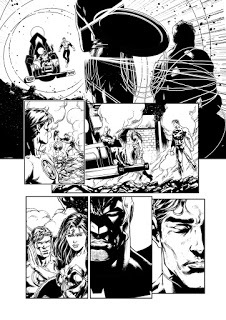
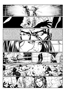
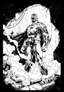
Also, here are some inks for issue 47 that came out a few weeks ago. Enjoy!


Published on January 09, 2016 07:17
December 19, 2015
(Spoilers) How Star Wars The Force Awakens Should Have Ended
I just came back from seeing Star Wars The Force Awakens. It was a blast. The new characters were great. The returning cast was magical. The first half of the film was spellbinding.
But the end of the film left me confused and a bit baffled.
This is an open letter to Mr Abrams, Kathleen Kennedy and Disney as to how the film should have ended.
SPOILERS AHEAD. IF YOU HAVEN'T SEEN THE FILM, TURN
I'll keep this quick because I respect your time. I also won't go on about what happened in the film because the creators and the audience now know after watching the film.
I really feel like the creators dropped the ball on an ending that could have opened up some really great twists and original ideas moving forward.
In the film, the last act sees our heroes storming the dreaded Starkiller base, which is essentially a third Death Star. As I watched the film, I was expecting a twist to the classic formula. Would the creators really do another Death Star run, making this 3 death stars the last 4 movies chronologically to be destroyed?
The answer was yes. And I was disappointed.
Here is my quick fix to HOW the force awakens should have ended, making this film unique from the others, in point form:
-the movie remains unchanged up until the part where they discuss how to stop the First Order from firing the planet destroying laser
- they move in, battling against the New Order army with fighting on the ground and in the air. The First Order is getting whipped, lots of casualties.
- Here's the twist: instead of blowing up the base, like they did in two of the last three films chronologically, we have a unique ending: THE RESISTANCE CAPTURES THE BASE.
- The First Order retreats to keep from losing everything, the resistance moves in and now we have a reversal in power: The resistance now has a Death Star
Think of the possibilities here. You can now play with the idea that Absolute power corrupts absolutely. What would the resistance do with a Death Star? We could have internal power struggles within the resistance as to how to use it. Will they use it to kill millions and restore peace? And at what cost?
You could now have a reversal in plot for the remainder of the trilogy. The First Order now launches an attack on the rebel Death Star. These moral themes could have been explored in future films and would have made The Force Awakens much more unique instead of a rehash of 2 other films
Sadly, not much can be done at this point.
In the end, I want to thank Mr Abrams for bringing back the magic of Star Wars. I simply wish more thought would have gone into a twist that we wouldn't have seen coming.
Published on December 19, 2015 08:20
December 12, 2015
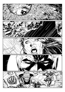
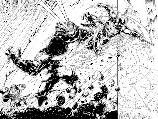
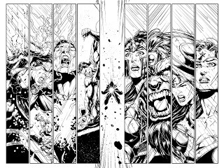
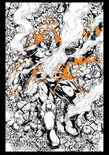
Justice League 44 Inks
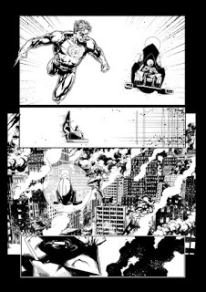
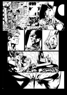
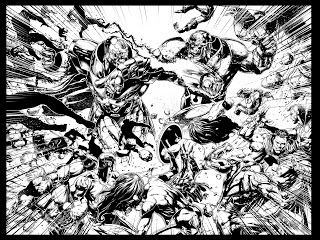
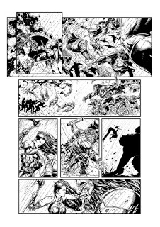
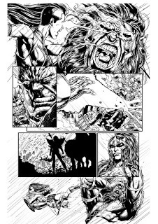
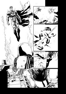
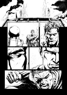
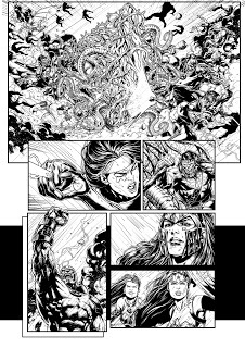
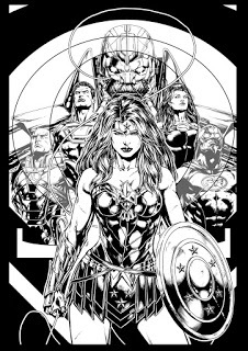
Sorry for the long delay in updates. Here are some inks from issue 44 of Justice League as well as some random covers and stuff Ive done.
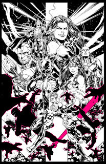
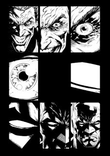
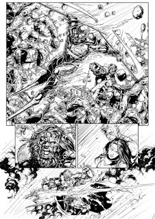
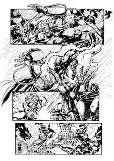
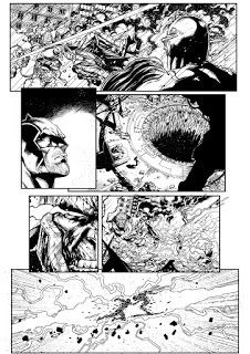
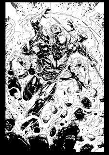


Published on December 12, 2015 12:36
September 2, 2015
Justice League 42 and 43 Inks
Published on September 02, 2015 08:30
Jason Fabok's Blog
- Jason Fabok's profile
- 31 followers
Jason Fabok isn't a Goodreads Author
(yet),
but they
do have a blog,
so here are some recent posts imported from
their feed.


