
Randy Krum's Blog
June 2, 2026
Cool Infographics on YouTube!
I’ve started a new Cool Infographics video series on YouTube. In each episode, my co-host Jarred Romley and I will discuss an infographics design and cover the pros and cons of the design, how to make it better, the design tools used, and finish with some Cool Picks each time.
The Good, the Bad and the Ugly!Over the course of my career I’ve learned that every design could be improved and teach us lessons. We’re going to review and critique some the the best and the worst infographics. Communicating with infographics requires a special set of skills, and we can learn a lot by looking at the designs, the tools they used, how they were published, and how audiences responded.
Cool Infographics Videos How you can help:Like and Subscribe on YouTube
YouTube algorithm depends on Subscribes, Likes, and Comments.
Share with your co-workers and friends
Each episode has a few easily shareable shorts. You can find them on YouTube Shorts, Facebook Reels or LinkedIn Videos. Help spread the word by liking and sharing the short clips.
Submit your ideas
Send us links to data visualizations and infographics you think we should discuss. You can add comments on the videos or reply to this email. I read them all.


March 17, 2026
The Authors of the Best Dataviz Books
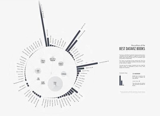
Evelina’s chart of The Authors of the Best Dataviz Books, combines the dataviz community’s published book authors to show which field everyone has come from. A good example of showing how diverse communities can utilize and benefit from data visualization. I made the chart under the Math, Stats, & Engineering section. Do you see other names you know?
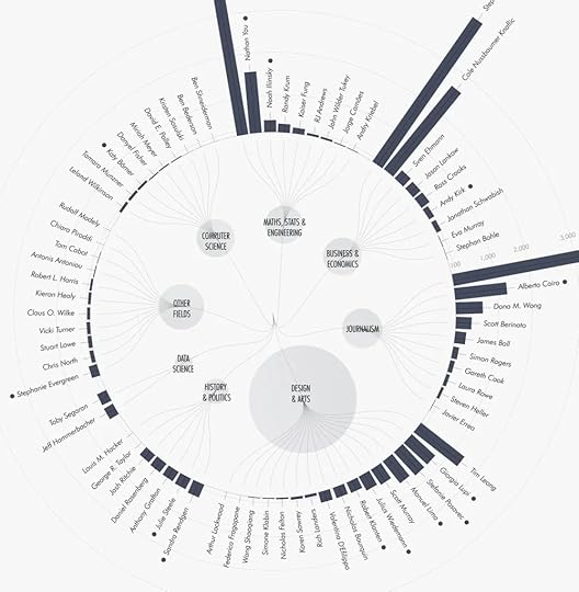
Since you're reading this newsletter, you likely work with data visualisation and storytelling. But how did you get here? What's your background?
Probably only a handful of you can say you have a formal education in data visualisation—maybe even a bachelor's or master's degree. Most of us have taken a more winding path of study and work experiences that brought us to where we are today. I worked with data analytics, public speaking, nonprofits, and event management, before all these experiences led me to data storytelling.
At the very beginning of my visualisation journey, I was curious about everyone else’s paths. So I created a chart (very meta, I know!) about the diverse fields that people in our community come from. While it’s somewhat biased—based on published book authors—it gives you an idea of how many different disciplines can lead to dataviz.
Found on The Plot by Evelina Parrou
December 12, 2025
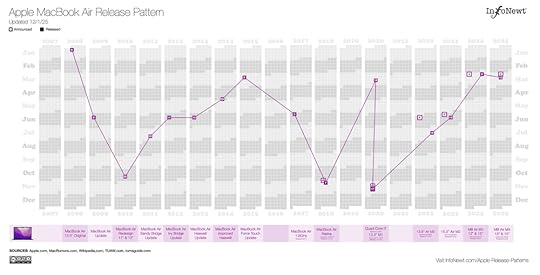
Apple Product Release Patterns (2025 Update)
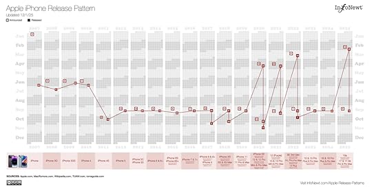
Apple traditionally doesn't release any products during December, so all of my Apple Release Patterns infographics are complete and up-to-date for 2025. You can see them all on the InfoNewt site, and that’s where I continue to maintain them and post updates as Apple releases new products and updates.
You can see that some products, like the iPhone, follow a fairly regular and predictable release schedule. Other products, like the MacBook Air, are much more unpredictable.
October 29, 2025
Scorigami: Visualize Every NFL Score Ever
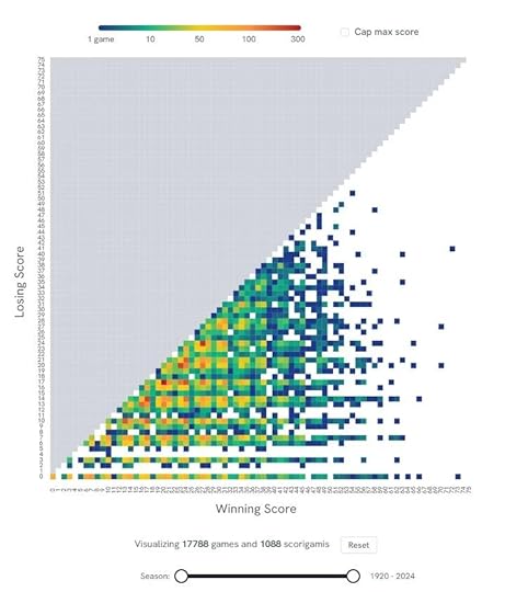
Scorigami: Visualize Every NFL Score Ever is a fun interactive infographic were you can see every final NFL score in history and how often each score occurs. PerThirtySix took the inspiration from Jon Bois coined term “scorigami” and is updated weekly.
You can view all team or use the controls to narrow down the visualization to just the teams and years you want to see. It’s fun to play with.
A scorigami is a final score that has never happened before in the history of the NFL. The term was coined by Jon Bois and narrated in a 2017 video called Every NFL Score Ever (highly recommended, Jon Bois is one of best storytellers out there!). Since then, scorigami has entered the football lexicon and has become a fun way to track the history of the NFL.
Found on PerThirtySix
October 14, 2025
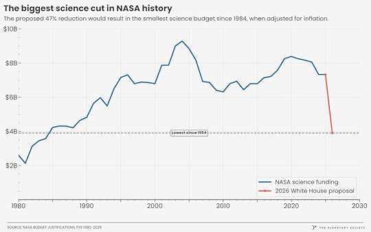
The State of the Space Program infographics
The Planetary Society has a great collection of infographics and data visualizations about NASA and the U.S. Space Program.
Founded in 1980 by Carl Sagan, Louis Friedman, and Bruce Murray, The Planetary Society is the world’s largest and most influential non-profit space organization. With a global community of more than 2 million space enthusiasts, they promote their mission to “Empower the world’s citizens to advance space science and exploration.”
October 6, 2025
Pirated DataViz Books Used to Train AI

For all of my fellow book authors, you can now positively determine if pirated copies of your book(s) were illegally used in the training of AI models. Use the search tool here: https://secure.anthropiccopyrightsettlement.com/lookup
Doing a quick check, I confirmed that the Cool Infographics book is included, as well as many of the other data visualization and infographics books that I have in my library. A quick check of many other popular dataviz authors confirms that pirated books by Alberto Cairo, Steve Wexler, Cole Nussbaumer Knaflic, Nathan Yau, Edward Tufte, Stephen Few, Garr Reynolds, Jonathan Schwabish, RJ Andrews, Manuel Lima, Andy Kirk, Noah Iliinsky, Scott Berinato, Ben Jones, Naomi Robbins, and David McCandless are all included in the training database.
The double-edged sword is that the inclusion of these books makes the AI models really good at giving advice about data visualizations, charts, and infographics. The models learned from the best. The downside is no compensation or credit is given to any of these authors who spent years of work building their knowledge and writing comprehensive books.
As part of the class action Anthropic Settlement from Bartz v. Anthropic in September 2025, an online searchable Works List of all books included in the lawsuit is now available. Authors can search the database to positively determine which of their book(s) were used to train the Anthropic models. Of course, not just dataviz books, but thousands of fiction and non-fiction books.
Historically, there hasn’t been an absolute list of pirated books used to train the major AI platforms. Allegedly, the BOOKS3 and LIBGEN databases online were lists of pirated books used by chatGPT, Meta and others to train their AI models. However, there was never any official confirmation by any of the AI companies about which specific pirated books they used.
This new development from the Anthropic settlement, is that they have made public a searchable database of the books covered under the lawsuit that were used in the training of their AI models. The lawsuit settlement forced them to be specific about which books were used. Although the search tool is convenient, it falls short of actually publishing the full list.
As an author, if you wish to be included in the settlement, you can file a claim on the settlement website: https://www.anthropiccopyrightsettlement.com
September 15, 2025
Planets Mean Temperatures

Planets Mean Temperatures made by Jonathan Chris uses a box and whisker plot to show the average surface or atmosphere temperature of a planet in Celsius or Fahrenheit. A cool way to use the normal layout of the solar system graphic, but with the twist that they are rearranged by mean temperatures instead.
Explore the mean temperatures of planets. The mean temperature of planets refers to the average surface or atmospheric temperature of a planet over a specific period of time. This measure provides a general indication of the thermal environment of the planet and is typically calculated by averaging temperature readings taken at various locations and times on the planet’s surface or atmosphere.
I love this simple visualization, and the use of the actual planet images on the chart instead of dots and text.
Found on Tableau Public Viz of the Day
August 21, 2025
Photography Cheat Sheet
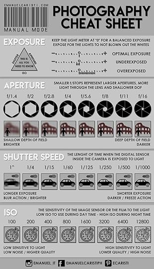
Emanuel Caristi starts his photography tutorial on shooting in manual mode, with a Photography Cheat Sheet.
Shooting in manual mode is nothing mystical or for which you should be afraid, especially if you are not under pressure and you have time to meditate on your settings. Learning these simple technical knowledge will give you the photography fundaments, necessary to be confident with your camera and to taking control of the action.
All you need to know to start to take well-exposed pictures is how Aperture, Shutter speed, and ISO affect your photos.
I really simplified certain concepts to make them easier to digest, my wish is you get the basic tools to be more active taking photos. If you have not a DSLR or Mirrorless, you can certainly use your smartphone, its camera surely can be used in manual mode.
The visual example of each setting is incredibly helpful.
See full post at emanuelcaristi.com
May 20, 2025
Power Tool Manufacturers and Who Really Owns Them-2024
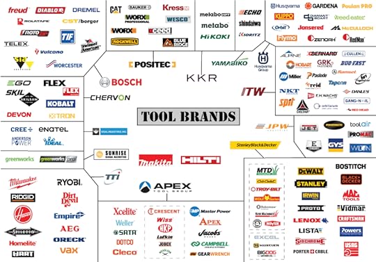
Power Tool Manufacturers and Who Really Owns Them-2024 infographic, provides a nice snapshot view of which companies own which tool brands (and it’s been changing rapidly in the last few years). You can read the full article on ProTool Reviews or watch Clint DeBoer’s YouTube video.
In a time when companies are gobbling up companies as fast as teenagers devour pizza, the landscape of business is rapidly changing, with mergers and acquisitions becoming the norm. It’s often hard to know who owns which tool brands anymore. Don’t worry, I’ve got you. If you’ve ever wondered who owns Craftsman Tools, Milwaukee Tool, Mac Tools, Skil, or any other major tool manufacturing brand, this article should answer most of your questions. It may surprise you to know that just a handful of power tool companies own your favorite tools. That’s right; most tool brands fall under a parent company that also owns additional power tool manufacturers and brands. I’ll break it all down for you. Prepare for lots of lists!
I appreciate that the infographic is a summary overview of a detailed article and video that walks through the highlights in detail.
Infographic from ProTool Reviews.
March 25, 2025
How Long Do Animals Live?
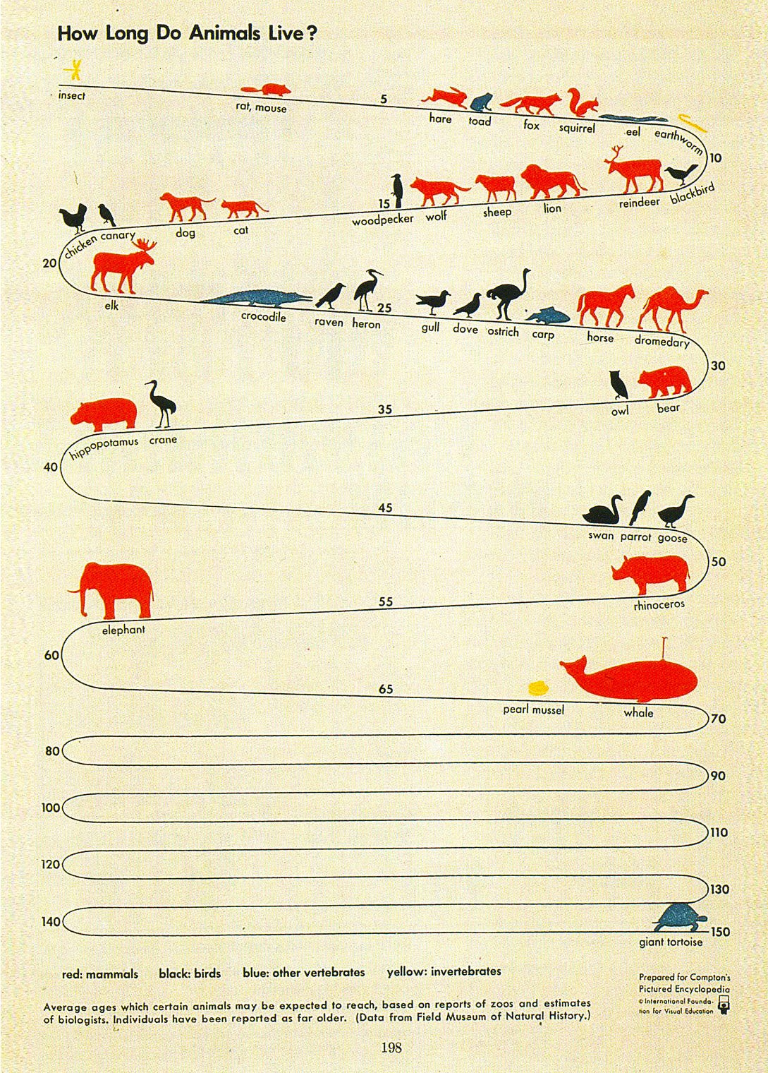
How Long Do Animals Live? is from Compton’s Pictured Encyclopedia from 1943a, depicting the life expectancy of mammals, birds, other vertebrates, and invertebrates. The zig zag style really helps to condense the long timeline into a condensed infographic.
I’m generally not a fan of winding timeline designs, but this one works for me. The visual metaphor of the animals walking down a path really works. From 1939!
Shared on RJ Andrew’s Substack

