Tim Gibson's Blog
October 2, 2014
Converting a Digital Comic to Print
I get two questions about comics all the time. One: ‘Who has better underwear – Captain America or Superman’ (Answer: Superman – dude’s got so much junk in his trunk his underpants need a belt) and Two: ‘How will Moth City work in Print.’
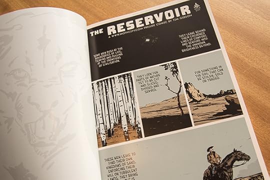
Well Faction editor Damon Keen gave you the opportunity to judge for yourself by asking me to convert my most digitally-digital mini-comic ‘The Reservoir’ so he could publish it in his fancy full-colour Kiwi comics anthology. Never one to miss an opportunity that involves large amounts of unpaid work, I leapt at it.
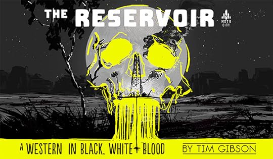
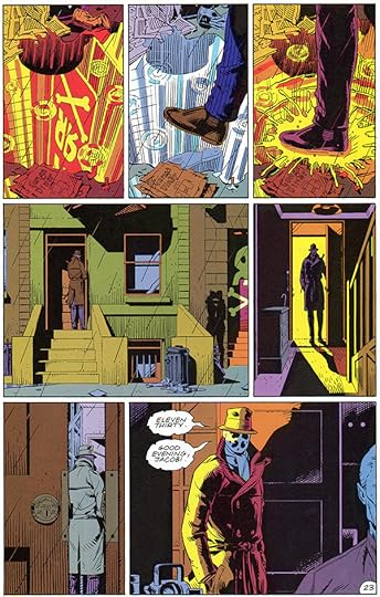
While the main ‘Moth City’ series is created print-ready with special digital features, it’s off-shoot ‘The Reservoir’ was intended as a purely digital experience, focusing on full-screen images in lieu of smaller panels and large bold type that even a low resolution black and white Kindle could handle. It was as far away from Dave Gibbon’s nine-panel structure in ‘Watchmen’ as you could get and still consider it a comic.
I tried a lot of things, and learned a lot, some technical, some story related. Below are six important things I learned from the process.
ONE: Damon owes me a beer.
TWO: Print resolution can be much higher than digital.
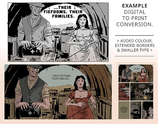
I had created ‘The Reservoir’ for HD screens with a max resolution of 1920 x 1080. I bumped this expectation way up for the main series, but I didn’t know any better then. A full-screen panel was around 2750 x 1570 which allowed for some pinch and zoom and a bit of future-proofing in regards to screen technology.
Using the print-specifications I got from Damon I couldn’t even stretch one of those panels across a single page, let alone do a double page spread.
THREE: It’s all about the bottom right corner.
With digital you can draw out a moment forever. Want more suspense? Add a screen of black with a little text or have a screen with art only. I found that if I wanted to end my printed pages on a certain moments I often had to cut or stretch the moments in-between. Some images just couldn’t make the cut, others had to be tweaked to have additional text.
FOUR: A grid will save your life.
Due to the challenge of hitting the right beats before the page turns, I went with the 3×3 panel grid that Gibbons did in ‘Watchmen’. It gave me sense of pacing that was still flexible, allowing me to absorb a whole row of 3 panels into one landscape panel, or break things down a piece at a time.
My “mini-comic” was stretching to 30 printed pages and I needed to control things better. Initially I experimented with free-form panels, thinking that I could gain something from the organic layout or contrast in panel sizes, and a combination of low-res source material (see TWO) and pacing (see THREE) made this impossible. Back to the grid, baby.
FIVE: Colour in print comics is more enveloping than it is in digital.
I work very hard on matching my colours to the tone of the scenes they appear in, even designing colour scripts that match the overall arc and genre-twists of Moth City. But there’s something about the framing device of digital that stops the reader from appreciating the pages to either side of the current one being viewed. Flicking through Faction, you can relive the whole arc of McCaw’s story in moments.
SIX: Call backs and clues in Digital comics are a pain in the ass.
“Wait, she’s lying, isn’t she?” “Was that a dialogue callback?” “Oh sh*t isn’t that the sailor’s pistol?” These types of questions drive readers insane with digital comics like Moth City. Checking on something is not the elegant flicking of tree flesh, but instead an injury inducing click-fest. Which is a shame, cause I looooove putting in call backs and clues in my drawings. Examples? I can’t be bother finding them in digital either.
Physical comics are fantastic at laying our clear comparisons. With their visual nature it is one of the things that separate it from film, and bring it closer to the form of the novel. I’d suggest it’s superior to the novel in this aspect. Print helps complex visual narratives stories shine.
SUMMARY:
All visual storytelling relies on the balance of reveals, breaking patterns and flow, so the digital to print transition was not as much work as I feared. ‘The Reservoir’ would be as hard as it gets, much harder than the main series. I’ve been lucky that with ‘Moth City’ I’ve always kept the traditional comic reader in mind; digital elements act only as a bonus element, action unfolds to the right – following the western reading pattern, and print page layout techniques are respected.
If you’re exploring the exciting space of digital comics and you see your work as bigger than a few tricks and gimmicks you might consider walking that line yourself.


September 2, 2014
Comics for Schools
As most of you will know, 2014 is 100 years after the commencement of World War I. New Zealand was a nation influenced by the vigour of the still burgeoning British Empire, the isolation of islanders and possibly even an inferiority complex of a small nation.
So it’s no surprise that 100 years ago the young men of New Zealand joined up in their droves to fight and die on foreign soil.
Kiwi’s my age have been blessed. We’ve avoided disruptions to our benign and peaceful lives. Which makes it easy to get cynical about War, whichever side of the fence you fall upon in heated debates over wine or whiskey.


Without dispute though, New Zealand has a particular place in WWI. We had one of the war’s highest per-captia casualty rates, extraordinary considering we we’re an invaded country in Europe, but instead an island on the other side of the earth with no borders or enemies. WWI wiped out how generations of men in some of our small towns.
With the inundation of centenary media happening this year it’s hard to find a new story from war times.
That’s why I was so happy to be offered a job drawing a short comic with a new perspective – the tunnerlers of New Zealand. These men slogged underneath the shells and wire of the battleground above, risking cave-ins, gas leaks and opposing sappers to undermine enemy fortifications. Mining men from small towns like Waiha or Reefton dug in the soil of Europe, scrawling New Zealand’s place names on the walls of their work.


The fact that the work would be published in a bona-fide New Zealand establishment, The School Journal, sealed the deal. Filled with facts, diagrams and drama I was addicted to them as a child. Then and now, The School Journal showcases the lost art of creative collaboration – editors, designers, writers and illustrators communicating stories of worth to our nation’s children.
I hope the School Journal continues to feature the work of kiwi comic artists or writers, as the publication has a strong tradition of combining words and pictures, surely the chief preoccupation of the New Zealand comic community.
I also got to try out some new inking brushes and colouring techniques – always a perk!


The included images are from ‘Sky-High’ The School Journal, Level 4, June 2014 and are published with permission from the Ministry of Education, Lift and Bolster. Editor: Susan Paris, Lettering and Design: Jodi Wicksteed, Writer: Robert Sullivan and Illustrator: Tim Gibson

February 27, 2014
A project to break your heart
Heck, it’s been a while.
I’ve been all-in on a great animation gig over the last few months which is why the blog posts have been happening with such irregularity. Awesome project though; I was bought on to provide illustration and animation skills and ended up with my head buried in research and writing voice over narration and animation scripts as well.
I probably can’t talk about the project for some months, but it’s a documentary that explores the lives of young Kiwi soldiers during WWI. It was such a crazy experience for those boys. And so many of them were boys, not just young, but literally teenagers who were so hopped up to enlist that they literally ran away from home and lied about their age to go.
It was a hard thing to research. The production company and I had to read a lot of harrowing letters home, and interviews with people who made it back. Some of it was heart-breaking.
For people of my generation it’s easy to dismiss the experiences of long-ago soldiers. We haven’t had to fight for anything. Sure, battles are fought everyday, murder is done and friends are lost, but me and mine are completely untouched. I think I would have gone on quite happily ignorant of the personal experiences of those young soldiers if I hadn’t *had* to do this research. I really had to bury myself in it, and some of the stuff they went through just destroyed you.
Hopefully we’ve captured some of that and presented it in a concise way that’ll get to people.
Storytelling is hard like that. All this stuff, all these emotions, all that research, and it needs to be funnelled though the creators (adding their personality, whether planned or not) to the audience. There’s so much to get across; the situation, the emotions and the characters. I’ve developed a few tricks for shorthand from producing Moth City, and especially the latest addition to the series – ‘The Reservoir’. Some parts of stories need to be sketched in to emphasise the parts that require more attention – not just from the creator but for the viewer.
In design terms it’s called a visual hierarchy. To emphasise one thing you often need to pull back on everything else. What is most important. One of the big frustrations that designers have with clients comes down to a fundamental misunderstanding of this concept. “Just make it bigger” is a common client-solution. It works, but it’s often followed up a day or so later with, “Now the logo looks too small, can you bump that up 200%” and shortly thereafter with “Marketing would like you to make more of the social media accounts, can you scaled them up to match the logo?”
The animation I’ve just finished (just-just) didn’t have any of those frustrations. I wanted to keep the focus on our young boys, not elaborate tactics, camera movements or vast vistas of stuff. The result is remarkably touching and effective (in my opinion, obviously). Thank god for good clients.
It’ll be a while till the show is released, but I’ll be sure to post up interesting tid-bits here when I can.

January 30, 2014
The Reservoir on Comixology
UPDATE: To celebrate Chinese New Year and thank you all your continued support, I convinced Comixology’s big wig to run a 50% off sale on all Moth City titles – meaning you can get any of the comics for just .99c or ALL SIX comics for less than $5. Crazy talk. It’s this weekend only, Saturday and Sunday, Eastern Standard Time.
Tell your friends and share the discount love!
—
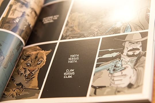
Something is special is coming out this Wednesday, something you don’t see very often in comics, a Western. Or as I have subtitled it, a Western in Black, White & Blood. Everybody’s favourite cowboy, Governor McCaw is in it, in his younger days.

The early reviews are already coming in, and they’re glowing. Here’s some pieces from Paradox Comics Group, Multiversity Comics and Robot 6. And if you wanna learn more about how it all came about Pipedream Comics asked me some pertinent questions via the electronic mail systems, which you can read here.
It’s coming on via Comixology in their stunning HD format, weighs in a more than 150 pages and is only $2.99

Because I was so clueless when Moth City first launched on Comixology I want to make a real impact with this one. And for that I need help – all the reviewers and media have jumped on board with great positivity and feedback, but now I need you fullas to get involved. If you can share the link on facebook, tweet about it or sneakily purchase it on your Grandfather’s iPad without him knowing I’d greatly appreciate it!

Thanks, and I’ll be updating this post with new news regarding the launch and any reviews and press that comes in!
Peace,
Tim


January 15, 2014
Bring on 2014
Well, we’re back for another year and if 2014 is near as good as 2013 it’s going to be epic. So much happened in 2013, I got so much support from you, my readers, and industry creators, reviewers and press and the fine people who run places like Thrillbent, Armageddon Expo and Comixology.
Humbling. A friend asked me to write a blurb for their comic today, which is weird. I mean, I know that 99.9 percent of people who see that blurb will be all ‘who the f*ck is Tim Gibson, and why does he misuse comas’ – but it’s still fun to be asked. I’ve also been given some truly awesome artwork from friends and fellow artists to go in the backs of Moth City’s digital issues – some of which you’ve seen, and some of which I’m saving for later issues. Beautiful work, beautiful people. Everybody helps out.
One of the coolest things actually happened while I was away on my New Zealand vacation (more about that soon). Comixology, who just announced they have sold over 6 Billion comic book pages included me in their Best of 2013 comics list.

I mean, look at those names that are surrounding me like dazzling gods. I feel a little like the cleaner who got invited to the fancy Oscar after party and amidst stolen glances at Jennifer Lawernce, is constantly frowning at that smudge on his (Too wide?? Too thin?) tie.
Ah, imposter syndrome, I know you well. Thank god Dylan Horrocks told me about that before I experienced it first-hand.
It’s ok though – I was able to calm my nerves with alcohol and sun shine. Because unlike those poor saps in North America, we had a lovely warm Christmas and New Year’s down this end of the world. Just for shits and giggles I’m posting some images from the South Island, where I spent most of my time.
I should warn you that my below description of my holiday does in no way reflect my day-to-day life of keyboard hunching, public transport and flat whites (look it up, it’s Kiwi’s gift to coffee).
I rode a bike. A lot, like for 40 Kilometres (look it up, it’s like Miles, but better) a day for four days. I drank Pinot Noir and ate cherries and looked at pretty hills. I hurt my knees. I mucked out horses. Two of them. Rural, eh? I tussled with one particular cranky one who has horsey diabetes (don’t look it up, just trust me), was on a strict diet and had to have his feet scrapped clean by an amateur like me. I planted fruit trees and dug holes. I got a blister.
It’s New Zealand, so I probably also got a low dose of skin cancer, but that’s ok, I can take it.


Bring on 2014.

December 11, 2013
Issue Six Review Round Up
UPDATE: I’m away for NZ summer holiday, so the next comic update will be happening on the Monday the 13th of January. Meantime, have a read of the lovely reviews below (new additions from Destroy the Cyborg and Screen Invasion just added) and enjoy your own vacations!
Moth City’s sixth issue has been out almost a week (buy it here), and it is already picking up some great feedback and reviews. As is my wont, I‘ll highlight my favourite quotes below and point you in the direction of those that worded them.
The industry quote inside #6 is the talented Ben Stenbeck, who does a lot of great work for Dark Horse comics, such as the Baltimore series written by Mike Mignola and Christopher Golden. He’s mad talented, and having have a beer with him after Chromacon, an all-together decent human being.
Destroy the Cyborg comes back for more with their review by Xander Riggs (*sweet* name, possibly a pen name?!)
”The Story: is one of power, selflessness, anger, oppression, freedom, and… everything. As many themes as it has, the series has a likewise number of genres. “
And in an attempt to take on Xander’s name, sometime in the past someone decided to name their man-child Arlo, who wrote a sweet review over at ScreenInvasion, wherein he said:
“What impresses me the most about the series, though, is how Gibson constantly finds new ways to implement the unique opportunities digital affords… There’s some exciting hand-to-hand combat, not to mention a hail of bullets, but the most effective things Gibson does with the in-panel “animation” are also the quietest. A queasy sequence featuring Governor McCaw at his very worst is the best example.
Next up a brief quote from a first time reviewer of MC – megasite Newsarama.
“Highly Recommend”
Now if that review seems powerfully succinct, but you like a bit more to chew on in your reviews, then you can read the same reviewer’s (the marvelously furry Rob McMonigal) more verbose review of the previous issue on his personal site, Panel Patter here.

Another new site, this time 13th Dimension brings Moth City into the fold via the penmanship and probing questions of Clay N Ferno. He asks the hard questions, world peace, trigonometry and whether I can fit any more genres in Moth City.
“genre spanning… instinctual approach to digital-native comics”
The only man in comics without a twitter account, Dan Pennacchia (who totally has a twitter account) gave MC 4/5 Stars and a healthy dose of ‘warm fuzzies’ over at All-Comic in his review. It’s worth a read, as he’s new to the series and while he obviously enjoyed it, issue 6 also goes somewhere pretty dark. He manages to thoroughly recommend it without coming off like a man who enjoys tearing the wings off moths, or condoning the actions Governor McCaw. Props.
“Masterful… It is unrelentingly fatalistic and as each conflict converges, readers will be desperate for a conclusion; though it is likely they will experience it through the cracks between their fingers – 4 STARS”
Top man Hugh Armitage dragged Digital Spy out of review retirement for his thoughts on Moth City 6, and even though he professes some flesh-eating apathy, he still reckons MC is
“one of the finest examples of digital storytelling”

One of the funnier reviews (of any comic) that I’ve read recently is by Jude Terror‘s over at The Outhouse. He takes the time to applaud the comic, while also acknowledging that I’m a persistent bugger. The flaw in his plan though, is that now I know The Outhouse likes my comic I’m going to pester them even more! Here’s what he had to say about the way MC pulls you in, panel by panel and genre by genre.
“without even realizing, you’ve not only accepted zombie kung fu as a plausible thing, you can’t wait for more of it… dark, gritty, and ugly (in a good way)”
The Girls Like Comics crew put Moth City under the lens and Alice Vernon decides it’s:
“Gloriously dramatic.”
Alice reviewed issue 5 a few weeks back and had a few qualms about my characters of the female variety. I did what you’ve never supposed to do and got in touch with her (I know, but bear with me, it’s going to be ok). I laid out some of my reasons for putting some characters in the situations that they were in, that they all had places to go, but that they needed to have a full arc to get there and to wait and see what happens. I then defended my right to be absolutely horrible to any of my characters and kill them off at a whim just so Alice wouldn’t know what was coming next – tee he he.

The Weekly Crisis steps back up to the plate and takes on MC6 via Nevin P. Jones. Issue 6 is definitely a low point for McCaw, and The Weekly Crisis isn’t shy about calling him out as a downright detestable human being. Just as an aside, I always hope that people detest McCaw as much as I do, but still grin at some of his off-colour humor. Anywho, go check out their review, they describe MC as
“A pulpy-political-sci-fi-horror-action comic that demands to be read and continues to surprise with each issue.”
Comics Bulletin and Daniel Elkin compare and contrast Moth City with its bizarreo-land comic cousin, ‘Xeno Trip’ in this Digital Ash review. They generously gave it a 4 Star review and delve into the savagery of the latest issue, asking if single-mindedness and obsession is what it takes to survive in Moth City. Like the rest of you, Daniel will have to wait and see, but in the meantime he says Moth City
“had me choking as it wrapped its fingers across my throat – 4 STARS”
The charming David Gillette put aside part of his blog to write up the latest issue, paying special attention to the story as a whole and the structure the story. A writer himself, it is interesting to see what David focuses on, summing up Moth City as
“an island-sized house of horrors.”

Long term supporters of MC and lovers of fine comics, Leo Johnson & Nerdspan put the latest issue under the microscope here. Presumably with a site called NerdSpan, that microscope is a large technical apparatus (much larger than your run-of-the-mill microscope) that uses Steve Urkel’s coke bottle lens in-place of lameo magnifying lenses. I always look forward to their reviews, because Leo and Nerdspan have watched the story evolve and shift direction without the expectation that comes from arriving late to the party, saying Moth City has
“a story that’s changed dramatically since the first page”
And lastly a special shout out goes to my mates at the Paperkeg Podcast #129, whose least favourite member, Jonsey looked to the sky and summed up the series as
“This amazing genre bending thriller reaches a fever pitch of Kung Fu. Please understand that this comic gets my highest possible recommendation for a guided view book”
#jonseylovesbeersealofapproval
If you don’t listen to these guys you should start; three likable dudes talking about comics they like. I like them, you might too. #timalsolovesbeersealofapproval

November 24, 2013
Issue 6 is out next week
Just a quick update to let y’all know that issue 6 of Moth City will be out next week (Wednesday the 4th of December) over at Comixology and on our own store. If you’re a Comixology reader now would be a great time to either catch up, or review the issues you’re already read over at the Moth City series page.
And just because I hate doing blog posts without images here’s a little process image from a panel that became the cover of issue six.


And if you’re looking for a more substantial Tim-post, you can check out my Thrillbent guest post from last week, or me and Mark Waid blabbing about Moth City over at Newsarama.

November 15, 2013
Guest Post Over on Thrillbent
Something special for this week’s blog post, a good ol’ fashioned switcharoo. This week it’s all happening at Thrillbent, and here it is: Digital – the Time is Now by yours truly.
I express my love of books, my distaste of trees and discus the Marketing 101 mistakes I’ve made with Moth City, you’d like it. Click the link above, yo.
Also (holy $h!t) I’m on Newsarama talking about MC and Thrillbent with Mr Waid, which you can read here> WETA Alum’s MOTH CITY Mixes Game of Thrones with Chinatown & Kung Fu.
That’ll be all for this week, don’t forget that MC Season 2 is starting on Thrillbent, so if you’re into what they’re doing, make sure you check it out, and some picks of the bunch from last week.

November 8, 2013
Thrillbent, Baby!
I’ve always loved me some Thrilbent.
Great writers, amazing artwork and design, and a dedication to trying something new with the classic medium of comics. So I’m super excited to tell you that Moth City is back on the weekly schedule, every Friday (US) starting next week with Season 2.
Mr Mark Waid just made the announcement on the TB blog, Moth City and Thrillbent’s Commitment To Free, and in case the title was too subtle, there is a limited time free download offer going on. All of Season 1, all high resolution, all free.
I’m going to be writing a blog at TB next Friday, which I hope you’ll check out. It might be the first time you’ll see weird British spelling there. I might even drop some odd Kiwi colloquialisms. Ghost accent, bro. In honor of this auspicious occasion, and due to my new found technical abilities I’m sharing the first installments of three of my favourite TB comics here, using their fancy embed feature.
Numero one is a great example of TB-style horror, a great use of the medium and a perfect balance of mystery and upfront terror. I love this comic, you should too:
The Eighth Seal, Chapter 1
Team: James Tynion IV, Jeremy Rock, Nolan Woodard, Troy Peteri
(just click on the image, or use the arrows to go forward and if you like what you see click on the TB logo bottom right to read in higher res)
Up next is a fresh offering from the Waid, Woodard, Peteri team, but with talented brush of Dennis Culver stepping in on Artwork. Super pro, grabs you from that first panel and moves through a quirky, complete story-of-the-week style story that is timeless:
In the Pi of the Beholder
Team: Mark Waid, Dennis Culver, Nolan Woodard, Troy Peteri
And now for the kind of fun that we remember from childhood cartoon favourites, another fresh series, Mini Comics Included, which really knows how to through down the gauntlet and challenge those ‘dark and gritty’ stories that we’re all become obsessed with. I mean, just look at that title:
Mini Comics Included – Literary Commandos
Team: Steve Seeley, Michael Moreci, Paul Tucker

October 30, 2013
Crime Comic ‘Sin Titulo’ Review
This review will be divided into a general and a signposted Spoilers section. It is written from the perspective of a writer/artist (me, I do a comic called Moth City, not a pro reviewer.
Sin Titulo (ST) is a rollicking crime adventure that grabs you by the lapels before taking your off-road into a mysterious world of memory, imagination and obsession. While for me it doesn’t hit every note, it takes risks that a lot of graphic novels or webcomics don’t and dares to be more than your standard, while also being crafted beautifully and carefully.
As an artist I can learn from the simplified and concise cartooning. As a writer, from the relentless momentum and drive of the first two acts of the story. As a reader things get a little more esoteric and undefined, but in a world of bow tied finales, that’s not necessarily a bad thing.
“But a word of warning…”
But a word of warning: if you need to understand everything in a story once it’s reached its conclusion you’ll hate ST.
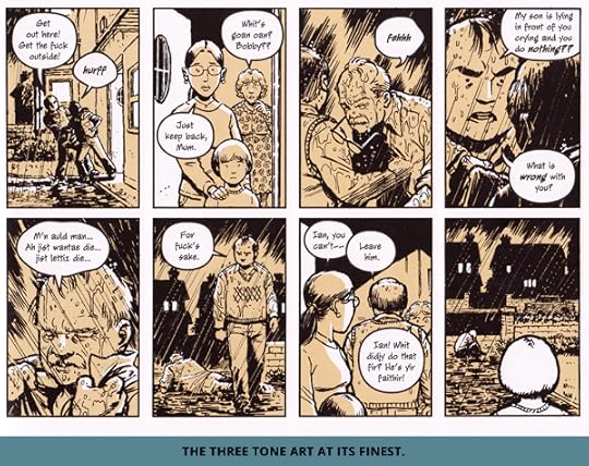
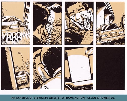
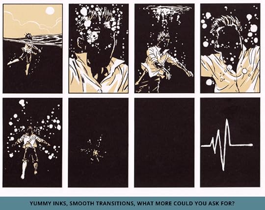
The long gestation period of Cameron Stewart’s creator owned book is reflected in shifts of line quality and small art changes, but you’ve got to respect the approach. A three toned process, presumably all-digital, consistent page layouts and complete control of the reader’s focus tie the work into a unified whole despite the long adolescence of the work. The blacks are used powerfully, boldly creating shapes and frames within frames, giving us enough variation to keep the otherwise generic page layout alive.
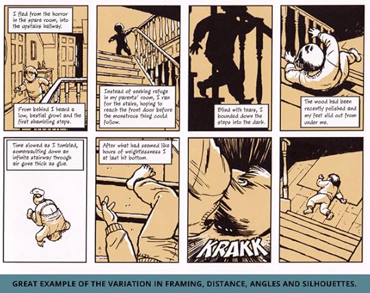
It’s a beautiful book, somewhere between the art of Dylan Horrocks and David Mazzucchelli. They’re cartoons, but with a fluid and organic placement of camera and use of angles that turn pared back brush work into a real world.
Where the long gestation and write-as-you-go approach might also be telling is the writing, both positive and negative. Every single page, uploaded weekly when ST existed as a webcomic, is a lesson in pacing and control. Each page gives you something, each page moves you forward and almost every page leaves you with a question or a need to see just a little more. Stewart’s combination of low-frequency mystery and high-frequency action and movement really keep the story ticking over.
“…a lesson in pacing and control.”
The writer/artist in me sees a correlation in how I approach my own work. When you’re the one drawing the work, investing in the page’s creation you don’t want to waste anything. If nothings happening then Stewart doesn’t draw. One would assume that the weekly update schedule, and the expectancy that comes with it, helped keep him honest, as well.
It’s a story with loose ends and unfinished threads, and that’s cool. There might be a few more than is ideal due to this same week-by-week approach. I can’t help but feel like the last third, while enlightening from a thematic perspective, was a little panicked from a plot approach. The drama is still there, as well as a powerful psychical confrontation that reminds us how good a straight mano-o-mano fight can be in comics.
“… a powerful psychical confrontation that reminds us how good a straight mano-o-mano fight can be…”
Sin Titulo is beautifully put-together look at a man lost between apathy and obsession. A man who must confront his own self-worth and his regrets to gain a second chance. It benefits greatly from an art-approach to storytelling, from pulling characters from the same subtle design mould, to call backs to certain angles or certain images.
It’s not a perfect book, and it leaves a lot to the imagination, which is just what we need sometimes. Highly recommended.
You can get a lovely hard cover, published by Dark Horse at your LCBS like I did, or via Amazon.
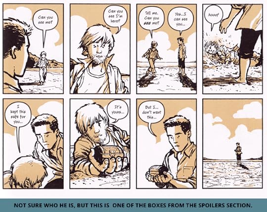
>> SPOILERS AND POSSIBLE READINGS OF SIN TITULO. <<
I believe that Stewart is exploring obsession, creation, and violence. The story sneaks the violence up on you. It doesn’t seem like that style of book, but as it draws you in the actions of Alex and Wesley (the hospital orderly) take darker and darker turns. A single mysterious photo and a blonde lead, page by page, to the final confrontation on the beach. All because, despite the warnings and the negative consequences, Alex cannot turn aside from the mystery. He risks everything to find the answer, or the ‘story,’ as he says.
“The constant recreation of the tree motif borders on the insane…”
This level of obsession is reflected both by the original creator of the Sin Titulo painting, Stanislav Vacek, and his eventual seeding of the alternative world, and the constant repetition of John’s work. The constant recreation of the tree motif borders on the insane, as John attempts to refine the work into reality, perhaps an unknowing attempt to truly reach his comatose wife, D.
The idea of the artist, and perhaps the presumed obsessiveness that goes with it, ties young-Alex (with the crayons), Stanislav, Ladislav and John together, literally men who can make reality out of nothing.
Amongst the summary of Plato’s Theory of Forms (“Consider a bed”) that semi-explains the beach’s existence is another potential clue into the differences between the worlds: the approach of the characters. The Alex from the beginning of the story, is a copier and a pawn who works not as a writer, but a fact-checker, vs. his place at the conclusion as the creator of his own new reality.
“… a copier and a pawn who works not as a writer, but a fact-checker…”
Perhaps the counter point to this are the combo of Alex’s father and Wesley, who bare more than a passing resemblance to each other. Both are men of destruction rather than creation.
Another aspect to the story might be free will, or breaking obsessions and patterns to find a happier life. Alex is a man worn down by disappointing others. Lovers, family, teachers and workmates, he never lives up his potential, literally copying other people’s stories in an attempt to please them. When he is given John’s box containing a gun it furthers the predicable path, one that leads nowhere but to more violence, more despair. When he retrieves and opens his own box from the sand he finds it empty, perhaps a symbol of his freedom, his lack of constraints. His life can truly be ‘what he makes it.’
“Alex is a man worn down by disappointing others.”
Presumably this is tied to the story’s mysterious conclusion. Alex is back in the real world, but either the time has shifted backwards, or something else has changed. The cops are still alive, he doesn’t have a warrant out for his arrest and he (probably) hasn’t meet or tangled with Wesley. John is presumably still alive, and may now a graffiti artist.
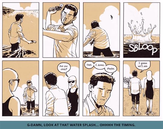
So who does he call in the last page? I imagine there’s some debate about this. I wouldn’t be surprised if Stewart isn’t firm on it either. I don’t believe it’s his girlfriend, because as she vision-sates, he ‘never really loved her’. It could be his former lover from France, or even his resurrected Grandfather. I’m not sure who he is calling is as important as the action itself.
Regardless, the book ends with Alex taking more control of his life, an effective clean slate and possibly more self-awareness and control. He is no longer copying the stories or paths of others, but is creating his own. If only we all got that second chance.
“I still loved it.”
Are there plot holes and unexplained coincidences and alliances? Sure, but I still loved it.