Simon Howe's Blog
January 14, 2026
A Picture Book About Going Home
I have a new picture book coming out called Going Home. It’s a simple story about a mouse father and child who spend a quiet day wandering and chatting. Along the way, they ruminate on the idea that everything is, in one way or another, on its way home. At first they’re talking about beetles and bees. But the idea becomes more abstract and soon it’s balloons, sticks and lost scarves that are also going home.
I set out to write about a young child’s comprehension of home as a predictable and inevitable return to safety, familiarity and comfort, and the wholesomeness and hopefulness of wishing that for everyone and everything. But there’s another subject in the story that springs quietly from a single illustration towards the end of the book. I intended this addition to be subtle. Present, but not prominent. And yet, as the book began to be marketed and reviewed, I was surprised to see this particular layer of the story given more attention than I expected.
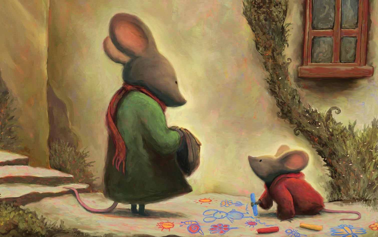 We’re going out, says Dad.
I wrote the story after a real day I spent with my daughter when she was about two years old. We were walking and talking and I commented on a car, suggesting it was going home. We then pointed out other things that might be going home, and she began to apply the idea to increasingly abstract things. What started with vehicles and bugs soon included clouds, raindrops and sticks floating in a creek. She decided that everything was on its way home. The game lasted the afternoon, but I was still thinking about it days later. In her experience of the world, wherever she was going, she always ended up safe at home. Why wouldn’t she conceive of home as the endpoint of all things? It was a sweet and cosy line of thought - just right for a picture book.
When I was drafting the images, I saw an opportunity to add something else to the emotion of the story. Towards the end of the book, the child-mouse reflects that “it’s good to know where things are going… and where other things have gone”. Accompanying the second part of that sentence are two images. The first is a picture of the child-mouse staring at an empty ice-cream cone, with the remnants of said ice-cream all over her face and coat. It’s a funny image and one of my favourite moments. The second image shows the two mice sitting together and looking at a photograph. There are three mice in the photo. Two of them are presumably the father and child. The implication of this illustration is that there is someone special who has gone.
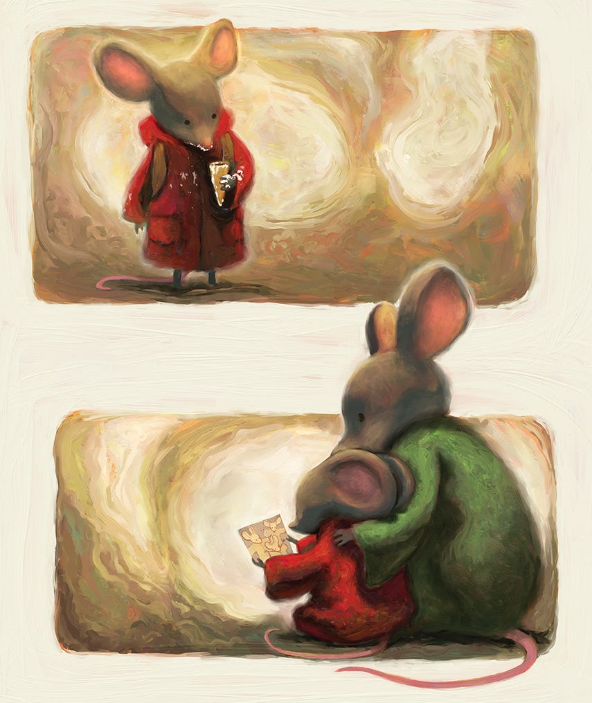 It’s good to know where things are going… and where other things have gone.
Nothing further is explained or implied about this third person. But if you pause here, the emotional scope of the book shifts. The father and child supposedly conceive of this absence as the person having gone home. And suddenly a book about a silly and meandering game of a conversation asks us to consider grief, impermanence, and even spirituality. If home is at the end of all things, then home and loss become linked. Home and death become linked.
I didn’t intend this line of thinking to be particularly noticeable. But my publishers noticed. On the back cover of the Australian edition, the book is described as “a beautiful and quietly meaningful tale of life, loss and love.” A blurb from the US publisher says that the book’s “open-ended questions might invite a broader exploration of loss and other universal themes.” And a recent book review on Instagram described the characters as exploring “questions of life and loss.” This reaction left me wondering if people were exaggerating the subtle implications of a single illustration. Worse still, were they misreading the book, and missing what I really wanted to talk about?
It recently occurred to me that it might actually be the other way around. What if I’ve misread my own writing? Looking at it now, it’s obvious that feelings about loss are scattered through the whole book, not just one illustration at the back. It’s called Going Home, but it’s also about things going away. It’s about the passing of time and things disappearing and how we make sense of that. How do we deal with things that we have and then don’t have? The answer these characters come up with is home - a destination that gathers and ties together the scattered pieces of a day. They suggest that things don’t go away behind us. They’re not lost in the past. They go home ahead of us, in the same direction we’re going. Because we’re going home too.
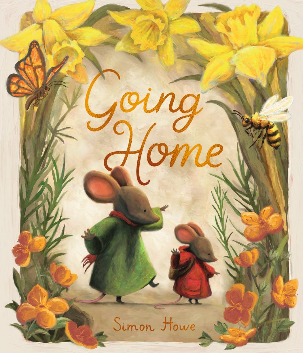 The cover for the Australian and New Zealand edition of Going Home.
Going Home is available in bookshops in Australia and New Zealand from February 1st. This will be followed by foreign editions in the United States (under the title, Going Home With Dad), Italy, France, Moldova and Denmark.


June 30, 2025
Reading Books With Children
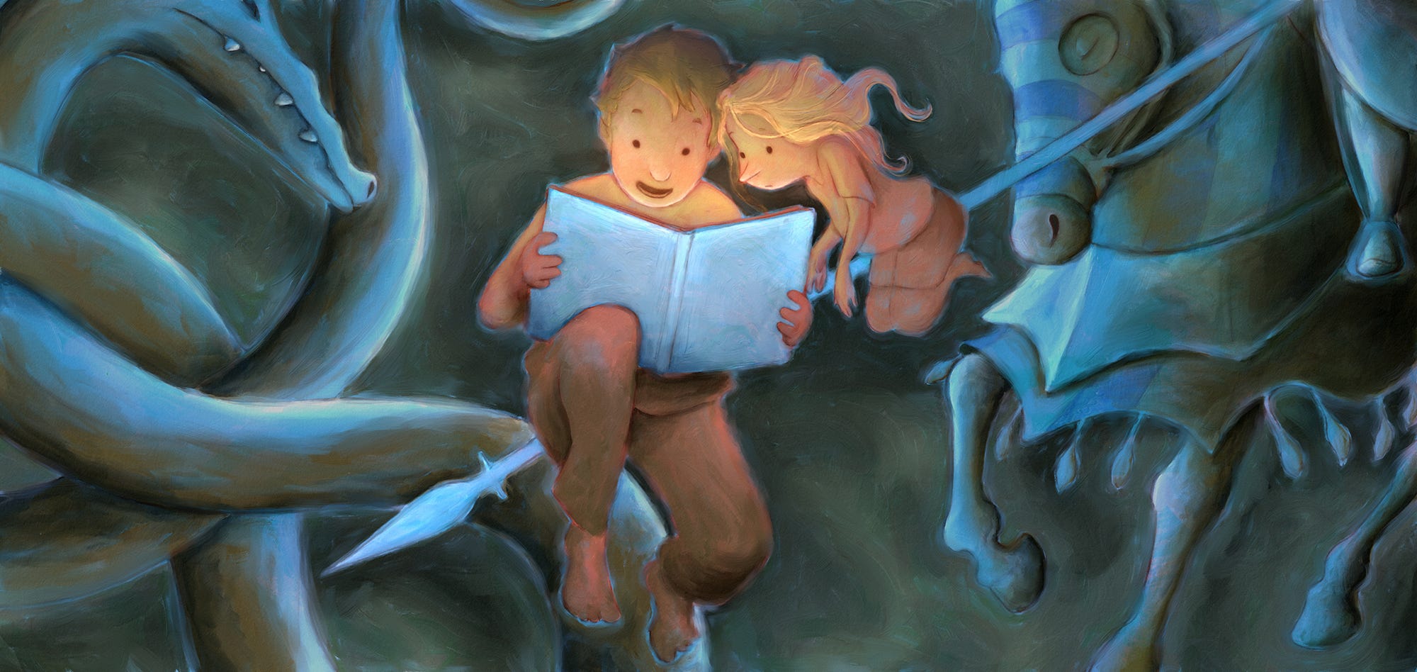
I don’t think I really understood the importance of children's books until I started reading them out loud to children. What I realised is that the words and the pictures are only two points of a triad. The third point is the ritual of reading; how the experience is delivered and received between a voice and a pair of percipient and eager ears. So much can happen in those moments that an author, illustrator or publisher can’t touch. It’s those moments when the whole endeavour comes together.
A book built to be read out loud has both a permanence and transience about it. It lives on a shelf as an object. It is not a screen conjuring many things; it is one, unchanging thing. Each reading is the same and each reading is entirely different. A different mood, parent, energy or spot to sit. A young child might read or peruse the pictures by themselves, but more often another is invited into the experience. It’s something to be shared. It has the peace of a painting, the sequentiality of cinema, the impermanence of a play and the reciprocity of religious communion. It’s a connection point between two or more persons participating in a story; both on the page and in the moment. I can’t think of another art form that does all this so well.
I recently watched a talk by artist and public speaker, Jonathan Pageau, on what he believes is missing in our contemporary experience of art. As an example of art at its best, he describes the observation already rattling in my head. He says:
You sit in bed, you open the book, and the parent reads the story to the child. They are engaging in a relationship. They are not just treating this as a moment of performer and public… It is a true moment of affection and mutuality that is being experienced. It's a little liturgical experience to read a story to a child.
Pageau shares a vision for the renewal of Orthodox Christian art, but I think his ideas about art and culture are relevant to anyone interested in a more meaningful creative world. His observation on children’s books sits within his broader vision for art. He talks about our ingrained idea of art as rebellion, subversion and even revolution, and contrasts this with a classical, ancient idea of art understood mostly as a means of celebration; as participation in a memory of who we are. He champions art that doesn’t challenge or attack but remembers and reminds. He wants an art culture that abandons cynicism for elevation and enlightenment.
I love this thinking. What he’s talking about is the very thing that excites me about making books. It’s an opportunity to reach beyond entertainment and distraction and immerse ourselves in the delight of uniting humans through stories that remember and ratify family, purpose, goodness and home.
It’s an aspiration that enlivens me not only as an artist, but as a reader and a father too. “Dad, read me a story”, might be my favourite thing to hear. Ask me again, I think to myself. And she does. And I do.
It’s those moments when the whole endeavour comes together.
August 28, 2023
An Admiration of Fine Books
Some way through last year, I saw an announcement that The Folio Society were releasing a limited edition boxed set of Mervyn Peake’s Gormenghast Trilogy, illustrated by Dave McKean and introduced by Neil Gaiman. I’ve loved these stories since I was a teenager, and it’s hard to explain my reaction without sounding a bit silly. They’re just books. Just paper, thread, ink and glue. And yet my heart rages to know that these delicious objects were conceived, desired, championed, expertly crafted and sent out into the world. With a limited number of 750 sets, it was priced at A$1,650. Too much for me. But I don’t mind not owning them. It excites me just to know that there exists both the will to make such books, and the market to buy them. McKean’s contribution is stunning, and the binding is extraordinary. They deserve to be expensive. They make me think a lot about the best a book can be; the best the object of a book can be.
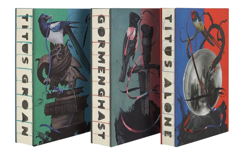 The Folio Society’s exquisite 2022 editions of Mervyn Peake’s Gormenghast books.
The books were printed in Italy with an open-spine binding, Setalux cloth covers, 142 new colour illustrations, and presented in a hand-made, cloth-covered, foil stamped and screen printed presentation case. Like most of The Folio Society’s work, I think they look spectacular. But there are other publisher’s taking the pursuit of fine bookmaking to even greater heights. Lyra’s Books, also in England, not only hand binds their books, but prints them with traditional letterpress. Like Folio, they produce both new editions of public domain works, as well as very fine editions of modern titles. As of this writing, they are preparing to release three editions of Neil Gaiman’s Coraline. The most expensive of these is the Lettered Edition, which is letterpress printed in black and red ink, with new illustrations by Rovina Cai, on 160gsm mould made paper, bound in hand marbled goatskin, and presented in a black leather solander box, lined with grey suede. It also comes with a cloth quarter-bound portfolio, containing a selection of colour prints from the book. The print run is only 26 copies, and they cost a hefty £2,500 (about A$4,896). Of course, they’ve all sold out.
 The Lettered Edition of Coraline, beautifully made by Lyra’s Books.
I’m describing products for serious collectors, but what interests me most is the craft of bookmaking, how good it can be, and how it can connect to the crafts of writing and picture making. I want to make my own books. Not because I don’t like traditional trade publishing - I do. But as an artist, it just makes sense to pursue the making of the book as part of the process. Art is a cultural act. The industrial manufacture of physical books is a commercial act. These two aspects of book publishing are linked and can work together so well. But they’re also distinct and often in conflict. Making a book by hand extends the cultural act through to the finished product. So much of art is admiration. Writing books is an admiration of the world. Binding books carefully is an admiration of the writing. It’s the making of an object that is both a house for the idea, and an extension of the idea itself.
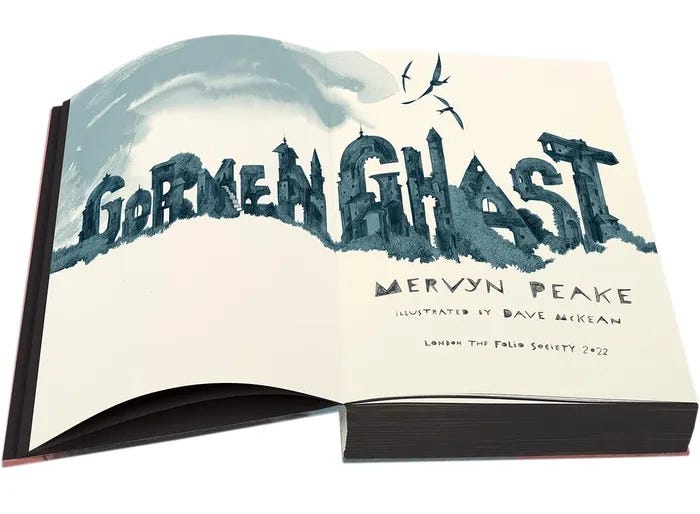 Dave McKean’s type design for the title page of Gormenghast. I swoon.
It’s worth noting that neither Folio or Lyra are selling new books; they’re selling existing works that are widely beloved. They could never sell such extravagant editions without the prior mass distribution of cheaper copies that readers have accessed at low prices and fallen in love with. This is why my praise of handmade books is not a denigration of the trade book industry. They work together. Writers need their work discoverable and accessible, and working with a trade publisher is a great way to do that. But they can also backup that accessibility with artisan objects infused with the same love and care that saturates the content inside. If someone grows a strong enough connection to the content of your writing, and they have the means, they will seek out ways to participate in that content in a devotional way. Don’t leave them wanting. And don’t miss out on such a rewarding step in the bookmaking process. If you’re currently negotiating a publishing contract, see if you can keep the rights to a deluxe edition. It’s an opportunity worth keeping up your sleeve.
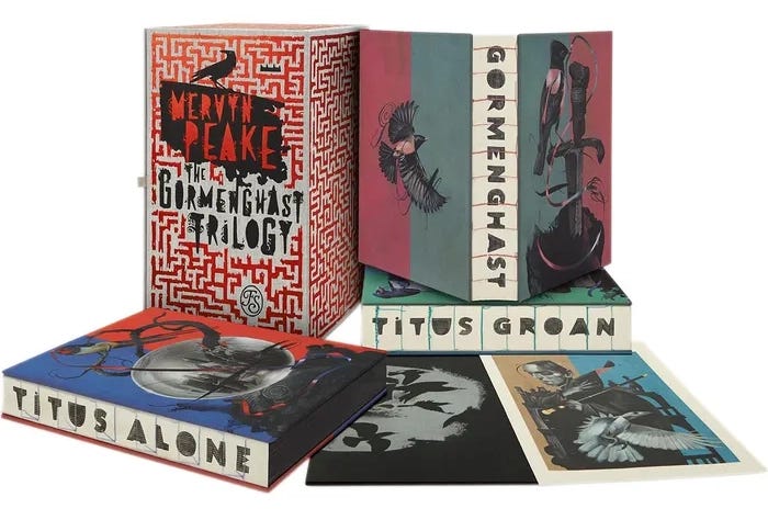 The Gormenghast set showing the three books with the presentation case and a separate print, presented in a black folder printed in silver.
 These beautiful Gormenghast books from The Folio Society are such a fine admiration of Mervyn Peake’s work, and a demonstration that art, craft, effort, expertise and tradition are important, meaningful, valuable and desired. They make us think about the best a book can be. We like beautiful things. We like the fruits of skill and purpose. These are the things that make my heart rage. I don’t need to own books like these to benefit from this celebration of human art and endeavour. But I do want to make them.
February 19, 2023
How I Make a Picture, and why it Matters
Today I want to write about my process in making a digital illustration. And by way of conclusion, I’ll also comment on process itself, and why I think sharing a process for making is more important than ever.
I tend to make a digital illustration in five steps - Research, sketching, drawing, painting and final tweaks. Let’s go!
1) ResearchThe first stage of a drawing often involves no drawing at all. It’s where I think about what I want to draw, and then browse Pinterest or other image galleries for references and inspiration. It’s very easy to get bogged down here, so I try not to get too hung up on finding the perfect reference. If there are particular character poses I’m after, I’ll generally focus on that. But I’m also thinking about costumes, colours, and what other elements and objects will feature in the picture. If I want to start a drawing first thing in the morning, I try to have my references sorted the night before (though I’m not always that organised).
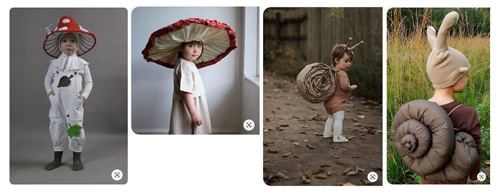 The references I used from Pinterest. 2) Sketching
Once I have the references I need, I start sketching. Most of the time I’ll jump straight into Procreate for this. But sometimes I like to start on paper. Working on paper forces you push past your mistakes and keep moving, rather than standing still to endlessly erase and revise. I end up with a lot of garbage but it’s good garbage - I like seeing my mistakes and how I tweak ideas along the way. Initially, I planned for the main character of this piece to be a child dressed as a mouse. But I changed my mind along the way and made them a snail instead. This stage is basically about thinking it through, and seeing quickly what might or might not work.
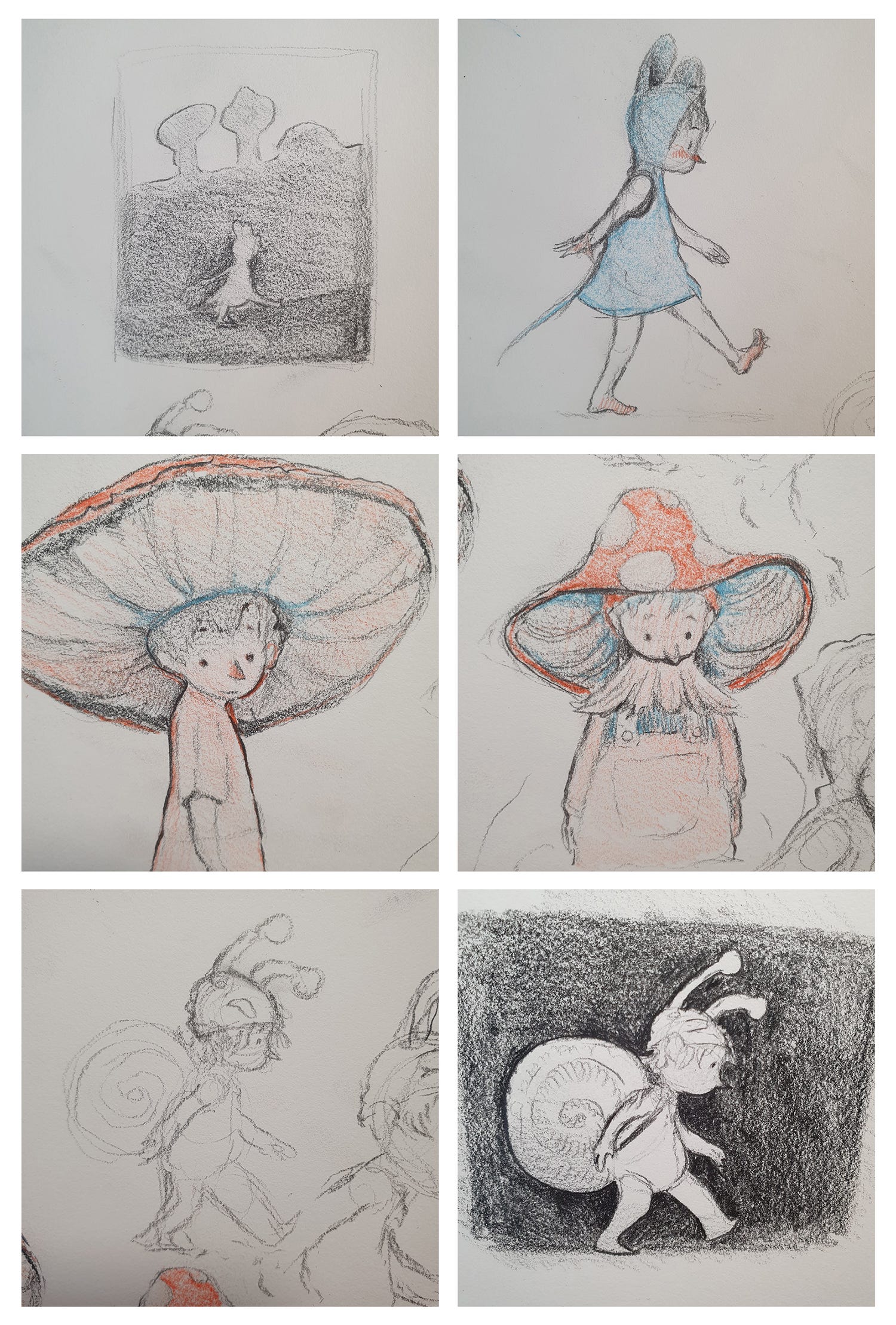 Initial sketches in my sketchbook. The first image shows a very rough composition and value plan. 3) Drawing
Once I know what I’m doing a bit more, I’ll go into Procreate (if I’m not already there), and start working towards the finished linework. If I have a pencil sketch that I really like, I might photograph it with the iPad and trace it. But usually I’ll start again on a blank canvas with any previous sketches simply as reference.
When drawing linework, I like to use pencil, charcoal and pastel brushes. I start with a lighter grey, and build up to blacks as I go. I use a kneaded eraser to erase lines softly, and almost never entirely. This drawing is actually quite tight, but generally I like leaving small traces of mistakes. With that in mind, I also use smudge brushes extensively, and often in place of the eraser. If I want to re-do a line or shape, I might smudge it out and draw over the top. All this serves to build up texture, movement and spontaneity. Sometimes if I finish the contours a little too tightly, I’ll go through at the end and erase and smudge away what doesn’t need to be there. I’ll add a bit of charcoal or pastel texture to indicate tone and shadow, but I don’t go overboard - a lot of this can be done in the painting stage.
Most often I’ll spend a lot of time in the drawing stage. I’ve gone through phases where I draw minimally and do most of the work in the painting stage, but I can never quite get the effect I’m after. I’m more comfortable drawing than painting, and so I tend to let the linework carry most of the picture’s success. In this piece, the drawing is simple, and didn’t take me too long. I’m leaving a lot of space for blocks of colour and texture
I use an assortment of Procreate brushes from various purchased packs, but for lines like this I mostly use charcoal and pastels from Lane Brown. You can find his brushes here.
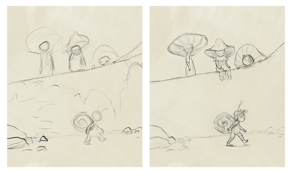 The rough block-in and first pass at the drawing in Procreate. I added a tone to the background because I find it kinder on the eyes than jumping into a white canvas.
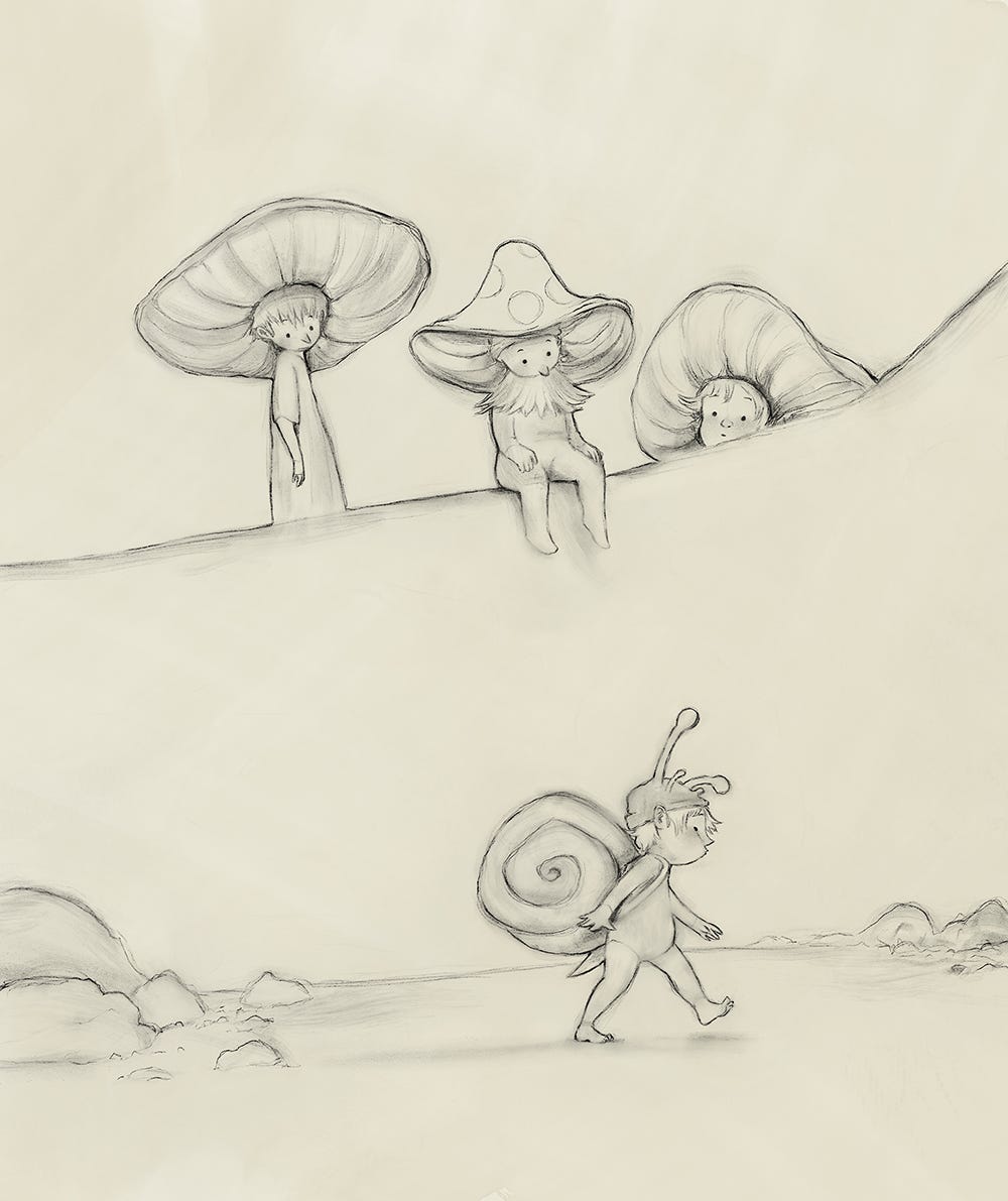 The finished linework. Ready to get out of Procreate and start painting.4) Painting
For a very long time I only painted in Photoshop. I knew the application well, I liked the brushes - it was a comfort zone. Then (a few years ago now) I finally got myself an iPad, and I completely fell in love with Procreate. The brushes didn’t quite behave the way I wanted them too, but the app more than made up for that by how truly pleasurable it was to draw in. I now frequently finish entire projects in Procreate, including whole picture books for publishers. But I recently started experimenting with a painting program called Rebelle, by Escape Motions.
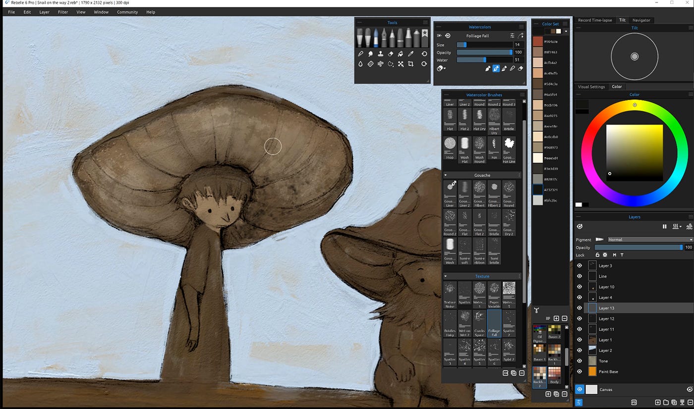 The Rebelle workspace. I’m left-handed, so I tend to group the tool windows over on the right
Rebelle is a PC/Mac application and I use it on a Wacom Cintiq Pro 16. It’s really quite extraordinary in the way it imitates the look and feel of traditional wet media. I use the watercolour brushes for the bulk of the colouring, and the oil brushes to build up texture and add highlights and accents. Partly because of the way the brushes work and partly because I’m still learning how to use it, I work slowly in Rebelle. But I don’t mind - not for personal work. It’s nice to slow down and concentrate on what I’m doing; fumbling along and often being surprised at what happens.
In this picture, I didn’t use the watercolour brushes to their full potential. You can control how much water is applied to both the brush and the canvas, and if you use a lot, the colours will run and blend and granulate and do all kinds of brilliant things. I’ll demonstrate this more in future posts, but in this one I kept the canvas dry and the colours consequently quite controlled.
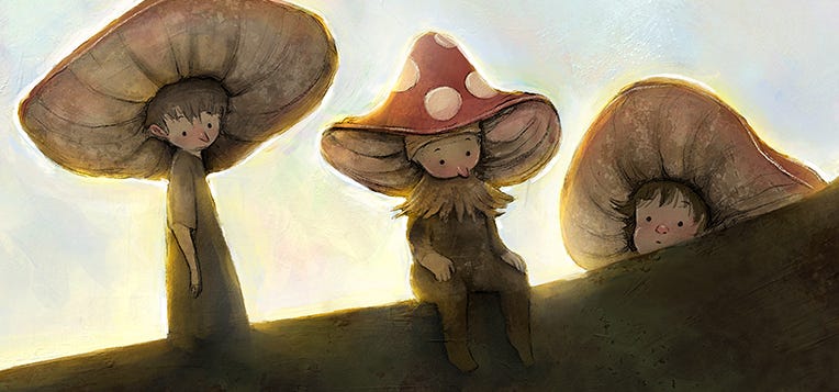
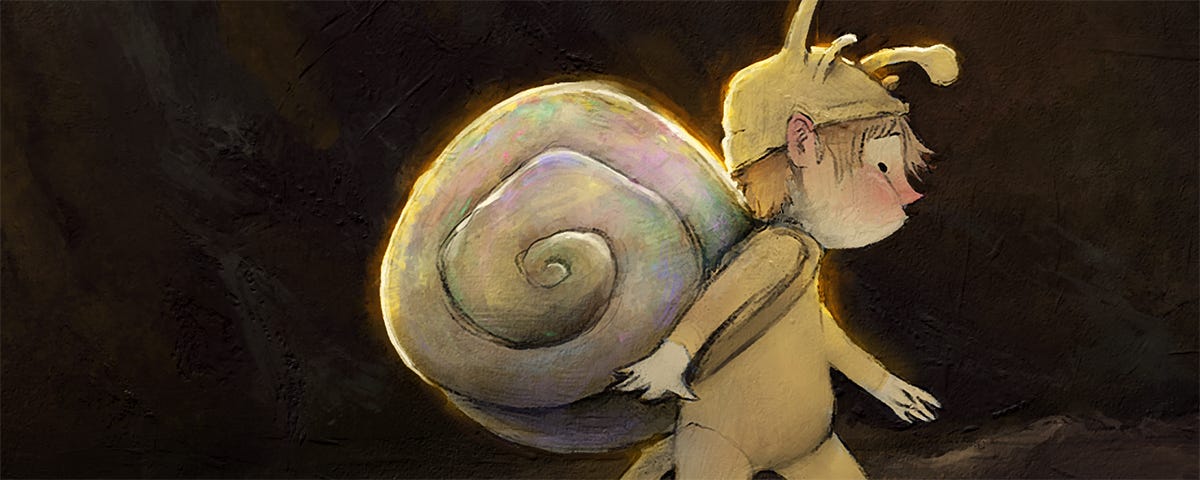
I like muted colours. I tend to gravitate towards browns, greens, yellows and red accents. Because I know what I like, I didn’t plan the colour palette beforehand; I just followed my instincts. I knew I wanted the snail fellow to pop against a dark background, and the silhouettes of the mushroom fellows to read starkly against the bright sky. Other than that, I made it up as I went. At some point in the process, I decided to add some opalescence to the sky and snail shell. I think it works! A sneaky way of getting colour in there without impacting the overall brown. I should say that for client work, I would put considerably more thought into colour, and would likely be working from a pre-planned palette.
Another notable feature of Rebelle is what it calls NanoPixel technology (available in the Pro version). It’s basically an advanced upscale function that allows you to export a file up to 16x the canvas size with little-to-no noticeable loss of quality. This is an important feature, as the software uses a lot of computing power. My PC is pretty decent, but when working at full print size, the watercolour brushes in particular become very laggy. Working at 50% scale, however, fixes that issue. The brushes work faster, and I simply export at twice the pixels (and it still looks great). That said, I’ve been too nervous to work at 50% scale for client work. I think it would be fine, but I haven’t yet compared print tests to see if I can tell the difference between a piece enlarged and one painted at full scale. Stay tuned for further comment!
All up, I was fiddling around in Rebelle for about four and a half hours on this picture.
5) Final TweaksAfter I’ve finished painting in Rebelle, I’ll export a TIFF and open it in Photoshop (yes, my old friend). While I don’t draw much in Photoshop anymore, I do still like finishing up in there. I adjusted the brightness and contrast, boosted the saturation a touch, sized the canvas appropriately and exported the final files - some for print, some for screen. On other projects I might play with the colours a bit too, but for this one, apart from a bit of saturation, I left the colours as I painted them.
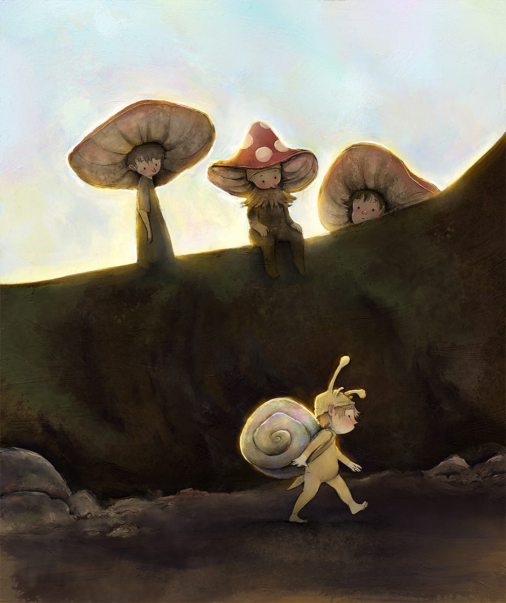
I titled this post, “How I Make a Picture, and why it Matters". So why does it matter? Here, I’m not writing about my process specifically; I’m writing about process in general. I want to comment about why having a process - any process at all - is important.
Over the past year, most people have become aware of the awesome and bewildering rise of AI text-to-image generators like Midjourney and DALL.E 2 by OpenAI. There are legal and regulatory hurdles on the horizon for these companies, but the fact remains that the technology is here to stay. Incredible and beautiful pictures can now be generated by anyone with increasing speed, accuracy and customisability. If you’re an artist who makes purely for the love of craft, this takes nothing away from you. Process obviously matters because that’s where the joy and reward is. But if you’re a commercial artist who sells work as a product or service, be aware that the whole art economy is going to change. But I’m not writing to frighten or depress you. I have some encouragement, I promise.
The value of a finished picture is going to diminish. We’re going to be swamped with so much beautiful imagery (made instantly without any making at all), that we won’t be impressed, awed or even particularly interested. When something is easy to do, we don’t value it. I’d rather phrase it like this: people will always value things that are hard to do. From now on, people won’t know whether a picture was hard to do or not. Not unless an artist shows them. That’s why I’m saying that process matters. If you’re a professional artist, I believe your finished work is no longer your primary product - your process is. If something is hard to do - if it takes time and practice and is connected fundamentally to individual human endeavour - then it has a story. And people like stories.
So if you make things, tell us how you make things. Show us. We want to know, because in an age where so much is easy, we’re utterly fascinated with effort; with people who try and make and master. We’re fascinated with stories. With how a nothing becomes a beginning and then a struggle and an end. Pictures themselves don’t matter as much anymore. But people do. And process matters more than ever.
January 31, 2023
Fairy Tales & Fatherhood
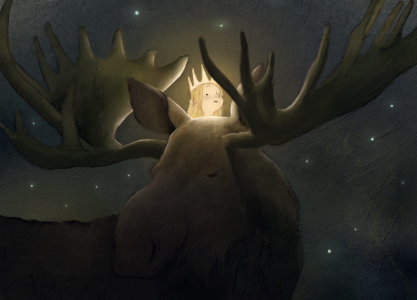
A little while ago, my three year old daughter and I found ourselves reading a book of Swedish fairy tales, illustrated by John Bauer. She was particularly taken by Leap the Elk and Little Princess Cottongrass by Helge Kjellin. We read it twice. John Bauer is one of my favourite illustrators, and his pieces for this story are some of his best and most well known. Nevertheless, I thought it would be fun to retell the tale with my own illustrations for this newsletter. That’s what I sat down to do. But that’s not what I did. Well, I drew some pictures, and I have them here to share. But it also turns out I had a few thoughts about the story. Thoughts about dark woods, innocent princesses and the responsibility of kings.
I won’t retell the tale in full, but I’ll give you a brief summary.
A child - Princess Cottongrass - has slipped away from her castle to play in a flowering meadow. She wears a crown, a white dress, and a golden heart pendant around her neck. She meets an elk (or what I would call a moose) called Longleg Leap. She implores Leap to take her with him. “Let me sit behind your neck”, she says, “and then carry me out into life.” Leap hesitates and warns her of the world’s dangers. But she insists, and he eventually obeys. On the road, they pass a series of threats. Each time, Leap warns the princess of the particular danger and gives her instructions on how to stay safe. Each time, however, she makes a mistake and loses something dear to her. First, she is tricked by elves who steal her golden crown. Next, she is tricked by a witch who steals her white dress. Lastly, they come to a murky, enchanted pool. “Hold on tight,” Leap warns. “There is danger under the water. Watch your golden heart!” But again, the princess does not listen. She loses her golden heart in the pool, and in searching for it, falls under a spell. Enchanted, she sends Leap away and gazes into the water. And as years pass, she is no longer a little girl, but a “slender plant, crowned with white cotton”, leaning over the edge of the pool, forever searching for a lost heart.
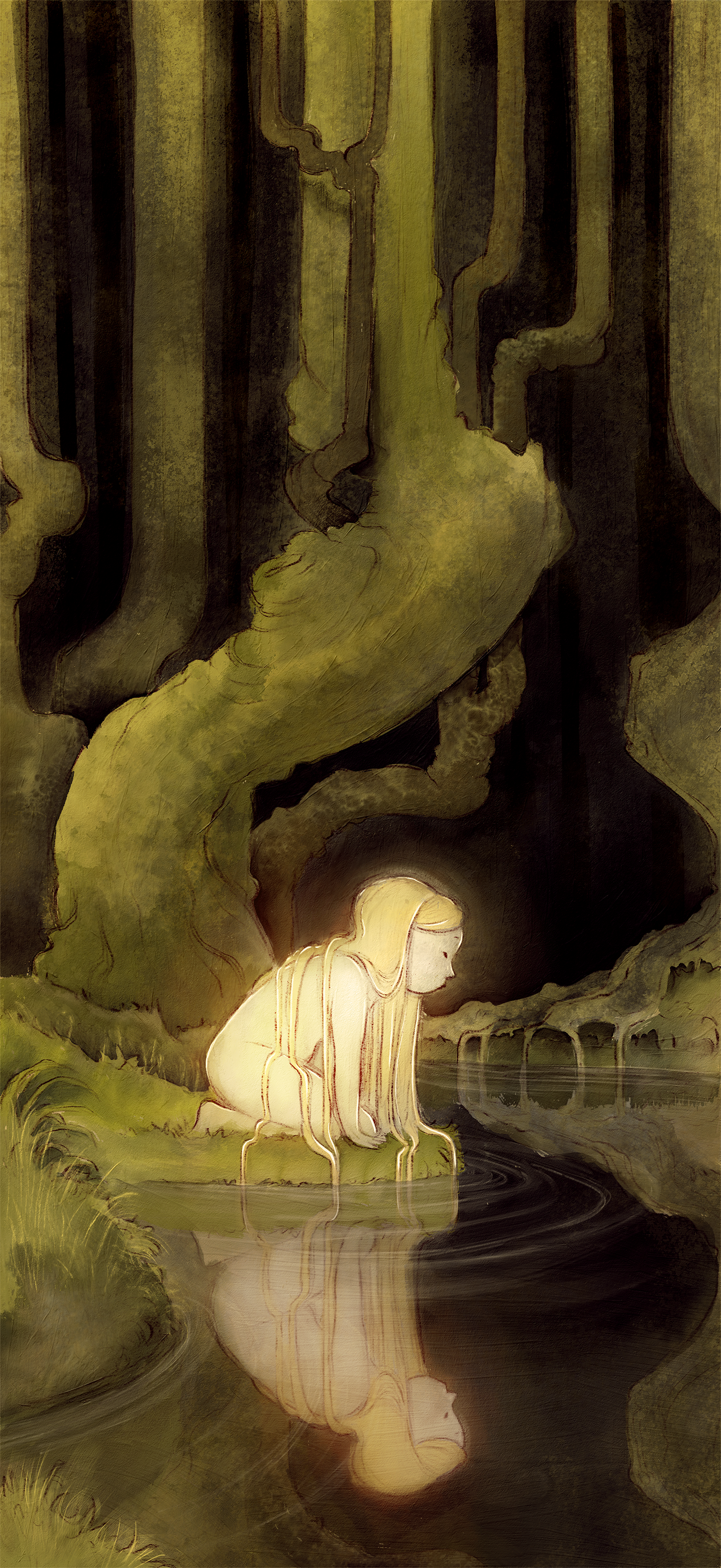 “Far, far under the water lies a lost heart”.
When I first discovered this story, I was attracted to the melancholy of it; to the haunting, quiet and poetic end of the poor princess. But reading it again, I found myself more specifically interested in Longleg Leap. What resonates most with me now is Leap’s terrible failure of responsibility. For all his strength and wisdom, he doesn’t live up to her trust in him. He seems committed to protecting her, and stands watch over her all night while she sleeps. But he gives her room to make mistakes, and when she makes them, he can’t keep her safe. I felt so irritated and angry by this. Why did it bother me so much? I didn’t know initially, but then it hit me: I was now reading the story as a father. Was I reading Leap as a father figure?
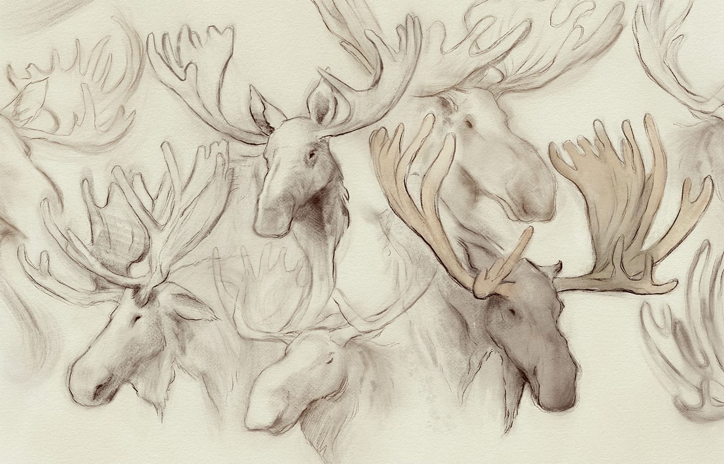 Some moose studies done in Procreate.
I don’t feel consciously insecure about parenting. I love it, and I’m good at it. But it wouldn’t be honest to say I didn’t dwell on the weight of it from time to time. Perhaps seeing Leap fail the child princess picks at some bubbling, buried insecurity about fatherhood. I don’t necessarily think Leap was written as a paternal figure. But he could be. And this explains why his character bothered me: seeing a father fail was frightening.
But there’s a flaw in this criticism. How much should Leap have intervened in the princess’s missteps? To guarantee her safety, Leap should have left her in the meadow by the castle, hidden and naive. Is that a better fate? Surely, to hide our kids too well from the dangers of the world will ultimately do them a more terrible harm. Kids need to walk away and into the woods to be tempted by elves and witches and enchanted tarns. They need to grow up. It makes me even more uneasy to think that Leap did everything right, to the same sad end. If he did fail, he was doomed to do so by the princess’s true parents - the King and Queen - who had already hidden her away from the world too long. Their smothering meant that Leap never stood a chance of guiding her safely through the woods.
What failed the princess was not Longleg Leap. She was failed by a lack of experience, a lack of fear, and a lack of fairy tales. Stories prepare us for the world, and the best ones have just the right amount of scary. My daughter wasn’t scared by this one, but others have frightened her a bit. What’s interesting is to see how much she enjoys dancing on the edge of that fear; right on the border between safety and imaginative overwhelm. She loves it. And she has her own way of managing the scariness of particular stories - she brings the scariest characters and scenarios willingly into our role-playing. Specifically, she asks me to play the scary characters in a game (again and again), and then she pacifies them; either defeating them, or demanding they become good. Put simply, she takes control of the story and conquers the things that at first frighten her. I watch her do this, and I think: oh, you’ll be fine in the woods. You’ll be perfectly, bravely fine.
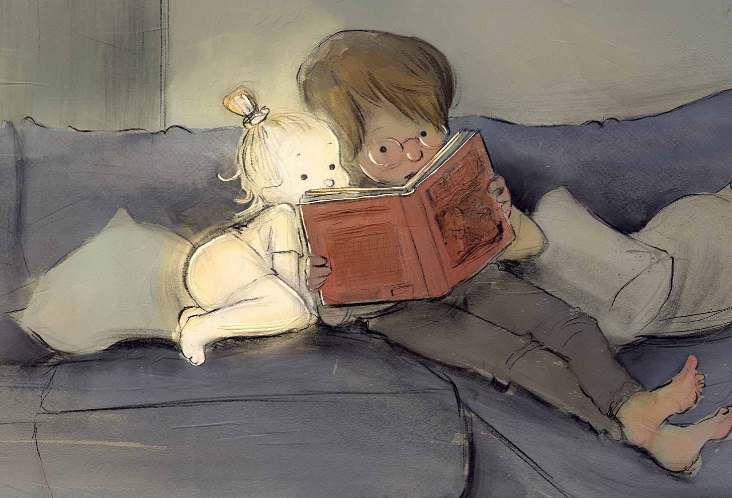
Thanks for reading Pictures, Mostly! Subscribe for free to receive new posts and support my work.
January 18, 2023
On Dinosaurs, Dopamine & Reasons to Draw
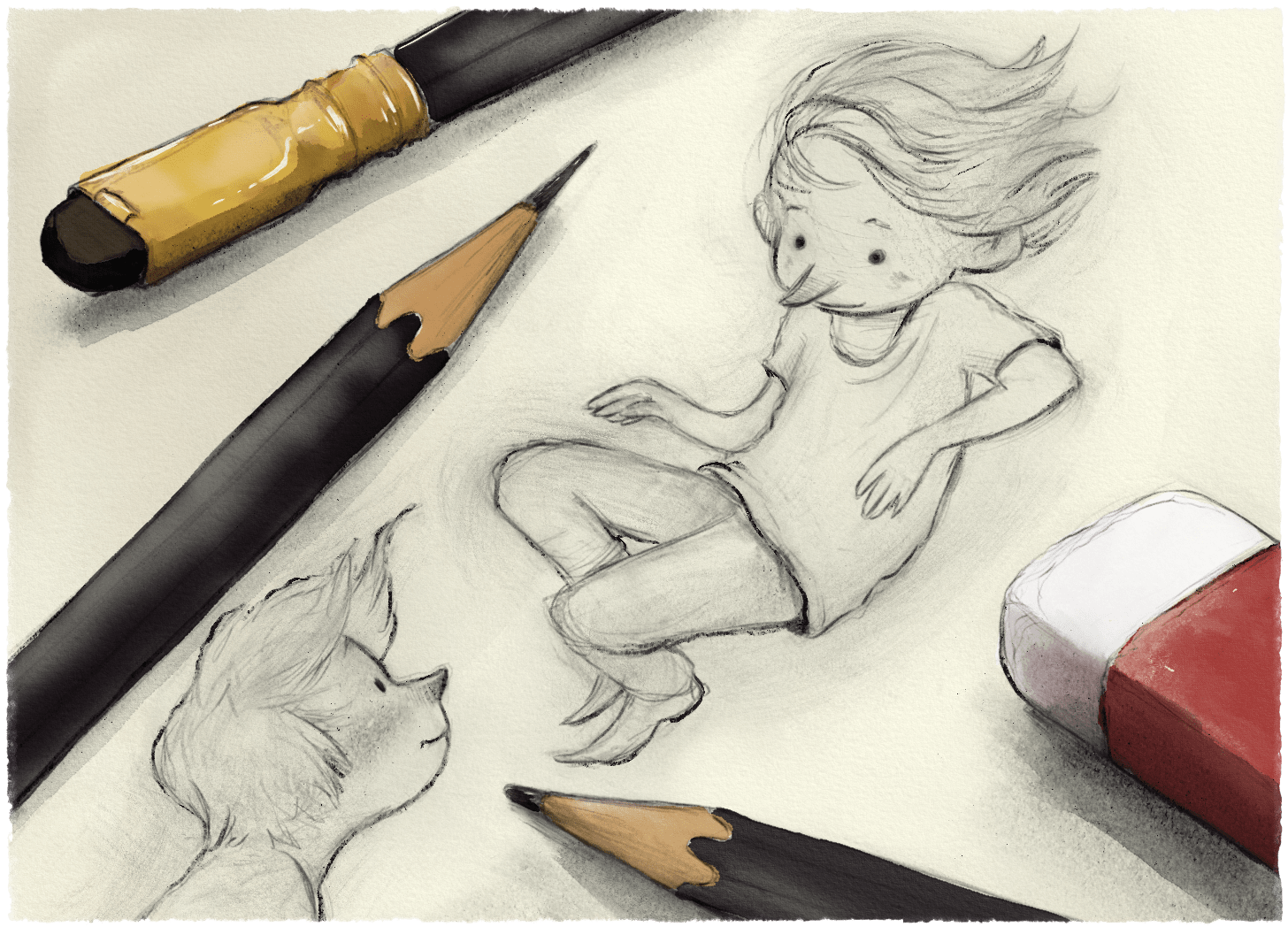
There are many reasons you might sit down to draw a picture. Some of these are excellent reasons. But are there also bad reasons to draw?
At times I’ve found myself drawing for no other reason than to post on social media and linger on whatever engagement I can get. This, probably, is a bad reason to draw. There’s guilt mixed with that dopamine. But is drawing for the praise of others always such a bad thing? Is it not a reasonable motivator?
When I was in grade 4 (about 8 years old), I became aware that my friend, Jeff, could draw exceptionally well. He must have been learning from a drawing instruction book, because he had a sheet of paper on which he had drawn numerous eyes and noses and lips from different angles of view. I remember spending lunchtimes in the library with Jeff, concentrating devoutly as he taught me how to render realistic facial features. I was eager to learn his tricks because it impressed me. But also because it impressed other people. One day, he presented a drawing of some chicks (we had hatched them from an incubator in class) to a girl in grade 7 named Sanya. I walked home from school with Sanya sometimes, and I had a crush on her. She was wowed by Jeff’s careful sketch, and I was shaken with envy. And so this, I think, was one of my earliest motivations for making art - a recognition that competence yielded attention and possibly admiration (Sanya’s at least).
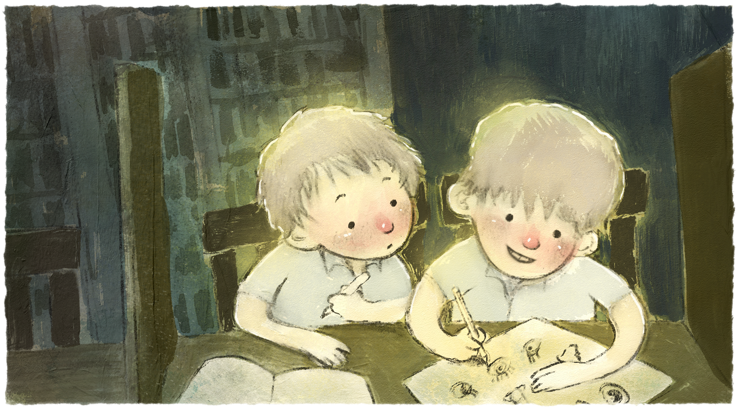 Drawing with Jeff in the school library.
By the following year, I was using my drawing as a social tool. I remember drawing a Tyrannosaurus Rex; a copy, I think, of some Jurassic Park concept art by Mark McCreery. My classmates thought it was amazing, and I realised that drawing, more than being impressive, could earn me an instant identity without any need for a personality. It was a good deal. I moved a lot as a kid and by this time I was in my fourth primary school and second country. Having a shortcut to a social identity was valuable. I’m an art-kid. No need to get to know me, here’s a perfectly rendered T-Rex.
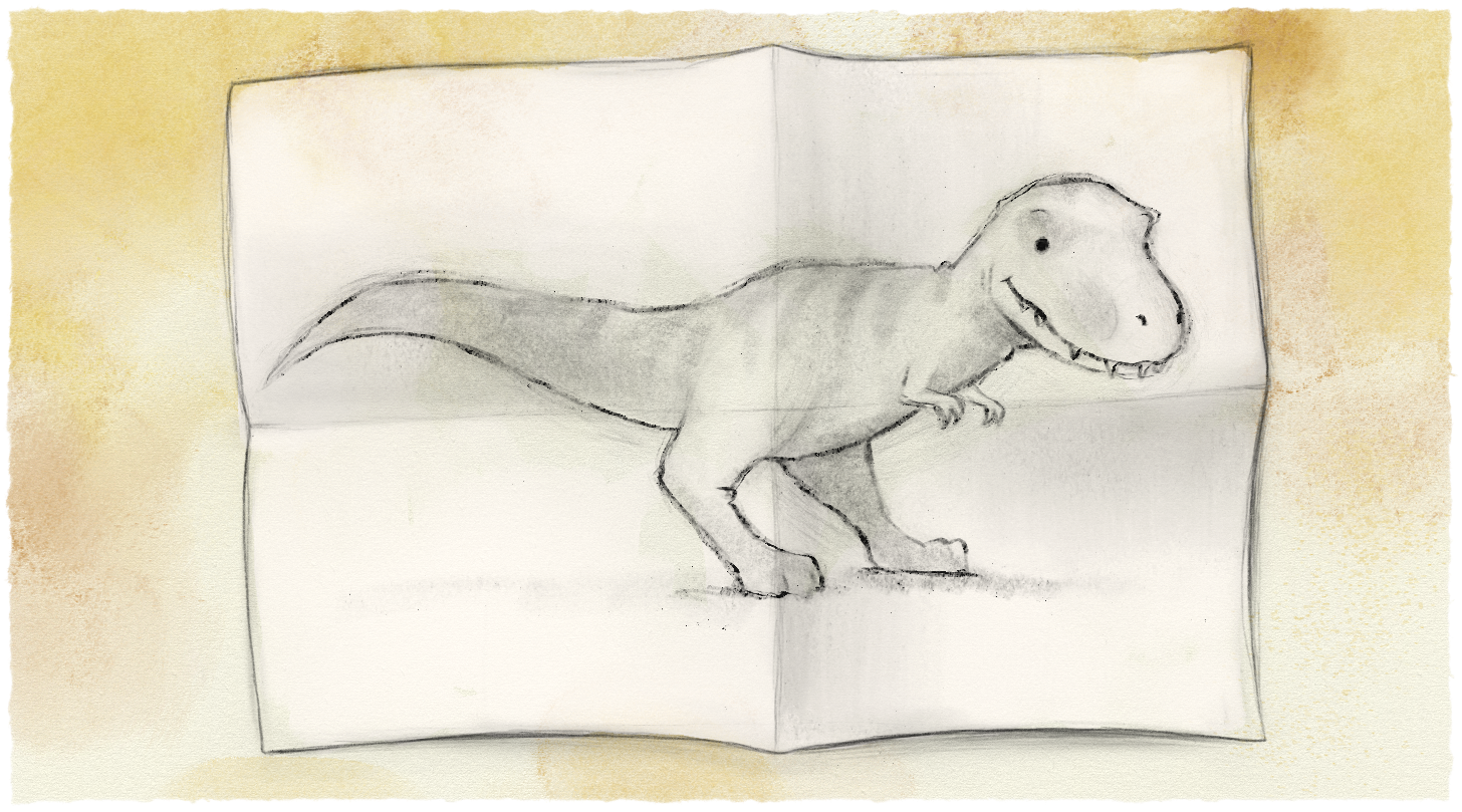 I don’t have the original T-Rex drawing, but here’s an impression of what it certainly did not look like.
 But was this a bad reason to draw? Shouldn’t I have been drawing for the joy of it? Well, I was doing that too. And here, perhaps, is my answer. These reasons for drawing are only bad in the absence of excellent reasons.
Here is an excellent reason to draw: the pursuit of excellence. When I was 8, I wanted to draw so I could impress the girl I liked. But that wasn’t the only reason. I also just enjoyed making something, and making it well. Excellence is not a destination, but a constantly evolving standard that one strives to meet and surpass. I’m not sure I’ve ever finished a drawing and not thought: the next one will be better. That’s what keeps me coming back to the desk.
Here is another excellent reason to draw: the pleasure of it. Drawing can be exceptionally absorbing and playful. When I was drawing dinosaurs in grade 5, I enjoyed the attention from my peers, but I was primarily drawing as a means of engaging with my interests. I was the most important audience for my drawings. Even now, my sketchbooks are a record of things that interest me (not so many dinosaurs anymore, sadly).
What I have meant by bad in these examples is external validation, and what I have meant by excellent is internal validation. Why are external validations bad without intrinsic ones to back them up? Because it’s unsustainable if you want to draw for a career. If the outcome is the only reward, the process of making pictures and telling stories commercially will, at some point, become a hill too big to scale. You need to be rewarded by the process itself.
At the end of the day, I need to draw for the praise of others. It’s what gets me paid. It’s why people buy my books. But in order to keep coming back, again and again, to sit down and make pictures, I need more than attention and the possibility of Sanya’s admiration. I need excellent reasons. And if those excellent reasons are solid and present in my day-to-day approach, then maybe it’s okay to needily refresh my notifications from time to time.
Thanks for reading Pictures, Mostly! Subscribe for free to receive new posts and support my work.