M. Shannon Hernandez's Blog
November 10, 2025
15 Accessible Beige Kitchen Cabinets (Warm and Classic!)
If you’ve ever stared at your kitchen wondering how to make it feel warm but still modern, I get it. I went through the same thing before finding Accessible Beige kitchen cabinets.
The color instantly changed the mood of my space, soft, calm, and inviting without feeling too gray or too creamy. You’ll see how it naturally adapts to light and works with almost any countertop or backsplash.
If your kitchen is sunny or shadowed, Accessible Beige kitchen cabinets bring balance and warmth that never go out of style. Once you picture it in your own space, it’s hard to imagine choosing anything else.
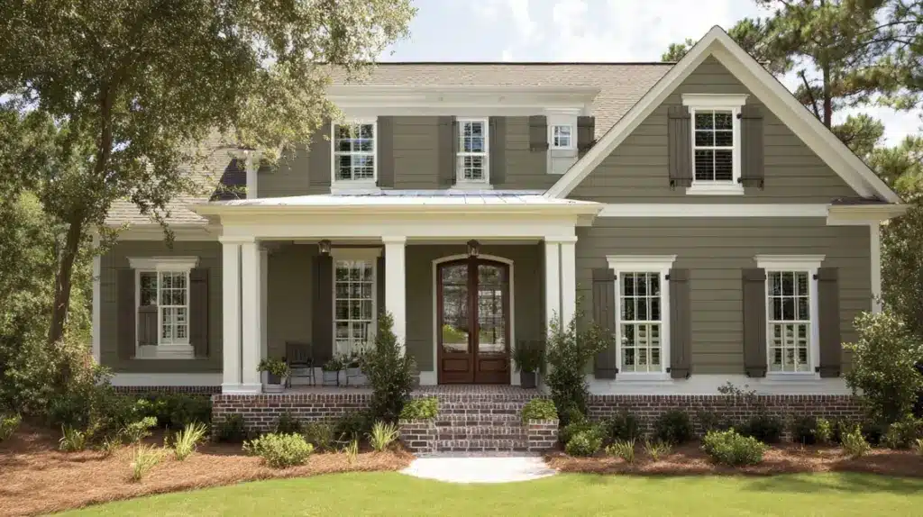
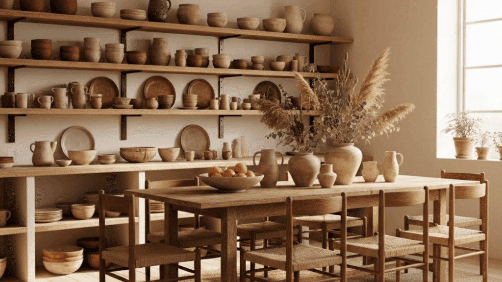
What is Sherwin-Williams Accessible Beige?Accessible Beige (SW 7036) is one of Sherwin-Williams’ most versatile neutral shades. It’s often called a “greige” because it blends the warmth of beige with the calm tone of gray.
Color family: Neutral (warm greige)Undertones: Soft gray with a hint of warmthLight Reflectance Value (LRV): 58, it reflects a medium amount of light, keeping rooms bright without feeling starkThis balance makes it ideal if you want something cozy but not too yellow or cold. It’s neutral enough to match nearly any countertop, flooring, or backsplash finish.
How it behaves in light:
In bright rooms, Accessible Beige shows its warmer, creamy side.In low-light or north-facing kitchens, it leans slightly cooler and more gray.Under warm LED lighting, it appears soft and inviting.That flexibility is what makes it a favorite for cabinets and walls alike.
Now that you know what Accessible Beige really is, let’s look at how this shade actually works on kitchen cabinets.
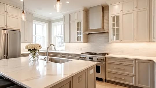
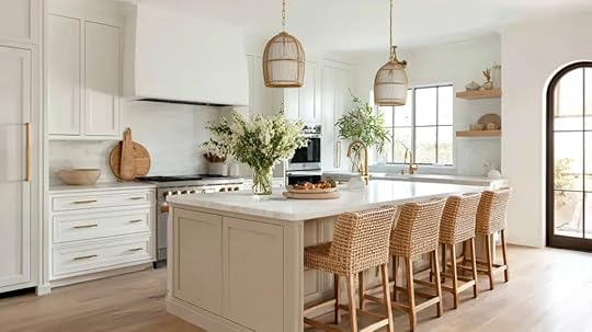
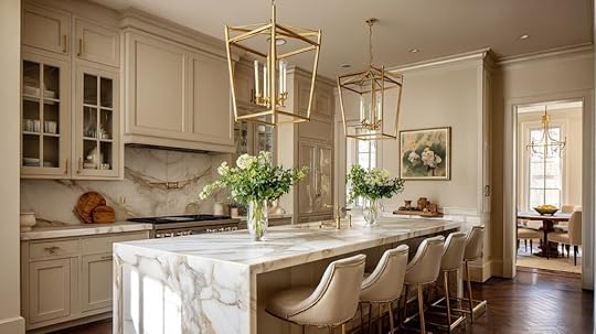
Accessible Beige Kitchen Cabinet IdeasAccessible Beige is one of Sherwin-Williams’ most versatile shades. These cabinet ideas show how you can use it beautifully across different kitchen styles, lighting conditions, and design preferences.
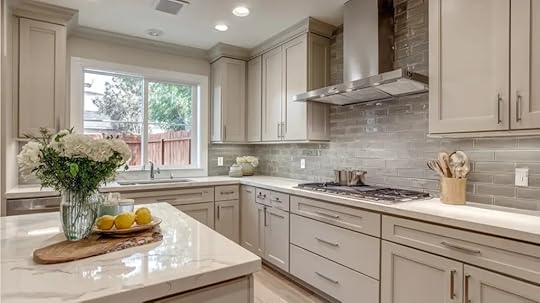
1. Accessible Beige Cabinets with White Quartz Counters
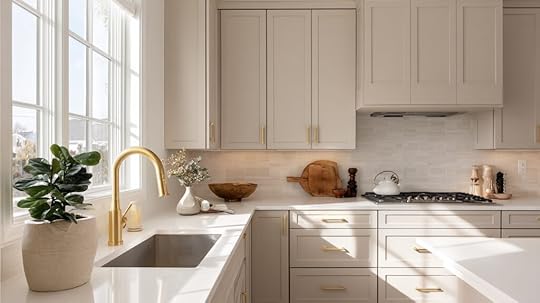
Bright, clean, and perfectly balanced, this pairing brings warmth, contrast, and openness to both large and small kitchens, making even low-light spaces feel airy, polished, and classic.
Why it works:
White quartz reflects light, brightening darker roomsBeige adds warmth and prevents a sterile lookIdeal for kitchens with limited natural lightTry this:
Brass or matte black hardware for depthWarm LED under-cabinet lightsGlossy white backsplash for subtle shine2. Two-Tone Kitchen with Light Uppers
Stylish and space-improving combining Accessible Beige lower cabinets with white uppers adds contrast and openness, keeping the kitchen bright while creating natural balance and visual depth.
Why it works:
Prevents lower cabinets from feeling heavyWhite uppers reflect available lightAdds contrast without harsh transitionsTry this:
Uppers in Sherwin-Williams Alabaster or Pure WhiteBeige lowers in satin finishBrushed nickel hardware for soft unity3. Warm Farmhouse Kitchen Design
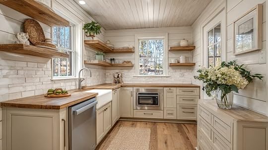
Cozy, relaxed, and welcoming, this farmhouse look combines Accessible Beige cabinets with wood textures and white accents, creating warmth that feels lived-in but still fresh and clean.
Why it works:
Beige grounds the rustic aestheticComplements shiplap, wood, and open shelvingFeels classic yet approachableTry this:
White subway tile backsplashNatural oak or pine flooringBlack or bronze pulls for contrast4. Modern Minimalist Look

Simple, sleek, and refined, this design uses Accessible Beige to soften a modern kitchen’s clean lines, blending warmth with minimalism for a balanced and sophisticated finish.
Why it works:
Greige tone warms modern designsFlat-panel doors create seamless flowWorks great in neutral or low-light roomsTry this:
Matte black fixtures for contrastQuartz backsplash with faint veiningRecessed LED lighting for even glow5. Beige Cabinets with Brass Accents
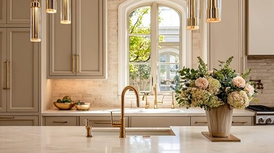
Warm, reflective, and stylish this pairing improves natural or artificial light, making beige cabinets gleam softly while brass details add classic character to your kitchen.
Why it works:
Brass reflects light beautifullyComplements beige’s natural warmthAdds a subtle upscale touchTry this:
Brass pendant lights over the islandCream or white countertopsWarm LED bulbs (2700–3000K)6. Beige Island in a White Kitchen
Balanced, inviting, and modern, a beige island anchors an all-white kitchen, adding gentle contrast, dimension, and a cozy focal point without overpowering the space.
Why it works:
Adds warmth to an all-white paletteCreates visual focus and depthKeeps overall look clean and freshTry this:
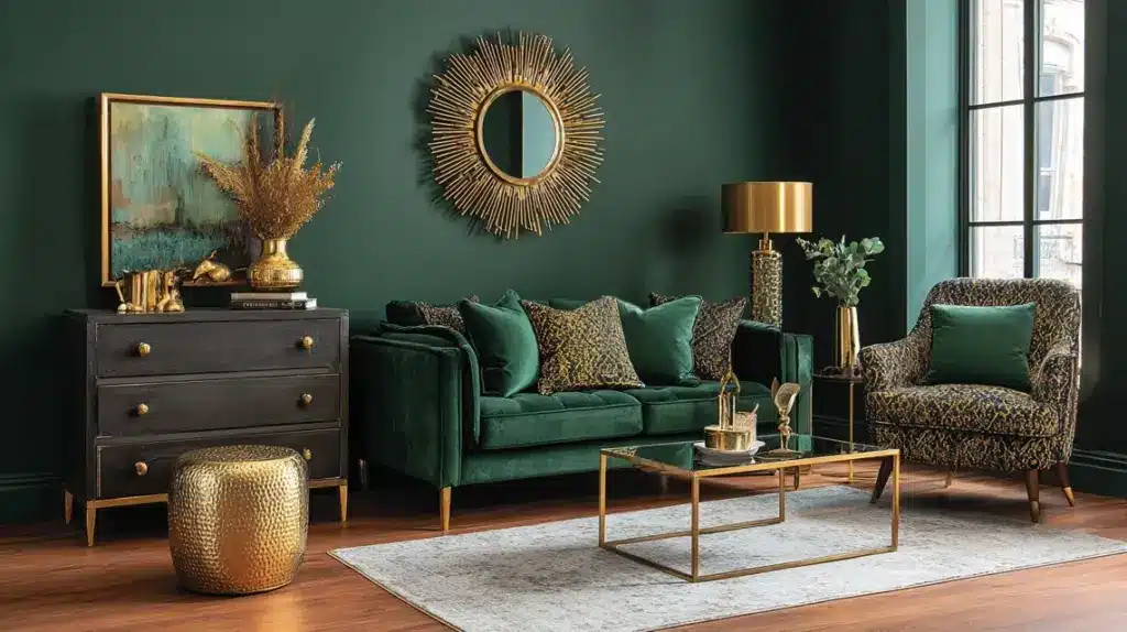
White perimeter cabinetsRattan or wooden stools for textureGold or black fixtures for contrast7. Beige Cabinets with Green Accents

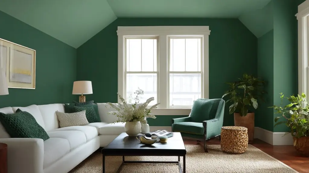
Natural, soft, and earthy, this palette combines Accessible Beige with shades of green to create a peaceful kitchen that feels calm, balanced, and connected to nature.
Why it works:
Neutral beige balances green’s cool toneEvokes outdoor freshness indoorsWorks in both bright and low-light kitchensTry this:
Sage or olive backsplash tilePotted herbs on open shelvingBrass or wood accents for warmth8. Accessible Beige with Terracotta Floors
Warm, rustic, and grounded, terracotta flooring pairs beautifully with beige cabinets, giving kitchens a cozy, Mediterranean-inspired charm that feels classic and full of personality.
Why it works:
Beige complements earthy reds and brownsPrevents warm tones from overwhelming the roomPerfect for natural, rustic interiorsTry this:
White grout for added brightnessLight beige or off-white wallsTerracotta pots for subtle repetition9. Beige Cabinets with Black Countertops

Bold, clean, and stylish, black countertops with Accessible Beige cabinets create a dramatic balance, offering modern contrast without making your kitchen feel too dark.
Why it works:
Contrasts highlight cabinet toneKeeps beige from looking flatAdds a sleek, high-end appealTry this:
Glossy tile backsplash for light bounceBrass or gold hardwareWarm LED lighting to soften shadows10. Small Kitchen with Beige Cabinets
Bright, soft, and space-friendly, Accessible Beige opens up small kitchens, bringing warmth without closing in the space or adding visual weight to compact layouts.
Why it works:
Light greige expands visual spaceHides fingerprints better than whiteWorks well under warm lightingTry this:
Glossy backsplash to reflect lightSimple hardware and uncluttered shelvesWarm LED strips below cabinets11. Beige Cabinets with Natural Wood Details
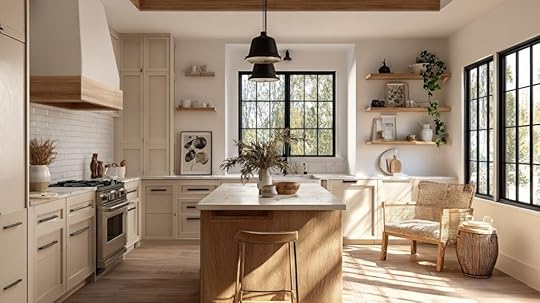
Organic, cozy, and inviting, natural wood textures highlight Accessible Beige’s earthy undertones, creating warmth and character that never feels too heavy or busy.
Why it works:
Combines painted and natural finishesAdds depth and textureWorks in rustic or modern homes alikeTry this:
Wood floating shelves or island baseButcher block countersWarm white wall paint for balance12. Beige Cabinets with Gray Backsplash
Neutral, layered, and balanced, pairing gray tile with Accessible Beige creates a refined, tone-on-tone look that feels modern but still soft and welcoming.
Why it works:
Gray and beige share greige undertonesOffers contrast without harshnessIdeal for transitional kitchen designsTry this:
Matte gray subway tilesBrushed nickel handlesWhite quartz counters for brightness13. Beige Cabinets with Gold Lighting
Radiant, warm, and luxurious, gold fixtures bring soft glow and warmth to beige cabinets, giving your kitchen an elevated yet comfortable feel.
Why it works:
Gold reflects ambient lightEnhances beige’s warm undertonesBrightens dim kitchens naturallyTry this:
Gold or brass pendants over islandCream backsplash with subtle textureWhite quartz or marble counters14. Beige Cabinets with Navy Walls
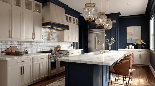
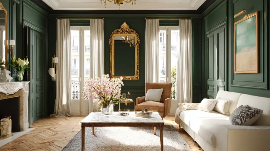
Dramatic, stylish, and grounded, navy walls contrast beautifully with Accessible Beige, creating depth and interest while keeping your kitchen warm and sophisticated.
Why it works:
Strong contrast improves beige tonesNavy feels modern yet classicWorks well in larger kitchensTry this:
Brass or copper hardwareWhite counters for balanceWarm LED bulbs to avoid cool shadows15. Classic All-Neutral Kitchen

Soft, serene, and classic, combining Accessible Beige with white and natural materials creates a harmonious, neutral space that feels inviting all day long.
Why it works:
Warm tones create cohesionWorks in every lighting conditionStays stylish through design trendsTry this:
Beige cabinets and white wallsLight stone countertopsGreenery or wood decor for textureWhy Use Accessible Beige for Kitchen CabinetsAccessible Beige works so well on kitchen cabinets because it strikes the right balance between warmth, neutrality, and versatility.
Its greige tone, a mix of gray and beige, adds subtle warmth without leaning too yellow or too cool. That makes it fit seamlessly in both modern and classic kitchen styles, from farmhouse to minimalist.
The color’s mid-level depth also hides everyday wear, smudges, and dust better than bright whites, making it ideal for high-use areas like kitchens.
With an LRV of 58, it reflects enough light to stay bright but still adds a grounded, cozy feel. Whether your kitchen is sunlit or dimly lit, Accessible Beige stays balanced and welcoming. It’s neutral, dependable, and always classic.
How Accessible Beige Looks in Different LightingLighting plays a big role in how Accessible Beige looks in your kitchen. Different light directions and sources can change its warmth and depth dramatically.
Lighting TypeColor AppearanceTips for Best ResultsSouth-FacingAppears warm and creamy beigePair with white quartz or marble to keep the look freshNorth-FacingShows cooler, gray undertonesUse warm LEDs to bring back beige warmthEast-FacingWarm glow in mornings, cooler by noonChoose reflective backsplash or lighter countersWest-FacingRich golden tones in late day lightKeep walls neutral to prevent orange huesArtificial LightVaries by bulb typeUse 2700–3000K bulbs for a soft, balanced tonePro tip: Satin or semi-gloss finishes help reflect more light, keeping Accessible Beige cabinets lively in dim kitchens.
What Colours Pair Well with Accessible Beige CabinetsAccessible Beige pairs beautifully with a wide range of shades and finishes. Here’s how to combine wall, trim, counters, backsplash, and hardware to create a cohesive kitchen palette.
Wall and Trim ColoursAccessible Beige looks best with warm whites and soft neutrals that highlight its greige undertone.
Try Sherwin-Williams Alabaster, Pure White, or Greek Villa for trim and walls. These tones brighten the room without clashing. If you want contrast, pair it with soft taupe or muted green-gray walls.
Avoid bright whites or heavy yellows, they can make the cabinets appear dull or muddy. Keep trim slightly lighter than the walls to frame the cabinetry cleanly and maintain depth across the space.
CountertopsAccessible Beige works with a wide range of countertop materials. For a classic look, use white quartz or marble, they help reflect light in low-lit kitchens.
If you prefer warmth, choose butcher-block or light oak surfaces. Want contrast? Dark charcoal or soapstone adds sophistication while highlighting the beige tone.
Avoid overly busy granite with yellow veining; it can compete with the neutral base. Stick with light, subtle patterns for an elegant and balanced finish that lets the cabinetry stand out.
BacksplashA well-chosen backsplash enhances Accessible Beige cabinets and pulls the room together. Go for glossy white subway tiles to reflect light or soft gray tiles for a layered greige-on-greige effect.
For warmth, use beige mosaic or tumbled stone tiles that complement the cabinet color. Avoid overly bright or patterned backsplashes that overpower the subtle tone.
In low-light kitchens, glossy finishes help bounce light, keeping the area fresh and open. Consistent undertones between cabinets and tiles make the look cohesive.
HardwareThe right hardware can shift your entire kitchen style. Brass and gold finishes add warmth and catch light beautifully, perfect for dim kitchens.
Matte black brings strong contrast and a modern touch, while brushed nickel fits well in transitional designs. Avoid overly shiny chrome, it can feel too cool against the greige tone.
Keep pulls and knobs simple for a timeless look. If your space lacks natural light, choose reflective metal hardware to help enhance brightness naturally.
Mistakes to Avoid with Accessible Beige CabinetsAccessible Beige is forgiving, but a few design mistakes can dull its beauty. Avoid these common pitfalls to keep your cabinets looking warm and balanced.
Using floors that are too dark: Deep wood tones can absorb light, making the beige appear muddy or flat. Balance with lighter flooring or bright rugs.Pairing with stark whites: Bright, cool whites clash with beige undertones and make the cabinets look dingy. Choose warm whites like Alabaster or Greek Villa instead.Ignoring undertones: Beige has subtle gray and green hints. Test it beside your counters and backsplash to ensure harmony under your lighting.Skipping light tests: Paint looks different in every direction. Always view samples in morning, afternoon, and artificial light.Overusing warm tones: Too many yellows or reds around Accessible Beige can make the whole space feel dated, mix in neutrals for balance.ConclusionAfter seeing how flexible and easy to work with it is, it’s clear why so many people love Accessible Beige kitchen cabinets. They bring the right mix of warmth and neutrality, blending beautifully with almost any style or lighting.
If your kitchen gets plenty of sunshine or stays on the dim side, this shade has a way of making the space feel calm and complete.
If you’ve been looking for a color that feels classic without being plain, this might be the one.
Would you try Accessible Beige kitchen cabinets in your own home? I’d love to hear how you’d style them. Keep finding more color and kitchen ideas in my other blogs, there’s plenty of inspiration waiting for you.
The post 15 Accessible Beige Kitchen Cabinets (Warm and Classic!) appeared first on Amenity Home.


24 Exterior Brick Paint Color Ideas You’ll Love
When I first started looking at paint colors for brick, I was surprised by how tricky it was to get it right.
A color that looked perfect in the store suddenly felt too bright or dull once it hit real sunlight. If you’ve ever stood in front of paint swatches wondering which one will make your home look warm and balanced, I get it.
The right exterior brick paint color ideas does more than change appearance; it sets the whole mood of your home.
In the next few minutes, you’ll find ideas that actually work in natural light, including color pairings for red brick and charcoal trim that make your exterior feel balanced and complete.
Trending Exterior Brick Paint Color Ideas for Every Home StyleFind fresh, modern, and classic shades for painted brick exteriors, complete with real paint names and ready-to-use combinations.
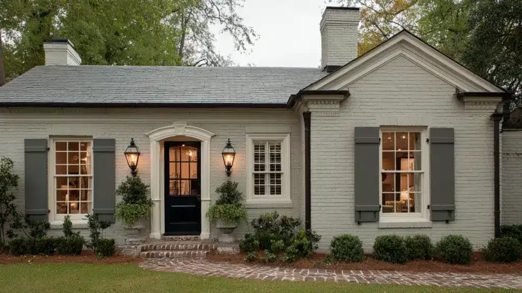
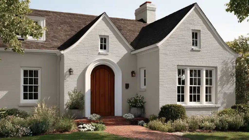
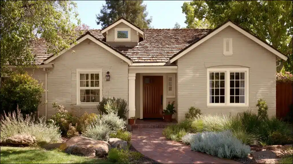
Classic Whites and Off-Whites1. Sherwin-Williams Alabaster SW 7008
Undertone: Warm cream
LRV: 82
Pairs With: Black shutters, cedar doors, dark roofs
Alabaster brings soft warmth to brick exteriors, keeping them bright without glare. It reflects light gently, adds balance to shaded areas, and highlights architectural details. Perfect for farmhouse or transitional homes that need a cozy but clean appearance.
2. Benjamin Moore White Dove OC-17
Undertone: Warm gray
LRV: 85
Pairs With: Green landscaping, stone accents, gray roofs
White Dove’s creamy tone softens sharp edges and brightens without harshness. It works beautifully on older or traditional homes, creating a gentle, timeless contrast. A go-to shade for those wanting light that feels natural and welcoming.
3. Sherwin-Williams Pure White SW 7005
Undertone: Neutral warm
LRV: 84
Pairs With: Charcoal trim, bronze lighting, natural wood doors
Pure White offers crisp brightness while keeping a subtle warmth that flatters brick. It adapts well to sunlight, staying even-toned throughout the day. A dependable choice for modern or transitional homes seeking a clean, polished finish.
4. Behr Whisper White HDC-MD-08
Undertone: Neutral soft white
LRV: 83
Pairs With: Muted greens, stone walkways, light trim
Whisper White gives a balanced brightness that never feels stark. It blends seamlessly with both contemporary and traditional designs, improving texture and warmth on brick walls. Ideal for homeowners who want a calm, neutral backdrop.
5. Benjamin Moore Chantilly Lace OC-65
Undertone: True neutral
LRV: 90
Pairs With: Black trim, muted greens, or gray shutters
Chantilly Lace is crisp, pure, and light-reflective, perfect for creating visual spaciousness. It adds fresh contrast to darker details and works beautifully in coastal or modern settings. Great for those who prefer a clean, airy finish.
6. Sherwin-Williams Snowbound SW 7004
Undertone: Warm white
LRV: 83
Pairs With: Natural stone, soft gray roofs, muted door tones
Snowbound keeps exteriors soft and cohesive. Its warmth prevents the white from feeling cold, making it ideal for homes surrounded by greenery or neutral landscapes. A steady choice that stays elegant year-round.
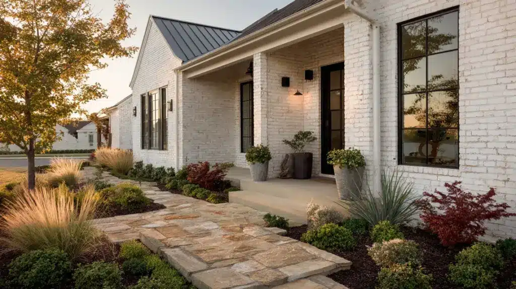
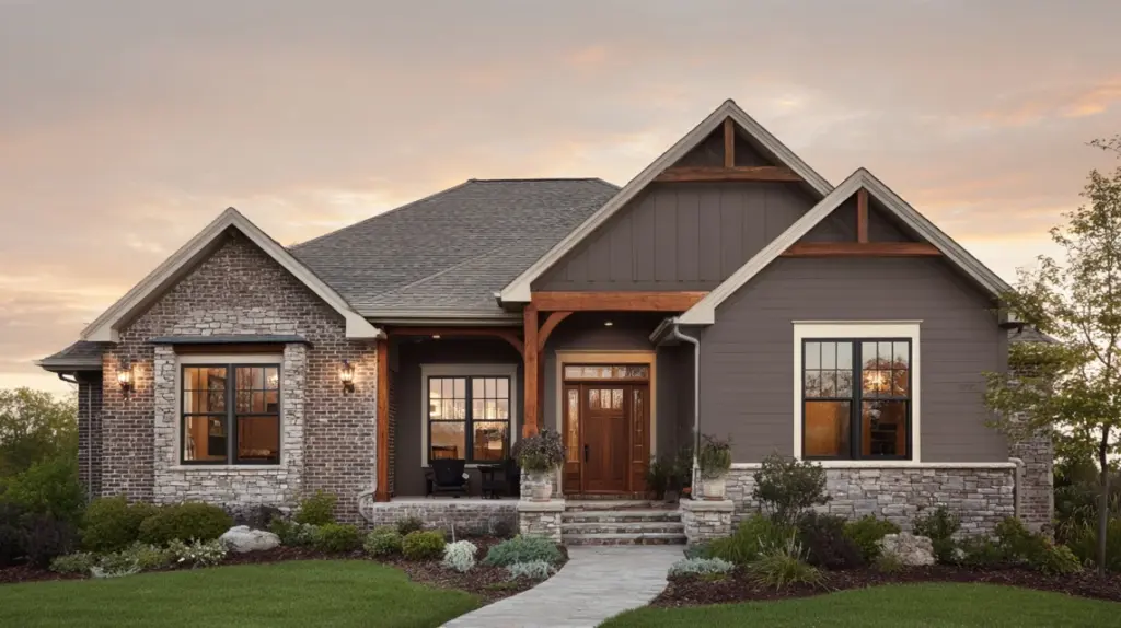
Warm Earthy Neutrals (Taupe, Brown, Muted Greens)7. Sherwin-Williams Accessible Beige SW 7036
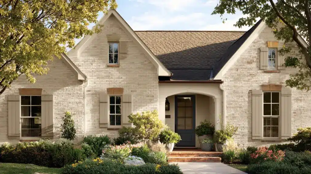
Undertone: Warm greige
LRV: 58
Pairs With: Cream trim, stone accents, tan roofing
Accessible Beige gives brick a soft, cohesive warmth that feels natural in sunlight or shade. Its greige balance keeps exteriors relaxed and adaptable to any home style. Ideal for traditional homes needing warmth without heaviness.
8. Benjamin Moore Revere Pewter HC-172
Undertone: Taupe-gray
LRV: 55
Pairs With: White trim, black gutters, wooden accents
Revere Pewter blends warm and cool tones for a subtle, classic exterior. It softens brick texture while keeping a calm, grounded look. A go-to neutral for classic homes that need balance between warmth and structure.
9. Behr Toasty Gray N320-2
Undertone: Warm brown-gray
LRV: 60
Pairs With: Tan trim, natural stone, wood shutters
Toasty Gray brings a friendly warmth to brick, adding depth without darkness. It complements both modern and traditional designs, blending seamlessly with natural surroundings. Consistent across lighting, it’s dependable and easy to style.
10. Sherwin-Williams Shiitake SW 9173
Undertone: Taupe-brown
LRV: 51
Pairs With: Cream trim, wood accents, green landscaping
Shiitake delivers a grounded, cozy tone that enhances red or brown brick beautifully. Its earthy warmth works well with natural materials and shaded facades. A stable, organic color that stays consistent through every season.
11. Benjamin Moore Grant Beige HC-83
Undertone: Neutral beige
LRV: 56
Pairs With: Off-white trim, wood doors, gray roofs
Grant Beige adds lightness and balance to brick homes without losing warmth. Its neutral base works across all lighting and climates, keeping exteriors soft and unified. Perfect as a main color or trim to tone down darker brick tones naturally.
12. Behr Muted Sage N350-5
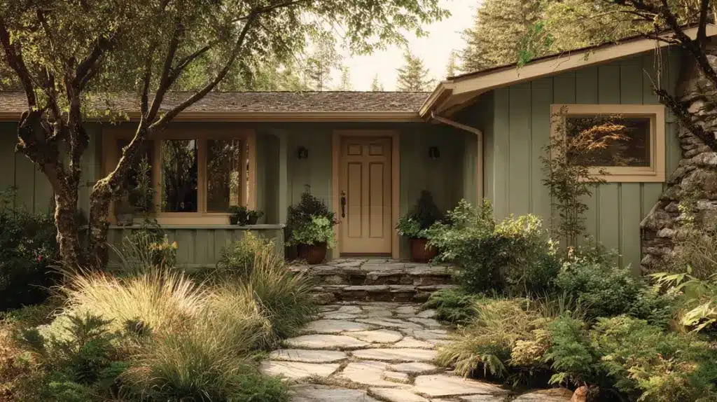
Undertone: Green-gray
LRV: 45
Pairs With: Cream trim, stone paths, black doors
Muted Sage brings an earthy calm to brick exteriors, blending easily with gardens and natural surroundings. Its soft green-gray tone feels classic yet fresh, adding subtle color without heaviness. Ideal for homes that connect visually with outdoor landscapes.
Cool Modern Grays and CharcoalCool grays and charcoals give brick homes a sleek, contemporary style. These shades contrast well with white trim or wood accents for added depth.
13. Sherwin-Williams Repose Gray SW 7015

Undertone: Soft, warm gray
LRV: 58
Pairs With: White trim, black doors, dark roofs
Repose Gray adds calm structure to brick without feeling flat. Its slight warmth keeps the exterior approachable while offering a clean, modern finish that looks consistent in all lighting.
14. Benjamin Moore Coventry Gray HC-169

Undertone: Cool blue-gray
LRV: 48
Pairs With: Crisp white trim, slate roofs, navy accents
Coventry Gray provides a refined mid-tone balance. It highlights brick texture while staying sophisticated and steady in outdoor light, perfect for a subtle yet defined exterior.
15. Sherwin-Williams Peppercorn SW 7674
Undertone: Deep charcoal
LRV: 10
Pairs With: Light brick, white trim, natural wood doors
Peppercorn delivers bold contrast and modern dimension. It defines architectural details sharply and maintains richness even under strong sunlight, giving brick homes a strong, polished appearance.
16. Benjamin Moore Amherst Gray HC-167

Undertone: Muted neutral gray
LRV: 25
Pairs With: Cream trim, wood shutters, stone bases
Amherst Gray adds depth and balance to brick exteriors. Its cool neutrality grounds the structure, making homes appear solid and cohesive. Works well for both classic and modern styles.
17. Behr Graphic Charcoal N500-6
Undertone: Neutral deep gray
LRV: 14
Pairs With: White trim, metal accents, cedar doors
Graphic Charcoal introduces bold contrast that elevates modern brick designs. It delivers crisp definition without feeling harsh, offering a stable, contemporary base that stands out in any setting.
18. Sherwin-Williams Iron Ore SW 7069
Undertone: Warm black-gray
LRV: 6
Pairs With: Light brick, warm wood, stone accents
Iron Ore provides a striking contrast and architectural definition. Its near-black tone adds drama while staying soft under sunlight. Perfect for homeowners wanting bold sophistication that still feels balanced.
Bold Accent Colors (Burgundy, Navy, Sea Green)Bold colors make a statement on brick exteriors. Burgundy, navy, and sea green work as whole-house colors or striking accents on trim and doors.
19. Benjamin Moore Hale Navy HC-154
Undertone: Cool blue-gray
LRV: 6
Pairs With: White trim, gray roofs, wood doors
Hale Navy gives brick exteriors a timeless, polished depth. Its cool undertone keeps the color crisp, while rich saturation adds contrast against lighter materials. Perfect for classic or coastal homes wanting bold definition without harshness.
20. Sherwin-Williams Naval SW 6244
Undertone: Deep navy blue
LRV: 4
Pairs With: White trim, stone accents, black gutters
Naval offers a sophisticated navy that stands out cleanly on brick. Its dark base adds structure, while soft undertones keep it versatile. A strong, balanced option for homeowners seeking a bold yet refined exterior.
21. Behr Dark Crimson M140-7

Undertone: Warm red
LRV: 8
Pairs With: Cream trim, white shutters, gray roofing
Dark Crimson brings powerful warmth to brick facades. It adds character without overwhelming, especially when used on doors or shutters. Works beautifully for traditional homes seeking energy and depth in their color palette.
22. Sherwin-Williams Rookwood Red SW 2802

Undertone: Deep brick-red
LRV: 12
Pairs With: Cream trim, muted gray, black accents
Rookwood Red delivers rich color inspired by historic architecture. It adds visual depth and timeless appeal, grounding brick homes naturally. A perfect match for classic designs needing warmth with sophistication.
23. Benjamin Moore Narragansett Green HC-157
Undertone: Blue-green
LRV: 13
Pairs With: Off-white trim, taupe shutters, dark roofs
Narragansett Green blends bold color with a natural tone. The blue-green mix keeps it earthy yet refined, pairing beautifully with neutral trim. Ideal for homeowners wanting contrast with subtle outdoor harmony.
24. Sherwin-Williams Coastal Plain SW 6192

Undertone: Muted sea green
LRV: 37
Pairs With: Warm white trim, tan roofs, natural wood
Coastal Plain offers a soft, nature-inspired green that feels calm and uplifting. Its muted base remains consistent throughout the day, creating a gentle yet distinct brick exterior.
Red Brick House Trim ColorsChoosing the right trim color can completely change how a red brick house feels from the street. Since red brick already has a lot of warmth and texture, your trim shade should create contrast without clashing or dulling its natural tone.
Best Trim Options:
Crisp White or Off-White: Brightens the brick and gives a timeless, clean finish.Greige or Taupe: Softens strong red undertones while keeping the look calm and balanced.Muted Green: Connects beautifully with natural surroundings, giving a relaxed, earthy feel.Charcoal or Black: Adds modern structure and makes architectural lines stand out sharply.A Red Brick House with Charcoal Trim is one of the most balanced and modern combinations. The dark gray trim frames windows and doors neatly, toning down the brick’s warmth while adding depth.
It also complements natural materials like wood doors, slate roofs, and olive or navy accents, keeping the overall exterior bold but cohesive.
Sample Palettes:
Red brick with off-white trim and a black doorRed brick with greige trim and a wood doorRed brick with charcoal trim and a sage or navy doorEach combination enhances the natural warmth of red brick while maintaining a polished, well-balanced appearance.
Front Door Colors for Painted BrickYour front door is the final touch that ties your entire brick color palette together, adding personality and balance to the exterior.
Black or Charcoal: Clean, timeless choices that add crisp contrast and match most trim or roof colors.Olive or Moss Green: Earthy tones that blend beautifully with landscaping and soften red or white brick exteriors.Navy Blue: A classic color that feels bold but polished, ideal for both modern and traditional homes.Natural Wood: Adds warmth and texture, complementing neutral paint colors while keeping an organic, welcoming appearance.Off-White or Beige: Light shades that contrast with darker brick or charcoal trim for a bright, balanced front entry.Two-Tone Combinations (Brick + Trim Color Palettes)Two-tone designs give brick exteriors depth. Pair one paint color for the brick with a contrasting trim shade for a polished, balanced, and custom appearance.
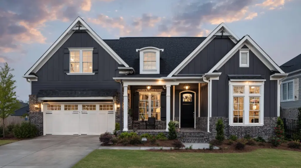
1. White Brick + Sherwin-Williams Tricorn Black Trim (SW 6258)

A white brick exterior paired with Sherwin-Williams Tricorn Black SW 6258 trim creates a bold, high-contrast look.
The crisp trim outlines windows, doors, and rooflines sharply, making architectural details stand out. This classic pairing works for modern, farmhouse, or transitional homes.
The deep black trim stays rich under different lighting, while the white brick keeps the overall look bright and balanced. It’s a dependable combination for homeowners seeking a clean yet dramatic exterior palette.
2. Warm Gray Brick + Benjamin Moore Simply White Trim (OC-117)

Warm gray brick with Benjamin Moore Simply White OC-117 trim offers a soft, timeless contrast.
The light trim highlights edges gently, giving a welcoming appearance without harshness. This combination works well for traditional and contemporary houses alike.
The neutral base keeps the look grounded, while the bright trim adds clarity and freshness. It’s especially appealing for homes with stone or wood accents, since Simply White balances warm gray brick while keeping the overall exterior cohesive.
3. Charcoal Brick + Sherwin-Williams Alabaster Trim (SW 7008)
Charcoal brick with Sherwin-Williams Alabaster SW 7008 trim creates a striking but approachable exterior.
The deep brick color anchors the house, while the soft, warm white trim brightens outlines and softens the contrast. This pairing suits modern, industrial, or farmhouse designs.
Alabaster’s gentle undertone prevents the trim from feeling stark, which helps maintain a welcoming atmosphere even with dark brick. It’s a versatile choice that delivers a crisp yet balanced look on any brick home.
4. Red Brick + Benjamin Moore Iron Mountain Trim (2134-30)
Red brick with Benjamin Moore Iron Mountain 2134-30 trim offers a rich, grounded palette.
The deep gray-brown trim frames windows and doors, adding definition without overpowering the red brick. This pairing feels strong yet classic, fitting for historic or traditional houses.
Iron Mountain’s muted undertone holds steady under varying light, ensuring consistent curb appeal. It’s ideal for homeowners who want a deep, sophisticated trim shade that works seamlessly with warm red brick exteriors.
5. Soft Taupe Brick + Sherwin-Williams Greek Villa Trim (SW 7551)
Soft taupe brick paired with Sherwin-Williams Greek Villa SW 7551 trim creates a gentle, inviting look. The warm off-white trim complements the taupe base without stark contrast, making it perfect for cottages or transitional homes.
Greek Villa adds a subtle glow to window frames, eaves, and doors. This combination works beautifully with natural landscaping and muted accent colors, giving a calm and cohesive exterior that feels bright but still warm and approachable throughout the day.
6. Navy Brick + Behr Polar Bear Trim (75)

Navy brick with Behr Polar Bear 75 trim delivers a striking, nautical-inspired palette. The bright white trim outlines the deep blue brick for a fresh, crisp effect. This combination works well for coastal, modern, or statement-making houses.
Polar Bear’s clean tone highlights windows, doors, and rooflines, making the navy brick appear even richer. It’s an excellent choice for homeowners who want a bold exterior with clear definition and a touch of classic coastal style.
7. Olive Brick + Sherwin-Williams Pure White Trim (SW 7005)
Olive brick with Sherwin-Williams Pure White SW 7005 trim offers a nature-inspired palette that still feels fresh.
The crisp white trim brightens edges and frames openings, balancing the muted green-brown base. This combination suits homes with gardens or wooded surroundings because it blends naturally while keeping a neat finish.
Pure White’s clean undertone makes architectural details stand out without harshness. It’s a reliable choice for creating a subtle yet distinctive exterior on brick houses.
Quick Picks: Best Brick Paint ColorsWhites & Off-Whites: Benjamin Moore White Dove, Sherwin-Williams Alabaster, Behr Whisper WhiteGreiges & Taupes: Sherwin-Williams Fawn Brindle, Behr Even Better Beige, Benjamin Moore Revere PewterCharcoals & Deep Grays: Sherwin-Williams Iron Ore, Benjamin Moore Kendall Charcoal, Behr Graphic CharcoalSage & Olive Greens: Behr Muted Sage, Sherwin-Williams Clary Sage, Benjamin Moore Saybrook SageBlues: Benjamin Moore Boothbay Gray, Sherwin-Williams NavalThese shades perform well outdoors and appear balanced under sunlight or shade. Always sample before deciding.
How to Choose the Right Color for BrickPick a shade that fits your house style, surroundings, and upkeep needs, ensuring a balanced and lasting exterior look. Here’s how to pick a brick color that fits your home’s style, surroundings, and upkeep level.
Match Home StyleThink about your home’s age, shape, and overall style before choosing a color. A shade that works with your architecture and meets neighborhood or HOA rules will always look more natural.
The goal is to highlight what’s already beautiful about your home, not compete with it or make it stand out for the wrong reasons.
Coordinate With Roof, Trim, & MortarYour roof, trim, and landscaping all influence how paint looks outdoors. A color that complements these details creates balance and flow from top to bottom.
Always test samples beside key features in natural light, morning, afternoon, and evening, to see how tones change throughout the day. This simple step helps you find the most cohesive match.
Consider Maintenance of Light & Dark ColorsLight colors make brick homes look brighter and reflect heat, but they can show dirt or stains more quickly. Dark shades hide marks better but may fade sooner in strong sunlight.
Consider your climate and the level of maintenance you’re comfortable with before deciding. The right balance keeps your exterior attractive and easy to maintain over time.
Testing Exterior Brick Paint ColorsTesting paint outdoors helps you see how colors behave in natural light before committing.
Prep a Clean Area: Wash a small section with mild soap and let it dry.Apply Swatches on Different Sides: Paint samples on sunny and shaded walls.Check at Different Times of Day: View colors morning, noon, and evening to spot shifts.Take Photos: Compare pictures later to see which shade feels most consistent.Testing this way prevents expensive mistakes and helps you see how the color behaves under real light.
Best Paint Type and Finish for BrickChoosing the right paint and finish protects your brick while ensuring a smooth, lasting look. Always use breathable masonry or mineral paints, as they let trapped moisture escape and prevent cracking or peeling.
Avoid thick latex coatings, which can seal in water and cause long-term damage to your brick surface. For the best appearance, use a flat or matte finish on walls to reduce glare and hide surface texture.
Reserve satin or semi-gloss finishes for trim, doors, and shutters, where easy cleaning and subtle shine matter most.
Apply two even coats using a sprayer followed by a roller to ensure deep coverage and a consistent, durable result that keeps your brick looking clean and well-protected.
Maintenance Tips for Painted BrickKeeping painted brick looking fresh comes down to simple, consistent care. Regular cleaning and small touch-ups go a long way in preserving its finish.
Clean Gently: Wash the brick twice a year with mild detergent and a soft brush to remove dirt and mildew.Inspect Regularly: Check for cracks, chips, or peeling paint every season and fix them before they spread.Repaint Every 7–10 Years: Refresh the paint when fading appears, especially on lighter shades exposed to full sunlight.Avoid Pressure Washers: Use a low-pressure hose or gentle rinse to prevent stripping paint or damaging mortar.Control Moisture: Keep gutters clear, redirect downspouts, and trim plants away from walls to prevent moisture buildup.Touch Up Promptly: Keep leftover paint for quick fixes to maintain even color throughout the year.Common Mistakes to AvoidHere are some of the most common mistakes homeowners make when painting brick.
Skipping Surface Prep: Painting over dirty or damaged brick leads to poor adhesion, peeling, and a shorter lifespan for the new finish.Using Non-Breathable Paint: Sealing moisture inside brick can cause bubbling, cracking, and hidden structural damage over time. Always choose breathable masonry coatings.Ignoring Climate-Specific Recommendations: Colors and finishes behave differently in the sun, humidity, and cold. Using the wrong type reduces durability and appearance.Not Testing Sample Areas First: Skipping swatches can result in unexpected color shifts and expensive repaints. Always test on multiple walls first.ConclusionI’ve shared the most practical exterior brick paint color ideas and shown you how real shades and trim pairings look on actual homes.
You now know how to test colors, match them with your roof and landscaping, and plan a palette that feels right from the street.
Try sampling a few swatches this week and photographing them at different times of day; you’ll be surprised how much easier the decision becomes.
If you’d like more fresh palettes and tips on caring for painted brick, take a look at my other posts. They’ll give you even more ideas to make your exterior feel intentional and lasting.
The post 24 Exterior Brick Paint Color Ideas You’ll Love appeared first on Amenity Home.
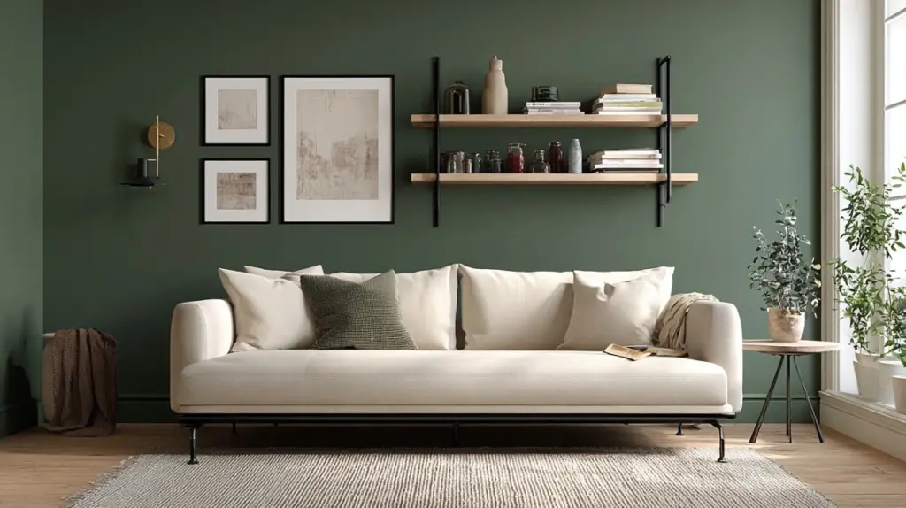
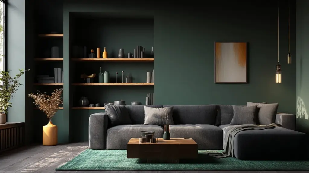
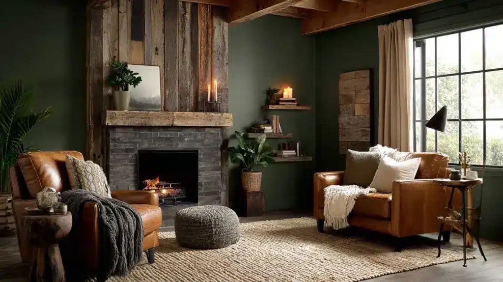
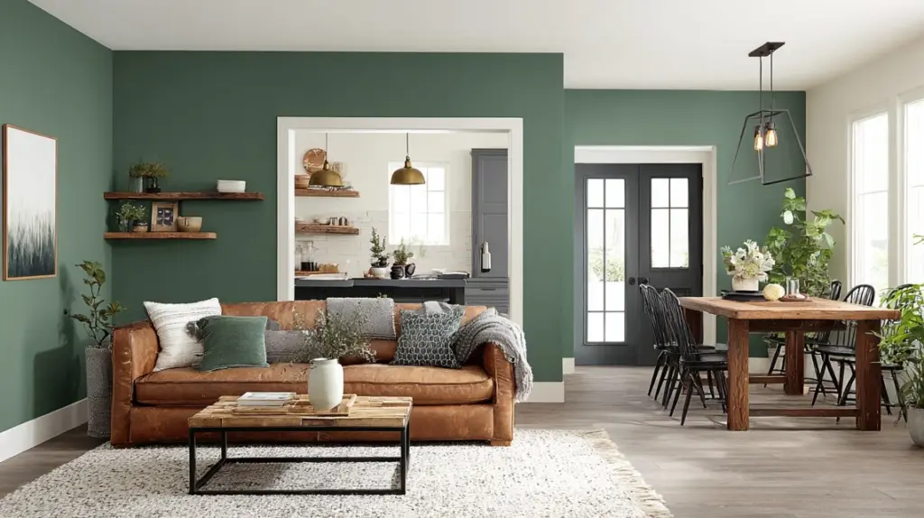
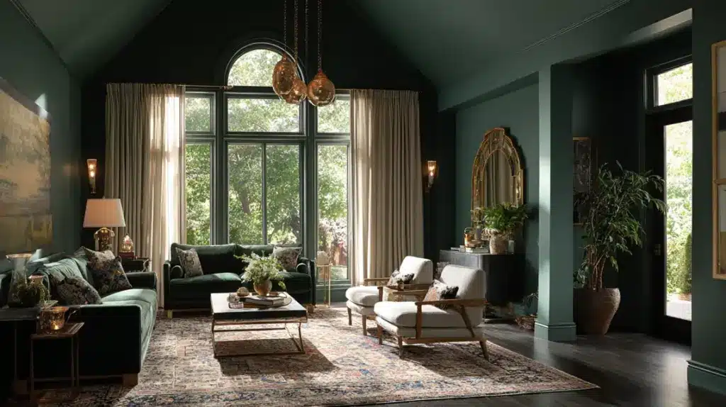
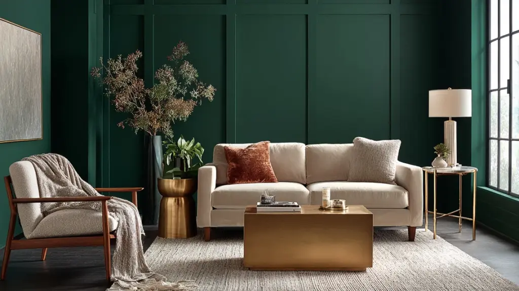
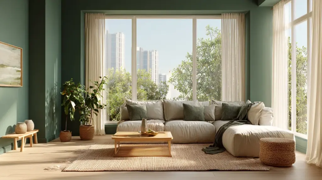
45 Modern Dark Green Living Room Ideas You’ll Love
I’ve always believed the right color can completely change how a room feels. When I painted my living room dark green, I didn’t expect it to feel this calm and grounded.
It’s rich but not overbearing, warm but still modern. That’s what makes it so special: it brings balance and depth without taking over the space.
If you’ve been looking for a way to refresh your home, a modern dark green living room might be exactly what you need.
I’ll walk you through simple, real-life ideas to help you style yours. You’ll see how color, lighting, and texture come together to create a space that feels natural, inviting, and perfectly personal to you.
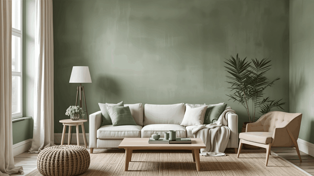
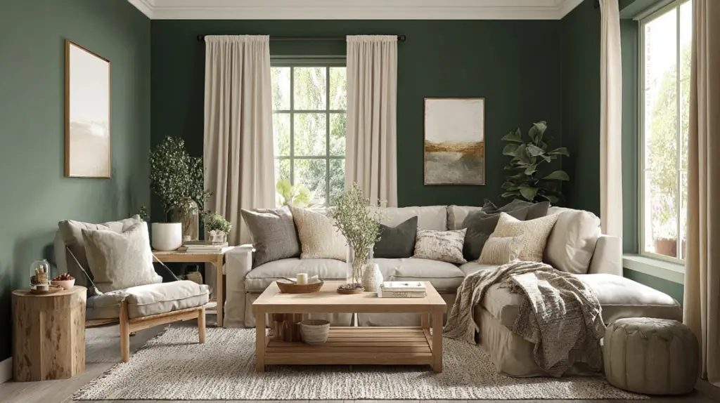
Why Dark Green Works So Well in Modern Living RoomsDark green brings a calm and grounded feel to your space. It’s rich, cozy, and adds depth without being overwhelming. The color feels natural and comfortable, making it easy to pair with wood, beige, or black accents.
In modern homes, it bridges style and comfort, bold enough to stand out but soft enough to relax in. Even small rooms can handle this color when paired with warm lighting and lighter fabrics.
If your home is sleek or casual, dark green adds a steady, welcoming mood that works all year round. It’s an easy way to refresh your space while keeping it relaxed and inviting.
Inspiring Modern Dark Green Living Room IdeasDark green living rooms feel calm, stylish, and versatile. Find innovative ideas, color pairings, and décor styles that make this rich shade work in any space.
1. Minimalist Green With Soft Neutrals
Matte dark green walls give your living room a calm and balanced look. Add a beige sofa with black metal legs, light wood shelves, and a simple rug for warmth.
Keep décor limited to a few framed prints and soft cream cushions. This setup feels open and easy to maintain while letting the color stand out naturally. The key is clean lines, soft lighting, and space to breathe.
How to Recreate: Try Sherwin-Williams “Roycroft Bottle Green” and use warm LED bulbs for gentle lighting.
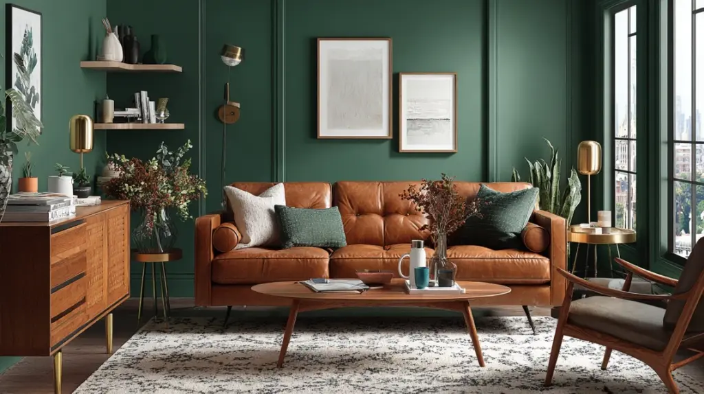
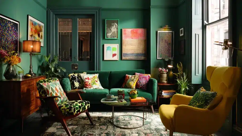
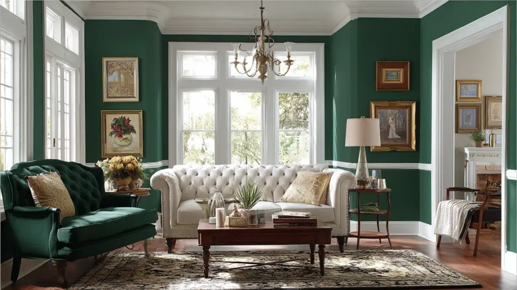
2. Luxe Forest Green and Brass Accents
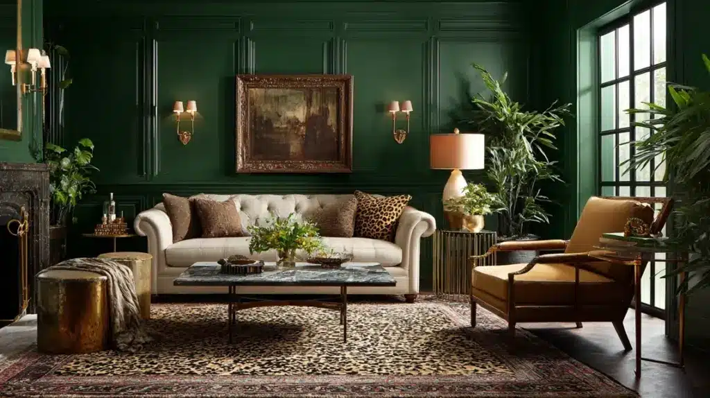
Deep forest green walls paired with brass elements make any space feel rich yet relaxed. Add paneled walls, brass sconces, and a cream rug to soften the contrast.
Use a velvet sofa and marble-top tables for texture and shine. This mix works beautifully in formal or semi-formal living rooms, balancing luxury with comfort. Warm lighting highlights the green’s depth and the gold’s glow.
Budget Tip: Update old lamps or handles with brass spray paint for an affordable high-end look.
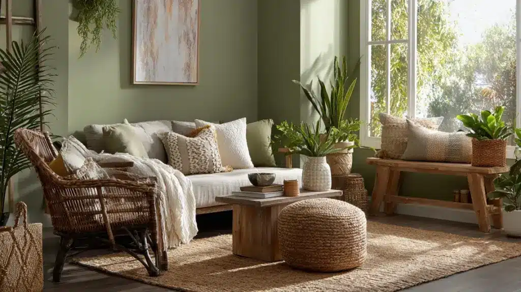
3. Modern Boho Green With Textured Layers
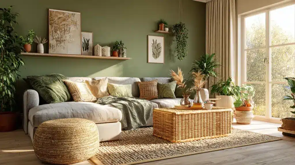
Olive walls and natural textures create a warm, easygoing mood. Use rattan furniture, woven rugs, terracotta planters, and light linen curtains. Layer cushions and throws for comfort without clutter.
The combination of earthy tones and greenery keeps the space cozy but not heavy. It’s ideal for relaxed, everyday living. Add a few hanging plants to tie the theme together.
Small-Space Tip: Paint only the lower half dark green and keep the upper section light beige to expand the room.
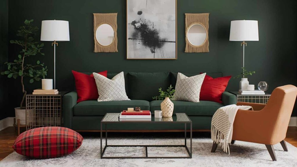
4. Moody Green With Black and Charcoal
Matte dark green walls, black accents, and charcoal furniture create a modern and confident atmosphere.
Add walnut shelves or a wooden coffee table for warmth. This palette works well in larger rooms or spaces with plenty of natural light. Use soft fabrics like cotton or suede to balance the dark tones.
The result is bold yet comfortable, perfect for evening relaxation.
Lighting Tip: Warm amber bulbs soften shadows and keep the space from feeling overly dark.
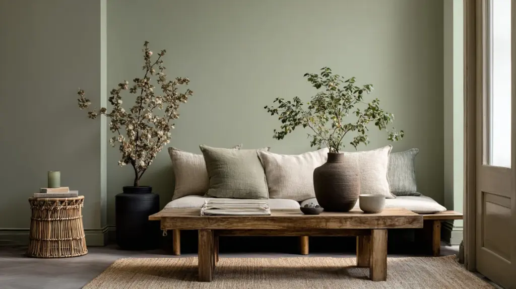
5. Scandinavian Green Simplicity
Soft sage walls paired with natural oak and white accents bring calm into your living room. Keep furniture low and streamlined to improve openness.
Add cotton curtains, simple artwork, and a few indoor plants for texture. This layout feels neat and welcoming without much effort. The light green tone keeps it airy while the wood adds a touch of comfort.
How to Recreate: Use pale sage paint, oak finishes, and white accessories for an easy Scandinavian setup.
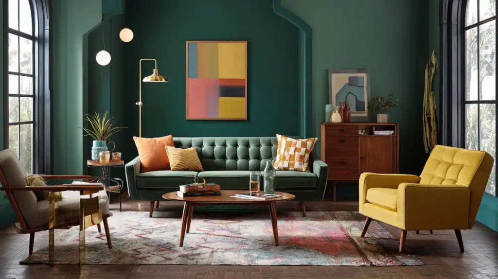
6. Mid-Century Green Warmth
Dark green walls make a striking backdrop for mid-century pieces. Include a tan leather sofa, a walnut sideboard, and a patterned rug for character.
Brass-legged chairs or table lamps complete the style without crowding the space. The combination feels familiar but modern, great for open-plan living. Use geometric prints to add a quiet personality.
How to Recreate: Pair “Hunter Green” paint with classic wood tones and brass highlights for balanced warmth.
7. Nature-Inspired Green Haven
Olive-green walls, woven baskets, and indoor plants turn your living room into a peaceful retreat. Add jute rugs, wooden tables, and linen cushions for softness.
Natural light improves every texture, giving the space a grounded feel. Keep colors earthy and décor simple to maintain harmony. It’s perfect for anyone who loves a calm, grounded setting.
How to Recreate: Choose mid-tone green and mix it with rattan, jute, and leafy plants for a nature-based setup.
8. Modern Glam Green and Gold
Glossy green walls paired with gold details make your room shine without excess. Add a gold-framed mirror, velvet cushions, and a light rug for contrast.
Keep furniture neutral to avoid visual clutter. The metallic touches brighten dark tones and add visual rhythm. It’s a polished look that feels both stylish and practical.
Budget Tip: Replace drawer pulls, lamp bases, or small décor with gold finishes to upgrade your space easily.
9. Cozy Cottage Green Corner
Dark green wainscoting, plaid fabrics, and warm lighting create an inviting cottage look. Add a cream rug, a wood coffee table, and knitted throws for softness.
White trim keeps the color crisp while avoiding heaviness. This design works beautifully in smaller rooms, giving comfort without clutter. A reading chair and lamp can turn one corner into a peaceful spot.
Small-Space Tip: Paint only half the wall dark green to maintain openness while keeping the cozy feel.
10. Urban Loft Green Style
Dark green walls look striking against exposed brick or concrete finishes. Add a brown leather sofa, metal shelving, and simple wall art for balance.
Keep the décor raw and minimal to let textures stand out. Use black frames and industrial lamps for structure. This setup gives your space a grounded yet modern appeal that suits apartments and studios.
How to Recreate: Choose a matte deep green with visible grain and mix it with metal accents for an effortless loft look.
11. Green and White Contrast
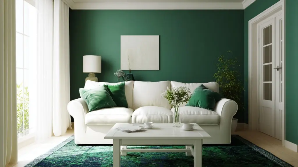
Pair rich green walls with crisp white trim and furniture for a clean, bright look. The contrast brings energy to the room without making it feel dark.
Add a white sofa, green cushions, and soft lighting for harmony. This style works well in any home, especially where you want the color to stand out. A simple rug helps tie everything together.
Lighting Tip: Use daylight bulbs to highlight the contrast and keep both tones fresh throughout the day.
12. Rustic Cabin Green Comfort
Dark green pairs perfectly with rustic textures like reclaimed wood and stone. Add a tan leather armchair, woven rugs, and simple linen curtains.
Keep the lighting warm and soft to improve the cozy feeling. This combination feels natural and inviting, perfect for homes with open layouts. A few antique accents can add personality without making it cluttered.
How to Recreate: Choose an olive or moss tone and layer it with visible wood grains and earthy fabrics.
13. Farmhouse Green Warmth
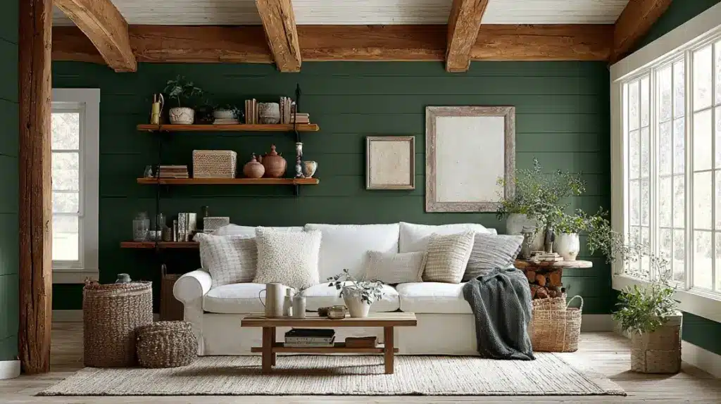
Combine deep green walls with white shiplap, wooden beams, and soft cotton fabrics for a farmhouse feel. Add a light gray sofa and neutral rug to keep the palette balanced.
Mix baskets, pottery, and vintage frames to give character. The room feels simple but full of comfort, great for family homes.
Budget Tip: Add texture using wooden wall trims or peel-and-stick shiplap panels for a farmhouse finish on a budget.
14. Eclectic Green Mix
Playful and full of energy, this look combines dark green walls with mixed furniture and bold patterns. Use colorful cushions, different chair styles, and unique artwork.
The goal is to keep it balanced with common undertones like warm browns or golds. Add layered lighting to highlight each piece.
How to Recreate: Pick one shade of dark green for all walls, then use three or four accent colors in small touches for visual balance.
15. Contemporary Green Edge
Clean lines, dark green paint, and glossy surfaces give this room a sharp, modern look. Use a low sofa, sleek tables, and black lighting fixtures.
Keep colors minimal, white, gray, and muted wood work best. This setup suits apartments and small living spaces where simplicity matters. The green adds just enough drama without crowding the design.
How to Recreate: Use a satin dark green finish for walls and pair it with glass or chrome décor for contrast.
16. Coastal Green Breeze
Soft green walls combined with sandy beige and white accents create a coastal-inspired space. Add a light slipcovered sofa, rattan furniture, and striped cushions.
The result feels bright, fresh, and relaxed. Natural light improves the airy tone while keeping it soothing. Use woven lighting fixtures to add warmth.
How to Recreate: Choose a muted sea-green shade and combine it with natural fibers like rattan and cotton for a breezy, coastal look.
17. Vintage Green Beauty
Dark green walls paired with antique furniture bring a nostalgic feel. Add a velvet armchair, brass floor lamp, and patterned rug to complete the look. Keep accessories simple; framed art, books, and flowers are enough.
The key is balance between color and texture, giving old pieces new life. This setup feels timeless and personal.
How to Recreate: Mix deep green paint with one standout vintage piece, like a cabinet or mirror, as your anchor.
18. Transitional Green Balance
Dark green works beautifully in transitional spaces that blend modern and classic design.
Use paneled walls, a neutral sofa, and stylish lighting. Add subtle metal accents and natural fabrics for comfort. This look feels polished but still relaxed. The key is soft layering, nothing too bold or too plain.
How to Recreate: Combine matte forest green paint with neutral furniture and gold or black lighting fixtures for a smooth, balanced style.
19. Industrial Steel and Green Fusion
Dark green pairs beautifully with exposed brick, black metal, and weathered wood. Add a brown leather sofa and steel-framed shelves for structure and balance. Keep décor minimal so the natural materials and bold contrasts can stand out clearly.
Edison-style lamps add a warm glow that softens the strong industrial lines, creating a space that feels both grounded and lived-in. The result is stylish, low-maintenance, and full of quiet strength.
How to Recreate: Use matte forest green paint, leave one wall raw or unfinished, and layer metal accents to highlight the industrial theme.
20. Artistic Green Expression
Turn your living room into a creative space with deep green walls and bold artwork. Mix textures like linen, metal, and wood for dimension.
Use colorful art or abstract prints to stand out against the rich backdrop. Keep furniture neutral so the focus stays on the art. It’s an expressive but livable design for anyone who loves visual interest.
How to Recreate: Use dark green as a canvas for wall art and choose lighting that spotlights your pieces.
21. Family-Friendly Green Comfort
Dark green walls make a cozy base for a family gathering spot. Add washable slipcovers, soft rugs, and layered lighting for flexibility.
Include storage furniture to keep toys or books neatly tucked away. The green color hides scuffs and fingerprints better than lighter tones. This setup keeps things practical yet stylish for busy homes.
How to Recreate: Choose a satin finish for easy cleaning and pair it with cotton fabrics that can handle daily use.
22. Small Space Green Retreat
In a small living room, one dark green wall adds depth without closing in the space. Use white or cream on other walls to balance it.
Add compact furniture and mirrors to reflect light. Keep floors clear and décor simple. The result feels peaceful instead of cramped, with color adding character.
Small-Space Tip: Paint one accent wall dark green behind your sofa or TV unit to anchor the room visually.
23. Open Concept Green Flow
In an open-plan home, dark green helps define zones without walls. Paint the living area green and keep the kitchen or dining area neutral.
Add consistent accents like wood tones or metal lighting to tie it together. The contrast adds structure while maintaining flow. It feels connected yet distinct.
How to Recreate: Use one green wall to outline your seating space and repeat green details in nearby décor pieces.
24. Indian Style Green Living Room
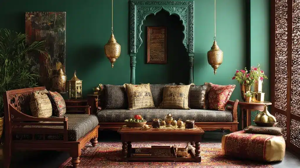
Pair dark green walls with warm wood furniture, brass décor, and patterned cushions. Add a carved jharokha frame or handwoven rug for traditional beauty.
Use hanging lamps or lanterns to improve the glow. The setup feels rich but comfortable, reflecting classic Indian warmth.
How to Recreate: Combine deep green paint with teak or mango wood and handwoven textiles for an authentic Indian-inspired look.
25. Monochrome Green Layers
Use multiple green shades, from moss to emerald, for subtle depth. Add light green cushions, dark rugs, and mid-tone furniture.
The layering keeps the color theme strong but not repetitive. Metallic accents like bronze or silver can help break the tone. This style works beautifully in contemporary homes.
How to Recreate: Mix three green tones across walls, fabrics, and décor to create dimension without extra colors.
26. Soft Lighting Green Space
Dark green walls look best under warm, soft lighting. Use layered lamps, floor lights, and wall sconces to create a glow instead of glare.
Add light-colored furniture to keep the balance. This design turns any room into a calm evening retreat. Avoid bright white lights that flatten the color.
Lighting Tip: Choose warm bulbs (2700K–3000K) and use dimmers to adjust mood through the day.
27. Retro Green Revival
Bring back the 70s vibe with dark green walls, rounded furniture, and patterned rugs that add rhythm to your living room. Choose a velvet sofa in mustard or rust for warmth, and mix in walnut or teak furniture for vintage character.
Brass lamps and geometric prints complete the retro look without feeling outdated. Keep the color palette earthy with greens, browns, and oranges for harmony. The result is nostalgic yet stylish, offering both comfort and flair.
How to Recreate: Use matte green paint, pair it with curved furniture, and add one bold vintage pattern for a true retro feel.
28. Parisian Panelled Green Style
Dark green walls with white molding bring a refined and balanced look. Add a marble coffee table, a gold mirror, and light drapes to reflect soft light.
Use parquet flooring or a cream rug to anchor the space. This setup combines old-world beauty with everyday comfort. Small touches like fresh flowers or framed art keep it inviting.
How to Recreate: Paint walls in rich green, keep trim bright white, and include brass or marble accents for a Paris-inspired living room.
29. Japandi Green Calm Olive Space
Mix Scandinavian simplicity with Japanese warmth using muted olive walls, bamboo furniture, and cotton fabrics. The tone feels steady, while clean lines and open space bring peace.
Add low furniture and natural textures like linen or rattan. Indoor plants add a quiet, organic touch. This look is ideal for those who value calm and minimal design.
How to Recreate: Use matte olive paint, neutral flooring, and soft fabrics for a relaxing, uncluttered setup.
30. Classic Green Living Room
Deep green walls, white trim, and tailored furniture create a timeless setup. Add a tufted sofa, a patterned rug, and stylish lighting.
Artwork or framed prints on the wall improve the design. The palette feels balanced and works well in both large and small rooms. Natural wood furniture adds depth and comfort.
How to Recreate: Choose forest green paint with white detailing and mix it with warm-toned wooden accents for a classic look.
31. Textured Limewash Green Walls
A limewashed green wall brings gentle texture and depth that plain paint can’t match. The soft, uneven finish adds organic movement, giving your living room a handcrafted, timeless feel.
Pair it with natural materials like linen curtains, jute rugs, and oak furniture to improve the earthy beauty.
The subtle variations in tone catch light beautifully throughout the day, creating a calm and layered look. This design works well in both rustic and modern homes, adding quiet sophistication without effort.
How to Recreate: Apply limewash in thin layers over matte green paint, using a wide brush for soft strokes and natural texture.
32. High-Ceiling Green Grandeur
Tall rooms look beautiful with dark green walls and layered lighting. Paint two-thirds of the wall green, leaving the top lighter for balance.
Add long curtains, large mirrors, and pendant lighting to draw the eye upward. This mix makes the space feel bold yet comfortable.
How to Recreate: Combine deep matte green paint with light trims and ceiling color to soften the room’s scale.
33. Accent Wall Green Focus
An accent wall gives impact without overwhelming the room. Choose the wall behind your sofa or TV unit for maximum effect.
Keep other walls neutral and repeat touches of green through cushions or vases. It’s simple but striking, especially in small rooms.
Small-Space Tip: Use one deep green wall and matching décor pieces to make your layout look cohesive and open.
34. Light Flooring Contrast
Pair dark green walls with pale floors for a clean, open feel. Light oak or cream tiles brighten the room while balancing darker tones.
Add soft furnishings in white, beige, or taupe to tie it all together. This setup works well in homes that need brightness without losing depth.
How to Recreate: Choose matte forest green walls with light flooring to create contrast that looks fresh and airy.
35. Layered Neutrals With Green
Dark green pairs beautifully with soft neutral layers. Add beige cushions, off-white curtains, and light wood accents for warmth.
This design keeps the space calm and flexible while allowing the wall color to lead. Use subtle texture to avoid monotony. It’s perfect for relaxed, lived-in spaces.
How to Recreate: Combine dark green walls with three soft neutrals, beige, ivory, and tan, for balance and comfort.
36. Statement Ceiling With Dual Green
A statement ceiling gives your living room a distinct identity. Paint the walls deep green and use a lighter green on the ceiling to draw eyes upward. This pairing creates depth without making the space heavy.
Keep trim, white, and furniture simple for balance. It’s a great way to add character while keeping the palette cohesive.
How to Recreate: Use two shades from the same green color strip, darker for walls, lighter for ceiling, and finish with soft white lighting.
37. Velvet Focus Design
Velvet furniture looks incredible against dark green walls. The soft texture improves the depth of the color and adds quiet warmth.
Choose a velvet sofa or armchair in beige, rust, or gray to keep the balance. Metallic side tables or mirrors help break the monotone. This setup feels refined without being flashy.
Budget Tip: Add velvet through cushion covers or a throw blanket to achieve the same look without replacing main furniture pieces.
38. Modern Apartment Green Setup
In smaller apartments, one dark green wall can ground the space and add style. Keep other walls neutral to maintain brightness. Use slim furniture, glass tables, and open shelving to reduce clutter.
A few plants soften the edges and make the color feel fresh. The setup is stylish and space-efficient.
How to Recreate: Paint one feature wall dark green, add neutral furnishings, and use warm lighting to create a balanced apartment layout.
39. Cozy Reading Nook
Dark green walls make the perfect backdrop for a quiet reading space. Add a soft armchair, warm lamp, and small bookshelf. A textured rug and throw blanket complete the cozy setting.
The color helps you feel calm and focused while reading or relaxing. It’s ideal for both small corners and larger rooms.
How to Recreate: Choose matte green paint and layer soft fabrics under warm lighting to make your reading spot comfortable.
40. Natural Light Emphasis
Dark green shines when paired with natural light. Large windows, sheer curtains, and minimal décor let sunlight bring out the paint’s richness.
Light-colored furniture keeps the space balanced. The look changes beautifully throughout the day, adding movement and comfort.
How to Recreate: Use matte forest green paint and place mirrors opposite windows to improve natural brightness. Keep curtains light and airy.
41. Seasonal Switch Green Décor
A dark green base makes it easy to refresh your living room throughout the year. In winter, add red cushions, plaid throws, and gold accents for a warm, festive touch. When summer comes, switch to beige or tan textiles, light wood décor, and airy fabrics to brighten things up.
The constant green backdrop keeps your space grounded while allowing quick, affordable updates that match each season’s feel. It’s perfect if you enjoy subtle, low-effort changes that still feel fresh and intentional.
How to Recreate: Keep your walls dark green and swap out cushions, throws, and small décor pieces with each season for easy styling updates.
42. Bold Contrast Design
Dark green walls look striking with strong contrast tones. Pair them with navy, mustard, or black for a confident setup.
Use patterned cushions or wall art to link colors together. Keep lighting warm to soften the intensity. The style adds energy while keeping the base natural.
How to Recreate: Pick two accent colors matching your green’s undertone and repeat them across cushions or décor pieces.
43. Minimal Accessories Approach
Sometimes, the best décor choice is restraint. Dark green walls alone can set the tone when paired with clean lines and open space.
Use one large art piece, a simple sofa, and layered lighting. The focus stays on color, texture, and proportion rather than objects. It’s modern, clear, and timeless.
How to Recreate: Limit accessories to three key items, one artwork, one centerpiece, and one plant, for a clean finish.
44. Botanical Green Living Room
Bring the outdoors inside with dark green walls and layers of indoor plants. Use a mix of large potted palms, hanging planters, and small tabletop greens to create a lively setting.
Add wicker baskets, wooden furniture, and neutral cushions to balance the look. Natural textures soften the richness of the color and keep the space bright. It’s fresh, calming, and ideal for plant lovers.
How to Recreate: Pair matte dark green paint with a variety of plants in woven or ceramic pots to create a soft, nature-inspired setup.
45. Projector-Ready Green Media Room
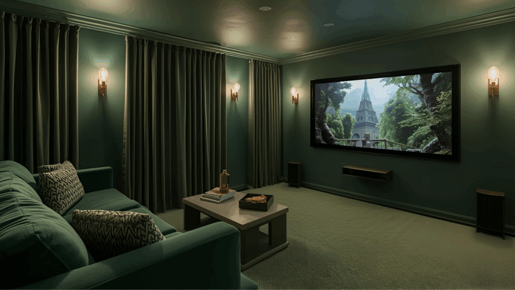
Turn your living room into a cozy home theater with deep matte green walls that absorb light and reduce glare. Keep the ceiling a lighter tone to maintain balance and prevent a cave-like feel.
Add plush seating, blackout curtains, and layered warm lighting to create a soft, cinema-style glow. The dark walls enhance picture quality, making movie nights more immersive while keeping the space stylish enough for daily use.
A few brass or wood accents can warm up the overall mood beautifully.
How to Recreate: Use matte jungle green paint, a lighter ceiling shade, and warm dimmable bulbs for perfect contrast and theater-level comfort.
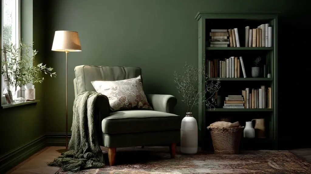
Choosing the Right Shade and FinishPicking the right shade of dark green can completely change how your living room feels. Deep tones like forest or bottle green create warmth and depth, perfect for cozy spaces.
Lighter shades, such as olive or sage, keep the room bright while still adding character. The key is matching the color to your room’s lighting and size.
Darker greens work best in well-lit or larger areas, while softer greens suit smaller or dimly lit rooms. Finish also plays a major role.
Matte or eggshell finishes give a smooth, stylish look and hide wall flaws, while satin or semi-gloss adds light reflection for a modern touch.
For high-traffic areas, washable finishes make maintenance easier. Always test paint samples on your wall before committing, as natural and artificial light can change how each shade appears throughout the day.
What Colours Go With Dark Green?Dark green pairs beautifully with both warm and cool tones, helping you create balance, depth, and contrast in any living room style.
Colour TypeExamplesEffect in the RoomBest Used ForNeutralsWhite, beige, cream, graySoftens the richness of greenWalls, rugs, furnitureWarm TonesMustard, tan, rust, goldAdds warmth and characterCushions, lamps, framesCool TonesNavy, teal, blushImproves depth and contrastAccent décor, curtainsMetallicsBrass, copper, bronzeBrings shine and textureLighting, handles, mirrorsNatural ElementsWood, rattan, juteKeeps the look organicFurniture, baskets, trimsDark green works best when paired with colors that highlight its tone without overpowering it. Test small samples before finalizing combinations.
Small Living Room: Try These TricksMake your dark green living room feel open and bright with these simple layout and décor ideas.
Add Mirrors: Reflect light to make the room appear larger.Use Lighter Curtains: Let in natural light while keeping the space airy.Choose Glass Tables: Maintain openness and reduce visual clutter.Try an Accent Wall: Paint one wall dark green instead of the entire room.Layer Lighting: Use table lamps, floor lamps, and sconces for balanced brightness.Go for Light Fabrics: Linen, cotton, and neutral tones help soften darker walls.Real-Life Dark Green Living Room UpgradeSee how homeowners used dark green to refresh their living rooms with color,
Case Study: “Too Brown” Room Gets Green BalanceBefore: Lots of brown tones made the room feel flat. White walls and ceiling. A projector needed darker surfaces for better picture quality.
Goal: Add depth for movie nights without making the space feel closed in.
What Changed:
Added dark green and burnt orange accentsConsidered dark jungle green on the walls and ceilingTested the full paint plan in a mockup firstAfter: Kept walls white after testing. Used green accents and warm textures. The room feels grounded for movies, still bright for daytime.
Why It Worked: Accents gave depth and contrast. Keeping the ceiling light avoided a “cave” effect.
Homeowner Quote: “After a mockup, I liked it better as it is. The walls will stay white.”
Tips You Can Use:
If you watch on a projector, darken one wall firstKeep curtains light for daytime, darker for movie timeTry a digital mockup before full paintNoted Pieces (From Comments):
Sofa: Kawola “Big Sofa Madeline” (deep seat)Rug: Nouristan (soft, vintage floral look)Mini Review: “Walls Yes, Ceiling No”Before: The Plan was dark green on both walls and ceiling for a theater vibe.
Change Made: Painted only the walls. Left the ceiling white. Choose lighter curtains after the paint for contrast.
Why It Worked: You get the cozy movie feel from the walls. The light ceiling keeps the room open.
Quick Tip: If you love dark green, start with the walls. Go one or two shades lighter on the ceiling if you still want color up top.
Mini Review: “Accent First, Then Decide”Before: Unsure how much green was too much.
Change Made: Added green pillows, throws, and plants. Brought in burnt orange for balance. Lived with it for a week, then made paint choices.
Why It Worked: Testing accents showed how the room would feel. Paint became a final step, not the first.
Quick Tip: Layer accents (pillows, rug, art) before painting. If it still feels flat, add one dark green feature wall.
Maintenance & Upkeep for Dark Green Living RoomsKeep your dark green walls looking fresh, even-toned, and stylish with a few simple habits and seasonal updates.
Clean Dark Walls Safely: Use a soft sponge or microfiber cloth with mild soap and warm water. Avoid scrubbing too hard or using chemical cleaners that dull the finish.Prevent Uneven Fading: Protect your walls from direct sunlight using sheer curtains or UV-filtering film. Rotate décor or furniture occasionally to avoid patchy color exposure.Refresh Décor Seasonally: Change small details like throw pillows, rugs, and artwork with the seasons to keep the space vibrant without repainting.Touch Up When Needed: Keep a small can of your wall paint for minor touch-ups, ensuring consistency and preventing dull spots over time.Final ThoughtsDark green has a way of making any space feel peaceful and complete. Once you see how it transforms your room, you’ll understand why so many people love it.
A modern dark green living room isn’t about being trendy; it’s about finding comfort and character in a color that feels timeless.
Start small if you’re unsure. Try a feature wall, new cushions, or darker curtains. You’ll notice how everything suddenly feels more connected and calm. That’s the beauty of this shade: it adapts to you.
I’d love to know how you’re planning to use dark green in your own space. Share your thoughts, or check out my other home design blogs for more relaxed inspiration.
The post 45 Modern Dark Green Living Room Ideas You’ll Love appeared first on Amenity Home.
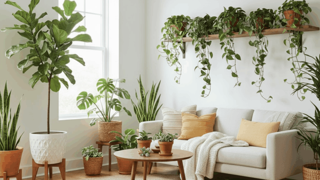
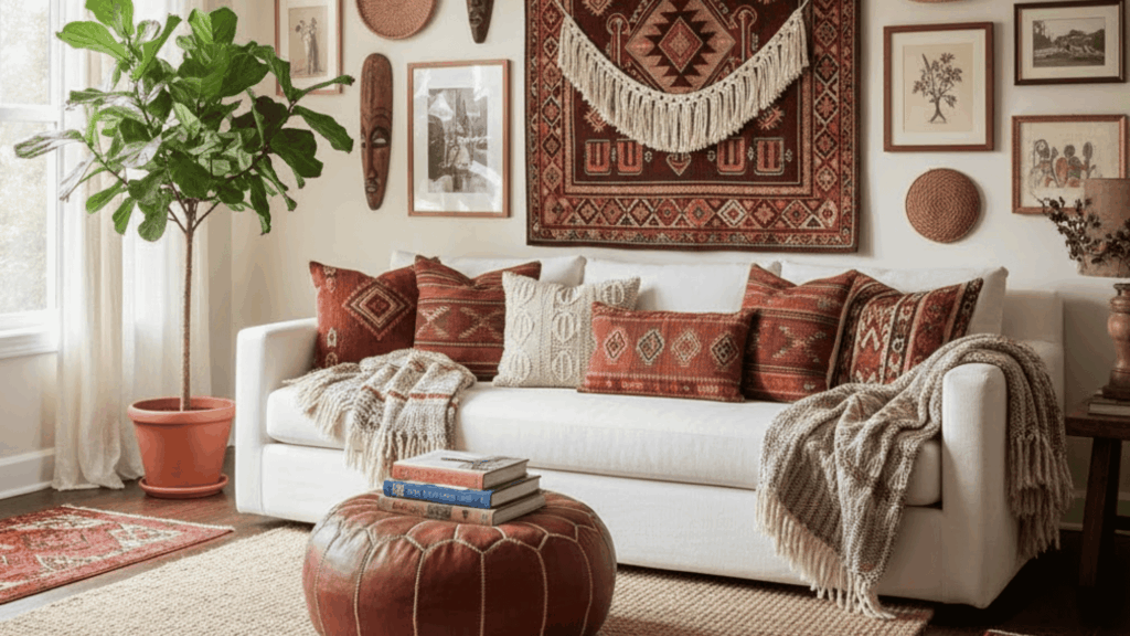
21 Best Modern Bohemian Interior Design Ideas
When I walk into most homes these days, I see two types of spaces, simple white rooms with clean lines or colorful ones filled with pattern and texture.
But what if, like me, you want both? You want calm and creativity. That’s where modern bohemian interior design comes in.
It mixes the easy, natural feel of boho with the clean look of modern style.
In this blog, I’ll explain what modern boho design is, how it differs from traditional boho, its key elements, and ideas to create a cozy, stylish, personal modern boho living room.
What is Modern Bohemian Interior Design?Modern bohemian design is a blend. It’s not traditional boho with its maximalist vibe and every surface covered. Instead, it pulls back a bit.
You still get the warmth. The texture. The handmade touches. But now there’s space to breathe. Clean lines balance out the pattern. Neutral tones ground the color.
Here’s what makes it work:
Natural textures like rattan, jute, linen, and wood.Warm, earthy colors, think terracotta, cream, olive, and rust.Layered textiles such as throws, rugs, and cushions.Plants that bring life into every corner.Handcrafted pieces that tell a story.Then vs. Now
Old-school boho was all about more. More color. More pattern. More stuff. Modern boho says less. It keeps the soul but clears the clutter.
You might have one bold rug instead of three. A single statement plant instead of a jungle. It’s boho that grew up a little.
Core Elements of Modern Bohemian StyleLet’s break down what actually makes a space feel modern boho.
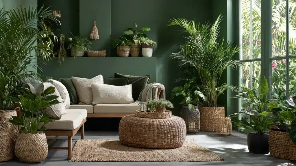
Color Palette: Start with a neutral base, such as cream, beige, or a soft gray. Add warmth with earthy tones. Throw in a jewel tone here and there. Keep it simple.Textures: This is where modern boho really shines. Mix smooth with rough. Soft with structure. Try linen curtains with chunky jute rugs. Texture adds depth without adding noise.Furniture: Look for timeless pieces. Mid-century modern chairs and vintage thrift finds work well. Keep shapes simple with low tables and clean-lined sofas. Don’t match everything perfectly.Lighting: Warm lighting changes everything. Skip harsh overhead lights. Go for woven pendant lamps or floor lamps with linen shades. Natural light is your best friend here.Décor: This is where you show who you are. Hang global-inspired art and display handmade ceramics. But edit as you go. Choose pieces that mean something to you.Plants: If there’s one rule in modern boho design, add plants. Big leafy ones in corners. Hanging plants near windows. Small succulents on shelves. They make spaces feel grounded.Modern Boho Living Room Ideas1. Rattan Revival
My friend Sarah completely changed her living room last spring by adding a curved rattan chair from a local thrift store. “It completely changed the feel of the space,” she told me over coffee.
The natural material brought warmth without overwhelming her small apartment. Rattan furniture works because it’s lightweight and breathable, making rooms feel open rather than cluttered.
The woven texture adds visual interest while staying neutral enough to pair with almost any color scheme.
How to Style It:
Start with one statement piece, like a rattan chair or headboardMix rattan with soft textiles to balance the harder textureLook for secondhand pieces at estate sales for unique findsKeep rattan away from direct sunlight to prevent drying and cracking2. Earthy Neutrals
The color palette in my neighbor Tom’s apartment proves that beige doesn’t have to be boring. He layered terracotta, cream, and warm taupe throughout his space, creating a calm foundation that feels grounded.
These tones work together because they’re all pulled from nature, think desert sand, clay pots, and tree bark. The room feels cohesive without being monotonous, and he can easily swap in colorful accents when the mood strikes.
How to Style It:
Use paint samples on your walls to see how natural light affects each shadeCombine at least three neutral tones to add depthAdd texture through linen, wool, or cotton in similar colorsInclude one darker neutral like chocolate brown to anchor the space3. Layered Rugs

Walking into designer Sofia Martinez’s living room, you’ll notice rugs stacked on rugs, a jute base with a smaller vintage Persian on top.
This technique adds dimension and makes the space feel collected over time rather than decorated all at once. The bottom layer provides coverage while the top rug brings pattern and color.
It’s practical too, since you can change the top rug seasonally without replacing the larger investment piece underneath.
How to Style It:
Place a larger, neutral rug as your base layerAdd a smaller patterned or textured rug on top, slightly offsetMake sure the top rug is at least 2 feet smaller on each sideUse a rug pad between layers to prevent slipping4. Greenery Galore
My sister Kate fills every corner of her studio with plants, fiddle leaf figs, pothos trailing from shelves, and a monstera that’s nearly touching her ceiling. “They make the air feel cleaner and the space feel alive,” she says.
Real plants do require care, but even low-maintenance varieties like snake plants or ZZ plants can soften hard edges and bring organic shapes into a room.
The varying heights create visual layers that draw your eye around the space.
How to Style It:
Group plants in odd numbers for a natural lookUse plant stands at different heights to create levelsChoose pots in clay or ceramic to match the boho vibeResearch light requirements before buying to ensure plants will thrive5. Vintage Finds
There’s a 1970s brass floor lamp in my living room that I found at a flea market for twenty dollars. It has more character than anything I could buy new, with slight tarnishing that tells its story.
Vintage pieces anchor boho spaces by bringing history and uniqueness that mass-produced items can’t match.
A wooden trunk, or mismatched dining chairs, all add personality while keeping the room from feeling too coordinated.
How to Style It:
Visit thrift stores and estate sales regularly for the best selectionFocus on solid wood furniture that can be refinished if neededDon’t worry about matching wood tones—variety adds characterCheck structural integrity before buying, especially for seating6. Global Accents
A hand-woven Moroccan pouf sits in designer Olivia Pierce’s living room, paired with Turkish pillows and an Indonesian wall hanging.
These pieces from different cultures share common threads, natural materials, handcrafted details, and rich patterns.
The room feels worldly without trying too hard. Travel souvenirs or marketplace finds tell stories about the places they’re from, making the space feel more personal than any store-bought collection could.
How to Style It:
Choose pieces from cultures you’ve actually experienced or researchedBalance busy patterns with solid colors to avoid visual chaosSupport artisans by buying directly from makers when possibleGroup similar items together rather than scattering them throughout7. Cozy Floor Seating
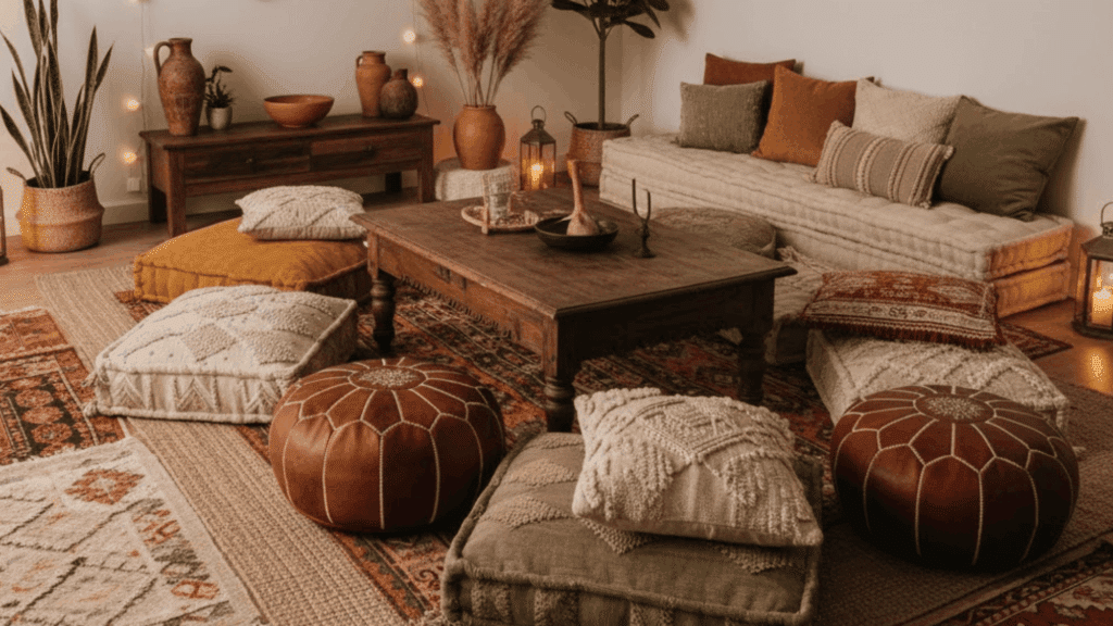
Low cushions and poufs surround the coffee table in interior stylist Nina Caldwell’s meditation corner, creating an intimate gathering spot.
Guests naturally relax when they’re closer to the ground, and the casual setup encourages longer conversations.
Floor seating takes up less visual space than bulky furniture while still providing comfort. It’s perfect for small apartments where traditional sofas might overwhelm the room.
How to Style It:
Layer floor cushions over a thick rug for added comfortChoose cushions with removable, washable covers for easy maintenanceAdd back support with large floor pillows against the wallKeep extra seating stored in a basket when not in use8. Textured Wall Hangings
Amber Lewis, one of my colleagues, mounted a large woven wall piece above her bed instead of traditional artwork. The three-dimensional texture catches light differently throughout the day, making the wall feel alive.
Fiber art softens hard surfaces and absorbs sound, which is especially helpful in rooms with high ceilings or lots of hard flooring. These pieces work as functional art that adds warmth without color.
How to Style It:
Hang wall textiles at eye level for proper visual impactUse a wider piece than you think you need to fill the spaceSteam wrinkles out gently rather than ironing directlyRotate pieces seasonally to prevent dust buildup in the fibers9. Patterned Throw Pillows
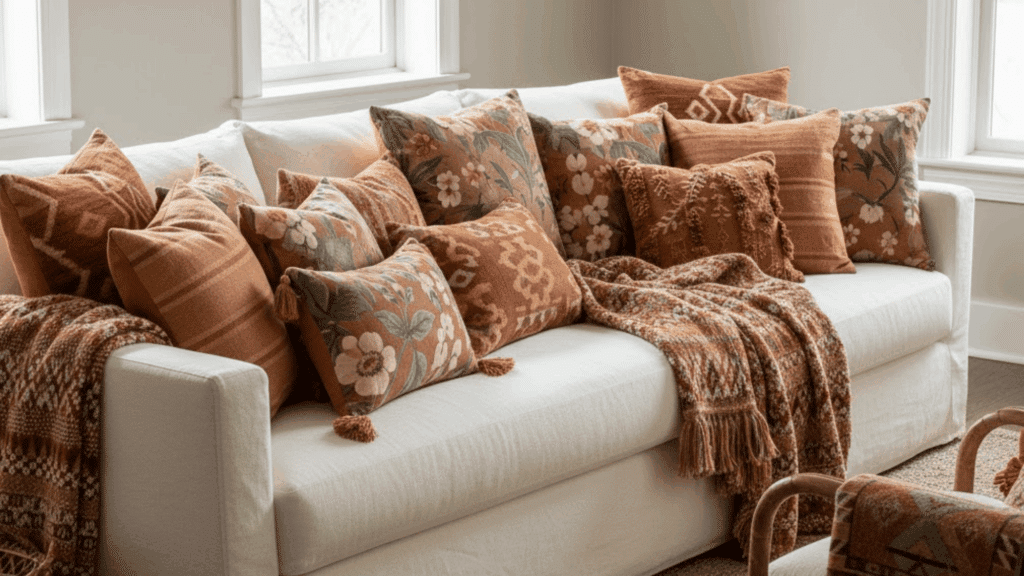
Stylist Claire Bennett mixes geometric prints with floral designs on her sofa while keeping the color palette consistent. “The trick is having a common thread,” she says.
Three to five pillows in varying sizes create interest without overwhelming the seating. The patterns add personality, and the varied textures, velvet, cotton, and linen, make them appealing to use rather than just look at.
How to Style It:
Stick to three colors maximum across all pillow patternsVarious sizes from 16 to 24 inches for visual interestPlace larger pillows in the back, smaller ones in frontInclude at least one solid pillow to give the eye a resting spot10. Woven Light Fixtures
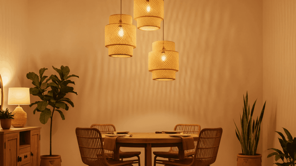
A rattan pendant lamp hangs over my cousin Leanne’s dining table, casting intricate shadows across the walls when lit.
The woven material filters light beautifully, creating warmth without harsh glare. These fixtures become sculptural elements during the day and functional lighting at night.
They work in nearly any room, kitchens, bedrooms, or entryways, bringing organic texture overhead where most people forget to add interest.
How to Style It:
Install dimmer switches to control the mood and shadow intensityHang pendants 30-36 inches above dining tables for proper scaleClean woven fixtures with a soft brush attachment on your vacuumChoose the right bulb color; warm white works best with natural materials11. Natural Wood Furniture
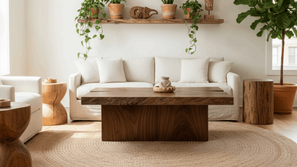
A live-edge coffee table anchors designer Zara Montgomery’s sitting area, with visible knots and grain patterns that make each angle interesting.
The organic edges contrast beautifully with straight-lined sofas and rectangular rugs. Wood brings warmth that painted or metal furniture simply can’t match.
Different wood tones, light oak next to darker walnut, create depth rather than looking mismatched when the rest of the room stays cohesive.
How to Style It:
Look for FSC-certified wood to ensure responsible sourcingSeal raw wood surfaces to protect against water rings and stainsEmbrace imperfections like knots and natural cracks as characterMix wood finishes freely but keep metals consistent for balance12. Handcrafted Ceramics
Pottery teacher Linda keeps a collection of mismatched mugs on open shelving in her kitchen, each one slightly different in glaze and form.
“You can feel the maker’s hands in each piece,” she mentioned during a workshop last fall. Handmade ceramics add a human touch to a space, with slight variations that machine-made items lack.
A ceramic vase or bowl becomes both functional and decorative, especially when left empty to showcase its form.
How to Style It:
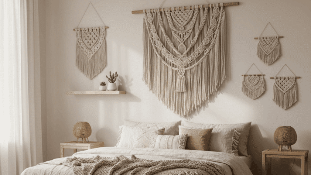
Visit local pottery studios or craft fairs to find unique piecesGroup ceramics in sets of three or five for visual appealDisplay pieces where natural light highlights the glaze variationsHand-wash delicate items to preserve the finish over time13. Macramé Touches
A knotted plant hanger suspends a trailing pothos near the window in stylist Isla Thompson’s sunroom. The cream-colored cord adds vertical interest while taking up zero floor space.
Macramé works because it’s three-dimensional, the knots create shadows and texture that flat wall art can’t achieve.
Even small touches like a macramé table runner or key holder bring that handcrafted, bohemian feel without overwhelming a room.
How to Style It:
Start small with a single plant hanger before adding larger piecesChoose natural cotton cord over synthetic for a genuine textureSecure ceiling hooks into studs for heavier hanging plantersDust macramé monthly with a soft brush to prevent buildup14. Minimalist Boho Palette
Designer Hannah Wright’s guest room uses only white, black, and natural wood tones. The stripped-back approach lets texture stand out with chunky knit throws, woven baskets, and linen bedding, avoiding busy patterns.
This restrained version of boho feels calmer and more modern while keeping the relaxed, natural vibe. It’s easier to maintain, too, since everything coordinates without much thought.
How to Style It:
Add warmth through varied textures rather than multiple colorsInclude black accents in small doses for visual groundingUse natural materials exclusively to maintain the organic feelLet one or two statement pieces stand out against the neutral backdrop15. Statement Artwork
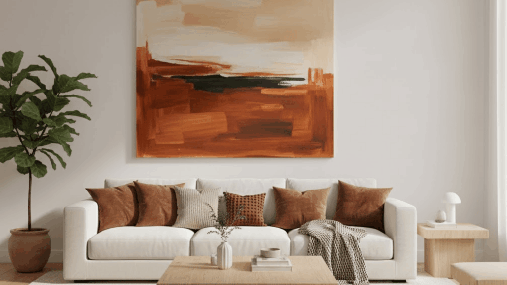
Last year, I bought an oversized abstract canvas at an art fair, all burnt orange, cream, and deep brown swirls. It was more than I planned to spend, but hanging it above the sofa changed everything.
The painting became the room’s anchor point, and suddenly choosing pillows and throws got easier because I just pulled colors straight from the canvas.
That single piece does more work than the three smaller prints it replaced ever did. Large art commands attention in a way that feels intentional rather than empty.
How to Style It:
Choose art that’s at least two-thirds the width of your sofaConsider original pieces from local artists for unique findsFrame prints in simple wood or metal to keep focus on the artHang artwork at 57 inches from the floor to the center, following gallery standards16. Fringe and Tassel Details
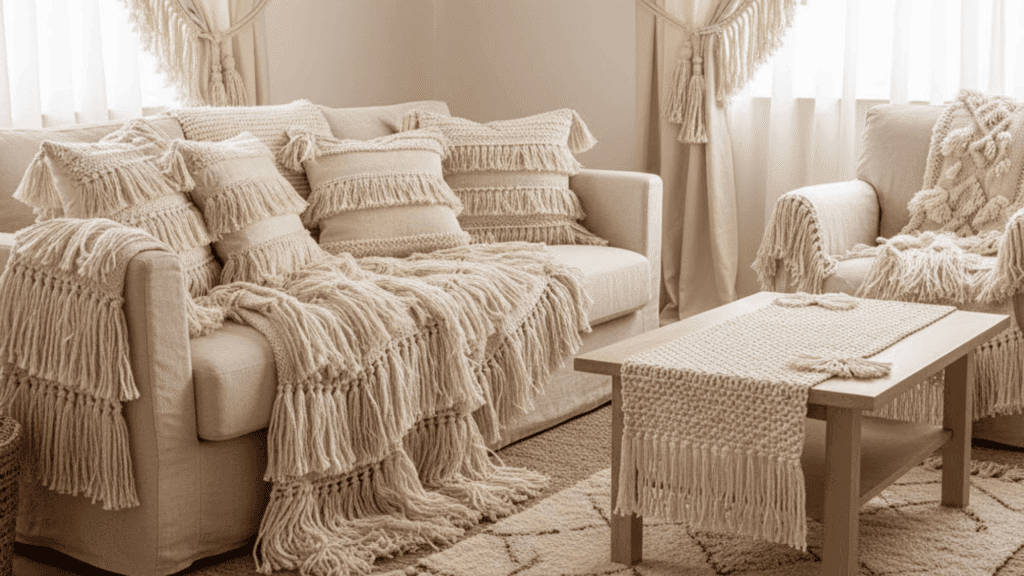
A cream throw blanket draped over the arm of the sofa catches attention not because of its color, but because of the long fringe that sways when you walk past.
Interior designer Mara Steinberg uses these playful details throughout her spaces, tassels on curtain tiebacks, fringe edging on pillows, and knotted pulls on cabinet doors.
These small touches add movement and softness to a room. The texture breaks up flat surfaces and gives the eye something interesting to land on without adding clutter.
How to Style It:
Add fringe to existing items with fabric glue or simple stitchingChoose tassel lengths proportional to the item—longer for curtains, shorter for pillowsTrim uneven fringe with sharp scissors for a cleaner lookAvoid mixing too many fringe styles in one room to prevent visual confusion17. Warm Ambient Lighting

Designer Rebecca Chandler layers multiple light sources in every room rather than relying on overhead fixtures.
Table lamps on different surfaces, a floor lamp in the corner, and candles on the coffee table create pools of warm light that make spaces feel inviting after dark.
The varying heights and intensities add dimension, while warm bulbs cast a golden glow that feels more natural than cool white light. Rooms lit this way photograph beautifully and feel comfortable for actual living.
How to Style It:
Use bulbs between 2700K and 3000K for warm, flattering lightPlace lamps at three different heights throughout the roomAdd dimmer switches to control brightness for different moodsKeep lamp shades light-colored to diffuse rather than block light18. Moroccan-Inspired Decor
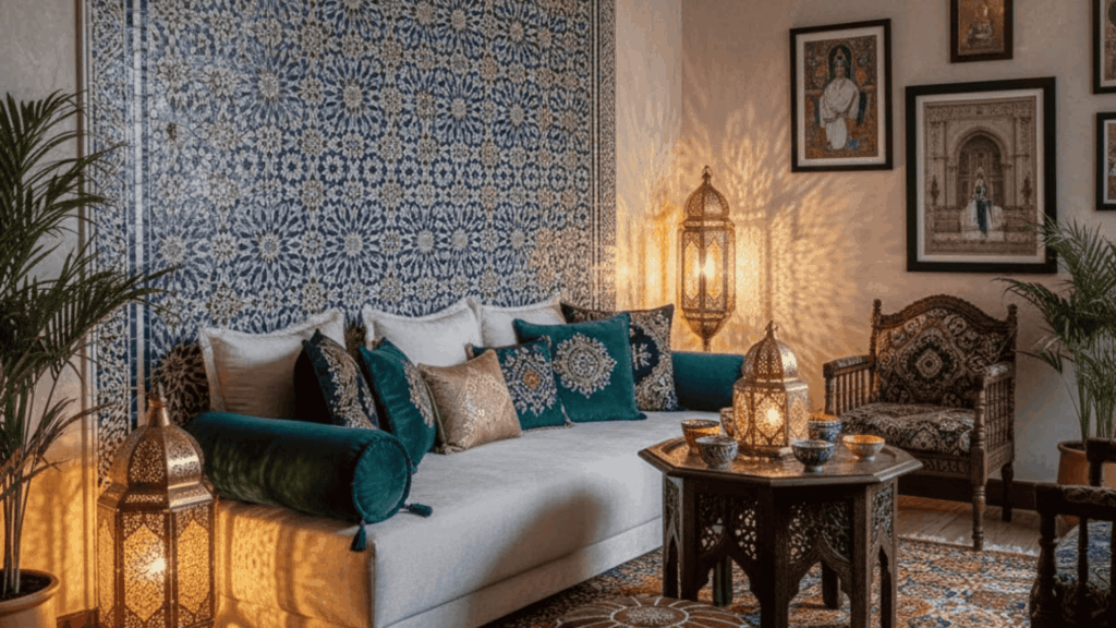
A geometric tile pattern covers the bathroom floor in stylist Diana Rothman’s renovation, featuring deep blue and white in a traditional zellige design.
The intricate pattern brings Old World charm without feeling stuffy. Moroccan elements—poufs, lanterns, patterned textiles- add richness and detail that plain modern pieces often lack.
These designs have survived centuries because they balance complexity with functionality, working in contemporary spaces just as well as traditional ones.
How to Style It:
Start with one Moroccan element like a pouf or mirrorBalance intricate patterns with plain walls and simple furnitureUse brass or copper accents to complement the styleLayer in textiles with geometric designs for cohesion19. Boho Glam Elements
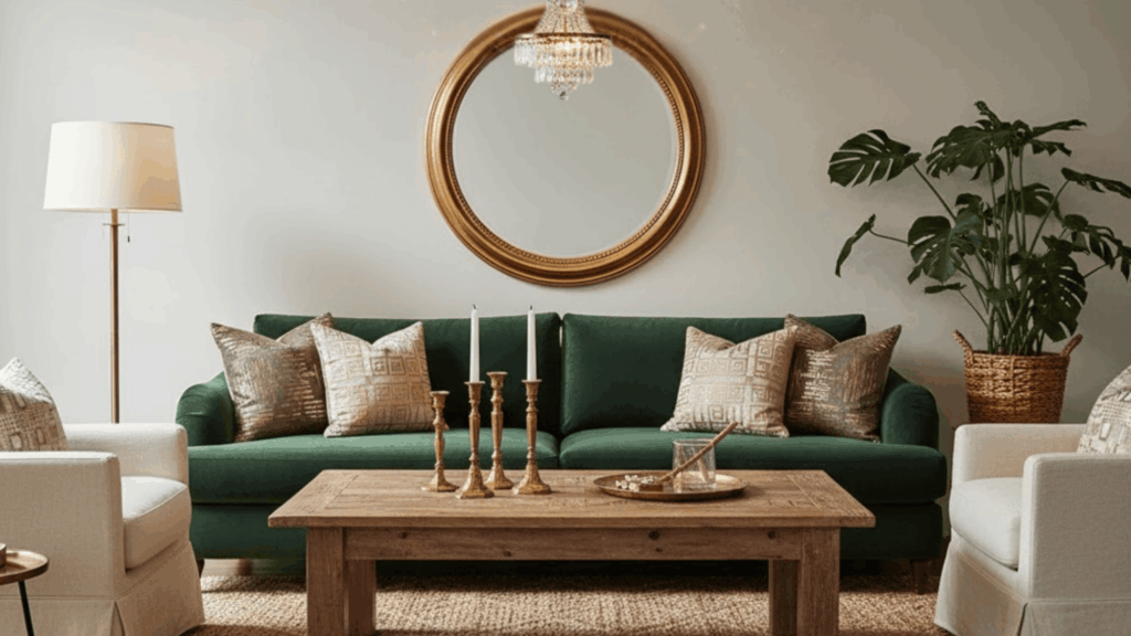
Gold accents appear throughout my colleague Simone’s otherwise earthy living room, a gilded mirror frame, brass candlesticks, and metallic thread in throw pillows.
The shimmer elevates the space from casual to refined without losing its relaxed feel. This contrast between rustic and polished creates tension that keeps rooms interesting.
A velvet cushion next to a jute rug, or a crystal chandelier above a reclaimed wood table, proves that boho doesn’t have to mean rough around the edges.
How to Style It:
Limit metallic finishes to one type, gold, brass, or copperAdd shine-through accessories rather than major furniture piecesBalance glamorous elements with rougher textures like wood or stoneUse metallic accents in groups of three for visual impact20. Mixed Metal Accents
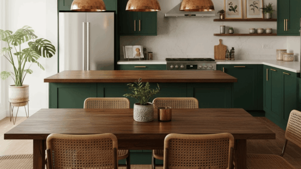
The kitchen in designer Veronica Mills’s home features brass cabinet pulls, copper pendant lights, and a stainless steel fridge. “Matching all your metals feels too coordinated,” she writes in her design guide.
The mix feels collected and personal rather than store-bought. Different finishes catch light in unique ways, adding subtle variation throughout the day.
This approach works especially well in boho spaces where perfection isn’t the goal.
How to Style It:
Choose one dominant metal and use others as accentsKeep metals in the same temperature family—warm or coolDistribute mixed metals evenly throughout the spaceAvoid more than three different metal finishes in one room21. Low-Lying Sofas
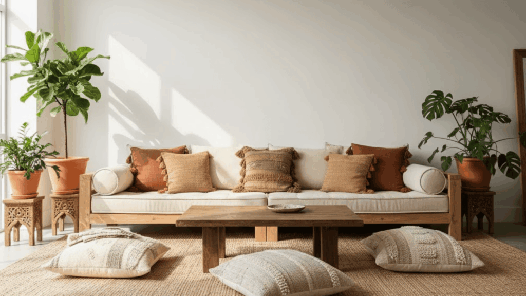
A teak platform sofa sits just inches off the ground in my friend John’s living space, piled with oversized cushions. The low profile makes the ceiling feel higher and the room more spacious.
These pieces encourage a relaxed posture, more lounging than sitting, which suits the laid-back boho aesthetic.
Floor-level furniture also puts you closer to layered rugs and floor plants, creating a grounded feeling that standard-height sofas miss.
How to Style It:
Add extra cushions for back support on very low seatingKeep coffee tables proportionally low to match the sofa heightConsider mobility needs before committing to low furnitureUse furniture risers if you change your mind later about the heightHow to Balance Boho and Modern AestheticsHere’s the tricky part. Too much boho and your space feels messy. Too modern and it feels cold. Balance is everything.
Stick to 3–4 colors: Choose a neutral base and two or three accent colors. When everything works together, the room feels calm, even with pattern and texture. No need for more.Limit your patterns: One patterned rug. Maybe a few patterned cushions. But not patterned everything. Let some pieces be solid so your eye has somewhere to rest and relax.Use symmetry: Even in a relaxed boho space, symmetry helps. Two matching chairs facing a sofa. A pair of lamps on either side. It keeps things from feeling random.For every bold piece, add a grounding neutral: Got a bright orange throw? Pair it with a cream sofa. A busy rug? Keep the furniture simple. This way, nothing fights for attention in the room.Bohemian Décor EssentialsNot sure where to start? Here’s a simple checklist.
ItemWhy You Need ItRattan or wicker chairAdds texture and that classic boho feelMacramé wall hangingJust one, not fivePatterned area rugLook for Moroccan or vintage stylesPouf or floor cushionGreat for extra seatingThrow blanketsLayer two or three in different texturesPlants in woven basketsSnake plants and pothos are easy to care forHandmade ceramicsVases, bowls, or plantersWood coffee tableSomething with natural grainWhere to find them
You don’t need to spend a lot. Thrift stores and flea markets are gold mines for vintage finds. Etsy has tons of handmade pieces. Check out local artisans for one-of-a-kind ceramics or textiles.
And if you’re crafty, try a DIY project. Paint a plain vase. Make your own woven wall art. Turn old fabric into cushion covers.
Global Influences in Bohemian DesignBoho style has always pulled from different cultures. That’s part of what makes it interesting. But it’s important to do this with respect.
Moroccan: Think lanterns, patterned rugs, and metal trays. These pieces add warmth and history.Mexican: Bold colors, handcrafted pottery, and woven textiles. Look for pieces made by local artisans.Indian: Block-printed fabrics, carved wood furniture, and brass accents. These bring richness without feeling heavy.When you buy from real makers, you’re supporting their craft. And your space feels more authentic.
Final ThoughtsModern bohemian design, to me, is all about comfort and creativity living side by side. I love how it mixes clean, modern lines with cozy, collected details that tell a story.
The best part? There are no strict rules, just balance, warmth, and personality. Even if it’s a rattan chair, a layered rug, or a plant-filled corner, each piece adds a bit of soul.
Start small, trust your taste, and let your home change naturally over time.
If you’re ready to give your space that modern boho charm, pick one idea from this guide and try it today. Your perfect cozy-meets-chic home is waiting!
The post 21 Best Modern Bohemian Interior Design Ideas appeared first on Amenity Home.
Modern Bohemian Style: Create a Naturally Relaxed Home
When I first started decorating my home, I wanted it to feel warm, calm, and personal, not just stylish. That’s exactly what modern bohemian style brings.
It’s relaxed, welcoming, and full of quiet character without feeling busy. I love how it blends natural textures, cozy fabrics, and soft, earthy colors that make any space feel instantly peaceful.
You don’t have to match everything perfectly, just choose what feels right to you. Each item adds meaning and comfort in its own way.
As you start layering wood, linen, and woven pieces, you’ll notice how your rooms begin to reflect your personality. Modern boho turns simple spaces into homes that truly feel lived in and loved.
Understanding Modern Bohemian StyleModern bohemian style is a relaxed yet refined approach to decorating that blends creativity with comfort. It keeps the free-spirited heart of classic boho but trims away the clutter.
Instead of filling every corner, it uses space wisely, choosing fewer pieces that still feel warm and personal. You’ll see natural textures like rattan, jute, linen, and light woods mixed with clean lines and simple shapes.
The color palette leans on soft neutrals, white, beige, sand, and tan, layered with earthy tones like rust, olive, or terracotta. It’s a look that feels calm, lived-in, and effortless rather than polished.
A modern boho room might include a linen sofa, woven baskets, a jute rug, and a few handmade ceramics.
To visualize it, imagine a mood board with warm, sunlit tones, soft fabrics, and organic finishes, all designed to bring a sense of ease and character to your space.
Modern vs. Traditional Bohemian Style
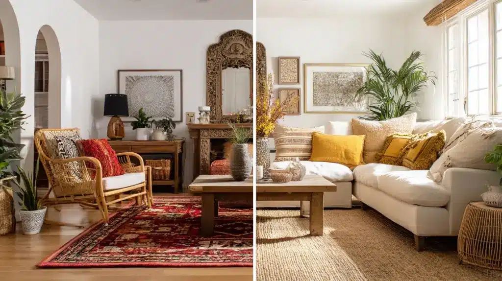
Both styles celebrate creativity, but modern boho feels lighter, calmer, and more intentional than its traditional, eclectic roots.
FeatureTraditional BohoModern BohoColorRich, saturatedSoft neutrals, earthy huesLayoutEclectic, busyOpen, balancedMaterialsVelvet, carved woodRattan, cane, linenDécorMaximal layeringCurated minimalismCore Elements of Modern Boho DécorModern boho décor is built on comfort, texture, and simplicity, creating inviting spaces that feel warm, natural, and personal.
Natural Materials: Rattan chairs, jute rugs, cane lighting, and linen cushions add warmth and texture.Layered Textures: Mix woven fabrics, wood, ceramics, and metal accents to create depth without clutter.Neutral Base: Use whites, creams, and tans as your foundation, adding muted earth tones for contrast.Greenery and Plants: Bring life and softness through hanging plants, potted palms, or trailing vines.Woven Storage: Use baskets for organization that doubles as décor.Lighting Examples: Choose rattan pendants or bamboo floor lamps for a calm, diffused glow.Furniture Focus: Keep clean lines, simple wood tables, low sofas, and light, open shelving for balance.Why Modern Boho is Trending AgainModern boho interior design is making a strong return because people want homes that feel personal, cozy, and full of character.
After years of cool, gray minimalism, many are craving warmth and comfort, something softer and more natural. This style offers balance, combining creativity with calm through earthy tones, layered textures, and meaningful pieces.
It’s also simple to adapt. You can mix vintage finds with clean-lined furniture, add handmade décor, or use natural materials without following strict rules.
Every home feels unique, relaxed, and inviting. That easy flexibility, along with its classic comfort, makes modern boho one of today’s most appealing and lasting design trends for all kinds of spaces.
Modern Bohemian Style IdeasModern bohemian style thrives on comfort, texture, and individuality. These ideas help you create a relaxed, welcoming, and naturally balanced space.
1. Start With a Neutral Base
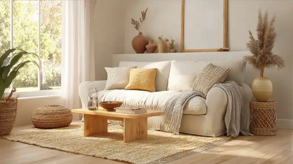
A neutral foundation keeps your modern boho space bright, calm, and adaptable.
Begin with shades like white, beige, or sand to maintain openness. Add warmth with accents such as clay, taupe, or terracotta. This palette allows furniture and decor textures to stand out naturally.
Neutral tones also help light reflect better, making small rooms feel more spacious and cohesive.
This approach gives flexibility when updating your decor seasonally without repainting or replacing key items.
White or beige wallsLight wood furnitureClay vases or bowlsWoven beige rugInspiration: Bright, open living room with cream walls, woven rug, and oak furniture creating a calm, welcoming look.
2. Layer Natural Textures
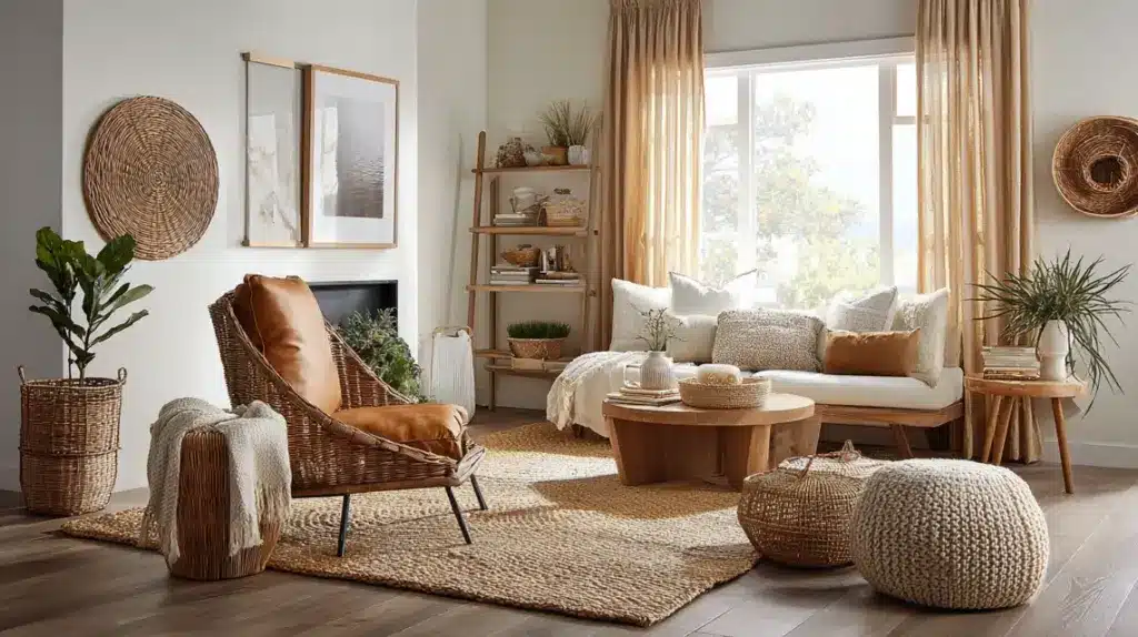
Layered textures create depth, comfort, and personality in modern boho homes.
Mix rattan chairs, jute rugs, and linen throws for tactile richness. Cane furniture and woven wall art also soften edges while adding warmth. Keep a balance by pairing smooth surfaces like glass or polished wood with rougher, organic finishes.
This mix keeps the design relaxed but visually interesting, giving every surface a sense of life and texture.
Jute or sisal rugLinen or cotton curtainsRattan chair or benchWoven basket setInspiration: Cozy space featuring a jute rug, rattan chair, linen curtains, and soft throws layered for warmth.
3. Add Cozy Woven Lighting
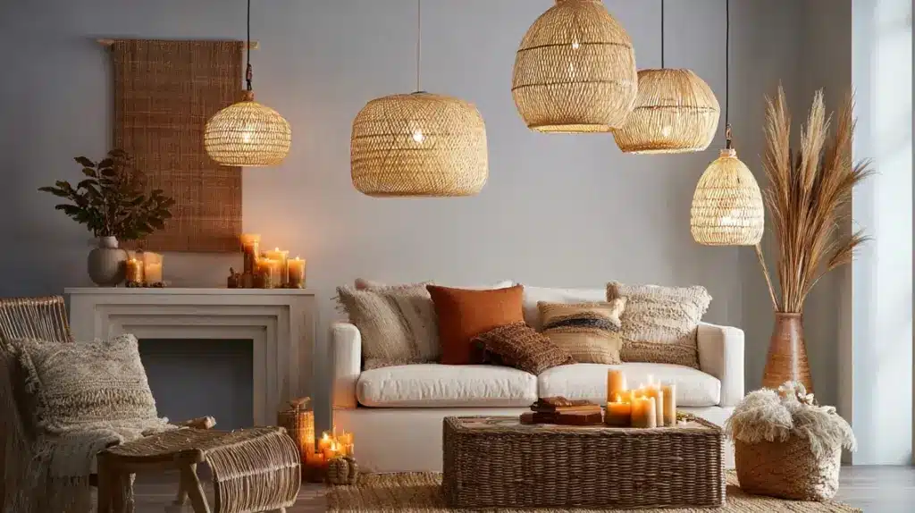
Soft lighting defines the mood of a modern boho room and highlights its layered textures naturally.
Swap harsh overhead lights for rattan pendants, wicker shades, or bamboo lamps. They diffuse light gently and add warmth to plain corners. Layer in table or floor lamps to create depth and balance.
These fixtures make the space feel comfortable without adding visual clutter. They also introduce subtle texture overhead, tying in with other natural elements.
Use warm bulbs, not whiteTry rattan or cane pendantsAdd a floor lamp near seatingMix candles for evening ambianceInspiration: Softly lit room with hanging rattan pendants, bamboo lamps, and candles glowing against natural textures.
4. Mix Vintage and Handmade Décor
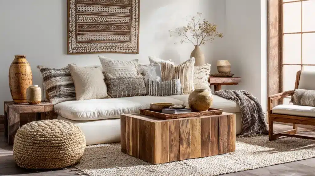
Mixing vintage and handmade décor brings warmth and character to modern boho spaces.
Use flea-market finds, pottery, or handwoven baskets to add individuality. Choose items with natural finishes or subtle wear for charm. Pair these with simple, modern pieces to balance old and new.
This approach makes your home feel authentic and lived-in, not staged. Every item tells its own small story while still working within the modern boho look.
Vintage side tableHandmade ceramic vaseWoven wall artRattan tray displayInspiration: Eclectic living area styled with vintage wood furniture, ceramic vases, and handwoven baskets for character.
5. Create a Statement Wall
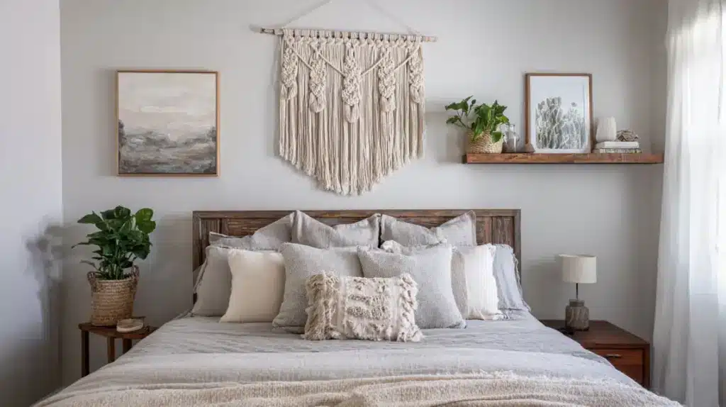
A statement wall adds focus and personality without overwhelming the room.
Pick one area for artwork, macramé, or woven hangings. Use colors that align with your neutral base so the display feels balanced. Keep the remaining walls simple to maintain the flow.
This idea adds a creative centerpiece and draws the eye while keeping the mood relaxed. It also helps express your personal style in a subtle way.
Macramé wall hangingLarge neutral art printNatural wood floating shelvesMinimal gallery displayInspiration: Bedroom with macramé wall art above a wooden headboard and neutral bedding for visual balance.
6. Bring Nature Indoors With Plants
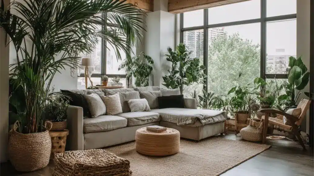
Plants are a natural part of boho design, adding energy and color to calm spaces.
Use tall varieties like palms or fiddle leaf figs to fill corners. Add trailing plants such as pothos or ivy on shelves. Natural pots made from terracotta or woven fiber keep the look cohesive.
Greenery softens the geometry of furniture and links indoor living with nature. It’s the simplest way to refresh a space year-round.
Large leafy palmHanging pothos vineTerracotta potWoven planter basketInspiration: Bright corner filled with leafy palms, hanging vines, and terracotta pots placed near wide windows.
7. Choose Simple, Modern Furniture
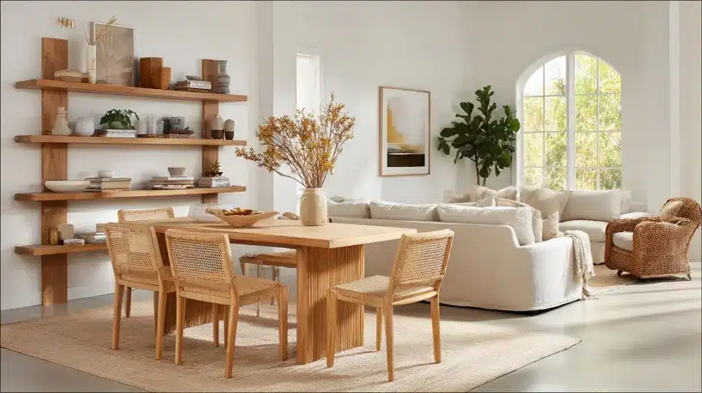
Simplicity in furniture helps maintain balance in modern boho rooms.
Go for clean lines and low silhouettes in wood or cane. Choose light stains instead of dark ones to keep the room airy. Avoid bulky furniture that blocks natural flow.
This approach gives a relaxed look while allowing textures and small décor details to stand out clearly. Comfort and functionality always come first in this design style.
Light wood dining tableLinen or cotton sofaCane-backed chairsOpen wood shelvingInspiration: Minimal living room with a light wood table, a linen sofa, and cane chairs arranged in an open space.
8. Use Global Patterns Sparingly
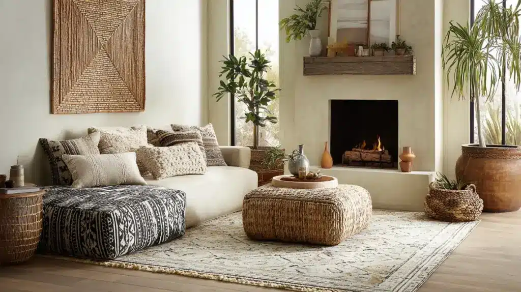
Patterns inspired by global design add culture and texture when used carefully.
Try Moroccan, Aztec, or tribal motifs through throw pillows or rugs. Stick to muted tones that match your neutral palette. A few patterned accents create depth without visual overload.
Balanced use of these prints honors bohemian roots while maintaining modern simplicity.
Neutral patterned rugFaded tribal cushionsHandwoven blanketSimple geometric wall artInspiration: Seating area featuring neutral cushions, a faded patterned rug, and woven art for subtle contrast.
9. Design a Modern Boho Bedroom
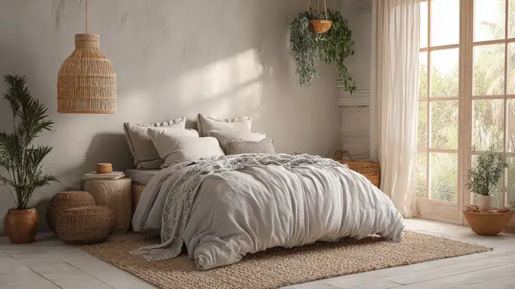
A boho bedroom should feel restful and layered, not cluttered.
Start with light bedding in linen or cotton. Add throws, woven lamps, and macramé wall décor for texture. Use muted colors to keep the mood soft and inviting.
Keep only items that bring comfort or meaning—simplicity enhances peace.
Linen duvet setRattan pendant lampWoven area rugSmall potted plantInspiration: Peaceful bedroom with linen bedding, woven lamp, soft rug, and hanging plants near the window.
10. Refresh Your Kitchen With Boho Touches
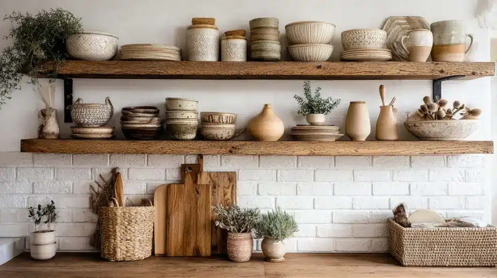
Bring boho texture into your kitchen through simple, natural updates.
Replace standard metal handles with wood or matte finishes. Add open shelving to display pottery or herbs. Keep counters clear except for decorative essentials.
This design keeps your kitchen practical but warm, blending modern and natural details seamlessly.
Wooden cutting boardsClay or ceramic dishwareOpen shelving unitHanging herb rackInspiration: Kitchen with open wood shelves, clay dishware, woven baskets, and small potted herbs by the sink.
11. Style a Relaxed Dining Area
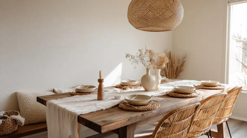
A boho dining area should feel casual and inviting.
Use a simple wooden table with linen runners and mismatched chairs. Add woven placemats or natural tableware for texture. Keep lighting soft to encourage comfort.
This setting creates an easy, welcoming space for everyday meals or gatherings.
Rattan or cane chairsLinen table runnerBrass or bamboo light fixtureDried flower centerpieceInspiration: Dining room with a wooden table, mixed chairs, a linen runner, and a warm pendant lamp overhead.
12. Upgrade Your Bathroom With Natural Details
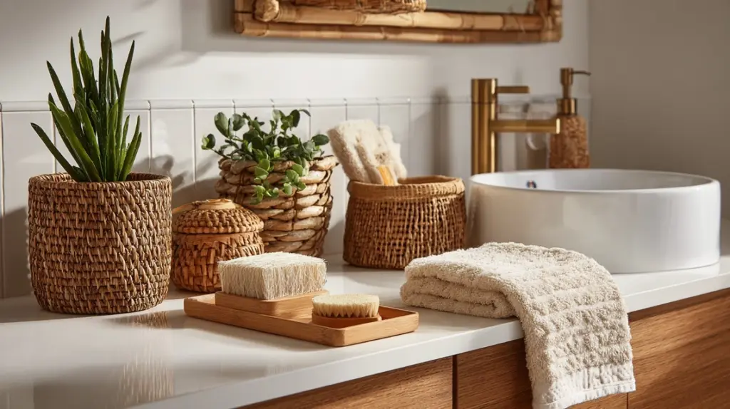
Add organic warmth to your bathroom using wood, bamboo, and soft fabrics.
Incorporate woven baskets, trays, and small potted plants. Replace bright bulbs with warm ones for a relaxed glow. Natural textures balance the clean lines of modern fixtures.
These details make even compact bathrooms feel serene and personal.
Bamboo accessoriesWooden vanity trayWoven hamperTerracotta planterInspiration: Bathroom styled with bamboo racks, woven baskets, and a wooden vanity paired with soft, warm lighting.
13. Layer Lighting for Warmth
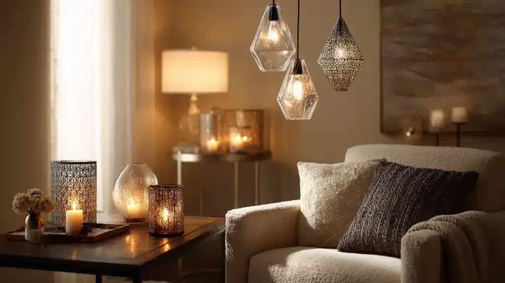
Layering light sources builds depth and flexibility in any room.
Use ceiling pendants, floor lamps, and table lights together. Each source highlights a different layer of texture. Keep bulbs warm to maintain a cozy feeling throughout.
Proper lighting transforms a neutral space into one that feels welcoming from morning to night.
Ceiling pendant lampLinen-shaded floor lightSmall desk lampCandles for mood lightingInspiration: Living room layered with ceiling pendants, floor lamps, and candles, creating a soft, golden glow.
14. Add Seasonal Décor Changes
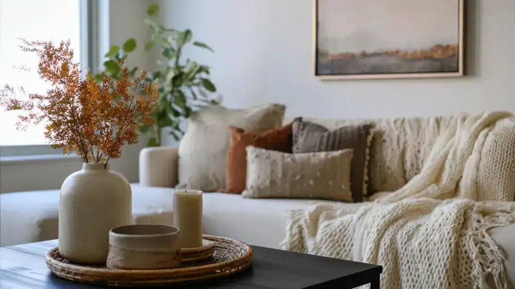
Refresh your modern boho look with subtle seasonal updates.
Switch textiles, plants, and small accessories as the weather changes. Lighter fabrics and fresh greens work for summer, while knits and earth tones suit winter.
Rotating small details keeps your home lively without requiring major changes.
Linen throws for summerWool blankets for winterSeasonal art printsDried leaves or flowersInspiration: Same neutral room refreshed with linen in summer and cozy knits for the cooler seasons.
15. Choose Sustainable Materials
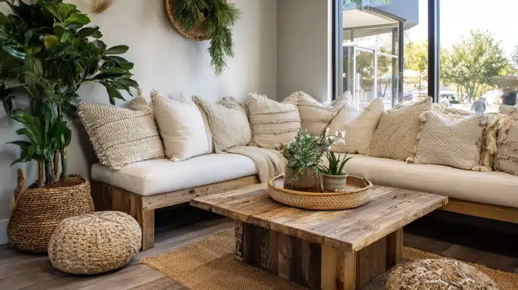
Sustainability fits perfectly within the modern boho mindset.
Select furniture made from reclaimed wood and fabrics from organic fibers. Buy local crafts to support artisans and reduce waste. Eco-conscious design adds longevity and meaning.
Small sustainable choices make your space beautiful and responsible at once.
Reclaimed wood tableOrganic cotton cushionsBamboo traysUpcycled décor itemsInspiration: Corner setup featuring reclaimed wood table, organic cotton cushions, and bamboo trays for everyday use.
16. Decorate on a Budget
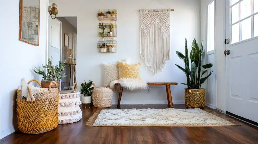
Modern boho interiors can be affordable when you use creativity.
Shop thrift stores or repurpose older furniture with fresh paint. DIY projects like handmade wall hangings or art can add personality. Focus on texture and proportion instead of high-cost items.
Thoughtful layering makes inexpensive spaces look intentional and stylish.
Thrifted basketsPainted a secondhand chairDIY macramé artRepurposed glass jarsInspiration: Small entryway styled with a thrifted bench, a jute basket, a painted frame, and a woven floor rug.
17. Incorporate Boho-Inspired Outdoor Spaces
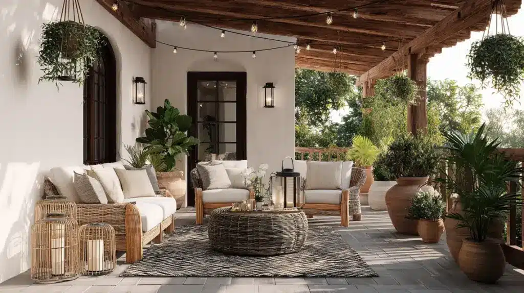
Outdoor areas can carry the same warmth and texture as your interiors.
Use weather-friendly materials like rattan, bamboo, and jute. Add cushions in neutral tones with subtle prints. String lights or lanterns make evenings feel soft and inviting. Include plants in large clay pots or hanging baskets for a natural, relaxed vibe.
Your outdoor setup becomes an extension of your home’s calm, cozy atmosphere.
Rattan or wicker seatingNeutral outdoor cushionsString or lantern lightingLarge clay plantersInspiration: Outdoor patio featuring wicker chairs, string lights, a woven rug, and clay pots under a wooden pergola.
How to Bring Modern Boho Style Into Your Home
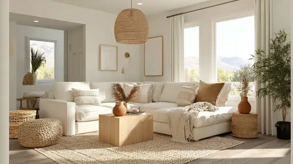
Bring your modern boho vision to life with simple, step-by-step actions focused on color, furniture, texture, and personal touches.
Step 1: Define Your Color PaletteStart simple. Pick 3–4 tones: one base, one main accent, one light highlight, and one deep anchor. Keep these colors consistent across rooms so your home feels connected. Let wood tones count as part of the palette.
Quick Picks: white, tan, rust, sageWhere To Use: walls (base), sofa/rug (main), pillows/throws (highlight), small metal or wood details (anchor)Avoid: adding extra colors mid-way “just because”Pro tip: Save a swatch set on your phone and check it while shopping.
Step 2: Build Around Key Furniture PiecesSet the room with the largest items first: sofa, bed, or table. These pieces set scale and flow. Bring in small décor after the big items are placed.
Order: rug → main furniture → side tables → lighting → decorKeep Interest: mix textures (linen, jute, cane, wood) more than new colorsFlow: leave clear walk paths on the most-used routesPro tip: If a piece works for size and comfort, keep it; change covers or hardware for a new look.
Step 3: Add Layers Through TextilesTextiles give softness and depth fast. Use throws, rugs, and curtains to warm hard edges and reduce echo.
Rugs: large jute base + softer topperCurtains: hang high; choose natural fabrics in palette tonesRepeats: echo colors from your palette in small dosesPro tip: Aim for 1–2 patterns per room and keep the rest solid.
Step 4: Personalize With Art and Handmade ItemsShow your story without clutter. Choose a few pieces that matter: ceramics, prints, woven art, travel finds. Give each item space so it reads clearly.
Placement: one focal wall or a tight gallery, not bothSurfaces: style trays and shelves, but leave empty space between itemsRotate: swap small pieces seasonally instead of buying morePro tip: Before adding anything new, remove one thing. Rooms feel calmer and more intentional.
Styling Tips for a Balanced Modern Boho LookLearn how to balance color, texture, and layout so your modern boho home feels relaxed, cohesive, and visually grounded.
Mix textures, not patterns, for harmonyKeep 60% neutrals, 30% accents, 10% contrast tonesLayer lighting: overhead, task, and ambientCombine vintage finds with clean modern linesUse plants to connect different materialsLeave white space around bold piecesRepeat natural elements like wood and juteKeep décor heights varied for flowAdd one standout handmade or artisan item per roomBalance warm metals (brass, copper) with matte finishesCaring for Your Modern Boho SpaceKeeping your modern boho space beautiful is all about maintenance, balance, and mindfulness. Focus on light upkeep rather than deep cleaning marathons. Dust woven items and macramé weekly using a handheld vacuum or soft brush.
Rotate cushions, rugs, and throws seasonally to prevent fading and even out wear. When possible, air out natural fabrics like linen or cotton in sunlight to refresh them.
Water plants on schedule and repot when roots show to maintain that organic feel. Avoid overfilling surfaces; let each decorative piece breathe.
Refresh scents naturally with dried herbs or essential oil diffusers instead of synthetic sprays. A few minutes of regular care keep your modern boho space feeling calm, grounded, and effortlessly inviting year-round.
Summing UpModern bohemian style is about creating comfort with purpose, a home that looks effortless and feels genuinely lived in. By focusing on texture, light, and simple details, you can turn any space into a calm and grounded retreat.
Each piece, from woven rugs to handmade accents, adds quiet character and warmth without feeling cluttered.
I hope this sparked ideas for how you can bring modern bohemian style into your own space. Try starting small, maybe a textured lamp, a jute rug, or soft linen cushions.
Little changes can upgrade how your home feels. If you enjoyed this, check out my other home styling blogs for more relaxed, down-to-earth design ideas that make every corner feel inviting.
The post Modern Bohemian Style: Create a Naturally Relaxed Home appeared first on Amenity Home.
November 9, 2025
Reviewing Benjamin Moore Natural Cream (OC-14)
Choosing the right neutral paint can be surprisingly tricky. I’ve been there, staring at dozens of swatches that all look the same until they’re on the wall.
One color that truly stands out is Benjamin Moore Natural Cream (OC-14). It’s soft, warm, and incredibly versatile, making it a favorite for cozy homes and modern spaces alike.
In this blog, I’ll share everything about this beautiful shade, its undertones, how it looks in different rooms, how it compares to other Benjamin Moore colors, and the best color pairings.
You’ll also find tips on where to buy it, how to test it, and ideas for using it in your home. Let’s dive into why Natural Cream Benjamin Moore might be your perfect neutral.
What Is Benjamin Moore Natural Cream (OC-14)?BM Natural Cream (OC-14) is a light greige, a mix of gray and beige, that brings a calm and cozy feeling to any space.
It sits beautifully between warm and cool tones, making it work well with almost any decor style.
Here are a few quick facts:
FeatureDetailsColor FamilyGreige / NeutralLRV (Light Reflectance Value)64.78Finish OptionsMatte, Eggshell, Satin, Semi-GlossAverage Price$5.99 (sample) – $30.99 (quart)Best ForLiving rooms, bedrooms, kitchens, cabinetsThis color reflects a good amount of light without looking stark white. It keeps rooms feeling bright but still soft and inviting.
The Undertones of Natural Cream OC-14One of the biggest reasons people love Benjamin Moore Natural Cream is its undertones. It’s a warm greige with very subtle green undertones.
That little hint of green keeps it from turning too yellow or pink under certain lights.
Here’s how lighting affects it:
North-facing rooms: It looks more like a soft gray-beige, giving a cooler feel.South-facing rooms: It appears warmer and cozier, leaning slightly toward beige.Artificial lighting: The shade looks creamy and balanced, not too dark or too bright.Quick Tip: If a room gets lots of sunlight, Natural Cream looks lighter. In low-light rooms, it feels a bit more grounded and warm.
Where to Use Natural Cream in Your Home1. Living Room
BM Natural Cream creates a peaceful backdrop that blends effortlessly with any style—from modern minimalism to farmhouse comfort. It keeps the space feeling warm and welcoming without overpowering the decor.
Works beautifully with warm wood furniture, beige upholstery, and textured neutral rugs.Add contrast with black metal frames, gold light fixtures, or soft greenery for a balanced, stylish look.2. Bedroom
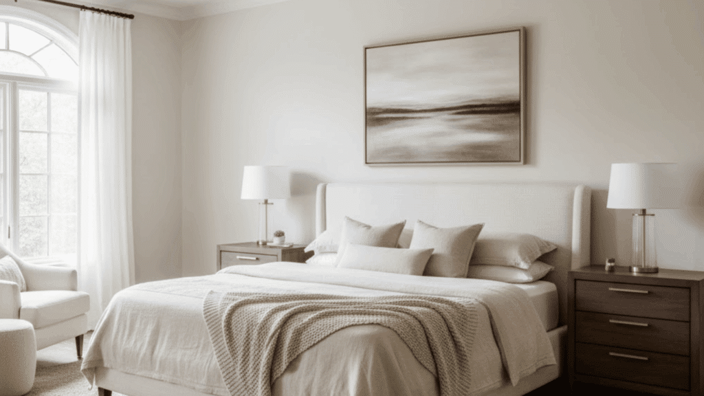
This color turns bedrooms into calm, restful retreats filled with warmth and simplicity. The soft, beige tone adds just enough coziness to help the room feel both modern and soothing.
Pairs perfectly with white trim, natural linen bedding, and woven rattan textures.Layer in warm lighting and light wood furniture to make the space feel relaxing and timeless.3. Kitchen
For kitchen cabinets and walls, Benjamin Moore Natural Cream delivers a clean, classic look that never goes out of style. It’s an inviting shade that adds gentle warmth without making the space feel heavy.
Complements brass hardware, matte black fixtures, and white quartz countertops.Blends effortlessly with open shelving, farmhouse sinks, and stainless-steel appliances for a cozy yet modern feel.4. Bathroom
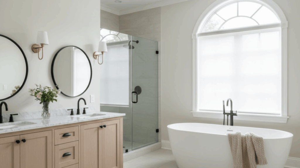
In bathrooms, this greige shade introduces a serene, spa-like atmosphere that feels both refreshing and elegant. Its balanced undertones make it perfect for creating a light, airy retreat.
Works wonderfully with marble countertops, white tiles, and warm wooden vanities.Accentuate the calm with soft beige towels, woven baskets, and brushed-gold fixtures for a luxurious finish.Natural Cream vs. Similar Benjamin Moore ColorsPeople often compare Natural Cream OC-14 to other popular shades like Swiss Coffee or Ballet White.
Here’s a quick comparison:
Natural Cream sits right in the middle; it’s warmer than gray, cooler than beige, and perfect when you can’t decide between the two.
Colors That Go Well with Benjamin Moore Natural CreamPairing colors is where this paint really shines. Natural Cream loves to play nice with many tones, from crisp whites to deep charcoals.
Here are some tried-and-true pairings:
Neutral CompanionsWhite Dove (OC-17): A soft white that works beautifully on trim.Stone Hearth (984): A warm gray that adds contrast to Natural Cream.Silver Lake (1598): Cool and modern gray for a balanced palette.Accent ColorsMaritime White (OC-5): Adds a coastal feel.Winds Breath (981): A lighter neutral for layering walls and trims.Silhouette (AF-655): Deep charcoal for dramatic contrast.Combine Natural Cream walls with white trim, black metal fixtures, and wood floors for a timeless, cozy look that never goes out of style.
Availability and Where to BuyReady to try BM Natural Cream in your own space? Here’s where it can be found:
Benjamin Moore Stores: Available in sample pots, quarts, and gallons.Samplize: Peel-and-stick samples for around $6.95.Etsy: Curated Natural Cream color palettes and decor guides.Average Price Range:
Sample Pot (8 oz): $5.99Quart: $25.99–$30.99Gallon: Around $60–$70Tip: Always test a sample on your wall first. Paint can look different depending on your lighting and flooring.
Tips for Using Natural Cream Like a ProHere are a few helpful design tricks to make the most of this shade:
TipDescriptionTest before paintingTry a large sample board to see how the color looks in both morning and evening light before committing to it.Match your finishesUse matte or eggshell finishes for walls to create a soft look, and semi-gloss for trims to add subtle contrast.Play with texturesCombine Natural Cream with wood, linen, and other natural materials to create a warm, cozy atmosphere.Contrast smartlyPair with dark furniture, black fixtures, or metal accents to make the color stand out beautifully.Mind your lightingWarm bulbs highlight the creamy warmth of the shade, while cool LED lights bring out its gray undertones.Why Natural Cream Benjamin Moore Is So PopularIf unsure, paint a sample on poster board and move it around the room. It’s a safe way to see how the tone changes throughout the day.
This paint color has gained a following because it just works. Unlike trendy colors that come and go, Natural Cream remains classic.
Here’s why it stands out:
Versatility: Works with any style, modern, farmhouse, coastal, or traditional.Balance: Neither too warm nor too cool.Mood: Feels cozy, welcoming, and timeless.Compatibility: Matches a wide range of decor and materials.It’s one of those shades that make spaces feel bigger, softer, and more elegant—all without being “too much.”
Final ThoughtsAfter seeing how beautifully Benjamin Moore Natural Cream (OC-14) works in different rooms, it’s easy to understand why so many people love it.
It’s one of those rare paint colors that fits every mood, warm, calm, and endlessly versatile. Whether it’s on walls, cabinets, or trim, it always brings a soft, welcoming feel.
Personally, I think it’s the kind of shade that instantly makes a house feel like home.
If you’re searching for a cozy neutral that never goes out of style, give BM Natural Cream a try, grab a sample today and see how it transforms your space!
The post Reviewing Benjamin Moore Natural Cream (OC-14) appeared first on Amenity Home.
How to Choose the Best Sander for Furniture Projects?
Tired of rough, uneven furniture finishes that ruin hours of hard work, no matter how carefully you sand by hand? Finding the best sander for furniture converts tedious projects into smooth, professional results that make your pieces look store-bought instead of homemade.
Different furniture jobs need specific sanders, whether you’re stripping old paint, smoothing raw wood, or adding final touches to delicate surfaces.
I’ve tested popular models and researched what actually works for real furniture projects at every skill level and budget available.
Understanding sander types, features, and safety practices helps you choose tools that match your workshop needs and project demands. Let me show you the best sander for furniture that matches your needs perfectly.
Why You Need the Right Sander for Furniture?Using the right sander makes furniture projects easier, faster, and produces smoother finishes that look professionally done rather than amateurish.
Proper sanding improves how paint, stain, or finish adheres to wood surfaces, preventing peeling or uneven coverage that ruins your work.
Sanding raw wood requires different techniques than removing old paint or refinishing antique pieces with delicate surfaces that need gentle care.
The right grit sandpaper, tool power level, and sanding motion all work together to create smooth results without damaging wood fibers.
Using the wrong tools leaves swirl marks, gouges, or rough patches that show through the paint and make your furniture look cheap and poorly finished. Choosing the correct sander saves time and frustration while delivering results you’ll be proud to display.
Types of Sanders for Furniture ProjectsDifferent sanders serve specific purposes, and choosing the right one depends on your project size, furniture condition, and experience level. Here’s how each sander type compares to help you pick the best tool for your furniture work:
Sander TypeMotionPower LevelIdeal ProjectsOrbital SandersGentle circular motionLow to mediumFinal finishing, painted furniture prepRandom Orbital SandersRotary + orbital motionMedium to highStripping paint, refinishing, and general sandingDetail/Corner SandersOscillating triangle motionLowIntricate furniture, chair spindles, carvingsBelt SandersPowerful linear motionHighTabletops, rough furniture, initial sandingPalm SandersCompact orbital motionLowSmall projects, touch-ups, tight budgetsMost furniture projects benefit from having at least two sanders for different stages of the job. Start with a more aggressive sander for stripping and finish with a gentler one for smooth surfaces.
Best Sanders for FurnitureI’ve tested and researched the top sanders available to help you choose the right tool for your specific furniture projects and skill level. Here are the best options, ranging from beginner-friendly models to professional-grade tools for different sanding needs:
1. Makita 5″ Random Orbital Sander

This sander offers variable speed control from 4,000 to 12,000 OPM for detailed sanding on different woods. It’s ergonomically designed with a comfortable grip and a front handle to help reduce hand fatigue.
Its dust collection system keeps your workspace clean, but the bag may fill quickly. The tool is slightly larger in size, which could cause discomfort over long tasks, but it delivers consistent performance with minimal vibration for smooth finishes.
Best for: Woodworkers and carpenters needing reliable, versatile sanding power.Ratings: ★★★★☆ 4.3/52. Black & Decker Random Orbit Sander

This lightweight sander is beginner-friendly and perfect for small to medium furniture projects. It delivers smooth finishes but lacks the power needed for heavy sanding.
The dust collection is decent but requires frequent emptying, making it suited for short sessions. It has a simple design that offers good grip and control, and it works quietly for light-duty use but may wear down faster with extensive use.
Best for: DIY users and light furniture sanding.Ratings: ★★★☆☆ 3.8/53. Makita Belt Sander (4″x24″ or 3″x21″)

Highly powerful and efficient, this belt sander excels at rapid material removal and surface shaping. Its weight and bulk make it less suitable for fine finishing work.
Good dust collection helps control the mess during operation. It’s great for rough sanding phases, but it can cause user fatigue during long use. Its robust motor ensures steady, reliable performance every time.
Best for: Heavy sanding and fast material removal on large projects.Ratings: ★★★★☆ 4.4/54. DeWalt 20V Max Cordless Orbital Sander

Cordless and highly mobile, this sander offers variable speed settings and long-lasting battery life. The ergonomic design reduces hand fatigue, and its efficient dust collection makes cleanup easier.
Although pricier, it offers cord-free flexibility and consistent performance, making it popular among pros who need mobility on job sites.
Best for: Professionals valuing cordless flexibility and power.Ratings: ★★★★☆ 4.3/55. SKIL Detail Sander

This sander is lightweight and compact, making it excellent for tight corners and detailed edges. Its power is moderate, so it’s not fit for large jobs.
Dust collection works reasonably well, though the bag fills quickly. It’s easy to control and weighs little, but lacks the firmness needed for aggressive sanding.
Best for: Edge and corner sanding in furniture projects.Ratings: ★★★☆☆ 3.9/56. Craftsman Palm (Sheet) Sander

Small and easy to use, this sander is perfect for finishing work and smaller projects. It uses replaceable sheet sandpapers, convenient for quick changes.
Though it’s quieter and provides consistent speed, its sanding area is small, which makes it slower for large surfaces. It handles delicate finishes well and is reliable for routine refinishing.
Best for: Small surface sanding and fine finishing tasks.Ratings: ★★★☆☆ 3.7/57. Black & Decker 1.2 Amp Detail Sander

This budget sander is lightweight, quiet, and easy to handle. Its vibration is low, which reduces fatigue for longer use.
It’s not suited for big, heavy projects but works well for detailed touch-ups. The dust collection system is basic but sufficient for light sanding jobs. Its ease of use makes it great for beginners.
Best for: Detailed small sanding and light touch-ups.Ratings: ★★★☆☆ 3.6/5How to Choose the Best Sander for FurnitureSelecting the right sander depends on your project requirements, workspace setup, and how often you plan to use the tool. Here are the key factors to evaluate when choosing the best sander for your furniture projects:
Consider your project type: Determine if you’re refinishing furniture, removing old paint, or doing light smoothing to match the sander’s power level.Power source matters: Choose corded for consistent workshop power or cordless for outdoor flexibility and mobility without outlet limitations nearby.Variable speed and control: Look for adjustable speed settings that let you work gently on delicate wood or aggressively on stubborn finishes.Dust collection system: Prioritize sanders with effective dust bags or vacuum attachments to keep your workspace clean, safe, and breathable.Ergonomics and comfort: Check grip design, vibration control, and weight to ensure comfortable handling during longer projects without hand fatigue.Evaluating these factors before purchasing ensures you get a sander that matches your skill level and project demands perfectly. The right tool makes furniture sanding faster, easier, and produces professional-quality results you’ll be proud to show off.
Safety Precautions When Using Sanders

Sanders create dust, noise, and vibration that can harm your health if you don’t take proper safety measures during use. Following these essential precautions protects you from injuries and long-term health problems while working on furniture projects:
Wear safety goggles to protect your eyes from flying wood particles and dust that can cause serious eye injuries.Use ear protection when operating loud sanders for extended periods to prevent hearing damage from prolonged noise exposure over time.Always wear a dust mask or respirator to avoid breathing harmful wood dust that damages your lungs with repeated exposure.Never change sandpaper while the sander is running because this causes injuries from moving parts that can catch fingers instantly.These safety steps take only seconds but prevent painful injuries and serious health issues that could affect you for life. Never skip protective gear, even for quick jobs, because accidents happen fast and cause permanent damage without warning.
Avoid These Common Furniture Sanding ErrorsEven experienced woodworkers make sanding errors that ruin finishes and waste hours of hard work on furniture projects. Knowing these common mistakes helps you avoid frustration and achieve smooth, professional results every time:
MistakeWhy It’s a ProblemHow to Avoid ItUsing too much pressureCauses gouges, uneven surfaces, and damages wood fibersLet the sander do the work; apply light, steady pressure onlySkipping grits or using dull sandpaperCreates scratches that show through the finish and requires more workProgress through grits gradually; replace sandpaper when wornForgetting to clean before stainingDust prevents proper adhesion, causing a blotchy or uneven finishWipe surfaces with a tack cloth or a damp rag before finishingAvoiding these mistakes saves time, materials, and ensures your furniture looks professionally finished rather than amateurish and rushed. Take your time with each step and follow proper sanding techniques for results that last and look beautiful.
That’s a WrapChoosing the best sander for furniture depends on balancing your project type, budget, workspace setup, and how often you tackle refinishing jobs.
I hope this breakdown helped you understand which sander type suits your specific needs, whether you’re a beginner or experienced woodworker.
Always remember that investing in quality tools with good dust collection, variable speed, and comfortable grips pays off through better results.
Your furniture projects deserve sanders that make the job easier, not ones that fight you with poor performance or uncomfortable handling.
Safety matters just as much as results, so never skip protective gear even for quick jobs. What’s your biggest challenge when sanding furniture? Share your experiences in the comments below.
The post How to Choose the Best Sander for Furniture Projects? appeared first on Amenity Home.
4 Best Paint Shades for Garage Walls (And Types of Paint)
Are you tired of watching your garage walls crack, peel, and fade just months after painting them with regular interior paint? Finding the best paint for garage walls feels confusing when you’re faced with countless options in the hardware store aisle.
I want to help you choose paint that actually survives temperature swings, moisture, dust, and daily wear without constant touch-ups. Your garage deserves protection that lasts, rather than paint that disappoints you year after year with premature failure.
The right choice saves you time, money, and the frustration of redoing the same job repeatedly over the years. Let me show you the best paint for garage walls so you can finally get lasting results.
Why Your Garage Walls Need Special PaintYour garage faces harsher conditions than any room inside your house, so it needs paint that can handle the challenge.
Temperature swings happen constantly as you open and close the door, exposing walls to hot summers and freezing winters.
Dust from cars, tools, and outdoor debris settles on garage walls much more than it does in your living room. Moisture seeps in from rain, snow, humidity, and even your car, bringing wetness inside after driving through bad weather.
Interior paint wasn’t designed for these tough conditions, so it cracks, peels, and fades quickly when you use it.
Garage-specific paint contains special ingredients that resist temperature changes, repel moisture, and stand up to daily wear and tear.
Best Paint Types for Garage Walls
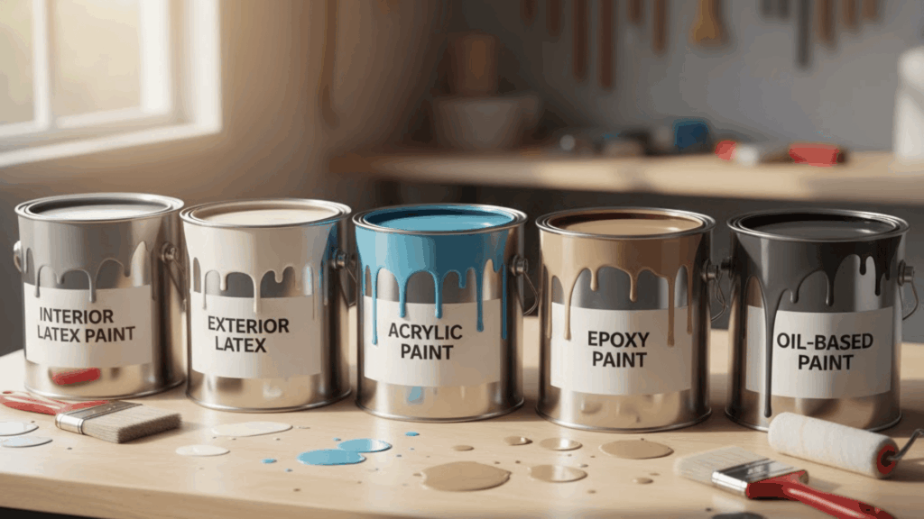
Each paint type offers unique benefits depending on your garage setup, climate conditions, and how you use the space daily. Here are the best options with their specific features, advantages, and drawbacks:
1. Interior Latex PaintInterior latex paint dries quickly, usually within one to two hours, and produces minimal odor during application and drying. It cleans easily with soap and water, making maintenance simple when dirt or grease accumulates on your walls.
This water-based formula works perfectly on finished drywall and provides good coverage with just two coats. However, it doesn’t handle extreme temperatures or high moisture well.
2. Exterior Latex PaintExterior latex paint resists moisture penetration and handles temperature fluctuations from freezing winters to hot summers without cracking or peeling.
It contains mildew-resistant additives that prevent mold growth in damp garages where humidity levels stay high throughout the year. This paint bonds well to concrete, wood, and drywall surfaces effectively. The downside is slightly longer drying times and a higher cost.
3. Acrylic PaintAcrylic paint stays flexible after drying, allowing it to expand and contract with temperature changes without cracking on your walls. It resists fading from direct sunlight exposure, making it perfect for garages with windows or doors that let in bright light.
This paint maintains color vibrancy for years, even in high-UV environments indoors, and adheres well to most surfaces. The main drawback is the higher cost.
4. Epoxy PaintEpoxy paint effectively creates a waterproof barrier that protects concrete and masonry walls from moisture damage, oil spills, and chemical exposure. It bonds exceptionally well to porous surfaces like cinder blocks and bare concrete, creating a hard, durable finish that lasts.
This paint resists stains, impacts, and abrasions better than any other option available today. However, epoxy requires careful surface preparation and has strong fumes.
5. Oil-Based PaintOil-based paint delivers exceptional durability and creates an extremely hard finish that effectively withstands heavy wear in high-traffic garage areas. It provides superior adhesion to previously painted surfaces and covers stains better than water-based alternatives, requiring fewer coats.
This paint resists moisture and temperature changes well, maintaining its protective qualities for many years without significant deterioration. The major downsides include strong odors and high VOC content.
Best Finishes for Garage WallsThe paint finish you choose affects how easily you can clean your walls, how well they resist moisture, and how they look overall. Here are the most common finishes and which ones work best for different garage situations:
Semi-Gloss: This shiny finish offers the best cleanability and moisture resistance, making it perfect for garages with heavy use and frequent spills.Satin: A balanced option that’s not too shiny but still easy to maintain, satin works well for most standard garages with moderate activity.Eggshell: This subtle finish suits low-traffic garages where you store seasonal items but don’t work on projects or park dirty vehicles regularly.Flat: While flat paint hides wall imperfections beautifully, it’s not recommended for heavy use because it absorbs stains and resists cleaning poorly.Shinier finishes like semi-gloss handle scrubbing and moisture better, but show every wall imperfection more clearly than flatter options. Choose based on how much cleaning your garage walls will need and how often you use the space daily.
Top Paint Brands for Garage WallsHere are some of the top paint brands trusted for garage walls based on durability, moisture resistance, and overall performance. These options range from budget-friendly to premium choices, depending on your needs and budget:
BrandPaint TypeIdeal ForAverage Cost (USD/gallon)Ratings Sherwin-Williams Acrylic Latex (Duration, SuperPaint)Durable garage walls with moisture resistance$50 – $70★★★★★ 4.7 Behr Acrylic Latex (Premium Plus, Marquee)High-traffic garage walls, stain resistance$40 – $60★★★★☆ 4.6 Benjamin Moore Acrylic Latex (Regal Select, Aura)Long-lasting, mildew-resistant garage walls$60 – $80★★★★★ 4.8 Rust-Oleum Mold & Mildew-Proof Latex PaintHumid, mold-prone garage environments$25 – $45★★★★☆ 4.5 Valspar Acrylic Latex (Signature Interior)Budget-friendly garage paint with durability$30 – $50★★★★☆ 4.3Each brand offers specific advantages like antimicrobial protection, one-coat coverage, or excellent freeze-thaw resistance for challenging garage conditions. Choose based on your climate, budget, and how much durability you need for your specific garage use and activity level.
Step-by-Step Guide to Painting Garage WallsPainting your garage walls correctly ensures a professional finish that lasts for years without peeling, cracking, or fading prematurely. Follow these six simple steps to transform your garage walls from start to finish:
Step 1: Gather Your Supplies: Collect all necessary materials, including rollers, brushes, drop cloths, painter’s tape, primer, and your chosen paint, before starting the project.Step 2: Protect Your Space: Cover the floor with drop cloths and tape off trim, outlets, and edges to keep paint only where you want it.Step 3: Prepare the Walls: Clean walls thoroughly to remove dust, grease, and dirt, then patch any holes or cracks with spackling compound and sand smooth.Step 4: Apply Primer: Roll on a quality primer designed for garage walls and let it dry completely before moving to the next step.Step 5: Paint Two Coats: Apply your first coat of paint evenly, allow proper drying time, then add a second coat for complete coverage and durability.Step 6: Add Finishing Touches: Once the main wall coats are completely dry to the touch, paint trim or add accent finishes if desired.Taking your time with each step ensures better results than rushing through the entire project in one weekend. Proper preparation and patience make the difference between paint that lasts years versus paint that fails within months of application.
Best Paint Colors for Garage WallsChoosing the right color can completely change how your garage feels and functions. Lighter tones create space and reflect light, while deeper shades add calm and depth. Here are a few trusted colors that balance practicality and style for every type of garage:
1. Light Gray
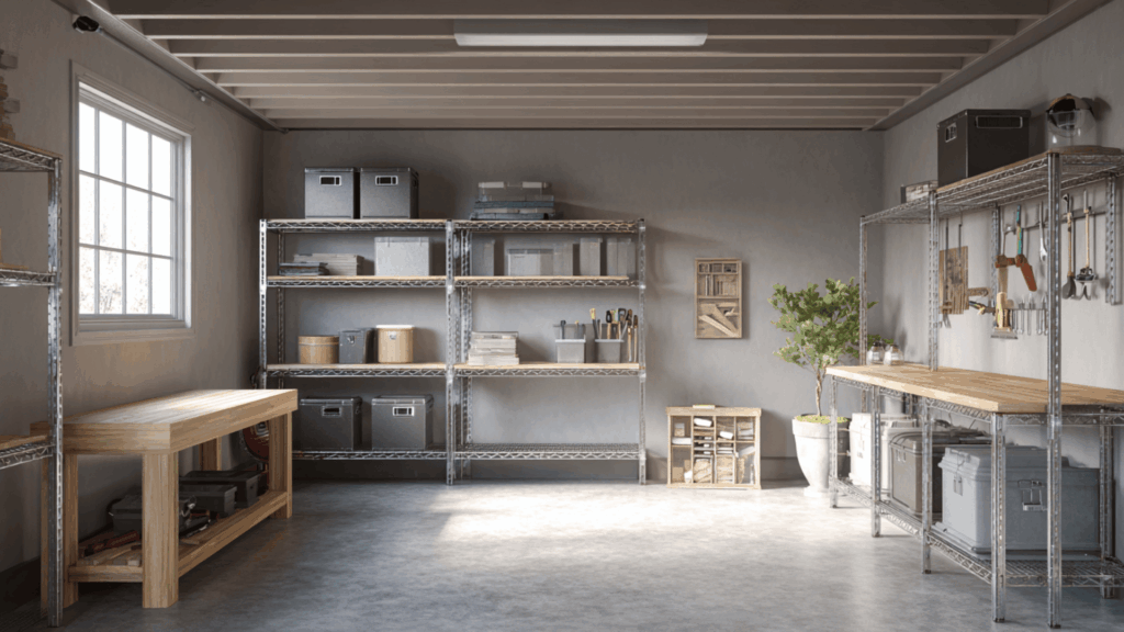
Light gray makes the garage feel open and organized without looking sterile. I’ve seen it used in several workshops where it hides dust well.
Experts say it’s perfect for balancing brightness and warmth in functional spaces. It gives the room a clean, practical, and modern look that feels calm and uncluttered.
2. Bright White
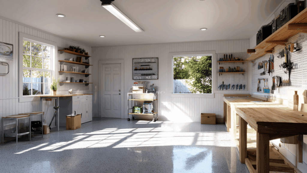
Bright white instantly brightens darker garages and reflects light beautifully. My friend Jake, who uses his garage as a home workshop, told me, “White paint made my space look cleaner and easier to work in.”
Professionals recommend semi-gloss white because it’s easy to clean and improves brightness, giving a crisp, well-maintained appearance overall.
3. Warm Beige
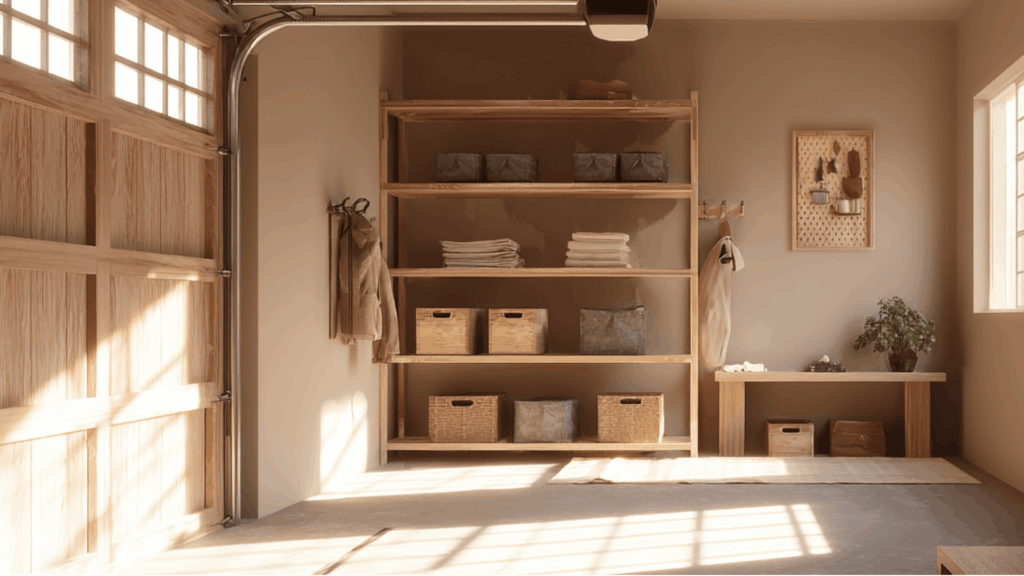
Warm beige adds comfort and subtle warmth without making the garage look too soft. I recommend it if you use your garage as a multi-purpose space.
It pairs well with wood shelving, neutral floors, and natural light. The result feels inviting and practical, making your garage an extension of your living area.
4. Slate Blue

Slate blue brings a cool, industrial look that still feels calm and refined. My colleague Anna, who recently remodeled her garage gym, said, “Slate blue makes it feel modern without feeling cold.”
Specialists agree it hides scuffs and marks better than lighter colors. It adds quiet depth while keeping your space fresh and balanced.
Community and Expert Recommendations

Many real homeowners prefer brands like Sherwin-Williams and Behr for garage walls because they are tough and easy to clean. Contractors often suggest satin or semi-gloss finishes for durability and wipeability.
A popular Reddit conversation shows people recommending Behr Premium Plus eggshell as a good balance of cost and performance.
Another user mentioned Sherwin-Williams Duration paint as almost bulletproof and easy to wipe down. Real experiences show that a good primer and two coats of paint give the best results.
Final WordsNow you know exactly which options work best as the paint for garage walls based on your climate and usage needs. I hope these practical recommendations help you avoid costly mistakes and achieve a finish that truly lasts for years.
Remember that proper surface preparation and choosing the right finish make just as much difference as the paint itself. Your garage can look clean, organized, and professional when you use products designed specifically for these demanding conditions daily.
Start by evaluating if your garage stays heated, how much moisture it gets, and what activities happen inside regularly.
What’s your biggest challenge when it comes to keeping your garage walls looking good? Share your garage painting experiences in the comments below.
The post 4 Best Paint Shades for Garage Walls (And Types of Paint) appeared first on Amenity Home.
November 7, 2025
27 Industrial Bedroom Ideas for Every Space
If you love spaces that feel real and full of character, an industrial bedroom might be your style. I like how it mixes brick, metal, and wood with soft fabrics and warm light; it’s tough yet comfortable.
You don’t need a huge loft or warehouse to make it work. Even small updates can bring that raw, relaxed feel to your space.
In this guide, you’ll learn how to design your own industrial-inspired bedroom with simple ideas that fit any budget.
From lighting and color to furniture and styling, I’ll walk you through everything you need to make your room feel cozy, balanced, and personal.
What Is Industrial Style?Industrial style is inspired by old factories, lofts, and warehouses.
It celebrates raw materials, open spaces, and a simple, honest look. The beauty comes from what’s usually hidden: brick, steel, wood, and concrete.
This style grew from turning empty workspaces into homes. Instead of covering walls and ceilings, people left them exposed. The result is bold, practical, and full of character.
Over time, those features became part of the design style itself.
You’ll often see:
Brick or concrete wallsExposed beams or ductworkReclaimed wood and metal furnitureSimple lines with minimal decorationNatural, worn finishesTogether, these elements create a space that feels both sturdy and stylish.
Best Industrial Bedroom IdeasIndustrial bedrooms mix raw materials with warmth, giving you a space that feels real and comfortable. You can use simple updates like lighting, color, and texture to get the look without a full remodel.
1. Loft Bedroom with Brick Walls
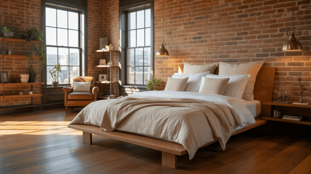
Keep the brick exposed and let it shine as the room’s centerpiece. Add a low bed, wood floors, and soft bedding for balance.
Natural light makes the space feel open and calm. Hang pendant lights or art to highlight the brick’s rough texture without overpowering the room.
2. Warehouse-Style Bedroom
Use tall ceilings, wide windows, and simple furniture to reflect that airy, industrial vibe. Metal frames, reclaimed wood, and cotton bedding create a mix.
Keep the space uncluttered with open floors and minimal décor. The goal is to make everything feel intentional yet effortless.
3. Concrete Accent Wall
A concrete wall gives your bedroom a strong, modern foundation. Soften it with warm fabrics, layered bedding, and wooden touches.
If real concrete isn’t possible, faux paint or panels can achieve the look. Black metal details add structure while keeping the design unified and balanced.
4. Modern Industrial Minimalism
Stick to clean lines, matte finishes, and a neutral palette of black, white, and gray. Choose sleek furniture with hidden storage to keep the look simple.
Add texture through linen bedding or a wool rug. This minimalist setup feels calm while still showing off raw materials.
5. Exposed Beams and Steel Details
Show off exposed beams or visible steel pipes to emphasize structure. These details bring height and visual depth to the space.
Add warmth with rugs, soft linens, and wooden accents. Keep lighting subtle so the room feels open and relaxed rather than busy.
6. Warm Wood and Metal Combo

Mix wood furniture with metal frames for a classic industrial look. Add warm lighting and layered fabrics to soften the contrast.
A mix of textures, smooth metal, rough wood, and soft cotton, keeps the space cozy. The blend creates a strong yet comfortable atmosphere.
7. Rustic Industrial Bedroom

Combine aged wood with metal details for a design that feels lived-in but stylish. Add a vintage trunk, old lamp, or distressed leather chair for personality.
Keep walls simple to highlight textures. The result is warm, grounded, and perfect for relaxing at the end of the day.
8. Neutral-Toned Haven
Layer soft neutrals like taupe, beige, and gray to build a peaceful base. Mix textures through linen bedding, rattan baskets, and knit throws.
Use warm lighting instead of bright white bulbs. This calm palette makes the room restful without losing the industrial edge.
9. Compact City Loft Bedroom
For smaller rooms, keep furniture low and storage built-in. Wall-mounted lights and floating shelves free up space. Use mirrors to make the room feel larger.
Stick to simple colors and finishes so every detail looks clean, practical, and open.
10. Industrial Bedroom with Plants
Add greenery to break up the hard lines of metal and concrete. Choose easy plants like snake plants or pothos for low care.
Green tones naturally warm the space. Mix plant heights for balance and pair with natural wood planters for a relaxed finish.
11. Black Metal Frame Bed
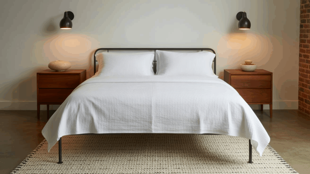
A metal frame bed anchors an industrial bedroom with strength and simplicity. Pair it with crisp sheets and soft bedding to add comfort.
Wooden nightstands or a woven rug balance the cool metal. Keep other décor minimal so the bed stands out naturally.
12. Soft Industrial Touches
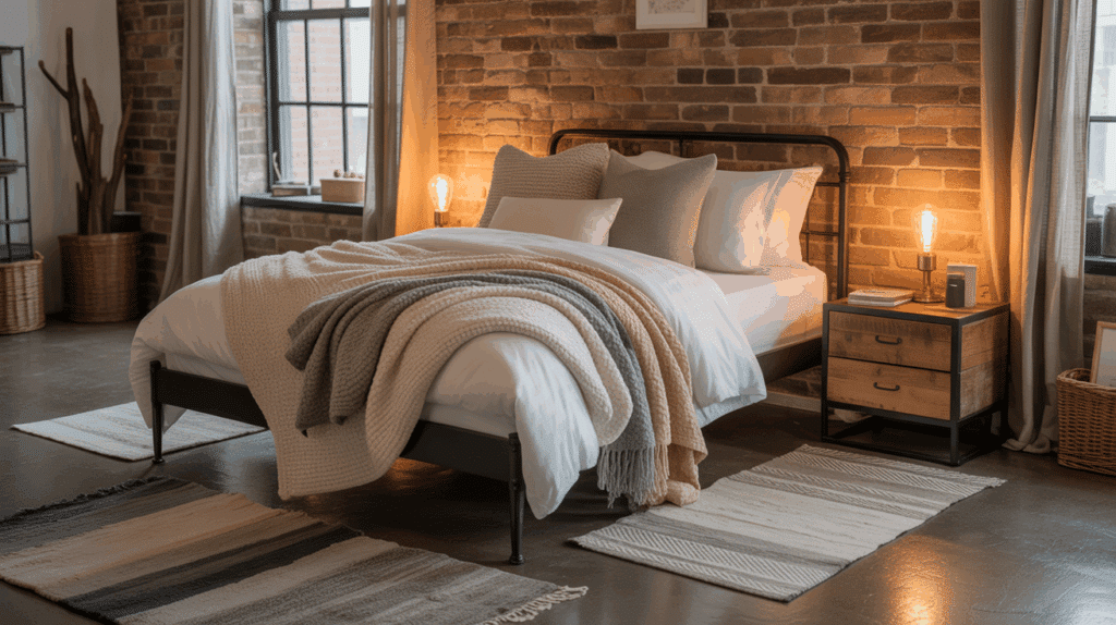
You can make an industrial bedroom feel cozy without losing its edge. Layer rugs, throws, and cushions in soft neutrals. Keep the main materials: wood and metal, visible underneath.
The blend of textures gives warmth while staying true to the industrial look you love.
13. DIY Pipe Shelves

Create pipe shelves using black fittings and reclaimed wood boards. They add structure and storage while keeping the design simple. You can use them for books, décor, or plants.
Try matching them with a small pipe desk or clothing rack for a coordinated DIY setup.
14. Faux-Brick Wall Makeover
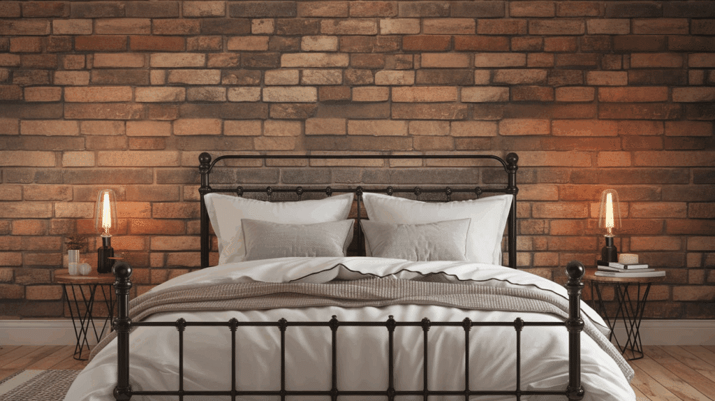
Peel-and-stick brick wallpaper gives instant character without the mess. It’s affordable and easy to apply, even in rentals. Pair it with neutral bedding and soft lights for balance.
The texture adds depth while keeping the rest of the space simple and calm.
15. Leather and Linen Layers
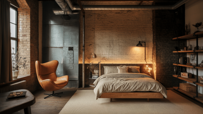
Mix soft linen bedding with leather cushions or chairs for contrast. Natural shades like tan, cream, and brown keep the palette earthy and warm.
The pairing of rugged and soft textures creates an inviting balance. A neutral rug completes the comfortable, grounded look.
16. Reclaimed Wood Headboard
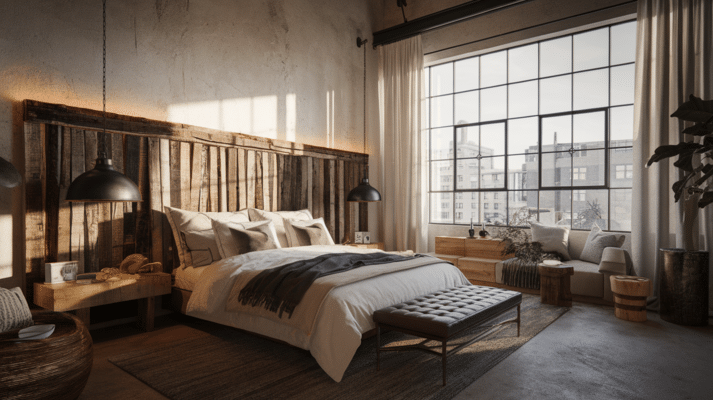
A reclaimed wood headboard adds warmth and history to the room. Pair it with soft bedding and dark metal accents for balance.
The grain and imperfections in the wood make it unique. Add warm lighting to highlight the natural texture and tones.
17. Neutral Bedding with Texture
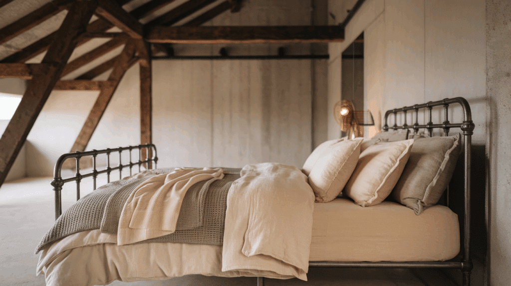
Layer bedding materials like linen, cotton, and knits for depth. Keep the colors neutral, gray, cream, or beige, for a calm effect.
The texture adds character without needing extra décor. It’s an easy, affordable way to make your bed feel more inviting.
18. Vintage Lighting Fixtures
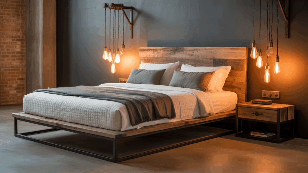
Replace standard lamps with pendant lights or wall sconces made from metal or glass. Choose warm bulbs for a soft glow. Hanging lights at different heights adds interest.
The mix of old-style fixtures and modern design keeps the space balanced and timeless.
19. Floating Nightstands
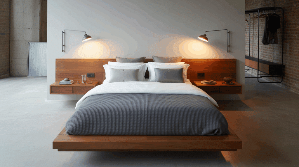
Use small wall-mounted shelves instead of bulky tables. They keep the space open and neat. Add small wall lamps above them for easy lighting.
This layout works perfectly for smaller bedrooms, keeping everything functional and modern without clutter.
20. Cozy Attic Industrial Bedroom
Turn an attic into a cozy industrial hideaway with exposed beams and low lighting. Use warm woods, metal frames, and layered rugs for comfort.
Keep clutter to a minimum to maintain open space. Add a skylight or pendant light to highlight the structure.
21. Painted Concrete Floors
Seal and paint concrete floors in soft gray or beige tones. A matte finish feels more natural and less cold. Layer area rugs near the bed to add texture and warmth.
It’s a simple way to keep the industrial base while making it livable.
22. Industrial Teen Bedroom
Create a fun, practical setup with strong furniture and simple décor. Use metal bed frames, wall storage, and relaxed bedding.
A chalkboard or pegboard wall adds personality. Stick to earthy tones so the room feels cool but still comfortable for everyday use.
23. Guest Bedroom Simplicity

Design a guest space that’s simple but inviting. A wood bed frame, neutral bedding, and one feature light make it complete.
Add a small bench or side chair for comfort. Guests will appreciate the peaceful, clutter-free environment that still feels stylish.
24. Statement Wall Art
Hang one large art piece above your bed to anchor the room. Black-and-white photography or simple prints work best with industrial textures.
Keep frames minimal and colors soft. The art adds focus while letting the materials and lighting shine through.
25. Pipe Clothing Rack

Swap a bulky wardrobe for a simple pipe clothing hanger. It’s open, space-saving, and fits perfectly with industrial décor.
Use matte black or brushed steel pipes for durability. Add a small wooden shelf beneath for shoes or boxes to keep it organized.
26. Industrial Lighting Grid
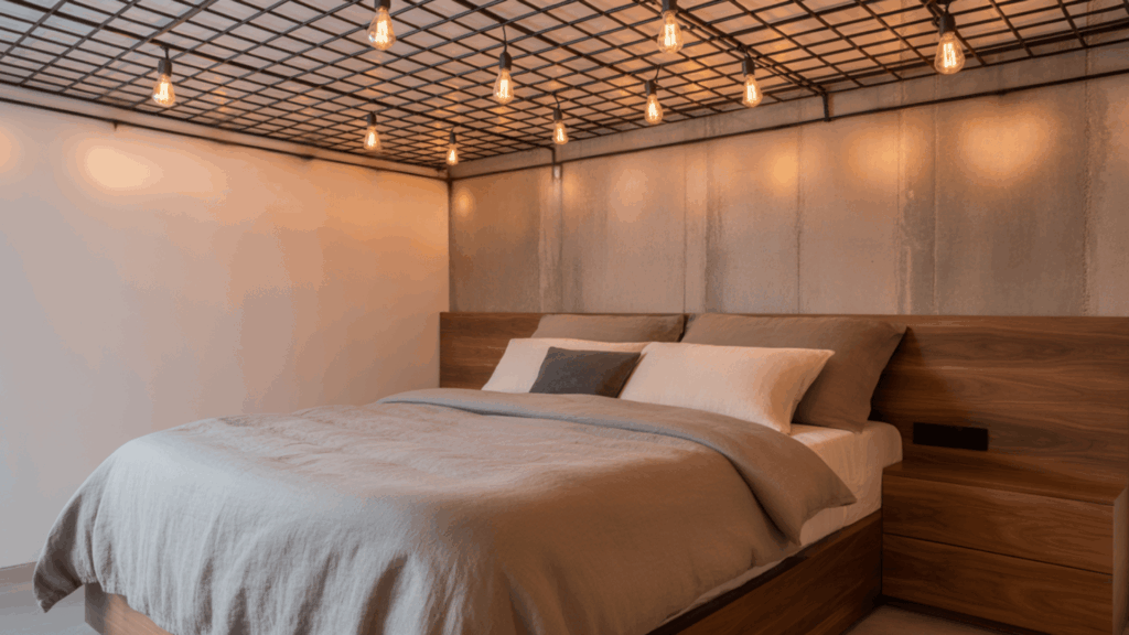
Hang several bulbs at different heights for a dramatic effect. Use warm-toned bulbs to make the space glow instead of glare.
This setup works over the bed or the center of the room. Add a dimmer switch for easy control of mood and brightness.
27. Mixed-Material Finish
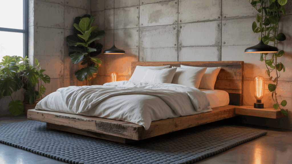
Combine raw concrete, reclaimed wood, and soft linen bedding for balance. The variety of textures keeps the room from feeling flat.
Add plants or wall art to bring life to the space. This layered approach captures everything industrial style stands for: strong, simple, and warm.
Core Materials & Finishes for Industrial DesignIndustrial bedrooms rely on a few key materials that define the look: brick, concrete, wood, and metal. You don’t need the real thing to achieve the effect.
Try peel-and-stick brick panels, limewash paint, or concrete-look finishes to bring in texture without the cost or weight.
Mixing materials is what gives this style balance. If your walls are rough or textured, pair them with soft bedding, linen curtains, or a woven rug.
When using metal furniture, offset it with reclaimed wood, natural fibers, or fabric upholstery to keep the room warm and livable. The right blend of raw and refined finishes makes the space feel grounded yet comfortable.
Industrial Color Palette & TexturesStick with warm neutrals like charcoal, taupe, beige, and greige. Then layer in muted tones; deep green, rust, or navy can all add depth and richness to the space.
Textures bring this style to life. Combine different surfaces and fabrics to keep the room balanced and inviting:
Linen: for a soft, breathable feelLeather: for warmth and contrastWool: for cozy layers and comfortMetal: for shine and strengthWood: for natural texture and groundingUse smooth metals beside rough wood or soft fabrics to create contrast. The mix of textures keeps your space visually interesting and comfortable.
Lighting for Mood and Function
Lighting can make or break an industrial bedroom. Layer different types so you can adjust the mood.
Pendant lights for the main glowWall sconces for readingTask lights for your desk or dresserChoose warm LED bulbs for comfort. Dimmers help you set the tone for morning or night. If you use exposed bulbs or cords, keep them away from fabrics for safety.
Industrial Bedroom Budget BreakdownYou can create an industrial bedroom at any budget level. If you’re updating a few details or planning a full redesign, here’s what you can expect at each price range.
Budget LevelKey UpgradesWhat It Adds to Your SpaceLow Budget– DIY shelves made from pipes and wood– Peel-and-stick brick walls
– Metal lamps from thrift stores
– Wooden crates for storageGreat for beginners who want the industrial look without spending much. These small updates build texture and character instantly.Mid Budget– Reclaimed wood bed frame
– Pendant lighting with dimmers
– Textured area rugs
– Upholstered benchIdeal if you’re ready for bigger updates. This level combines comfort and design, giving the room more warmth and durability.High Budget– Custom wood or metal furniture
– Premium lighting fixtures
– Real brick or concrete finishes
– High-quality linen beddingPerfect for long-term design. These upgrades create a polished, best industrial look that’s built to last.
Start small if you’re testing the look. Even a few thoughtful changes can make your room feel brand new without a complete overhaul.
Furniture, Layout & Styling Tips for Industrial BedroomKeep your industrial bedroom simple, balanced, and comfortable. Focus on strong furniture, open layouts, and soft accents that add warmth.
Furniture: Use low platform beds, metal nightstands, and reclaimed wardrobes. Mix wood and metal for contrast and keep pieces functional.Layout: Stay open and uncluttered. Try under-bed drawers or wall shelves in small rooms. In larger spaces, use rugs or furniture to define zones.Styling: Add plants, wall art, and layered rugs for softness. Use cotton, wool, or linen fabrics to warm up rough textures. Balance metal or concrete with natural elements for comfort.These details bring warmth and personality, turning a simple setup into a cozy, inviting space.
Wrapping UpCreating an industrial bedroom is all about finding a balance between strength and comfort. You’ve seen how simple materials, soft textures, and warm lighting can turn a plain room into something that feels personal and relaxed.
I like how this style gives you room to mix things up; nothing has to match perfectly for it to work.
Start small if you’re new to it. Try adding one or two changes, like new lighting or a textured wall, and build from there. Each piece you add makes the space more your own.
If you enjoyed this post, take a look at more of my blogs for easy home design ideas and practical tips.
The post 27 Industrial Bedroom Ideas for Every Space appeared first on Amenity Home.
17 Rug Dimensions Ideas for Every Room in Your Home
Choosing the right rug size can completely change how your room feels. I’ve seen how one rug can make a space feel cozy and pulled together, while another throws everything off.
If you’ve ever stood in a store or scrolled online wondering which rug fits best, you’re not alone. The good news is, understanding rug dimensions makes it much easier.
In this guide, you’ll learn how to pick the right size for every room, from the living room to the hallway. I’ll also share measuring tips, layout ideas, and simple rules that make your home feel balanced and comfortable.
How to Find the Accurate Rug Dimensions?Rug dimensions describe the length and width of a rug, measured in feet or inches. For example, a rug labeled 8×10 ft means it’s eight feet wide and ten feet long.
Most rugs follow standard sizing, which fits well in average rooms. Custom rugs are made for spaces that don’t match standard shapes or proportions.
The size you choose affects how your room looks and feels:
Large rugs pull everything together and make the room feel grounded.Smaller rugs highlight certain areas like reading corners, entryways, or under coffee tables.When you match rug size to room size, the entire space feels balanced and intentional.
Standard Rug Sizes (Inches, Feet, and Metric)Knowing common rug sizes helps you pick the right one without guessing. Here’s a simple rug size guide:
Small rugs (2×3 ft, 3×5 ft, 4×6 ft): Great for entryways, kitchens, bathrooms, or layering under accent furniture. Metric: 60×90 cm to 120×180 cm.Medium rugs (5×8 ft, 6×9 ft): Best for small living rooms, under a coffee table, or beneath a queen bed. Metric: 150×240 cm to 180×270 cm.Large rugs (8×10 ft, 9×12 ft, 10×14 ft+): Ideal for open layouts, family rooms, or under a king-size bed. Metric: 240×300 cm to 300×420 cm+.When in doubt, go slightly larger. It helps anchor the furniture and gives the room a complete look.
Rug Dimensions Ideas for Living RoomYour living room rug sets the tone for how the entire space feels. It should anchor your furniture, define the seating area, and make everything look connected.
The right rug size can pull the room together and make it feel complete.
1. All Furniture on The Rug

This layout works best for large or open living rooms. Place all furniture legs, including sofas and chairs, fully on the rug for a unified look.
It creates a defined seating zone that feels cozy and well-balanced. A 9×12 ft or larger rug usually fits this layout best. Leave a small border of floor around the edges to frame the space.
2. Front Legs on The Rug

This setup is ideal for medium-sized rooms or when a full rug feels too large. Keep the front legs of sofas and chairs on the rug and the back legs off.
It visually connects furniture while allowing the room to feel open. An 8×10 ft rug often works perfectly for this layout. Make sure all front legs align to keep the design balanced.
3. Floating Layout with Clearance

If your furniture sits away from walls, use a floating layout with equal rug space around all sides. Center the rug under your coffee table so part of each seat touches or nearly touches it.
This style works well in open floor plans or large living rooms. Choose a rug that fits the center grouping but still shows the floor beneath. It keeps the layout airy and relaxed.
4. The 12–18 Inch Rule
Leave about 12–18 inches of floor showing between the rug edge and the walls. This gives your room a clean border and prevents the rug from feeling too large.
Smaller rooms can use a 10-inch border for a snug look. Larger rooms look better with more open space around the rug. This simple spacing rule works for nearly every living room layout.
Choose Size by Room Width6×9 ft: Works for small apartments or tight sitting areas.8×10 ft: Fits most standard living rooms.9×12 ft: Best for open layouts or rooms with large sectionals.Rug Dimensions Ideas for Dining RoomA dining room rug should frame the table, protect the floor, and keep chairs steady when pulled out. The right rug size also adds warmth and helps the table feel centered in the room.
It’s not just about style; it’s about comfort and function when you’re sitting down to eat.
5. Leave 24–36 Inches Around the Table
Add two to three feet of extra rug space beyond each side of your dining table. This gives plenty of room for chairs to slide back without catching on the rug edge.
It also prevents uneven wear around the table. If your dining area is tight, aim for at least two feet of clearance. This small buffer keeps everything looking neat and easy to move around.
6. Rectangular and Oval Tables
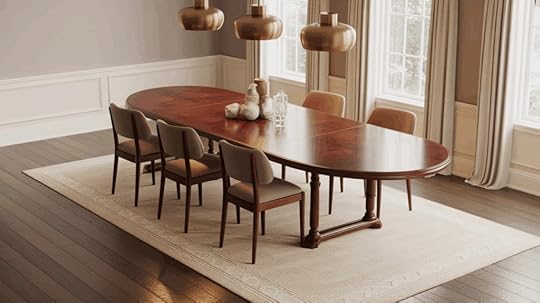
For six- to eight-person tables, choose rugs that measure 8×10 ft or 9×12 ft. These sizes usually fit the table and chairs comfortably while leaving a clear floor border.
Oval tables follow the same rule, just center the rug evenly beneath the table shape. If you have an extendable table, size the rug for its longest length. That way, it still fits when you add leaves for guests.
7. Round and Square Tables
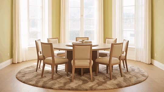
Round or square tables look best with rugs that match their shape. Use an 8-foot-round or 9-foot-square rug so the chairs stay balanced and centered even when pulled out.
A rug that mirrors the table’s outline helps everything look symmetrical. Make sure the rug extends far enough so chair legs don’t slide off when guests sit down. This gives both comfort and visual balance.
8. Use Low or Flat Pile Rugs
Choose flat-weave or low-pile rugs to make moving chairs easy and quiet. They clean up faster and don’t trap crumbs or spills as much as thick rugs.
This style is also safer because chair legs won’t catch or tip. Look for materials like wool-blend or synthetic fiber for easy maintenance. These options handle daily use and still look great over time.
Rug Dimensions Ideas for BedroomA bedroom rug adds warmth, comfort, and softness underfoot. It also helps reduce noise and ties the furniture layout together.
The right rug size can make your bedroom feel calm, balanced, and inviting from the moment you walk in.
9. Under-Bed Rug Layout
Choose a rug that fits both the bed and the surrounding floor space. For a twin bed, use a 5×8 ft or 6×9 ft rug; for a full or queen, try 8×10 ft; and for a king, 9×12 ft works best.
Center the rug under the bed so it extends evenly on both sides and a few feet beyond the footboard. This placement adds comfort when you step out of bed and visually grounds the entire setup.
10. Side Runners or 3-Piece Sets
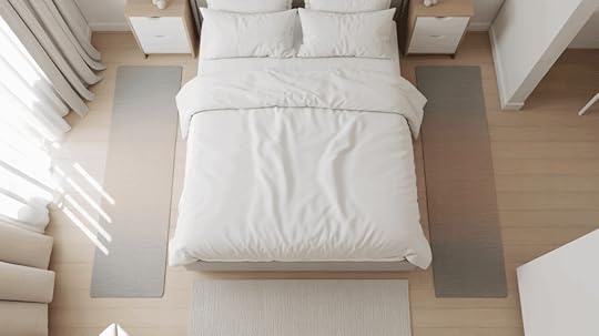
If you don’t have room for a large rug, use runners instead. Place one on each side of the bed and a small rug at the foot for balance. This setup leaves the center of the room open and easy to clean.
It’s also ideal for smaller bedrooms or shared spaces. You still get a soft landing for your feet without covering the whole floor.
11. Small Room Work-Around
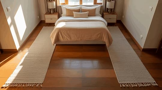
For narrow or compact bedrooms, skip a full rug altogether. Use two long runners along each side of the bed to bring in texture and warmth. It helps the room feel cozy without making it seem smaller.
Choose lightweight rugs so you can clean or move them easily. This simple trick adds comfort while keeping the layout open and airy.
Rug Dimensions Ideas for Kitchen, Entryway & HallwayHigh-traffic areas need rugs that are durable, non-slip, and easy to clean.
12. Kitchen Runners
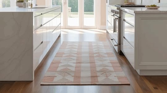
Common sizes are 2×6 ft or 2×8 ft, depending on your layout. Place runners along sinks, stoves, or main prep zones to cushion your feet while cooking.
Always use a non-slip pad underneath to prevent sliding. Washable or stain-resistant materials work best for kitchen use. A runner with a subtle pattern can also help hide everyday messes.
13. Entryway Rugs
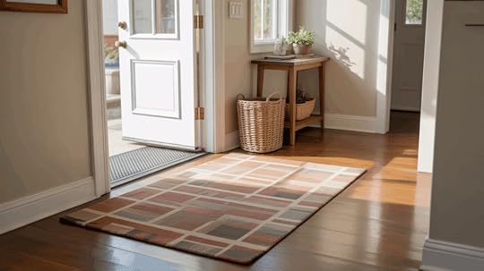
Choose 3×5 ft or 4×6 ft rugs that let your door open and close freely. Look for low-pile or indoor-outdoor designs that trap dirt and moisture without holding onto it.
A durable rug pad keeps the mat in place even with constant foot traffic. Try darker colors or patterned designs to disguise wear between cleanings. The right entry rug instantly makes your home feel welcoming.
14. Hallway Runners

Keep about 4–6 inches of floor visible along each side of your runner to frame the hallway evenly. Pick a length that stops a few inches before each end of the wall or doorway.
Long, narrow rugs make tight spaces look longer and more open. Flat-weave or low-pile styles are easier to vacuum and won’t bunch up.
A hallway runner adds warmth and quiets footsteps in busy areas.
Rug Dimensions Ideas for Outdoor SpacesEach space in your home has different rug needs depending on use, comfort, and how much traffic it gets.
In work areas, rugs need to be practical and sturdy, while in playrooms or bathrooms, they should feel soft and safe. The right choice makes these smaller spaces both functional and comfortable.
15. Home Office

Pick a rug large enough to fit your desk, chair, and workspace comfortably. A low-pile or flat rug lets your chair roll smoothly without catching.
The rug should extend at least 18–24 inches beyond the desk to cover movement space. Choose durable materials that resist wear from office chairs and foot traffic.
A neutral color helps reduce distractions and keeps the area looking tidy.
16. Nursery or Kids Room

Choose soft, washable rugs sized around 5×8 ft or 6×9 ft to give plenty of play space. Round or oval shapes make the room feel fun and help soften sharp corners. Look for materials that are easy to clean and gentle underfoot.
A rug with a light texture or pattern can also hide small messes between cleanings. It’s a simple way to add comfort and warmth without fuss.
17. Outdoor Spaces
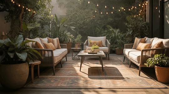
Select rugs made for patios, porches, or decks that can handle rain, sunlight, and foot traffic. The rug should fit under your outdoor seating set, with at least the front legs of each chair resting on it for balance. Weather-resistant materials like polypropylene dry quickly and resist fading.
Choose patterns that blend with outdoor furniture and landscape tones. An outdoor rug ties the space together and makes it feel as cozy as your indoor rooms.
How to Measure Your Space (Before You Buy!)Before ordering, test the rug size right in your room.
Measure the full floor area, including door swings and vents.Mark where your furniture will sit using tape or string.Outline your rug shape with painter’s tape to visualize size and fit.Step back and look from different angles to see how it feels.This “tape-out” method helps you catch sizing mistakes before spending money.
Rug: Materials, Thickness, and PaddingThe material and thickness of your rug affect comfort, cleaning, and how big it looks in the room.
Low pile rugs: Great for dining rooms, offices, and hallways. They’re easy to clean, stay flat, and handle heavy use.High pile rugs: Soft and cozy, best for bedrooms or living rooms. They add warmth but need more care since they trap dust.Rug pads: Keep rugs from slipping and add a bit of cushioning. Choose a pad 1–2 inches smaller than your rug so edges stay smooth.Material tips: Wool feels warm and soft. Cotton is washable and light. Synthetic fibers like polyester or nylon handle traffic and spills well. Natural fibers such as jute or sisal add texture but don’t do well in damp spots.Small Rug Sizes: Where They Work and Where They Don’tSmall rugs can look great in the right setting but may feel out of place in larger rooms. Use them thoughtfully to define small areas or add color and texture where you need it most.
PlacementRecommended SizesWhy It Works / Doesn’t WorkTipsEntryway or Bathroom2×3 ft or 3×5 ftAdds warmth and keeps feet off cold floors; easy to clean.Choose washable or low-pile rugs that handle moisture.Kitchen2×6 ft runner or 3×5 ftDefines prep zones and adds comfort while standing.Use a non-slip pad for safety near sinks and stoves.Bedroom (Bedside)3×5 ft or 4×6 ftGives a soft landing spot and adds symmetry.Place halfway under nightstands or beside the bed edge.Living Room3×5 ft or 4×6 ftOften too small; it makes furniture look disconnected.Layer over a larger neutral rug to anchor the space.Open Layouts / Large RoomsUnder 5×7 ftVisually shrinks the space and breaks the flow.Always size up or combine two small rugs for balance.Layering small rugs over larger ones adds depth and texture without overwhelming the space. You can also place two identical small rugs side by side for symmetry in long or narrow rooms.
When in doubt, size up slightly; it nearly always looks better and helps the space feel more balanced.
Common Rug Sizing MistakesEven a stylish room can feel off when the rug size isn’t right. Avoid these common mistakes to keep every space balanced and functional.
Rug too small for furniture: Makes the room feel disconnected and unfinished. Always let furniture legs touch the rug.No space for dining chairs: Chairs should stay on the rug even when pulled out — add at least 24 inches of extra room.Wrong orientation: Match your rug shape to the layout. A rectangular room usually needs a rectangular rug.Skipping a rug pad: Pads prevent slipping, protect floors, and keep rug edges from curling.Rug pad too thick: Can make furniture wobble or cause trip hazards. Keep it thin and stable.Ignoring doors and vents: Rugs that block doors or cover vents wear out faster and look awkward.Wrap UpMeasure your space twice before buying. A few extra minutes with a tape measure saves time, effort, and frustration later.
Now that you understand rug dimensions, you can pick the right size with confidence. You know how to measure, what layouts work best, and which rugs suit each room in your home.
I hope this guide helps you see how simple it can be to find a rug that fits both your space and your style. When your rug matches the room, everything just feels right; balanced, comfortable, and complete.
If you’d like more ideas or tips to make your home feel its best, take a look at my other posts for more easy inspiration.
The post 17 Rug Dimensions Ideas for Every Room in Your Home appeared first on Amenity Home.