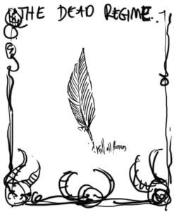
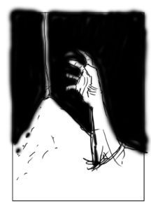
Book Cover Sketches
They say don’t judge a book by its cover. There’s a reason this is a common adage – because we all judge books (and everything else) by their cover. When I was a teenager I would go into the record store and buy albums solely because they had cool art. Iron Maiden has made an entire career off of this. Indie books tend to have horrible covers. This isn’t necessarily a reflection of what’s on the inside, but it’s not doing the book any favors. Just because I’m an indie author doesn’t mean my books have to look it. That’s why I set out to find an artist with great skill and tons of style. That’s why I ended up working with Godmachine.
Unlike the first book, I didn’t have a clue what I wanted on the cover of Sons of Light and Darkness. I didn’t have a clue two years ago when I first starting writing Sons, and if asked for the first time now that it’s all done I still wouldn’t have a clue. Instead of trying to force something to fit my needs, Godmachine asked some simple questions and I provided him a synopsis and some scenes from the book that I thought might be good visual starting points. After mulling it over he came back to me with the following set of sketches. Now keep in mind these are only meant to be the roughest of brainstormings. But knowing how much talent Godmachine has, and being familiar with much of his other work I could already see something kick-ass coming to the surface.