The Chisme: It’s all in the rebrand…
Onto our first The Chisme topic: Rebranding a book/series
Y’all have seen it; you’re looking up a book or series that you only know by the cover, but by the time you find it, you learn you’ve been looking at the book or series all along?
Maybe the title changed.
Maybe the blurb has been reworked.
But you know for damn sure you knew it by a completely different cover…
Do you ever wonder why authors unpublish works and rework them? While my sister and I are no experts, we have some personal insight on why authors do this.
Reason One:
The original branding was off to begin with.
One thing my sister and I know is that as you grow as an author, your eye for certain things improve. When we first started out, we were sh*t when it came to blurbs. Our cover game left a lot to be desired, and we choose covers based on whether we liked them, not necessarily if they met genre expectations.
Our very first romance novel was Same Page, an untitled series duet that featured its sequel Next Chapter (excuse us as we cringe a bit). Not equipped with any cover designers or Photoshop experience, we commissions many of our romance covers from fiverr.
Our first goal was attempting to put both faces of the characters (or at least how we saw them in our heads!) on the cover. We were apart of reader groups for years on Goodreads, and many of the common conversations surrounding covers were that people wanted to get an idea of how the couple looked like on the cover.
 1st Attempt
Maybe not our personal best, but the first cover brought enough interest for readers of interracial romance to take a chance on it.
One thing we were always trying to do at the start of our romance journey was be different. With our first two romance series,’ we couldn’t have been more different in terms of being so stubborn, we were failing to meet reader expectations.
In Same Page, there was a faux pas on our part, that featured cheating as a plot point, something we weren’t aware at the time was often a no-no in romance. Some readers liked it, some could ignore it for the story, abd the remainder didn’t appreciate the cheating. If we had known about terms like taboo and attached them to Same Page, it may not have suffered from some of its initial pushback, as making sure readers understand its forbidden, or taboo, would have made them aware of what to expect.
To save the series, I convinced Libertad to expand on future characters and center it as much as possible around the bookstore, calling it the Bookish Friends to Lovers series. We faced some minor setbacks in 2016-2018 but were still able to rebrand it to feature a couple on the cover, as seen in the example below.
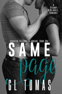 2nd Attempt
We spent years neglecting it based on ego and a lot of other things that made our writing suffer. I was able to convince Libertad to revive the series, especially after it received a Bookbub Featured Deal in 2020, another in 2021, as well as its audiobooks getting our very first Chirp deal due in a few days.
We knew they would require a rebrand to move forward, especially since we were able to get Next Chapter in audio in mid-2021.
We decided to experiment with just a sexy bare torso this time around, as the couple on the cover was something we asked for, but our naivete made it a challenge to know whether the cover would hit with audiences. Looking at the Amazon charts we’d love to place in, we decided that the final product was just enough to blend in as it’d stand out, as pictured below.
 Final Attempt
We honestly feel like it’s just enough Timothy (nice body, sexy beard, etc.) for readers to get an idea but also make up their own face if they’d prefer to picture their dream guy.
Reason Two:
Failure to meet genre expectations.:
As you can see, our very first attempt at F*THS we also got through Fiverr. Not a horrible cover but also not an eye-catching one. Our first goal with the first cover was to ensure people could tell it was a bwwm/interracial romance. Our second attempt was to mimic covers we loved, but those designs were dated and may have worked when other authors went that route but made it more challenging to see there was a Black woman on the cover. It did sell a little better, but over time, we got bored with the design and couldn’t wait until we made the move to change it.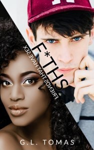 1st Attempt
 2nd Attempt
Our final attempt came a little over 2020. We saw a premade that could be made into a set and knew that even though it only had a man’s body on the cover, his tattoos would convey Asher in a way trying to put both of them on the cover hasn’t been able to. Originally, the Friends That Have Sex series was only meant to be a duet of books, followed by a second duet depicting their ‘later in life” stories.
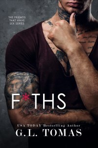 Final Attempt
After a long few years, we weren’t sure we were ever going to make time, or even want to continue on with the series, so when Libertad asked, could you make their future story more tropish(the first few books were arguably very niche and had strong romance elements but some don’t always read it as a romance) I thought long and hard but couldn’t come up with anything.
She was actually the one to suggest making it a “we’re planning a baby” trope as well as making it a second chance, as Asher and Teddy have been estranged since Friends That Break (originally titled How We Start) and reunite only when both of them have healed and had years away from each other.
Friends That Collide will be the final book and it’s kind of taken that long to figure out what could stand on its own (without having to read the first two books, as F*THS and Friends That Still… are much more New Adult, whereas Friends That Collide is a second chance romance) while also finishing up their story and staying true to the characters.
Reason Three:
Reader complaints
This one hurts the most, as it was something we couldn’t help. The first cover was designed by our go-to designer Najla Qamber @ Qamber Designs. It was to market and exactly what we needed for a Cowboy romance. When it came out it had been the first book we released with over 100 pre-orders in a short pre-order push so it was our most successful book when it came out in 2017. However, lots of readers complained that the woman on the cover had the skin color of a white woman on her legs with a Black woman’s face.
Exhibit A:

Original Stock Image

1st designed cover
If you notice the only thing that changes about her legs is the effect. Those are HER legs and her body. Nothing about her was changed outside of the effects the designer used to make the cover look “western.” But there were so many people who were just not happy that it LOOKED like her face was just plastered on. With this cover, the book did well but with all the angry emails we got about it we just decided to unpublish it. We were changing our brand anyways and weren’t sure this cover/book fit into our brand. It took us two years to reread the book and we mutually decided that all it needed was a new title, a new cover, and major edits.
Below is what we decided on:

Rebranded cover
What we’ve learned:
Truthfully, sole men on covers sell books. It isn’t the popular answer but we notice our sales are way different with a man on the book. That’s not to say we won’t feature couples. We have eight covers we haven’t revealed yet that most DEFINITELY have couples on them but we do have back-ups in the crappy case that those ones don’t perform as well as we hoped. All our unrevealed covers have interracial couples on them. Half of those are two POC characters so obviously, we want to show that representation. But please, we beg you…
Please be understanding when authors change their covers. Maybe you loved the first one. Maybe you felt like the first one fit the image of the characters more. Authors don’t change their covers based on a whim. It’s to reach out to the audience that hasn’t discovered them yet. Maybe you’ve been day one’s but there’s a truckload of readers that are dying to make someone their new favorite author but the first cover just didn’t speak to them. Perhaps the second one will…

The post The Chisme: It’s all in the rebrand… appeared first on Welcome.