Coming up with a cover
What makes a good cover? What draws the eyes and makes a potential reader stop and pickup the book?
Should it be flashy? Do I need to give away the story on the cover, or leave it simple and mysterious? The book is a series so is it presumptuous to say the book is “Book One” in a series? Should you design it yourself? Should I spend some of my possible funds that I’m investing in this project on hiring someone else to design it?
As I’ve spent my recent time researching and preparing for the release of Cascade, I finally got past just the words inside the cover and started asking myself these very questions. Sure, I needed to keep polishing, keep editing, and all together just keep working on the manuscript itself. But it was getting to the point that I needed to focus on aspects other than the story itself, especially since at the time I had just sent out the draft to my beta readers.
With my manuscript in my beta readers very capable hands, I decided to tackle the next step to preparing my cover. Now, since I am going the self publishing route, the fact of the matter is everything is going to be an investment I’m choosing to make in myself, but because I’m doing it that way, I have to decide where and when the funds I’m giving myself for this project are allocated. Knowing that, and knowing that I did have some artistic talent of my own, I decided I would tackle designing the cover on my own. After all, I’d read a lot of books, seen a lot of covers, and again, had done a bit of digital design.
So where to start? Well I started by just giving myself a rough sketch of what I wanted.
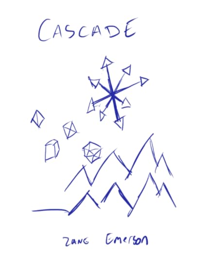 Beautiful, isn’t it?
But no, it didn’t have to be complex, not for my initial design. But what went into it? What were the elements?
I knew I wanted the dice. Cascade is a story largely about and inspired by Dungeons and Dragons. I knew I wanted mountains, they just felt so integral to my pictured idea of fantasy stories, and one of the major locations in my book, Lumenoak, was nestled right into the base of towering mountains. And then there was the symbol, well that’s there because [REDACTED]
So, now that I had my basic design, I set out to actually, well, design it. And after hours and hours of work, not even joking I hand pulled the lines into position on Illustrator even though I’m sure there was an easier way, I was left with a design I was actually proud of… it just wasn’t good as a book cover.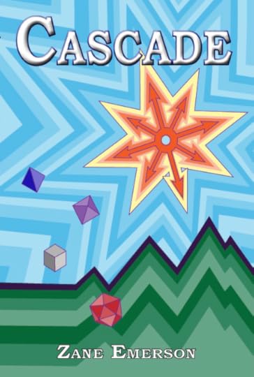 It’s not terrible. Not really, and in fact I think it does do a good job at catching the eye thanks to the myriad of colors and all of that but…
Well, the but is it doesn’t look professional. At the end of the day, this cover, while I spent time on it and was proud of the results, just looked like something someone had done at home, which it was but not the point.
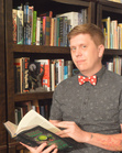
So I had to go back to the drawing board. Not literally though, I did have the right elements there, I just needed to refine them, to polish them to perfection and make them look like something I would instinctively pick up and at least check out the back cover. And for that, I needed to do one very, very important task, maybe the hardest, most intimidating task of my non-existent writing career. I had to admit I didn’t know everything about books and ask my wife for a second opinion.
After a solid hour of looking at my ideas and designs, and taking note of the elements I knew I wanted to include, she grabbed a handful of books from our little home library and got to work. While she did that, I did what I should have done in the first place, I actually went to YouTube and watched some photoshop tutorials on cover designs (really they do some wonders for teaching you the actual benefits of layering), and we came together to make what I think is a hell of a cover.
I could of course reveal it here and now, but I did already decide I was doing the full cover reveal this a Friday so you'll just need to check back then to see the full cover. But with each step I make toward the publish date, the more and more confident I get in how this project is coming together. With all that, here is just a tiny sneak peek at the updated cover.
 See yah on the stream.
Should it be flashy? Do I need to give away the story on the cover, or leave it simple and mysterious? The book is a series so is it presumptuous to say the book is “Book One” in a series? Should you design it yourself? Should I spend some of my possible funds that I’m investing in this project on hiring someone else to design it?
As I’ve spent my recent time researching and preparing for the release of Cascade, I finally got past just the words inside the cover and started asking myself these very questions. Sure, I needed to keep polishing, keep editing, and all together just keep working on the manuscript itself. But it was getting to the point that I needed to focus on aspects other than the story itself, especially since at the time I had just sent out the draft to my beta readers.
With my manuscript in my beta readers very capable hands, I decided to tackle the next step to preparing my cover. Now, since I am going the self publishing route, the fact of the matter is everything is going to be an investment I’m choosing to make in myself, but because I’m doing it that way, I have to decide where and when the funds I’m giving myself for this project are allocated. Knowing that, and knowing that I did have some artistic talent of my own, I decided I would tackle designing the cover on my own. After all, I’d read a lot of books, seen a lot of covers, and again, had done a bit of digital design.
So where to start? Well I started by just giving myself a rough sketch of what I wanted.
Beautiful, isn’t it?But no, it didn’t have to be complex, not for my initial design. But what went into it? What were the elements?
I knew I wanted the dice. Cascade is a story largely about and inspired by Dungeons and Dragons. I knew I wanted mountains, they just felt so integral to my pictured idea of fantasy stories, and one of the major locations in my book, Lumenoak, was nestled right into the base of towering mountains. And then there was the symbol, well that’s there because [REDACTED]
So, now that I had my basic design, I set out to actually, well, design it. And after hours and hours of work, not even joking I hand pulled the lines into position on Illustrator even though I’m sure there was an easier way, I was left with a design I was actually proud of… it just wasn’t good as a book cover.
It’s not terrible. Not really, and in fact I think it does do a good job at catching the eye thanks to the myriad of colors and all of that but…Well, the but is it doesn’t look professional. At the end of the day, this cover, while I spent time on it and was proud of the results, just looked like something someone had done at home, which it was but not the point.
So I had to go back to the drawing board. Not literally though, I did have the right elements there, I just needed to refine them, to polish them to perfection and make them look like something I would instinctively pick up and at least check out the back cover. And for that, I needed to do one very, very important task, maybe the hardest, most intimidating task of my non-existent writing career. I had to admit I didn’t know everything about books and ask my wife for a second opinion.
After a solid hour of looking at my ideas and designs, and taking note of the elements I knew I wanted to include, she grabbed a handful of books from our little home library and got to work. While she did that, I did what I should have done in the first place, I actually went to YouTube and watched some photoshop tutorials on cover designs (really they do some wonders for teaching you the actual benefits of layering), and we came together to make what I think is a hell of a cover.
I could of course reveal it here and now, but I did already decide I was doing the full cover reveal this a Friday so you'll just need to check back then to see the full cover. But with each step I make toward the publish date, the more and more confident I get in how this project is coming together. With all that, here is just a tiny sneak peek at the updated cover.
See yah on the stream.


No comments have been added yet.