
Process Post-Mortem: FAC
F.A.C. was a bit of an experiment, combining digital and traditional art elements, including alcohol markers and stamping, in order to create the final printed zine. This post-mortem post has been sitting in my drafts for about a year — just like the zine itself, this post had a bit of a hiatus as well, but I hope it will be an interesting look at how F.A.C. came about.
ProcessThe Daily Grind (aka My Usual Routine)Writing & SketchingInitially, I wrote the script on my phone’s note app. Once written, thumbnails came somewhat easy. I say somewhat as I have multiple pages of iterations that never made it in, but the initial work was straightforward.
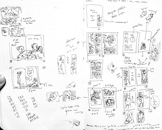 Thumbnails of F.A.C.Hiatus
Based on my work in progress status updates on social media regarding this zine, I took a hiatus sometime around October 2021 and did not return to it until July 16, 2022. There are a couple of reasons for this:
The spread that had inspired this whole zine — the one of young Jehan on one side and young Annemarie and Emilein on the other — was still waiting to be inked and I didn’t want to mess it up, being that it inspired the whole thing, so I wanted to save it for lastAt the time, I was stuck on one page that, no matter how I tried to lay it out or resketch it or rethumb it, just did not cooperate; until I could get that page settled, I didn’t want to work on the rest, including the first point.My engagement ended suddenly which as you might imagine was a bit of a difficulty in life.While I’m still slowly recovering from #3 on that list, #2 and #1 were still a thorn in my side; add to it, I managed to delete the only copy of the script I had which meant all I had to go off of were bits of it I’d already typed into the first few pages of the zine, my own chicken scratch lurking in my digital sketches or thumbnails, and my memory. In an odd twist, losing my script actually was the biggest benefit to me because it forced me to look at everything I had, finished and unfinished, and ask myself: is this necessary?
Revision (aka Hacking It Up)I’d been thinking about the zine on and off and, after spending more money on paper and other BS at Michaels (BOGO 50% off select Recollections paper? You bet I’ll stock up on shiny card-stock!) I decided to sit down and try to puzzle the rest of it out. I started moving pages around in Clip Studio, opening up old pages and re-reading what script I could salvage, re-writing bits of script on sketch layers, and pulling out pages that weren’t working. Rather than continue it, as originally intended, I figured why not cut it off after the sort of amended “refrain”. That worked!
So I kept cutting, rewriting, and rearranging — keeping in mind that ultimately I needed to have my final page count be a multiple of four and I would need a title page (since the cover would not have a proper title or author) with some sort of copyright page — until things started to click. The problem page that couldn’t be sketched was scrapped. Half-started pages were scrapped and moved to a “junk pile” at the end of the story file. The original ending page was scrapped. A bit of a difficulty in all this was that I realized I wanted the spread that inspired this to be centerfold, so as I made edits I also had to be mindful of the pacing, to ensure that spread would be dead center.
Eventually, everything clicked into place; I finished the lineart for the inspired spread, added my final text boxes, and then exported my pages as PSD files (with editable text thanks to the new Clip Studio update.) It was now time to start adding tones.
And Now For Something Completely Different!Usually when I do “traditional” coloring in my digital pieces, I stay in Clip Studio Paint and use 100% digital brushes that mimic traditional media — usually Frenden, DAUB, or some True Grit Texture Supply brushes. Maybe I throw in a texture or two for good measure. It always looks nice, though I find for some brushes, personally I can rarely make traditional digital brushes look as authentic as other people seem to make ’em look.
However, with this zine I wanted to try something a little bit different: something my friend Romey Petite showed me once over video call. Romey is an effervescent creator, patient teacher, and illuminating clown and I am very lucky to call such a being my friend. Anyway, Romey showed me how they would line a drawing in Manga Studio 4, print it out, and then using (or creating) a lightbox they would add a textured color or shade on a separate paper stacked above the drawing, tracing the contours that shone through the box. Once that was done, the traditional art would be scanned and digitized and introduced back into the digital artwork, lined up as best as possible. This method allowed for unique custom textures to be introduced. I figured with this method, I could replicate both the traditional textures and opacity variants of art markers as well as create a sort of intentional registration error.
Digitized Traditional On Digital From my instagram
First things first: I had to print out each page. I created my InDesign file, added my linked PSD files in, and printed out each page: this way, I could edit the PSD files and they would update in InDesign automatically. Second, I layered a second sheet of printer paper on top my printed inks, clipped them together, and colored in my “tones” where appropriate using a lightbox to see where my inks were. Then I scanned in my “tones” and pulled the scanned images into Photoshop to be touched up and added to the comic PSD files.
Lessons learnedYour monitor will make everything look light. This is a lie. Duplicate your tones on a new layer, set the opacity to ~50%, and set the Layer Mode to Overlay. You’ll be happy when you print.Make sure you print your initial inks from InDesign rather than Clip Studio. Also make sure there’s no bleed or weird scaling happening. You want this to be as 1:1 as possible.So long as paper can slip and slide out of place on a lightbox, so too will you be chopping up and editing these tones until they match up as best as possible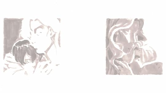 Above: Scanned “tones” done in French Grey Prismacolor Double-Ended Brush Tip Markers on printer paper via lightbox
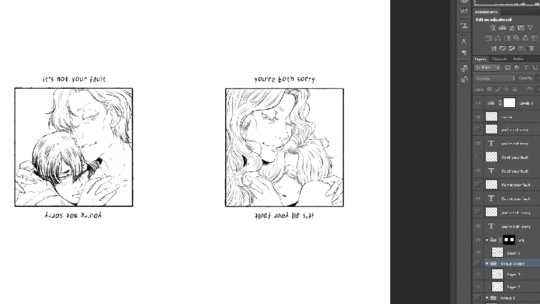 Above: Animated GIF showing scanned greys inserted into PSD of comic file underneath digital lineartStamp Effect
I wanted the cover to have a stamped, file-like aspect, but I also needed a title page; so, I grabbed a spare test print of a font variation and used it to get some letter samples, as well as some stamp décor elements.
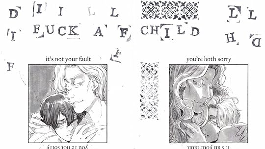 Above: Scanned rejected test print with various ink stamps in the negative space
Once scanned, the image was opened in Photoshop. The Threshold tool was used to whiten the whites and blacken the blacks of the letters and design motif, creating a crunchy high contrast image. The letters and motif were modified and all letters were rearranged as needed to spell out the title and its abbreviation in Photoshop then saved as images.

After creating these word, letter, and motif images, I was able to easily drop them where needed into InDesign.
Putting it all togetherFrom there on out, the process was about the same for most of my print books: the rest of the text and front matter was added in InDesign, PDFs were exported, File > Print Booklet was invoked multiple times, and the long arm stapler was busted out. The biggest change from, say, printing Not Real was the cover: rather than printing on cardstock from my laser printer, I used Recollections Holographic Foil Cardstock and sticker tags with alphabet stamps from Michaels (which hey if they’d like to sponsor me… ;P) to create the title. One thing I had noticed from printing the cover of Not Real was that some colors of cardstock did not seem to take the ink well: it would rub off like newsprint ink. I am not sure if it was the fact it was cardstock versus 20lb or 24lb or what, but it was a pain in my opinion. Plus the novelty of the iridescent cover with the one-of-a-kind touch of the stamped title label worked in the zine’s favor — especially since the content is all free.
TakeawaysLet’s get the negative elephant out of the room: F.A.C. was time-consuming — even accounting for the hiatus, the process by its nature of traditionalizing digital art (i.e. printing it out) and then digitizing traditional art is a bit tedious. The process also affords many opportunities to get side tracked when switching gears: moving digital files from my tablet PC with Clip Studio to my desktop PC with Adobe software; printing out inks to tone with the lightbox; scanning the tones; touching the tones up in Photoshop and pulling them back onto the original files. Arguably, there exist digital brushes that could do the exact same effect almost as well. Unfortunately, this is a process that is difficult to efficiently streamline any more than it already has been.
That being said, funny enough I found that the individual processes of digitally inking and traditionally toning both were incredibly quick: toning actually took less time traditionally than it would have taken digitally using marker style brushes. I chalk that up in part due to the scale: you cannot magnify traditional space (and there’s no RAM or CPU to stall as you try to color in a large area on a large canvas) so there’s less room to overkill on details. Either way, the overall effect is, in my opinion, worth the tedious troubles and paid off for this zine. Maybe such a process would be too much for a full, multi-panel-per-page comic, but for a short, illustrated storybook-esque zine? The time and effort feels worthwhile. This is definitely a process I hope to revisit in the future.


