Cover Versions (vol. 1)
One of the great things about being an indie author is the ability to commission/design/decide upon the covers for your books.
It’s also one of the worst things.
Sometimes you get it right, sometimes you get it wrong. But life is a work-in-progress so why shouldn’t the gaudy paper you wrap your insights into the human condition (and nob gags) in?
This week (for boring reasons I won’t go into) I had to go back and make some minor changes to some of my backlist and discovered that ‘Come On Steal The Noise‘ paperback still had its original cover in one of the places that prints books for me.
Not one to let go the opportunity to wax lyrical about myself and my books go easily I thought it might be interesting to show you the journey. The journey so far, that is, because there’s no guarantee it won’t change again in the future.

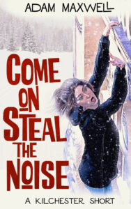
The original.
When the novella was originally written I was languishing under the misapprehension that, rather than play to the humour in my writing which is pretty fucking unavoidable, I would trick readers into buying the books thinking they were ‘straight’ crime novels then hope they liked them anyway.
As idiotic ideas, it’s up there but in spite of that, for the most part, I really like the cover.
The use of negative space, the red colour against the snowy backdrop… the cassette. There’s a lot to like.
BUT
The only model I could find who looked remotely like Zoe Zimmerman unfortunately had an almost identical haircut to Violet (except for the fringe or bangs if you’re that way inclined). Which wasn’t ideal.
It definitely encapsulates the drama of the story with a little bit of its daftness but, without doing an actual photoshoot and finding a model who looked like Zoe, it wasn’t going to get much closer.

The update.
By now things have changed. We’ve fully embraced the balance of peril, of thrilling action and, naturally, of the daftness.
The Hitchcock and Saul Bass-inspired font for my name and the subtitle balanced with the BOOM statement branding of the pulp font. Actually a recreation of a font used on real pulp novels by authors including the phenomenal John D MacDonald, the title font was chosen because it’s instantly recognisable as both pulp and that it’s also fun… matching the Bass-ishness and running with it.
Same snowy backdrop (identical in fact) as the original but this time Zoe is digitally painted to look like Zoe.
BUT
As happy as I was with this overall… I just wasn’t 100% sold on the mid-fall element of the action. My shortcomings as a cover-designer, painter, whatever… my fault.

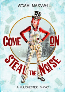
The best…?
Not sure where I came across it but I spotted a series of tributes to Norman Rockwell’s Saturday Evening Post paintings and went down the rabbit hole until I realised that the stupidly long title I’d given the novella would fit in the circular format really well…
And I could use the same wintery background AGAIN.
And even better… I could show Zoe in her mid-heist cosplay of Noddy Holder with the top hat with the mirrors on it. And… frankly… I think the final digital painting turned out amazing 
Everything from her sassiness to the winter to the pulp to the humour to the cassette in her pocket are all just working.
It took a few years to get here but, folks, I think the journey was worth it. What do you reckon?
Come On Steal The Noise is available as an ebook as well as in hardback and paperback.
The post Cover Versions (vol. 1) appeared first on Adam Maxwell.


