
My Logos A-Z: BATMAN to BISHOP
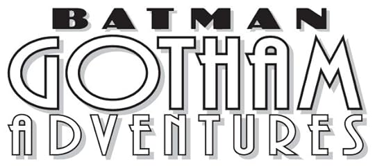 Image © DC Comics.
Batman Gotham Adventures. Client: DC Comics. Medium: digital. Date: 1998. Made from two commercial fonts with art deco style. Appeared on 17 issues.
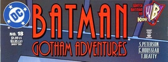 Image © DC Comics
Batman Gotham Adventures. Client: DC Comics. Medium: digital. Date: 1999. With this issue, a version was requested that pushed BATMAN to prominence. I used the same commercial art deco font for that as for the bottom line. Even with digital logos, where I should have images in my files, I sometimes can’t find them or no longer have them, as here. Seen on 24 issues.
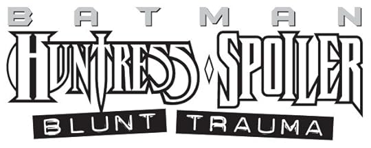 Image © DC Comics
Batman Huntress Spoiler: Blunt Trauma. Client: DC Comics. Medium: digital. Date: 1997. Team up books like this can be difficult because you’re forced to combine styles that don’t go together, as here. BATMAN is from his then current series, not by me, I don’t know who designed this 1994 Huntress logo. Spoiler is from a modified title font of my own. The subtitle is a commercial font that looks like it was made with a label maker. Kind of a mess, but what else can you do? Appeared on a single issue.
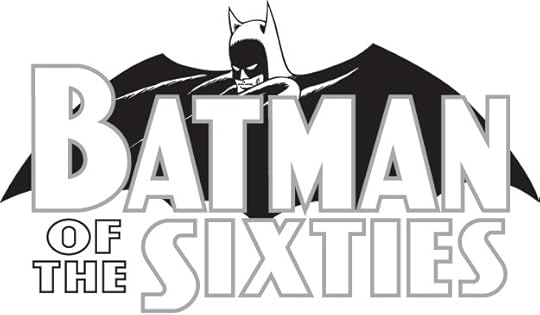 Image © DC Comics
Batman of the Sixties. Client: DC Comics. Medium: digital. Date: 1999. This hardcover and paperback collection came out with a slight title change to Batman IN the Sixties, and a logo by someone else, but I was paid for this. I digitally recreated the Batman logo of the time with its Ira Schnapp letters, and then did the rest in the same style. They might have used my bat shape.
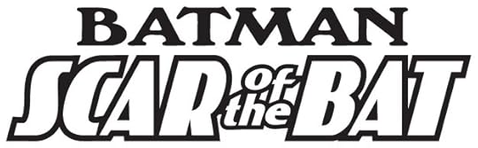 Image © DC Comics
Batman Scar of the Bat. Client: DC Comics. Medium: digital. Date: 1995. Another art deco commercial font for the main title, and a different font for Batman. I like the way SCAR and BAT stand out. Appeared on a single 52-page graphic novel.
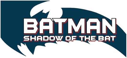 Image © DC Comics
Batman Shadow of the Bat. Client: DC Comics. Medium: digital. Date: 1996. Uses the bat shape I did from Frank Miller’s thumbnail sketch first seen on Batman Year One, BATMAN is in the style then being used on his own book, I added the second line in the same style. Appeared on 44 issues I think, sometimes with no bat shape, sometimes with a different one.
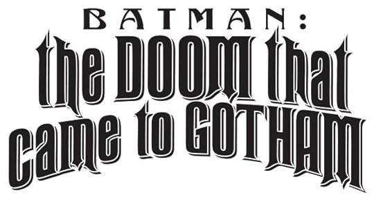 Image © DC Comics
Batman: the DOOM that came to Gotham. Client: DC Comics. Medium: digital. Date: 2000. This used two commercial fonts with a Victorian flavor. Dover Publications put out some fine ones in a book with a CD of the font files. Appeared on three issues.
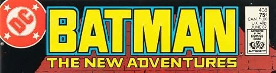 Image © DC Comics
Batman The New Adventures. Client: DC Comics. Medium: pen and ink. Date: 1986. Uses the Batman I designed for Batman Year One with a slightly heavier outline, and was on the issues following that four issue series within the regular Batman title. I added THE NEW ADVENTURES in a similar style. Appeared on nine issues, and this Batman alone appeared on five issues.
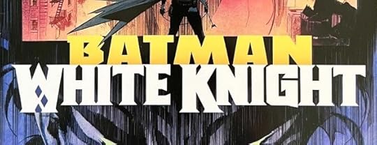 Image © DC Comics
Batman White Knight. Client: DC Comics. Medium: digital. Date: 2017. The first White Knight series and logo, which I think works best in color on the cover. Each line uses one of my title fonts as the starting point. Appeared on eight issues.
 Image © DC Comics
Batman (for Year One). Client: DC Comics. Medium: pen and ink. Date: 1986. One of my most popular logos I think, and mostly due to the bat shape, which began as a tiny thumbnail sketch by Frank Miller. More HERE. The Batman letters were much like what had come before, but less tall to fit better in the shape. Quite an easy and fun design job. The bat shape was used on other logos by me and other designers. Appeared on four issues of Batman, #404-407.
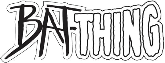 Image © Marvel and DC Comics
Bat-Thing. Client: Amalgam Comics (Marvel and DC). Medium: digital. Date: 1996. Combination of a then-current Man-Bat logo at DC and the classic Man-Thing logo at Marvel by Gaspar Saladino, I don’t know who designed the other one. Used on one issue.
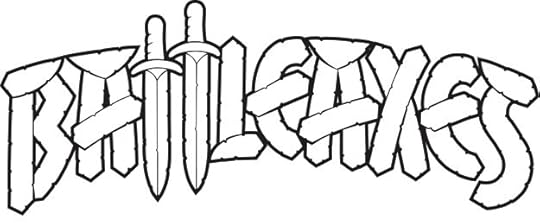 Image © DC Comics
Battleaxes. Client: Vertigo/DC Comics. Medium: digital. Date: 2000. This began with elaborate marker sketches, more HERE. The version that appeared had some minor design changes not by me, and heavy photoshop textures, but I thought it worked fine. Appeared on four issues.
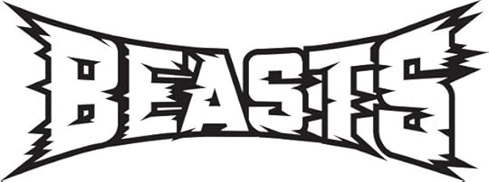 Image © Marvel
Beasts (Universe X). Client: Marvel. Medium: digital. Date: 2001. I think all the Universe X logos through three series and many one-shots were pencilled by Alex Ross and digitally inked and/or finished by me, this is one of those. I like the feeling of wide-screen surrounding motion created by the burst points. Used on one issue.
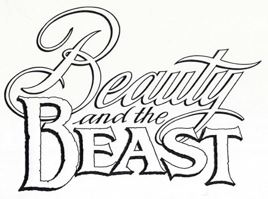 Image © Disney
Beauty and the Beast. Client: Disney Comics. Medium: pen and ink. Date: 1992. I don’t recall getting any direction for this logo, I went for contrasting styles that I thought played well with each other. It appeared on two issues of DISNEY’S NEW ADVENTURES OF BEAUTY AND THE BEAST.
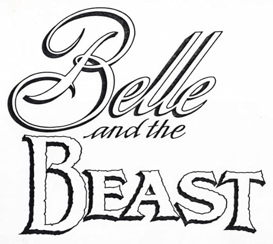 Image © Disney
Belle and the Beast. Client: Disney Comics. Medium: pen and ink. Date: 1992. They also asked for this version, but I don’t think it was used.
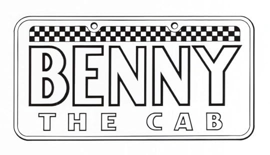 Image © Disney
Benny the Cab. Client: Disney Comics. Medium: pen and ink. Date: 1990. One of the character logos I did for Roger Rabbit’s Toontown. It first appeared in the second issue. I enjoyed researching and imitating a cab license plate.
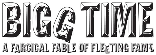 Image © DC Comics
Bigg Time. Client: DC Comics. Medium: digital. Date: 2002. This used a commercial font that would look like letters on a movie marquee, and then I distressed them and gave them uneven alignment. Appeared on a graphic novel by Ty Templeton.
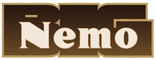 Image © Electricomics
Big Nemo. Client: Electricomics. Medium: digital. Date: 2014. One of several feature logos for this company created by Alan Moore and his daughter Leah that did online comics for a new app. I never saw the app, and it doesn’t seem to be around anymore, but I enjoyed working on the logos.
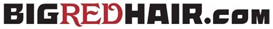 Image © Anina Bennett and Paul Guinan
BigRedHair.com. Client: Anina Bennett and Paul Guinan. Medium: digital. Date: 2016. Website logo for the creator-own projects of Anina and Paul. The name came from Anina’s own hair. It uses two commercial fonts. It’s still active HERE.
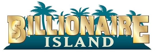 Image © Ahoy Comics
Billionaire Island. Client: Ahoy Comics. Medium: digital. Date: 2019. This uses a commercial font to which I added the dollar sign and metallic shine. I think I copied the palm tree silhouettes from a photo I found online, and Island is another commercial font. Appeared on two six-issue series.
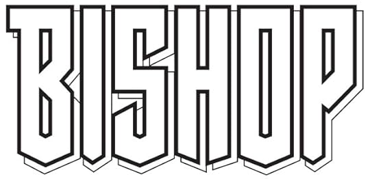 Image © Marvel
Bishop. Client: Marvel. Medium: pen and ink. Date: 1994. The comics market was booming at the time, and I was getting lots of logo work from Marvel. A little more on this one is HERE. Not as pointy as some I did for them, but certainly angular. I like the sloped shapes along the bottom. Used on a four-issue series and two later series, somewhat modified.
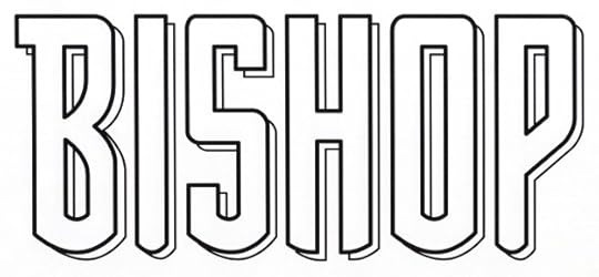 Image © Marvel
Bishop (Flashback). Client: Marvel. Medium: digital. Date: 1997. One of several logos I did for Marvel under a Flashback banner, Justin Copp found it on WHAT IF…? -1. Softening all the angles gave it a Sam Rosen feel.
Posts in this series are listed on the Logo Links page of my blog.
The post My Logos A-Z: BATMAN to BISHOP appeared first on Todd's Blog.


Todd Klein's Blog

- Todd Klein's profile
- 28 followers

