
Looking back at a pandemic simulator
It’s been six years now since the early days of the Covid pandemic. People who were paying super close attention started hearing rumors about something going on in China towards the end of 2019 — my earliest posts about it on Facebook were from November that year.
Even at the time, people were utterly clueless about the mathematics of how a highly infectious virus spread. I remember spending hours writing posts on various different social media sites explaining that the Infection Fatality Rates and the R value were showing that we could be looking at millions dead. People didn’t tend to believe me:
“SEVERAL MILLION DEAD! Okay, I’m done. No one is predicting that. But you made me laugh. Thanks.”
You can do the math yourself. Use a low average death estimate of 0.4%. Assume 60% of the population catches it and then we reach herd immunity (which is generous):
328 million people in the US.60% of that is 196 million catch it.0.4% of that is 780,000 dead.But that’s with low assumptions…
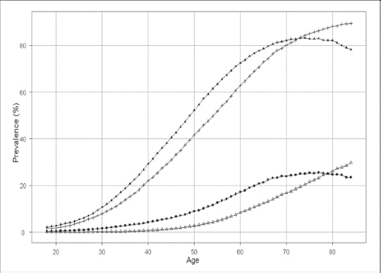 Graph showing fatality rates with and without comorbidities, by age.
It was like typing to a wall. In fact, it’s pretty likely that it still is, since these days, the discourse is all about how bad the economic and educational impact of lockdowns was — and not about the fact that if the world had acted in concert and forcefully, we could have had a much better outcome than we did. The health response was too soft, the lockdown too lenient, and as a result, we took all the hits.
Of course, these days people also forget just how deadly it was and how many died, and so on. We now know that the overall IFR was probably higher than 0.4%, but very strongly tilted towards older people and those with comorbidities. We also now know that herd immunity was a pipe dream — instead we managed to get vaccines out in record time and the ordinary course of viral evolution ended up reducing the death rate until now we behave as if Covid is just a deadlier flu (it isn’t, that thinking ignores long-term impact of the disease).
The upshot: my math was not that far off — the estimated toll in the US ended up being 1.2 to 1.4 million souls, and worldwide it’s estimated as between 15 and 28.5 million dead. Plenty of denial of this, these days, and plenty of folks blaming the vaccines for what are most likely issues caused by the disease in the first place.
Anyway, in the midst of it all, tired of running math in my spreadsheets (yeah, I was tracking it all in spreadsheets, what can I say?), I started thinking about why only a few sorts of people were wrapping their heads around the implications. The thing they all had in common was that they lived with exponential curves. Epidemiologists, Wall Street quants, statisticians… and game designers.
Could we get more people to feel the challenges in their bones?
 The design sketch
So… I posted this to Facebook on March 24th, 2020:
Three weeks ago I was idly thinking of how someone ought to make a little game that shows how the coronavirus spreads, how testing changes things, and how social distancing works.
The sheer number of people who don’t get it — numerate people, who ought to be able to do math — is kind of shocking.
I couldn’t help worrying at it, and have just about a whole design in my head. But I have to admit, I kinda figured someone would have made it by now. But they haven’t.
It’s not even a hard game to make.
Little circles on a plain field. Each circle simply bounces around.
They are generated each with an age, a statistically real chance of having a co-morbid condition (diabetes, hypertension, immunosuppressed, pulmonary issues…), and crucially, a name out of a baby book.
They can be in one of these states:
healthyasymptomatic but contagioussymptomaticseverecriticaldeadrecoveredIn addition, there’s a diagnosed flag.
We render asymptomatic the same as healthy. We render each of the other states differently, depending on whether the diagnosed flag is set. They show as healthy until dead, if not diagnosed. If diagnosed, you can see what stage they are in (icon or color change).
The circles move and bounce. If an asymptomatic one touches a healthy one, they have a statistically valid chance of infecting.
Circles progress through these states using simple stats.
70% of asymptomatic cases turn symptomatic after 1d10+5 days. The others stay sick for the full 21 days.Percent chance of moving from symptomatic to severe is based on comorbid conditions, but the base chance is 1 in 5 after some amount of days.Percent chance of moving from severe to critical is 1 in 4, modified by age and comorbidities, if in hospital. Otherwise, it’s double.Percent chance of moving from critical to dead is something like 1 in 5, modified by age and comorbidities, if in hospital. Otherwise, it’s double.Symptomatic, severe, and critical circles that do not progress to dead move to ‘recovered’ after 21 days since reaching symptomatic.Severe and critical circles stop moving.We track current counts on all of these, and show a bar graph. Yes, that means players can see that people are getting sick, but don’t know where.
The player has the following buttons.
Hover on a circle, and you see the circle’s name and age and any comorbidities (“Alison, 64, hypertension.”)Test. This lets them click on a circle. If the circle is asymptomatic or worse, it gets the diagnosed flag. But it costs you one test.Isolate. This lets them click on a circle, and freezes them in place. Some visual indicator shows they are isolated. Note that isolated cases still progress.Hospitalize. This moves the circle to hospital. Hospital only has so many beds. Clicking on a circle already in hospital drops the circle back out in the world. Circles in hospital have half the chance or progressing to the next stage.Buy test. You only have so many tests. You have to click this button to buy more.Buy bed. You only have this many beds. You have to click this button to buy more.Money goes up when circles move. But you are allowed to go negative for money.Lockdown. Lastly, there is a global button that when pressed, freezes 80% of all circles. But it gradually ticks down and circles individually start to move again, and the button must be pressed again from time to time. While lockdown is running, it costs money as well as not generating it. If pressed again, it lifts the lockdown and all circles can move again.The game ticks through days at an accelerated pace. It runs for 18 months worth of days. At the end of it, you have a vaccine, and the epidemic is over.
Then we tell you what percentage of your little world died. Maybe with a splash screen listing every name and age of everyone who died. And we show how much money you spent. Remember, you can go negative, and it’s OK.
That’s it. Ideally, it runs in a webpage. Itch.io maybe. Or maybe I have a friend with unlimited web hosting.
Luxury features would be a little ini file or options screen that lets you input real world data for your town or country: percent hypertensive, age demographics, that sort of thing. Or maybe you could crowdsource it, so it’s a pulldown…
Each weekend I think about building this. So far, I haven’t, and instead I try to focus on family and mental health and work. But maybe someone else has the energy. I suspect it might persuade and save lives.
 Notes on the design
Some things about this that I want to point out in hindsight.
At the time that I posted, I could tell that people were desperately unwilling to enter lockdown for any extended period of time; but “The Hammer and the Dance” strategy of pulsed lockdown periods was still very much in our future. I wanted a mechanic that showed population non-compliance.There was also quite a lot of obsessing over case counts at the time, and one of the things that I really wanted to get across was that our testing was so incredibly inadequate that we really had little idea of how many cases we were dealing with and therefore what the IFR (infection fatality rate) actually was. That’s why tests are limited in the design sketch.I was also trying to get across that money was not a problem in dealing with this. You could take the money value negative because governments can choose to do that. I often pointed out in those days that if the government chose, it could send a few thousand dollars to every household every few weeks for the duration of lockdown. It would likely have been less impact to the GDP and the debt than what we actually did.I wanted names. I wanted players to understand the human cost, not just the statistics. Today, I might even suggest that an LLM generate a little biography for every fatality.Another thing that was constantly missed was the impact of comorbidities. To this day, I hear people say “ah, it only affected the old and the ill, so why not have stayed open?” To which I would reply with:Per the American Heart Association, among adults age 20 and older in the United States, the following have high blood pressure:
For non-Hispanic whites, 33.4 percent of men and 30.7 percent of women.For non-Hispanic Blacks, 42.6 percent of men and 47.0 percent of women.For Mexican Americans, 30.1 percent of men and 28.8 percent of women.
Per the American Diabetes Association,
34.2 million Americans, or 10.5% of the population, have diabetes.Nearly 1.6 million Americans have type 1 diabetes, including about 187,000 children and adolescentsPer studies in JAMA,
4.2% of of the population of the USA has been diagnosed as immunocompromised by their doctorNext, realize that because the disease spreads mostly inside households (where proximity means one case tends to infect others), this means that protecting the above extremely large slices of the population means either isolating them away from their families, or isolating the entire family and other regular contacts.
People tend to think the at-risk population is small. It’s not.
The response, for Facebook, was pretty surprising. The post was re-shared a lot, and designers from across the industry jumped in with tweaks to the rules. Some folks re-posted it to large groups about public initiatives, etc.
There was also, of course, plenty of skepticism that something like this would make any difference at all.
 Screenshot of Covid Ops, by John AlbanoTeams take it up
The first to take up the challenge was John Albano, who had his game Covid Ops up and running on itch.io a mere six days later. You can still play it there!
Stuck in the house and looking for things to do. Soooo, when a fellow game dev suggested a game idea and basic ruleset along with “I wish someone would make a game like this,” I took that as a challenge to try. Tonight (this morning?), the first release of COVID OPS has been published.
John’s game was pretty faithful to the sketch. You can see the comorbidities over on the left, and the way the player has clicked on 72 year old Rowan — who probably isn’t going to make it. As he updated it, he added in more detailed comorbidity data, and (unfortunately, as it turns out) made it so that people were immune after recovering from infection. And of course, like the next one I’ll talk about, John made a point of including real world resource links so that people could take action.
By April 6th, another team led by Khail Santia had participated in Jamdemic 2020 and developed the first version of In the Time of Pandemia. He wrote,
The compound I stay at is about to be cordoned. We’ve been contact-traced by the police, swabbed by medical personnel covered in protective gear. One of our housemates works at a government hospital and tested positive for antibodies against SARS-CoV-2.
The pandemic closes in from all sides. What can a game-maker do in a time like this?
I’ve been asking myself this question since the beginning of community quarantine. I’m based in Cebu City, now the top hotspot for COVID-19 in the Philippines in terms of incidence proportion.
This game would go on to be completed by a fuller team including a mathematical epidemiologist, and In the Time of Pandemia eventually ended up topping charts on Newgrounds when it launched there in July of 2020.
This game went viral and got a ton of press across the Pacific Rim. The team worked closely with universities and doctors in the Philippines and validated all the numbers. They added local flavor to their levels representing cities and neighborhoods that their local players would know.
Gregg Victor Gabison, dean of the University of San Jose-Recoletos College of Information, Computer & Communications Technology, whose students play-tested the game, said, “This is the kind of game that mindful individuals would want to check out. It has substance and a storyline that connects with reality, especially during this time of pandemic.”
Not only does the game have to work on a technical basis, it has to communicate how real a crisis the pandemic is in a simple, digestible manner.
Dr. Mariane Faye Acma, resident physician at Medidas Medical Clinic in Valencia, Bukidnon, was consulted to assess the game’s medical plausibility. She enumerated critical thinking, analysis, and multitasking as skills developed through this game. “You decide who are the high risks, who needs to be tested and isolated, where to focus, [and] how much funds to allocate….The game will make players realize how challenging the work of the health sector is in this crisis.”
“Ultimately, the game’s purpose is to give players a visceral understanding of what it takes to flatten the curve,” Santia said.
Aftermath

I think most people have no idea that any of this happened or that I was associated with it. I only posted the design sketch on Facebook; it got reshared across a few thousand people. It wasn’t on social media, I didn’t talk about it elsewhere, and for whatever reason, I didn’t blog about it.
I have had both these games listed on my CV for a while. Oh, I didn’t do any of the heavy lifting… all credit goes to the developers for that. There’s no question that way more than 95% of the work comes after the high-level design spec. But both games do credit me, and I count them as games I worked on.
A while back, someone on Reddit said it was pathetic that I listed these. I never quite know what to make of comments like that (troll much?!?).
No offense, but I’m proud of what a little design sketch turned into, and proud of the work that these teams did, and proud that one of the games got written up in the press so much; ended up being used in college classrooms; was vetted and validated by multiple experts in the field; and made a difference however slight.
Peak Covid was a horrendous time. Horrendous enough that we have kind of blocked it from our memories. But I lost friends and colleagues. I still remember. Back then I wrote,
This is the largest event in your lifetime. It is our World War, our Great Depression. We need to rise the occasion, and think about how we change. There is no retreat to how it used to be.
There is only through.
A year later, the vaccine gave us that path through, and here we are now.
But as I write this, we have the first human case of H5N5 bird flu; it was only a matter of time.
Maybe these games helped a few people get through it all. They were played by tens of thousands, after all. Maybe they will help next time. I know that the fact that they were made helped me get through, that making them helped John get through, helped Khail get through — in his own words:
In the end, the attempt to articulate a game-maker’s perspective on COVID-19 has enabled me to somehow transcend the chaos outside and the turmoil within. It’s become a welcome respite from isolation, a thread connecting me to a diversity of talents who’ve been truly generous with their expertise and encouragement. As incidences continue to rise here and in many parts of the world, our hope is that the game will be of some use in showing what it takes to flatten the curve and in advocating for communities most in need.
So… at minimum, they made a real difference to at least three people.
And that’s not a bad thing for a game to aspire to.


