
My Logos A-Z: BRAVE to CAPTAIN AMERICA
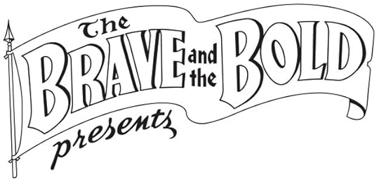 Image © DC Comics
The Brave and the Bold (recreation). Client: DC Comics. medium: digital. Date: 2001. My tracing in Adobe Illustrator of Ira Schnapp’s classic logo, appeared on THE BRAVE AND THE BOLD ANNUAL #1 1969, but of course actually first issued in 2001. I liked doing these when asked, it was a way to closely study the work of Schnapp and other early designers.
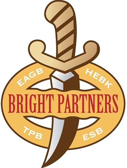 Image © Bright Partners
Bright Partners. Client: Holly Kavanagh. Medium: digital. Date: 2015. Around the same time I did the Angry Babies logo for Terry Kavanagh, I did this for his wife Holly. I don’t know where it was used, or what it’s about.
The Broken Sword. Client: Fantagraphics. Medium: pen and ink. Date: 1983. I have no copy of this, and I find none online, so I’m guessing it was never used. The Broken Sword was the title of a fantasy novel by Poul Anderson, possibly a comics adaptation was planned.
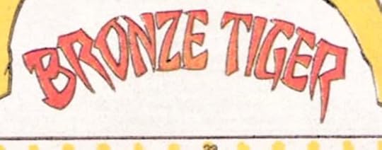 Image © DC Comics
Bronze Tiger. Client: DC Comics. Medium: pen and ink or marker. Date: 1984. For issue #3 of Who’s Who, I used the faux Chinese style that was common at the time for any oriental character, but is now frowned upon by the Asian community. At least, it has elements of that along with my pointy style.
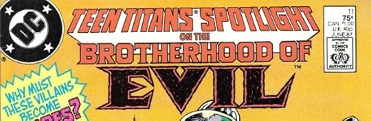 Image © DC Comics
The Brotherhood of Evil. Client: DC Comics. Medium: pen and ink. Date: 1987. Commissioned for TEEN TITANS SPOTLIGHT #11, above. Pointy rough letters with black inner shapes for Evil.
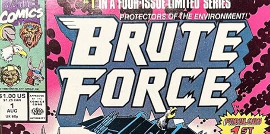 Image © Marvel
Brute Force. Client: Marvel. Medium: pen and ink. Date: 1990. This looks like a cool comic, though I never saw it. I had fun adding bird and animal elements to the B and C. One of those designs I didn’t get a copy of before I sent it off. I didn’t have my own copier until about 1992, and of course with digital logos, I can always get an image from my files if I have it (I don’t always). A little more on this is HERE.
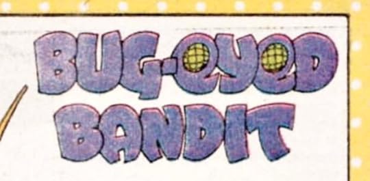 Image © DC Comics
Bug-Eyed Bandit. Client: DC Comics. Medium: pen and ink or marker. Date: 1984. From Who’s Who #3, I wasn’t familiar with this 1960s character, but the eye design was an obvious choice.
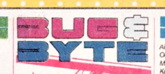 Image © DC Comics
Bug & Byte. Client: DC Comics. Medium: pen and ink or marker. Date: 1984. Another one for the same issue. Not as interesting or as much fun, though I kind of like the odd B shapes.
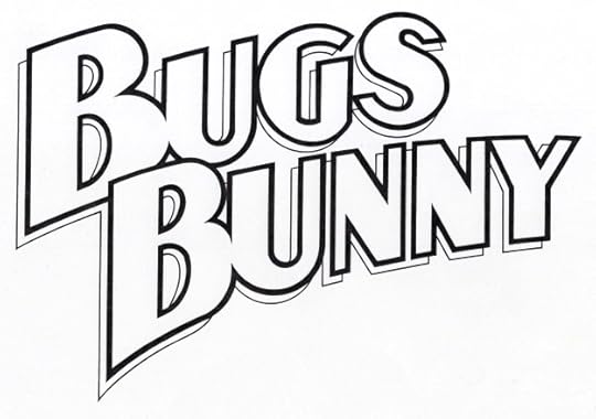 Image © DC Comics
Bugs Bunny. Client: DC Comics. Medium: pen and ink. Date: 1990. When DC started doing comics with Warner Bros. cartoon characters, they wanted fresh logos. Bugs had appeared for decades in comics from Dell/Western, this was a different, almost a super heroic approach. Appeared on three issues.
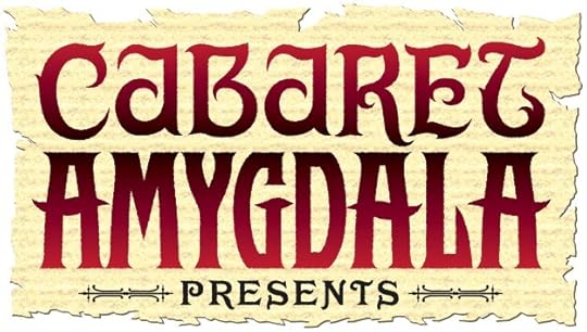 Image © Electricomics
Cabaret Amygdala. Client: Electricomics. Medium: digital. Date: 2014. Another feature created by Alan Moore and produced by Leah Moore for the Electricomics app that seems to no longer be around. I think this was created from sketches, except PRESENTS, which is a commercial font.
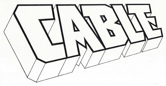 Image © Marvel
Cable. Client: Marvel. Medium: pen and ink. Date: 1992. Blocky, with perspective and telescoping similar to the classic X-Men logo by Jim Steranko from the 1960s. A little pointy in the A and E. Appeared on 95 issues and an annual as well as other places, including a modified version on CABLE AND DEADPOOL. More on this HERE.
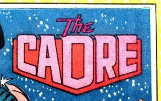 Image © DC Comics
The Cadre. Client: DC Comics. Medium: pen and ink or marker. Date: 1985. For Who’s Who #4. The background shape holds this one together nicely.
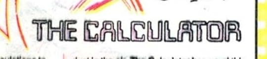 Image © DC Comics
The Calculator. Client: DC Comics. Medium: pen and ink or marker. Date: 1985. Another one, and I used the letters seen on some checks and other bank documents, which at the time seemed modern, and now seems old-fashioned.
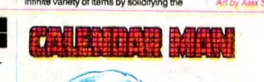 Image © DC Comics
Calendar Man. Client: DC Comics. Medium: pen and ink or marker. Date: 1985. And another one, an awful logo that also reproduced badly. What was I thinking? I probably did all three of these in an evening at home, and by this one was exhausted and out of good ideas.
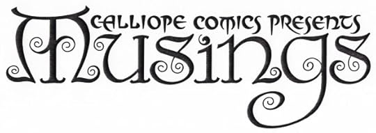 Image © Steve Tice
Calliope Comics Presents Musings. Client: Steve Tice. Medium: pen and ink. Date: 1992. My favorite small press logo, done for a fanzine with a focus, at least initially, on The Sandman. I couldn’t get in any more curly ends. They were inspired by the art of Frank C. Papé on books by James Branch Cabell. More HERE.
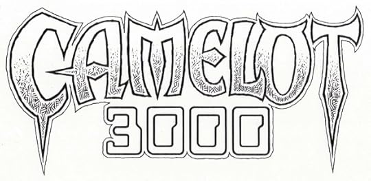 Image © DC Comics
Camelot 3000. Client: DC Comics. Medium: pen and ink. Date: 1982. Something about this combination worked, even with those bank check numbers for 3000. The top line uses shapes that suggest Celtic or Norse alphabets with lots of points, and the inner texture is something I enjoyed using when I could, copied from science fiction/fantasy illustrators like Virgil Finlay and Stephen Fabian. Appeared on twelve issues.
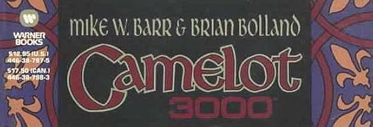 Image © DC Comics
Camelot 3000. Client: DC Comics. Medium: pen and ink. Date: 1987. I don’t have this in my files, but the cover above seems like the right date. I can’t say I remember doing it either, so I may have worked over a layout from someone else, or possibly what I did wasn’t used.
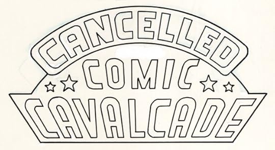 Image © DC Comics
Cancelled Comics Cavalcade. Client: DC Comics. Medium: pen and ink. Date: 1978. One of my earliest DC logos, I think I did it for editor Mike Gold in exchange for a copy of this very limited photocopy print run collection made to secure copyrights on material that was cancelled by the DC Implosion. It uses the 1940s logo from the All-American division of DC Comics, designer unknown, with my new top line. It appeared on two thick issues of photocopies, one set went to the copyright office in Washington, DC, the others were given to DC staffers and freelancers who had work in them or that Gold felt should have copies. I made a pretty good decision, I sold my copy for $1,200 in 1989 to help raise a deposit for the house I’m still living in. Probably the most I ever received for a logo design, though it took eleven years to get it.
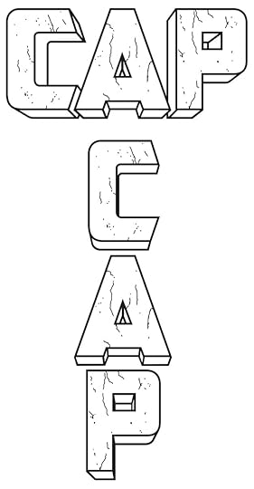 Image © Marvel
Cap (Universe X). Client: Marvel. Medium: digital. Date: 2000. Digitally inked from pencils by Alex Ross. I’m not sure if the distress marks were in his design or if I added them. The vertical and horizontal versions were both used on different cover variants. Appeared on one issue.
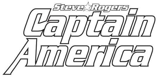 Image © Marvel
(Steve Rogers) Captain America. Client: Marvel. Medium: digital. Date: 1995. I was still learning to design in Adobe Illustrator, and I used the commercial font Serpentine Bold with modifications to the C and A. My design included Cap’s shield, as seen on the first few appearances, but I don’t have a copy of that version. Appeared on twelve issues beginning with #444. More on it HERE.
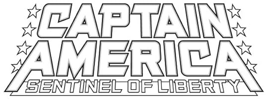 Image © Marvel
Captain America: Sentinel of Liberty. Client: Marvel. Medium: digital. Date: 1998. Here I used one of my title fonts. The title is too long, but having the hero’s name large allows it to work fine. Slightly similar to the Joe Simon logo on the first issue of CAPTAIN AMERICA COMICS from 1941. Appeared on twelve issues. More HERE.
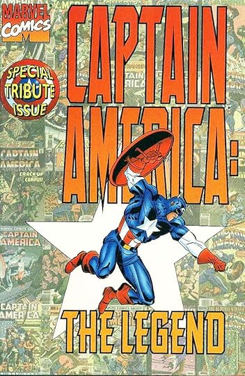 Image © Marvel
Captain America The Legend. Client: Marvel. Medium: digital. Date: 1996. Around this time, Marvel editors were also exploring digital cover design, and they had a thing for very tall logos, but instead of asking the designer to make a tall version that was proportionally correct, they stretched what they had in a way that I hated. Other travesties can be found from the time. This also uses one of my title fonts. Appeared on one issue.
Posts in this series are listed on the Logo Links page of my blog.
The post My Logos A-Z: BRAVE to CAPTAIN AMERICA appeared first on Todd's Blog.


Todd Klein's Blog

- Todd Klein's profile
- 29 followers

