
My Logos A-Z: CAPTAIN ATOM to CHALLENGERS
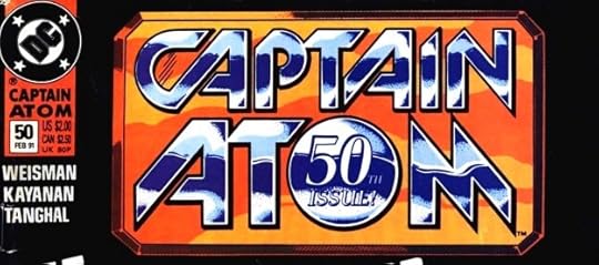 Image © DC Comics
Captain Atom (Issue 50). Client: DC Comics. Medium: pen and ink. Date: 1990. Sometimes DC asked for a special logo treatment for a particular issue. Here I started with Ken Bruzenak’s series logo and made it look shiny and metallic with inserts held here in purple. I also added the “50th Issue!” in the O, and probably the beveled frame around everything.
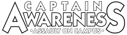 Image © Danny DeAngelo
Captain Awareness. Client: Danny DeAngelo. Medium: digital. Date: 1998. For a charity comic raising funds for “Assault on Campus.” This used a commercial font, and I didn’t do a lot with it. I probably designed it for no fee, as I do for charity projects. Used on one issue.
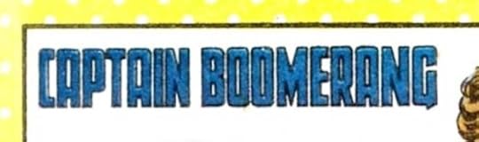 Image © DC Comics
Captain Boomerang. Client: DC Comics. Medium: pen and ink or marker. Date: 1985. For Who’s Who #4, standard tall block letters. I should have included a boomerang somewhere.
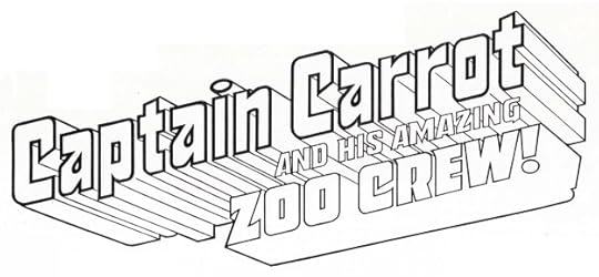 Image © DC Comics
Captain Carrot and his Amazing Zoo Crew. Client: DC Comics. Medium: pen and ink. Date: 1981. Gaspar Saladino had done a clever logo for this using letters shaped like carrots in his design, but DC wanted something simpler and more heroic. All the facets on the telescoping add complexity to this one, and should have been simplified, but it works okay in color. Gaspar’s version can be seen HERE. Used on 20 issues, and a modified version on a 2007 three-issue series.
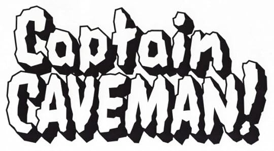 Image © DC Comics.
Captain Caveman. Client: DC Comics. Medium: digital. Date: 1999. DC was doing an anthology, CARTOON NETWORK PRESENTS, and I was asked to create or recreate logos for some of the Hanna-Barbera characters. This first appeared on issue #23 I think, I’m not sure where else. For some of these I was given reference, I think this one was just my idea. It has a Flintstones feel.
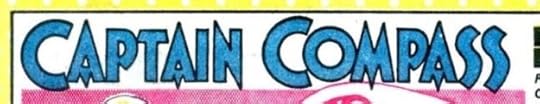 Image © DC Comics
Captain Compass. Client: DC Comics. Medium: pen and ink or marker. Date: 1985. This is a recreation of the logo on the backup series that ran in Detective Comics in the 1950s. I guess there was no image to be found in the DC files that could be used, so I probably photocopied a splash page from a bound volume in the DC library and traced it. The original might be by Ira Schnapp, I’m not sure.
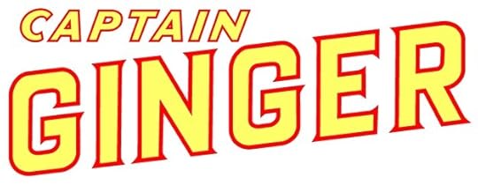 Image © Ahoy Comics
Captain Ginger. Client: Ahoy Comics. Medium: digital. Date: 2017. A space opera with anthropomorphic animals, the editor suggested I look at science fiction pulp magazine logos for ideas. We settled on Thrilling Wonder Stories, and this is based on the first two lines of that.
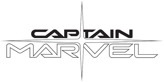 Image © Marvel
Captain Marvel. Client: Marvel Comics. Medium: digital. Date: 2002. An Alex Ross design that I traced in Adobe Illustrator over his pencils. I think it’s the sleekest and best logo design for any of the Captain Marvel characters.
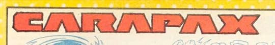 Image © DC Comics
Carapax. Client: DC Comics. Medium: pen and ink or marker. Date: 1987. Created for Who’s Who Update #1, clearly I had just that much space to fill.
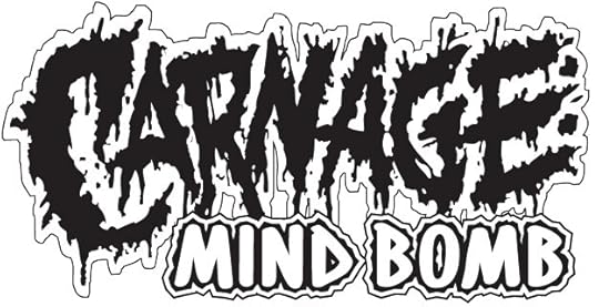 Image © Marvel
Carnage: Mind Bomb. Client: Marvel. Medium: digital. Date: 1995. The top line looks like it was created with a brush or ink bottle topper, and then traced in Illustrator. The second line is one of my title fonts. I didn’t get this messy very often in logo designs. Appeared on a single issue.
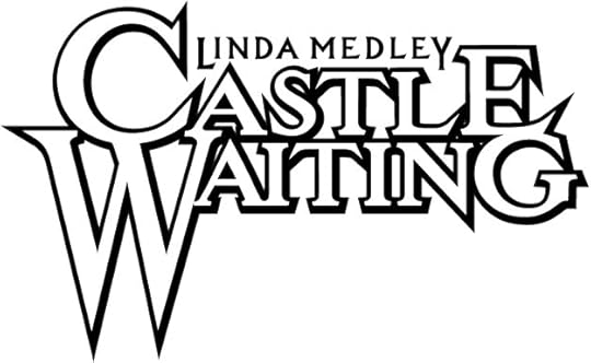 Image © Linda Medley and Cartoon Books
Castle Waiting. Client: Cartoon Books. Medium: digital. Date: 2000. Linda Medley self published this title for a while with a perfectly fine type-based logo, but when it moved to Jeff Smith’s Cartoon Books, he asked me to do a new logo that was somewhat similar in size to his BONE logo, with large first letters. I guess Linda thought it was okay, because when she took the book back to her own Olio imprint, she kept the logo.
Catwoman (licensing). Client: DC Comics. Medium: pen and ink. Date: 1982. I have this as a paid logo in my payment records, but no copy of it, and I don’t see it online anywhere, so perhaps it wasn’t used.
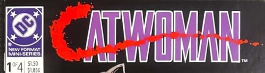 Image © DC Comics
Catwoman. Client: DC Comics. Medium: pen and ink. Date: 1988. I don’t have this one in my files either, but I remember working on the bloody C made with drips from an ink bottle topper. Possibly DC art director Keith Wilson was involved in that. The rest is standard block letters. Appeared on four issues.
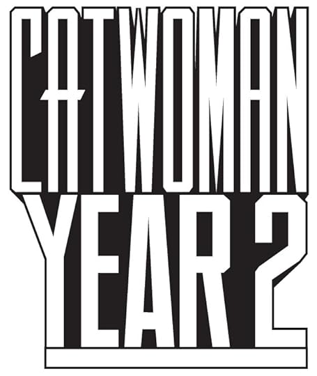 Image © DC Comics
Catwoman Year 2. Client: DC Comics. Medium: digital. Date: 1996. This is the way to do a very tall logo, have the designer plan it that way from the start. It appeared on issues 38-40 of the ongoing Catwoman series of the time, with issue 39 having a variant where YEAR and 2 were stacked. I used one of my title fonts.
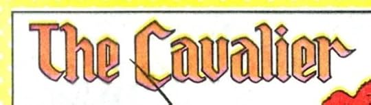 Image © DC Comics
The Cavalier. Client: DC Comics. Medium: pen and ink or marker. Date: 1985. Appeared in Who’s Who #4, I used a somewhat Old English style, or as I’d call it “Old English Light.”
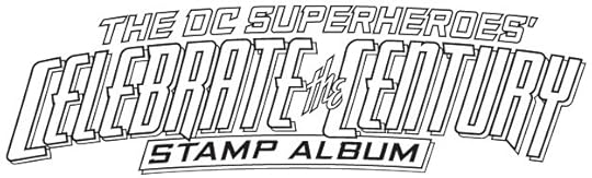 Image © DC Comics
(The DC Superheroes’) Celebrate the Century Stamp Album. Client: DC Comics. Medium: digital. Date: 1998. Stamp collecting was a hobby I enjoyed at the time, so it was fun being part of this collaboration between DC and the US Postal Service. Unfortunately, they didn’t use this logo. The design was changed to make SUPER HEROES by far the largest words, and it was done by someone else.
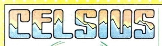 Image © DC Comics
Celsius. Client: DC Comics. Medium: pen and ink or marker. Date: 1985. Another for Who’s Who #4, not a bad idea and design, I’d say.
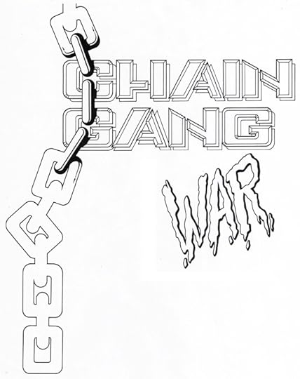 Image © DC Comics
Chain Gang War. Client: DC Comics. Medium: pen and ink. Date: 1993. This was done over a layout by someone else, perhaps cover penciller Dave Johnson. WAR was separated so it could be placed wherever they wanted it, which was over the end of GANG. Appeared on twelve issues.
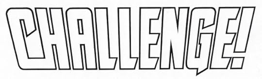 image © DC Comics
(DC) Challenge. Client: DC Comics. Medium: pen and ink. Date: 1984. Positioned on covers so that the DC symbol was just under the edge of the C, allowing it to read as part of the name. Appeared on twelve issues.
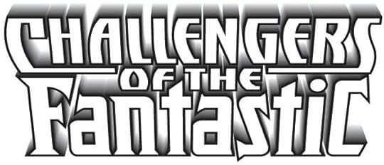 Image © Marvel and DC Comics
Challengers of the Fantastic. Client: Amalgam Comics (Marvel and DC Comics). Medium: digital. Date: 1996. Combines my recently designed Challengers of the Unknown logo (see below) with the Fantastic Four logo I had done for Marvel licensing (Toy Biz) in 1994. The fadeaway telescoping was another of the KPT Vector Effects add-ons to Adobe Illustrator, and I thought it was cool. The only problem was it ended in white, which did not always look good on the cover art. On this one-shot they made it all a solid color.
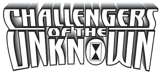 Image © DC Comics
Challengers of the Unknown. Client: DC Comics. Medium: digital. Date: 1996. The same idea as above, but with UNKNOWN in a slight arc, and having a sand dial symbol in the O. This used my title font derived from the logo for The Adventures of Cyclops and Phoenix of 1993. Appeared on sixteen issues.
Posts in this series are listed on the Logo Links page of my blog.
The post My Logos A-Z: CAPTAIN ATOM to CHALLENGERS appeared first on Todd's Blog.


Todd Klein's Blog

- Todd Klein's profile
- 28 followers

