
My Logos A-Z: CHAMELEON to COMIC
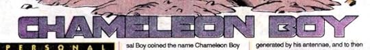 Image © DC Comics
Chameleon Boy. Client: DC Comics. Medium: pen and ink or marker. Date: 1985. For Who’s Who #4, pretty bland, but I didn’t have much room.
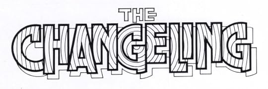 Image © DC Comics
The Changeling. Client: DC Comics. Medium: pen and ink. Date: 1981. Created for TALES OF THE NEW TEEN TITANS #3. I’m not sure where the concentric circles idea came from, it may have just occurred to me when I had laid out the block letters with the circular G in the center. They do add motion, but could be distracting if colored in contrasting alternate colors.
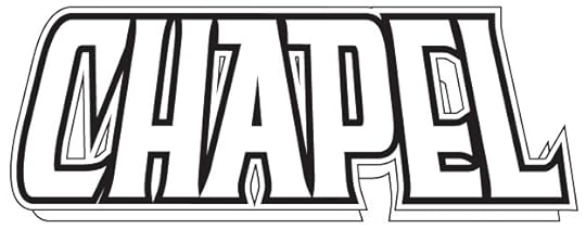 Image © Image Comics
Chapel. Client: Image Comics. Medium: digital. Date: 1995. At this time there was a small trend toward religious-sounding character names, Bishop was another one. I started with one of my title fonts and modified most of the letters. Used on eight issues from Image and one from Awesome.
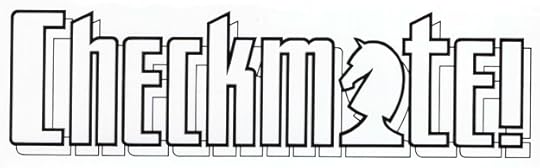 Image © DC Comics
Checkmate! Client: DC Comics. Medium: pen and ink. Date: 1987. I can’t tell you how pleased I was to use that knight chess piece in place of the A. I played chess a little growing up, and was probably the worst player in my high school chess club, but here I was able to play the game in my own way. Appeared on 33 issues.
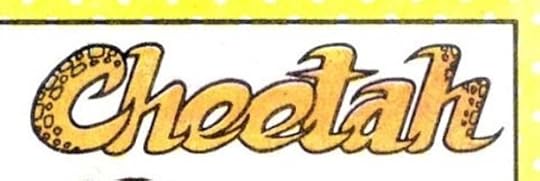 Image © DC Comics
Cheetah. Client: DC Comics. Medium: pen and ink or marker. Date: 1985. One of two I did for Who’s Who #4, this was the golden age version of the character.
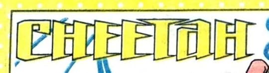 Image © DC Comics
Cheetah. Client: DC Comics. Medium: pen and ink or marker. Date: 1985. And this was the modern version of the time. The points kind of suggest claws on both, I guess.
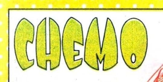 Image © DC Comics
Chemo. Client: DC Comics. Medium: pen and ink or marker. Date: 1985. Another for Who’s Who #4, I like these egg-shaped letters, though I can’t say why. Should have put small bubbles in them like the character has in his chemical body.
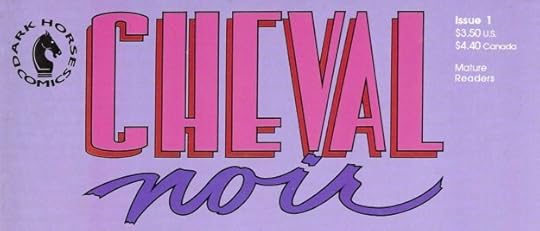 Image © Dark Horse Comics
Cheval Noir. Client: Dark Horse. Medium: pen and ink. Date: 1989. One of my first jobs for this publisher, and looking it up on the Grand Comics Database, the logo is co-credited to myself and Dave Stevens, who did some of the covers. Dave was an excellent designer as well as a wonderful artist, and I’m happy to share credit with him, though if I worked from his ideas, I didn’t know it. More likely he made changes after my version was accepted and sent in. The first issue, above, uses my script NOIR, but the CHEVAL might be by Dave. I’ve written about my process and sketches HERE.
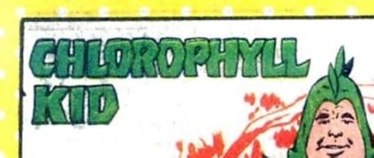 Image © DC Comics
Chlorophyll Kid. Client: DC Comics. Medium: pen and ink or marker. Date: 1985. These letters have a little bounce and personality to take them a small step above the usual bland block letters. For Who’s Who #4.
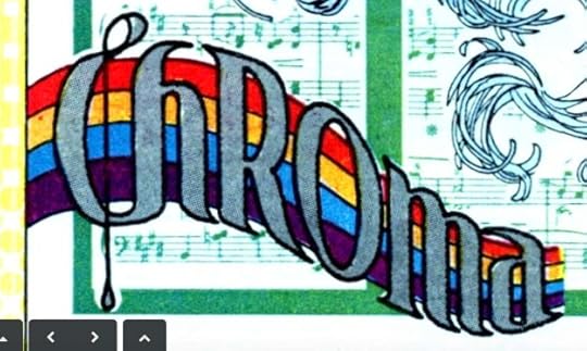 Image © DC Comics
Chroma. Client: DC Comics. Medium: pen and ink or marker. Date: 1987. For Who’s Who Update #2. More creative than most of these, combining music with a rainbow.
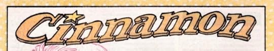 Image © DC Comics
Cinnamon. Client: DC Comics. Medium: pen and ink. Date: 1978. This female western character was created as a backup for one of DC’s western titles, and I lettered this name logo on the splash page of her first story in WEIRD WESTERN TALES #48. She also appeared in issue #49. I pulled out that logo for Who’s Who #5, seen here.
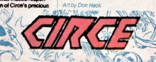 Image © DC Comics
Circe. Client: DC Comics. Medium: pen and ink or marker. Date: 1985 For Who’s Who #5.
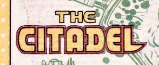 Image © DC Comics
The Citadel. Client: DC Comics. Medium: pen and ink or marker. Date: 1985. This one has a little more personality at least. For Who’s Who #5.
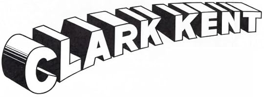 Image © DC Comics
Clark Kent. Client: DC Comics. Medium: pen and ink. Date: 1986. Somewhat puzzling, not sure if it was done for DC Licensing or for a comic. There’s a similar one on the cover of DC COMICS PRESENTS #79, but this has somewhat thicker letters and more accurate telescoping. That issue was published about a year before this was designed, so perhaps licensing saw it and wanted a better one.
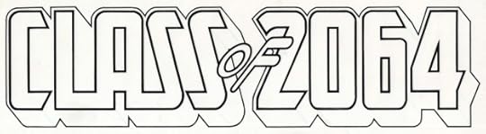 Image © DC Comics
Class of 2064. Client: DC Comics. Medium: pen and ink. Date: 1983. Designed for the series I wrote for NEW TALENT SHOWCASE, which appeared in issues 1-3 and 7-8. Most of the features did not have real logos, but of course I had to do one for mine! The date was almost 100 years ahead of my own high school time, 1965-69. Now we’re more than halfway there.
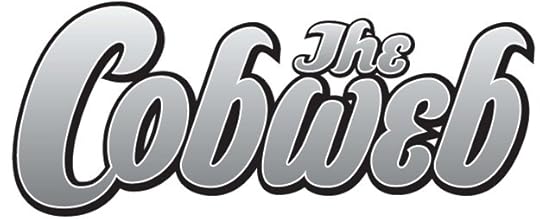 Image © DC Comics
The Cobweb. Client: America’s Best Comics. Medium: digital. Date: 1999. One of the features in TOMORROW STORIES written by Alan Moore, this one drawn by Melinda Gebbie and others, also used on a few covers. I think this began as a sketch and was developed in Adobe Illustrator. Appeared in 12 issues and a Special.
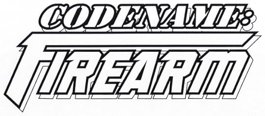 Image © Marvel
Codename: Firearm. Client: Malibu Comics. Medium: digital. Date: 1995. The first line uses a commercial stencil font, the second line uses one of my title fonts with the F extended to suggest a gun. Appeared on six issues.
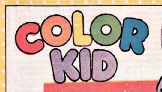 Image © DC Comics
Color Kid. Client: DC Comics. Medium: pen and ink or marker. Date: 1985. For Who’s Who #5. For some reason there were lots of characters beginning with C that didn’t have logos. Here the round letters are given a little energy with a rough outer line, and the coloring makes it work.
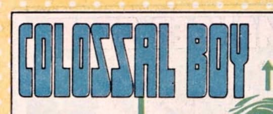 Image © DC Comics
Colossal Boy. Client: DC Comics. Medium: pen and ink or marker. Date: 1985. Another one for Who’s Who #5. Made it as tall as I could, and in this case allowed the bottom of each letter to be distorted thickly to add to the tall feeling, like platform shoes.
 © unknown
ComicArtCommissions.com. Client: GeorgiaWebPro. Medium: digital. Date: 2008. There’s still a website with this name, but I don’t see my logo on it, and the owner is someone else. Websites are so flighty. I used one of my title fonts.
Posts in this series are listed on the Logo Links page of my blog.
The post My Logos A-Z: CHAMELEON to COMIC appeared first on Todd's Blog.


Todd Klein's Blog

- Todd Klein's profile
- 28 followers

