New Year, New Cover, New Blog Post.
This post is all about that familiar saying, "Don't judge a book by its cover." And alas, that's not always the way it goes. Sure, the blurb has a massive effect on a potential reader's interest. But in the end, the blurb doesn't get looked at if the cover isn't enticing (I've been guilty of this a time or two). Personally, I see nothing wrong with that. Books are entertainment, and as such there is an expected level of presentation that needs to be achieved.
Foremost, this comes in the form of the story itself. A spectacular cover be damned if the accompanying novel is worthless drivel, right? Have I ever encountered such? Yes. But perhaps part of that is taste. Maybe the story wasn't to my liking, and maybe I felt the cover gave unwarranted expectations. When I set about creating my first cover for The Pale Hand of God, I wanted something simple, yet something that conveyed the underlying theme of the novel.
Sadly, my first true cover didn't accomplish that.
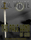 Click for larger image I suppose my intentions can be gathered from the above image. I wanted the sword to stand out, and I wanted the background to produce the dark and grim atmosphere that is a major part of the story. While I'm not altogether displeased with the cover, I can see why readers might pass it over. It does carry the stamp of an amateur. This is always a problem for Indie authors. It doesn't help that many cover-creating artists charge a hefty sum for their work. Really, I just wanted to design my own, not only because of financial reasons, but also for the control factor. Being a writer I have immense control over all that I do. It's not an easy thing to give up. This is perhaps the most appealing aspect of being an Indie writer: I have no one to answer to but myself. My stories are wholly my own, with nothing catered to a targeted readership. A reading of Pale Hand will show that.
But, because being an Indie author means also being a marketer and promoter, I decided to search out a cover that might garner more attention. My second true cover came in a sort of generic box, and for a time I was happy with it.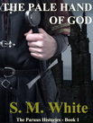 Click for larger image Yet, as you see, it feels stilted. I enjoyed the concept, especially the paleness of the knuckles and the broken stone foundations behind. But it didn't feel special. It felt flat and lifeless.
In envisioning covers, I never pictured anything with movement. I didn't want men fighting, or a portrayal of war, or anything that put an emphasis on action. I've always felt the cover for this book should be subdued, that anyone who looked on it would gather a sense of patience (It is a book about a waiting darkness, after all). And while the story is a rampant exploration of violence, I want it to be read and understood as a brooding novel searching out the meaning of honor and courage and terror.
When I'm asked what my novel is about, what elements of it are intriguing and fantastic, I find myself giving this long monologue praising the story for opening up heroes and villains, and for its commentary on love and faith and misplaced devotions. I expand on how my characters display bravery and cowardice, and how the human condition is mirrored in the trials and quests Pale Hand offers. Then I take a breath, and find a more compact explanation is in order. So I say my story is about how people set about changing the world, for good or bad. This works for both the world at large and the smaller worlds of the characters themselves. It is a novel about extraordinary people, virtuous and evil, who are trying to fashion reality to their desires.
What does all that have to do with my cover? It is this: how do you portray such a thing in an image? It is not possible. What is possible is a cover that stands as a testament to what my novel aspires to. I was incredibly lucky to receive this:
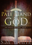 Click for larger image There is so much I love about this cover. Again, the sword draws the attention, but the addition of the open book at the bottom provides a feeling of age and scholarship. This is an important component of the story.
What I like most about this cover is how the simplicity hides the complexity. The colors are wonderful and eye-catching, holding to a feeling of promise and despair. And the subtlety of a certain element found in the novel shown in the image is marvelous.
I am proud to have this as my first line of offense against a well-defended genre fanbase. So far the cover has been received well. And when the sequel comes out in a few months, its cover will follow the same lines.
Foremost, this comes in the form of the story itself. A spectacular cover be damned if the accompanying novel is worthless drivel, right? Have I ever encountered such? Yes. But perhaps part of that is taste. Maybe the story wasn't to my liking, and maybe I felt the cover gave unwarranted expectations. When I set about creating my first cover for The Pale Hand of God, I wanted something simple, yet something that conveyed the underlying theme of the novel.
Sadly, my first true cover didn't accomplish that.
 Click for larger image I suppose my intentions can be gathered from the above image. I wanted the sword to stand out, and I wanted the background to produce the dark and grim atmosphere that is a major part of the story. While I'm not altogether displeased with the cover, I can see why readers might pass it over. It does carry the stamp of an amateur. This is always a problem for Indie authors. It doesn't help that many cover-creating artists charge a hefty sum for their work. Really, I just wanted to design my own, not only because of financial reasons, but also for the control factor. Being a writer I have immense control over all that I do. It's not an easy thing to give up. This is perhaps the most appealing aspect of being an Indie writer: I have no one to answer to but myself. My stories are wholly my own, with nothing catered to a targeted readership. A reading of Pale Hand will show that.
But, because being an Indie author means also being a marketer and promoter, I decided to search out a cover that might garner more attention. My second true cover came in a sort of generic box, and for a time I was happy with it.
 Click for larger image Yet, as you see, it feels stilted. I enjoyed the concept, especially the paleness of the knuckles and the broken stone foundations behind. But it didn't feel special. It felt flat and lifeless.
In envisioning covers, I never pictured anything with movement. I didn't want men fighting, or a portrayal of war, or anything that put an emphasis on action. I've always felt the cover for this book should be subdued, that anyone who looked on it would gather a sense of patience (It is a book about a waiting darkness, after all). And while the story is a rampant exploration of violence, I want it to be read and understood as a brooding novel searching out the meaning of honor and courage and terror.
When I'm asked what my novel is about, what elements of it are intriguing and fantastic, I find myself giving this long monologue praising the story for opening up heroes and villains, and for its commentary on love and faith and misplaced devotions. I expand on how my characters display bravery and cowardice, and how the human condition is mirrored in the trials and quests Pale Hand offers. Then I take a breath, and find a more compact explanation is in order. So I say my story is about how people set about changing the world, for good or bad. This works for both the world at large and the smaller worlds of the characters themselves. It is a novel about extraordinary people, virtuous and evil, who are trying to fashion reality to their desires.
What does all that have to do with my cover? It is this: how do you portray such a thing in an image? It is not possible. What is possible is a cover that stands as a testament to what my novel aspires to. I was incredibly lucky to receive this:
 Click for larger image There is so much I love about this cover. Again, the sword draws the attention, but the addition of the open book at the bottom provides a feeling of age and scholarship. This is an important component of the story.
What I like most about this cover is how the simplicity hides the complexity. The colors are wonderful and eye-catching, holding to a feeling of promise and despair. And the subtlety of a certain element found in the novel shown in the image is marvelous.
I am proud to have this as my first line of offense against a well-defended genre fanbase. So far the cover has been received well. And when the sequel comes out in a few months, its cover will follow the same lines.


No comments have been added yet.