Hogan’s Äule*
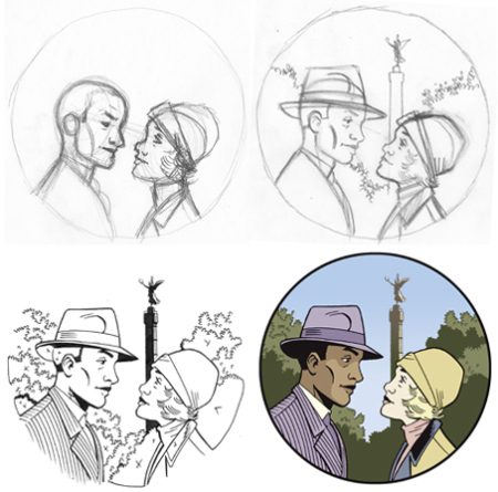
The above images show the four stages I recently went through to complete the cover illustration for the German edition of Berlin: City of Smoke. You can see in that first sketch that my drawing often starts out looking pretty awkward, and gets improved through a process of refinement. Figure placement gets readjusted, facial features are shifted, tiny details added or removed. The hardest part about this drawing was making the composition work with the Siegessäule (Victory Column) in the background, and I think it’s marginally successful. The only part I’m not really happy with is Kid Hogan’s head, which in retrospect looks a little squished.
This working method, as some readers and critics have noted, often leaves my finished work looking “cold” and “stiff.” I don’t disagree with that assessment, but neither do I think that there is a single visual standard to which all cartoonists should aspire. Between Gary Panter and Joost Swarte is a rich and multifarious spectrum of visual potential, and I’m happy with my place near the cooler end, having arrived here after many years of experimentation and hundreds of pages of comics.
Still unhappy about the squished-looking head, though.
NOTES
* Nothing like a bad pun that doubles as an unintentional Tolkien reference.


Jason Lutes's Blog
- Jason Lutes's profile
- 226 followers


