
Hi gals...Okay, after lots of research and thinking, I'd ...
 Hi gals...
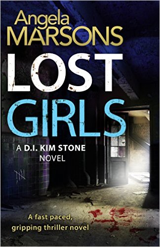
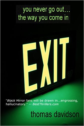
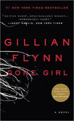
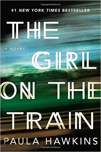
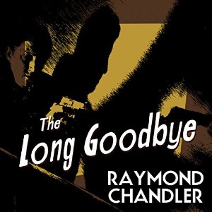
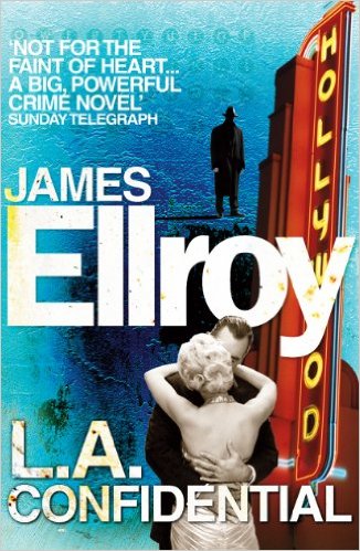
Okay, after lots of research and thinking, I'd like you to look at these covers and tell me if any seem a good fit to emulate for Thrill Girl.
It seems the successful books in the general 'mainstream suspense-mystery-domestic noir' category use image and font to set tone, and deliberately give no images of character.


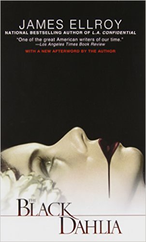
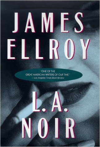
The older, classic noirs use stylized, somewhat salacious tones and pics no matter if doing 50s books or more modern adaptations

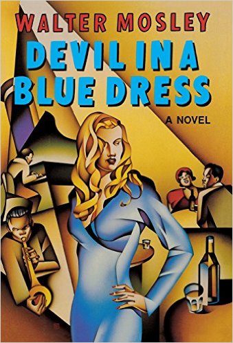
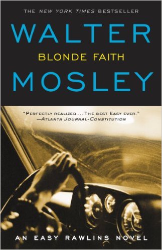
And there are those with modern photos that seek to tell the plot with people...
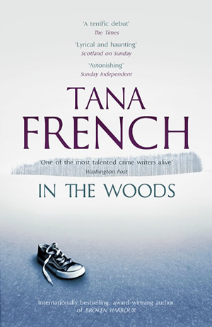
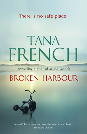
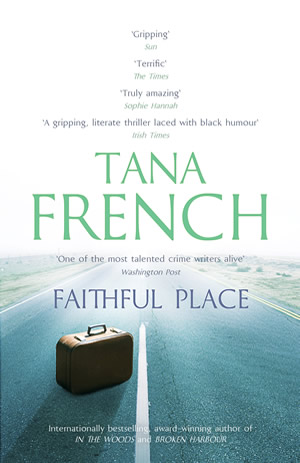
And of course the fabulous Tana French ones, with a single, realistic itemand the evocative setting


date newest »
message 1:
by
K-BRC
(new)
Jan 21, 2016 03:58PM
 I really love the font on EXIT and that image of the suitcase is do striking on TF's Faithful Place. That truly is the trend on hard back covers of best sellers in the library. Good luck! K
reply
|
flag


