
Test illustrations
I’m working on some illustrated prose at the moment, and wanted to make sure I had a good handle on the look I wanted for the illustrations before I started, since it’s a slightly different beast than comics.
So I had the bright idea to do a sketch, and then ink it with three slightly different media approaches, to get a real comparison. I’m…not sure I recommend this. Inking the same thing three times is kinda boring (who knew!).
But it might be of interest to people other than me, so here we go!
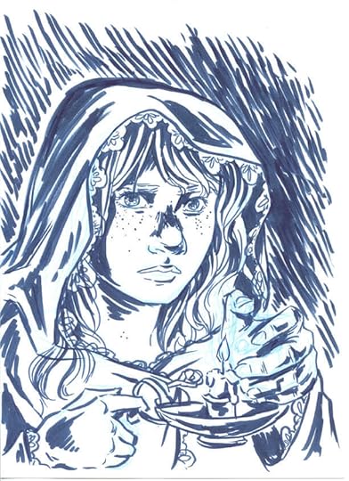
Sketch (printed in cyan for each of the inks):
Just ink and white!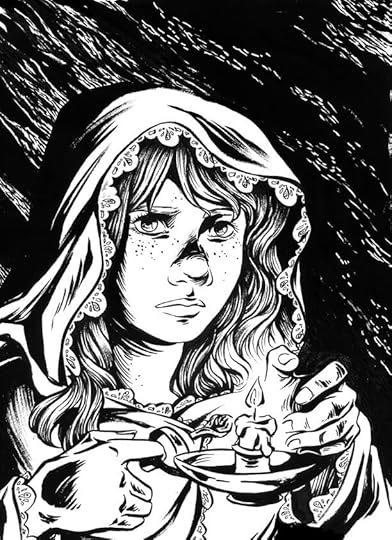
Ink and wash (should’ve blended to soften it a bit):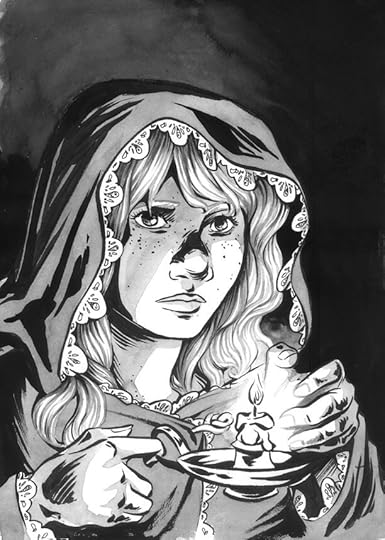
Ink and charcoal: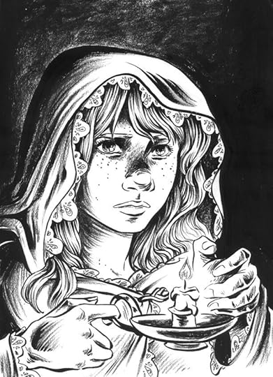
So there we go! The pure ink is closest to the feel I want for this, but while overall the ink and charcoal feels like a bit too much texture to me, I love the texture in the large black areas, so I’ll probably bring a bit of that in!


Sally Jane Thompson's Blog
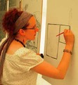
- Sally Jane Thompson's profile
- 5 followers

