
The Not-So Austen Bookclub discussion
Bookworm Debates
>
Book Covers ~ Right or Wrong?
date newest »
 I judge books by their covers all the time. Literal books, I mean. I once had a book recommended to me, and I kept it in my room for ages, fully intending to read it, but the cover just put me off so much that I never ended up turning the first page! Mind you, I was a lot younger then.
 I don't think it's a good idea to have models, either. If you must have a person on the front, I think you should see them from the back, or their silhouette, or even just the shape/side of their head, so that you get the general impression, but your imagination isn't forced to accept the person on the cover. Everyone's ideas of characters are different.
I adore good covers - It makes me want to buy the book, even if the book wasn't all that good! - But covers that have nothing whatsoever to do with the story absolutely anger me.
:)
 Mod
Mod
And those books (the ones with the shirtless guys) are kinda difficult to read because when people come up to you and see the cover of what you're reading they say something like, "Uhh, what kind of book are you reading?!"
And it gets really awkward.
(City of Bones etc. - I'm looking at you. I haven't read you yet, but one day I might)
 I borrowed City of Bones once - but was too embarresed to read it. One day I will... :)
Ha!! Yes. Yes, I do like the cover to be something you don't have to hide in your bag and hope no one sees :P
I borrowed City of Bones once - but was too embarresed to read it. One day I will... :)
Ha!! Yes. Yes, I do like the cover to be something you don't have to hide in your bag and hope no one sees :P
 Mod
Mod
Ahahah ... I had the same problem with the City of Bones cover. But It's a pretty good series .. I recommend it. However Infernal Devices which is the prequel series to Mortal Instruments is WAY WAY WAY better. But that's just my opinion. You have to read it to find out. :)
 I do judge a book by its cover. I like covers that are very distinctive (i.e have symbols, images that represent the story EXCLUSIVELY).
 For example the Harry Potter books (children's first editions) are so colorful, bright and very distinctive. They contain symbols of Hogwarts crest and there is nothing to confuse them with.


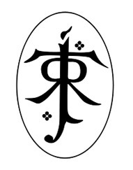
This aplies to JRR Tolkien's books, which contain his symbol at the top of all of his published works...
If i read a book that i like and it is the first in a series, then i have an addictive habbit of buying the rest in the series. The Vampire Diaries is an example of this! Thier book covers are also very easy to spot ~ simple yet memorable.
Other book covers i am drawn to are those sparkly, simply beautiful ones that seem SO special you take as much pleasure in gazing at the cover as do you reading the story. Some examples include -


 etc.
etc. So yes, for me i personally feel that the cover of the book is extremely important.
I love simple covers with only a few covers and, if it's a series, that one color should be on every single one of the book covers.
I don't enjoy book covers with a lot of things going on in it - again, keep it simple. Also, the cover has to be relevant to the content inside. If your book is about a vampire hunter why does the cover have a picture of a fairy princess?
Book covers with models on them are usually no-nos for me, but some exceptions would be Clockwork Princess and The Elite.
 Mod
Mod
I don't enjoy book covers with a lot of things going on in it - a..."
I agree totally - I hate when what is on the cover has no connection whatsoever to the story/what is inside the book.
E.g. Nevermore by James Patterson - no one in that book has grey hair so who is the person on the front cover?!

 I love to judge books by their covers. I mean how can you not? If it doesn't look nice when I first see it I don't really look into it. If it does then I read further. I like simple covers, I also like covers with the faces on the front because it makes it a little easier for me to come up with what the characters look like in my head. I'm not saying I don't make a few altercation, I do. It's just nice to have something to start off with.
Mod
I love to judge books by their covers. I mean how can you not? If it doesn't look nice when I first see it I don't really look into it. If it does then I read further. I like simple covers, I also like covers with the faces on the front because it makes it a little easier for me to come up with what the characters look like in my head. I'm not saying I don't make a few altercation, I do. It's just nice to have something to start off with.
Mod
 or
or
 ?
Mod
or ?"
?
Mod
or ?"They're both gorgeous but I really like the 1st one better.

 Love them. The Fault In Our Stars cover is amazing.
Mod
Love them. The Fault In Our Stars cover is amazing.
Mod
How do you all feel about simplistic covers (The Fault In Our Stars, for example)?"
I love simplistic covers. =)
For Example:
 Some US covers are so different to UK ones.
 For instance...

 VS
VS


and
 VS
Whoa! That's crazy. I know about Harry Potter but not the Daughter of Smoke and Bone.
VS
Whoa! That's crazy. I know about Harry Potter but not the Daughter of Smoke and Bone.
 I don't like models on book covers. Let me imagine the characters' appearances on my own, thank you. What's even stranger is when the model doesn't look remotely like anyone actually in the book. It's a mystery as to who the person is and it makes the cover even more irrelevant to the book. I like black and white covers, drawn covers, abstract covers, and simple but intriguing covers.
Things I Like on a Book Cover:
*a title in an interesting font
*one review about the book
*simple pictures
*a picture that has something to do with the novel
Things I Dislike on a Book Cover:
*when the character on the cover looks NOTHING like the description of the character in the novel
*too much going on
*no background image
*a title in an interesting font
*one review about the book
*simple pictures
*a picture that has something to do with the novel
Things I Dislike on a Book Cover:
*when the character on the cover looks NOTHING like the description of the character in the novel
*too much going on
*no background image
well, the jury may still be out, but personally I find that even a book with a dull cover can conceal a totally awesome narrative -- so don't pre-judge, for really what's not to like?!
 I like covers that have the title of the book at the top in larger type than the author's name. I realize it's a marketing thing for popular authors, but if the author has an unusual name (or pen name) it can be difficult to figure out what the title of the book is. I was in the library once looking at a shelf of books; the author's name was unusual and in large print at the top and the titles of the books were all ladies names and in smaller font. At first I thought it was odd that three women would write a book that had the same title; then I realized that I had it backwards. :-)

The Not-So Austen Bookclub
Books mentioned in this topic
Daughter of Smoke and Bone (other topics)Daughter of Smoke & Bone (other topics)
Harry Potter and the Philosopher’s Stone (other topics)
Harry Potter and the Sorcerer's Stone (other topics)
Days of Blood and Starlight (other topics)
More...

But what about in the literal sense. A physical book in front of you. It has a cover that has been crafted in some sort of way. This cover is meant to either influence/persuade you to pick it up and read it or give an insight to the story through symbolism.
Many of us, would agree that Book covers can influence us. It may not necessary influence our opinion of the book but we can say that certain covers are better than others.
So what do you like/dislike about book covers?
Here is my list.
Things I like
1. I love simplicity. Sometimes just having the title on the cover intrigues me. An example would be The Fault in Our Stars.
2. Symbolism. I love books that portray the story of the novel so well. It makes me happy. I feel that the book cover that does this well would have to be Unravel Me
3. A good colour scheme. I don't like having too many different colours. I really like a simple colour scheme.
Things I don't like
1. A cover that is overdone. I don't like having too much on the cover because it sort of burns my eyes and ruins the effect of the cover.
2. When they put an actual person on the cover. This is because I feel as if I do not have the freedom to imagine the character as I wish.
In some cases it's fine but in other cases it angers me.
One example is Clockwork Princess. Although I love this cover, I don't like the fact that they used an actual model for Tessa. I loved the first two covers mostly because they were so mystical and had an eerie feel to them. Clockwork Princess still has this feel but the whole having a model on the cover threw me off.
Some other cases would be Shatter Me by Tahereh Mafi
I also feel that the cover should do the book justice. Sometimes you have these amazing books that no-one picks up because the cover puts you off or the cover doesn't do the book justice.
Another thing I can't stand is the overuse of Girls in long dresses on YA Fiction novels. Half the time it is not needed.
And when a book cover has nothing to do with the story I just become really confused.
So what about you? What's your opinions/ feelings to book covers?